Chandelier Exit [UTS]📈 Chandelier Exit - Trend-following Confirmation and Exit Indicator
💡Overview
A smarter way to trail your stops—Chandelier Exit dynamically adapts to price swings and volatility. This indicator makes trend direction clear at a glance and gives you robust risk management.
• Dynamic Stops – Long stop = Highest High over Range bars minus ATR×Multiplier; Short stop = Lowest Low over Range bars plus ATR×Multiplier.
• Monotonic Adjustment – Stops only trail in the direction of the trend, never against it.
• Single-Event Signals – Marks the exact bar where the trend flips—one signal per event, no noise.
• Trend Fill – The area between the stops is filled: green for bullish, red for bearish.
• Customizable Inputs – Tweak Range, ATR Period, and Multiplier to fit your strategy.
• Non-Repainting – All signals and stops are confirmed at bar close for reliability.
🔍 How to Use
Spot trends, entries, and exits with clarity—Chandelier Exit simplifies your workflow.
• Trend Bias: Green fill signals bullish conditions; red fill signals bearish conditions.
• Entries/Exits: Enter long on ▲, exit or consider shorts on ▼, and vice versa.
• Avoid Noise: Best results in trending markets—avoid in choppy price action.
• Combine Filters: Pair with your favorite filters or oscillators for even better signals.
⚙️ Inputs
Fine-tune the indicator to your trading style with these simple settings.
• Range: Number of bars for Highest High / Lowest Low (default: 7)
• ATR Period: ATR calculation length (default: 9)
• ATR Multiplier: Adjusts stop distance based on volatility (default: 2.5)
📊 Signals
Stay informed at the moment of a real trend shift—no more double-counting or repainting.
• ▲ Green below bar = New long trend detected (plots only once at trend change)
• ▼ Red above bar = New short trend detected (plots only once at trend change)
🔔 Alerts
Create alerts via the “Add Alert” dialog and select the appropriate signal.
• “Long Signal”: Triggered on ▲ (Once Per Bar Close)
• “Short Signal”: Triggered on ▼ (Once Per Bar Close)
• Supports “Once Per Bar Close” to avoid repainting
📝 About
A modern, Pine Script® v6 implementation for today’s traders.
• Script Language: Pine Script v6
• Release Date: 2025-07-09
⚠️ Disclaimer
All trading involves risk. This tool is for educational purposes—always backtest before using live and consult your financial advisor as needed.
Volatility

Trend Akkam [UTS]📈 Trend Akkam — Clean and Objective Trend Indicator 🔍
💡 What It Does
Trend Akkam is a minimalist, non-repainting trend indicator designed to clearly show market direction using price and volatility structure.
It plots a dynamic trailing line that adapts to market conditions using ATR (Average True Range). The result is a visually clean and rule-based way to understand trend bias — without relying on lagging moving averages or noisy oscillators.
🚀 How It Works
Trend Akkam uses the open price and ATR to create a directional line that trails price and flips only when structure changes:
• In an uptrend ➜ the line stays below price
• In a downtrend ➜ the line stays above price
• When price closes across the line ➜ the trend is considered flipped
• The line auto-adjusts based on market volatility
This creates a clean, responsive trend envelope that updates only when significant changes occur.
🧠 Simplicity Wins
Trend Akkam emphasizes clarity over complexity:
• 💡 Easy to interpret — One line that flips sides when trend changes
• 🧱 Structure-based — Focuses on key price behavior, not noise
• 🧘 Minimal and effective — No clutter, just actionable visuals
🎯 Best Use Cases
• 🔄 Trend Detection
• 📉 Reversal Alerts — Visual confirmation when structure breaks
• 🛑 Exit Planning — Use line flips as smart trailing exit signals
• 🔍 Noise Filtering — Avoid re-entering too early after corrections
🔧 Settings
• ATR Range — Period for calculating market volatility
• ATR Factor — Multiplier that determines trailing distance
• ATR Smoothing - Op [tional smoothing for the ATR
No overcomplication. Just two intuitive inputs for trend clarity.
🔔 Alerts
Trend Akkam supports the following alert conditions for integration into your trading workflow:
• "Long Signal": Trend Flip to Bullish — Triggers when the trailing line flips below price, indicating a potential uptrend
• "Short Signal": Trend Flip to Bearish — Triggers when the trailing line flips above price, indicating a potential downtrend
You can create alerts using these conditions via the “Add Alert” dialog on TradingView, selecting the appropriate signal from the script’s built-in options.
✅ Final Word
Trend Akkam gives you a clean and confident way to read market direction. Whether you're building entries, managing exits, or simply filtering trend noise, it’s a straightforward tool that keeps your chart readable and your trading disciplined.
Let structure lead. Let Trend Akkam guide your direction. 🧭
📝 About
• Pine Script®: v6
• Created: 2025-07-09
⚠️ Disclaimer
For educational purposes only. Not financial advice. Trading carries risk—use proper money management and thoroughly backtest before going live.

Angular Volatility📘 Angular Volatility – Technical Indicator for Trend Intensity Analysis
Angular Volatility is an advanced technical analysis tool developed specifically for cryptocurrency markets on the Binance platform. Its primary objective is to detect structural shifts in price dynamics with greater precision by analyzing the combined behavior of market volume and the angular slope of a customizable moving average.
Unlike conventional indicators that operate directly over the price chart, this script displays all of its metrics within a dedicated secondary window, allowing a cleaner and more isolated view of critical movements such as acceleration, pause, or potential reversals. In addition, it includes a robust system for volatility intensity classification, automated alerts, and a live technical info table that summarizes key real-time values.
🎯 What does Angular Volatility analyze?
Angular Volatility measures the interaction between traded volume and the angle of a moving average selected by the user from six types (SMA, EMA, WMA, HMA, ALMA, and SWMA). From these variables, the system generates:
- Angular Volatility Index: A composite value representing the product of volume and angular slope, reflecting the true strength behind a move.
- Angular Oscillator: A standalone line that displays the directional angle (in degrees) of the selected moving average, limited between ±90°.
- Volatility Intensity Levels: Automatic classification of peaks into four levels—moderate, elevated, high, and extreme—displayed with distinct colors and geometric shapes.
- Technical Data Table: A real-time panel showing both the current angle of the moving average and the current value of the Angular Volatility Index in a compact, user-friendly format.
- Custom Alerts System: Five built-in alert conditions allow users to monitor key volatility events without needing to watch the chart constantly.
⚙️ Configuration Parameters
The script includes multiple configuration sections that allow users to fine-tune both its analytical precision and visual appearance:
- High Volume Detection: Adjustable historical depth and sensitivity to identify significant volume spikes.
- Initial Moving Average Settings: Selection of MA type, length, offset, and dynamic coloring based on slope angle.
- Volatility Index Options: Fully customizable visuals, synced with the angle values set in the moving average section.
- Volatile Intensity Styling: Choose which levels to display, customize their colors and icons, and optionally color the main chart candles for quick interpretation.
- Information Table: Options to show/hide the table, adjust size and position, and customize background/text colors.
🧠 Compatibility and Technical Recommendations
This indicator was developed to operate exclusively on Binance using the following timeframes only: 1m – 5m – 15m – 30m – 1h – 4h – 1D.
This restriction is deliberate, ensuring consistency in the mathematical model used to calculate angular data. Using this script on other platforms or timeframes may result in inaccurate readings or logic errors, as asset types like stocks, forex, or indices behave differently in terms of volume structure and slope normalization.
If applied to unsupported markets or timeframes, the script will automatically display a warning message without calculating or drawing technical values.
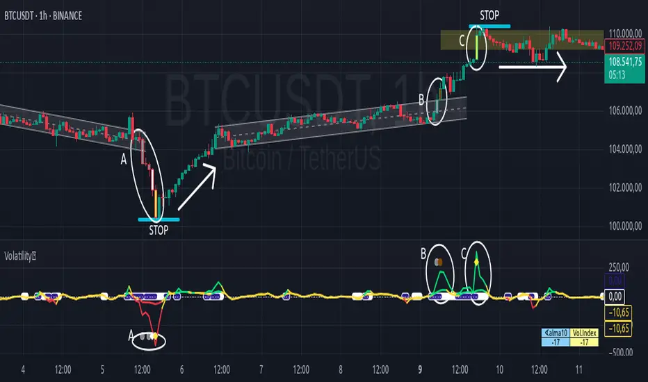
🔬 Practical Example
The following case study—applied to the BTC chart on a 1-hour timeframe—demonstrates how volatility intensity levels behave in structured scenarios such as channel breakdowns, rebound phases, false breakouts, and high-energy consolidation zones:
🔻 Letter A: Downward breakout and full intensity sequence
- The price was moving within a fairly uniform descending channel, which ends with a false breakout to the upside—quickly invalidated as a market trap.
- The true breakout occurs to the downside through a strong red candle, categorized by the system as moderate intensity (gray).
- This candle is followed by a Doji, then a smaller red candle also marked as moderate intensity, followed by a larger red candle showing high intensity (white), and finally a stronger red candle painted yellow, indicating extreme intensity.
- This full sequence (moderate → moderate → high → extreme) marks a technical climax, after which the price begins a progressive reversal.
- Although the drop unfolds over five red candles, the subsequent recovery takes place over 18 candles, mostly green and smaller in size, forming a “V” shape: sharp decline followed by a steady upward climb.
- This entire section is enclosed within an oval labeled A, with the four intensity levels clearly reflected on both the main chart and the Angular Volatility panel.
🔼 Letter B: Ascending channel and breakout with increasing bullish pressure
- After the rebound described in section A, the price begins forming a new ascending channel, marked with the letter B. This channel starts right where the previous range ends, with a very slight upward offset—nearly indistinguishable.
- In the final stage of this channel, a green candle classified as moderate intensity (gray) attempts a breakout. It is followed by a stronger green candle, painted brown, indicating elevated intensity and confirming bullish acceleration.
- Both candles and the corresponding peak on the Angular Volatility indicator are enclosed in an oval labeled B, representing a second wave of directional energy.
⛓️ Letter C: Resistance zone and consolidation following extreme volatility
- The upward movement continues until it reaches a resistance level, where a large green candle emerges, painted yellow to denote extreme intensity.
- Unlike the previous case in section A, this movement does not trigger a sharp reversal, but rather a technical pause followed by sideways consolidation, forming a horizontal range.
- This zone is marked on the chart with an oval labeled C, representing a classic case of stopping volume and range formation.
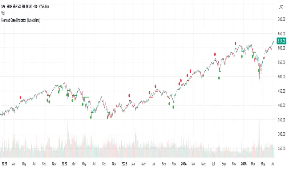
Fear and Greed Indicator [DunesIsland]The Fear and Greed Indicator is a TradingView indicator that measures market sentiment using five metrics. It displays:
Tiny green circles below candles when the market is in "Extreme Fear" (index ≤ 25), signalling potential buys.
Tiny red circles above candles when the market is in "Greed" (index > 75), indicating potential sells.
Purpose: Helps traders spot market extremes for contrarian trading opportunities.Components (each weighted 20%):
Market Momentum: S&P 500 (SPX) vs. its 125-day SMA, normalized over 252 days.
Stock Price Strength: Net NYSE 52-week highs (INDEX:HIGN) minus lows (INDEX:LOWN), normalized.
Put/Call Ratio: 5-day SMA of Put/Call Ratio (USI:PC).
Market Volatility: VIX (VIX), inverted and normalized.
Stochastic RSI: 14-period RSI on SPX with 3-period Stochastic SMA.
Alerts:
Buy: Index ≤ 25 ("Extreme Fear - Potential Buy").
Sell: Index > 75 ("Greed - Potential Sell").
Funding Ratio BinanceThis advanced indicator is designed for perpetual futures traders looking for an edge by understanding market dynamics on Binance. It provides key insights into the Premium Rate and Estimated Funding Rate, helping you make informed decisions about your trades.
What does this indicator offer you?
Premium Rate (4H): Displays the real-time difference between the perpetual futures price and the spot price on Binance. A positive premium can indicate bullish demand from futures buyers, while a negative premium suggests bearish demand. This data updates every 4 hours.
Estimated Funding Rate (4H): Calculates an estimate of the upcoming funding rate to be applied on Binance. This rate is crucial, as it determines payments between long and short positions. A positive rate means longs pay shorts, and vice versa. Knowing this estimate can help you anticipate market movements and manage your positions.
Suggested Position: Based on the current Premium Rate, the indicator provides a suggested position ("Long", "Short", or "Neutral"). This is a helpful guide for evaluating the overall sentiment of the perpetual futures market relative to the spot price.
Key Features:
Real-time Data: Obtains information directly from Binance (via TradingView) to ensure maximum accuracy.
Fixed Timeframe: Premium and funding calculations are performed on a fixed 4-hour timeframe, regardless of your current chart's timeframe.
Configurable: You can adjust the fixed Binance interest rate used in the Estimated Funding Rate calculation, as well as clamping limits to fine-tune its relevance. You can also customize the table's position on your chart to suit your preferred layout.
Automatic Pair Detection: For the Premium Rate, the indicator automatically detects the cryptocurrency pair you are currently viewing, ensuring relevant data without extra configuration.

HL/OL Histogram + (Close-Open)🧠 Core Concept
This indicator is designed to detect meaningful directional intent in price action using a combination of:
Intrabar candle structure (high - open, open - low)
Net price momentum (close - open)
Timed trigger levels (frozen buy/sell prices based on selected timeframe closes)
The core idea is to visually separate bullish and bearish energy in the current bar, and to mark the price at which momentum flips from down to up or vice versa, based on a change in the close - open differential.
🔍 Components Breakdown
1. Histogram Bars
Green Bars (high - open): Represent bullish upper wicks, showing intrabar strength above the open.
Red Bars (open - low): Represent bearish lower wicks, showing pressure below the open.
Plotted as histograms above and below the zero line.
2. Close–Open Line (White)
Plots the difference between close and open for each bar.
Helps you visually track when momentum flips from negative to positive, or vice versa.
A bold black zero line provides clear reference for these flips.
3. Buy/Sell Signal Logic
A Buy Trigger is generated when close - open crosses above zero
A Sell Trigger occurs when close - open crosses below zero
These trigger events are one-shot, meaning they’re only registered once per signal direction. No retriggers occur until the opposite condition is met.
📈 Trigger Price Table (Static)
On a signal trigger, the close price from a lower timeframe (15S, 30S, 1, 2, 3, or 5 min) is captured.
This price is frozen and displayed in a table at the top-right of the pane.
The price remains fixed until the opposite trigger condition fires, at which point it is replaced.
Why close price?
Using the close from the lower timeframe gives a precise, decisive reference point — ideal for planning limit entries or confirming breakout commitment.
🛠️ Use Cases
Momentum traders can use the histogram and line to time entries after strong open rejection or close breakouts.
Scalpers can quickly gauge intrabar sentiment reversals and react to new momentum without waiting for candle closes.
Algo builders can use the frozen price logic as precise entry or confirmation points in automated strategies.
Bimmeresty's ROCBimmeresty's ROC indicator is a custom technical analysis tool designed for day traders, particularly those employing scalping strategies on low timeframes such as the 1-minute chart. Built by @highlyrisky, this indicator combines the Rate of Change (ROC) oscillator with a Simple Moving Average (SMA) of the ROC, enhanced with customizable horizontal lines and color-coded fill zones to assist in identifying potential entry, exit, and profit-taking opportunities. The indicator visually represents momentum, trend direction, and key levels for decision-making. ROC is a momentum-based oscillator that measures the percentage change in price over a specified period. It quantifies how fast the price is moving relative to a previous price point, providing insight into the strength and speed of price movements.
The customizable horizontal lines and their fill zones serve as critical reference points for scalpers
Long Positions: When trading a long (buy) position, the Upper Inner Zone (0.5 to 1.0) is a key area for considering profit-taking. If the ROC enters this zone, it suggests that bullish momentum is becoming overextended, potentially signaling a reversal or slowdown.
Short Positions: For short (sell) positions, the Lower Inner Zone (-0.5 to -1.0) is the target for profit-taking. A ROC in this zone indicates strong bearish momentum that may be nearing exhaustion.
This indicator is also useful for exiting positions in unfavorable direction or preventing a premature close of a position (such a consolidation zone).
Follow me @highlyrisky for more trading content

ATR as % of Close (Daily)Sometimes, ATR is more comparable and meaningful when we express it in % rather than dollar. This is a quickly developed version (using ChatGPT), so review it and use it with caution, although the calculation is quite straightforward.

khahana OscillatorThe Khahana Oscillator is a directional strength tool that helps traders align with dominant market momentum.
It visualizes two forces:
🟢 Green Line = Bullish strength
🔴 Red Line = Bearish strength
These lines measure how consistently price aligns with a core trend engine across multiple perspectives, giving you a reliable read on which side — bulls or bears — currently dominates.
Rather than generating entry signals, this oscillator serves as a confirmation and filtering tool, perfect for:
Avoiding trades against the trend
Confirming breakout or pullback entries
Staying out of choppy or indecisive markets
📈 How to Use:
✅ 1. Confirm Trade Direction
Buy entries:
→ Only when the green line is rising
→ And green is higher than the red line
→ This signals building bullish dominance.
Sell entries:
→ Only when the red line is rising
→ And red is higher than the green line
→ This confirms bearish momentum is in control.
🧮 2. Read the Strength Scores
At the bottom-right corner, a table shows:
🟢 Bull Score – number of aligned bullish layers
🔴 Bear Score – number of aligned bearish layers
These scores range from 0 to 9 and reflect how strongly the market supports one direction.
→ Use this as a secondary filter — the higher the score, the stronger the conviction.
⚠️ 3. Avoid No-Consensus Zones
When both lines are flat or scores are low/close together, the market lacks direction.
→ Reduce exposure or wait for clearer signals.
🔄 4. Use for Confirmation, Not Signals
The oscillator is not a signal generator — it's a momentum filter.
→ Pair it with your strategy (breakouts, price action, etc.) and only take trades when the oscillator supports your direction.
💡 Pro Tips:
The oscillator value and scores are bounded between 0 and 9 — making it easy to gauge extreme strength or weakness.
Strong trends usually show one line rising while the other stays low or falls.
Crossover or reversal in dominance (green overtakes red or vice versa) often signals a shift in trend.
Best used on all markets: forex, crypto, gold, indices, and stocks.

HBD.2025.BOZ AYIThis indicator is designed for financial market analysis. The code generates trading signals using various **technical oscillators** such as **moving averages (EMA)**, **RSI, MACD** and **Stochastic**, as well as the **ADX trend filter**. It also offers additional visualization and analysis tools such as **bear market alerts** based on historical **price action**, **channel plots** and **MA50 cloud**. It includes a range of **input settings** that allow users to customize their strategies by **turning on and off** various filters and indicators. Finally, it also features a simple charting feature for potential **profit/loss (PnL) tracking**.

High-Low Range % – poslední 2 periodyHere’s a ready-to-use **English description** for publishing your script on TradingView:
---
## 📈 **High-Low Range % – Last 2 Periods**
This indicator calculates and visualizes the **percentage range** between the **High and Low** of the last **two closed periods** (daily, weekly, or monthly – user selectable).
### 🔍 Features:
* Displays the **High–Low range in %** for each of the **two most recent completed candles**.
* **Highlights** the range label if it exceeds a user-defined threshold (e.g., 10%).
* Allows switching between **daily, weekly, or monthly** timeframe bases.
* User controls for:
* Range threshold
* Label color (normal and highlighted)
* Label text size
* Vertical label offset above the High
### ⚙️ Inputs:
* **Timeframe**: Select between `"D"`, `"W"`, or `"M"` to define the range period.
* **Threshold (%)**: If the range exceeds this value, the label changes color.
* **Highlight Color**: Color for ranges above the threshold.
* **Normal Color**: Color for ranges below the threshold.
* **Text Size**: Tiny → Huge label size.
* **Offset**: Distance in ticks to place the label above the period's High.
### 🖼 Visual Output:
* A label placed **just above the High** of the respective candle.
* High and Low levels of the selected period are plotted as horizontal lines.
* Only the **two most recent closed periods** are displayed to keep the chart clean.
---
Let me know if you'd also like a **screenshot description** or **tags** for publication (e.g., `volatility`, `range`, `BTC`, `weekly`, etc.).

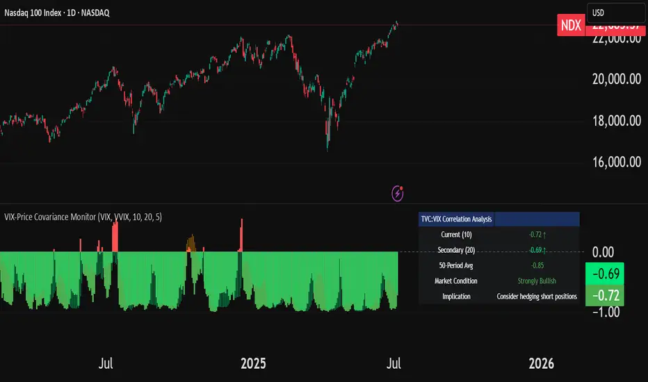
VIX-Price Covariance MonitorThe VIX-Price Covariance Monitor is a statistical tool that measures the evolving relationship between a security's price and volatility indices such as the VIX (or VVIX).
It can give indication of potential market reversal, as typically, volatility and the VIX increase before markets turn red,
This indicator calculates the Pearson correlation coefficient using the formula:
ρ(X,Y) = cov(X,Y) / (σₓ × σᵧ)
Where:
ρ is the correlation coefficient
cov(X,Y) is the covariance between price and the volatility index
σₓ and σᵧ are the standard deviations of price and the volatility index
Enjoy!
Features
Dual Correlation Periods: Analyze both short-term and long-term correlation trends simultaneously
Adaptive Color Coding: Correlation strength is visually represented through color intensity
Market Condition Assessment: Automatic interpretation of correlation values into actionable market insights
Leading/Lagging Analysis: Optional time-shift analysis to detect predictive relationships
Detailed Information Panel: Real-time statistics including current correlation values, historical averages, and trading implications
Interpretation
Positive Correlation (Red): Typically bearish for price, as rising VIX correlates with falling markets. This is what traders should be looking for.
Negative Correlation (Green): Typically bullish for price, as falling VIX correlates with rising markets
How to use it
Apply the indicator to any chart to see its correlation with the default VIX index
Adjust the correlation length to match your trading timeframe (shorter for day trading, longer for swing trading)
Enable the secondary correlation period to compare different timeframes simultaneously
For advanced analysis, enable the Leading/Lagging feature to detect if VIX changes precede or follow price movements
Use the information panel to quickly assess the current market condition and potential trading implications
Finance Nirvana Buy/Sell Signals Generator V1.1Finance Nirvana Buy Sell Indicator combines multiple layers of analysis into a single, streamlined overlay. It plots key trend and volatility structures—EMAs and Bollinger Bands—while computing a fast, zero-lag EMA (ZLEMA20) for more responsive trend detection. Extreme RSI and volume events are flagged directly on the chart, and classic two-bar price-action (Buy / Sell) signals are only triggered when confirmed by ATR-based volatility breakouts, ADX trend strength, dynamic RSI momentum filters, and volume confirmations. A multi-timeframe alignment table shows both “bullish vs. bearish” status and live RSI readings across 5m, 15m, 60m, 240m, and daily frames, and intraday pivot, support, and resistance levels are drawn for easy reference.
Rel 1.1 contains Table to show previous / todays High/low

Rob Hoffman IRB Strategy by SniffDog30 Min Bonk Strategy. Not sure if this is beneficial for other tokens/coins. Use at you own risk.
Good strategy for starter in Rob Hoffman style of indicators.
NOTE:
1) Switch to 30 mins
2) adjust to your exchange and quantity of trade

Turtle Trader SystemTurtle Trading script made by ChatGPT.
20 day Donchian Primary entry
55 day Donchian Secondary entry
10 day Donchian Trailing Stops

Buy/Sell Indicator (RSI, MACD, ATR) v6+Buy Sell indicators based on EMA, Volume and MACD Has buy and sale flag indicators

POCs Volume Profile Multi-Timeframe by smaPOCs Volume Profile Multi-Timeframe by sma is a visual tool designed to highlight key price levels where the highest trading volume occurred, also known as Points of Control (POCs), across multiple timeframes: monthly, weekly, and daily.
This indicator automatically plots dynamic horizontal levels based on historical POC data from each timeframe. It helps traders identify potential zones of interest, confluence, and institutional activity, providing context for both short-term and long-term strategies.
Customization options include line color, thickness, style, and the ability to display labels. The script maintains performance by limiting the number of plotted levels per timeframe.
Ideal for traders who use volume profile or structure-based approaches.
---
**Versión en español**
POCs Volume Profile Multi-Timeframe by sma es una herramienta visual que muestra los niveles de mayor volumen operado (POCs) en distintos marcos temporales (mensual, semanal y diario). Ayuda a identificar zonas clave de confluencia o interés institucional, útil para estrategias basadas en estructura o volumen.

Non-Repainting RSI 30/70 SignalA simple buy and sell indicator that relies on overbought and oversold areas that you enter whenyou get either a buy or sold signal.

Time-Specific Volume AverageA volume indicator based on historic volume.
Checks for the average volume in the past few days at the same time of day. This helps you determine when there is truly volume in the markets.
We will see often see sustained volume above the average during a clear trend. If you see spikes in volume without it being sustained above the average, it is very likely that the trend will die off quickly.
This is very helpful in determining whether to trade based on a trend following system, or a range based system.
Settings are below:
Days to average: Number of days to look back(tradingview has limits depending on your plan)
SMA Length: Number of "volume averages" to look at. Keep this at 1 if you want the average volume at the exact moment in the day. If you increase it, will also average in the past few candles of "volume averages".
SMA Multiplier: Multiplies the SMA by this amount(helps to get higher quality trends)

Dynamic Ray BandsAbout Dynamic Ray Bands
Dynamic Ray Bands is a volatility-adaptive envelope indicator that adjusts in real time to evolving market conditions. It uses a Double Exponential Moving Average (DEMA) as its central trend reference, with upper and lower bands scaled according to current volatility measured by the Average True Range (ATR).
This creates a dynamic structure that visually frames price action, helping traders identify areas of potential trend continuation, overextension, or mean reversion.
How It Works
🟡 Centerline (DEMA)
The central yellow line is a Double Exponential Moving Average, which offers a smoother, less laggy trend signal than traditional moving averages. It represents the market’s short- to medium-term “equilibrium.”
🔵 Outer Bands
Plotted at:
Upper Band = DEMA + (ATR × outerMultiplier)
Lower Band = DEMA - (ATR × outerMultiplier)
These bands define the extreme bounds of current volatility. When price breaks above or below them, it can signal strong directional momentum or overbought/oversold conditions, depending on context. They're often used as trend breakout zones or to time exits after extended runs.
🟣 Inner Bands
Plotted closer to the DEMA:
Inner Upper = DEMA + (ATR × innerMultiplier)
Inner Lower = DEMA - (ATR × innerMultiplier)
These are preliminary volatility thresholds, offering early cues for potential expansion or reversal. They may be used for scalping, tight stop zones, or pre-breakout positioning.
🔁 Dynamic Width (Bands are Dynamically Adjusted Per Tick)
The width of both inner and outer bands is based on ATR (Average True Range), which is recalculated in real time. This means:
During high volatility, the bands expand, allowing for wider price fluctuations.
During low volatility, the bands contract, tightening range expectations.
Unlike fixed-width channels or standard Bollinger Bands (which use standard deviation), this per-tick adjustment via ATR enables Dynamic Ray Bands to reduce false signals in choppy markets and remain more reactive during trending conditions.
⚙️ Inputs
DMA Length — Period for the central DEMA.
ATR Length — Lookback used for ATR volatility calculations.
Outer Band Multiplier — Controls sensitivity of extreme bands.
Inner Band Multiplier — Controls proximity of inner bands.
Show Inner Bands — Toggle for plotting the inner zone.
🔔 Alerts
Alert conditions are included for:
Price closing above/below the outer bands (trend momentum or overextension)
Price closing above/below the inner bands (early signs of strength/weakness)
🧭 Use Cases
Breakout detection — Catch price continuation beyond the outer bands.
Volatility filtering — Adjust trade logic based on band width.
Mean reversion — Monitor for snapbacks toward the DEMA after price stretches too far.
Trend guidance — Use band slope and price position to confirm direction.
⚠️ Disclaimer
This script is intended for educational and informational purposes only. It does not constitute financial advice or a recommendation to trade any specific market or security. Always test indicators thoroughly before using them in live trading.
Volatility Zones (STDEV %)This indicator calculates and visualizes the relative price volatility of any asset, expressed as a percentage of standard deviation over a rolling window.
🧠 How it works:
- Calculates rolling standard deviation of price (close) as a percentage of the current price.
- Classifies market into three volatility regimes :
• Low Volatility (≤2%) → Blue zone
• Medium Volatility (2–4%) → Orange zone
• High Volatility (>4%) → Red zone
📊 Why it matters:
Volatility structure reflects the underlying regime of the market — ranging, expanding, or trending. This tool helps traders:
- Spot optimal low-risk entry conditions
- Avoid chop zones or highly erratic moves
- Time breakouts or trend initiations
🛠 Usage:
- Works on any timeframe and instrument
- Adjustable lookback period
- Best used alongside trend filters or entry signals (e.g., SuperTrend, EMAs, etc.)

Hamster DynamicHamster Dynamic – Precision Scalping in Key Zones
Hamster Dynamic is a high-performance scalping strategy designed for traders who value speed, precision, and clarity. This script focuses on executing trades around key support and resistance levels, helping traders capitalize on high-probability setups in volatile markets.
The system combines real-time price action analysis with adaptive trend and volatility filters, making it a powerful tool for fast-paced trading environments.
Key Features
Automatic detection of major support and resistance zones
Rapid-entry scalping engine with precise timing
Built-in trend and momentum filters to avoid false signals
Fully customizable for different trading styles
Compatible with Forex, Crypto, Gold, and major indices
Who is it for
Traders who rely on zone-based entries and exits
Scalpers who need fast, accurate signals
Beginners seeking structure and confidence
Experienced traders looking to add a lightweight tactical edge
Let your strategy move with purpose. Hamster Dynamic is built for those who trade with intention.

[Top] 🦙 LHAMA Bands🦙 LHAMA Bands — Adaptive Bollinger Bands with RSI Heatmap Fill
This indicator combines adaptive Bollinger Bands and a dynamic RSI-based heatmap fill to help traders assess price volatility and momentum extremes at a glance. Unlike standard Bollinger Bands that use a fixed SMA basis, this version includes a Low-High Adaptive Moving Average (LHAMA) option that adjusts responsiveness based on recent price action, reducing lag during trend shifts.
How It Works
1. Basis Calculation (SMA or LHAMA)
SMA Basis:
Uses a traditional simple moving average of the selected source over the Bollinger Band length.
LHAMA Basis:
Computes an adaptive moving average that reacts faster when the highest high or lowest low changes over the LHAMA length. The adaptive coefficient increases during volatility, making the bands tighten or expand more responsively.
2. Bollinger Bands
Upper and lower bands are calculated by adding/subtracting a multiple of standard deviation from the basis. The multiplier (e.g., 2) controls the sensitivity to volatility.
3. RSI Heatmap Fill
The fill between the bands is dynamically colored based on the RSI value.
Colors range from:
Deep purple for very oversold (RSI ≤10)
Gradient purples and oranges through neutral
Bright yellow for very overbought (RSI ≥90)
This makes it easy to see whether price is consolidating at oversold/overbought extremes within the bands.
4. Optional RSI Table
Displays a floating table showing the current RSI value. Text color changes depending on RSI level for instant reference.
Inputs & Customization
You can adjust:
Bollinger Band Settings
Line Type
SMA or LHAMA
LHAMA length (if selected)
RSI Settings
Heatmap Colors
RSI Table:
Toggle table visibility and select its screen position.
How to Use
Volatility & Trend Context:
Use the adaptive bands to gauge when price is expanding or contracting.
The LHAMA basis can help identify faster-moving trends than an SMA.
Momentum Confirmation:
Observe the RSI heatmap fill color to confirm whether price is in overbought or oversold territory.
Dynamic Entry/Exit Zones:
Look for confluence between price touching bands and RSI extremes.
For example, if price is near the lower band with a deep purple fill (RSI ≤10), it could signal exhaustion.
Visual Clarity:
The optional table allows quick reference to the RSI value without opening separate indicators.
What Makes It Unique
This indicator enhances classic Bollinger Bands by:
Providing adaptive smoothing (LHAMA) for improved reactivity.
Embedding a color-coded RSI heatmap fill that instantly shows momentum context.
Offering extensive customization of colors, styles, and display options to fit any charting workflow.
