Ichimoku Cloud Indicator MasterclassIchimoku Cloud
Ichimoku Cloud is a set of technical Indicators that show support and resistance levels, momentum as well as trend direction which is done by taking into consideration multiple averages and plotting them over the chart.
It is composed of 5 lines, 2 of which compose a cloud where the difference between the two lines is shaded in where the price may find support or resistance.
The 5 lines include,
a 9-period average (conversion line),
26-period average (baseline),
an average of those 9-period and 26-period averages (Leading Span A),
a 52-period average (Leading Span B) and
a lagging closing price line (Lagging Span)
There are different ways to interprate the Indicator:
Ichimoku Cloud
The cloud is the most prominent feature of the Ichimoku Cloud plots. The leading Span A moves faster than the Leading Span B as Leading Span A, the average of conversion line (9-period average), and base line (26-period average) while Leading Span B, 52-period average making the shorter moving average more sensitive and faster than longer moving averages.
The price is above the cloud indicates an uptrend and it is strengthened when the Leading Span A is moving above and rising from Leading Span B, similar for downtrend.
Ichimoku Crossover
For the crossover strategy there will be use of Conversion Line (9-period moving average) and Base Line (26-period moving average). The crossover line takes lesser data points into consideration and reacts to the price more quickly while the baseline considers more data points tending it away from the market price thereby making the reactions slower.
Therefore, for Ichimoku crossover a buy signal is generated when the conversion line moves above the base line and sell when the conversion line drops back below the base line.
Price-Baseline Trend
As the price moves down below the Base Line representing a short-term oversold situation within a bigger uptrend with the pull back ending when the price moved back above the Base Line to trigger Bullish signal while as the price moves above the Base Line representing a short-term overbought region within a bigger downtrend with the bounce ending when the price moved back below the Base Line trigger to a Bearish signal.
Ichimoku + RSI
The Oscillator indicator is RSI and the moving average is Ichimoku in which we’ll be using RSI to give signal i.e. the signal chart while Ichimoku will provide with the trend i.e. the trend chart.
Buy when Leading Span A is above Leading Span B, and the value of RSI crosses up 30 and sell when Leading Span A is below Leading Span B along with the value of RSI crosses below 70.
Few Limitations of Ichimoku Cloud
Can make chart complex and distracting
There are few points plotted in future which might go in vain
May become irrelevant for long period of time as price remains way above or way below the cloud
Different signals from different elements making it a bit confusing
----------------------------------------------------------------------------------------
Your questions and comments are most welcome.
If you find the post useful, please like, share and follow to make sure that you get more information once I publish it.
- Mudrex
M-oscillator

Super set of oscillators by Thomas DeMark!Dear friends!
I continue describing oscillators developed by Thomas DeMark.
In my previous articles, I have already explained such tools as
TD REI and TD POQ (look here ).
In this post I’ll continue describing technical tools developed by Thomas DeMark.
TD DeMarker I
I’d like to start with the TD DeMarker I indicator. It is similar to TD REI and aims to distinguish between trend and non-trend movements in the market, and then, having determined the trend, it searches for reversal points depending on how the indicator reacts to oversold and overbought levels.
Its calculation technique is very simple. TD DeMarker I compares the current and the previous trading day’s highs according to the following algorithm:
1. Calculate the TD DeMarker I numerator
• If the current bar’s high is higher or equal to the previous bar’s high, the difference is calculated and added to the numerator.
• If the current bar’s high is lower than the previous day’s high, then zero value is assigned to that bar. Next values of the difference between the highs for each bar are added to the numerator over a series of 13 consecutive bars.
• If the current bar’s low is equal or less than the previous price bar’s low, then the difference between the previous day’s low and the current low are the numerator.
• If the low of the current bar’s is greater, a zero value is assigned to the nominator at this bar. The next values of the difference between the lows for each bar are added to the numerator over 13 consecutive bars.
2. Calculate the denominator of TD DeMarker I equation
• You add the value in the denominator to the sum of the differences between the lows in the same period.
3. Calculate TD DeMarker I = divide the numerator by the denominator.
• As a result, we get a value that will move in the range from zero to 100 in the form of a fluctuating 13-period line. At the same time, the overbought zone will be above 60, and the oversold zone will be below 40.
Now, let’s find out how this indicator’s signals are interpreted
A buy signal should satisfy the following conditions:
1. DeMarker I must not be below 40 for more than 13 bars
2. The bar’s close at the signal level should be lower than the low of one or two bars ago
3. The bar’s close at the signal level must be lower than the previous bar’s open or close.
4. The open of the next bar following the assumed reversal bar must be less than or equal to the close of any of the two previous bars.
5. The asset must be trading higher than at least one of the two previous closes.
As an example, I’ll take the BTCUSD market situation that has recently occurred. It is clear from the above chart that the BTCUSD was in the overbought zone (above 60) from the start till the end of May. Afterwards, the price rolled down below 40 and the indicator entered the oversold zone.
Immediately after that, we look for a point where the bar features the low before price exits the oversold zone.
Finally, when the price went beyond the oversold zone on June 13, we can easily identify the low in the period when the ticker had been below 40, according to TD DeMarker I.
Now, we can analyze the continuation pattern based on the above conditions.
1. The DeMarker I indicator was below the level of 40 for not more than 13 bars - in our case it was only 5 days;
2. The bar’s close under the red arrow is lower than the previous bar’s low (blue dots are above than the red dotted line).
3. The close of the bar below the arrow is lower than the previous bar’s open and close (blue dots are far lower than the previous bar).
4. The next bar’s open following the reversal bar is equal to the previous bar’s close (there are no gaps).
5. The asset is trading higher than the previous bars’ close levels. Furthermore, when the indicator exited the overbought zone, the price had been already trading above all the previous bars’ close levels.
Therefore, one could have safely entered a buy trade at the current level when the new bar of June 14 opened (I marked it with a red cross in the chart).
As we already know, this signal reached the target and provided the opportunity to gain on the BTCUSD movement up to the high at 14 000 USD.
I should note that when a buy signal is not confirmed, that is, the five conditions above are not met, there is still a signal, but it is a sell signal. Although such a sell signal cannot be as strong, it can be a confirmation for bearish signals of other indicators.
There is a good example in the chart above. It displays bitcoin’s all-time high at 20 000 USD.
After the DeMarker I had been in the overbought zone for quite a long time, it moved into the oversold zone, and so, we start counting and see how long the price will be in this zone.
Finally, there is the following situation:
1. DeMarker I was not below the level of 40 for more than 13 bars, in this case it was 12. So, this condition is satisfied.
2. The close of the bar under the red arrow is lower than the previous bar’s low (blue dotetd line is below the red dotted line). This condition is also satisfied
3. The close of the bar under the arrow is lower than the previous bar’s open and close. This condition is also met.
4. The open of the bar following the reversal bar is equal the close of the previous bar (there are no gaps). This condition also confirms the bullish scenario.
5. The asset is trading above the previous close levels. This condition is not met.
It is clear from the above chart the bar following the oversold zone (marked with a red arrow) went down lower than the close levels of the previous two bars, and, moreover, it was trading below the close level of the two bars preceding the reversal bar.
Therefore, the last condition is not satisfied, and so, we have the reasons to assume that there is a real reversal of the bullish trend.
Now, let us study the sell signals.
The following conditions must be met:
1. A sell signal should meet the following conditions:
2. The indicator must be above level 60 for at least six bars.
3. The signal bar’s close must be above the previous bar’s open and close.
4. The open of the bar following the signal must be equal or higher than the close of any of the two previous bars.
5. The asset must be trading below one of the previous close levels.
As soon as all these conditions are satisfied, it can be interpreted as a sell signal.
TD DeMarker II
The above chart presents an example of the Bitcoin bullish trend reversal in December 2017, after which there started a long-tern bearish trend. Let us analyze this situation as a bearish signal. When the bar marked with a red cross was forming, the DeMarker I indicator leaves the overbought zone and goes below level 60. Therefore, it is the case for looking for a sell signal within the zone, where the price was above level 60 (the zone is highlighted with green in the chart).
The red arrow highlights the bar that closed higher than the highs of the previous two bars, and so, higher than the previous bar’s open and close (in the chart, it is marked by the purple dotted line on December 17 that is above the green line). The next bar, following the one with the red arrow, also meet the condition and opens above the close of the second-last bar. Finally, there is the trend reversal signal and the opportunity to take the profit on December 20 (it is the bar marked with the red cross in the chart). However, this indicator, like other technical tools, may send false signals. To filter the entry signal, it is recommended to apply TD DeMarker II as a supplementary tool.
TD DeMarker II
Unlike the TD REI and TD DeMarker I, which compare the price highs and lows with those of one bar ago, TD DeMarker II analyzes a number of price ratios to measure the pressure of buyers and sellers.
Let us study the calculation formula of the TD DeMarker II.
Calculate the numerator:
1. Calculate the difference between the current bar’s high and the previous bar’s close.
2. Add the result to the difference between the current bar’s close and its low.
3. Distract the previous value from the current bar’s high
4. Sum up all the values. If there is negative result, assign a zero value to it.
Calculate the denominator:
1. Add the difference between the current bar’s low and the previous bar’s close to the numerator.
2. Add the result to the difference between the current bar’s high and its close (this value defines the selling pressure).
The buy and sell signals of this indicator work under the same conditions as for the TD DeMarker I, so, I won’t enumerate them again. I have already many times mentioned that, if multiple buy or sell signals are at the same place, the signal becomes much stronger. As it is clear from the above chart, a buy signal sent by the TD DeMarker II (green cross) matches to the one sent by the TD DeMarker I (red cross), which in combination confirms the sell signal and enhances it.
TD Pressure
DeMark suggests that the price action is directly affected by the supply/demand ratio. As the price change is often preceded by a change in trading volume, DeMark suggests measuring the speed of changing in the trading volume along with the speed of price changes. In addition, according to DeMark, these parameters are more important for the current bar, rather than for the complete bars. In general, these values determine the buying pressure on the market, which is calculated by subtracting the current bar’s open from the its close and dividing the result by the price range of this bar.
The result is multiplied by the trading volume of the current period and is added as a progressive total to the indicator value.
Finally, we have an indicator that shows buying pressure. For example, if the bar’s open is equal to its low, and the bar’s close is equal to its high, then the trading volume will be on side of buyers, and the indicator will display a strong rise of buying pressure. And vice versa, if the bar’s open and close coincide, even a greater trading volume won’t affect the indicator, as the market will be balanced, and the bulls’ power will be roughly equal to that of bears.
The indicator’s band moves from 0 to 100%, and the overbought and oversold zones, like for the indicators, described above, are the zones above 60 and below 40 respectively. The buy and sell signals sent by this indicator are interpreted in the same way as those sent by TD DeMarker I and II. Besides, this indicator is also a confirming one, and when it coincides with other signals, it confirms the indicated direction.
You see in the above chart that the signal sent by the TD pressure (yellow cross) matches to the signals sent by the DeMarker I and the DeMarker II (red and green crosses respectively), which means that the sell signal is true.
TD Rate of change (TD ROC)
TD ROC is an integral component of TD Alignment but can also be used in isolation as an overbought/oversold indicator.
It is thought to be quite simple and is determined by dividing the close of the current price bar by the close of twelve price bars earlier.
Although it is pretty simple, this indicator is quite efficient. According to Thomas DeMark, the bears’ zone is below 97.5. Bulls zone is above 102.5. Therefore, when the indicator is in a narrow band between 97.5 and 102.5 the market is in balance.
So, this indicator helps you identify the market sentiment at any moment.
But this is not its primary advantage. You can employ this indicator in technical analysis and draw the common patterns and trend lines. The chart above shows how a triangle worked out. A strong momentum, marked with a red arrow, draws the indicator beyond the triangle, which means that the market lost balance and started moving in the bullish trend.
Next, after the triangle was broken out and the bullish trend started, we build trend lines according to the common rules; in the bullish trend, the trend is outlined along the support line (red line), in the bearish trend -along the resistance lines (green line).
It is clear from the chart above that the breakout of these lines and entering the bear zone send a sell signal (red cross) in early July. Afterwards, we build the trend line along the resistance levels sand expect until the price breaks it through and enter bullish zone. Finally, in the mid-July, there is such a buy signal, marked with green cross in the chart.
Next, there is a strong growth in the bullish trend that is marked with the red trend line. The breakout of this line sends a signal to take profit, and entering bearish zone again signals the trend weakness.
As you see from the chart above, the indicator broke through the green trendline in late July but it hasn’t entered the bullish zone, and so, there has been no buy signal so far.
Another signal that really matters when using this indicator is the signal of convergence and divergence.
These signals are rarely sent by this indicator, but they are usually quite accurate, especially in long-term timeframes.
There is a clear divergence in the above chart. When the price is growing, the indicator is declining, which signals the trend exhaustion. In early July, the price couldn’t break through the previous high, thus confirming the direction of the indicator (marked with a circle).
Finally, as I have already said, the indicator went down below the trend line, which sends a strong sell signal; however, as you know, the bearish correction didn’t work out, so, for an accurate forecast, it important to employ all the DeMark's tolls together.
TD Alignment
Just for this purpose, to combine all the tools together, the TD Alignment indicator was developed.
TD Alignment is a composite indicator that combines the following five TD oscillators to measure buying and selling pressure:
1. TD DeMarker I
2. TD DeMarker II
3. TD Pressure
4. TD Rate of Change
5. TD Range expansion Index (this indicator is described here)
Each of these indicators has its own distinct method of measuring overbought/oversold conditions. TD Alignment is based on the values of all the above indicators according to the principle, where the final result is determined of the number of indicators in an oversold condition, overbought and equilibrium.
In addition, to calculate the TD Alignment, there were defined the following overbought/oversold zones:
Overbought/Oversold
1. TD DeMarker I - 60/40
2. TD DeMarker II - 60/40
3. TD Pressure - 82/12
4. TD Rate of Change - 101/99
5. TD Range expansion Index - 40/-40
Therefore, when the TD DeMarker enters the oversold zone, 1 is added to the total result. If the indicator enters the equilibrium zone, between 60 -40, a zero value is assigned, if it is below 40, 1 is subtracted from the total value.
Based on the same principle, all the indicators are calculated, and finally, there is the TD Alignment value that is moving between -5 and +5. -5 is reached when all the indicators are in the oversold zone, and +5 is associated with the case when all the indicators are in the overbought zone.
Unfortunately, I failed to find the TD Alignment in free access, so I had to write everything on my own. I must admit there may be errors in calculations, nonetheless, it performs quite well during testing. As you see, the main benefit of this indicator is showing the cases when the market reaches the extremes of the overbought/oversold zones.
In the above chart, I highlighted these levels from +4 to +5 and from -4 to -5.
When the indicator reaches this zone, it is obvious that the price will start correction soon and so you should take a corresponding decision on either taking profit or entering a trade. In addition, the indicator shows the market sentiment currently dominating; if it is above zero, bullish sentiment is dominating, if it is below zero, the market is bearish.
Buy or sell signal here must meet the same 5 conditions, described for TD DeMarker at the beginning of the article, the only difference is that you need to count the number if bars above or below zero.
Based on my own experience, I would add one more condition, the sixth one, to be met for entering a buy or a sell trade. A buy/sell signal is confirmed when the TD Alignment indicator breaks through zero level (red dots) only provided that the indicator hit the overbought/oversold zone before.
In the above chart, I tried to illustrate that, after the indicator hits green or red zone, i.e. overbought or oversold zone, the sixth condition is satisfied. So, when the indicator breaks through or rebounds from the zero level, there is a buy or a sell signal (according to the market sentiment, I marked the entry signals with green and red arrows). A red thumb down marks the levels where the market doesn’t reach the zones indicated above, and so, the condition is not met and the buy or sell signal is false; I marked false signal with the red crosses in the chart.
However, not everything is that perfect, because this indicator is rather sensitive and so, it sends quite many false signals. That is why, I do not recommend employing this indicator alone, rather, it should be used together with other DeMark's tools so that it will be more efficient.
I will describe other useful DeMark's indicators and explain how to apply them to BTCUSD trading in my next articles.
Subscribe not to miss the continuation!
I wish you good luck and good profits!

My favorite indicatorsIndicators. They make us feel good, they comfort us, we love to expect too much from them then call them useless when they fail to predict the future.
Or at least some people do. I myself find indicators comforting, or should I say they bring me relief. They can make every thing smoother, they throw numbers at us. The number is either above our threshold or below, the answer is binary. They give us certainty which is something we all crave in this seemingly random continuous dynamic flow of prices.
I am going to start with the indicators I always use, and then present a few of my favorite ones and describe what they do and what I think of them.
1- Fibonacci
Sometimes it gets called an indicator, sometimes it does not. Indicator or not there is not 1 buy or sell I do that does not involve a retracement, extension, or at least the measuring tool.
I trust my eyes alot, but if I was to trust them to know if we are at 50%, more, or less, my judgements would be all over the place.
The definition of a fib retracement that is given is a tool that allows analysts to find areas of support.
It helps me see where we are and where to enter a trend. 23,6% and below is too early for me, 38,2% is often a nice one.
Fib extensions let me see how far we really have gone, and helps with finding targets, or when to look for reversal.
Depends on the context on various timeframes, this includes alot of things, depends my goals, and the pair or commodity.
2- Average True Range (ATR)
I use this one all the time. This indicator measures how much the price has been moving in the past specified number of candles, including gaps.
"It was created to allow traders to more accurately measure the daily volatility of an asset by using simple calculations."
I want to know how volatile the market is to help find out how "active" the pair is and other things, and to help define stop loss, entry, target.
If I am looking at a trend on the H4 and D1 timeframes and I want to ride it I will not want to buy a pullback of 1 H1 ATR. And target more than this too.
It can also be used to note how expensive - in spreads - a pair is: if the spread is 20% of the daily ATR, it will be pretty hard to day trade it.
Now, the ones I do not use often.
a- Moving Averages
Moving averages are indicators that go on the chart and show what the average price for a certain period & timeframe is over time.
The smooth out noise, and provide indications to determine what the direction of the trend is.
There are several types of moving averages: Simple, Exponential, Smoothed.
I do not use them.
First of all my eyes are trained to detect trends and find what I want to see in the price quickly.
Second, I am interested in vertical moves, both for going with or against the trend, am I so picky that the price clearly is past MAS.
Third, once I identified something I like I will do a full analysis of it, very detailled, precise, using MAS would be ridiculous.
b- Relative Strength Index, MACD, and Stoch
Ah one of scammy "vip educators laptop on the beach lifestyle" & novice investors favorite.
Those momentum indicators show strength, with alot of lag, and poor precision, the MACD also has additional info I will not get into.
Some bad unprofitable market participants use it for "oversold" readings, meaning they will consistently buy in downtrends.
I look at them sometimes mainly because I think they look good. They look "professional", and they can be conforting, seeing divergence triggers the rewarding center.
But I would not seriously incorporate them in my activities.
c- The Commitment of Traders
It is a report that shows the open interest of participants in the futures market.
A simplified version such as in the example below can help make decisions to buy long or short contracts.
While imperfect (a big hedger with a small speculative position has all counted as "commercial") and general, it can help with one's study of a commodity.
For example, gold was over-shorted at the bottom in August 2018.
d- Average Directional Movement (ADX)
This indicator that was designed for commodity daily charts can be used for about everything, and it shows the strength of a trend.
It does so by measuring the amount of price movement in a single direction.
Wilder suggests that a strong trend is present when ADX is above 25 and no trend is present when below 20.
I think it is better than the RSI or worse Stoch & MACD. In particular in the following example with the smoothed version (25 DI length), otherwise it can be all over the place.
I see how it could be used with an alert (when value > 25) to warn an investor a trend might be happening. Also to help filter consolidations many want to avoid, if the eyes are not trained yet to a naked chart, or if the investor is not disciplined.
e- STDEV & Implied Volatility
Standard Deviation is a statistical calculation used to measure the variability.
Implied volatility is a metric that captures the market's view of the likelihood of changes in a given security's price.
The VIX is a market index that tries to project the expected volatility (downwards because that's all they care about) in the stock market.
I do not care much about those values. ATR + Fib + Measuring tool etc are better.
f- Bollinger Bands
These bands envelop the price using a moving average (20SMA) and standard deviations away from it.
"When the bands tighten during a period of low volatility, it raises the likelihood of a sharp price move in either direction."
It is supposed to help visualise tight periods before a big move. And the price often stays between the bands (that's not very helpful).
Sometimes when the price really gets tight with BB it really hits the eyes (Bitcoin), the small range and then the massively expanding one.
I do not really see the use for it. Bollinger Band users blind much? I have no use for them but they sure look pretty.
g- Volume for Stocks & Crypto
Good luck using volume with Forex. Volume tells us how much activity has happened. Did the price go up with only a few buyers? Or were there a whole lot of them?
Is a support strong: Many participants are watching it? Or only a few = not that strong.
There is a whole lot you can deduce with volume, but it is not the holy grail either. I rarely use it because the Forex market is OTC and we do not have that data, and with futures, it is rarely that useful.
h- On Balance Volume (OBV)
OBV rises when volume on up down is bigger than volume on down days. Its creator thought that volume precedes price.
It was designed to help detect bottoms with divergence, and spot smart money (big institutions) buying while dumb money (retail) was selling.
I doubt it will make the dumb money (that all think they are this special wonderboy) outsmart the dumb money.
Retail investors are likely to call bottoms every 2 weeks and chase bottoms and get giga rekt in the biggest bear market ever.
Maybe a good idea to go short when there are bullish signals in the future? I can already picture greedy and overexcited "investors" chasing every single "signal" they see. There will be many pullbacks in the big downtrend.

Bill Williams - Three Wise MenA tutorial on the "Three wise men" strategy by Bill Williams. This strategy was introduced in his book, "Trading Chaos". I highly recommend reading the book before actually using this strategy.

RSI Static Supports and Resistances on Multi time framesRSI Static Supports and Resistances on Multi time frames.
educational

Evolution of MACDMoving Average Convergence Divergence – MACD
The most popular indicator used in technical analysis, the moving average convergence divergence (MACD), created by Gerald Appel. MACD is a trend-following momentum indicator, designed to reveal changes in the strength, direction, momentum, and duration of a trend in a financial instrument’s price
Historical evolution of MACD,
- Gerald Appel created the MACD line,
- Thomas Aspray added the histogram feature to MACD
- Giorgos E. Siligardos created a leader of MACD
MACD employs two Moving Averages of varying lengths (which are lagging indicators) to identify trend direction and duration. Then, MACD takes the difference in values between those two Moving Averages (MACD Line) and an EMA of those Moving Averages (Signal Line) and plots that difference between the two lines as a histogram which oscillates above and below a center Zero Line. The histogram is used as a good indication of a security's momentum.
Mathematically expressed as;
macd = ma(source, fast_length) – ma(source, slow_length)
signal = ma(macd, signal_length)
histogram = macd – signal
where exponential moving average (ema) is in common use as a moving average (ma)
fast_length = 12
slow_length = 26
signal_length = 9
The MACD indicator is typically good for identifying three types of basic signals;
Signal Line Crossovers
A Signal Line Crossover is the most common signal produced by the MACD. On the occasions where the MACD Line crosses above or below the Signal Line, that can signify a potentially strong move. The standard interpretation of such an event is a recommendation to buy if the MACD line crosses up through the Signal Line (a "bullish" crossover), or to sell if it crosses down through the Signal Line (a "bearish" crossover). These events are taken as indications that the trend in the financial instrument is about to accelerate in the direction of the crossover.
Zero Line Crossovers
Zero Line Crossovers occur when the MACD Line crossed the Zero Line and either becomes positive (above 0) or negative (below 0). A change from positive to negative MACD is interpreted as "bearish", and from negative to positive as "bullish". Zero crossovers provide evidence of a change in the direction of a trend but less confirmation of its momentum than a signal line crossover
Divergence
Divergence is another signal created by the MACD. Simply, divergence occurs when the MACD and actual price are not in agreement. A "positive divergence" or "bullish divergence" occurs when the price makes a new low but the MACD does not confirm with a new low of its own. A "negative divergence" or "bearish divergence" occurs when the price makes a new high but the MACD does not confirm with a new high of its own. A divergence with respect to price may occur on the MACD line and/or the MACD Histogram
Moving Average Crossovers , another hidden signal that MACD Indicator identifies
Many traders will watch for a short-term moving average to cross above a longer-term moving average and use this to signal increasing upward momentum. This bullish crossover suggests that the price has recently been rising at a faster rate than it has in the past, so it is a common technical buy sign. Conversely, a short-term moving average crossing below a longer-term average is used to illustrate that the asset's price has been moving downward at a faster rate and that it may be a good time to sell.
Moving Average Crossovers in reality is Zero Line Crossovers, the value of the MACD indicator is equal to zero each time the two moving averages cross over each other. For easy interpretation by trades, Zero Line Crossovers are simply described as positive or negative MACD
False signals
Like any forecasting algorithm, the MACD can generate false signals. A false positive, for example, would be a bullish crossover followed by a sudden decline in a financial instrument. A false negative would be a situation where there is bearish crossover, yet the financial instrument accelerated suddenly upwards
What is “MACD-X” and Why it is “More Than MACD”
In its simples form, MACD-X implements variety of different calculation techniques applied to obtain MACD Line, ability to use of variety of different sources, including Volume related sources, and can be plotted along with MACD in the same window and all those features are available and presented within a single indicator, MACD-X
Different calculation techniques lead to different values for MACD Line, as will further discuss below, and as a consequence the signal line and the histogram values will differentiate accordingly. Mathematical calculation of both signal line and the histogram remain the same.
Main features of MACD-X ;
1- Introduces different proven techniques applied on MACD calculation, such as MACD-Histogram, MACD-Leader and MACD-Source, besides the traditional MACD (MACD-TRADITIONAL)
• MACD-Traditional, by Gerald Appel
It is the MACD that we know, stated as traditional just to avoid confusion with other techniques used with this study
• MACD-Histogram, by Thomas Aspray
The MACD-Histogram measures the distance between MACD and its signal line (the 9-day EMA of MACD). Aspray developed the MACD-Histogram to anticipate signal line crossovers in MACD. Because MACD uses moving averages and moving averages lag price, signal line crossovers can come late and affect the reward-to-risk ratio of a trade. Bullish or bearish divergences in the MACD-Histogram can alert chartists to an imminent signal line crossover in MACD
The MACD-Histogram represents the difference between MACD and its 9-day EMA, the signal line. Mathematically,
macdx = macd - ma(macd, signal_length)
Aspray's contribution served as a way to anticipate (and therefore cut down on lag) possible MACD crossovers which are a fundamental part of the indicator.
Here come a question, what if repeat the same calculations once more (macdh2 = macdh - ma(macdh, signal_length), will it be even better, this question will remain to be tested
• MACD-Leader, by Giorgos E. Siligardos, PhD
MACD Leader has the ability to lead MACD at critical situations. Almost all smoothing methods encounter in technical analysis are based on a relative-weighted sum of past prices, and the Leader is no exception. The concealed weights of MACD Leader are such that more relative weight is used in the more recent prices than the respective weights used by the components of MACD. In effect, the Leader expresses more changes in average price dynamics for the recent price movement than MACD, thus eventually leading MACD, especially when significant trend changes are about to take place.
Siligardos creates two less-laggard moving averages indicators in its formula using the same periods as follows
Indicator1 = ma(source, fast_length) + ma(source - ma(source, fast_length), fast_length)
Indicator2 = ma(source, slow_length) + ma(source - ma(source, slow_length), slow_length)
and then take the difference:
Indicator1 - Indicator2
The result is a new MACD Leader indicator
macdx = macd + ma(source - fast_ma, fast_length) - ma(source - slow_ma, slow_length)
• MACD-Source, a custom experimental interpretation of mine,
MACD Source, presents an application of MACD that evaluates Source/MA Ratio, relatively with less lag, as a basis for MACD Line, also can be expressed as source convergence/divergence to its moving average. Among the various techniques for removing the lag between price and moving average (MA) of the price, one in particular stands out: the addition to the moving average of a portion of the difference between the price and MA. MACD Source, is based on signal length mean of the difference between Source and average value of shot length and long length moving average of the source (Source/MA Ratio), where the source is actual value and hence no lag and relatively less lag with the average value of moving average of the source . Mathematically expressed as,
macdx = ma(source - avg( ma(source, fast_length), ma(source, slow_length) ), signal_length)
MACD Source provides relatively early crossovers comparing to MACD and better momentum direction indications, assuming the lengths are set to same values
For further details, you are invited to check the following two studies, where the first seeds were sown of the MACD-Source idea
Price Distance to its Moving Averages study, adapts the idea of “Prices high above the moving average (MA) or low below it are likely to be remedied in the future by a reverse price movement", presented in an article by Denis Alajbeg, Zoran Bubas and Dina Vasic published in International Journal of Economics, Commerce and Management
First MACD like interpretation comes with the second study named as “P-MACD”, where P stands for price, P-MACD study attempts to display relationship between Price and its 20 and 200-period moving average. Calculations with P-MACD were based on price distance (convergence/divergence) to its 200-period moving average, and moving average convergence/divergence of 20-period moving average to 200-period moving average of price.
Now as explained above, MACD Source is a one adapted with traditional MACD, where Source stands for Price, Volume Indicator etc, any source applicable with MACD concept
2- Allows usage of variety of different sources, including Volume related indicators
The most common usage of Source for MACD calculation is close value of the financial instruments price. As an experimental approach, this study will allow source to be selected as one of the following series;
• Current Close Price (close)
• Average of High, Low, and Close Price (hlc3)
• On Balance Volume (obv)
• Accumulation Distribution (accdist)
• Price Volume Trend (pvt)
Where,
-Current Close Price and Average of High, Low, and Close Price are price actions of the financial instrument
-Accumulation Distribution is a volume based indicator designed to measure underlying supply and demand
-On Balance Volume (OBV), is a momentum indicator that measures positive and negative volume flow
-Price Volume Trend (PVT) is a momentum based indicator used to measure money flow
3- Can be plotted along with MACD in the same window using the same scaling
Default setting of MACD-X will display MACD-Source with Current Close Price as a source and traditional MACD can be plotted eighter as a companion of MACD-X or can be selected to be plotted alone.
Applying both will add ability to compare, or use as a confirmation of one other
In case, traditional MACD Is plotted along with MACD-X to avoid misinterpreting, the lines plotted, the area between MACD-X Line and Signal-X Line is highlighted automatically, even if the highlight option not selected. Otherwise highlight will be applied only if that option selected
4- 4C Histogram
Histogram is plotted with four colors to emphasize the momentum and direction
5- Customizable
Additional to ability of selecting Calculation Method, Source, plotting along with MACD, there are few other option that allows users to customize the MACD-X indicator
Lengths are configurable, default values are set as 12, 26, 9 respectively for fast, slow and smoothing length. Setting lengths to 8,21,5 respectively Is worth checking, slower length moving averages will lead to less lag and earlier reaction to price actions but yet requires a caution and back testing before applying
Highlight the area between MACD-X Line and Signal-X Line, with colors emphasising the direction
Label can be added to display Calculation Method, Source and Length settings, the aim of this label is to server only as a reminder to trades to be aware of settings while they are occupied with charts, analysis etc.
Here comes another question, which is of more importance having the reminder or having the indicators with multi timeframe feature? Build-in Multi Time Frame features of Pine is not supported when labels and lines introduced in the script, there are other methods but brings complexity. To be studied further, this version will be with labels for time being.
EPILOGUE
MACD-X is an alternative variant of MACD, the insight/signals provided by MACD are also applicable to MACD-X with early and clear warnings for the changes in the trend.
If MACD is essential to your analysis, then it is my guess that after using the MACD-X for a while and familiarizing yourself with its unique character and personality, you will make it an inseparable companion to other indicators in your charts.
The various signals generated by MACD/MACD-X are easily interpreted and very few indicators in technical analysis have proved to be more reliable than the MACD, and this relatively simple indicator can quickly be incorporated into any short-term trading strategy

EURUSD 19 AUGUST 2020 RSI to ID accumulation in uptrend.RSI has recently become part of my style. I spent over a year learning how to identify the actions of smart money using volume. Understanding where something is and why its doing what its doing does not require RSI or any other indicator other than volume. I highly recommend that if this is a profession you truly want to pursue, you must spend some time understand volume. Volume is what moves price. With volume, you can very precisely see wether or not buying or selling is active or not. This is arguably the most important thing to understand in the markets and about 99% of people don't, including "experts"... and its actually not that hard.
Imagine volume as energy.
Energy can be stored (accumulated) and/or released (distributed).
If you haven't familiarised yourself with Richard Wyckoff's accumulation and distribution schematics please DDgo them (or google). If you follow me and look and my analysis (thank you very much by the way!) you are probably already familiar with the way I explain things and how I swear by VSA/Wyckoff.
RSI settings are slightly adjusted to increase sensitivity. I find these setting very reliable for signalling particularly on the 15 minute and in Forex (still working out some settings with digital).
I highlighted the areas of accumulation/re-accumulation. What is critical to understand is that we are only using the 1 hour to judge the condition of the trend (bearish or bullish) and not for entry. The 5 and 15 are used for entry because the smaller time frames convey greater detail. Within those two times frames you can begin more of a range analysis versus a trend analysis (will build on that concept in another chart).
Once RSI is below the median line (50 level or a MA) in a positively identified up trend, you can start looking for phase "A" ( selling climax, preliminary support, automatic rally and secondary test). once these are identified the trading range has been established and you can begin looking for phases "C" and "D" for a possible no supply entry after a spring ( or on the spring if you are really good with your risk management).
Again, use RSI for your trend analysis to identify these critical pullback areas and never chase.

Trend playing with RSII have never been fan of RSI, however after 1,5 years of trading, I decided to give it a shot and find out, whether this famous indicator could be useful for me or not.
First of all I was certain, that I will be using this indicator only on higher time frames, I was testing it on 15 minutes TF, but for me, there was just too much "noise" and I found out, that RSI on 1hr is best setup for me. And I found one pattern, that is constantly repeating in TRENDING market and I found this pattern very, very useful.
I still think, that best trading advice is "trend is your friend" and I remember when I was always trying to catch bottoms or tops and I always got stopped out and miss continuation of dominant trend. This pattern on RSI is good indication, that trend isn´t finished yet and now you have a chance to get on the "train".
This pattern is simple : UPTREND CYCLE: bearish divergence -> bullish divergence -> new swing high -> repeat.
DOWNTREND CYCLE: bullish divergence -> bearish divergence -> new swing low -> repeat
Of course, you just can´t trade based on this pattern, I am using it with eliott waves, so if I see finished correction or 5-wave reversal and I am also seeing that trend divergence, I will always bet on trend continuation. You also can´t predict any take profit with this pattern, but as a trend follower, it works perfectly.

How to use the Oscar OscillatorOSCAR Oscillator by GenZai
Green line is the Oscar Rough
Red line is the Oscar
By default based on the 8 last candles and smoothed using RMA
Purple line is the Slow Oscar
By default based on the 16 last candles and smoothed using WMA
HOW TO USE
Exit signaling
This indicator can be used as an exit indicator when line cross each other.
Entry signaling
When the green line crosses up, it indicates a long entry
When the red line crosses up, it indicates a short entry
Overbought/Oversold
When the indicator crosses the dashed grey lines it indicates Overbought Oversold
Slow Oscar Add-on
This is an Add-on to the orignal Oscar indicator
Can be hidden if you want the original experience of the Oscar indicator.
Can be used as a confirmation indicator by looking at the direction of the slope to verify is your are trending long or trending short.
Can be used as a baseline to confirm signals given by Oscar
Can be used to tweak your signals and test different settings.
Stock or Forex?
The program was originally written for stocks, but works equally well with the Forex market.
How this indicator is calculated ?
This is the formula we use to calculate the Oscar:
let A = the highest high of the last eight days (including today)
let B = the lowest low of the past eight days (including today)
let C = today's closing price
let X = yesterday's oscillator figure (Oscar)
Today's "rough" oscillator equals (C-B) divided by (A-B) times 100.
Next we "smooth" our rough number (let's call it Y) like this:
Final oscillator number = ((X divided by 3) times 2), plus (Y divided by 3).
SETTINGS:
You can choose between different smoothing options:
RMA: Moving average used in RSI. It is the Adjusted exponential moving averages (also known as Wilder's exponential moving average)
SMA : Simple moving average
EMA : Exponential moving average
WMA : Weighted moving average
The Script can be found here:

EURUSD identifying dist. with RSI/15 min (ref.)RSI @ 7
oversold @ 75
Overbought @ 25
VWMA @ 100
Avoid selling into support (strength)
Avoid buying into resistance (weakness)

Kyber Network (KNC USDT) - Breakdown of Recent Trades I recently took two discretionary positions on KNC/USDT. In this analysis I've documented my thought process and execution sequentially from left to right in the call outs.
In these trades I used several methods of analysis.
1. Chart Patterns
My first trade entry was predicated upon a Rectangle Top Pattern I identified KNC forming. Rectangle Tops occur during bullish up trends and when the overall market is bullish, as altcoins currently are, they have a high probability of breaking to the upside.
2. Trend Analysis
Fundamental to my trading strategy is trading in the direction of the overall trend. Trading against the dominant trend is like stepping over dollars to pick up pennies. Using the Daily and 4HR time frame, I identified that KNC was above my Base Line indicator, therefore confirming a bullish trend and that I should be trading to the long side.
3. Target Measurement
For my initial trade I used Bulkowski's measurement method for Rectangle Tops, measuring the difference from Resistance to Support and adding that to Resistance. This proved to be successful, however my first trade ended up running quite a bit beyond my target. For this reason I used my primary method of profit taking, 50/50. I take 50% of my profit at a pre-determined level and allow the rest of my position to run to take advantage of powerful trends.
4. Indicator Support
Utilizing my ICYSbot indicator and strategy to help supplement entry and exit conditions.
5. Patience and Risk Management
I used a position sizing strategy where a pre-determined percentage of my account is at risk should my trade hit the stop loss. In this case, I personally used 2% risk per trade. I also did not rush these trades, I let price evolve and the trend emerge as it did. I attached no personal bias or feelings toward the trade.
Overall, quite happy with these trades. I hope this post was helpful in providing insight into how I view the markets and trade execution. Thank you for your support.
Trade safely!

Awesome OscillatorThe Awesome Oscillator (AO) is displayed as a histogram showing the market momentum based on a comparison of the simple moving average (SMA) of the last 5 price bars median to the simple moving average of the last 34 price bars median.
MEDIAN PRICE = (HIGH+LOW)/2
AO = SMA(MEDIAN PRICE, 5)-SMA(MEDIAN PRICE, 34)
When the momentum of the past 5 bars is weak compared to that of the 34 bar period, the AO displays this shift as a red bar. When the recent 5 bar momentum is stronger, the AO displays the shift as a green bar. The AO displays these shifts by a series of red and green bars. Series of red bars indicate declining bias. Series of green bars indicates rising bias.
Related to the AO are Zero Line Cross Over , Twin Peaks Patterns , and Price/Momentum Divergence . When the AO is added to other technical indicators, such as Divergent Bars and Bollinger Bands, traders are able to assess which way a stock is likely to move. The AO can help see what is coming!
Zero Line Cross Over
When the AO crosses over the zero line, moving from above the zero line to below the zero line, this is a declining bias indicator. A rising bias is indicated when the AO crosses over the zero line, moving from below to above.
Twin Peaks
The Twin Peaks pattern indicates a declining bias when the AO forms a series of green and red bars where each transition from green to red (a peak) is smaller than the previous peak.
A rising bias is indicated when the AO forms a series of green and red bars where each transition from green to red (a peak) is larger than the previous peak.
Price/Momentum Divergence
Declining Bias - When the AO shows declining momentum and, during the same time period the price of the stock is showing a rising trend (higher highs and higher lows), there is divergence that is forecasting an eventual decline in the price. When momentum weakens, price may still rise for a period however, without momentum the price will snap back because there is not enough buying volume to maintain the upward price momentum. Imagine a rubber band stretched between the two ends of the “V” formed by the two trend lines.
In the chart example above, you can see the strong divergence between rising price and declining momentum. The price ended up snapping back in line with the AO and then continued to move lower.
Rising Bias - When the AO shows rising momentum and, during the same time period the price of the stock is showing a declining trend (lower lows and lower highs), there is divergence that is forecasting an eventual rise in the price of the stock. When momentum strengthens, price may still decline for a period however, eventually increasing momentum will push the price higher.


BTCUSD 4 hour RSI signalling RSI sensitivity at 7
Instead of 70/30, levels are set at 80/20.
Using RSI as an adjunct/signal tool. Note the volume anytime RSI breaks the 20 level. You can set an alert at 20/30. Whenever price breaks this level you will be alerted and there may be a potential long situation setting up.
RSI can convey divergences between price and volume.
Also can be used as a final confirmation. for example, you are about to enter long but notice RSI hovering around the 50 level: Middle of range, not ideal.
Takes patience but there are opportunities off of the 20 RSI if you understand volume.
practice*

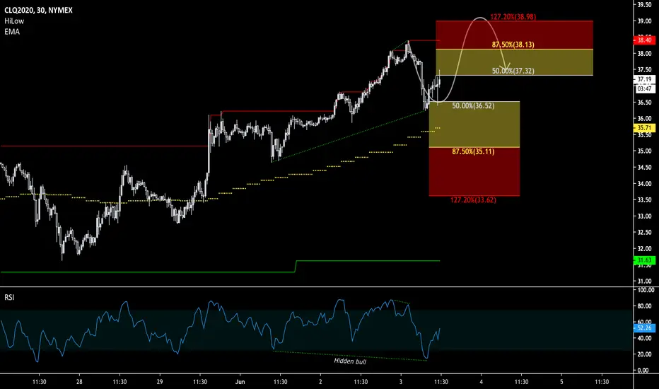
CLQ0: Corrective Formation Oil has been very bullish as of lately; the September delivery contract is up by almost 100% from its YTD low. The hidden bullish divergence implies a significant amount of pullback continuation players in the market. Trying to follow the momentum by buying dips and being alert for signs of bearish reversal is the prudent approach. The risk of a fast bear action that sheds at least 1/8th of the value is ever more present the further upside oil sees from here.
USDJYP RSI Training referenceDowntrend
RSI (10) negative divergence into resistance with supply expansion
RSI 80/20
Diminished demand at test area (neckline) with supply in the background
Hypothetical push through entry to initial profit area .39%
Training reference/practice

EURJPY how good are you part 5: Validating a divergenceOne positive divergence led to lower prices (failed divergence).
One positive divergence led to a trend reversal.
Why?
NISON - SWING TRADING STRATEGIESNISON - SWING TRADING STRATEGIES
PB&J - Pullback to Sweetspot
TT9 - Trading The 9
Trailing Stop


Judge the price action momentum - rising wedge pattern and RSIThere are a number of ways to judge the price action momentum. In the previous post, I show you using trend channel as an alternative to up wave or upward thrust to gauge the buying or selling momentum.
In this video, I also adopt the same example S&P 500 futures ( CME_MINI:ES1! ) to show you using the popular pattern - rising wedge and RSI indicator to achieve the same objective.
Yet, what I would like to emphasize is to understand the rationale behind the pattern and the indicator, which we can always go back to the first principle to find out, i.e. why a rising wedge is bearish in nature or what bearish divergence in RSI actually means?
Once you understand the rationale or the first principle about the price action momentum, you can start trading without memorizing every single pattern or indicator if you prefer.

Divergences basics: types of divergences and how to trade them.Introduction and practical sample of how to trade divergences (in Russian).

4H Support / Resistance with RSI Day Trading StrategyRSI = Blue, EMA of RSI = Red.
RSI 14, EMA 45
Long Rules:
1) RSI > EMA RSI = look for long setups
2) Resistance is broken ( a new high )
3) Price rejects (pulls away) from the previous resistance
4) RSI > EMA RSI >> 50
Short Rules:
1) RSI < EMA RSI = look for short setups
2) Support is broken ( a new low)
3) Price rejects (pulls away) from the previous support
4) RSI < EMA RSI << 50
I typically like to place a stop loss at the top of the closest resistance (if going short) and at the bottom of the closest support (if going long) and TP 1:1.
Another method is to go for partial profit at the closest support/resistance and move the stop to breakeven to catch longer trades.
3/4 trade setups in the past month on AUDUSD
FLAGS:
*the setup on the 20th of March was a working short position, but the strategy is looking long.
*the setup on the 31st of March was not validated as the RSI is not > EMA of RSI

Commitment of traders reportWHAT IS IT
The Commitment Of Traders (CoT) is a report issued by the Commodity Futures Trading Commission (CFTC) , one of the most important trading insitutionsof the American government. The report has the purpose of transparently showing market dynamics to the all the people involved or interested in the matter.
The COT report show all currently open positions (open interest) of the future and options market, where 20 or more traders hold positions for an amount greater or equal to the minimum amount amount established by the CFTC .
The report is issued every Friday at 3:30 P.M. (Eastern Standard Time, hence UTC-5). Each report normally contains data until previous Tuesday. CFTC usually receives data on Wednesday morning from the reporting firms (i.e.: Future Commission Merchants, Financial Insititutions, Brokers or International Stock Exchanges). After some verifications, CFTC publish data the following Friday. For each market, data are provided in terms of existing (still open) LONG and SHORT positions.
TYPES OF REPORTS
There are 4 types of report:
1) Legacy
It contains data split by stock exchange. This report has two different variants: "futures only", that contains data related to the futures market only, and "combined", that contains aggregated data for futures and options market. All the reported positions in this report are split in two main market actors categories: Commercials (or Large Speculators) and Non-Commercials
2) Supplemental
It includes contracts related to 13 selected agricultural market commodities. This kind of report split positions in 3 market actors categories: Commercials (or Large Speculators), Non-Commercials and Index Traders. Differently from Legacy report, the Supplemental is provided in the "combined" format only, hence contains data for both futures and options market
3) Disaggregated
This report contains the same data issued in the Legacy report, but with a more detailed drill down in terms of representation. First of all, it presents data split in 5 macro-categories: Agriculture, Petroleum and Products, Natural Gas and Products, Electricity, Metals and Other. Moreover, the report shows open positions/interests of 4 market actors categories: Producer/Merchant/Processor/User, Swap Dealers, Managed Money e Other Reportables. Aggregating data of this report, it is possible to obtain same data of Legacy report, hence this is a detailed view of data contained in the Legacy report. The Disaggregated, as well as the Legacy one, is available as "futures only" and "combined" variants
4) Traders in Financial Futures (TFF)
This report includes contracts related to currencies, US Treasury Bonds, Eurodollar deposits, VIX shares and Bloomberg Index only. The reports shows open interests of 4 market actors categories: Dealer/Intermediary, Asset Manager/Institutional, Leveraged Funds e Other Reportables. Last, also this report is available as "futures only" and "combined" variants
REPORT FORMATS
Legacy and Disaggregated reports are provided in two formats: short (synthetic) and long (extended). Both these formats contain same data, but long format contains also the concentration of open positions in the hands of the major 4 and 8 market investors at the moment of data collection, while short format does not contains any data about concentration.
TFF report is available in long format only, while the Supplemental is available in the short format only.
Report type Scope Format
Futures Combined Long Short
Legacy ✓ ✓ ✓ ✓
Disaggregated ✓ ✓ ✓ ✓
TTFF ✓ ✓ ✓ X
Supplemental X ✓ X ✓
Legacy report
As said above, market actors in Legacy report are divided in 2 categories:
Non-Commercials , or Large Speculators : they are market speculators as well as hedge funds. This category normally uses financial leverage to amplify variation of derivative asset and has an aggressive behavior in the market. They use rigid stop loss policies and, when the market falls below certain levels, they reverse positions on the other side. The main purpose of Large Speculators is not the asset they buy or sell, but to obtain a net profit from the buy/sell cycle. They normally have a trend following behavior.
Commercials buy futures just because they are interested in the underlying asset and try to hedge their financial exposition related to the commercial activity with the assets they are interested in. These market actors hold more than 50% of open positions in the US futures market and normally they go against the price trend: they sell when the market goes higher and they buy when the market goes lower. Their positions on underlying assets normally anticipate market trend, hence they should be carefully monitored
Non-Reportable : are the open position of small investors/traders that normally are on the wrong side of the market. This investors category is usually confused and not disciplined. They do not follow precise rules and are usually dragged by the trend, but they are slow to reverse positions when the market trend reverses.
The following example contains data about "futures only" market for BUTTER, coming from Chicago Mercantile Exchange.
BUTTER (CASH SETTLED) - CHICAGO MERCANTILE EXCHANGE Code-050642
FUTURES ONLY POSITIONS AS OF 03/17/20 |
----------------------------------------------------------------------------------| NON-REPORTABLE
NON-COMMERCIAL | COMMERCIAL | TOTAL | POSITIONS
--------------------------------|---------------------|--------------------------|-----------------
LONG | SHORT |SPREADS | LONG | SHORT | LONG | SHORT | LONG | SHORT
--------------------------------------------------------------------------------
(CONTRACTS OF 20,000 POUNDS) OPEN INTEREST: 11,597
COMMITMENTS
0 2,473 453 10,401 8,149 10,854 11,075 743 522
CHANGES FROM 03/10/20 (CHANGE IN OPEN INTEREST: 753)
0 -127 101 675 796 776 770 -23 -17
PERCENT OF OPEN INTEREST FOR EACH CATEGORY OF TRADERS
0.0 21.3 3.9 89.7 70.3 93.6 95.5 6.4 4.5
NUMBER OF TRADERS IN EACH CATEGORY (TOTAL TRADERS: 47)
0 12 10 28 22 38 34
It is possible to see as in the report is provided the total amount of LONG and SHORT positions for Non-Commercial, Commercial and Non-Reportable actors. Variations from previous week are moreover reported.
In addiction to LONG and SHORT positions, Legacy report contains also the SPREAD amount, that is available for Non-Commercial only, and refers to contracts that are opened LONG and SHORT at the same time. Normally a growing SPREAD value means a high level of uncertainty.
If we calculate NET POSITIONS (NP) for the 3 actors categories, as it's easy to check, the report show a zero-sum scenario:
NP Non-Comm = 0 – 2,473 = - 2,473
NP Comm = 10,401 – 8,149 = 2,252
NP Non-Rept = 743 – 522 = 221
NP Non-Comm + NP Comm + NP Non-Rept = -2,473 + 2,252 + 221 = 0
OPEN INTEREST value is the grand total resulting as the sum of LONG, SHORT and SPREAD positions:
Open Interest = 0 + 453 + 10,401 + 743 = 11,597
Supplemental report
Even the Supplemental report (called also Commodity Index Traders - CIT) shows data in the same manner of Legacy report, but the market actors are 3: Non-Commercial, Commercial and Index Traders.
Non-Commercial and Commercial actors are the same, while Index Traders category has appeared for the first time in January 2007. Before that date, investors that are now reported in this category were scattered in the two existing categories (Non-Commercial and mostly in the Commercial). The creation of Index Traders category has had the purpose to separate that category from Commercials, because Index Traders are not involved in the buy/sell cycle of underlying assets, and are usually managed funds, institutional investors or swap dealers. Index traders are normally interested in passive and longstanding LONG positions, while are not interested in the short-term price fluctuations. It's not unusual that this category start buying when price is falling and technical analysis says that the price falling will be even more deep. Index Traders are hence a counter-part of speculators, who have usually a contrarian habit.
Supplemental report is provided for 13 commodities:
• WHEAT-SRW - CHICAGO BOARD OF TRADE
• WHEAT-HRW - CHICAGO BOARD OF TRADE
• CORN - CHICAGO BOARD OF TRADE
• SOYBEANS - CHICAGO BOARD OF TRADE
• SOYBEAN OIL - CHICAGO BOARD OF TRADE
• SOYBEAN MEAL - CHICAGO BOARD OF TRADE
• COTTON NO. 2 - ICE FUTURES U.S.
• LEAN HOGS - CHICAGO MERCANTILE EXCHANGE
• LIVE CATTLE - CHICAGO MERCANTILE EXCHANGE
• FEEDER CATTLE - CHICAGO MERCANTILE EXCHANGE
• COCOA - ICE FUTURES U.S.
• SUGAR NO. 11 - ICE FUTURES U.S.
• COFFEE C - ICE FUTURES U.S.
Disaggregated report
Market actors of Disaggregated report are:
Producer/Merchant/Processor/User : they are involved in production, handling, packaging or transport of physical assets that is underlying to the future instrument or option. These actors use futures to cover/hedge risks associated to the activities they are involved in that are strictly related to the production of the assets
Swap Dealers : they are subjects that are involved in trading swap contracts related to the commodity and uses futures market to cover/hedge risks associated with swap transactions. The counterpart of a Swap dealer could be a speculative traders, as well as an hedge fund, or a more traditional Commercial subject that is interested in managing risks associated with the commerce activities of the asset
Money manager : to this category belong Commodity Trading Advisor (CTA), Commodity Pool Operator (CPO) or an unregistered fund identified by the CFTC. These subjects are delegated from their clients to do financial operations in their behalf
Other Reportable : all speculative traders that are not belonging in the three previous category are included in this category
Even in this case, the report shows LONG, SHORT and SPREAD positions.
Comparing this kind of report with Legacy, we can see that:
COMMERCIAL = PRODUCER/MERCHANT/PROCESSOR/USER + SWAP DEALERS
NON-COMMERCIAL = MONEY MANAGER + OTHER REPORTABLE
This explains why the report is called "disaggregated". It shows the same data but with a more level of detail especially regarding the actors that hold open positions.
If we take the Disaggregated report about BUTTER for the "futures only" market coming from Chicago Mercantile Exchange (equivalent to the previous example that is showed under the Legacy report section, we see:
:------------------------------------------------------------------------------------------------------------------------------------------------------ :
: Producer/Merchant : : : :
: Processor/User : Swap Dealers : Managed Money : Other Reportables :
: Long : Short : Long : Short : Spreading : Long : Short : Spreading : Long : Short : Spreading :
--------------------------------------------------------------------------------------------------------------------------------------------------------
BUTTER (CASH SETTLED) - CHICAGO MERCANTILE EXCHANGE (CONTRACTS OF 20,000 POUNDS) :
CFTC Code #050642 Open Interest is 11,597 :
: Positions :
: 8,893 6,326 1,048 1,363 460 0 301 180 0 2,172 273 :
: :
: Changes from: March 10, 2020 :
: 244 648 324 41 107 0 -12 -8 0 -115 109 :
: :
: Percent of Open Interest Represented by Each Category of Trader :
: 76.7 54.5 9.0 11.8 4.0 0.0 2.6 1.6 0.0 18.7 2.4 :
: :
: Number of Traders in Each Category Total Traders: 47 :
: 24 18 . . 4 0 . . 0 10 9 :
---------------------------------------------------------------------------------------------------------------------------------------------------------
If we take the categories Producer/Merchant/Processor/User and Swap Dealers and we sum all LONG positions and then subtract all SHORT positions, we obtain an overall NET positions like this:
NP = (8,893 +1,048 + 0 + 0) - (6,326 + 1,363) = 2,252
Now, if we do the same calculation for Commercial category of the correspondent Legacy report (see above) we obtain:
NP = 10,401 - 8,149 = 2,252
This is the confirmation that Disaggregated report contains the split of data reported in the Legacy report, where Commercial category is divided in Producer/Merchant/Processor/User and Swap Dealers. Same calculation would demonstrate that Non-Commercial category in the Legacy report is spitted here in Managed Money and Other Reportable categories.
If we now consider the Disaggregated report and we sum all LONG positions and then we subtract all SHORT positions for each actors category, we obtain:
(8,893 + 1,048 + 0 + 0) – (6,326 + 1,363 + 301 + 2,172) = 9941 - 10162 = -221
Given that the grand total should represent a zero-sum scenario, e can deduce from Disaggregated report that net position of Non-Reportable subjects should be +221, hence a net LONG of 221 contracts, and that is correct, in fact it is possible to obtain the same result from correspondent Legacy report (see above) by subtracting net SHORT position for Non-Reportable actors to the amount of net LONG positions for the same actors. Hence Disaggregated report allow us to calculato also net position of Non-Reportable, even if the data do not explicitly report the value.
Traders in financial futures report
This report is a further view on the market and split market actors in two sides (SELL and BUY) and 4 categories:
SELL SIDE
Dealer/Intermediary : are financial intermediaries who earn by the commissions related to the sell of financial products. Big banks and other financial entities are involved in this activities
BUY SIDE
Asset Manager/Institutional : they are insitutional investors, including pension funds, insurance companies and investment portfolio managers whose clients are mainly institutional entities
Leveraged funds : these are typically speculative funds (hedge funds) and various types of money managers, including the Commodity Trading Advisors (CTA) and the Commodity Pool Operators (CPO) not necessarily registered by CFTC. These subjects can be involved in hedging strategies and arbitrages on their own capital, or even third parties capital
Other reportable : these are all the traders that are not included in previous categories
Differently from Disaggregated report, the TFF report the positions of the mentioned actors categories are not an exact disaggregation of Commercial and Non-Commercial positions reported in the Legacy report. Here each actor belonging to one of the categories mentioned above could belong to the Commercial or the Non-Commercial category in the Legacy report, basing on the decision that CFTC takes during the report creation, that can be different time after time (i.e.: a subject that has already been considered a Commercial one in the beginning, can be shifted to Non-Commercial after a while, depending on the specific activities he is involved during the time, that can change as well). The TFF report is moreover available only in the LONG format
REPORT ANALYSIS
If we properly analyze data in the Commitment of Traders legacy report, we can determine the expectations of each market actor category regarding the market future.
The possibility to know the net positions of Commercial subjects (institutional investors) is the basis to understand the market sentiment. Their influence is, in fact, between 50% and 75% of the entire futures market of S&P500 and from 40% and 60% of Nasdaq100.
It is useful to point out that Commercial subjects, as well as the Non-Commercial, can take arbitrage or hedging positions, or, alternatively, put in place an active management of their portfolios by buying or selling futures on foreign (not US) markets, or, again, have open position on the futures' underlying assets and protect themselves from risks of price variations by taking opposite positions on the futures market. Hence the Commitment of Traders Report is an important thermometer to measure US stock exchange sentiment, but it isn't a tool that, alone, can allow us to predict how financial markets will move. It should be used (as usual) together with other indicators, tools, analysis and perspectives to have a better understanding of what is happening and a good approximation of what is going to happen (most likely).
Commercial subjects are active actors in the futures' underlying asset market and generally sell when the market (price) grows and buy when the price is more convenient (low), hence their activities are contrarian to the logic of speculators. For this reason the Commercial actors are often responsible of market moves and trends. They drag prices and the market with their activities, hence they anticipate and determine the market trends.
Non-Commercial subjects, viceversa, have opposite interests. They want to make money by price variations, hence they buy when the market shows growing prices and sell in the opposite conditions. This behavior is what we call "trend following" approach.
Here are some typical scenarios that we can find by analyzing the Commitment of Traders report:
1) If Non-Reportable actors (small/retail traders) are LONG and Commercial are SHORT, the Non-Reportable actors are most likely going to loose money because the price will go to to the side where Commercial are pushing it (down)
2) On the maximum levels of an asset price (i.e. near significant RESITANCE levels), Non-Reportable are likely pushed to SELL their positions. Then stop loss levels are likely hit and only after the price starts his falling stage
3) If Non-Commercial are LONG and Non-Reportable are SHORT, we are likely in the middle of an UPTREND and there is more space for the price to gro further
4) If Non-Commercial are LONG and also Non-Reportable are LONG, we are likely in the "euphoric" phase of the trend, hence the trend is going to finish soon
5) If Non-Commercial are SHORT, Non-Reportable are upgrading their SHORT positions and Comemrcial slow down their LONG positions, e re likely in the terminal phase of a downtrend
If we accept the hypothesis that Commercial traders hold better information on the market than the others just because they are active actors of the futures' underlying assets (it's their own business!), it is very important to monitor their behaviour in order to understand how they are evaluating the situation related to the specific commodity that is at the center of our interest.
Commitment of Traders Index
An interesting approach to have effective insights from the Commitment of Traders report can be obtained by calculating an index using the report data. Normally Comemrcial net positions are used to calculate the index as follows:
NP (Net Position) = Long Positions – Short Positions
Usually, an interval of 26 periods (weeks) is selected and the calculation to determine the index value is:
COT Index = * 100
The index, expressed as a pecentage value from 0 to 100, reflects net position of Commercials on the basis of last 26 periods. It can be used as an indicator of overbought and oversold zones and can be a good tool to understand where investors are moving.
The index can be also calculated for Non-Commercial or Non-Reportable positions.
Last, but not least, remember that Commitment Of Traders report is released every Friday evening, but contains data up until previous Tuesday, hence a "lagging" effect should be seriously considered in all the analysis that involves it.
The content of this article has solely education purposes and should be not considered trading or investement advise.
