The Relative Strength Index (RSI): A Beginner’s GuideThe Relative Strength Index (RSI) is one of the most widely used technical indicators in trading. Developed by J. Welles Wilder in 1978, it helps traders evaluate the momentum of a market and identify overbought or oversold conditions.
What is RSI?
RSI is an oscillator that measures the speed and magnitude of price changes over a specific period, typically 14 periods. It provides a value between 0 and 100, which helps traders gauge whether an asset is overbought or oversold.
Overbought: RSI above 70 suggests the asset might be overbought and due for a correction.
Oversold: RSI below 30 indicates the asset might be oversold and due for a rebound.
The RSI Formula
The RSI is calculated as:
Where:
RS= Average Gain of Up Periods (over the lookback period) / Average Loss of Down Periods (over the lookback period)
How to Interpret RSI
1. Overbought and Oversold Levels:
- When RSI crosses above 70, it may signal that the asset is overbought and could experience a price decline.
- When RSI drops below 30, it may indicate that the asset is oversold and could see a price increase.
2. Divergence:
- Bullish Divergence: When the price makes lower lows, but RSI makes higher lows, it suggests a potential upward reversal.
- Bearish Divergence: When the price makes higher highs, but RSI makes lower highs, it indicates a potential downward reversal.
3. Centerline Crossover:
- RSI crossing above 50 is often viewed as a bullish signal, indicating upward momentum.
- RSI crossing below 50 suggests bearish momentum.
Strengths of RSI
- Versatility: Works well in a variety of markets (stocks, forex, crypto, etc.) and timeframes.
- Simplicity: Easy to interpret for beginners.
- Divergences: Offers insight into potential trend reversals.
Limitations of RSI
- False Signals**: RSI can provide false overbought/oversold signals in strong trending markets.
- Lagging Indicator: Like most indicators, RSI relies on historical data, which may delay signals.
Best Practices for Using RSI
1. Combine with Other Indicators:
- Use RSI with trend-following indicators like Moving Averages or MACD to filter out false signals.
- Pair it with support and resistance levels to validate potential reversals.
2. Adjust the Period:
- Shorten the period (e.g., 7 or 9) for more sensitive signals.
- Lengthen the period (e.g., 20 or 30) for smoother, less frequent signals.
3. Context Matters:
- In a trending market, RSI may remain overbought or oversold for extended periods. Use it cautiously in such conditions.
Example of RSI in Action
Imagine a cryptocurrency like Bitcoin has been rallying for several days, and the RSI rises above 70. This suggests that Bitcoin might be overbought, and a pullback could occur soon. However, if the market trend is strong, Bitcoin’s RSI could stay above 70 for an extended period. Combining RSI with trend analysis or support/resistance levels can provide better insights.
Conclusion
The RSI is a powerful tool for traders seeking to understand market momentum and potential reversal points. While it’s simple to use, its effectiveness increases when combined with other indicators and market context. As always, practice using RSI on historical data before applying it to live trades, and remember that no single indicator guarantees success
M-oscillator

Mastering RSI: The Complete and CORRECT Way to Trade ItThe Relative Strength Index (RSI) is one of the most popular and widely used indicators in trading.
Despite its prevalence, many traders misuse it or are unaware of its full potential. RSI isn't just about identifying overbought and oversold conditions; when applied correctly, it becomes a robust tool for trend confirmation, reversals, momentum acceleration, and much more.
This guide explores how to unlock the full power of RSI and avoid common pitfalls.
What Is RSI?
Developed by J. Welles Wilder Jr., RSI measures the speed and magnitude of price changes over a specified period. It oscillates between 0 and 100, with the following traditional zones:
Above 70: Indicates overbought conditions, where the price may reverse or consolidate.
Below 30: Indicates oversold conditions, where the price may rebound or reverse upward.
However, it’s important to note that RSI above 70 or below 30 can sometimes indicate trend acceleration rather than an immediate reversal—especially in strong trending markets, discussed in #6
The real reversal signal comes after RSI crosses back below 70 (for overbought) or back above 30 (for oversold). Understanding this distinction is critical to using RSI effectively.
1. Overbought and Oversold Conditions
The classic use of RSI involves identifying overbought and oversold levels:
Overbought: RSI rises above 70 and then drops back below it, signaling potential selling pressure.
Oversold: RSI falls below 30 and then moves back above it, indicating potential buying interest.
These signals are more effective when combined with tools like support/resistance levels or trendlines.
2. Centerline Crossover
The 50-level on RSI is a reliable trend indicator:
Above 50: Bullish momentum dominates.
Below 50: Bearish momentum dominates.
Use these crossovers to confirm trends:
Enter long trades when RSI is above 50.
Enter short trades when RSI is below 50.
3. Divergences
Divergences between RSI and price can signal potential trend reversals:
Bullish Divergence: Price makes lower lows, but RSI forms higher lows.
Bearish Divergence: Price makes higher highs, but RSI forms lower highs.
These divergences highlight weakening momentum and often precede reversals.
4. RSI Patterns
RSI can form recognizable chart patterns, such as triangles, head-and-shoulders, or double tops/bottoms. These patterns often precede price moves:
Triangles: A breakout on RSI often signals a strong price move.
Double Tops : A topping pattern on RSI warns of potential price declines.
5. Failure Swings
Failure swings occur when RSI enters an extreme zone (above 70 or below 30) but fails to sustain momentum and reverses. This is a strong reversal signal and can precede significant price moves:
Bullish Failure Swing:
RSI dips below 30.
It rises but dips again, staying above 30.
RSI breaks its previous high, signaling a bullish reversal.
Bearish Failure Swing:
RSI rises above 70.
It falls but rises again, staying below 70.
RSI breaks its previous low, signaling a bearish reversal.
How to trade it:
For a bullish failure swing, enter long when RSI confirms the higher low and breaks above the previous swing high.
For a bearish failure swing, enter short when RSI confirms the lower high and breaks below the previous swing low.
6. Momentum Acceleration Strategy
While RSI is traditionally used for spotting overbought and oversold conditions, it can also identify momentum acceleration during strong trends:
Above 70: In strong uptrends, when RSI rises above 70 and stays there, it signals upward acceleration, indicating buyers are in control.
Below 30: In strong downtrends, when RSI dips below 30 and stays there, it signals downward acceleration, with sellers driving the market lower.
How to trade it:
In uptrends, treat RSI staying above 70 as a sign of strength and look for pullbacks to enter long positions.
In downtrends, use brief rebounds as opportunities to short while RSI remains below 30.
7. Multi-Timeframe Strategy
Analyzing RSI across multiple timeframes enhances accuracy:
Use the higher timeframe (e.g., daily) to identify the overall trend.
Use the lower timeframe (e.g., 1-hour) to time trade entries.
Example:
If RSI on the daily chart is above 50 (bullish trend), look for hourly RSI dips below 30 to enter long trades.
If RSI on the daily chart is below 50 (bearish trend), wait for hourly RSI to reach overbought levels above 70 to short.
Tips for Advanced RSI Use:
Adjust RSI Settings: Shorter periods (e.g., 7) make RSI more sensitive, while longer periods (e.g., 21) smooth out signals for longer-term trends.
Combine RSI with Other Tools: Use RSI alongside moving averages, Fibonacci retracements, or Candlesticks.
Risk Management: Always pair RSI signals with a stop-loss strategy to manage risk effectively.
PRO TIP: As I like to say "Trade the price, not the indicator."
Use RSI as a confirmation tool, not the main signal.
For example, a price reversal from resistance or a bullish engulfing candle becomes far more reliable when backed by RSI signals.
Conclusion
RSI is far more versatile than many traders realize. While it’s traditionally used for identifying overbought and oversold levels, strategies like momentum acceleration and failure swings add depth to its utility. By combining RSI with centerline crossovers, divergences, multi-timeframe analysis, and chart patterns, traders can pinpoint entries, reversals, and momentum shifts with more precision and trade more confidently.
Key Takeaways:
- RSI staying above 70 or below 30 in trends signals momentum acceleration.
- Failure swings offer reliable reversal signals when RSI breaks key levels.
- Combining RSI strategies with other tools and proper risk management leads to more confidence

Raw VS Percentage Volatility FormatA Quantitative Comparison of "Buying & Selling Pressure" and "Average Bullish & Bearish Percentage Change"
In market analysis, the choice of averaging method can profoundly influence the insights derived. The "Buying & Selling Pressure " and "Average Bullish & Bearish Percentage Change" indicators demonstrate the unique strengths of fixed-period and candle-count-based averaging approaches.
Key Differences Between Fixed-Period and Candle-Count Averaging
Fixed-Period Averaging in BSP:
➡︎ In "Buying & Selling Pressure", candle metrics are averaged over a defined period (e.g., 14 bars).
➡︎ This provides rapid insights into market sentiment changes, making it ideal for tracking incentive shifts and volatility in real time.
➡︎ However, because this method includes all candles in the averaging window, it may reflect short-term fluctuations, offering less stability compared to candle-count-based methods.
Candle-Count Averaging in ABBPC:
➡︎ "Average Bullish & Bearish Percentage Change"uses a predefined count of bullish or bearish candles for averaging percentage changes.
➡︎ This produces stable and reliable values, which are less sensitive to noise and better suited for risk and reward assessment.
➡︎ The focus on specific candle states ensures that only relevant market behaviors contribute to the averages.
Using Percentage Change for Risk Definition
One of the greatest strengths of the "Average Bullish & Bearish Percentage Change" indicator is its ability to assist in risk and reward calculations with much more market related figures instead of raw values of volatility:
Defining Risk
The average percentage change of bearish candles can serve as a dynamic stop-loss level.
For example, if the average bearish percentage change over the last 10 candles is 2%, a trader can set a stop-loss at 2% below their entry to account for typical market behavior.
Quantifying Reward:
The average bullish percentage change helps identify realistic profit targets.
If the average bullish percentage change over the last 10 candles is 3%, a trader can set a target at 3% above their entry to maintain a favorable risk-to-reward ratio.
Dynamic Adjustments:
As the market evolves, these average percentage changes update, allowing traders to adjust their risk and reward levels in real time for better precision.
Quantitative Advantages of Percentage Change Averaging
Normalization Across Price Levels:
Percentage changes enable consistent comparison across assets with vastly different price ranges.
Enhanced Stability for Risk Assessment:
Candle-count averaging smooths out noise, offering a reliable basis for setting risk parameters like stop-losses and profit targets.
Improved Predictability:
By isolating specific candle behaviors, percentage-based metrics provide clearer signals for trend-following or mean-reversion strategies.
Advantages of BSP’s Fixed-Period Averaging
Despite being less stable, "Buying & Selling Pressure " excels in areas requiring speed and adaptability:
Fast Incentive Tracking:
Period-based averaging adapts quickly to changing market conditions, providing timely insights into shifts in buying or selling pressure.
Broad Volatility Capture:
BSP includes all candles in the defined period, capturing overall market dynamics, including sudden spikes or reversals.
Real-Time Decision Making:
Its responsiveness makes it highly suitable for momentum or breakout trading strategies.
Bottomline:
Use "Average Bullish & Bearish Percentage Change" for stable, consistent data ideal for risk assessment, particularly when defining dynamic stop-loss levels or profit targets based on average percentage changes.
Use "Buying & Selling Pressure " for its speed and adaptability in tracking real-time shifts in market incentives and capturing volatility.

Treasury yields at a crossroads? The implications for marketsThe long end of the US Treasury curve has been influential for FX markets recently. The rolling 10-day correlation between US 10-year yields with the DXY, EUR/USD, GBP/USD, and USD/JPY is either strongly positive or negative. Even gold shows a notable -0.73 correlation, highlighting the influence of long bonds on broader markets.
Given the inverse relationship between bond yields and prices, it’s no surprise that the correlation between 10-year yields and 10-year Treasury futures (shown in orange, left-hand pane) has been nearly perfectly negative over the past two weeks.
In terms of directional risks for yields moving forward, the right-hand pane showing US 10-year Treasury note futures is instructive. The price remains in a downtrend, repeatedly rejected since being established October. If this trend persists, it signals lower prices and higher yields.
That said, with the bullish hammer candle from the lows last week, coupled with RSI (14) and MACD which are providing bullish signals on momentum, you get the sense we may be in the early stages of a turning point.
If we were to see the price break the downtrend, resistance may be encountered at 113’00, a level that’s been tested from both sides in recent weeks. If that were to give way, it points to an environment of a softer US dollar and kinder conditions for longer duration assets and commodities.
Good luck!
DS

TOP 10 BEST TRADINGVIEW INDICATORS FOR 2025In this video, I show you all how I use some of my favorite TradingView indicators for my trading & investing strategies & explain how these can be the most powerful tools in your arsenal if you are a trader or investor!
My Top 10 TradingView Indicators are also Below:
1. CM_Ultimate RSI Multi Time Frame by ChrisMoody
2. Death Cross - 200 MA / 50 Cross Checker by MexPayne
3. Gaps
4. Indicator: WaveTrend Oscillator by LazyBear
5. Moving Average Convergence Divergence (MACD)
6. Pi Cycle Bottom Indicator by Doncic
7. RCI3lines by gero
8. Stochastic RSI
9. TDI - Traders Dynamic Index by JuanManuelOrtiz
10. True Strength Index

US dollar rally faces hurdle as rates unwind stalls at key levelWhether it reflects US economic exceptionalism reducing the need for large-scale rate cuts from the Federal Reserve or improved prospects for Donald Trump winning the US Presidential election, or a combination of both, it’s obvious the US interest rate outlook is dictating direction across FX markets.
Higher US yields are sucking capital from other parts of the world, helping to fuel US dollar strength. With short-dated Treasury futures teetering above a key technical level, what happens next could be highly influential in determining the path for currencies and global borrowing costs as we move towards year-end.

How to Use Trading Zones in CryptoHello, Skyrexians!
Last two articles were the deep dive into the Awesome Oscillator and Acceleration Deceleration indicators by Bill Williams. In conjunction with the fractals and the alligator these indicators are the powerful concept in cryptocurrency trading. It can significantly boost your cryptocurrency trading strategy, crypto trading algorithm or you can implement it into trading bot. Today we will expand this concept with the trading zones - the periods on the market with the bullish or bearish superiority.
Trading zones is not the popular concept in comparison to Awesome Oscillator, that's why using it can give you a huge advantage in crypto trading because even top crypto traders don't use it in their trading routine. Let's go through its concept.
Before start observing the trading zones concept we have to understand what are the Awesome Oscillator and Acceleration/Deceleration. Awesome oscillator is the approximation of the market's driving force. Usually it starts moving before the price if this is an impulsive wave. During corrections it can flash the false signals. Before the driving force starts moving the acceleration changes its direction. That's why combination of these indicators is so important.
What is the trading zone?
As you know from AO and AC descriptions they can have 2 conditions: increasing (greed bars) and decreasing (red bars). According to this we can define 3 marker conditions:
Green zone. Both AO and AC have the increasing columns. This is the strong bullish phase. Only long trades are allowed.
Red zone. Both AO and AC have the decreasing columns. This is the strong bearish phase. Only short trades are allowed.
Gray zone. AO and AC have the different directions. No signals can be generated by this trading zone

How to REALLY Trade Divergences (One of My Favorite Entries)This tutorial might be short, but it is packed with potent information on how to REALLY trade divergences.
Divergences are one of the BEST ways to catch market reversals. However, from what I have seen, most people do not have a real process for determining when a divergence is actually confirmed/triggered, and then how to determine targets based on the divergence setup.
In other words, most people don't have a plan for trading divergence.
This video will give you a full plan (Setup/Trigger/Follow Through) for trading divergences.
I give full credit to Jake Bernstein, as this is a concept that I learned from him. He is one of the all time greats, and very worth your time to check out.
I hope you found this video insightful.
Have a great week.

How I Use Multi Timeframe Analysis to Capture LARGE Price SwingsDISCLAIMER: This is not trade advice. Trading involves real risk. Do your own due diligence.
TUTORIAL:
Today, I demonstrate the thought process and mechanical steps I take when trading my Multi-Timeframe strategy. We take a look at US Treasuries, which have offers a classic lesson in how to apply this approach.
As you will see, throughout the year, this approach took some losses prior to getting involved in the "real" move which we anticipated. No strategy is perfect, and I do not purport this to be perfect. It is a rules based and effective way to read price. This strategy is great for people who don't have a lot of time to spend at the charts. I would classify this more as an "investing" strategy when utilizing the 12M-2W-12H timeframe.
If you have questions about anything in this video, feel free to shoot me a message.
I hope you have all had a great week so far.
Good Luck & Good Trading.

Deep dive into Acceleration / Deceleration Indicator Hello, Skyrexians!
Last time we discussed how you can use the Awesome Oscillator to create profitable crypto trading strategies and which type of signals it generates. Today we will deep dive into Acceleration/Deceleration (AC) the next Bill Williams indicator, which can also enhance your cryptocurrency trading strategy. This indicator also can be valuable not only for manual trades, but also for developing your crypto trading algorithm, crypto algo trading platform, crypto trading bot, ai trading bot or grid bot.
The main thing is to understand what is the AC indicator and which signals it generate, which signals we shall use in crypto trading like top crypto traders. Let's go!
What is Acceleration / Deceleration?
The Acceleration/Deceleration Oscillator (AC) is a technical analysis indicator developed by Bill Williams, a notable trader and author known for his work in market psychology and trading systems. This indicator helps traders identify changes in market momentum and potential trend reversals.
How the Acceleration/Deceleration (AC) Indicator Works? The AC indicator is based on the idea that the momentum of the market (speed of price movement) often changes before the price itself changes. By identifying these shifts in momentum early, traders can anticipate potential trend changes.
The AC is derived from the Awesome Oscillator (AO), another indicator created by Bill Williams, which is the difference between a 34-period and a 5-period simple moving average of the median price (the average of high and low prices).
The AC is calculated by subtracting a 5-period simple moving average of the AO from the AO itself. Mathematically, it can be represented as:
AC = AO − SMA5(AO)
Where AO is Awesome Oscillator (calculated as the difference between the 34-period SMA and the 5-period SMA of the median price). SMA5(AO) is 5-period simple moving average of the AO. Now let's consider which types of signals AC can generate.

How to use Implied Volatility Index to analyze Bitcoin▮ Introduction
Bitcoin is known for its price volatility. Analyzing the price chart alone is often not enough to make buy and sell decisions.
Implied volatility indexes such as DERIBIT:DVOL and VOLMEX:BVIV can complement traditional technical analysis by providing insights into market sentiment and expectations.
▮ Understanding DVOL/BVIV
DVOL and BVIV measure the expected implied volatility of Bitcoin over the next 30 days, derived from real-time call and put options.
DVOL is calculated by Deribit, the world's largest Bitcoin and Ether options exchange.
BVIV is calculated by Volmex Finance; the data is extracted from exchanges (currently Deribit and OKX), and then combined into a single set.
* In addition to Bitcoin, it is possible to analyze Ethereum-specific instruments through the ticks DERIBIT:ETHDVOL and VOLMEX:EVIV, whose line of reasoning is the same.
▮ Interpreting the chart
🔶 High DVOL/BVIV values indicate that the market expects greater volatility in the next 30 days. This is usually associated with uncertainty, fear, or expected major events.
🔶 The index does not indicate the direction of the price, but rather whether volatility will increase or decrease.
🔶 Low values indicate an expectation of lower volatility and are usually associated with calmer and more optimistic markets.
🔶 To get an idea of the expected daily movement of Bitcoin, simply divide the DVOL value by 20. For example, a DVOL of 100 indicates an expected daily movement of 5%.
🔶 Divergences between the price of Bitcoin and DVOL/BVIV can signal inflection points.
🔶 Price rising with a drop in DVOL/BVIV may indicate exhaustion and a potential top.
🔶 Price falling with a drop in DVOL/BVIV may indicate exhaustion and a potential bottom.
▮ Example
The price of BTC here is at the top in white.
The DVOL and the RSI of DVOL are both in red.
The reason I put the RSI here is that it is easier to analyze DVOL, since the values are in a fixed range, therefore easier to interpret.
On March 25, 2022, the RSI shows a contracted value of 30, that is, low implied volatility. This foreshadows a period of calm that precedes a period of agitation.
In this case, the “agitation” soon materializes in a period of price decline.
When the RSI then reaches the upper limit range, at 83 (on May 12, 2022), a peak in volatility is characterized.
Then, after that, it begins to decrease. This decrease in volatility in DVOL corroborates the moment of Bitcoin’s lateralization within the orange box.
▮ Conclusion
Although DVOL and BVIV should not be used in isolation, they can be valuable tools for confirming price chart signals and anticipating major movements.
Incorporating implied volatility analysis into your strategy, can improve the timing of entries/exits and help manage risk.
⚠️ But remember:
Just because a strategy worked in the past does not mean it will work forever.
Past profitability is no guarantee of future profitability.
Do your own analysis and risk management.

Deep dive into Awesome OscillatorsHello, Skyrexians!
We continue our series of educational content. Today it's time to consider the Awesome Oscillator, the indicator introduced by Bill Williams in his book "Trading Chaos". It can be very useful in your crypto trading. A lot of crypto trading strategies use this indicator. You can combine it with other indicators to create your crypto trading algorithm, trading bot or manual cryptocurrency trading strategy. Most of top crypto traders and top crypto trading platforms use it in their automated crypto trading. If you will be aware you to trade using Awesome Oscillator will be able to enhance your automated trading bot, manual trading strategy or setup grid trading bot more effectively. We think there is enough arguments to learn how to use this indicator. Let's start our deep dive!
What is Awesome Oscillator?
The Awesome Oscillator (AO) is a momentum indicator used in technical analysis to measure the strength and direction of a market trend. It was created by Bill Williams and is designed to help traders identify potential reversals or trend continuations.
Key Features of the Awesome Oscillator:
Momentum Measurement: The AO measures the difference between a short-term moving average and a long-term moving average, using midpoints of each candlestick rather than closing prices. This provides insights into the market's momentum.
Histogram Representation: The indicator is typically displayed as a histogram, with bars oscillating above and below a zero line. Green bars represent increasing momentum (bullish), while red bars indicate decreasing momentum (bearish).
The Awesome Oscillator is calculated using simple moving average(SMA) as follows:
AO = SMA(5-period) − SMA(34-period)
Now let's consider the signals which can be produced by Awesome Oscillator with the examples.

An ADX Tip. :)Hello traders! I'm back from a few years away and found a little nugget on ADX in my trading notes which I wanted to share with you. As you may know I have focused the majority of my attention on candlestick analysis using Steve Nison training material. In one of his courses I have written down this quote by a significant trader he talks about sometimes,
" Some of the best buy signals are found when ADX is below 15 and begins to rise. " - Chuck Lebeau
Having seen that quote I brought up TradingView and found the most recent occurrence of that happening on the asset I was analyzing on the Weekly chart and look what I found:
Steve Nison teaches a strategy called "Trading the 9" which involves the 9, 20, & 50 period moving averages. Look, there was a Golden Cross of all of them exactly when ADX crossed above 15! Outstanding! Maybe look at adding an alert on the assets you watch for ADX crossing above 15! :)

Elliott Wave DemonstrationDemonstration of Elliott Wave Principles using Bitcoin chart:
Rules:
Wave 2 never goes below end of Wave 1 => checked
Wave 3 is not the shortest of Wave 1, 3 and 5 => checked
Wave 4 never goes below end of Wave 1 => checked
Guidelines:
Guideline of Alternation: Wave 2 and 4 alternates in form (sharp vs sideways), retracement (shallow vs deep) and duration (long vs short) => checked
Guideline of Wave Equality: Two out of three waves (1,3 and 5) tend to be equal in length and duration, Wave 1 and 5 meeting this guideline => checked
Momentum is highest during end of wave 3, end of Wave 5 normally creates divergence with price => checked
Volume during Wave 3 is normally the highest amongst Wave 1,3 and 5
Relations with Fib ratios:
Wave 2 retraced Wave 1 by 78.6% (deep)
Wave 3 was equal to 261.8% of Wave 1 (longest)
Wave 4 retraced Wave 3 by 38.2% (shallow)
Wave 5 was equal to 100% of Wave 1 (Guideline of Wave equality)

Divergence: RSI vs. PriceHey everyone!
In my years of trading, I've really come to love Reversal Strategies and my favorite is in the form of a DIVERGENCE!
Today, I took some time to put together an Educational Video on:
1) What a Divergence Is?
2) How to Spot them!
&
3) How to Trade them!
I hope you find this helpful!
**Tips
- Divergence is never good enough to trade alone, YOU NEED CONFIRMATION!
- The longer the Divergence takes, the more reliable it is
- Change in Momentum is KEY!

RSI Indicator LIES! Untold Truth About RSI!
The Relative Strength Index (RSI) is a classic technical indicator that is applied to identify the overbought and oversold states of the market.
While the RSI looks simple to use, there is one important element in it that many traders forget about: it's a lagging indicator.
This means it reacts to past price movements rather than predicting future ones. This inherent lag can sometimes mislead traders, particularly when the markets are volatile or trade in a strong bullish/bearish trend.
In this article, we will discuss the situations when RSI indicator will lie to you. We will go through the instances when the indicator should not be relied and not used on, and I will explain to you the best strategy to apply RSI.
Relative Strength Index analyzes the price movements over a specific time period and displays a score between 0 and 100.
Generally, an RSI above 70 suggests an overbought condition, while an RSI below 30 suggests an oversold condition.
By itself, the overbought and overbought conditions give poor signals, simply because the market may remain in these conditions for a substantial period of time.
Take a look at a price action on GBPCHF. After the indicator showed the oversold condition, the pair dropped 150 pips lower before the reversal initiated.
So as an extra confirmation , traders prefer to look for RSI divergence - the situation when the price action and indicator move in the opposite direction.
Above is the example of RSI divergence: Crude Oil formed a sequence of higher highs, while the indicator formed a higher high with a consequent lower high. That confirmed the overbought state of the market, and a bearish reversal followed.
However, only few knows that even a divergence will provide accurate signals only in some particular instances.
When you identified RSI divergence, make sure that it happened after a test of an important key level.
Historical structures increase the probability that the RSI divergence will accurately indicate the reversal.
Above is the example how RSI divergence gave a false signal on USDCAD.
However, the divergence that followed after a test of a key level, gave a strong bearish signal.
There are much better situations when RSI can be applied, but we will discuss later on, for now, the main conclusion is that
RSI Divergence beyond key levels most of the time will provide low accuracy signals.
But there is one particular case, when RSI divergence will give the worst, the most terrible signal.
In very rare situations, the market may trade in a strong bullish trend, in the uncharted territory, where there are no historical price levels.
In such cases, RSI bullish divergence will constantly lie , making retail traders short constantly and lose their money.
Here is what happens with Gold on a daily.
The market is trading in the uncharted territory, updated the All-Time Highs daily.
Even though there is a clear overbought state and a divergence,
the market keeps growing.
Only few knows, however, that even though RSI is considered to be a reversal, counter trend indicator, it can be applied for trend following trading.
On a daily time frame, after the price sets a new high, wait for a pullback to a key horizontal support.
Your bullish signal, will be a bearish divergence on an hourly time frame.
Here is how the price retested a support based on a previous ATH on Gold. After it approached a broken structure, we see a confirmed bearish divergence.
That gives a perfect trend-following signal to buy the market.
A strong bullish rally followed then.
RSI indicator is a very powerful tool, that many traders apply incorrectly.
When the market is trading in a strong trend, this indicator can be perfectly applied for following the trend, not going against that.
I hope that the cases that I described will help you not lose money, trading with Relative Strength Index.
❤️Please, support my work with like, thank you!❤️

How to read mean returns (Expand the indicator)Mean returns is a trend detection and overextension indicator. It oscillates around the value of 0. The mean return line in reality is the orange one as well as the blue one. The difference is in the number of data points into the past that they consider. Since the value of those lines is the expected value of the returns in period t, then if it's over 0 the expectation is that returns will be positive, as previously the price has been trending higher. The opposite being true as well.
Meanwhile, the red and green line represent the expected upwards and expected downwards returns. That means you only take the expected value for the days in which the return was positive or negative accordingly. Therefore, if the mean returns are over the expected upwards returns the price is likely to be overextended, and vice versa.
Other adjustments were made to consider the current candle. This code will remain private, as it took a lot of effort to invent. I hope you are able to understand the math. If you can't, I hope this at least allowed you to read the meaning of the indicator through this.

Trading with RSI: The Bad, The Good and Even BetterIn this video I explain how to use RSI (Relative Strength Index) to make trading decisions. You'll learn how to properly use RSI oversold condition, combining low timeframe price action signals with high level context analysis.
Besides of explaining three different strategies (the bad, the good and even better) I'll do back-testing on historical data to demonstrate how those strategies translate into real trading results.
Disclaimer
I don't give trading or investing advice, just sharing my thoughts.

1-Indicator Strategy For Beginners...The Stochastic Hey Rich Friends,
Happy Wednesday!
I wanted to share one of my top 3 favorite indicators with you.... The Stochastic (STOCH). As a leading (vs lagging) indicator, it is perfect for beginners because you can find entry and exit signals with only a few key details.
Adding the STOCH to your chart:
1. Search the indicators for "STOCHASTIC" and click once to add to your chart. The only thing that I modify is the thickness of the lines but feel free to make further changes to your liking.
2. Make sure that the "indicators and financial values" option is ON. Right-click your scales, select labels, and make sure "indicators and financial values" is checkmarked.
Entry signals for a buy:
- The STOCH is facing up
- The fast line (blue) is above the slow line (orange)
- The STOCH has crossed above the 20% level, from oversold, back into the blue-shaded area
Exit the trade or take profit once the STOCH has crossed back below the 80% level, from overbought, into the blue-shaded area.
Entry Signals for a sell:
- The STOCH is facing down
- The slow line (orange) is above the fast line (blue)
- The STOCH has crossed below the 80% level, from overbought, back into the blue shaded area
Exit the trade or take profit once the STOCH has crossed back above the 20% level, from oversold, into the blue-shaded area.
I hope that this video helps someone become a more independent and profitable trader. Let me know in the comments if you try this strategy!
Peace and Profits,
Cha

Don't Get Duped by the RSIWhy This Popular Indicator Can Lead You Astray
The Relative Strength Index (RSI) is a common technical analysis tool used by traders to gauge whether an asset is overbought (priced too high) or oversold (priced too low). It analyzes price movements over a specific period (often 14 days) and displays a score between 0 and 100. Generally, an RSI above 70 suggests an overbought condition, while an RSI below 30 suggests an oversold condition.
While the RSI seems straightforward, there's a crucial catch: it's a lagging indicator. This means it reacts to past price movements rather than predicting future ones. This inherent lag can sometimes mislead traders, particularly when markets are volatile or trending strongly.
Here's how the RSI's lagging nature can be deceptive:
Overbought Traps: The RSI might reach overbought territory (above 70) during a strong uptrend. However, instead of signaling an imminent reversal, the price could keep climbing, potentially reaching new highs. This can lure traders into believing a correction is coming (based on the high RSI) only to miss out on further gains.
Oversold Deceptions: Conversely, the RSI might dip into oversold territory (below 30) during a downtrend. This could be interpreted as a buying opportunity, anticipating a bounce back. But, in a strong downtrend, the price may continue to fall, and the RSI might stay oversold for extended periods.
How to Use the RSI More Effectively:
Despite its limitations, the RSI can still be a valuable tool when used strategically:
Confirmation Tool: Combine the RSI with other technical indicators or chart patterns for confirmation. For example, an RSI divergence (where the RSI moves in the opposite direction of the price) might strengthen a potential reversal signal.
Identify Trending Markets: The RSI can help identify the strength of a trend. During strong uptrends, the RSI may frequently reach overbought levels without signaling an immediate reversal. Conversely, in downtrends, the RSI may stay oversold for extended periods.
Identify Overbought/Oversold Conditions: While not a precise timing tool, the RSI can indicate when an asset might be nearing extreme price levels, potentially due for a correction. However, be cautious about chasing these signals blindly.
Beyond the RSI:
Remember, the RSI is just one piece of the puzzle. Always consider other factors like market sentiment, news events, and overall price trends when making trading decisions.
Here are some additional tips:
Don't rely solely on technical indicators. Develop a comprehensive trading strategy that considers both technical and fundamental analysis.
Backtest your strategies. Test your trading ideas using historical data to see how they would have performed in different market conditions.
Start small and manage your risk. Don't invest more than you can afford to lose, especially when using potentially deceptive indicators.
By understanding the limitations of the RSI and using it strategically, you can improve your technical analysis skills and make more informed trading decisions.

Double EMA Strategy...For Beginners Hey Rich Friends,
Happy Monday! It's a new week which means many new opportunities to get into the market...but it doesn't mean that you have to take all of them.
Make sure you focus on finding the best setups by sticking to your plan and following your confirmation checklist. The best out of 25 will give you a good idea of your win/loss ratio.
If you are still struggling to find a SIMPLE strategy that works for you, try using this Double EMA strategy that I apply to my trades. Let me know what you think and if it works for you!
Today we will cover:
1. How to use EMAs on Tradingview
2. Double EMA Strategy
3. Feel confident taking a buy or sell in Forex trades
4. Trade with the trend
Peace and Profits,
Cha

Where to Put Your TP and SL | Learn in 10 MinutesHey Rich Friends,
This quick video will explain how I easily find my TP and SL for my Forex Trades. I've noticed how many new traders struggle with this, so hopefully this video will help. Here is what I do:
1 . Identify the overall trend of the market.
It is important to understand that a Selling market will look like a roller coaster going up, have more red candles and it will continue to create Lower Highs and Lower Lows. A Buying market will look like a roller coaster going down, have more green candles, and continue to create Higher Highs and Higher Lows. This is very important.
2 . Collect my confirmations for the potential trade. Here are some questions I ask myself:
- What color is the current candle?
- Are the candles above or below my EMAs?
- Have the EMAs crossed?
- Is my Momentum indicator facing up or down? Is it positive or negative?
- Is my Stochastic facing up or down? Is the Indicator's financial value above 50?
These are the answers you should get:
- Bullish/Buying: Green, Above, Up, Over, Higher, and Positive
- Bearish/Selling: Red, Below, Down, Under, Lower and Negative
3. Enter the market at Market Execution or set a Pending Order.
4. Choose my TP and SL using the Long position tool for buying and the Short position tool for selling.
Buys: Place TP above previous high and SL below the previous low
Sells: Place TP below previous low and SL above the previous high
- Peace and Profits, Cha

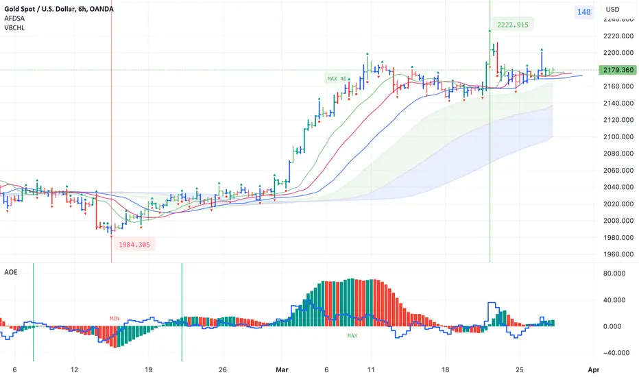
Indicators for trading using Bill Williams' Profitunity strategyI published 3 indicators for trading using Bill Williams' Profitunity strategy. For each indicator, I have added a visual and detailed description in English and Russian. In this post I will briefly describe these indicators and how I use them together.
AFDSA indicator (Alligator + Fractals + Divergent & Squat Bars + Signal Alerts)
Includes Williams Alligator, Williams Fractals, Divergent Bars, Market Facilitation Index, Highest and Lowest Bars, maximum or minimum peak of the Awesome Oscillator, and signal alerts based on Bill Williams' Profitunity strategy:
Bullish and Bearish Divergent Bar Signal + Squat Bar + Green Bar + Fake Bar + Awesome Oscillator Color Change + AO Divergence.
Crossing the green line (Lips) of an open Alligator.
Formation of a fractal.
Signal about the breakdown of the last upper or lower fractal.
Signal about the appearance of a new maximum or minimum peak of AO in the interval of 140 bars from the last bar.
I also added an Alligator display for the higher timeframe, for example, if the chart timeframe is 1 hour, then the higher timeframe will automatically be 4 hours, if the chart timeframe is 4 hours, then the higher timeframe will be 1 day, etc.
AOE Oscillator (Awesome Oscillator + Bars count lines + EMA Line)
Includes the Awesome Oscillator with two vertical lines at a distance of 100 and 140 bars from the last bar to determine the third Elliott wave by the maximum peak of AO in the interval from 100 to 140 bars according to Bill Williams' Profitunity strategy. Additionally, a faster EMA line is displayed.
I also added display of the AO line for the lower timeframe instead of the EMA line if the Moving Average Line values (method, length and source) are equal to the Awesome Oscillator values in the indicator settings. For example, if the chart timeframe is 1 day, then the lower timeframe will automatically be 4 hours, if the chart timeframe is 4 hours, then the lower timeframe will be 1 hour, etc.
VBCHL indicator (Visible bars count on chart + highest/lowest bars, max/min AO)
The indicator displays the number of visible bars on the screen, including the prices of the highest and lowest bars, the maximum or minimum value of the Awesome Oscillator. The values change dynamically when scrolling or changing the scale of the chart, but with a delay of several seconds, so this feature is included in a separate indicator so as not to slow down the work of other indicators.
Indicator settings
In the AFDSA indicator I use the following settings:
By default, the Squat Bar is colored blue, and all other bars are colored to match the Awesome Oscillator color, except for the Fake bars, which are colored with a lighter AO color. But I also enable the display of "Green" Divergent bars in the "Green Bars > Show" field.
I enable the display of Alligator for higher timeframes in the "Alligator for higher timeframe > Enable" field.
In the indicator style settings, I disable the display of the highest and lowest bars, maximum and minimum AO peak labels, because these labels are also displayed by the VBCHL indicator depending on the number of visible bars in the chart window.
Only after opening a position, I enable all additional alerts in the “Enable all additional alerts” field (after changing this field, you need to re-create the alert for the current chart): crossing the green line of an open Alligator, formation of a fractal, appearance of a new maximum or minimum AO peak.
In the settings of the AOE oscillator, I enable the display of the AO line for the lower timeframe instead of the EMA line, setting the same values in the fields for the Moving Average Line (method, length and source) and Awesome Oscillator.
In the VBCHL indicator settings, I only enable the simple display text style for labels in the "Simple display text style for labels" field.
As a result, when analyzing the current chart, I immediately see all the signals on the chart, the location of the bars relative to the Alligator on the higher timeframe and changes in the Awesome Oscillator on the lower timeframe. And thanks to the VBCHL indicator, I quickly select the desired timeframe for analyzing the 5-wave Elliott impulse, focusing on the interval of 140 bars, and immediately see whether there is divergence between the maximum AO peak and the following lower AO peak in this interval.