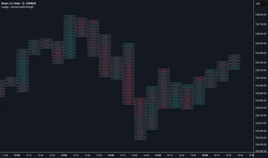
Internal Candle Strength [LuxAlgo]The Internal Candle Strength tool allows traders to divide each chart bar into multiple rows of custom size and inspect the strength of the lower timeframes trends located within each row.
This tool effectively helps traders in identifying the power dynamic between bulls and bears within multiple areas within each bar, providing the ability to conduct LTF analysis.
🔶 USAGE
The strength displayed within each row ranges from 0% to 100%, with 0% being the most bearish and 100% being the most bullish.
Traders should be aware of the extreme probabilities located at the higher/lower end of the bars, as this can signal a change in strength and price direction.
Traders can select the lower timeframe to pull the data from or the row size in the scale of the chart. Selecting a lower timeframe will provide more data to evaluate an area's strength.
Do note that only a timeframe lower than the chart timeframe should be selected.
🔹 Row Size
Selecting a smaller row size will increase the number of rows per bar, allowing for a more detailed analysis. A lower value will also generally mean that less data will be considered when calculating the strength of a specific area.
As we can see on the chart above (all BTCUSD 30m), by selecting a different row size, traders can control how many rows are displayed per bar.
🔶 SETTINGS
Timeframe: Lower timeframe used to calculate the candle strength.
Row Size: Size of each row on the chart scale, expressed as a fraction of the candle range.
Candlestick analysis
CloudHidden FVG)The bearish logic (red zones): starts at low → high , extends to the right until price closes above → then stops.
The bullish logic (green zones): starts at high → low , extends to the right until price closes below → then stops.
Both use arrays of box objects and test na(box.get_right(b)) to ensure they don’t stop twice.
No unnecessary loops or lookahead; fully within 97-bar and performant.

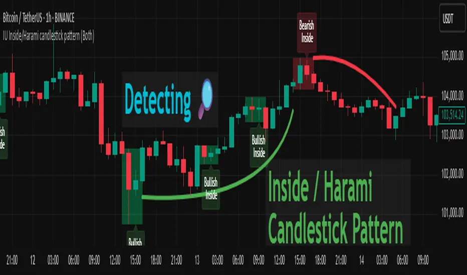
IU Inside/Harami candlestick patternDESCRIPTION
The IU Inside/Harami Candlestick Pattern indicator is designed to detect bullish and bearish inside bar formations, also known as Harami patterns. This tool gives users flexibility by allowing pattern detection based on candle wicks, bodies, or a combination of both. It highlights detected patterns using colored boxes and optional text labels on the chart, helping traders quickly identify areas of consolidation and potential reversals.
USER INPUTS :
Pattern Recognition Based on =
Choose between "Wicks", "Body", or "Both" to determine how the inside candle pattern is identified.
Show Box =
Toggle the appearance of colored boxes that highlight the pattern zone.
Show Text =
Toggle on-screen labels for "Bullish Inside" or "Bearish Inside" when patterns are detected.
INDICATOR LOGIC :
Bullish Inside Bar (Harami) is detected when:
* The current candle's high is lower and low is higher than the previous candle (wick-based),
* or the current candle’s open and close are inside the previous candle’s body (body-based),
* and the current candle is bullish while the previous is bearish.
Bearish Inside Bar (Harami) is detected when:
* The current candle's high is lower and low is higher than the previous candle (wick-based),
* or the current candle’s open and close are inside the previous candle’s body (body-based),
* and the current candle is bearish while the previous is bullish.
The user can choose wick-based, body-based, or both logics for pattern confirmation.
Boxes are drawn between the highs and lows of the pattern, and alert messages are generated upon confirmation.
Optional labels show the pattern name for quick visual identification.
WHY IT IS UNIQUE :
Offers three different logic modes: wick-based, body-based, or combined.
Highlights patterns visually with customizable boxes and labels.
Includes built-in alerts for immediate notifications.
Uses clean and transparent plotting without repainting.
HOW USER CAN BENEFIT FROM IT :
Receive real-time alerts when Inside/Harami patterns are formed.
Use the boxes and text labels to spot price compression zones and breakout potential.
Combine it with other tools like trendlines or support/resistance for enhanced accuracy.
Suitable for scalpers, swing traders, and price action traders looking to trade inside bar breakouts or reversals.
DISCLAIMER :
This indicator is not financial advice, it's for educational purposes only highlighting the power of coding( pine script) in TradingView, I am not a SEBI-registered advisor. Trading and investing involve risk, and you should consult with a qualified financial advisor before making any trading decisions. I do not guarantee profits or take responsibility for any losses you may incur.

Smart Money Premium | Made by EF (Improved)📊 Smart Money Premium | Made by EF (Improved)
A powerful all-in-one toolkit built for Smart Money / ICT traders.
It helps you clearly identify market structure, liquidity, order blocks, fair value gaps, and high-probability entry signals — all visualized directly on your chart.
✨ Key features:
✅ Automatic detection of Swing High / Swing Low points
✅ Real-time BOS / CHOCH (Break of Structure / Change of Character) labeling
✅ Dynamic Order Blocks with adjustable duration and color
✅ Detection of Fair Value Gaps (FVG) and visualization with customizable zones
✅ Liquidity zones (EQH/EQL) with tolerance settings
✅ Smart Swing Failure Patterns (SFP) with instant labels
✅ Built-in Kill Zones for London & New York sessions
✅ Automatic adaptation of key parameters to your timeframe
✅ Volume filter for additional signal confirmation
✅ Clear SL/TP levels with customizable Risk:Reward
✅ Interactive status panel showing trend, structure, session, and live signal readiness
⚙️ How to use:
1️⃣ Add the indicator to your chart
2️⃣ Choose your preferred settings (or let it auto-tune by timeframe)
3️⃣ Follow the on-chart signals: BOS, CHOCH, SFP, OB & FVG zones
4️⃣ Use the SL/TP levels and Risk:Reward built into each signal to plan your trades
✅ Designed for:
• Traders who follow Smart Money Concepts / ICT methodology
• Those who want a clean, visual and data-driven approach
• Both beginners and advanced traders looking to save time and keep discipline
🛠 All logic is transparent and customizable — colors, lookback periods, OB/FVG duration, liquidity sensitivity and more.
🔔 Alerts included for Long and Short setups.

1H Opening Range Trap v3Indicator Name: First Hour Candle Trap
Alternative Names: Daily Open Range Trap, CRT V1
Summary
This indicator is designed for intraday markets to identify failed breakouts of the daily opening range. Its primary purpose is to capture moments when the price creates a "trap" by breaching the range established in the first hour of trading, only to quickly reverse back inside. The indicator then presents this potential reversal as an entry signal. The strategy is based on the principles of liquidity hunts and failed breakouts, often associated with "smart money" concepts.
Strategy Logic
The market often establishes a significant high-low range during the first hour of the trading day (typically the 00:00 UTC candle), which can act as an important support and resistance zone for the remainder of the day.
The Opening Range: The indicator automatically identifies the high and low of the first 1-hour candle of the day and visualizes this zone on the chart.
The Trap: Price will often attempt to break out of this range. However, if this initial breakout attempt fails and the price quickly returns inside the range, it suggests that traders who took the breakout are now trapped on the wrong side of the market. Our indicator is designed to pinpoint this exact moment.
LONG Signal: A LONG signal is generated when the price first dips below the opening range low and then re-enters the range by moving back above it. This indicates a trap for sellers, suggesting that sellers are weakening and buyers are taking control.
SHORT Signal: A SHORT signal is generated when the price first breaks above the opening range high and then re-enters the range by moving back below it. This suggests that buyers are weakening and sellers are gaining momentum.
Visual Components of the Indicator
Opening Range Box: The zone between the high and low of the first hourly candle is displayed on the chart, typically as a semi-transparent box.
LONG/SHORT Markers: When the strategy conditions are met, labels such as BUY (LONG) or SELL (SHORT), or arrows, will appear above or below the signal candle.
How to Use
Timeframe: This indicator is designed and has been optimized for the 1-Hour (1H) timeframe, where the original strategy was developed and tested.
Entry Signal: When a BUY or SELL label appears on the chart, it signals a potential entry at the close of that candle.
Risk Management (Stop-Loss and Take-Profit): The indicator provides the entry signal, but risk management is up to the user. The method that was tested and proven successful in the original "Champion Strategy" was:
Fixed Ratio: Setting a fixed 2% Stop-Loss and a 2% Take-Profit from the entry price. This offers a 1:1 Risk/Reward ratio.
Alternative Methods:
Stop-Loss: Can be placed just outside the range (e.g., slightly below the range low for a long position; slightly above the range high for a short position).
Take-Profit: Can target the opposite side of the opening range.
Additional Notes
By its nature, this strategy generates a maximum of one trade signal per day. Some days may have no signal at all.
Like any trading strategy, this indicator is not a holy grail. Always conduct your own backtesting and adhere to your risk management rules. Past performance is not indicative of future results.

OTC supply & demand Candleshi traders and OTC colleagues,
this simple indicator used to spot easly the (indecisive , decisive , explosive) candles
i suggest to keep the candle boarders from the chart setting (blue or green for bullish ) and (red for bearish) . this indicator simplify spotting the supply and demand zones and the most powerful explosive candles in eye plink based on Bernd Skorupinski
theory.
from indicator setting
colour 0 (indecisive)
colour 1 (decisive) bullish
colour 2 (decisive) bearish
colour 3 (explosive) bullish
colour 4 (explosive) bearish
you can change the colour as u wish.
have a good trading day

AG DayTradeThis is one of best support&resistant indicator. It gives best possible entry and exit points with long term and short term trends.

OTC supply & demand Candleshi traders and OTC colleagues,
this simple indicator used to spot easly the (indecisive , decisive , explosive) candles
i suggest to keep the candle boarders from the chart setting (blue or green for bullish ) and (red for bearish) . this indicator simplify spotting the supply and demand zones and the most powerful explosive candles in eye plink based on Bernd Skorupinski
theory.
from indicator setting
colour 0 (indecisive)
colour 1 (decisive) bullish
colour 2 (decisive) bearish
colour 3 (explosive) bullish
colour 4 (explosive) bearish
you can change the colours as u wish.
have a good trading day

Trading Radio RSI Over Detector For BTCUSD v1.0🚀 Trading Radio RSI Over Detector For BTCUSD v1.0
The ultimate RSI structure detector for Bitcoin scalpers & swing traders
Experience the power of Trading Radio RSI Over Detector, built exclusively for BTCUSD. This smart indicator combines classic RSI thresholds with real market structure detection (HH, HL, LH, LL) to give you high-probability reversal insights on the Bitcoin chart.
🎯 What makes it powerful?
✅ Dynamic RSI signals for Overbought & Oversold levels (customizable thresholds).
✅ Automatic detection of last market structure: Higher Highs, Higher Lows, Lower Highs, Lower Lows.
✅ Generates precise signals when RSI extremes align with market structure shifts.
✅ Real-time RSI panel right on your candles for instant momentum reading.
✅ Anti-overload delay to avoid redundant signals in noisy BTC markets.
✅ Visual alerts on chart + structured labels showing RSI level & market context.
✅ Alerts ready for automation or push notifications — never miss critical oversold or overbought conditions again.
🧭 Why you’ll love it:
Because it doesn’t just rely on RSI alone — it intelligently filters based on recent price structures, giving you a smarter edge for spotting reversals. Perfect for both short-term scalpers and longer timeframe Bitcoin hunters who value disciplined signals.

Trading Radio XAUUSD Signals v1.0🚀 Trading Radio XAUUSD Signals v1.0
Advanced Smart Signal System for Gold Scalpers
Discover the power of Trading Radio XAUUSD Signals v1.0 — a precision-engineered indicator designed exclusively for scalping XAUUSD. This tool blends advanced market structure analysis, RSI filters, dynamic pullback validation, and multi-timeframe confirmations to give you high-quality BUY & SELL signals directly on your chart.
🎯 Key Features:
✅ Identifies Highs & Lows with smart ZigZag logic
✅ Breakout detection combined with RSI confirmation
✅ Validates entries through candle pullback patterns to reduce fakeouts
✅ Adaptive anti-overtrade filter with minimum signal distance in minutes
✅ Auto plots Entry Lines & live RSI levels on signal candles
✅ Automatic Support & Resistance detection with labeled pivot zones
✅ Optional Winrate Panel tracking total signals, wins, losses & dynamic winrate
✅ Cross-timeframe signals: see M1 signals while on M5, and vice versa
✅ Realtime RSI labels to instantly gauge momentum
✅ Instant alerts for both BUY & SELL signals so you never miss an opportunity
🔍 Why choose this indicator?
Because it’s built to keep your entries disciplined, avoid double signals, and highlight only high-probability setups — all while giving you a transparent dashboard of your strategy’s performance.
Perfect for gold traders who want clear, structured, and visually stunning signals backed by proven technical filters.

Zonas No Rotas Top & Bottom Detector, Break of Structure, Reversal Levels, Phase Shift, Strategic Breakout

Trading Radio Indicator Dashboard v1.0Trading Radio Indicator Dashboard v1.0 is a multi-factor market analysis toolkit designed to give you a clear snapshot of current trading conditions.
It combines:
📊 Technical signals like RSI (14), RSI Extreme, Stochastic, EMA cross, market structure (HH/LL), ATR levels, and volume.
💵 Live DXY tracking for correlation insights.
📈 Automatic detection of market sessions (Tokyo, London, New York).
🚀 Dynamic pip tracker showing distance from your last signal, with milestone markers.
Perfect for XAUUSD scalping or intraday trading, but flexible for any instrument.
Created by Trading Radio to help traders navigate volatility with confidence.

ONE: PEMA, EMA, SuperTrend, CPR, VIDYAThe ONE indicator is an all-in-one TradingView Pine Script that combines multiple popular trend, momentum, and volume tools into a single overlay. It is designed for senior traders and analysts who need a comprehensive yet lightweight solution to:
1. Identify dynamic price trends (PEMA & standard EMAs)
2. Capture volatility-driven reversals (SuperTrend)
3. Define key support/resistance (Central Pivot Range)
4. Measure adaptive momentum (VIDYA)
Key Advantages
Unified InterfaceNo more juggling separate scripts—activate/deactivate each component via simple inputs.
-PEMA (Price-Embedded MAs) with color-coded trend direction.
-Standard EMAs (5/13/26) for classic crossover strategies.
-SuperTrend for volatility-based stop-and-reverse signals.
-Central Pivot Range (daily & weekly) for intraday support/resistance.
-VIDYA (Variable Index Dynamic Average) for momentum that adapts to market conditions.
Adaptive Momentum Smoothing (VIDYA)Unlike fixed-length moving averages, VIDYA adjusts its sensitivity based on Chande Momentum Oscillator (CMO) or standard deviation.
- Fixed CMO option ensures consistent smoothing when you prefer a stable lookback.
- StDev option allows reactive smoothing in high-volatility environments.
- Customizable AlertsReal-time alertcondition on VIDYA color changes—ideal for automated trade entries/exits.
- Try pairing alerts with SuperTrend cross signals for high-probability setups.
Volume-Weighted Bar ColoringB ars are shaded based on volume spikes relative to an EMA of volume.
- Quickly spot institutional activity or accumulation/distribution phases.
Professional-Grade StylingClean, corporate color palette and line widths optimized for readability on both light and dark backgrounds.
Signal Interpretation
1. PEMA Green-to-Red Fill: Confirms multi-disciplinary trend reversals when the fast PEMA crosses the slow PEMA.
2. EMA Crossovers: Traditional 5/13/26 cross signals for momentum entry/exit.
3. SuperTrend Line: Trades above the line in uptrends; short when price closes below.
4. CPR Levels: Use daily CPR pivot (CP, BC, TC) for intraday range strategies; weekly pivot for broader support/resistance.
5. VIDYA Color Change: Blue to maroon or vice versa triggers alert for momentum shift.
6. Volume Coloring: Lime/red bars highlight high-volume moves; silver/gray for normal conditions.
Alert Setup
- Right-click on chart → Add Alert → Select ONE_VIDYA → Under Condition, choose VIDYA Color Alarm.
- Configure webhook/email/popup notifications for automated trading systems.

EdgeXplorer - Liquidity ScopeLiquidity Scope by EdgeXplorer
Liquidity Scope is a real-time liquidity detection system developed for traders who want to track where the market is hunting stops, absorbing orders, and setting up traps — often before the average eye catches on. Built to identify the telltale behavior of liquidity sweeps and false breakouts, this tool highlights areas on the chart where price interacts with key swing points, including wicks, breaks, and retests.
⸻
🔍 What Does Liquidity Scope Do?
Liquidity Scope scans price action for swing highs and lows, tracks how price behaves around them, and visually plots zones where liquidity is likely being targeted. It tells you:
• When price wicks into a previous swing without breaking it (a liquidity probe),
• When price breaks past that level and returns (a potential retest),
• And when a sweep is complete or mitigated.
The result? A visual map of where liquidity was grabbed, where it hasn’t been yet, and where price might revisit — all drawn directly on your chart, in real time.
⸻
⚙️ How It Works – Technical Breakdown
Here’s the logic behind the engine:
1. Swing Detection
The script uses ta.pivothigh() and ta.pivotlow() to mark structural swing points, using your selected “Swings” length to define sensitivity.
2. Sweep Conditions
For each swing high or low:
• If price wicks into the level but fails to close beyond it → potential liquidity test.
• If price closes beyond the swing → it’s marked as broken.
• If price later retests the broken level from the other side → it’s tagged as a retest zone.
3. Visual Memory
Each swing level stores its own “memory state” (whether it was wicked, broken, retested, or mitigated), allowing the tool to update visuals live and avoid clutter.
4. Dynamic Zones
• When a sweep is detected, the tool draws a colored zone (box) at the sweep location, along with a supporting line.
• These zones extend forward until price clearly invalidates or mitigates them.
⸻
📈 Visual Components – What You See on the Chart
Element Meaning
Green Zones / Lines Bullish sweep: liquidity hunted below a swing low
Red Zones / Lines Bearish sweep: liquidity hunted above a swing high
Dotted Lines Wicks — price tested the level without breaking
Dashed Lines Retests — price returned to retest a broken level
Solid Lines Confirmed sweep levels with clean structure
Shaded Boxes Sweep zones extended into the future for monitoring
Faded Transparency Indicates mitigation or that the zone is cooling off
Every visual is tied to a logic branch in the code — nothing is decorative. Each shape or line has meaning tied to price behavior.
⸻
📊 Inputs & Settings Explained
Setting Description
Swings (len) Sets the pivot lookback range. Higher = fewer, stronger swing levels.
Options (opt) Controls what sweep types you want to see:
• Only Wicks → Focus on traps and fakeouts
• Only Outbreaks & Retest → Focus on confirmed moves
• Wicks + Outbreaks & Retest → See it all |
| Bull/Bear Colors | Customize how bullish vs. bearish sweeps are drawn |
| Extend Zones (extend) | When on, boxes stretch forward in time until price touches or invalidates them |
| Max Bars (maxB) | Sets how long (in bars) sweep zones will stay active before expiring |
⸻
🧠 How to Read It in Live Markets
Liquidity Scope doesn’t tell you what to do — it tells you what the market just did in relation to liquidity and structure.
Here’s how to use it:
• Green Zones (Bullish Sweeps):
Price just grabbed liquidity under a low. Watch for:
• A bounce → potential reversal
• A retest → possible long entry confirmation
• Red Zones (Bearish Sweeps):
Price swept above a high. Watch for:
• Immediate rejection → potential short zone
• Pullback and retest → trend continuation trap or fake breakout
• Wick Sweeps Only:
Often seen in range-bound markets or when market makers are testing stops.
• Retest Sweeps:
Often seen in trending markets, validating breakouts or signaling exhaustion.
⸻
🧪 Optional Use Cases & Strategy Tips
Here’s how traders on the EdgeXplorer platform use Liquidity Scope:
• 🔄 Smart Money Concepts: Use sweep zones alongside order blocks, FVGs, and breakers to confirm institutional movement.
• ⚠️ Trap Zones: Spot liquidity fakeouts where retail might be chasing early breakouts.
• 🎯 Entry/Exit Filtering: Use zones to validate entries only when price reacts cleanly around them — or exits when mitigation completes.
• 🧠 Confluence Layer: Combine with trend indicators or volume to add strength to directional bias.
⸻
🔒 Final Note on Use & Compliance
Liquidity Scope is a market behavior visualizer, not a signal generator. It helps you understand where the market might be trapping liquidity, but you are the strategy. Always pair with proper confirmation, risk management, and your own discretion.
All logic, structure, and assets in this script are © protected under ETAPX Inc. and the EdgeXplorer platform. Unauthorized sharing or monetization of this code is prohibited under company and platform policy.

Daily High-Low RangeThis Pine Script calculates the daily range (High - Low) for each trading day to measure intraday volatility.
The orange line shows the actual daily high-low range.
The purple line represents the 10-day simple moving average of the daily range, smoothing out fluctuations for trend observation.
This indicator helps identify whether intraday volatility is increasing or decreasing over time and can be used to assess market momentum or risk.
이 Pine Script는 각 거래일의 고가와 저가의 차이 (일중 변동폭)을 계산하여 일중 변동성을 시각화합니다.
주황색 선은 매일의 고가-저가 범위를 나타냅니다.
보라색 선은 일중 변동폭의 10일 단순 이동평균(SMA)으로, 변동성의 추세를 부드럽게 보여줍니다.
이 지표를 통해 최근 시장의 변동성이 커지고 있는지 줄어들고 있는지를 파악할 수 있으며, 시장 리스크 또는 모멘텀 판단에 활용될 수 있습니다.

Price Deviation from MA5 (%)This Pine Script calculates and visualizes the percentage deviation of the current price from the 5-day simple moving average (SMA5).
The blue line represents the daily deviation (%) from the 5-day moving average.
The orange line shows the 10-day average of the deviation, providing a smoother trendline for volatility analysis.
A gray baseline at 0% helps identify whether the price is trading above or below the SMA5.
This indicator is helpful for identifying short-term overbought or oversold conditions and tracking intraday volatility behavior.
이 Pine Script는 현재 종가가 5일 이동평균선(MA5)으로부터 얼마나 떨어져 있는지(이격률, %)를 계산하고 시각화합니다.
파란색 선은 매일의 이격률(%)을 나타냅니다.
주황색 선은 이격률의 10일 평균값으로, 보다 부드러운 추세선을 제공합니다.
**0% 기준선(회색)**을 통해 현재 가격이 MA5 위에 있는지 아래에 있는지를 한눈에 파악할 수 있습니다.
이 지표는 단기 과열/과매도 구간을 파악하거나, 일중 변동성의 흐름을 분석할 때 유용합니다.

SKVolBal Pro v1.0SKVolBal Pro v1.0
Volume-RSI Fusion with Advanced Pattern Detection
This space-efficient indicator combines volume analysis, RSI, and candlestick pattern recognition in a single pane. Key features:
Volume-RSI Integration
Dual view modes: Stacked volume (Type 1) or separated buy/sell columns (Type 2)
RSI overlay with configurable levels (default 30/70)
Color-coded volume: Green = Buying pressure, Red = Selling pressure
Pattern Detection & Labels
Text labels indicate detected patterns with priority weighting:
C: Volume Climax
E: Engulfing Pattern
D: Divergence
H: Hammer
I: Inverted Hammer
S: Shooting Star
M: Hanging Man
B: Bearish Marubozu
G: Gravestone Doji
Label color indicates direction: Green = Bullish, Red = Bearish
Smart Signal Validation
Adaptive thresholds adjust to market volatility
Volume filters (vs SMA20) minimize false signals
Pattern weighting system prioritizes significant signals
Hover labels show all detected patterns with weights
Customization & Alerts
Adjust 15+ parameters including pattern sensitivity and volume allocation
Toggle individual patterns on/off with priority weighting
Built-in alerts for all 12 pattern types
Interpretation Guidance:
Strong signals: Labels appearing at RSI extremes (near 30/70) with high volume
Confirmation: Multiple patterns detected simultaneously (view via tooltip)
Caution: Isolated signals without volume/RSI confluence
Priority: Higher-weighted patterns override label display (weights 70-100)
*Optimized for efficiency with 500-label limit and 200-bar lookback. Color intensity reflects signal strength.*


Switch Up MethodICT Opening Price Line
This indicator plots horizontal lines at the New York opening prices for three specific times of day:
00:00 (midnight), 10:00 AM, and 18:00 (6:00 PM).
These times are commonly referenced in ICT (Inner Circle Trader) trading concepts to identify important market levels.
Key Features
* Allows the user to enable or disable plotting for each of the three times.
* Option to prevent showing the previous day's line if today's opening time has not occurred yet.
* Lines can be labeled with custom color and formatting options.
* Users can choose line style (solid, dotted, dashed), width, and how far the line should extend into the future.
* Each opening time line has its own customizable color.
How It Works
At the selected New York times, the script captures the opening price and draws a horizontal line from that point forward based on the user-defined number of bars.
Labels appear at the right end of each line if enabled.
The lines automatically reset each day and only display once the target time has occurred.

Gaussian Volatility Adjusted Key Features:Gaussian Smoothing: Applies a Gaussian filter to smooth price data (based on EMA or raw close prices), reducing noise while preserving trend information.
Volatility Adjustment: Uses ATR and standard deviation to create dynamic upper and lower bands around the smoothed price, adapting to market volatility.
Trend Detection: Identifies bullish (price above lower band) or bearish (price below upper band) trends, with additional confirmation using standard deviation thresholds.
Momentum Analysis: Measures momentum by calculating the price difference from key levels (upper band for bullish, Gaussian + standard deviation for bearish).
EMA Confluence: Optionally integrates an EMA of the momentum difference to confirm trend signals, enhancing accuracy.
Visual Output: Plots a zero line and an EMA line colored green (bullish) or red (bearish), with bar coloring to visually indicate trend direction.

Enhanced Market Structure (Advanced)Enhanced Market Structure Indicator (Advanced)
A multi-timeframe price action framework for structural visualization and liquidity mapping.
The Enhanced Market Structure Indicator (Advanced) is a custom-built tool designed to support traders in analyzing market structure using a multi-timeframe perspective. Rooted in the logic of widely known price action concepts, including those taught by ICT, this indicator simplifies the process of identifying structural shifts, liquidity grabs, and zone-based behavior across major timeframes like the 4H and Daily.
It is not a signal generator or entry tool. Its purpose is to visually assist with directional bias, market structure interpretation, and liquidity mapping, helping traders develop a clearer narrative for their setups.
🧠 Core Framework & Mashup Justification
This indicator incorporates a zigzag-like structural detection algorithm, enabling it to map swing highs/lows and identify significant breaks in market structure. It uses custom in-house logic to detect displacement and liquidity sweeps, with additional optional features powered by:
Fibonacci retracement levels (50%, 61.8%, 71.8%)
Custom zone generation logic
Multi-timeframe visualization controls
All mashups serve a clear functional purpose and are not presented as standalone indicators. The zigzag-style logic is used to enhance structural clarity — not to generate trade signals.
📊 What the Script Shows:
Breaks of Structure (BOS) and Change of Character (CHOCH)
Liquidity Sweeps via visual markers (💰/🔒)
Bullish/Bearish Entry Zones based on displacement logic
Rejection Labels for wick-based rejections of structure
Internal, External, and Microstructure levels
Directional bias through visual narrative of market behavior
Optional Fibonacci overlays on structural legs
This framework provides a structured, clean way to observe how price interacts with institutional-style concepts over time.
⚙️ SETTINGS OVERVIEW
🔧 Main Settings
Pivot Period – Controls sensitivity of swing point detection. Lower = more reactive/noisy; Higher = smoother/cleaner structure.
Extend Zones – Sets how far structural zones extend across the chart (0 = no extension; higher = more forward visibility).
Display Pivot Types – Choose to show All, External Only, or Internal Only structure.
🎯 Entry Zone Settings
Enable Entry Zones – Toggle primary bullish/bearish zone display
Zone Frequency
High = 50% retracement
Medium = 61.8%
Low = 71.8%
Customize Colors – Set Bullish and Bearish zone colors
🔂 Internal Entry Zones
Same logic as above, but applied to internal structure
Toggle visibility, adjust zone frequency, and customize bullish/bearish colors separately
🟢 Entry Arrows
Show/hide Entry Arrows that appear when price touches a zone
Separate toggles and color options for:
Bullish / Bearish Entry Arrows
Internal Bullish / Bearish Entry Arrows
Note: These arrows are not signals — they are contact markers only
🧱 Structure Color Settings
Customize colors for:
External Structure
Internal Structure
Microstructure
📈 BOS & CHOCH Line Settings
Bullish:
Show/hide Bullish BOS lines and Bullish CHOCH lines
Customize line colors
Bearish:
Show/hide Bearish BOS lines and Bearish CHOCH lines
Customize line colors
🚫 Rejection Labels
Toggle Rejection Labels on/off
These labels appear when price wicks into and rejects BOS or CHOCH zones
Customize rejection label color
🧠 Analysis Timeframe Settings
Choose the timeframe used for structural analysis
Example: Run Daily structure while viewing on 1H
Options include 1m, 5m, 4H, etc.
📐 Fibonacci Settings
Toggle Fibonacci lines on/off
Fib levels drawn from displacement legs
Uses 50%, 61.8%, and 71.8% retracements for zone generation
🧾 Final Notes & Disclaimer
This tool was built to provide a high-level, rule-based visualization of price action structure across multiple timeframes. While inspired by ICT concepts, it is not affiliated with any individual or mentorship and does not promise trade outcomes. It is not an automated signal generator.
Instead, it is designed to help traders develop narrative bias, contextualize price action, and frame market behavior through a structured lens — incorporating internal, external, and microstructural perspectives.
✅ Compliance Statement
This indicator:
Uses built-in logic and public tools (ZigZag-style swing detection, Fib levels) in a justified, original way
Does not generate signals or predictions
Is invite-only and intended for educational and discretionary use
Meets all TradingView house rules for mashup justification, originality, and clarity

The Frendicator#1 Indicator for all Frens
This indicator was created for the one and only Master Fren
This indicator uses Time and Price... Which is all that you need!
