Grid Tendence V1The “Grid Tendence V1” strategy is based on the classic Grid strategy, only in this case the entries and exits are made in favor of the trend, which allows to take advantage of large movements to maximize profits, since it is also possible to enter and exit with the balance with a controlled risk, because precisely the distance between each Grid works as a natural and adaptable stop loss and take profit. This fact helps to avoid overlapping entries and exits that would result from using stop loss and take profit as limit orders.
In this version of the script the entries and exits are always at market, and based on the percentage change of the price, not on the profit or loss of the current position.
The user will notice that the strategy setup is based on a controlled risk, risking 5% on each trade, a fairly standard commission and a modest initial capital, all this in order to protect the user of the strategy from unexpected or unrealistic results.
However, it is always recommended to optimize the parameters so that the strategy is effective for each asset and for each time frame.
Candlestick analysis

No Gaps - JizzanyNo Gaps – Jizzany
Fill the blanks. Own the patterns.
Don’t let thin futures feeds or blazing-fast 1 s bars break your flow—this overlay stitches every missing pixel back into your chart so you can:
🔍 Analyze low-liquidity markets (futures, exotic FX, crypto alt-pairs) without awkward jumps
⏱️ Trade ultra-low timeframes (1 s, tick charts) with full confidence in every wick
📈 Spot price patterns seamlessly, even when your broker’s feed skips a beat
How it works: Auto-detects gaps between sessions or feeds, then draws miniature candles from the prior close to the current open—using real intrabar highs/lows—so nothing ever goes unseen.
Perfect for scalpers, day traders, and anyone who demands continuity in every bar. Try it on your next chart and rediscover the story in every candle.
Turn This
Into This
This
Into
Live Inside Bar ColoringDescription
This script colors the current bar if it is inside the prior bar's high and low. Inside is defined as ≤ the high, and ≥ the low of the prior bar.
Utility
This gives a quick visual indication if the current bar is inside. This can indicate a choppier market. By definition, an inside bar is consolidating and not trending.
Function
Colors distinguish if the current price is above the opening price of the inside bar on a given timeframe. If you do not want to distinguish this, you can set both colors the same.
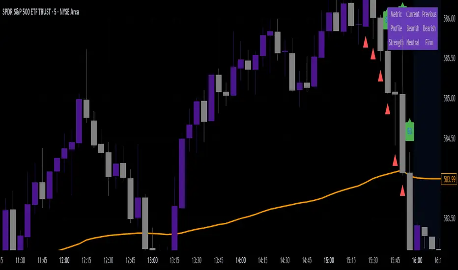
VWAP & Breakout Volume ConfirmHow the TradingView Indicator Works (Explained Simply)
VWAP Line (Orange)
It plots the Volume Weighted Average Price for the day.
Price above VWAP = bullish zone
Price below VWAP = bearish zone
Volume Spike Detection (Red Triangle)
It calculates the average volume over the last 20 candles.
If the current volume is 1.5× that average, it plots a red triangle under the candle.
Helps confirm if a move has real momentum or not.
Breakout Confirmation (Green Label ‘BO’)
Checks if price breaks above the last 10-bar high (for upside breakout) or below the last 10-bar low (for downside breakout).
If a breakout happens and the volume spike is present, it plots a green “BO” label above the candle.
This tells you the breakout is strong and likely to follow through.
FVG Zones (Remove Filled) + AlertA powerful TradingView indicator that automatically identifies Fair Value Gap (FVG) zones, removes them once price “fills” the gap, and sends you crystal-clear alerts specifying Bull or Bear zones—so you never miss a market imbalance.
🔍 Key Features
Automatic FVG Detection
Spots three-candle imbalance patterns (low > high for Bull, high < low for Bear) and draws colored boxes on your chart.
Auto-Remove Filled Zones
Once price enters a gap, the corresponding box is deleted—keeping your chart clutter-free.
Dedicated Alerts
Two separate alert conditions with constant messages:
“Price filled Bull FVG zone”
“Price filled Bear FVG zone”
On-Chart Labels
Enable debugging to display Bull FVG or Bear FVG tags above the triggering candle.
Performance-Tuned
Supports up to 500 active zones without slowing down your chart.
⚙️ Inputs & Customization
Show Alert Labels (Boolean) – Toggle on-chart text labels.
Max Boxes Count (Integer) – Control the maximum number of zones displayed.

Bias Ratio-ETH-3H @CTTC5108Most of the code of this strategy should be my own original.
This Ethereum 3-hour time cycle strategy can be traced back to February 24, 2023. Although the profit and winning rate are not high, it is still relatively stable.
This strategy uses the deviation rate to enter the market. Invest 10% of the principal each time.
The limit start time adopts a rolling design (should be original).
Real-time retracement and maximum retracement are accurately calculated (should be original).
Adopt segmented stop profit (optional) design.
Open source for learning and other use.
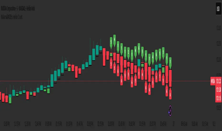
Malama's Heikin CountMalama's Heikin Count is a Pine Script indicator designed to enhance price action analysis by combining Heikin Ashi candlestick calculations with a normalized measurement of upper and lower shadow sizes. The indicator overlays Heikin Ashi candles on the chart and displays the relative sizes of upper and lower shadows as numerical labels (scaled from 1 to 10) for candles within the last two days, starting from 9:00 AM each day. This tool aims to help traders identify the strength of price movements and potential reversals by quantifying the significance of candlestick shadows in the context of Heikin Ashi’s smoothed price data. It is particularly useful for day traders and swing traders who rely on candlestick patterns to gauge market sentiment and momentum.
The indicator solves the problem of interpreting raw candlestick data by providing a smoothed visualization through Heikin Ashi candles and a simplified, numerical representation of shadow sizes. This allows traders to quickly assess whether a candle’s upper or lower shadow indicates strong buying or selling pressure, aiding in decision-making for entries, exits, or reversals.
Originality and Usefulness
Originality: While Heikin Ashi candles are a well-known technique for smoothing price data and reducing noise, Malama's Heikin Count introduces a novel feature by calculating and normalizing the sizes of upper and lower shadows relative to the total candle height. Unlike standard Heikin Ashi implementations, which focus solely on candle body trends, this indicator quantifies shadow proportions and presents them on a standardized 1–10 scale. This normalization makes it easier for traders to compare shadow significance across different timeframes and assets without needing to manually interpret raw measurements. The restriction of shadow size labels to the last two days from 9:00 AM ensures relevance for active trading sessions, avoiding clutter from older data.
Usefulness: The indicator is particularly valuable for traders who combine candlestick pattern analysis with trend-following strategies. By integrating Heikin Ashi’s trend-smoothing capabilities with shadow size metrics, it provides a unique perspective on market dynamics. For example, large upper shadows (high normalized values) may indicate rejection at resistance levels, while large lower shadows may suggest support or buying pressure. Unlike other open-source Heikin Ashi indicators, which typically focus only on candle plotting, this script’s shadow size normalization and time-based filtering offer a distinctive tool for intraday and short-term trading strategies.
Detailed Methodology ("How It Works")
The core logic of Malama's Heikin Count revolves around three main components: Heikin Ashi candle calculations, shadow size analysis, and time-based filtering for label display. Below is a breakdown of how these components work together:
Heikin Ashi Candle Calculations:
The script calculates Heikin Ashi candles to smooth price data and reduce market noise, making trends easier to identify.
Formulas:
haClose = (open + high + low + close) / 4: The Heikin Ashi close is the average of the current bar’s open, high, low, and close prices.
haOpen = na(haOpen ) ? (open + close) / 2 : (haOpen + haClose ) / 2: The Heikin Ashi open is either the average of the current bar’s open and close (for the first bar) or the average of the previous Heikin Ashi open and close.
haHigh = max(high, max(haOpen, haClose)): The Heikin Ashi high is the maximum of the current bar’s high, Heikin Ashi open, and Heikin Ashi close.
haLow = min(low, min(haOpen, haClose)): The Heikin Ashi low is the minimum of the current bar’s low, Heikin Ashi open, and Heikin Ashi close.
These calculations produce smoothed candles that emphasize trend direction and reduce the impact of short-term price fluctuations.
Shadow Size Analysis:
The script calculates the upper and lower shadows of each Heikin Ashi candle to assess market sentiment.
Formulas:
upperShadow = haHigh - max(haClose, haOpen): Measures the length of the upper shadow (distance from the top of the candle body to the high).
lowerShadow = min(haClose, haOpen) - haLow: Measures the length of the lower shadow (distance from the bottom of the candle body to the low).
totalHeight = haHigh - haLow: Calculates the total height of the candle (from high to low).
upperShadowPercentage = (upperShadow / totalHeight) * 100: Converts the upper shadow length to a percentage of the total candle height.
lowerShadowPercentage = (lowerShadow / totalHeight) * 100: Converts the lower shadow length to a percentage of the total candle height.
Normalization: The normalizeShadowSize function scales the shadow percentages to a 1–10 range using math.round(value / 10). This ensures that shadow sizes are presented in an easily interpretable format, where 1 represents a very small shadow (less than 10% of the candle height) and 10 represents a very large shadow (90–100% of the candle height). The normalization caps values between 1 and 10 for consistency.
Time-Based Filtering:
The script only displays shadow size labels for candles within the last two days, starting from 9:00 AM each day. This is achieved by calculating a start timestamp using timestamp(year(timenow), month(timenow), dayofmonth(timenow) - daysBack, startHour, startMinute), where daysBack = 2, startHour = 9, and startMinute = 0.
The condition time >= startTime ensures that labels are only plotted for candles within this time window, keeping the chart relevant for recent trading activity and avoiding clutter from older data.
Signal Generation:
The script does not generate explicit buy or sell signals but provides visual cues through shadow size labels. Large upper shadow sizes (e.g., 8–10) may indicate selling pressure or resistance, while large lower shadow sizes may suggest buying pressure or support. Traders can use these metrics in conjunction with the Heikin Ashi candle colors (green for bullish, red for bearish) to make trading decisions.
Strategy Results and Risk Management
Backtesting: The script is an indicator and does not include built-in backtesting or strategy logic for generating buy/sell signals. As such, it does not assume specific commission, slippage, or account sizing parameters. Traders using this indicator should incorporate it into their existing strategies, applying their own risk management rules.
Risk Management Guidance:
Traders can use the shadow size labels to inform risk management decisions. For example, a large upper shadow (e.g., 8–10) at a resistance level may prompt a trader to set a tighter stop-loss above the candle’s high, anticipating a potential reversal. Conversely, a large lower shadow at a support level may suggest a wider stop-loss below the low to account for volatility.
Default settings (e.g., 2-day lookback, 9:00 AM start) are designed to focus on recent price action, which is suitable for intraday and short-term swing trading. Traders should combine the indicator with other tools (e.g., support/resistance levels, trendlines) to define risk limits, such as risking 5–10% of equity per trade.
The indicator does not enforce specific risk management settings, allowing traders to customize their approach based on their risk tolerance and trading style.
User Settings and Customization
The script includes the following user-customizable inputs:
Days Back (daysBack = 2):
Description: Controls the lookback period for displaying shadow size labels. The default value of 2 means labels are shown for candles within the last two days.
Impact: Increasing daysBack extends the time window for label display, which may be useful for longer-term analysis but could clutter the chart. Decreasing it focuses on more recent data, ideal for intraday trading.
Start Hour (startHour = 9) and Start Minute (startMinute = 0):
Description: Defines the start time of the trading day (default is 9:00 AM). Labels are only shown for candles after this time each day within the lookback period.
Impact: Traders can adjust these settings to align with their preferred trading session (e.g., 9:30 AM for U.S. market open). Changing the start time shifts the time window for label display, affecting which candles are analyzed.
These settings allow traders to tailor the indicator to their trading timeframe and session preferences, ensuring that the shadow size labels remain relevant to their analysis.
Visualizations and Chart Setup
The indicator plots the following elements on the chart:
Heikin Ashi Candles:
Plotted using plotcandle(haOpen, haClose, haHigh, haLow), these candles overlay the standard price chart.
Color Coding: Green candles indicate bullish momentum (Heikin Ashi close ≥ open), while red candles indicate bearish momentum (Heikin Ashi close < open).
These candles provide a smoothed view of price trends, making it easier to identify trend direction and continuations.
Shadow Size Labels:
Upper Shadow Labels: Displayed above each candle at the Heikin Ashi high, showing the normalized upper shadow size (1–10). These labels are green with white text and use the label.style_label_down style for clear visibility.
Lower Shadow Labels: Displayed below each candle at the Heikin Ashi low, showing the normalized lower shadow size (1–10). These labels are red with white text and use the label.style_label_up style.
Labels are only shown for candles within the last two days from 9:00 AM, ensuring that only recent and relevant data is visualized.
Debugging Labels (Optional):
A blue label at the bottom of the chart displays the text "Upper: Lower: " for each candle, showing both shadow sizes for debugging purposes. This can be removed or commented out if not needed, as it is primarily for development use.
The visualizations are designed to be minimal and focused, ensuring that traders can quickly interpret the Heikin Ashi trend and shadow size metrics without unnecessary clutter. The use of color-coded candles and labels enhances readability, while the time-based filtering keeps the chart clean and relevant.
Malama's Candle Sniper Malama's Candle Sniper
This Pine Script is an overlay indicator crafted for TradingView to detect and highlight a variety of bullish and bearish candlestick patterns directly on the price chart. Its primary goal is to assist traders in identifying potential reversal or continuation signals by marking these patterns with labeled visual cues. The indicator is versatile, applicable across different markets (e.g., stocks, forex, cryptocurrencies) and timeframes, making it a valuable tool for enhancing technical analysis and informing trading decisions.
Originality and Usefulness
While the candlestick patterns detected by this script are well-established in technical analysis, "Malama's Candle Sniper" stands out due to its comprehensive nature. It consolidates the detection of numerous patterns—ranging from engulfing patterns to doji variations and multi-candle formations—into a single, unified indicator. This eliminates the need for traders to apply multiple individual indicators, streamlining their charting process and saving time.
The indicator’s usefulness lies in its ability to:
Provide Visual Clarity: Labels are plotted on the chart when patterns are detected, offering immediate recognition of potential trading opportunities.
Broad Pattern Coverage: It identifies both bullish and bearish patterns, accommodating various market conditions and trading strategies.
This makes it an ideal tool for traders who incorporate candlestick analysis into their decision-making, whether for spotting trend reversals or confirming ongoing momentum.
How It Works
"Malama's Candle Sniper" operates by defining helper functions in Pine Script that evaluate whether specific candlestick pattern conditions are met for the current bar. Each function returns a boolean value (true/false) based on predefined criteria involving the open, high, low, and close prices of the candles. The script then checks for transitions from false to true (i.e., a pattern newly appearing) and plots a corresponding label on the chart.
Bullish Patterns Detected
The script identifies the following bullish patterns, which typically signal potential upward price movements:
Bullish Engulfing: A small bearish candle followed by a larger bullish candle that engulfs it.
Three White Soldiers: Three consecutive bullish candles with higher closes.
Bullish Three Line Strike: Three bullish candles followed by a bearish candle that doesn’t negate the prior uptrend.
Three Inside Up: A bearish candle, a smaller bullish candle within its range, and a strong bullish confirmation candle.
Dragonfly Doji: A doji with a long lower wick and little to no upper wick, opening and closing near the high.
Piercing Line: A bearish candle followed by a bullish candle that opens below the prior low and closes above the midpoint of the prior candle.
Bullish Marubozu: A strong bullish candle with no upper or lower wicks.
Bullish Abandoned Baby: A bearish candle, a doji gapped below it, and a bullish candle gapped above the doji.
Rising Window: A gap up between two candles, with the current low above the prior high.
Hammer: A candle with a small body and a long lower wick, indicating rejection of lower prices.
Morning Star: A three-candle pattern with a bearish candle, a small-bodied middle candle, and a strong bullish candle.
Bearish Patterns Detected
The script also detects these bearish patterns, which often indicate potential downward price movements:
Bearish Engulfing: A small bullish candle followed by a larger bearish candle that engulfs it.
Three Black Crows: Three consecutive bearish candles with lower closes.
Bearish Three Line Strike: Three bearish candles followed by a bullish candle that doesn’t reverse the downtrend.
Three Inside Down: A bullish candle, a smaller bearish candle within its range, and a strong bearish confirmation candle.
Gravestone Doji: A doji with a long upper wick and little to no lower wick, opening and closing near the low.
Dark Cloud Cover: A bullish candle followed by a bearish candle that opens above the prior high and closes below the midpoint of the prior candle.
Bearish Marubozu: A strong bearish candle with no upper or lower wicks.
Bearish Abandoned Baby: A bullish candle, a doji gapped above it, and a bearish candle gapped below the doji.
Falling Window: A gap down between two candles, with the current high below the prior low.
Hanging Man: A candle with a small body and a long lower wick after an uptrend, signaling potential reversal.
Label Plotting
When a pattern is detected (i.e., its condition transitions from false to true):
Bullish Patterns: A label is plotted at the high of the bar, using a green background with white text and a downward-pointing style (e.g., "Bull Engulf" for Bullish Engulfing).
Bearish Patterns: A label is plotted at the low of the bar, using a red background with white text and an upward-pointing style (e.g., "Bear Engulf" for Bearish Engulfing).
This visual distinction helps traders quickly differentiate between bullish and bearish signals and their precise locations on the chart.
Strategy and Risk Management
Backtesting: "Malama's Candle Sniper" is strictly an indicator and does not include backtesting capabilities or automated trading signals. It does not simulate trades or provide performance statistics such as win rates or profit/loss metrics.
Risk Management: As an informational tool, it lacks built-in risk management features. Traders must independently implement strategies like stop-loss orders, take-profit levels, or position sizing to manage risk when acting on the detected patterns. For example, a trader might place a stop-loss below a Hammer pattern’s low or above a Hanging Man’s high to limit potential losses.
User Settings and Customization
Inputs: The script does not offer user-configurable inputs. All pattern detection logic is hardcoded, meaning traders cannot adjust parameters such as lookback periods or pattern sensitivity through the interface.
Customization: Advanced users with Pine Script knowledge can modify the code directly to:
Add or remove patterns.
Adjust the conditions (e.g., tweak the wick-to-body ratio for a Hammer).
Change label styles or colors.
However, the default version is fixed and ready-to-use as is.
Visualizations and Chart Setup
Plotted Elements:
Bullish Labels: Appear at the candle’s high with a green background, white text, and a downward-pointing arrow (e.g., "Hammer").
Bearish Labels: Appear at the candle’s low with a red background, white text, and an upward-pointing arrow (e.g., "Hanging Man").
Chart Setup: The indicator is configured as an overlay (overlay=true), meaning it integrates seamlessly with the price chart. Labels are displayed directly on the candlesticks, eliminating the need for a separate pane and keeping the focus on price action.
Usage Example
To use "Malama's Candle Sniper":
Add the indicator to your TradingView chart via the Indicators menu.
Observe the price chart for green (bullish) or red (bearish) labels as they appear.
Analyze the context of each pattern (e.g., trend direction, support/resistance levels) to decide on potential trades.
Apply your own entry, exit, and risk management rules based on the signals.
For instance, spotting a "Morning Star" label during a downtrend near a support level might prompt a trader to consider a long position, while a "Dark Cloud Cover" at resistance could signal a short opportunity.

Inside 4+ Candles Box (Entry + Target + SMA Stop Logic)🔍 What This Script Does
This indicator detects price compression areas using 4 or more consecutive inside candles, then draws a breakout box to visually highlight the range.
Once price closes above the box, a long entry marker is plotted, along with:
🎯 Target line at 1x box size above the breakout.
❌ Stop-loss at the box low or at a dynamic SMA-based level if the box is too large.
🧠 Why It’s Unique
This script combines inside bar compression, breakout logic, risk control, and visual clarity — all in one tool.
It also cancels the setup entirely if price closes below the box low before breakout, avoiding late or false entries.
⚙️ Customizable Settings
Minimum inside candles (default = 4)
SMA length (used as stop if box is large)
Box size % threshold to activate smart stop
Entry, Target, and Stop marker colors
📌 Notes
For long setups only (no short signals).
Use on any asset or timeframe (ideal on 4H/1D).
This is not financial advice. Use with proper risk management.
Backtest thoroughly before live use.
Built with ❤️ by using Pine Script v6.
🇸🇦 وصف مختصر باللغة العربية:
هذا المؤشر يكتشف مناطق تماسك السعر من خلال 4 شموع داخلية أو أكثر، ثم يرسم مربعًا يحدد منطقة الاختراق المحتملة.
عند الإغلاق أعلى المربع، يتم عرض إشارة دخول وسطر هدف بنسبة 100% من حجم المربع.
كما يتم احتساب وقف الخسارة تلقائيًا إما عند قاع المربع أو عند متوسط متحرك ذكي (SMA) إذا كان حجم المربع كبيرًا.
الميزة الإضافية: إذا تم كسر قاع المربع قبل الاختراق، يتم إلغاء الصفقة تلقائيًا لتجنب الدخول المتأخر.
🧪 للاستفادة التعليمية والتحليل فقط. لا يُعتبر توصية مالية.

Range Filter + ATR Strategy (Low Drawdown)Key Features for Low Drawdown:
Range Filter: Identifies trends while filtering out market noise
ATR-based Position Sizing: Adjusts position size based on volatility to risk a fixed percentage of capital
Trailing Stops: Uses ATR-based trailing stops to lock in profits and limit losses
Conservative Risk Parameters: Defaults to 1% risk per trade (adjustable)
Trend Confirmation: Requires two consecutive closes above/below the range filter
How to Use:
The strategy enters long when price is above the upper range filter for two consecutive bars
Enters short when price is below the lower range filter for two consecutive bars
Uses ATR to size positions appropriately for current volatility
Implements trailing stops based on ATR to protect profits
Optimization Tips:
Adjust the Range Filter period based on your timeframe
Modify the risk percentage (1% is conservative)
Tweak the ATR multiple for trailing stops (1.5 is moderate)
Consider adding a time-based exit if drawdown is still too high

Engulfing DetectorThis script detects classic candlestick reversal patterns known as Engulfing formations:
Bullish Engulfing: A green candle fully engulfs the previous red candle.
Bearish Engulfing: A red candle fully engulfs the previous green candle.
🔎 Features:
Works on any time frame or instrument.
Optional filter to ignore overly large or irregular candles.
Visual signals on the chart (BE/SE labels).
Built-in alerts for automation or notification.
✅ Recommended usage:
For intraday trading, this indicator performs best on the 5-minute chart of the Nasdaq (NQ) between 9:45 AM and 1:00 PM ET (15:45–19:00 CET).
💡 Suggested trading approach:
Optimized for scalping with short-term trades and small take-profits around +0.10%.

ORB 5M + VWAP + Braid Filter + TP 2R o Niveles PreviosORB 5-Minute Breakout Strategy Summary
Strategy Name:
ORB 5M + VWAP + Braid Filter + TP 2R or Previous Levels
Timeframe:
5-minute chart
Trading Window:
9:35 AM to 11:00 AM (New York time)
✅ Entry Conditions:
Opening Range: Defined from 9:30 to 9:35 AM (first 5-minute candle).
Breakout Entry:
Long trade: Price breaks above the opening range high.
Short trade: Price breaks below the opening range low.
Confirmation Filters (All must be met):
Strong candle (green for long, red for short).
VWAP in the direction of the trade.
Braid Filter by Mango2Juice supports the breakout direction (green for long, red for short).
📉 Stop Loss:
Placed at the opposite side of the opening range.
🎯 Take Profit (TP):
+2R (Risk-to-Reward Ratio of 2:1),
or
Closest of the following: previous day’s high/low or premarket levels.
⚙️ Additional Rules:
Only valid signals between 9:35 and 11:00 AM.
Only one trade per breakout direction per day.
Filter out "trap candles" (very small or indecisive candles).
Avoid trading after 11:00 AM.
📊 Performance Goals:
Maintain a high Profit Factor (above 3 ideally).
Focus on tickers with good historical performance under this strategy (e.g., AMZN, PLTR, CVNA).

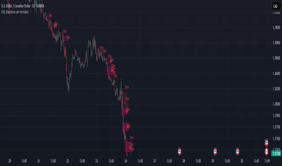
FVG (Nephew sam remake)Hello i am making my own FVG script inspired by Nephew Sam as his fvg code is not open source. My goal is to replicate his Script and then add in alerts and more functions. Thus, i spent few days trying to code. There is bugs such as lower time frame not showing higher time frame FVG.
This script automatically detects and visualizes Fair Value Gaps (FVGs) — imbalances between demand and supply — across multiple timeframes (15-minute, 1-hour, and 4-hour).
15m chart shows:
15m FVGs (green/red boxes)
1H FVGs (lime/maroon)
4H FVGs (faded green/red with borders) (Bugged For now i only see 1H appearing)
1H chart shows:
1H FVGs
4H FVGs
4H chart shows:
4H FVGs only
There is the function to auto close FVG when a future candle fully disrespected it.
You're welcome to:
🔧 Customize the appearance: adjust box colors, transparency, border style
🧪 Add alerts: e.g., when price enters or fills a gap
📅 Expand to Daily/Weekly: just copy the logic and plug in "D" or "W" as new layers
📈 Build confluence logic: combine this with order blocks, liquidity zones, or ICT concepts
🧠 Experiment with entry signals: e.g., candle confirmation on return to FVG
🚀 Improve performance: if you find a lighter way to track gaps, feel free to optimize!
Separators & Liquidity [K]Separators & Liquidity
This indicator offers a unified visual framework for institutional price behaviour, combining calendar-based levels, intraday session liquidity, and opening price anchors. It is specifically designed for ICT-inspired traders who rely on time-of-day context, prior high/low sweeps, and mitigation dynamics to structure their trading decisions.
Previous Day, Week, and Month Highs/Lows
These levels are dynamically updated and optionally stop projecting forward once mitigated. Mitigation is defined as a confirmed price interaction (touch or break), and labels visually adjust upon confirmation.
Intraday Session Liquidity Zones
Includes:
Asia Session (18:00–02:30 EST)
London Session (02:00–07:00 EST)
New York AM Session (07:00–11:30 EST)
New York Lunch Session (11:30–13:00 EST)
Each session tracks its own high/low with mitigation logic and duplicate filtering to avoid plotting overlapping levels when values are identical to previous session or daily levels.
Opening Price Anchors
Plots key opens:
Midnight (00:00 EST) (Customizable)
New York Open (09:30 EST) (Customizable)
PM Session Open (13:30 EST) (Customizable)
Weekly Open
Monthly Open
These levels serve as orientation for daily range expansion/contraction and premium/discount analysis.
Time Labels
Includes weekday markers and mid-month labels for better visual navigation on intraday and higher timeframes.
All components feature user-defined controls for visibility, line extension, color, label size, and plotting style. Filtering logic prevents redundant lines and maintains chart clarity.
Originality and Justification
While elements such as daily highs/lows and session ranges exist in other indicators, this script combines them under a fully mitigation-aware, duplicate-filtering, and session-synchronized logic model. Each level is tracked and managed independently, but drawn cooperatively using a shared visual and behavioral control system.
This script is not a mashup but an integrated tool designed to support precise execution timing, market structure analysis, and liquidity-based interpretation within ICT-style trading frameworks.
This version does not reuse any code from open-source scripts, and no built-in indicators are merged. The logic is independently constructed for real-time tracking and multi-session visualization.
Inspiration
This tool is inspired by core ICT concepts and time-based session structures commonly discussed in educational content and the broader ICT community.
It also draws conceptual influence from the TFO Killzones & Pivots script by tradeforopp, particularly in the spirit of time-based liquidity tracking and institutional session segmentation. This script was developed independently but aligns in purpose. Full credit is given to TFO as an inspiration source, especially for traders using similar timing models.
Intended Audience
Designed for traders studying or applying:
ICT’s core market structure principles
Power of Three (PO3) setups
Session bias models (e.g., AM reversals, London continuations)
Liquidity sweep and mitigation analysis
Time-of-day-based confluence planning
The script provides structural levels—not signals—and is intended for visual scaffolding around discretionary execution strategies.

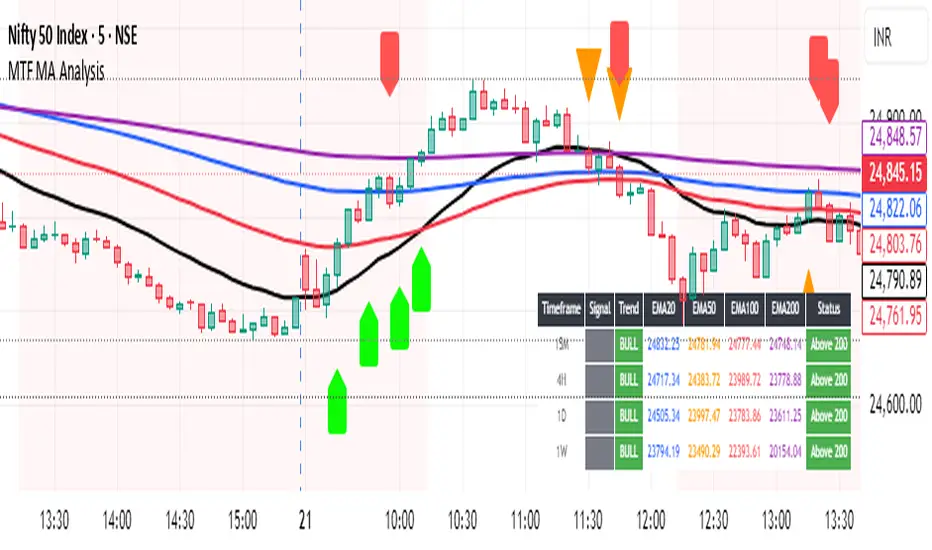
Multi-Timeframe MA Breakout/Breakdown Analysis📊 Overview
This sophisticated Pine Script indicator revolutionizes breakout/breakdown analysis by distinguishing between fake and genuine signals using a unique swing-level validation methodology. Unlike traditional moving average crossovers, this system validates price movements against historical swing points, providing traders with high-probability entry and exit signals across multiple timeframes.
🎯 Core Trading Methodology
The Swing Validation Concept:
Traditional MA breakouts often fail because they don't consider the context of previous price action. This indicator solves this by:
Recording swing levels when each MA is initially crossed
Validating subsequent crosses against these historical swing points
Classifying signals as fake or genuine based on this validation
Tracking signal evolution as price action develops
Signal Classification System:
🔻 Breakdown Analysis:
Fake Breakdown: Price cuts below MA but stays above the swing low from previous MA cut
Genuine Breakdown: Price cuts below MA and falls below the swing low from previous MA cut
Validation Chain: EMA 50 validates against EMA 20 swing low, EMA 100 against EMA 50 swing low, EMA 200 against EMA 100 swing low
🔺 Breakout Analysis:
Fake Breakout: Price crosses above MA but stays below the swing high from previous MA cross
Genuine Breakout: Price crosses above MA and exceeds the swing high from previous MA cross
Validation Chain: EMA 50 validates against EMA 20 swing high, EMA 100 against EMA 50 swing high, EMA 200 against EMA 100 swing high
📈 Signal Interpretation Guide
Visual Chart Signals:
Breakdown Signals:
🔻 Orange Triangle Down + "FAKE BREAKDOWN": Potential reversal opportunity - price likely to bounce
🔻 Red Triangle Down + "GENUINE BREAKDOWN": Trend continuation - expect further downside
🔺 Lime Triangle Up + "BULLISH REVERSAL": Strong buy signal after fake breakdown validation
Breakout Signals:
🔺 Orange Triangle Up + "FAKE BREAKOUT": Potential reversal opportunity - price likely to decline
🔺 Dark Red Triangle Up + "GENUINE BREAKOUT": Trend continuation - expect further upside
🔻 Fuchsia Triangle Down + "BEARISH REVERSAL": Strong sell signal after fake breakout validation
Multi-Timeframe Analysis Table:
Signal Column Interpretation:
"FAKE BD" (Orange): Fake breakdown detected - watch for bullish reversal
"GENUINE BD" (Red): Genuine breakdown - bearish continuation likely
"FAKE BO" (Orange): Fake breakout detected - watch for bearish reversal
"GENUINE BO" (Dark Red): Genuine breakout - bullish continuation likely
"BULLISH" (Lime): Bullish reversal confirmed - strong buy signal
"BEARISH" (Fuchsia): Bearish reversal confirmed - strong sell signal
Trend Column:
"BULL" (Green): EMAs in bullish sequence (20>50>100>200)
"BEAR" (Red): EMAs in bearish sequence (20<50<100<200)
"SIDE" (Gray): Sideways/mixed EMA alignment
Status Column:
"Above 200" (Green): Price above 200 EMA - bullish bias
"Below 200" (Red): Price below 200 EMA - bearish bias
"At 200" (Gray): Price at 200 EMA - neutral
💡 Trading Strategies
Strategy 1: Fake Signal Reversal Trading
For Long Entries (Fake Breakdown Reversal):
Wait for fake breakdown signal (orange triangle down)
Confirm bullish reversal (lime triangle up) when price reclaims EMAs
Enter long on bullish reversal confirmation
Stop loss below the swing low that validated the fake breakdown
Target next resistance level or previous swing high
For Short Entries (Fake Breakout Reversal):
Wait for fake breakout signal (orange triangle up)
Confirm bearish reversal (fuchsia triangle down) when price falls below EMAs
Enter short on bearish reversal confirmation
Stop loss above the swing high that validated the fake breakout
Target next support level or previous swing low
Strategy 2: Genuine Signal Trend Following
For Trend Continuation Longs:
Identify genuine breakout (dark red triangle up)
Confirm higher timeframe alignment (4H/1D showing bullish trend)
Enter on pullback to broken resistance (now support)
Stop loss below the validation swing high
Target measured move or next major resistance
For Trend Continuation Shorts:
Identify genuine breakdown (red triangle down)
Confirm higher timeframe alignment (4H/1D showing bearish trend)
Enter on pullback to broken support (now resistance)
Stop loss above the validation swing low
Target measured move or next major support
Strategy 3: Multi-Timeframe Confluence
High-Probability Setups:
Align signals across timeframes (15M signal + 4H trend confirmation)
Look for confluence (multiple timeframes showing same signal type)
Prioritize higher timeframe signals for swing/position trades
Use lower timeframes for precise entry timing
⚠️ Risk Management Rules
Position Sizing:
Fake signal trades: Reduce position size (higher risk, higher reward)
Genuine signal trades: Standard position size (trend following)
Multi-timeframe confluence: Increase position size (higher probability)
Stop Loss Guidelines:
Fake breakdown longs: Stop below validation swing low
Fake breakout shorts: Stop above validation swing high
Genuine signals: Stop beyond the MA that was broken
Reversals: Stop beyond the reversal invalidation level
Take Profit Strategies:
Scale out at key resistance/support levels
Trail stops using the 20 EMA for trend following
Take partial profits at 1:2 risk/reward ratio
Let winners run on strong trend continuation signals
🔧 Best Practices
Signal Validation:
Wait for candle close before acting on signals
Check volume confirmation on breakouts/breakdowns
Consider market context (news, earnings, etc.)
Avoid trading during low liquidity periods
Timeframe Selection:
Scalping: 15M signals with 4H trend filter
Day Trading: 4H signals with 1D trend filter
Swing Trading: 1D signals with 1W trend filter
Position Trading: 1W signals for major moves
Market Conditions:
Trending Markets: Focus on genuine signals for continuation
Range-Bound Markets: Focus on fake signals for reversals
High Volatility: Reduce position sizes and widen stops
Low Volatility: Look for breakout setups with volume
📋 Advanced Tips
Signal Evolution Monitoring:
Watch for signal transitions (fake becoming genuine or vice versa)
Adjust positions when signal classification changes
Use alerts to stay informed of signal updates
Monitor multiple timeframes for comprehensive analysis
Confluence Factors:
Support/Resistance levels at signal points
Volume spikes on genuine signals
RSI divergences with fake signals
Fibonacci retracements at reversal points
Common Pitfalls to Avoid:
Don't chase signals after significant moves
Don't ignore higher timeframe trends
Don't overtrade on every signal
Don't neglect risk management rules
🎯 Quick Reference
Bullish Signals Priority:
Bullish Reversal (Lime) - Highest priority
Fake Breakdown (Orange) - High probability reversal
Genuine Breakout (Dark Red) - Trend continuation
Bearish Signals Priority:
Bearish Reversal (Fuchsia) - Highest priority
Fake Breakout (Orange) - High probability reversal
Genuine Breakdown (Red) - Trend continuation
Multi-Timeframe Hierarchy:
1W: Major trend direction
1D: Intermediate trend and swing levels
4H: Short-term trend and entry timing
15M: Precise entry and exit points
⚡ Pro Tip: The most powerful signals occur when fake signals reverse into genuine signals in the opposite direction, creating high-momentum moves with excellent risk/reward ratios.
Disclaimer: This indicator is for educational purposes. Always combine with proper risk management, additional technical analysis, and fundamental research before making trading decisions. Past performance does not guarantee future results.
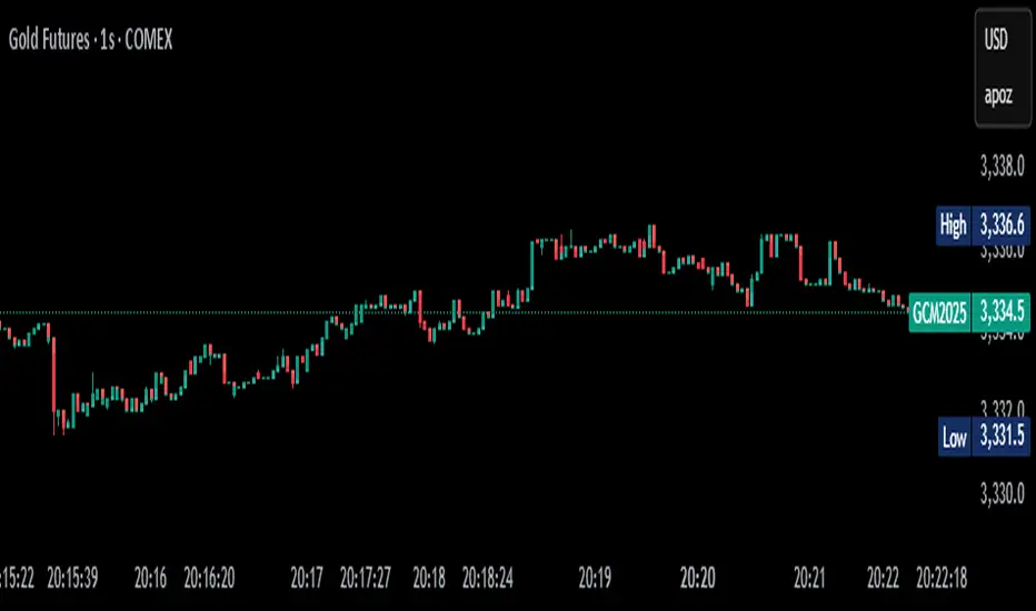
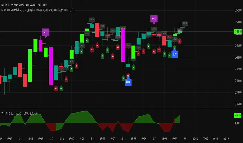
GCM Centre Line Candle MarkerGCM Centre Line Candle Marker (GCM-CLCM) - Descriptive Notes
Indicator Overview:
The "GCM Centre Line Candle Marker" is a versatile TradingView overlay indicator designed to enhance chart analysis by drawing short horizontal lines at user-defined "centre" points of candles. These lines provide a quick visual reference to key price levels within each candle, such as midpoints, open, close, or typical prices. The indicator offers extensive customization for line appearance, positioning, and conditional display, including an option to highlight only bullish engulfing patterns.
Key Features:
1. Customizable Line Position:
o Users can choose from various methods to calculate the "centre" price for the line:
(High + Low) / 2 (Default)
(Open + Close) / 2
Close
Open
(Open + High + Low + Close) / 4 (HLCO/4)
(Open + High + Close) / 3 (Typical Price HLC/3 variation)
(Open + Close + Low) / 3 (Typical Price OCL/3 variation)
2. Line Appearance Customization:
o Visibility: Toggle lines on/off.
o Style: Solid, dotted, or dashed lines.
o Width: Adjustable line thickness (1 to 5).
o Length: Defines how many candles forward the line extends (1 to 10).
o Color: Lines are colored based on candle type (bullish/bearish), with user-selectable base colors.
o Dynamic Opacity: Line opacity is dynamically adjusted based on the candle's size relative to recent candles. Larger candles produce more opaque lines (up to the user-defined maximum opacity), while smaller candles result in more transparent lines. This helps significant candles stand out.
3. Price Labels:
o Show Labels: Option to display price labels at the end of each center line.
o Label Background Color: Customizable.
o Dynamic Text Color: Label text color can change based on the movement of the center price:
Green: Current center price is higher than the previous.
Red: Current center price is lower than the previous.
Gray: No change or first label.
o Static Text Color: Alternatively, a fixed color can be used for all labels.
4. Conditional Drawing - Bullish Engulfing Filter:
o Users can enable an option to Only Show Bullish Engulfing Candles. When active, center lines will only be drawn for candles that meet bullish engulfing criteria (current bull candle's body engulfs the previous bear candle's body).
5. Performance Management:
o Max Lines to Show: Limits the number of historical lines displayed on the chart to maintain clarity and performance. Older lines are automatically removed as new ones are drawn.
6. Alert Condition:
o Includes a built-in alert: Big Bullish Candle. This alert triggers when a bullish candle's range (high - low) is greater than the 20-period simple moving average (SMA) of candle ranges.
How It Works:
• For each new candle, the script calculates the "center" price based on the user's Line Position selection.
• If showLines is enabled and (if applicable) the bullish engulfing condition is met, a new line is drawn from the current candle's bar_index at the calculated _center price, extending lineLength candles forward.
• The line's color is determined by whether the candle is bullish (close > open) or bearish (close < open).
• Opacity is calculated dynamically: scaledOpacity = int((100 - maxUserOpacity) * (1 - dynamicFactor) + maxUserOpacity), where dynamicFactor is candleSize / maxSize (current candle size relative to the max size in the last 20 candles). This means maxUserOpacity is the least transparent the line will be (for the largest candles), and smaller candles will have lines approaching full transparency.
• Optional price labels are added at the end of these lines.
• The script manages an array of drawn lines, removing the oldest ones if the maxLines limit is exceeded.
Potential Use Cases:
• Visualizing Intra-Candle Levels: Quickly see midpoints or other key price points without manual drawing.
• Short-Term Reference Points: The extended lines can act as very short-term dynamic support/resistance or points of interest.
• Pattern Recognition: Highlight bullish engulfing patterns or simply emphasize candles based on their calculated center.
• Volatility Indication: The dynamic opacity can subtly indicate periods of larger or smaller candle ranges.
• Confirmation Tool: Use in conjunction with other indicators or trading strategies.
User Input Groups:
• Line Settings: Controls all aspects of the line's appearance and calculation.
• Label Settings: Manages the display and appearance of price labels.
• Other Settings: Contains options for line management and conditional filtering (like Bullish Engulfing).
This indicator provides a clean and customizable way to mark significant price levels within candles, aiding traders in their technical analysis.
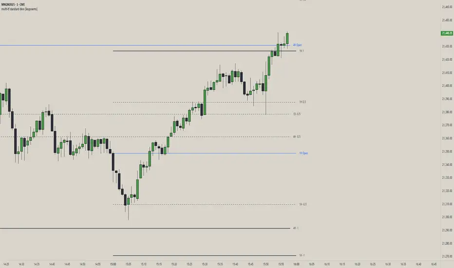
multi-tf standard devs [keypoems]Multi-Timeframe Standard Deviations Levels
A visual map of “how far is too far” across any three higher time-frames.
1. What it does
This script plots dynamic price “rails” built from standard deviation (StDev)—the same math that underpins the bell curve—on up to three higher-time-frames (HTFs) at once.
• It measures the volatility of intraday open-to-close increments, reaching back as far as 5000 bars (≈ 20 years on daily data).
• Each HTF can be extended to the next session or truncated at session close for tidy dashboards.
• Lines can be mirrored so you see symmetric positive/negative bands, and optional background fills shade the “probability cone.”
Because ≈ 68 % of moves live inside ±1 StDev, ≈ 95 % inside ±2, and ≈ 99.7 % inside ±3, the plot instantly shows when price is statistically stretched or compressed.
3. Key settings
Higher Time-Frame #1-3 Turn each HTF on/off, pick the interval (anything from 1 min to 1 year), and decide whether lines should extend into the next period.
Show levels for last X days Keep your chart clean by limiting how many historical sessions are displayed (1-50).
Based on last X periods Length of the StDev sample. Long look-backs (e.g. 5 000) iron-out day-to-day noise; short look-backs make the bands flex with recent volatility.
Fib Settings Toggle each multiple, line thickness/style/colour, label size, whether to print the numeric level, the live price, the HTF label, and whether to tint the background (choose your own opacity).
4. Under-the-hood notes
StDev is calculated on (close – open) / open rather than absolute prices, making the band width scale-agnostic.
Watch for tests of ±1:
Momentum traders ride the breakout with a target at the next band.
Mean-reversion traders wait for the first stall candle and trade back to zero line or VWAP.
Bottom line: Multi-Timeframe Standard-Deviations turns raw volatility math into an intuitive “price terrain map,” helping you instantly judge whether a move is ordinary, stretched, or extreme—across the time-frames that matter to you.
Original code by fadizeidan and stats by NQStats's ProbableChris.
Swing High/Low by %REnglish Description
Swing High/Low by %R
This indicator identifies potential swing high and swing low points by combining William %R overbought/oversold turning points with classic swing price structures.
Swing High: Detected when William %R turns down from overbought territory and the price forms a local high (higher than both neighboring bars).
Swing Low: Detected when William %R turns up from oversold territory and the price forms a local low (lower than both neighboring bars).
This tool is designed to help traders spot possible market reversals and better time their entries and exits.
Customizable parameters:
Williams %R period
Overbought & Oversold thresholds
The indicator plots clear signals above/below price bars for easy visualization.
For educational purposes. Please use with proper risk management!
คำอธิบายภาษาไทย
Swing High/Low by %R
อินดิเคเตอร์นี้ใช้ระบุจุด Swing High และ Swing Low ที่มีโอกาสเป็นจุดกลับตัวของตลาด โดยอาศัยสัญญาณจาก William %R ที่พลิกกลับตัวบริเวณ overbought/oversold ร่วมกับโครงสร้างราคาแบบ swing
Swing High: เกิดเมื่อ William %R พลิกกลับลงจากเขต Overbought และราคาแท่งกลางสูงกว่าทั้งสองแท่งข้างเคียง
Swing Low: เกิดเมื่อ William %R พลิกกลับขึ้นจากเขต Oversold และราคาแท่งกลางต่ำกว่าทั้งสองแท่งข้างเคียง
ช่วยให้เทรดเดอร์สามารถมองเห็นโอกาสในการกลับตัวของราคา และใช้ประกอบการวางแผนจังหวะเข้าหรือออกจากตลาดได้อย่างแม่นยำมากขึ้น
ตั้งค่าได้:
ระยะเวลา Williams %R
ค่าขอบเขต Overbought & Oversold
อินดิเคเตอร์จะแสดงสัญลักษณ์อย่างชัดเจนบนกราฟเพื่อความสะดวกในการใช้งาน
ควรใช้ร่วมกับการบริหารความเสี่ยง
Hilbert micro trends MainThe HILBERT MICRO TRENDS indicator uses advanced Digital Signal Processing techniques to uncover hidden characteristics in price series, providing a statistical edge across all types of assets. This indicator specializes in detecting short- and medium-term micro trends, which can appear isolated, embedded within larger trends, or even during broad-ranging price phases.
It operates with a single parameter, simplifying configuration and greatly reducing the risk of overfitting. HILBERT MICRO TRENDS applies modern low-pass and high-pass filtering techniques to smooth price data and remove noise efficiently across multiple levels. The mathematical formulas generate four recursively smoothed series, each more refined than the last in a subtle and precise way, avoiding abrupt changes. These smoothed series outperform traditional moving averages in every aspect: they have less lag (detecting trend shifts faster), generate fewer false signals, and stay closer to price action. This gives them an edge over standard indicators and algorithms based on conventional moving averages such as the simple, exponential, Kalman, or Hull MA.
Visual Structure
The indicator displays in two parts: one on the main chart and one on a sub-chart. On the main chart, the four smoothed series create a shaded area, with the upper and lower bounds representing the maximum and minimum of the series. If a series is rising (positive derivative), it signals bullish momentum; if falling, bearish. Since each series has a different smoothing level, they represent different time perspectives, and the indicator considers all four simultaneously. If all series are bullish, the area turns solid green. If three are bullish and one bearish, it's pale green. Two bullish, two bearish: gray. One bullish and three bearish: pale red. All bearish: solid red. A confirmed micro trend is present only when all four are aligned, i.e., when the area is pure green or red.
The sub-chart displays a histogram version of the same shaded area as an oscillator. An additional smoothed line tracks when the width of this shaded area expands or contracts.
How to Use and Interpret
As stated, the goal is to detect micro trends in price. The first rule is to open long positions only when the area is solid green, and shorts only when it’s solid red. Transitions from pale green to solid green can signal the start of a bullish micro trend, and similarly, from pale red to solid red for bearish trends. The width of the shaded area indicates the strength of the movement (best seen in the histogram). A wider area suggests stronger momentum, which is related to volatility only when a micro trend is active.
Use the orange line in the histogram to determine whether the micro trend is gaining or losing strength. A decreasing width suggests the trend might be ending, signaling an exit opportunity. However, since the orange line lags behind, it’s better used as confirmation rather than a trigger. For quicker signals, changes to pure red or green are more effective.
Price Relationship
Pay attention to the price's relative position to the shaded area. If the price stays within or fluctuates inside the area, it's usually a sign of a ranging market with no clear trend—avoid trading in such conditions. However, if the price breaks out and moves away from the area, it's a strong sign a micro trend has begun. When the price returns to the shaded area, the trend might be ending.
The indicator also marks pivot points from the last pure green or red zone. While not directly used to enter trades, these serve as useful price action reference points for combining with other strategies or tools.
Parameter Settings
The indicator includes a single but crucial parameter that controls smoothing intensity. A low value makes the indicator faster; a higher value slows it down. Success depends on choosing the right setting for the market environment. For long, clear trends, use higher values (80–100), as late entries are acceptable and premature exits are avoided. For shorter, mean-reverting trends, lower values (~40) are better to avoid lag. The default setting is 60, which suits most markets, but users are encouraged to adjust it to current conditions.
Always identify the current market phase and backtest how past micro trends have behaved on the instrument being traded. This ensures the indicator is tuned to the asset’s behavior and can deliver optimal results.
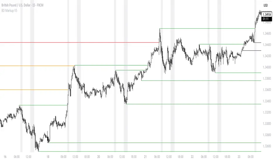
BD Markup V5BD Markup V5 — Multi-Time-Frame Extremes & Session Shading
Pine Script v6 • overlay = true
What the indicator does
BD Markup V5 automatically plots horizontal extreme levels (highs & lows) taken from completed candles on seven standard time-frames:
1 Year (Y) – Purple – “Show Yearly”
1 Month (M) – Red – “Show Monthly”
1 Week (W) – Orange – “Show Weekly”
1 Day (D) – Green – “Show Daily”
4 Hour (4H) – Black – “Show 4H”
1 Hour (H1) – Yellow – “Show H1”
15 Minutes (M15) – Maroon – “Show M15”
For every candle that closes the script:
Stores that candle’s high & low.
When a new candle of the same aggregation begins, draws two horizontal lines at those stored prices.
Extends each line to the right until price touches it ; at first touch the extension stops.
To keep the chart tidy you can set a Candle Count per time-frame so only the most-recent n highs & lows remain.
A Base Time-Frame filter hides all lower-TF lines (e.g. choosing “H4” hides H1 & M15).
The indicator also includes three custom intraday sessions whose backgrounds can be shaded with user-defined colours & transparency.
Key inputs
Base Time-Frame – show only levels whose aggregation order is equal or larger.
Show TF? check-boxes – enable/disable individual layers.
Colour pickers & Candle Count – customise appearance & history depth for each layer.
Chart Timezone – accepts any IANA name or UTC/GMT offset.
Session 1-3 – toggle, set session string (HHMM-HHMM), colour, and opacity.
How overlapping levels are handled
When a new line would be created at exactly the same price as an existing one:
If the new level comes from a higher time-frame, lower-TF duplicates are removed.
If it comes from a lower time-frame, the script skips drawing to preserve the higher-TF level.
This hierarchy keeps the chart clean and emphasises the most significant structure.
Practical uses
Highlight macro structure (yearly / monthly / weekly extremes).
Mark intraday reference points (previous session highs & lows).
Combine with your own strategies for bias, targets, or liquidity zones.
Visually compare price behaviour inside custom trading sessions.
Limitations & notes
Levels are based on completed candles only; they never repaint but always lag one full period.
Once price touches a level its extension stops, but the line remains until pruned by your Candle Count setting.
The script caps total line objects at 500 to stay within Pine runtime limits.
Disclaimer
This script is published for informational and educational purposes only.
It does not constitute financial advice and is not a solicitation to buy or sell any asset.
Trading and investing involve substantial risk; always perform your own research and consult a licensed professional before acting on any idea.
Past performance or historical levels do not guarantee future results.
By using this indicator you agree that the author is not liable for any loss or damage arising from its use.
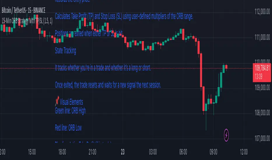
15-Min ORB Strategy with TP/SL
🔧 How It Works
Opening Range Defined
At market open, it tracks the first 15-minute candle.
The high and low of that candle form the Opening Range.
Breakout Detection
A Buy Signal is triggered when price closes above the ORB high (with confirmation).
A Sell Signal is triggered when price closes below the ORB low.
Trade Management
On a confirmed breakout, the script:
Records the entry price.
Calculates Take Profit (TP) and Stop Loss (SL) using user-defined multipliers of the ORB range.
Positions are exited when either TP or SL is hit.
State Tracking
It tracks whether you're in a trade and whether it’s a long or short.
Once exited, the trade resets and waits for a new signal the next session.
📌 Visual Elements
Green line: ORB High
Red line: ORB Low
Blue line: Active Take Profit (if in trade)
Orange line: Active Stop Loss (if in trade)
Buy/Sell Labels: Signal markers below/above candles for clear entry visibility
⚙️ Customizable Inputs
Take Profit Multiplier (default 1.5× ORB range)
Stop Loss Multiplier (default 1.0× ORB range)
Session Start/End time for ORB definition
✅ Ideal For:
Traders who want clean, rule-based signals with no indicators
Quick intraday setups using price action only
Adaptation to almost any liquid market (just adjust session times)
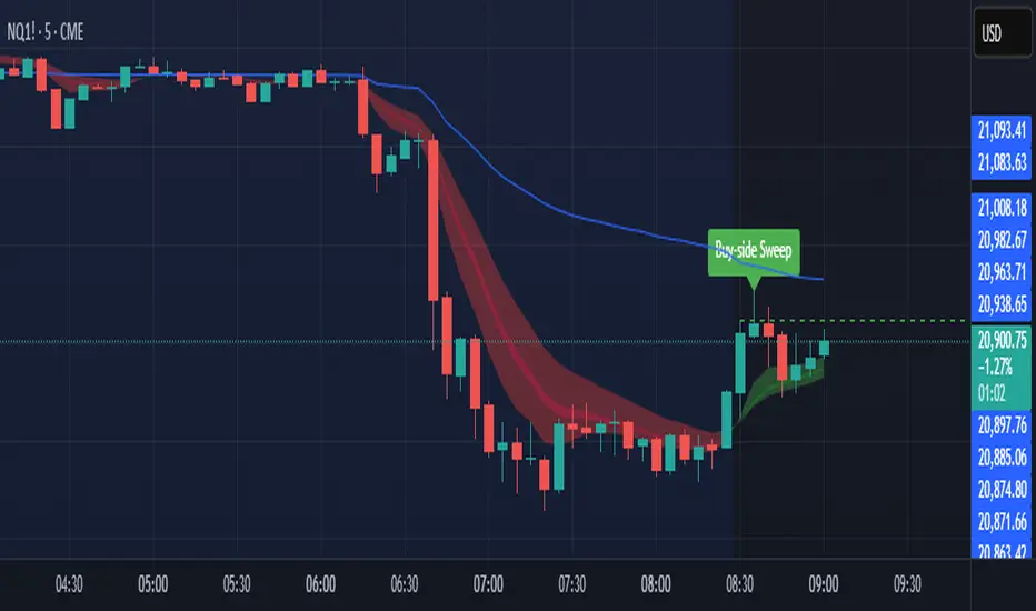
Sniper SweepsPurpose
Detect when price sweeps above recent highs (buy-side liquidity) or below recent lows (sell-side liquidity), but closes back inside the range. This is often interpreted as a stop-hunt or liquidity grab by institutional traders.
Core Concepts
Liquidity Sweep: When price briefly breaks a recent swing high/low (potentially triggering stop losses), but then closes back within the previous range.
Buy-side Sweep: Price breaks a previous high, but closes below it.
Sell-side Sweep: Price breaks a previous low, but closes above it.
Summary
This indicator is useful for:
Identifying potential stop-hunts or liquidity grabs.
Recognizing SMC trade setups around swept highs/lows.
Getting alerted when significant liquidity levels are manipulated.
Consecutive Candle CounterConsecutive Condition Counter is a versatile indicator that tracks and visualizes consecutive candles based on user-defined market conditions. It helps traders quickly identify streaks of bullish or bearish signals by counting how many bars in a row satisfy the selected condition.
🔍 Features:
Three selectable conditions via a dropdown:
Up & Down Days: Counts consecutive up or down candles. Each up candle adds +1, each down candle subtracts -1. The counter resets when direction changes.
RSI Signal: Counts how many consecutive bars RSI remains above 70 (+1 per bar) or below 30 (-1 per bar). Resets when RSI moves back to the neutral zone.
SMA Positioning: Counts consecutive bars where price stays above (+1) or below (-1) a Simple Moving Average (SMA). SMA period is user-defined.
📊 Visualization:
Positive streaks are shown in green, negative streaks in red, and neutral values in gray.
Displayed as a histogram below the chart for quick pattern recognition.
⚙️ Inputs:
Choose condition logic from the dropdown.
Configure the RSI period and SMA period as needed.
This tool can be helpful for identifying momentum streaks, overbought/oversold trends, or trend-following behavior in a visually intuitive way.
