Community ideas

Reading multi timeframe Secrethello everyone, this is my first video tutorial on this website. I hope I explained everything properly if I didn't let me know so I can make improvements...
I did have some people who contacted me how to trade, they liked my analysis so I made this video for them and also for people new to trading.. Or people who are already pro this will give a nice upgrade on there skills
for this tutorial I used DXY which is the most important index in trading and I think it's a good start for new traders so they can use DXY to trade major currencies..
please let me know how the video was?
thank you

TradingView Masterclass: Paper TradingIn this Masterclass, you’ll learn how to use our official paper trading tool. Paper trading gives trades the capability to test their trading skills in a simulated environment without risking real money. For all the new traders out there, you’ll want to make paper trading your best friend. Why? Have all the fun you want, practice endlessly, and never lose a dime.
Reminder: With Black Friday nearing (seriously… it’s coming soon), now is the time to master one of our most important tools. You’ll be ready to go the second you activate your upgraded account.
To get started, follow the steps below:
Step 1 - Click the ‘Trading Panel’ button located at the bottom of the chart.
Step 2 - Once you click the ‘Trading Panel’ button, a list of brokers in your region will appear, but also, at the very top, a Paper Trading account powered by yours truly, TradingView.
Step 3 - Click Paper Trading and you’ll now start the process of opening your free, simulated trading environment, entirely powered by us.
You made it! Time to celebrate! 🕺💃
Alright, let’s go a little deeper and talk about the buttons you’ll want to understand now that you’ve got your Paper Trading account opened.
While still having the Trading Panel open, click the button that says “Trade” and an order slip will appear. It’ll look like this:
As you get started, here are some tips to keep in mind:
Take Paper Trading seriously. Work Paper Trading as if it were a real account:
Record your trades, the reasons, the results obtained and the lessons learned.
Explore different approaches like intraday trading or swing trading.
Maintain emotional discipline, your trading strategy and risk management.
Practice, practice, practice - that’s what this is all about, getting better at trading through practice.
It gets better, because there are multiple ways to trade and customize your paper trading experience. Open the chart settings menu or right click on the chart, and you can add specific trading features to the chart as needed.
In-fact, we’ll explain all of the features available to you in the chart settings.
🟥🟦 Buy/Sell buttons :
When these are turned on, you’ll see a Buy and Sell button at the top right of the chart. When it comes to buying and selling, there are three primary order types:
Market (executed at the current market price),
Limit (executed at a defined specific value), and
Stop (executed when the price falls below a certain level).
👆 Instant Orders placement :
This option allows you to open positions at the market price by simply clicking the buy and sell buttons. You can choose the quantity by clicking on the number below the spread.
⏰ Play Sound for executions :
You can enable this option to receive an audible notification when a trade is executed, with eight different tones to choose from.
📲 Notifications :
Receive notifications for All events or Rejection orders only.
Tip : You can open the order panel by using the Shift + T shortcut or by right-clicking on a chart, then selectings Trade > Create a new order.
👁🗨 Positions :
Uncheck this box if you don’t want to see your active trading positions.
🔺🔻 Profit & loss :
This option allows you to view the profit and loss changes in your trades, which can displayed in both ticks and percentages.
🔃 Reverse button :
When enabled, a button is added to your active trading positions that allows you to reverse your trade.
👁 Orders :
See your current open unexecuted orders by checking this box.
🔺🔻👁 Brackets profit & loss :
It functions similarly to the Profit & Loss option, but for pending orders.
⏪ Executions :
It displays the past executed orders on the chart.
Execution labels :
Enable this option to view specific information about past execution orders, including trade direction, quantity, and executed price.
Extended price line for positions & orders :
It creates an extended horizontal line for your active trades.
⬅⬆➡ Orders & positions alignment :
You can move the alignment of your orders to Left, Center and Right in your charts.
🖥 Orders, Executions and Positions on screenshots :
Check this box if you want to download screenshots (shortcut: Ctrl + Alt + S) with active and pending orders.
Thanks for reading and we hope this tutorial helps you get started! We look forward to reading your feedback.
- TradingView Team

Revisiting Automatic Access Management API for VendorsThis video explains how to automate access management for vendors who build and sell invite only scripts based on subscription or one time fee. I have made videos about this earlier as well. But, due to high demand, I have been asked to make this video again.
🎲 Tools Required
Replit - Used for hosting the service that automates access management
Postman - To test the services hosted
🎲 Prerequisites
User should have premium tradingview account and be able to publish invite only scripts by following the house rules.
User should disable 2FA on their account in order to allow programs to login remotely and manage access.
🎲 Steps
All the steps are also mentioned in the githup repository: github.com
🎯 Run the access management service
Fork the replit repository: replit.com
Update Environment Variables tvusername and tvpassword
Run the repl
🎯 Use postman to test the service methods
Detailed explanation of the API calls are present in the github link provided above. The service is capable of doing following things.
Check if the given tradingview username is valid or not
Get the access details of given user to list of scripts identified by pub id.
Delete the access to given user to list of scripts identified by pub id.
Provide/Extend access to given user to list of scripts identified by pub id for specific duration.
🎲 Notes
Please follow house rules while publishing and selling subscriptions to invite only scripts.
Do not commercialize these API calls or do not turn it into product. The mechanism is built on backend calls that are not officially supported by tradingview. While tradingview is tolerant on individual use, any malicious activity may force them to shut this down for everyone.

Trading strategyA trading strategy encompasses a set of guidelines for initiating a position.
A trading system encompasses a set of rules for consistently profitable trading. This involves a clear comprehension of your strategy, specifying the assets you trade, the setups you utilize, the risk involved, preferred timeframes, and other pertinent details.
Consistency: A meticulously crafted action plan serves as a tool to maintain a steady trading strategy while minimizing the sway of emotions on your decision-making. Such consistency often yields more predictable results and enhances overall performance over time.
Confidence: Equipped with a playbook, you can trade with increased self-assurance, knowing that you are following a tried-and-tested strategy. This confidence alleviates stress and anxiety, enabling you to maintain focus and make sound decisions.
Adaptability: In the face of shifting market conditions, having a playbook at your disposal empowers you to adjust and fine-tune your strategies as needed. This adaptability is a critical factor in staying ahead and sustaining success in the constantly evolving realm of trading.
4 distinct components that constitute a trading strategy:
Context: Context encompasses the surroundings and circumstances related to a trading idea or event. It is crucial for a comprehensive understanding of the situation and is vital for maximizing the potential of your trading strategy. Many traders erroneously believe that a trading strategy is simply about identifying patterns or triggers along with basic risk management. For instance, some may focus on trading Order Blocks. However, the key to making Order Blocks a profitable tool lies in applying the correct context.
Patterns: The second component involves identifying the triggers or patterns that dictate when to enter a position. Context is applied to these triggers for in-depth analysis, aligning them with the risk-to-reward parameters defined in your trading system. Triggers can vary widely and should be chosen according to your individual trading style and strategy.
Position Management: Inexperienced traders often find themselves overwhelmed when they enter a position, leading to irrational decisions. Defining a repeatable process for managing your trades is essential. This process should align with the goals set out in your trading strategy. For instance, if your strategy aims for a risk-to-reward ratio of 3R or higher, your approach will differ from someone targeting a minimum of 1.5R. To ensure consistency, it's crucial to avoid excessive discretion when managing positions, such as attempting to achieve a 1:5 risk-to-reward ratio, placing short stops, or averaging down. Instead, aim for strict consistency, gradually honing your skills.
Risk Management: The final facet of any trading system is risk management. Poor risk management is a leading cause of trader failures. It often results from excessive leverage and a lack of understanding. Your risk management plan doesn't need to be overly complex, but it must be clear and diligently adhered to. By following a robust risk management strategy, you can avoid the pitfalls that ensnare many inexperienced traders who destroy their accounts due to reckless trading practices.
It may vary depending on your trading style, but for day trading I recommend the following:
* 1% maximum risk per trade
* 2% maximum per day
* 6% maximum per week
* 10% maximum per month
6 essential steps to build and refine your trading strategy:
Determine Your Trading Style: Start by defining your trading style, whether you are a day trader, swing trader, or long-term investor. This choice guides your selection of appropriate strategies, time frames, and risk management techniques. For instance, specify your preferred win rate (e.g., 50%+), risk-to-reward ratio (e.g., 2R minimum), and trading style (e.g., scalping, position trading, or swing trading).
Research and Select Strategies: Explore various trading strategies and choose the ones that align with your trading style, risk tolerance, and financial objectives. You may want to consider strategies like Smart Money trading, which could be particularly beneficial.
Define Entry and Exit Criteria: For each selected strategy, outline precise entry and exit criteria. Determine your stop loss and profit targets to ensure you execute trades accurately and limit potential losses. It's crucial to establish a well-defined trade management plan that guides step-by-step position management. For example, decide to move your position to break-even when a 1:1 risk-to-reward ratio is reached, open trades exclusively with a 1:2 ratio, or close 50% of your position at 1:1 and the remaining 50% at 1:3.
Establish Risk Management Rules: Implement robust risk management rules to safeguard your capital. These rules might include setting a maximum percentage of your account balance to risk per trade or using Expert Advisors to automatically determine position sizing for risk control.
Test Your Strategies: Prior to committing real capital, test your strategies using historical market data or a demo account. This testing phase allows you to refine your strategy and build confidence in your approach. If you cannot achieve positive results on a demo account, it's advisable to avoid risking real money until you've honed your skills.
Analyze Your Trades: Maintain a comprehensive trade journal recording the strategy used, entry and exit points, and relevant market conditions for each trade. Regularly review your trade results to pinpoint areas for improvement and adapt your trading plan accordingly. Analyzing your trades is crucial for continuous growth as a trader.
Hope you enjoyed the content I created, You can support with your likes and comments this idea so more people can watch!
✅Disclaimer: Please be aware of the risks involved in trading. This idea was made for educational purposes only not for financial Investment Purposes.
---
• Look at my ideas about interesting altcoins in the related section down below ↓
• For more ideas please hit "Like" and "Follow"!

How to Trade Crude OilLearning how to trade crude oil requires a nuanced understanding of its fundamental aspects, instruments, and trading strategies. This comprehensive article offers insights into the critical elements that affect crude oil prices, the range of instruments available for trading, and specific strategies traders use in this market.
The Basics of Crude Oil
Crude oil, often referred to as "black gold," is a fossil fuel derived from the remains of ancient organic matter. It serves as a crucial raw material for various industries, including transportation, chemicals, and manufacturing.
Two primary types of crude oil traded on global markets are West Texas Intermediate (WTI) and Brent Crude. WTI is primarily sourced from the United States and is known for its high quality and low sulphur content. On the other hand, Brent Crude originates mainly from the North Sea and serves as an international pricing benchmark.
The Organization of the Petroleum Exporting Countries (OPEC), which includes members like Saudi Arabia, Iran, and Venezuela, plays a pivotal role in determining global oil supply. By adjusting production levels, OPEC influences crude oil prices significantly. Additionally, other regions like Russia and the United States contribute to the world's oil supply, further affecting market dynamics.
Factors Affecting Crude Oil Prices
In oil trading, economics is a fundamental aspect that traders need to grasp to make educated decisions. Several factors drive the price of crude oil, and here are some of the most significant:
Supply and Demand: At its core, the price of crude oil is determined by how much of it is available (supply) versus how much is wanted (demand). An oversupply can depress prices, while high demand can cause prices to spike.
Geopolitical Events: Conflicts, wars, and diplomatic tensions in oil-producing regions can disrupt supply chains, affecting prices. For instance, sanctions on Iran or instability in Venezuela can push prices higher.
Currency Fluctuations: Oil prices are generally quoted in US dollars. A strong dollar can make oil more expensive for countries using other currencies, thereby affecting demand.
Seasonal Changes: During winter, demand for heating oil can rise, pushing crude oil prices up. Conversely, a mild winter might result in lower demand and prices.
Technological Advances: Innovations in extraction methods, such as fracking, can alter the supply landscape, making it easier to extract oil and thereby affecting prices.
OPEC Decisions: As previously mentioned, OPEC has a significant influence on oil prices. Their production quotas can tighten or flood the market, causing price swings.
Economic Indicators: Data like unemployment rates, manufacturing output, and interest rates can indicate the health of an economy, which in turn can affect oil consumption and prices.
How Is Crude Oil Traded?
When learning how to trade crude oil, traders have a variety of instruments to choose from. However, it’s also important to be aware of its trading hours and how leverage is used.
Crude Oil Instruments
Futures Contracts: A futures contract is an agreement to buy or sell a specific quantity of crude oil at a predetermined price on a specified future date. Both WTI and Brent Crude have their own futures contracts traded on exchanges like the New York Mercantile Exchange (NYMEX).
Contracts for Difference (CFDs): This financial derivative allows traders to speculate on oil price movements without owning the actual commodity. Essentially, you're entering into a contract with a broker to exchange the difference between the opening and closing prices of the crude oil position.
Exchange-Traded Funds (ETFs): These are investment funds traded on stock exchanges. ETFs such as the United States Oil Fund (USO) or the SPDR S&P Oil & Gas ETF (XOP) provide exposure to oil prices by either tracking the commodity's price or investing in oil-related equities.
Options: These financial instruments give traders the right but not the obligation to buy or sell crude oil at a fixed price before a certain date. They offer more flexibility but are generally considered riskier due to their complex nature.
Spot Market: In the spot market, physical crude oil is bought and sold for immediate delivery. However, this is less common for retail traders due to the logistical challenges involved.
At FXOpen, we offer both WTI and Brent Crude CFDs. To get started with oil trading, software such as our free TickTrader platform can provide the technical analysis tools necessary to analyse crude markets.
Trading Hours
Crude oil markets are open almost around the clock, offering high liquidity and the potential for trading opportunities at various times. The New York Mercantile Exchange (NYMEX), for example, is open for trading from Sunday evening until Friday afternoon, with a daily trading break. The most active trading hours are generally during the US (9:00 AM to 2:30 PM EST) and European sessions (6:00 AM to 11:00 AM EST).
Leverage
Leverage allows traders to use small amounts of capital to control a larger position. While this can amplify profits, it also increases risk. Most retail traders opt for trading crude oil through CFDs, which often come with higher leverage options, making it essential to manage risk carefully.
Crude Oil Trading Strategies
Given the volatile nature of crude oil prices, traders employ specific strategies to capitalise on price fluctuations. Here are some strategies particularly useful for crude oil trading:
Trend Following with Moving Averages
The trend is your friend, especially in commodities like crude oil. One effective way to follow the trend is by using moving averages, such as the 50-day (blue) and 200-day (orange). When the 50-day crosses above the 200-day, it's generally a bullish signal, and vice versa for a bearish trend. However, as with all technical analysis tools, moving averages can sometimes trigger false signals.
Range Trading
Due to supply-demand dynamics and geopolitical factors, crude oil prices often fluctuate within a specific range. Identifying these ranges can be useful for short-term trading. Traders buy at the lower end of the range and sell at the higher end, applying technical indicators like RSI or Stochastic Oscillator for entry and exit signals.
News-Based Trading
In crude oil markets, news about OPEC decisions, US oil inventory data, geopolitical tensions, and technological advancements can dramatically impact prices. Traders keeping an eye on oil news can take advantage of sudden announcements or an economic release likely to push prices in a particular direction. Given the high leverage commonly available in CFD trading, this strategy can be profitable but also comes with significant risk.
The Bottom Line
In crude oil trading, having the right strategies and tools is essential for success. By understanding the fundamentals, market dynamics, and utilising specific trading techniques, you are now equipped with the knowledge you need to get started. To access these markets with competitive spreads and rapid execution speeds, consider opening an FXOpen account and step confidently into the world of crude oil trading.
This article represents the opinion of the Companies operating under the FXOpen brand only. It is not to be construed as an offer, solicitation, or recommendation with respect to products and services provided by the Companies operating under the FXOpen brand, nor is it to be considered financial advice.

Day Trader's Toolbox Part 3: Average True Range (ATR)
Welcome to the final instalment of our Day Trader's Toolbox series, in which we highlight some essential tools and indicators which have the potential to transform your day trading.
Today we lift the lid on the Average True Range or ATR – a simple yet highly effective tool when analysing the price movement of any market. We’ll explain how ATR helps you to view the market through the eyes of a professional trader and we’ll outline the three core uses for ATR in day trading.
I. Understanding ATR:
What is ATR?
Okay, let’s start with the basics: ATR is designed to measure market volatility by calculating the average range between the high and low prices over a specific period.
Without delving into the ATR formula, it's important to understand that this indicator takes price gaps into account. This factor provides traders with an authentic representation of market volatility.
On TradingView, the ATR indicator appears as a line underneath your chart. And whilst it can be calculated on any timeframe, we typically talk about ATR in terms of the daily timeframe – hence ATR will tell us how much we can expect a stock to move up or down in typical trading day.
Daily ATR on Daily Candle Chart
Past performance is not a reliable indicator of future results
Start Seeing Price Movement Like a Seasoned Trader
Have you ever found yourself drawn to the lists of top gainers and losers on stock trading platforms? It's a common fascination for novice traders, as these lists provide quick summaries of what's "hot" on any given day.
However, seasoned traders know that evaluating stock prices solely based on percentage movements is about as practical as a paper umbrella in a rainstorm.
To illustrate this point, consider two stocks, Stock A and Stock B, both opening with a 3% increase. Yet, Stock A typically fluctuates by 3% on an average day, while Stock B usually moves by 1.5%. In this context, Stock B's price movement is far more significant.
This is where ATR comes into play. ATR normalises market price movements, making it a valuable tool for comparing a stock's price changes against its historical performance and its peer group.
So, it's time to shift your perspective. Leave behind the world of percentage-based analysis and adopt ATR to see price movement through the eyes of a professional trader.
II. 3 Ways to Use ATR When Day Trading
1. Profit Targets
Consider this day trading scenario: The market has broken above its previous day's high (PDH), and the price is showing signs of consolidation while staying above VWAP. With these clear signals of strength and insights from your higher timeframe analysis, you decide to go long. Now, the question is, where do you place your profit target?
Answer:
As a day trader, your goal is to capitalise on intraday price movements and avoid holding positions overnight, thereby mitigating overnight risks. This means that setting a structural target, such as the next resistance level, may not be practical.
However, if you incorporate the daily ATR with the current day's low, it provides you with an exceptionally realistic profit target. This target is entirely objective and calibrated to the specific market's current level of volatility.
It's important to note that ATR is an average, so it should be used as a guide rather than an absolute rule. Nevertheless, having a tool to adjust your profit expectations is invaluable, especially in the emotionally charged environment of day trading.
Example:
ATR based profit target
Past performance is not a reliable indicator of future results
2. Stop Placement
In swing trading, where positions are held over several trading sessions to capture price swings, using multiples of the ATR for stop placement is a smart strategy. It helps keep your stops outside of market noise and enhances risk management.
However, when it comes to day trading, it's understandable that stops need to be considerably smaller. But that doesn't mean we can't use ATR to fine-tune our stop loss levels according to market volatility.
Day traders can benefit from using a multiple of a lower timeframe ATR to establish a volatility-adjusted stop loss. This approach is often more effective than simply placing a stop below the nearest level of support. For day traders using a 5-minute candle chart, a stop set at 10 times the ATR on this timeframe is a reasonable starting point.
Keep in mind that ATR serves as a normaliser of price movement across different markets. Using ATR for stop placement allows for consistency in risk management across the various markets you trade.
For day traders who prefer locking in profits as a trade moves in their favour, an ATR trailing stop can be an invaluable tool. It trails the stop a certain number of ATRs below the close of a specified number of bars, dynamically adjusting to the market's volatility. TradingView offers numerous ATR trailing stop indicators just search for “ATR Trailing Stop” in the indicators tab.
Example:
ATR Trailing Stop Loss
Past performance is not a reliable indicator of future results
3. Measuring Overextension
Just as ATR proves invaluable in setting realistic profit targets calibrated to market volatility, it also serves as an objective measure to define when a market is overextended.
There are various methods to use ATR for this purpose, but one of the most straightforward approaches involves Keltner Channels, which envelop an ATR band on either side of an exponential moving average.
When the price moves beyond the boundaries of the Keltner Channels, it is considered overextended. Day traders can experiment with Keltner Channel settings. The standard setup involves using 2.5 times the ATR wrapped around a 20-period exponential moving average. Wider bands (a higher ATR multiplier) across a longer period of the moving average generate fewer signals, while narrower bands across a shorter period produce more signals.
Incorporating Keltner Channels, in conjunction with support and resistance levels, provides an additional layer of confirmation for day traders, enhancing their ability to assess overextension in the market.
Example:
Keltner Channels: S&P 500 5min Candle Chart
Past performance is not a reliable indicator of future results
In summary, ATR is a versatile tool for day traders, helping them navigate volatile markets with precision. It aids in setting realistic profit targets, fine-tuning stop placement, and identifying market overextension. By incorporating ATR into your trading strategy, you can make informed decisions and manage risk more effectively.
Disclaimer: This is for information and learning purposes only. The information provided does not constitute investment advice nor take into account the individual financial circumstances or objectives of any investor. Any information that may be provided relating to past performance is not a reliable indicator of future results or performance.

NEAR Q3 OverviewExecutive Summary
NEAR Protocol stands as a Layer-1 (L1) smart contract blockchain that couples a state-of-the-art sharded architecture with an emphasis on offering a user experience reminiscent of Web 2 platforms. While maintaining the security and decentralization integral to blockchains, NEAR aims to surpass the capabilities of prior chains, such as Ethereum, in terms of usability, efficiency, and scalability. Recognizing and aiming to overcome Ethereum's limitations, NEAR incorporates sharding. This key distinction allows the blockchain to significantly enhance its throughput, accommodating a more substantial transaction volume by dividing the blockchain into smaller, concurrent shards.
A pivotal differentiator for the NEAR Protocol, sharding was introduced in November 2021 as Nightshade. This technique allows validators to process only transactions specific to their assigned shards, enabling potentially infinite scalability. For end users and investors, Nightshade ensures quicker transaction speeds at reduced fees. Diverging from traditional sharding methods that split the blockchain into multiple states, NEAR's design maintains the blockchain as a singularly sharded entity. Additionally, a synchronized state mechanism ensures that a change in one block's state prompts adjustments in other shards correspondingly.
In March 2023, NEAR unveiled the Blockchain Operating System (BOS), a groundbreaking open-source platform that allows developers to craft applications across various blockchain environments using well-known programming languages. Moreover, it provides crypto users with an experience reminiscent of Web 2. Designed to be inclusive, BOS appeals to Web3 veterans and those new to the decentralized web. By ensuring easy onboarding, robust security, and seamless cross-chain interactions, BOS is setting a new paradigm for Web 3 application development.
The NEAR Foundation, with the inception of the NEAR Digital Collective (NDC) and a pivot to community DAOs, is pioneering a transition to a more democratized and decentralized framework compared to the conventional Board-based system. Launched in Q3 2022, the NDC represents a concerted effort to decentralize decision-making within the NEAR network, emphasizing transparency through defined treasury management and embracing decentralized governance with on-chain voting. Furthermore, the NDC aspires to advance validator decentralization and stimulate the development of the core protocol and infrastructure.
Looking forward into 2024, the Near protocol will introduce several pivotal milestones, including the next step in Nightshade sharding, meta transactions, zero-balance accounts, a Global Storage proposal, and more.
Introduction to Near
NEAR Protocol is a Layer-1 (L1) smart contract blockchain with a bleeding-edge sharded design and an emphasis on an intuitive Web 2-like customer experience, all while preserving the security and decentralization users expect with a blockchain. Established in 2018, it sets out to achieve improved usability, efficiency, and scalability over preceding chains like Ethereum. Founded by Illia Polosukhin and Alexander Skidanov and spearheaded by the Near Collective, the NEAR Protocol was envisioned to serve as a community-driven cloud computing PoS blockchain and a decentralized hub tailored explicitly for hosting innovative decentralized applications.
The central motivation behind NEAR's technology is to prevent network congestion and furnish a conducive environment for developers, thereby promoting on-chain protocol development. Early on, NEAR identified certain operational challenges in Ethereum, particularly related to network congestion and high/volatile gas fees, that it looked to solve. To do so, Near turned towards sharding.
A key differentiator for NEAR, sharding, in essence, provides the ability for a blockchain to increase its throughput and handle a larger number of transactions by partitioning the blockchain into smaller parallel shards. In its pursuits, Near introduced an original approach to sharding in November 2021 known as Nightshade, initially unveiled as Simple Nightshade. The underlying principle of Nightshade is that validators are not burdened with the task of processing every incoming transaction. Instead, they only handle transactions that are within specific shards. By doing so, Nightshade paves the way for theoretically limitless scalability. But what does this mean for the end user or investor? Primarily, this approach, which is entirely abstracted from the end-user experience, allows for reduced transaction fees while ensuring rapid transaction speeds.
Additionally, Near recently launched a new initiative in early 2023 known as the Blockchain Operating System (BOS). This development represents a significant shift in how we perceive blockchain platforms. The BOS is designed to integrate seamlessly with various blockchain systems while facilitating decentralization and discoverability, which have historically been impossible to achieve together.
Essentially, the BOS is grounded in blockchain technology but broadens its application by acting as a universal layer, making it adaptable to different blockchain frameworks. One of its primary features is the provision of a decentralized platform for front-end development. This platform aims to simplify the creation of blockchain applications by emphasizing clarity and flexibility.
One of the core advantages of BOS is its potential to decentralize user interactions, improve security protocols, and enhance the modularity of components. Additionally, it prioritizes compatibility across diverse blockchains, presenting developers with a more intuitive and straightforward development environment.
NEAR Technologies
Blockchain Operating System (BOS)
In March 2023, the NEAR protocol introduced the Blockchain Operating System (BOS), an open-source platform empowering developers with the flexibility to build across diverse blockchain environments using familiar programming languages and equipping crypto users with a familiar Web 2 UX. The BOS is designed to be inclusive and democratize the open, catering not only to seasoned web3 enthusiasts but also to the broader audience who might be newer to the decentralized web. A significant breakthrough in the system is eliminating the immediate need for a new user to own any cryptocurrency, substantially reducing the friction of user onboarding.
Additionally, the BOS interface streamlines access and navigation, making it more user-friendly for both developers and the general populace. Moreover, it enables users to search through a portal to diverse communities and applications, all the while prioritizing data privacy. Further, the BOS's user-centric design, coupled with its focus on accessibility, does not just simplify the onboarding experience but also bolsters the discovery of new applications.
Remarkably, the BOS functions both as a development platform and a social network. It’s an environment where users can both deploy and unearth new applications. In delivering straightforward onboarding procedures, unmatched security, and fluid interactions across all chains, the BOS is reshaping the framework for constructing Web 3 applications.
Source
BOS Under the Hood
The Blockchain Operating System (BOS) by NEAR seeks to redefine the landscape of Web3 applications through its unique architecture based on three pivotal elements: components, blockchains, and gateways. Here, we will delve into the significance of each element and examine how they collectively shape the BOS framework.
Components: The Building Blocks of BOS
Components exist at the decentralized application (dApp) layer and can be equated with notable platforms such as Lido, Uniswap, Compound, and others. They stand out for their on-chain storage, high degree of transparency, and their ability for developers to fork these applications, harnessing their functionalities and composability to craft comprehensive web applications. Storing the entirety of a component's code on-chain not only ensures auditability but also bolsters security. With the code readily available for scrutiny in blockchain explorers, users can operate these applications locally, enjoying resilience against potential censorship and a streamlined user experience. This ability to natively audit and locally run the applications represents a paradigm shift in the user-app relationship.
Blockchains: The Underlying Infrastructure
The versatility of components and the BOS becomes apparent in their ability to interact with numerous blockchains and smart contracts instead of just one chain. Currently, BOS offers compatibility with all EVM chains, such as Ethereum, Polygon, Arbitrum, and Optimism, as well as, the native NEAR platform. As EVM chains dominate the TVL in the DeFi space, the BOS’ ability to work across nearly all enables users to tap into nearly all the liquidity and top dApps in the crypto economy. NEAR's capability to efficiently and cost-effectively store HTML/CSS/JS makes it the preferred choice for hosting app source codes.
Gateways: Bridging the Gap to Decentralization
Gateways, the third pillar of the BOS, facilitate the delivery of decentralized front-ends to a broader audience. Each gateway is underpinned by a bespoke virtual machine (VM) equipped to load and run frontends for protocols, be they Ethereum-based, Layer 2 solutions, or alt-L1 platforms like NEAR. All code pertaining to these frontends finds its home on the NEAR blockchain. The gateways are diverse, ranging from wallets and portfolio tools to distinct applications like SWEAT. They cater to tasks as rudimentary as adding swap functionality or as intricate as erecting decentralized app stores. Integrating this expansive functionality requires just the addition of a JavaScript library, followed by a selection of desired app front-ends. Prominent gateway exemplars include near.org, bos.gg, near.social, Cantopia, and nearpad.dev.
The decentralization of composable front ends enabled by the BOS is unique to Near, filling a conspicuous and much-needed void in the crypto arena. Instead of relying on centralized data servers, these front ends are blockchain-stored, promoting both composability and resistance to potential censorship. Historical instances, such as Uniswap's token delisting and the sanctions imposed on Tornado Cash, underscore the vulnerabilities of front ends. BOS’s decentralized approach allows developers the flexibility to fork these front ends and build in the truly OSINT environment that the cryptocurrency movement was built upon.
BOS Advantages
The BOS aims to integrate decentralization with discoverability and developer flexibility. Central to the BOS framework is its array of Web3 development tools that are crafted with the intent of pushing Web3 mainstream. From the onset, the system is designed to enhance user onboarding, improve cross-chain development and app discoverability, and create a seamless UX for Web3 users.
This last point on abstracting away different blockchains for a seamless Web3 experience has benefits beyond simply improving UX. It can potentially also reduce the liquidity fragmentation and tribalism associated with a fragmented crypto economy built around disparate, siloed blockchains. The BOS proposes a solution to this by striving for a consistent user experience across multiple blockchains and allowing developers globally to access and implement various Web3 components. With users and developers now (potentially) unable to discern which blockchain they are using, there is no longer a need to promote one over the other.
None of this is possible without the composability offered by the BOS. The system aims to be chain and language-agnostic, allowing developers to reuse and adjust different components while utilizing the language of their choice. The BOS supports a variety of languages for smart contract development, including JavaScript, Rust, AssemblyScript, and Solidity. Complementing this are their collaborations with established cloud providers, namely Google, Seracle, and Alibaba Cloud, to make transitioning from Web2 to Web3 as comfortable as possible.
In addition, NEAR has initiated the NEAR Dev Hub, a platform envisioned as a resource hub for developers. Preliminary outputs from this initiative include sponsored hackathons and the establishment of community groups.
Thresholded Proof of Stake
The NEAR Protocol operates on a distinct consensus mechanism known as "Thresholded Proof of Stake" (TPoS). Similar to other PoS implementations, TPoS still uses validators, who must stake NEAR tokens to participate, to validate transactions and ensure the integrity/security of the network. However, within the TPoS environment, validators can assume one of four pivotal roles:
Chunk Producers: Their primary responsibility is to authenticate transactions on individual shards, subsequently crafting a chunk, often referred to as a "shard block", from their designated shard.
Block Producers: These validators gather chunks from their chunk-producing counterparts associated with discrete shards. Their function culminates in the production of a block, which is then added to the primary chain.
Hidden Validators: Operating under a veil of confidentiality, these validators authenticate random shards — shards whose identity remains a secret to them and is undisclosed to the public. This veil serves a dual purpose. Firstly, it considerably complicates the task for any malevolent entities attempting to compromise them. Secondly, it robustly augments the chain's overall security measures.
Fishermen: Actively overseeing certain chain segments, these validators act as the guardians against fraudulent activities. They constantly monitor, ready to flag any nefarious activities. Interestingly, their operational requirements are modest — a minimal stake. However, this role, though critical, doesn't confer any rewards.
Central to TPoS is its innovative auction system employed to select validators. This methodology, in essence, discourages the practice of pooling. When validators amass resources, they not only amplify their individual rewards but also consolidate control over the chain. Such centralization runs counter to the foundational principles of blockchain, which emphasize distributed control. The TPoS design confronts this challenge head-on by placing natural barriers against pooling.
Additionally, TPoS tackles the issue of consensus forking — a scenario in which multiple validators simultaneously contribute blocks to the chain. Such events can elongate the time required for transaction finality. By minimizing the possibility of these forking instances, TPoS ensures swifter transaction finality.
Validator Requirements
Validators bear the critical responsibility of validating and executing transactions across the entirety of NEAR's sharded blockchain. Additionally, they monitor their peers (other validators), ensuring no invalid blocks are produced or alternate chains are formed. Validators found compromising network stability undergo "slashing," where part or all of their staked assets are confiscated. To compensate for their services and inherent risks, NEAR validators receive a inflationary protocol rewards, amounting to 4.5% of the total supply annually.
Given the complexity of the validator role, there are stringent hardware requirements (e.g. costs) for anyone looking to run one. To effectively run a validator, a robust system configuration, consisting of an 8-Core CPU, 16GB of RAM, and 1 TB SSD storage, is necessary. Current estimates indicate that the monthly expenditure for hosting a block-producing validator node stands at $330+.
This excerpt just scratches the surface, for the full report, click here .

The very Fat tail of the Market!The trading value of the 5078 stock tickers traded in the 6088 billion USD.
Hence, the trading value of the top 10 tickers with the highest dollar value of trading was 1811 billion USD, almost 29.75% of all circulated dollars in the market.
The fact that the top 10 tickers account for almost 29.75% of all trading value is a sign of market inefficiency. This suggests that the market is skewed towards a few large tickers. This can lead to increased risk for investors who are trying to exploit market inefficiencies.
The top 10 tickers were:
TSLA: Accounts for more than 7.2% of all trades, 10.3% of S&P500 trades, and 18.98% of NASDAQ100
NVDA: Accounts for more than 6.8% of all trades, 10.3% of S&P500 trades, and 15.27% of NASDAQ100
AAPL
MSFT
AMZN
META
AMD
BRK.A
NFLX
GOOG
The top 10 tickers account for 70.55% of all trading value of tickers on the NASDAQ 100..!
The top 10 tickers account for 38.54% of all trading value of tickers on the S&P500..!
The S&P 500 and NASDAQ 100 are both broad market indices that track the performance of the 500 largest publicly traded companies in the United States and the 100 largest non-financial companies listed on the Nasdaq stock exchange, respectively. These indices are widely used by investors as benchmarks for their portfolios.
However, the fact that the top 10 tickers account for such a large share of trading value suggests that these indices may not be as representative of the overall market as they once were. This is because the performance of the top 10 tickers can have a disproportionate impact on the performance of the S&P 500 and NASDAQ 100.
The high kurtosis in the distribution of trading values also suggests that the S&P 500 and NASDAQ 100 may not be as good at capturing the full range of risk and return potential in the market. This is because the distribution of trading values is skewed towards a few large tickers. This means that there is a greater potential for large losses in the S&P 500 and NASDAQ 100 than would be suggested by their average returns.
As a result of these factors, the S&P 500 and NASDAQ 100 may be less useful for investors who are looking for a diversified portfolio that is representative of the overall market and that has a low risk of large losses.
Implications
The fact that the top 10 tickers had such a significant impact on the overall trading dollar value has a few implications.
1st: it means that investors who focus on investing in the top 10 tickers are more likely to generate higher returns than investors who invest in a wider range of tickers.
2nd: it means that regulators need to be aware of the potential for market manipulation by investors who have large holdings in the top 10 tickers.
3rd: it means that investors need to be careful not to over-concentrate their portfolios in the top 10 tickers, as this could make them more vulnerable to losses if the performance of these tickers deteriorates.
4th: The correlation between the tickers and indexes may be overstated. This is because the performance of the top 10 tickers has a disproportionate impact on the performance of the indexes. As a result, the correlation between the tickers and indexes may not be representative of the correlation between the individual tickers.
5th: The correlation between the tickers and indexes may be less informative. This is because the correlation between the tickers and indexes does not provide any information about the specific relationships between the individual tickers. For example, the correlation between the tickers and indexes does not tell us whether the individual tickers are moving in the same direction or in opposite directions.
Conclusion:
Even among the top 10 tickers, TSLA and NVDA have dragged too much attention from most market participants, and the Future of the market is very dependent on the future movements of these 2 tickers!
Education:
A fat tail in statistics is a feature of a distribution where the tails of the distribution are thicker than those of a normal distribution. This means that there are more extreme values in the distribution than would be expected under a normal distribution.

Unlocking Trend Reversals: Mastering Bollinger Bands and VWAPsIn this comprehensive video tutorial, we will delve into the powerful techniques of utilizing Bollinger Bands and VWAPs (Volume Weighted Average Prices) to identify and master trend reversals in the futures market. ES1!
You will learn how to leverage these volatility-based indicators to detect potential turning points in price trends. By understanding Bollinger Bands' ability to highlight periods of market consolidation and expansion, you will gain an edge in predicting trend shifts and take advantage of profitable opportunities.
Additionally, we will explore the significance of VWAPs, an essential tool for analyzing price and volume dynamics. By combining volume-weighted prices with Bollinger Bands, you will be equipped with a comprehensive approach to assess market liquidity, support, and resistance levels.
Throughout this tutorial, I provide step-by-step guidance to effectively interpret the signals generated by Bollinger Bands and VWAPs, empowering you to make informed trading decisions. We will also address common misconceptions that can often lead to misinterpretations and false signals.
Whether you are a seasoned trader seeking to refine your strategy or a beginner eager to grasp these technical indicators, this video is designed to provide valuable insights and practical knowledge that can elevate your trading outcomes.

Decoding Market Patterns:10 Essential Price Patterns Every TradeIn the intricate world of trading, price patterns are the footprints left by market sentiment. Understanding these patterns is like deciphering a complex code, revealing insights into potential market movements. Today we will explore 10 essential price patterns every trader should recognize. Each pattern is a chapter in the dynamic story of market behavior, offering opportunities to identify trends, reversals, and strategic entry or exit points.
1. Bull Flag: The Flagbearer of Continuation
A Bull Flag is a continuation pattern, often seen in strong uptrends. It resembles a flagpole (the initial price spike) followed by a rectangular flag (consolidation phase). When the price breaks above the upper boundary of the flag, it signals a potential continuation of the uptrend.
2. Bear Flag: The Bearish Counterpart
The Bear Flag is the opposite of the Bull Flag. It appears in downtrends, with a flagpole representing the initial price drop followed by a consolidation period. When the price breaches the lower boundary of the flag, it indicates a potential continuation of the downtrend.
3. Head and Shoulders: The Classic Trend Reversal
The Head and Shoulders pattern is a powerful reversal indicator. It consists of three peaks – the central peak (head) is higher than the surrounding peaks (shoulders). When the price drops below the neckline (a line drawn through the lowest points of the shoulders), it suggests a potential trend reversal from bullish to bearish.
4. Inverse Head and Shoulders: The Bullish Resurgence
The Inverse Head and Shoulders pattern is the bullish counterpart of the Head and Shoulders. It occurs after a downtrend and indicates a potential reversal to an uptrend. The pattern consists of three troughs – the central trough (head) is lower than the surrounding troughs (shoulders). When the price rises above the neckline, it signals a potential shift from bearish to bullish.
The cool thing about chat patterns is that they are everywhere. You often see many different chart patterns on a singular chart, or smaller patterns that are a part of a larger pattern. The tricky part is finding them and appropriately identifying them.
5. Double Top: The Bearish Reversal Duo
A Double Top pattern occurs after an uptrend and signals a potential reversal. It consists of two peaks at nearly the same price level, indicating a struggle to push the price higher. When the price falls below the trough between the peaks, it suggests a possible shift from bullish to bearish.
6. Double Bottom: The Bullish Reversal Duo
The Double Bottom is the bullish counterpart of the Double Top. It occurs after a downtrend and signals a potential reversal to an uptrend. It consists of two troughs at nearly the same price level, indicating a struggle to push the price lower. When the price rises above the peak between the troughs, it suggests a potential shift from bearish to bullish.
7. Rising Wedge: The Rising Price Constrictor
A Rising Wedge is a bearish continuation or reversal pattern. It can form during a downtrend or in an uptrend where buying pressure becomes exhausted. The wedge is characterized by converging trend lines that slope upward. While the price may make higher highs and higher lows, the pattern tightens, indicating weakening momentum. When the price breaks below the lower trendline, it suggests a potential continuation of the downtrend or reversal of an uptrend.
Rising Wedge Reversal Example:
Rising Wedge Continuation Example:
8. Falling Wedge: The Falling Price Constrictor
The Falling Wedge is the bullish counterpart of the Rising Wedge. It forms during an uptrend or a downtrend, characterized by converging trend lines that slope downward. While the price may make lower highs and lower lows, the pattern tightens, indicating weakening selling pressure. When the price breaks above the upper trendline, it suggests a potential continuation of the uptrend.
Falling Wedge Continuation Example:
Falling Wedge Reversal Example:
9. Symmetrical Triangle: The Balance of Bulls and Bears
A Symmetrical Triangle is a neutral pattern that forms during a trend, indicating a period of consolidation. It is characterized by converging trend lines that slope in opposite directions. When the price breaks above the upper trendline, it signals a potential bullish move, and when it breaks below the lower trendline, it signals a potential bearish move.
10. Pennant: The Brief Consolidation Pause
A Pennant is a continuation pattern that forms after a strong price movement. It resembles a small symmetrical triangle, indicating a brief consolidation before the previous trend resumes. When the price breaks above the upper boundary, it suggests a potential bullish continuation, and when it breaks below the lower boundary, it suggests a potential bearish continuation.
Important Thing To Consider:
Price patterns are a tool that if practiced and executed properly can be a great asset for any trader. There are a few things that all traders should keep in mind when using price patterns to make trading decisions.
Context is critical: Price patterns don't exist in isolation; they occur within the context of larger market trends. It's essential to consider the prevailing market conditions, including the overall trend (bullish, bearish, or sideways), volume trends, and recent price action.
Confirmation is Key: While recognizing a price pattern is an important skill, relying solely on its formation might lead to premature or false trades. Traders should always wait for confirmation signals before taking action. Confirmation can come in the form of a price breakout above a pattern's resistance level, a significant increase in trading volume confirming the pattern's direction, or additional technical indicators aligning with the pattern's signal. Waiting for confirmation helps traders filter out false signals, reducing the risk of entering trades based solely on pattern
Risk management is paramount: No pattern, regardless of its historical accuracy, guarantees a profitable trade. Traders must always implement proper risk management strategies, including setting stop-loss orders and defining acceptable levels of risk per trade as a percentage of their trading capital. Risk management ensures that even if a trade based on a price pattern fails to materialize as expected, the impact on the trader's overall portfolio remains manageable.
Practice, practice, practice: Identifying price patterns is a skill that improves with practice and experience. Traders should dedicate time to studying historical charts, both in live markets and during backtesting. Regularly practicing pattern charting enhances the ability to spot patterns quickly and accurately. TradingView offers a great set of tools to help anyone get started by offering a full line of automated pattern recognition indicators for educational and research use. Utilizing these automated pattern recognition indicators is a great way to visualize patterns in the real world as patterns are often less clean than textbook examples.
Recognizing these price patterns equips traders with a valuable skill set for navigating a dynamic market. However, it's vital to remember that patterns, like pieces of a puzzle, offer meaningful insights when combined with other indicators and thorough analysis. No single pattern guarantees profits, and each should be evaluated within the context of the broader market conditions. By integrating pattern recognition into a holistic trading strategy, traders can unlock the door to more informed, confident, and strategic trading decisions. Happy trading!
Ben with LeafAlgo

Five of the Best Volatility IndicatorsVolatility can seem like a scary concept at first glance: wild price swings, stop-outs, and general unpredictability. However, there are volatility technical indicators that can help. This article covers five essential volatility indicators, discussing how they work and how they’re used to gauge market conditions.
What Is Volatility?
Volatility represents the range and rate at which the price of a financial asset moves over a specific timeframe. In other words, it gauges the degree of variation in a trading price. High volatility often correlates with higher risks and potential rewards, while low volatility suggests a less turbulent market with lower risks and potential rewards.
Volatility Technical Indicators
Volatility indicators are specialised tools that help traders quantify these price swings, making it easier to forecast future movements. They can help traders identify potential breakouts or market reversals by revealing periods of accumulation or distribution. By providing a clearer understanding of market temperament, these indicators equip traders to make more calculated decisions – be it in forex, commodities, or stock markets.
These indicators can be overlaid on price charts to offer visual cues, thereby simplifying complex data. They are commonly used alongside other technical indicators like moving averages and momentum oscillators to reinforce their signals.
Best Volatility Indicators List
Now, let’s take a closer look at five of the best volatility indicators. To see how they work for yourself, head over to FXOpen’s free TickTrader platform. There, you’ll find each indicator ready to use.
Bollinger Bands
Bollinger Bands are a volatility indicator invented by technical analyst John Bollinger in the 1980s. The indicator consists of three bands: a middle band, which is a simple moving average (SMA) of the asset's price, and two outer bands that are placed two standard deviations away from the middle band. These bands adjust dynamically with volatility, widening during periods of high volatility and contracting when volatility is low.
In trading, Bollinger Bands serve multiple purposes. They can identify overbought or oversold conditions when the asset's price reaches the upper or lower bands. The width of the bands also helps in recognising periods of increasing or decreasing volatility, often signalling potential market transitions. Traders frequently use Bollinger Bands to confirm trend reversals or to validate other technical signals.
Average True Range (ATR)
The Average True Range (ATR) is a volatility indicator introduced by J. Welles Wilder in 1978. Unlike Bollinger Bands, which envelop price action, ATR is a single line that typically appears below a price chart.
The indicator calculates the average of true ranges – essentially the greatest value among the current high minus the current low, the absolute value of the current high minus the previous close, and the absolute value of the current low minus the previous close – over a set number of periods.
ATR is primarily used for setting stop-loss levels and gauging the volatility of an asset. It doesn't offer any clues about price direction, making it a "pure" volatility measure. Higher ATR values indicate increased volatility and may suggest that price jumps or drops are more probable, warranting caution. Lower ATR values signify lower volatility, often seen during sideways market movements.
Keltner Channels
Keltner Channels are another volatility-based indicator, created by Chester Keltner in 1960 but later modified by Linda Raschke. This indicator consists of three lines: a central line, which is an Exponential Moving Average (EMA) of the asset's price, and two outer bands calculated based on the ATR. Typically, the outer bands are set two ATR values away from the central EMA.
Much like Bollinger Bands, the width of the Keltner Channels expands and contracts based on market volatility. These channels are particularly useful for identifying trend continuations and reversals. For instance, a price that moves toward the upper band often indicates bullish activity, whereas a movement toward the lower band suggests bearish behaviour.
Chaikin Volatility Indicator
The Chaikin Volatility Indicator, developed by Marc Chaikin, focuses on the expansion and contraction of price movement, differentiating it from other volatility indicators. Instead of using trading volume or calculating the average range, this indicator measures the difference between two EMAs of an asset's price, typically over 10 days.
When the Chaikin Volatility Indicator shows an upward movement, it indicates an increase in price volatility, potentially signalling a market breakout or a strong trend. Conversely, a downward trend in the indicator often suggests a decrease in volatility, possibly pointing to a market consolidation phase. Because this indicator focuses solely on price behaviour, traders often pair it with volume-based indicators for more comprehensive analysis and confirmation of trading signals.
Volatility Index (VIX)
The Volatility Index, commonly known as the VIX, operates somewhat differently from typical volatility trading indicators. Developed by the Chicago Board Options Exchange (CBOE), the VIX quantifies market sentiment and volatility expectations for the next 30 days. It is often referred to as the "fear gauge," as it tends to spike during periods of market unrest or uncertainty.
Calculated from the implied volatilities of S&P 500 index options, a high VIX value suggests that traders expect significant price swings, usually accompanying bearish market phases. On the other hand, a low VIX often indicates periods of complacency or confidence, generally correlating with bullish markets.
While not directly applicable to an asset's price chart, the VIX serves as one of the leading stock volatility indicators, offering traders context for broader market conditions.
The Bottom Line
In essence, volatility indicators are invaluable tools in a trader's arsenal, helping to demystify often unpredictable price movements. Mastering and combining these indicators, especially with momentum and trend tools, can significantly enhance your decision-making process.
To put these five tools into practice, consider opening an FXOpen account. We offer hundreds of tradable instruments and sophisticated charting tools, allowing you to navigate the markets with confidence.
This article represents the opinion of the Companies operating under the FXOpen brand only. It is not to be construed as an offer, solicitation, or recommendation with respect to products and services provided by the Companies operating under the FXOpen brand, nor is it to be considered financial advice.

Mastering the Art of Investing: Common Mistakes & solutionsLet's keep it straight to the point, Shall We?
1. Emotional Investing:
One of the most prevalent mistakes is allowing emotions to drive investment decisions. Fear and greed can lead to impulsive actions, such as panic selling during market downturns or chasing speculative investments during bullish phases.
Solution: Develop a well-thought-out investment plan based on your financial goals, risk tolerance, and time horizon. Stick to this plan, regardless of short-term market fluctuations. Regularly review and adjust your portfolio, but do so based on rational analysis, not emotional reactions.
2. Lack of Diversification:
Concentrating all investments in a single asset or industry exposes investors to significant risks. If that particular investment performs poorly, it can have a devastating impact on the overall portfolio.
Solution: Diversify your portfolio across different asset classes, industries, and geographic regions. This strategy helps reduce risk and improves the potential for more stable returns over the long term.
3. Market Timing:
Attempting to time the market, i.e., buying and selling based on predictions of short-term price movements, is a common mistake. Even seasoned professionals struggle to consistently time the market correctly.
Solution: Adopt a long-term investment approach. Time in the market is generally more important than timing the market. Stay invested and focus on your financial goals rather than trying to predict short-term market movements.
4. Overlooking Fees and Expenses:
High investment fees and expenses can significantly erode returns over time. Many investors underestimate the impact of these costs.
Solution: Be mindful of the fees associated with your investments, including expense ratios, broker commissions, and advisory fees. Consider low-cost index funds or exchange-traded funds (ETFs) as cost-efficient alternatives.
5. Ignoring Asset Allocation:
Some investors focus solely on individual investments without considering how they fit into their overall portfolio. Neglecting proper asset allocation can expose portfolios to unnecessary risk.
Solution: Determine an appropriate asset allocation based on your risk tolerance and investment goals. Rebalance your portfolio periodically to maintain the desired allocation.
6. Chasing Hot Tips and Fads:
Acting on unsolicited stock tips or investing in the latest fads and trends can lead to poor decision-making and losses.
Solution: Rely on thorough research and due diligence before making any investment. Avoid making impulsive decisions based on hearsay or the fear of missing out (FOMO).
7. Lack of Patience and Discipline:
Investing is a long-term endeavor, and expecting quick riches can lead to disappointment and rash decisions.
Solution: Cultivate patience and discipline in your investment approach. Stay committed to your long-term strategy and avoid making knee-jerk reactions to short-term market movements. Also, another good way of increasing discipline is giving us a boost for our efforts :)
In conclusion, successful investing requires a well-structured plan, emotional resilience, and a commitment to disciplined decision-making. By avoiding these common mistakes and implementing the provided solutions, investors can increase their chances of achieving their financial goals and building a more secure financial future. Remember, investing is a journey, and learning from mistakes can ultimately lead to greater financial wisdom and success.
Have Insights or Questions? Let us know in the comments below.👇
While you do that, how about a boost for some motivation🚀
⚠️Disclaimer: We are not registered advisors. The views expressed here are merely personal opinions. Irrespective of the language used, Nothing mentioned here should be considered as advice or recommendation. Please consult with your financial advisors before making any investment decisions. Like everybody else, we too can be wrong at times ✌🏻

How to find Key Price Action zones for Daytrading successPrepping a market for daytrading is an important part of my process and understanding and identifying the KEY LEVELS is the major part of that process.
We have to build a Price Action picture of what may happen and what levels may be targeted so we will be ready for a trade. Understanding who (buyers or sellers) is getting caught off side and levels the market is targeting, will set us up for the higher probability trades.
I discuss a few key concepts for Intraday trading and how I identify the important zones. I show some trade examples and high probability trade zones.
** If you like the content then take a look at the profile to get more daily ideas and learning material **
** Comments and likes are greatly appreciated **

Day Trader's Toolbox: Previous Day's High and Low (PDH/PDL)
Welcome to the Day Trader's Toolbox, a 3-Part series focused on enhancing your day trading skills.
Day trading is all about seizing quick opportunities without overnight risk. In this first instalment, we'll delve into a fundamental tool every day trader should understand: the Previous Day's High (PDH) and Previous Day's Low (PDL). These levels are essential for making informed, rapid trading decisions, and we'll show you how to use them effectively.
I. Understanding PDH and PDL:
PDH and PDL are straightforward concepts. They signify the highest and lowest prices a market touched during the prior trading session.
However, don't underestimate their significance. These levels are pivotal because they offer undeniable historical context for a market's price movement. As a result, they draw the attention of many market participants, increasing the likelihood of non-random price action at these levels.
Here's why PDH and PDL stand out as the two most vital price lines a day trader can mark on their chart.
Gauging strength or weakness
PDH and PDL offer an objective glimpse into market sentiment, which holds immense value when formulating your daily trade plan.
During the first hours trading, if the market comfortably holding above the PDH it is a clear sign of strength while failure to hold above the PDL is a clear sign of weakness.
Just being aware of this simple concept can help keep day traders on the right side of the market.
Here’s some examples:
Holding above PDH is a clear sign of strength (EUR/USD 5min Candle Chart):
Failure to hold above PDL is a clear sign of weakness (EUR/USD 5min Candle Chart):
Price reversals:
Traders use PDH and PDL to set stop-loss orders, take-profit levels, and as reference points for assessing the risk-reward ratio of a trade.
Given the close attention PDH and PDL receive, they often act as both support and resistance levels, making them prime zones for potential price reversals.
A reversal pattern forming at PDH or PDL typically carries greater significance than one occurring within the prior day's range.
And should a market break and hold above the PDH, it can then provide support when the level is retested. Conversely, a break below PDL may offer resistance when the market trades below it.
Here’s some examples:
PDH and PDL acting as support and resistance (EUR/USD 5min Candle Chart):
Broken PDH becomes support (EUR/USD 5min Candle Chart):
Broken PDL becomes resistance (EUR/USD 5min Candle Chart):
Take note of the compelling examples above. No additional indicators clutter the chart. Armed only with an understanding of how price reacts to PDH and PDL, you can make smart day trading decisions.
For a deeper understanding, add PDH and PDL to your price charts and explore your own instances. You'll be astonished by how the market consistently responds to these levels.
II. How to Use PDH and PDL
Here are some practical tips for using PDH and PDL effectively in day trading:
Identify PDH and PDL: Before you start trading, identify the PDH and PDL levels for the market you are trading. You can draw these levels on yourself or type in ‘Previous Day High and Low’ into the Indicators, Metrics and Strategies bar on Trading View – here you will find a number of scripts that will add PDH and PDL to your charts automatically.
Observe price behaviour: Using the concepts outlined in section one ‘Understanding PDH and PDL’, you can create a game plan for the trading day based upon where price is trading in relation to PDH or PDL. For example, if price has opened within the prior days range the day trader may look to take bearish reversal patterns at the PDH and bullish reversal patterns at the PDL. Alternatively, if price is comfortably holding above PDH, the day trader may look to buy pullbacks.
Combine with other indicators: PDH and PDL are even more powerful when used in conjunction with other technical indicators such as Volume Weighted Average Price (VWAP), moving averages, RSI and many other. This can help validate your trading decisions.
Set stop-loss and take-profit orders: Use PDH and PDL as reference points to set stop-loss and take-profit orders. This helps manage risk and lock in profits.
Stay informed: Keep an eye on news and events that could impact the market. Unexpected news can sometimes cause price gaps that bypass PDH or PDL.
Practice and learn: The best way to become proficient in using PDH and PDL is through practice. Use Replay mode on Trading View to scroll through and replay many different trading days and hone your skills.
In summary, the Previous Day's High (PDH) and Previous Day's Low (PDL) are foundational tools for day traders. They offer valuable insights into market sentiment, help identify potential reversal points, and act as key support and resistance levels. By incorporating these levels into your daily trade plan, you can make more informed and strategic decisions, keeping you on the right side of the market.
Disclaimer: This is for information and learning purposes only. The information provided does not constitute investment advice nor take into account the individual financial circumstances or objectives of any investor. Any information that may be provided relating to past performance is not a reliable indicator of future results or performance.

Live stream - Scalping with the Stochastic Oscillator: A Simple Join us for an interactive webinar with FX Evolution as they take you through all you need to know about scalping with the Stochastic Oscillator

Trading like a Pro with Heikin AshiI am a big fan of Heikin Ashi (HA) candles! I think they are among the most powerful candles one can use.
If I were asked to trade a raw chart without any indicators or math or anything like that, I could do it with a Heikin Ashi chart. If you follow me, you will probably have seen a lot of my tutorials and education on the use of Heikin Ashi candles, as well as some strategies I have developed using Heikin Ashi.
I wanted to take the time to give a crash course, in writing, on the key concepts of using HA to trade that can be quickly applied and implemented. So let’s get into it, we will start with the foundations and then get into the advanced stuff.
Basics: Identifying Trend Starts and Stops
Before doing anything else, you need to be able to identify trend starts and stops. With HA candles, it is super easy. What you need to look for is 2 consecutive flat bottom or flat top candles on whichever timeframe you are utilizing. Let’s look at some examples of the start of bullish trends on the 1 hour, using NQ1!:
In the chart above, you can see the start of various bullish and bearish trends on the 1 hour. Once you have identified the start of the trends, you can then use these candles to draw support and resistance levels.
When drawing support and resistance levels, start from the first, flat top or flat bottom candle, like so:
If we do this on various trends on NQ on the 1 hour, we can start to see how these act as key support/resistance levels:
PRO TIP! When drawing support and resistance, avoid redundant support and resistance levels. You will notice in the chart above, The resistance level at 1528, the support level at 15303 and the resistance level at 1534 somewhat overlap (this is good, this tells you the HA is working properly to identify areas of trend starts/stops). We can simplify this by 2 ways.
Way #1 is by removing the redundancies and just leaving 1 area:
Way #2 is my preferred way and simply involves drawing a support box or “zone”:
This also works well on the daily timeframe as well:
And again, we can simplify this by drawing boxes on the closer proximity lines as such:
Identifying Trend Reversals
The one thing that is great about HA candles, is I personally find them much easier to:
a) Identify impending trend reversals and
b) Identify the likely pull-back range of the trend reversal.
How do we do that? Well, we need to pay attention to the wicks on the HA candles. Let me show you some examples of some wicks along with the terms I have assigned to them and what they mean:
#1 Stagnation
Stagnation occurs when wicks are equal height. In general, you should not see a wick that wicks higher or lower than the stagnation. Below is an example and explanation of stagnation:
The chart above shows you an example of stagnation. To clarify, I will show you examples that do not fit the stagnation definition:
What does Stagnation mean?
Stagnation means that we will see some slight pullback, but generally not below the previous low that lead to the stagnation. In the chart with the example, you can see I labelled the first low as “A”. This will be your reference range. Its simply identifying the lowest low that was made prior to the stagnation pattern forming. Stagnation generally means we will not go below that low (if bearish). If it is a bullish pattern, it means that we will pullback, but it will not go to the previous low (start of the uptrend).
Here is an example of a bullish stagnation pattern:
Stagnation is generally a BULLISH indication.
#2 Bearish Ascending Wicks
Bearish ascending wicks, as displayed in the example above, are very telling. Perfect ones are hard to come by, but if you are lucky enough to find one, it does tell you what you can expect quite reliably!
The defining characteristics of bearish ascending wicks are a cluster of 3, bullish candles with each proceeding wick proportionately higher than the previous:
What do Bearish Ascending Wicks mean?
Well, as the name suggests, this is a bearish reversal. Why they are bearish is because these wicks are telling us that the ticker is about go lower than the start of the current uptrend.
We already know how to identify the start of uptrends and downtrends. So we need to look for the start of the current uptrend that lead to these bearish wicks forming. In this case, it is here:
What the bearish ascending wicks are telling us, is that we can expect to move to and below the start of this uptrend. We can see that this was indeed the case:
Let us look at another example:
This one is a bit messier, but I wanted to show that it does work, even when the setup is not the most pretty. And let’s take a look at one more:
It works really well, but like I said, they are tough to find!
#3 Bullish Descending Wicks
Bullish descending wicks are the exact opposite of the bearish ascending wicks. You have 3, consecutive descending wicks of declining size.
These signify a likely continuation to the upside after some pullback. How high? Higher than the highest wick. So in the above example, we would draw a trendline from the highest wick as reference:
And let us find another example:
These patterns also repeat on the bottom wicks, too, but they are inverted. So let us cover those next.
#3 Bearish Descending wicks:
Bearish descending wicks are the inverted bullish descending wicks that we find on the top of uptrends. We find bearish descending wicks at the bottom of downtrends. These signal a continuation down.
How low?
Lower than the lowest of the three wicks:
Let’s look at another example:
Then, we have the other inverse:
#4 Bullish Ascending Wicks
These signal a bullish reversal and a higher high than the start of the previous downtrend. How do we find the high to reference? We need to find where the most recent downtrend started. So take a look at the chart above and see if you can identify where the trend started. Then, check below where I will give the answer:
You would also be correct to say that the trend started here:
We can simply simplify this by drawing a box:
Let’s look at one more example:
Here is a tiny one:
PRO TIP: Here is a special case. In the case below, we are in an uptrend already and the bullish ascending wicks simply signal a trend continuation. In this case, for reference, you can draw a trendline from the peak of the highest wick leading up to the ascending wicks:
Concluding remarks
And that concludes today’s lesson on using HA candles to trade!
This provides you with some fundamentals of how to use them to identify support and resistance, as well as identify trend changes. Now, its important to remember, these trend change identification strategies don’t work 100% of the time. Sometimes they fail. But they work frequently enough, especially on the indices, that I do rely on them quite a lot.
At the end of the day, no method is perfect, but I find the HA approach to be one of the more rigorous approaches to support and resistance plotting and trend identification.
Remember, these rules apply to all timeframes, including the smaller timeframes, so you can use these strategies and rules on the smaller timeframes. I personally use them on the 5 minute frequently.
I will link some of my other HA based tutorials below. Otherwise, I hope you learned something and leave your comments/questions below and suggestions below!
Safe trades!
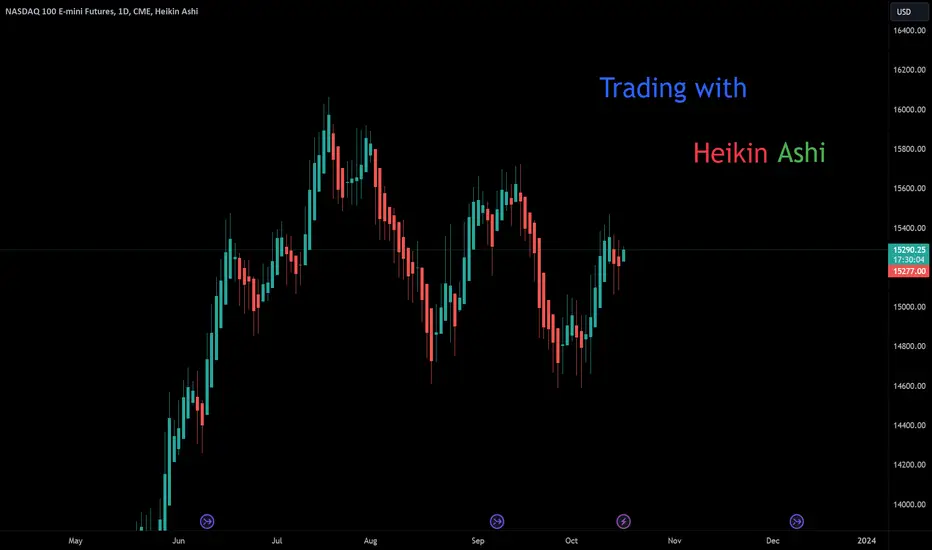
Live stream - 10/15/2023 pm - Stocks & Crypto TA - Trading & Inv10/15/2023, 03:30PM EST Livestream.
Stocks, Crypto, Indexes, Commodities, Forex, TA Charts, Requests.
Technical Analysis & Educational Charts livestream.
All content is Not financial advice.

TradingView Masterclass: How To Use Drawing ToolsWe continue with our Masterclass series, which we created to teach people how to get started with charting, research, and analysis. In this lesson, you’ll learn all about the Drawing Panel located on the left side of your chart. Let’s get started!
Drawing tools 🎨
There are eight categories in the drawing tool section: Cursors, Trend line tools, Fibonacci tools, Patterns, Forecasting and measurement tools, Geometric shapes, Annotation tools, and Icons. In addition, just below these categories, there are handy features that augment and optimize your research in specific situations, such as zooming in/out, measuring, and a magnet tool for selecting specific price points. Let’s analyze each of these in detail:
- Cursors: Located at the very top corner of the drawing tool section, Cursors gives you the capability to change your mouse as you move around the chart. For example, we have other variations such as the dot cursor or the simplest of all, the arrow cursor. Finally, we have an eraser tool to remove objects from the chart by clicking on them.
- Trend lines: Trend lines can be used to identify and visualize the direction of a price trend, and are sometimes used for drawing support or resistance lines as well. In this section, you can also find trend channels and pitchforks.
- Gann and Fibonacci tools: These advanced tools are often used by technical analysts and quants to locate retracements, pullbacks, measured moves, and advanced price sequences. The Fibonacci tools include retracement, extension, fans, arcs, and more. The Gann tools include box, square, and fan.
- Patterns: In this section, you’ll find popular drawing tools for mapping our complex patterns that require several different points to be drawn such as Elliott waves, head and shoulders, and impulses.
- Forecasting and measurement tools: These invaluable tools are used to make projections either long or short, study specific stats such as time or price ranges, and also give you the capability to analyze volume with VWAP and volume profiles.
- Geometric shapes: These tools are where you can find the brush tool to freely draw on your chart, but it also goes deeper than that, as there are also important shapes whereby a trader can highlight important areas on the chart with a rectangle or arrow such as accumulation or historical rebound zones.
- Annotation tools: These can be used to write notes, reminders, prices, and journal entries. These are key tools for traders who want to track their progress over time and always have specific notes attached to the chart. It also includes the ability to insert X links and images from your computer.
- Icons: Need a little more color or character on your chart? This section gives you hundreds of emojis, icons, and stickers to add to your chart. Highlight an area, add more art to your chart or spice up your creativity.
Tip: Keyboard shortcuts 🔠
Did you know that you can use keyboard shortcuts for the most popular drawing tools? To find out the command, you need to open the drop-down menu of one of the 8 drawing tool categories and you will see the command on the right side of some tools. For example:
Alt + T = Trendline
Alt + F = Fib retracement
Alt + H = Horizontal line
Alt + V = Vertical line
Alt + I = Invert chart
Alt + W = Add current symbol to watchlist
If you're a Mac user, use ⌥ instead of Alt.
Measure and zoom 📏🔎
When you use the Measure tool (the ruler icon just below the 8 drawing tool category icons), you can see at a glance how much an asset has fallen or risen in numbers, percentages, bars and days. Combined with the Zoom tool (the magnifying glass with +/- icons), you can also focus on the most important areas of the chart. For both measuring and zooming, the procedure is the same: select the tool, click on the point where you want to start measuring or from where you want to zoom, and end with another click where you want to end. You can also use the "Shift" hotkey instead of the icon. To remove a measurement, simply click on the chart.
Magnet mode 🧲
Magnet mode is a wizard that helps you to bring the drawing tools closer to the nearest price bars that you hover over with the mouse. There are 2 modes: Weak magnet and Strong magnet. This tool allows traders to perfectly connect a drawing tool to a specific price point. The current values are OHLC, meaning when Magnet mode is turned on, all drawing tools will connect to the nearest open, high, low or close value. Want to draw support lines that always connect to a specific price? Use this tool.
Stay in drawing mode 🎨
If you are going to make several drawings on the chart at the same time, you may find it useful to activate this option (pencil + padlock icon), as it will allow you to make as many drawings as you want without deactivating the selected drawing tool. Remember that you must deactivate this option to return to normal mode.
Lock all drawing tools 🛑
Once the chart has been configured, if you do not want to make any further changes, you can lock everything that has been drawn with this option (padlock icon) so that you do not accidentally delete elements in the future.
Hide/Show drawings/indicators/positions & orders 👁🗨
This option allows you to toggle the visibility of the drawings, indicators, positions & orders or even all three to make comparisons with a blank chart. The keyboard shortcut is "Ctrl + Alt + H".
Drawing sync 🔄
This allows you to synchronize the drawings of the selected charts in the current layout or in all layouts (globally). You’ll surely want to test this feature as it’s perfect for those who perform multi-timeframe technical analysis and research across multiple charts or timeframes. For example, when this tool is turned on, if you draw on one chart, all of your drawings will appear on your other charts that have the same symbol.
Delete objects 🗑
With a single click, you can delete all drawings or indicators, or even both at the same time. There are also a few other options to remove specific things on your chart. Use this tool wisely and don’t accidentally delete everything!
Show favorite drawing tools toolbar ⭐
To set up the favorites toolbar, first, you must first go to one of the eight drawing categories and click on the gray star in one of the tools. When you click on it, it turns orange and the quick access toolbar for drawing tools is created. Once you have selected all your favorites, move the favorites toolbar around so that you can use it conveniently every time you want to draw something on the charts.
That’s a wrap! We hope you found this guide valuable. We'd love to hear about your favorite drawing tool, so please share your thoughts in the comments below. Additionally, if you have any feedback or suggestions, drop us a line.
- TradingView Team

Bitcoin Q3 OverviewKey Takeaways:
- Poor quarter over quarter price performance at -11.5%, but BTC it still outperforming most asset classes including gold, treasuries, commodities, cash, and REITs year to date
- US bid that drove Bitcoin up in H1 has fully diminished at the time of writing
- Volume, liquidity, volatility, and search trends all continue to decline
- Grayscale’s discount to NAV has closed from -48% to -16% throughout the year
- Percentage of Bitcoin held by long term holders has reached an all time high of over 76%
- Bitcoin native valuation still shows BTC is in lower bounds of value
- Active addresses slightly up while transfer volume (entity-adjusted) continues to decline
Following a strong H1 price performance for Bitcoin, Q3 showed to be lackluster for BTC, down 11.5% quarter over quarter.
However, in this great chart from NYDIG, we can see that throughout 2023 YTD Bitcoin has quietly outperformed most major asset classes including large cap growth, mid and small cap growth, US and European stocks, commodities, treasuries, gold, cash, emerging markets, and REITs.
One of the biggest drivers of Bitcoin’s performance in the first half of the year was the Bitcoin ETF applications that were filed by several well-known traditional financial institutions including Blackrock and Fidelity. These filings were followed with a strong bid for BTC during US trading hours. As shown below, this US trading hour premium that was quite noticeable in March, has since fully diminished.
This is also reflected by Bitcoin’s CME futures open interest declining, which is primarily traded by traditional hedge funds, family offices, etc. Open interest refers to the number of futures contracts outstanding.
Other measures of excitement in the Bitcoin market have also shown a decline, including Bitcoin’s trading volume across spot and futures, Bitcoin’s 3-month futures basis (difference between spot and 3 month futures contracts), and can even be reflected by measures as basic as google search trends. It is safe to say that the Bitcoin market is in a period of deep apathy.
One positive trend that we’ve seen throughout the year is the GBTC discount to net asset value closing in, reflecting increased sentiment around Grayscale’s likelihood of being able to convert their current closed end trust into a spot Bitcoin ETF. Throughout 2023 the GBTC discount has closed in from -48% to just -16%.
In terms of valuation, one of the metrics that we follow most closely is the MVRV ratio. This compares Bitcoin’s current marginal trading price to its realized price, which is the cost basis of the entire network based on on-chain data. The idea of the methodology is that whenever MVRV is high, market participants are sitting with a large amount of unrealized profit and are incentivized to realize some of that profit, while when going negative means that the market in aggregate is underwater by definition. While the market is no longer in deep undervalued territory as it was at the end of last year, it is still far from overheated levels reached during the peak of 2017 and 2021.
Whether Bitcoin’s cyclicality is driven by halvings, macro forces, general behavior dynamics, or a combination of all three is up for debate; but when comparing this current cycle’s performance from its lows relative to Bitcoin’s three prior cycles, things appear to be playing out quite similarly from a time perspective.
Meanwhile, flipping over to network activity, we can see that the percentage of Bitcoin’s supply held by long term holders has reached an all time high at over 76%. This means that more than 3 out of every 4 BTC it held by long term holders. For reference, long term holders are defined as on-chain entities that have held their Bitcoin for more than 155 days, a threshold where on-chain data scientists have found the likelihood of coins being spent drops off the most significantly. This reflects the deep belief of Bitcoin’s core holder base despite crypto market wide contagion and macro uncertainty, as well as the rise of custody products.
When plotting out the amount of Bitcoin supply held by long term holders relative to short term holders, we can see the impulses that shape Bitcoin’s multi-year market cycles, as savvy investors accumulate throughout the bear market and distribute into the bull.
Another positive trend underneath the hood is the amount of Bitcoin held by on-chain entities with less than 10 Bitcoin, which not only trends up and to the right throughout Bitcoin’s entire history, has seen a large rise over the trailing year, with this quarter being no different. This is a positive trend that we’d like to see continue for the sake of Bitcoin’s supply distribution.
This quarter Bitcoin’s block height breached 800,000, a milestone reflecting that the decentralized network has continued to function as intended for well over a decade.
Bitcoin's hash rate has also set new all time highs this quarter, but with the halving on the horizon, increased competition may spell troubles for miners without competitive energy costs.
Active addresses saw a jump from 950,000 to just over 1,000,000 throughout Q3.
Meanwhile, the 7 day moving average of Glassnode’s entity-adjusted transfer volume continues to slump, down to just over $3.1 billion settled by the Bitcoin network a day.
Although still down from its July highs, Bitcoin’s public lightning network capacity jumped in Bitcoin terms throughout the last few weeks, currently sitting at 5,200 BTC. It is worth noting that this is just public lightning network capacity, and true figures may look different.
The USD denominated version of lightning network capacity offers a less favorable look, down to $140 million from its late 2021 peak of $215 million.
For the full report including all charts, click here .
Disclaimer: This research report is exactly that — a research report. It is not intended to serve as financial advice, nor should you blindly assume that any of the information is accurate without confirming through your own research. Bitcoin, cryptocurrencies, and other digital assets are incredibly risky and nothing in this report should be considered an endorsement to buy or sell any asset. Never invest more than you are willing to lose and understand the risk that you are taking. Do your own research. All information in this report is for educational purposes only and should not be the basis for any investment decisions that you make.

When You Should NOT Trade! 11 Reasons to Take a Step BackYou have two choices each day you open your trading platform.
To trade or not to trade.
There are circumstances that will rise where you won’t trade for that day. Then there are times where you should NOT trade at all. And then there are situations where you need to avoid trading.
You know when to trade. Now here are a couple of 11 reasons to take a step back with trading.
After a bunch of knocks
After you take a couple of losses, it might feel natural to want to jump right back in.
You don’t want to lose.
You want to recoup your losses.
You want to ride the prominent trend.
You have to learn to resist this temptation. Whether you buy or sell, if the market is in a bad state or environment – you’re likely to lose your positions.
So take a step back and come back tomorrow.
The peril of revenge and impulse trading tendencies
I’ve told you many times.
Any occurrence where you are NOT following your proven strategy is deadly.
Revenge and impulse trading (to try and make up for any losses) is a dangerous path.
Not only for the day.
But it scars and sets a precedent for you to do it in the future.
In the medium term, it’s a surefire way to harm your portfolio.
Learn to recognize and control these tendencies.
Rather take a step back and come back, the next day, with a more rational and logical approach.
The absence of clear setups
If you don’t have any high probability trades that have lined up, forget trying to take a trade.
This is like sailing with a destination in mind without a compass.
Trades will come. The markets will always be there for you tomorrow.
So wait them out…
Emotional instability
Emotions when trading are a dangerous trait to have.
Anxiety, excitement, ego, fear, greed or distress can cloud your judgment.
If you’re emotionally unstable, you need to take a step back and learn to control your emotions.
Drop your risk, ‘till you no longer feel a loser or winner.
Continue backtesting until you regain your confidence.
Refrain from trading until you learn to balance your emotions.
Can’t afford it – forget it!
If the funds you’re using for trading are essential for your survival or well-being, this is a red flag.
You are going to be highly dependent and emotionally attached to your funds.
I say it over and over…
Do not trade with money you can’t afford to lose.
It creates an unhealthy pressure that can influence your trading decisions.
Don’t know it – Don’t trade it.
If you lack a solid understanding of markets, methods or money management – you’re not ready to trade.
You need to understand the above along with the market dynamics, the costs and process of instruments and how your trading and charting platform works.
Education is key here. Learn, learn, learn.
When you have less questions and more answers, then it might be a better time to take the trade.
Low probability setups
When the market is moving nowhere slowly.
Or the markets are moving wildly with high volatility – this might be a time to not trade.
The risk and uncertainty of the market is high.
And this will result in only low probability trade setups lining up.
If you really want to trade them, because you have nothing better to do – fine.
But at least risk LESS.
Risk between 0.5% to 1% of your portfolio instead of the full 2%.
When exhausted, ill or mentally unstable
Physical well-being also plays an important role.
Your mental state affects your trading performance.
If you’re not in the right mindset, consider taking a break.
Avoid trading if you’re not feeling well, exhausted, angry, or you’re feeling unstable.
Get your mind right, recover and see the markets with healthier and happier eyes.
That made sense to me :/
No clear setup
Sometimes, you might analyse the markets.
And you’ll see nothing.
Then, you’ll re-analyse and look EXTRA carefully.
You’ll look and look and look until, somehow a trade presents itself.
I’m telling you now, this is a dangerous time to take the trade.
A trade should stick out like a sore thumb (according to your strategy).
If it doesn’t, then you’re trying to see something that most likely is NOT There.
Trade based on sound, proven and strong analyses, not via imagination and hope.
During major economic announcements
This point is more related and significant to Forex traders.
If you see a high impact economic announcement, report, meeting etc…
It might be a good idea to take a step back, and skip trading for the day.
I’m talking about NFP, Unemployment, GDP, FOMC, Interest and Inflation rates etc…
Without a trading plan
A well-crafted trading plan is your roadmap.
It’s your game-plan to make a probability prediction on a potential outcome.
You need to eat, breath, shower and sleep with your trading strategy.
If you don’t have one, don’t trade until you develop a plan and are ready to stick to it.
Right so, now you now when to take a step back and NOT trade.
I’ll sum them up here for you…
After a bunch of knocks
The peril of revenge and impulse trading tendencies
The absence of clear setups
Emotional instability
Can’t afford it – forget it!
Don’t know it – Don’t trade it.
Low probability setups
When exhausted, ill or mentally unstable
No clear setup
During major economic announcements
Without a trading plan

BUILDING A CHART "BRICK BY BRICK"What is it Renko?
Renko charts were invented in Japan, just like regular candlesticks, many years ago and they are called Renga, which means "brick". They display charts symmetrically and are effective for identifying major trends and structural support and resistance levels. Renko charts are very well suited for trend trading as they are visually appealing, making it easy to screen out noise and highlight trends easily.
Renko charts show a trend in a way that bars and candlesticks charts cannot. They are able to filter out the noise and create the sameness underlying the trend. In order to understand what a Renko is, let's remember what candlesticks show on our charts? They are the fluctuations in the price of a particular currency pair over a certain period of time: price and time.
The main difference is that Renko charts show only the change in price, neither trading volumes nor time intervals are taken into account in their development. The principle of building Renko bricks is based, as already mentioned, only on price fluctuations. In order for the chart to be displayed correctly, first of all, it is necessary to set the size of one brick. For example, many traders use a simple rule: 1 brick equals 10 pips. In other words, for a new brick/block to appear on the chart, the price must change by at least 10 points.
Candlestick chart:
Renko bars:
This is the feature of the Renko chart: it is extremely smooth and clear. All blocks have the same size. At the same time, if the price has changed by only a few points, it will not be displayed on the chart.
There are two types of brick size assignment methods: traditional and ATR-based. It measures the volatility of the asset, i.e. the values will be different at different periods of the trading period and on different time intervals. If you use this method, the value of the Renko bar should be equal to the ATR value.
Main Advantages and Disadvantages
Like any other graphical display of price changes, Renko has its pros and cons.
Advantages of Renko:
• This principle of construction allows to eliminate almost all noise from the chart as mentioned above.
• Renko shows itself perfectly in work with most indicators. Let's remember the main problem of some popular indicators - they output data with some delay (information is substituted into the formula only after the candle is closed). And since Renko is not tied to time, the indicator displays more real information as a result.
• Renko indicators show themselves perfectly in intraday trading. The trader does not need to wait for the candle to close.
The Main Disadvantages of Renko are as Follows:
• The chart does not work with most volume indicators.
• A new brick is built only when the trend increases/decreases by a certain number of points (which is equal to the size of one block). That is, the chart can remain unchanged for a long time if the market is consolidating.
• Renko chart does not show consolidation and impulse moves as seen on regular charts.
• In order to be aware of the likely measurement of trend direction, it is necessary to constantly monitor the market with other charts.
Examples
We will use a simple strategy based on the moving average with a period of 20 on the 15 minute timeframe. The sell and buy signal will be pinbar. Enter the trade when the pinbar is created near the moving average. Of course you can create your own strategy. You just need to spend some time with the chart and you will know if it will work for you or not.
EURAUD
USDJPY
GBPUSD (Sometimes Renko chart gives really beautiful and clear signals.)
Conclusion
Renko charts are quite convenient and practical because they display symmetrical candles and are effective for identifying major trends, support and resistance levels by filtering out noise. They can also be used in combination with other indicators to improve trading results. Renko charts allow you to identify various reversal patterns and see price structures in the market. However, they are mainly suitable for intraday trading.

Introduction to Relative Strength or Ratio 1-2In part one (linked) we discussed how to construct and use relative strength ratios (RS) in trading and analysis. We also discussed common errors and best use. In part two we finish that general discussion. In part three we will analyze consumer staples verses consumers discretionary and begin to discuss other ratios that I find useful.
How do spreads correct? One mistake is assuming that a spread will always be corrected by the rich security moving lower to meet the cheaper security. In actuality there are multiple ways a spread can correct. For instance, the rich market corrects lower relative to the cheaper market, the rich market declines while the cheap market rises, or the rich market remains relatively fixed while the cheap market rallies. And remember, this is all done within the context of the broader market trend.
This isn't particularly important when using spreads as informative to the business or market cycle (as I do). But if you are trading pairs (which outside of rates markets, I don't) the legs should generally be market neutral or directionally ambivalent. Along this same line, if the dollar value of the two legs is vastly different, the share counts must be adjusted to close to money neutral or the disproportionally large side of the trade will dominate.
This can also be an issue when the notional amounts of the two instruments are very different. For instance, two-year futures verses ten-year futures. Twos represent 200k notional while tens represent 100k notional. They also have far different sensitivities (duration) to a given change in rates. It should also be recognized that some sectors or ETFs are dominated by one or two very large names that skew directionality in favor of those few names. Looking for ETFs comprised of equally weighted components will mostly eliminate this issue. For instance equal weighted consumer staples (RSPS) verses equal weighted consumer discretionary (RSPD).
It's extremely important that you know what you are measuring. A good example is the change in the ratio between investment grade bonds (LQD) and high yield bonds (HYG). A quick glance at the chart might suggest that High Yield is weakening relative to Investment Grade. The easy conclusion would be that fundamentals in the high yield sector were deteriorating and investors were exiting HYG. While fundamentals are modestly deteriorating in HYG more quickly than in LQD, the dominant driver is the difference in duration between the two sectors. This can be seen when running the ratio between ten year and three-year treasuries and comparing it to LQD/HYG.
Many analysts smooth the RS line with moving averages. This is particularly useful when adjusting for the higher volatility of shorter time frames. This isn't my preference. First, I prefer to use longer periods (particularly weekly) in my analysis. Second, while averages are useful, they aren't an essential part of my own analysis toolkit. But there is value and moving averages can be used on spreads just as they are used on the underlying securities.
Finally, ratios can provide tremendous insight into economy and market cycles, for instance when, after a long RS decline, copper begins to strengthen relative to gold, the industrial economy may be entering the early stage of recovery. Or when consumer staples RS inflects higher relative to consumer discretionary it's likely that the outlook for the consumer, and by extrapolation the economy, is weakening. In future parts we will discuss and illustrate several of these ratios.
And finally, many of the topics and techniques discussed in this post are part of the CMT Associations Chartered Market Technician’s curriculum.
Good Trading:
Stewart Taylor, CMT
Chartered Market Technician
Taylor Financial Communications
Shared content and posted charts are intended to be used for informational and educational purposes only. The CMT Association does not offer, and this information shall not be understood or construed as, financial advice or investment recommendations. The information provided is not a substitute for advice from an investment professional. The CMT Association does not accept liability for any financial loss or damage our audience may incur.
