Forex Market Depth Analysis and Trading StrategiesForex Market Depth Analysis and Trading Strategies
Forex market depth analysis offers traders a deeper understanding of currency market dynamics. It reveals the real-time volume of buy and sell orders at different prices, which is crucial for assessing liquidity and trader sentiment. This article explores how to analyse and use market depth for trading, discussing various strategies and their limitations.
Forex Market Depth Explained
Market depth meaning is the volume of buy and sell orders at different price levels. It's a real-time snapshot of the pair’s liquidity and depth of supply (sell orders) and demand (buy orders). Traders use this information to gauge the strength and direction of a currency pair.
This depth is typically represented through an order book, displaying a currency pair’s existing orders at various price points. This book lists the number of units being bid or offered at each point, giving us insight into potential support and resistance levels. For instance, a large number of buy orders at a certain price level may indicate a strong support area, suggesting that many traders are willing to purchase the currency pair at this price.
Understanding market depth is crucial in assessing the likelihood of trades being executed at desired prices, especially in fast-moving currencies or when trading large volumes. It may help in identifying short-term price movements, offering a more nuanced view of an asset beyond just candlestick charts.
How to Analyse Market Depth
Analysing order flow is a fundamental aspect of market depth trading, providing traders with valuable insights into the supply and demand dynamics of forex pairs. Forex market depth can be assessed using various tools and indicators.
One key tool is the Depth of Market (DOM), which shows the number of buy and sell orders pending at different prices. DOM offers a visual representation of the currency pair’s order book, highlighting potential areas where large orders are placed. We can use such information to identify significant support and resistance levels where the pair might experience a turnaround.
Another essential tool is Level II quotes. These quotes provide detailed information about the price, volume, and direction of every trade executed in real-time. By analysing Level II quotes, traders may be able to identify the pair’s momentum and potential trend shifts. For example, if there is a sudden increase in sell orders at a particular price, it may indicate a potential downward movement, prompting us to adjust our positions accordingly.
Strategies Using Market Depth Analysis
In forex trading, market depth analysis is a crucial tool for understanding and executing a depth of market strategy. Here's how traders can leverage this type of analysis in their strategies:
Scalping Strategy
By closely observing the DOM, scalpers can identify minor price movements and liquidity gaps. For instance, if the DOM shows a large number of sell orders at a slightly higher price, a scalper might open a short position, anticipating a quick downturn. This strategy relies on fast, short-term trades, capitalising on small price changes.
Momentum Trading
Momentum traders use the order book to gauge the strength of a trend. By analysing the order flow and volume, they can determine if a trend is likely to continue or reverse. For example, a surge in buy orders at increasing prices may signal a strong upward momentum, prompting a trader to enter a long position. Conversely, a build-up of sell orders might indicate a potential downward trend.
Support and Resistance Trading
Depth analysis is invaluable for identifying key support and resistance levels. Clusters of orders often act as barriers, influencing price movements. Traders may use these levels to set entry and exit points. For example, a large number of buy orders at a specific price may indicate a strong support zone, reflecting a potentially good entry point for a long position.
Breakout Trading
Traders seeking breakout opportunities can use market depth to spot potential breakout points. A significant accumulation of orders just beyond a known resistance or support level may indicate a potential breakout. If the pair moves past these areas with high volume, it could signal the start of a new trend, potentially offering a lucrative trading opportunity.
Integrating Market Depth with Technical Analysis
Integrating a depth chart trading strategy with technical analysis may enhance decision-making, combining the real-time insights of depth charts with the power of technical indicators. For instance, we can use market depth to confirm signals from technical analysis tools.
If a moving average crossover suggests a bullish trend, a corresponding increase in buy orders in the depth chart may reinforce the signal. Similarly, a significant resistance level identified through technical analysis, such as a Fibonacci retracement level, might be substantiated if there’s a large accumulation of sell orders at that price point.
Risks and Limitations of Market Depth Analysis
While market depth analysis is a valuable tool in forex trading, it comes with certain risks and limitations:
- Dynamic and Fast-Changing Data: Order book data is highly dynamic, often changing within seconds, making it challenging to base long-term strategies solely on such information.
- Lack of Centralisation in Forex: Unlike stock exchanges, the forex market lacks a centralised exchange. This decentralisation means depth data might not represent the entire marketplace accurately.
- Susceptibility to 'Spoofing': Large players might place and quickly withdraw large orders to manipulate market depth perception, misleading other traders. It’s worth noting that spoofing is illegal in many jurisdictions.
- Limited Usefulness in Highly Liquid Markets: In highly liquid pairs, the depth of market data may become less relevant, as large orders are quickly absorbed without significantly impacting prices.
- Dependency on Broker's Data: The reliability of order book data depends on the broker's technology and the size of their client base, which can vary widely.
The Bottom Line
Market depth analysis provides critical insights for forex traders, though it's vital to recognise its dynamic nature and limitations. Integrating it with technical analysis may create robust trading strategies.
This article represents the opinion of the Companies operating under the FXOpen brand only. It is not to be construed as an offer, solicitation, or recommendation with respect to products and services provided by the Companies operating under the FXOpen brand, nor is it to be considered financial advice.
Forextrading

Direct Access Trading SystemsDirect Access Trading Systems
Direct access trading systems (DATS) offer traders a direct line to financial markets. By bypassing traditional brokerage routes, DATS enable swift, precise trading, essential for strategies reliant on speed and accuracy. This FXOpen article delves into the workings, benefits, and considerations of DATS, providing valuable insights for both seasoned and aspiring traders navigating the fast-paced world of modern trading.
Understanding Direct Access Trading Systems
Direct access trading systems (DATS) revolutionise how traders interact with financial markets, typically in the realm of stock trading. Unlike traditional brokerage platforms, these systems offer direct market access trading, a method allowing traders to place orders directly into the market's electronic order book. Such immediate access is crucial for those who require precision and speed in their trading decisions.
Traditionally, orders placed through brokers are processed internally before reaching the market, potentially causing delays. However, brokers with direct market access provide a conduit for traders to bypass these intermediate steps. These systems typically appeal to day traders and other short-term investors who value the ability to respond swiftly to market movements.
Usually, direct access brokers list Level 2 quotes, where bid and ask prices alongside order sizes are given for the asset, providing an additional layer of valuable information. By offering a more direct link to financial markets, these systems may provide an enhanced trading experience that aligns with the needs of active traders.
Selecting the best direct access broker for day trading involves considering several key factors. Traders look for platforms that offer high reliability and uptime, as any downtime can significantly impact outcomes. Speed of order execution is crucial in capturing market opportunities. Additionally, traders assess the fee and commission structure to ensure it aligns with their trading volume and strategy.
How Direct Access Trading Systems Work
DATS offer a sophisticated network that connects traders directly to financial markets. These systems use specialised software platforms, helping traders make efficient and swift operations:
- Order Entry: Traders use the DATS platform to enter their orders. These platforms are equipped with various order types, such as market, limit, or stop orders, giving traders flexibility in how they execute trades.
- Order Routing: After order placement, DATS route these orders directly to the market instead of through a broker. The process often involves Electronic Communication Networks (ECNs), which play a critical role. ECNs are automated systems that match buy and sell orders for assets, eliminating the need for intermediaries like traditional stock exchanges. They also provide a venue for trading outside traditional hours, offering greater liquidity and potential efficiency.
- Execution: Orders are executed via these ECNs or other market venues. The rapid execution capability is a defining feature of DATS, enabling traders to capitalise on fleeting market opportunities.
- Feedback and Reporting: Following execution, the system promptly provides feedback. Traders receive immediate trade confirmations, including execution price and time, essential in maintaining transparency and control over trading activities.
Through this streamlined process, DATS offer a high-efficiency trading environment. Such a setup is particularly advantageous for strategies that require quick decision-making and execution, such as day trading or scalping.
Advantages of Direct Access Trading Systems
DATS offer several compelling advantages over traditional brokerage platforms, particularly for those who engage in frequent trading. These benefits cater to the needs of active traders seeking efficiency and control in their strategies.
- Speed of Execution: DATS enable traders to execute orders almost instantaneously. Rapid processing is crucial in fast-paced markets where prices can fluctuate within seconds.
- Enhanced Control: Traders have greater control over their orders, including the timing, price, and order type. This level of control is especially crucial in volatile market conditions.
- Access to Real-Time Market Data: DATS provide real-time data, allowing traders to make informed decisions based on the latest market movements.
- Lower Transaction Costs: By eliminating the middleman, DATS often result in lower transaction costs, a significant advantage for high-volume traders.
- Customisation and Flexibility: Many direct access trading platforms come with advanced charting and analysis tools. These tools can be customised to fit individual strategies and preferences.
- Direct Market Interaction: Traders can interact directly with market liquidity providers, potentially leading to better pricing and execution quality.
Risks and Considerations
While these systems offer several advantages, they also come with inherent risks and considerations:
- Increased Complexity: DATS are typically more complex than traditional brokerage platforms. They require a sophisticated understanding of market dynamics and trading strategies, making them better suited for experienced traders. The complexity also extends to the technological infrastructure needed to use these systems, which may involve higher setup and maintenance costs.
- Higher Costs: Using DATS may be more expensive than traditional online brokers. The costs go beyond technology requirements; for example, the price of direct access trading systems and the commissions for trades can be higher. This aspect makes it vital for traders to evaluate the cost-benefit ratio of using DATS compared to other trading methods.
- Stricter Trading Rules: Direct market access often comes with more stringent rules. This could include tighter regulations around repeat dealing, deal rejections if trading outside normal market sizes, and potential penalty fees for inactive accounts.
The Bottom Line
In summary, direct access trading systems may enhance efficiency, offering speed, control, and direct market insights. However, they require a careful approach due to their complexity and cost.
This article represents the opinion of the Companies operating under the FXOpen brand only. It is not to be construed as an offer, solicitation, or recommendation with respect to products and services provided by the Companies operating under the FXOpen brand, nor is it to be considered financial advice.

Quantitative Trading Models in Forex: A Deep DiveQuantitative Trading Models in Forex: A Deep Dive
Quantitative trading in forex harnesses advanced algorithms and statistical models to decode market dynamics, offering traders a sophisticated approach to currency trading. This article delves into the various quantitative trading models, their implementation, and their challenges, providing insights for traders looking to navigate the forex market with a data-driven approach.
Understanding Quantitative Trading in Forex
Quantitative trading, also known as quant trading, in the forex market involves using sophisticated quantitative trading systems that leverage complex mathematical and statistical methods to analyse market data and execute trades. These systems are designed to identify patterns, trends, and potential opportunities in currency movements that might be invisible to the naked eye.
At the heart of these systems are quantitative trading strategies and models, which are algorithmic procedures developed to determine market behaviour and make informed decisions. These strategies incorporate a variety of approaches, from historical data analysis to predictive modelling, which should ensure a comprehensive assessment of market dynamics. Notably, in quantitative trading, Python and similar data-oriented programming languages are often used to build models.
In essence, quantitative systems help decipher the intricate relationships between different currency pairs, economic indicators, and global events, potentially enabling traders to execute trades with higher precision and efficiency.
Key Types of Quantitative Models
Quantitative trading, spanning diverse markets such as forex, stocks, and cryptocurrencies*, utilises complex quantitative trading algorithms to make informed decisions. While it's prominently applied in quantitative stock trading, its principles and models are particularly significant in the forex market. These models are underpinned by quantitative analysis, derivative modelling, and trading strategies, which involve mathematical analysis of market movements and risk assessment to potentially optimise trading outcomes.
Trend Following Models
Trend-following systems are designed to identify and capitalise on market trends. Using historical price data, they may determine the direction and strength of market movements, helping traders to align themselves with the prevailing upward or downward trend. Indicators like the Average Directional Index or Parabolic SAR can assist in developing trend-following models.
Mean Reversion Models
Operating on the principle that prices eventually move back towards their mean or average, mean reversion systems look for overextended price movements in the forex market. Traders use mean reversion strategies to determine when a currency pair is likely to revert to its historical average.
High-Frequency Trading (HFT) Models
Involving the execution of a large number of orders at breakneck speeds, HFT models are used to capitalise on tiny price movements. They’re less about determining market direction and more about exploiting market inefficiencies at micro-level time frames.
Sentiment Analysis Models
These models analyse market sentiment data, such as news headlines, social media buzz, and economic reports, to gauge the market's mood. This information can be pivotal in defining short-term movements in the forex market, though this model is becoming increasingly popular for quantitative trading in crypto*.
Machine Learning Models
These systems continuously learn and adapt to new market data by incorporating AI and machine learning, identifying complex patterns and relationships that might elude traditional models. They are particularly adept at processing large volumes of data and making predictive analyses.
Hypothesis-Based Models
These models test specific hypotheses about market behaviour. For example, a theory might posit that certain economic indicators lead to predictable responses in currency markets. They’re then backtested and refined based on historical data to validate or refute the hypotheses.
Each model offers a unique lens through which forex traders can analyse the market, offering diverse approaches to tackle the complexities of currency trading.
Quantitative vs Algorithmic Trading
While quant and algorithmic trading are often used interchangeably and do overlap, there are notable differences between the two approaches.
Algorithmic Trading
Focus: Emphasises automating processes, often using technical indicators for decision-making.
Methodology: Relies on predefined rules based on historical data, often without the depth of quantitative analysis.
Execution: Prioritises automated execution of trades, often at high speed.
Application: Used widely for efficiency in executing repetitive, rule-based tasks.
Quantitative Trading
Focus: Utilises advanced mathematical and statistical models to determine market movements.
Methodology: Involves complex computations and data analysis and often incorporates economic theories.
Execution: May or may not automate trade execution; focuses on strategy formulation.
Application: Common in risk management and strategic trade planning.
Implementation and Challenges
Implementing quantitative models in forex begins with the development of a robust strategy involving the selection of appropriate models and algorithms. This phase includes rigorous backtesting against historical data to validate their effectiveness. Following this, traders often engage in forward testing in live market conditions to evaluate real-world performance.
Challenges in this realm are multifaceted. Key among them is the quality and relevance of the data used. Models can be rendered ineffective if based on inaccurate or outdated data. Overfitting remains a significant concern, where systems too closely tailored to historical data may fail to adapt to evolving market dynamics. Another challenge is the constant need to monitor and update models to keep pace with market changes, requiring a blend of technical expertise and market acumen.
The Bottom Line
In this deep dive into quantitative trading in forex, we've uncovered the potency of diverse models, each tailored to navigate the complex currency markets with precision. These strategies, rooted in data-driven analysis, may offer traders an edge in decision-making.
*Important: At FXOpen UK, Cryptocurrency trading via CFDs is only available to our Professional clients. They are not available for trading by Retail clients. To find out more information about how this may affect you, please get in touch with our team.
This article represents the opinion of the Companies operating under the FXOpen brand only. It is not to be construed as an offer, solicitation, or recommendation with respect to products and services provided by the Companies operating under the FXOpen brand, nor is it to be considered financial advice.

What Is a Change of Character (CHoCH) and How Can You Trade It?What Is a Change of Character (CHoCH) and How Can You Trade It?
Navigating the nuances of Smart Money Concept (SMC) trading requires a keen understanding of market signals like the Change of Character (CHoCH). This concept can help traders detect and react to potential trend reversals. Today, we’ll delve into the mechanics of CHoCHs, explaining how they manifest in different market conditions and how they can be strategically leveraged for trading decisions.
Understanding Breaks of Structure
Understanding Breaks of Structure (BOS) is essential for traders before delving into concepts like Change of Character (CHoCH). A BOS in trading signifies a continuation within the current trend and is marked by a clear deviation from established swing points that indicate previous highs and lows.
In the context of an uptrend, a BOS is identified when the price exceeds a previous high without moving below the most recent higher low. This action confirms that the upward momentum is still strong and likely to continue as buyers push the market to new heights.
Similarly, in a downtrend, a BOS occurs when prices drop below a previous low without breaking the prior lower high, suggesting that sellers remain in control and the downward trend is set to persist.
By recognising these points where the market extends beyond its former bounds, traders can confirm that the current trend is robust and act accordingly. This foundational concept of BOS not only helps in assessing trend strength but also sets the stage for understanding more complex patterns like CHoCH, where the focus shifts from trend continuation to potential trend reversals.
CHoCH Trading Meaning
In trading, a Change of Character (CHoCH) signals a potential shift in market dynamics, often indicating a reversal from the prevailing trend. This concept is particularly valuable as it helps traders discern when the momentum is shifting, offering a strategic point to consider adjusting their positions.
A CHoCH occurs when there's a noticeable deviation in the market's price trend. For example, in a bullish trend characterised by a series of higher highs and higher lows, a CHoCH is indicated by the price failing to set a new high and subsequently falling below a recent higher low. This suggests that buyers are losing control, and a bearish trend could be emerging.
Similarly, during a bearish trend marked by lower highs and lower lows, a bullish CHoCH would occur if the price unexpectedly breaks above a recent lower high. This break indicates that sellers are losing their grip, and a bullish trend may be starting.
The Significance of CHoCHs Across Timeframes
The fractal nature of financial markets means that patterns and behaviours recur across various timeframes, each providing unique insights and implications for trading. Understanding CHoCHs in different timeframes is crucial for traders to effectively align their strategies with both short-term opportunities and long-term trend shifts.
In intraday trading, where decisions are made on lower timeframes (like minutes or hours), a CHoCH can signal a possible short-term trend reversal. For example, if a currency pair in a downtrend on a 15-minute chart suddenly posts a higher high, this could indicate a weakening of the bearish momentum, suggesting a potential bullish reversal.
Traders might use this information to close short positions or to consider a long position, capitalising on the emerging upward trend. These short-term CHoCHs allow traders to respond quickly to market changes, potentially securing returns before larger market shifts occur.
Conversely, CHoCHs observed on higher timeframes, such as daily or weekly charts, are particularly significant because they can indicate a shift in the broader market trend that might last days, weeks, or even months. Such changes can then be used by both long and short-term traders to adjust their positioning and directional bias.
How to Identify a CHoCH
The initial step to identify a CHoCH in trading involves clearly defining the existing trend on a specific timeframe. This is done by marking the significant swing highs and lows that delineate the trend's progress. These points should represent somewhat meaningful retracements in the price, providing clear markers of trend continuity or potential reversal points.
According to the Smart Money Concept (SMC) theory, the integrity of an uptrend is maintained as long as the price does not trade through the most recent significant higher low. Conversely, a downtrend is considered intact if the price does not surpass the most recent significant lower high. Therefore, traders focus their attention on these critical points.
To identify a CHoCH, traders watch for a break in these crucial high or low points. For instance, in an uptrend, a bearish CHoCH is indicated when the price achieves a higher high but then reverses to descend below the previous significant higher low.
Similarly, in a downtrend, a bullish CHoCH occurs when the price drops to a lower low before reversing to break above the previous significant lower high, setting a new high. Both types of breaks signal a potential reversal in the trend direction.
How to Trade a CHoCH
When trading a CHoCH, it’s essential to recognise that it should be integrated with other aspects of the SMC framework to get the best results. This includes the use of order blocks and imbalances, which are key components in identifying potential reversals.
Order Blocks and Imbalances
An order block is essentially a substantial consolidation area where significant buying or selling has occurred, and prices often revisit these zones before reversing. These blocks can be seen as levels where institutional orders were previously concentrated.
An imbalance, also known as a fair value gap, occurs when the price moves sharply up or down, leaving a zone that has not been traded extensively. Price often returns to these gaps to 'fill' them, establishing equilibrium before a potential reversal happens.
In practice, traders can look for a sequence where the price first approaches an order block and begins to fill any existing imbalances. This setup increases confidence in a potential reversal. As the price meets these criteria and a CHoCH occurs, this indicates that the influence of the order block is likely to initiate a price reversal.
Practical Example on GBP/USD
Consider the 4-hour chart of the GBP/USD pair above. We see the pair encounter an order block on the left, one that’s visible on the daily chart. As the price interacts with this block, it begins to retrace, attempting to fill the imbalance but moves away. Eventually, the price completes the fill of the imbalance and meets the previously established order block.
Switching to a 1-hour timeframe, this scenario unfolds similarly. After reaching the order block on the 4-hour chart, another CHoCH occurs, signalling the start of a new uptrend. This lower timeframe CHoCH, following the meeting of the order block, corroborates the potential for a reversal initiated by the higher timeframe dynamics.
This example illustrates how CHoCHs can be effectively utilised across different timeframes, tying back to the fractal nature of markets discussed earlier. By recognising these patterns and understanding their interaction with order blocks and imbalances, traders can strategically position themselves to capitalise on potential market reversals, aligning their trades with deeper market forces at play.
CHoCH vs Market Structure Shift
A Market Structure Shift (MSS) is a specific type of Change of Character that includes additional signals suggesting a potential trend reversal. Unlike a straightforward CHoCH that typically indicates a trend is shifting but may also be a false break, an MSS can be seen as a higher confluence CHoCH. An MSS occurs after the market first makes a key movement contrary to the established trend—forming a lower high in an uptrend or a higher low in a downtrend—without plotting a higher high or lower low.
Following these preliminary signals, an MSS is confirmed when there is a decisive break through a significant swing point accompanied by a strong displacement (i.e. impulse) move, creating a CHoCH in the process. This sequence not only reflects that the prevailing trend has paused but also that a new trend in the opposite direction is establishing itself.
Due to these additional confirmations, an MSS can offer added confirmation for traders, indicating a stronger likelihood that a new, sustainable trend has begun. This makes the MSS particularly valuable for traders looking for more substantiated signals in their trading strategy.
The Bottom Line
The concept of a CHoCH is instrumental in navigating the complexities of SMC trading. By identifying these crucial market signals, traders may align their strategies to capitalise on market movements efficiently.
FAQs
What Is CHoCH in Trading?
In trading, CHoCH is a technical observation that signifies a change in the trend's character, where the price movement breaks from its established pattern of highs and lows, suggesting a potential reversal or substantial shift in the market's direction.
What Is CHoCH in SMC Trading?
In Smart Money Concept (SMC) trading, a Change of Character (CHoCH) refers to a clear shift in market behaviour that indicates a potential reversal of the prevailing trend. This concept is used by traders to detect early signs of a momentum shift that might lead to significant changes in price direction, enabling strategic adjustments to their trading positions.
What Is a CHoCH in the Market Structure?
A CHoCH in market structure is identified when there is an observable deviation from established price patterns — specifically when new highs or lows contradict the current trend. It signifies that the previous market sentiment is weakening, and a new opposite trend may be starting, prompting traders to reassess their strategies.
How Do You Identify a CHoCH?
Identifying a CHoCH involves monitoring significant swing highs and lows for breaks that are contrary to the existing trend. For instance, in an uptrend, a CHoCH would be indicated by a failure to reach a new high followed by a drop below the recent higher low, suggesting a shift to a bearish outlook.
What Is ChoCH vs BOS in Trading?
While both CHoCH and Break of Structure (BOS) are critical in assessing market dynamics, they serve different purposes. CHoCH indicates a potential trend reversal by highlighting a significant change in the price pattern. In contrast, a BOS indicates a continuation of the current trend by showing the price surpassing previous significant highs or lows, reinforcing the ongoing direction.
This article represents the opinion of the Companies operating under the FXOpen brand only. It is not to be construed as an offer, solicitation, or recommendation with respect to products and services provided by the Companies operating under the FXOpen brand, nor is it to be considered financial advice.

Mitigation Block in Forex Trading: What It Is and How to Use It?What a Mitigation Block Is, and How You Can Use It When Trading Forex?
Understanding specific market mechanisms like mitigation blocks may enhance strategic decision-making. This article delves into the concept of mitigation blocks, detailing their definition, function, and practical application within forex.
Definition and Function of a Mitigation Block
A mitigation block in forex trading refers to a specific order block on a chart that indicates where previous movements have stalled and reversed, marking it as a potential area for future market turns. This concept within the Smart Money framework is crucial for traders looking to manage their positions by taking advantage of strategic entry and exit points.
The idea behind these areas is rooted in the dynamics of supply and demand within forex. When a currency pair reaches a level where buyers or sellers have previously entered the market in force, causing a reversal, it suggests a potential repeat of such actions when the price returns to the area.
Characteristics and How to Identify a Mitigation Block
Mitigation blocks can be bullish or bearish, each with distinct characteristics:
- Bearish Mitigation Block: This type forms during an uptrend and is identified by a significant peak followed by a decline and a failed attempt to reach or surpass the previous high, creating a lower high. When prices drop below the previous low, the order block above the low becomes mitigation. It may be characterised by an increase in selling volume as the price approaches the level, signalling resistance and a potential downward reversal.
- Bullish Mitigation Block: Conversely, a bullish type is established during a downtrend. It is characterised by a significant trough, followed by a rise to form a higher low, and a failure to drop below the previous low. As the pair moves up, the order block below the high marks mitigation one. This area often shows an increase in buying volume as the price approaches, indicating support and a potential upward reversal.
Mitigation Block vs Breaker Block
Mitigation and breaker blocks are both significant in identifying potential trend reversals in forex trading, but they have distinct characteristics that set them apart. A mitigation block forms after a failure swing, which occurs when the market attempts but fails to surpass a previous peak in an uptrend or a previous trough in a downtrend. The pattern indicates a loss of momentum and a potential reversal as the price fails to sustain its previous direction.
On the other hand, a breaker block is characterised by the formation of a new high or low before the market structure is broken, indicating that liquidity has been taken. This means that although the trend initially looked set to continue, it quickly reverses and breaks structure.
In effect, a breaker appears when the market takes liquidity beyond a swing point before reversing the trend. A mitigation appears when the price doesn’t move beyond the trend’s most recent high or low, instead plotting a lower high or higher low before reversing the trend.
How to Use Mitigation Blocks in Trading
Areas of mitigation in trading can be essential tools for identifying potential trend reversals and entry points. When they align with a trader's analysis that anticipates a reversal at a certain level, it can serve as a robust confirmation for entry.
Traders can effectively utilise these zones by simply placing a limit order within the area once it is considered valid. Validation occurs after a new peak or trough is established following the initial failure swing that forms the mitigation area.
If a liquidity void or fair-value gap is present, the trader may look for such a gap to be filled before their limit order is triggered, potentially offering a tighter entry. Stop losses might be placed beyond the failure swing or the most extreme point.
Furthermore, if a mitigation block is identified on a higher timeframe, traders can refine their entry by switching to a lower timeframe. This approach allows for a tighter entry point and potentially better risk management, as it offers more granular insight into the momentum around the area.
Common Mistakes and Limitations
While these blocks are valuable for forex trading, they come with potential pitfalls and limitations that traders should know.
- Overreliance: Relying solely on mitigation blocks without corroborating with other trading indicators can lead to misjudged entries and exits.
- Ignoring Context: Using these zones without considering the broader market conditions may result in trading against a prevailing strong trend.
- Misinterpretation: Incorrect identification can lead to erroneous trading decisions, especially for less experienced traders.
- False Signals: Mitigation blocks can sometimes appear to signal a reversal but instead lead to a continuation of the trend, trapping traders in unfavourable positions.
The Bottom Line
Understanding mitigation blocks offers traders a strategic edge in navigating the forex market. They can be vital for recognising potential price reversals and improving trading outcomes.
FAQs
What Is a Mitigation Block?
A mitigation block in forex trading is an order block that identifies potential reversal points. It signals where a currency pair has previously stalled, indicating strong buying or selling pressure, suggesting a potential for similar reactions in future encounters with these levels.
How Do You Identify a Mitigation Block?
Mitigation blocks are identified by analysing charts for areas where previous highs or lows were not surpassed, leading to a reversal. Traders look for a sequence of movements, including a swing high or low followed by a retracement that fails to exceed the previous swing.
What Is the Difference Between a Breaker Block and a Mitigation Block?
While both indicate potential reversals, a breaker block forms when the price makes a new high or low before reversing, suggesting a temporary continuation of the trend. In contrast, a mitigation block forms without creating a new extreme, indicating a direct loss of momentum and an immediate potential for reversal.
This article represents the opinion of the Companies operating under the FXOpen brand only. It is not to be construed as an offer, solicitation, or recommendation with respect to products and services provided by the Companies operating under the FXOpen brand, nor is it to be considered financial advice.

When and How to Use Weekly Time Frame in Gold Forex Trading
Ignoring weekly time frame chart analysis could cost you big losses in Forex, Gold trading!
Discover 3 specific cases when weekly time frame beats daily time frame analysis.
Learn the situations when weekly timeframe exposes what daily charts can’t, how to analyze it properly and when to check it.
1. Long-term historic levels
When the market trades in a strong bullish or bearish trend and goes beyond recent historic levels, quite often the daily time frame will not be sufficient for the identification of significant supports and resistances.
The proven way to identify the next meaningful levels will be to analyze a weekly time frame.
Examine a price action on EURAUD forex pair on a daily time frame chart. The market is trading in a strong bullish trend and just updated the high.
Checking the historic price action, we don't see any historic resistance on the left.
Switching to a weekly time frame chart, we can easily recognize a historic resistance that the price respected 5 years ago.
That's a perfect example when weekly t.f revealed a historic price action that a daily didn't.
2. Trend-lines
Weekly time frame analysis is important not only for a search of historic levels. It can help you find significant vertical structures - the trend lines.
We can easily find several meaningful historic resistances on EURUSD pair on a daily time frame.
Though, there are a lot of historic structures there, let's check if there are some hidden structures on a weekly.
Weekly time frame reveals 2 important trend lines, one being a vertical support and another being a vertical resistance.
With a daily time frame analysis, these trend lines would be missed .
3. More accurate breakout confirmations
Some false support and resistance breakouts that you see on a daily could be easily avoided with a weekly time frame analysis.
Quite regularly, a daily time frame support or resistance is in fact a weekly structure. And for its breakout, a weekly candle close will provide more accurate confirmation.
From a daily time frame perspective, we see a confirmed breakout - a daily candle close above a solid resistance zone.
It provides a strong bullish signal on AUDUSD forex pair.
However, the violation turned out to be false and dropped.
Such a false breakout , could be easily avoided, checking a weekly time frame chart.
The underlined resistance is in fact a weekly structure.
The price did not manage to close above, and perfectly respected that, starting to fall after its test.
Such a deeper analysis would completely change our bias from strong bullish (based solely on a daily) to strongly bearish (based on a daily AND weekly)
Remember This
Do not ignore and always check a weekly time frame.
It shows a unique perspective on the market and reveals a lot of hidden elements that you would not notice.
No matter whether you are a scalper, day trader or swing trader,
remember that weekly time frame structures are very impactful and accumulate large trading volumes.
❤️Please, support my work with like, thank you!❤️
I am part of Trade Nation's Influencer program and receive a monthly fee for using their TradingView charts in my analysis.

Learn TOP 3 Elements of a Perfect SWING TRADE (GOLD, FOREX)
In the today's post, I will share with you a formula of ideal swing trading setup.
✔️Element 1 - Market Trend
When you are planning a swing trade, it is highly recommendable that the direction of your trade would match with the direction of the market trend.
If the market is trading in a bullish trend, you should look for buying the market while if the market is bearish, you should look for shorting.
Take a look at CHFJPY pair on a daily. Obviously, the market is trading in a bullish trend and your should look for swing BUYING opportunity.
✔️Element 2 - Key Level
You should look for a trading opportunity from a key structure.
IF the market is bullish, you should look for buying from a key horizontal or vertical SUPPORT, WHILE if the market is bearish, you should look for shorting from a key horizontal or vertical RESISTANCE.
CHFJPY is currently approaching a rising trend line - a key vertical support.
Please, note that if the price is NOT on a key structure, you should patiently wait for the test of the closest one.
✔️Element 3 - Confirmation
Once the market is on a key level, do not open a trading position blindly. Look for a confirmation - for the sign of strength of the buyers, if you want to buy or for the sign of strength of the sellers, if you are planning to short.
There are dozens of confirmation strategies, one of the most accurate is the price action confirmation.
Analyzing a 4H time frame on CHFJPY, we can spot a falling wedge pattern. While the price is stuck within that, the minor trend remains bearish. Bullish breakout of the resistance of the wedge will be the important sign of strength of the buyers and can be your strong bullish confirmation.
Following these 3 conditions, you will achieve high win rate in swing trading. Try these techniques yourself and good luck in your trading journey.
❤️Please, support my work with like, thank you!❤️
I am part of Trade Nation's Influencer program and receive a monthly fee for using their TradingView charts in my analysis.

4 Profitable Bullish Patterns EVERY TRADER Must Know Forex, GOLD
In the today's post, we will discuss accurate bullish price action patterns that you can apply for trading any financial instrument.
1️⃣Bullish Flag Pattern
Such a pattern appears in a bullish trend after a completion of the bullish impulse. The flag represents a falling parallel channel. The market corrects itself within.
Bullish breakout of the resistance line of the channel is a strong bullish signal that can be applied for buying the market.
Best entries should be placed immediately after a breakout or on a retest.
Safest stop loss is below the lows of the flag.
Target - the next key resistance.
Here is the example of a bullish flag pattern that was formed on Gold on a 1H time frame. As you can see, after the breakout of the resistance of the flag, a strong bullish rally initiated.
2️⃣Ascending Triangle
Such a pattern forms in a bullish trend on the top of the bullish impulse. The market starts consolidation, respecting the same highs and setting higher lows simultaneously.
The equal highs compose a horizontal resistance that is called the neckline.
Its breakout is an important sign of strength of the buyers.
Buy the market aggressively after a violation, or set a buy limit order on a retest.
Stop loss should lie at least below the last higher low within a triangle.
Target - the next strong resistance.
Take a look at that ascending triangle formation on EURUSD.
Bullish breakout of its neckline was a perfect bullish signal.
3️⃣Falling Wedge
That formation is very similar to a bullish flag pattern.
The only difference is that the price action within the wedge is contracting so that the trend line of the wedge are getting closer to each other with time.
Your signal to buy is a bullish breakout of the resistance of the wedge.
Stop loss is strictly below its lows.
Target - the next key resistance.
GBPUSD formed a falling wedge on a 4H time frame, trading in a strong bullish trend.
You can behold how nicely the price bounced after a breakout of its upper boundary.
4️⃣Horizontal Range
Similarly to the ascending triangle, the horizontal range forms at the top of a bullish impulse in a bullish trend.
The price starts consolidation , then, setting equal highs and equal lows that compose a horizontal channel.
Breakout of the resistance of the range is a strong trend-following signal.
Buy the market aggressively after a breakout or conservatively on a retest.
Stop loss will lie below the lows of the range.
Target - the next strong resistance.
Dollar Index formed a horizontal range, trading in a strong bullish trend.
Breakout of the resistance of the range triggered a bullish rally.
The best part about these patterns is that they can be applied on any time frame. Whether you are a scalper, day trader or swing trader, you can rely on these formations and make consistent profits.
❤️Please, support my work with like, thank you!❤️
I am part of Trade Nation's Influencer program and receive a monthly fee for using their TradingView charts in my analysis.

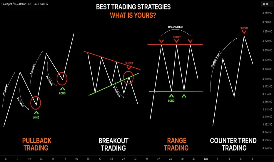
Learn the 4 Best Strategies to Maximize Your Profits in Trading
In the today's article, we will discuss 4 classic yet profitable forex and gold trading strategies.
1️⃣Pullback Trading
Pullback trading is a trend-following strategy where you open the positions after pullbacks.
If the market is trading in a bullish trend, your goal as a pullback trader is to wait for a completion of a bullish impulse and then let the market correct itself. Your entry should be the assumed completion point of a correctional movement. You expect a trend-following movement from there.
In a bearish trend, you wait for a completion of the bearish impulse, let the market retrace, and you look for short-entry after a completion of the retracement leg.
Here is the example of pullback trading.
On the left chart, we see the market that is trading in a bearish trend.
A pullback trader would short the market upon completion of the correctional moves.
On the right chart, I underlined the buy entry points of a pullback trader.
That strategy is considered to be one of the simplest and profitable and appropriate for newbie traders.
2️⃣Breakout Trading
Breakout trading implies buying or selling the breakout of a horizontal structure or a trend line.
If the price breaks a key support, it signifies a strong bearish pressure.
Such a violation will trigger a bearish continuation with a high probability.
Alternatively, a bullish breakout of a key resistance is a sign of strength of the buyers and indicates a highly probable bullish continuation.
Take a look, how the price broke a key daily resistance on a daily time frame. After a breakout, the market retested the broken structure that turned into a support. A strong bullish rally initiated from that.
With the breakout trading, the best entries are always on a retest of a broken structure.
3️⃣Range Trading
Range trading signifies trading the market that is consolidating .
Most of the time, the market consolidates within the horizontal ranges.
The boundaries of the range may provide safe points to buy and sell the market from.
The upper boundary of the range is usually a strong resistance and one may look for shorting opportunities from there,
while the lower boundary of the range is a safe place to buy the market from.
EURCAD pair is trading within a horizontal range on a daily.
The support of the range is a safe zone to buy the market from.
A bullish movement is anticipated to the resistance of the range from there.
Taking into considerations, that the financial instruments may consolidate for days, weeks and even months, range trading may provide substantial gains.
4️⃣Counter Trend Trading
Counter trend trading signifies trading against the trend.
No matter how strong is the trend, the markets always trade in zig-zags. After impulses follow the corrections , and after the corrections follow the impulses.
Counter trend traders looks for a completion of the bullish impulses in a bullish trend to short the market, and for a completion of bearish impulses in a downtrend to buy it.
Here is the example of a counter trend trade.
EURJPY is trading in a bullish trend. However, the last 3 bearish moves initiated from a rising trend line. For a trader, shorting the trend line was a perfect entry to catch a bearish move.
Such trading strategy is considered to be one of the most complicated , because one goes against the crowd and overall sentiment.
With the experience, traders may combine these strategies.
❤️Please, support my work with like, thank you!❤️
I am part of Trade Nation's Influencer program and receive a monthly fee for using their TradingView charts in my analysis.
Learn KEY PRINCIPLES of Technical Analysis in Gold Forex Trading
In the today's article, we will discuss the absolute basics of trading - 3 key principles of technical analysis in Forex & Gold Trading.
1️⃣History Repeats
History tends to repeat itself in the Forex market.
Certain trends are cyclical and may reemerge in a predictable manner, certain key levels are respected again and again over time.
Take a look at the example:
Silver perfectly respected a historical horizontal resistance in 2011 that was respected in 1980 already. Moreover, the price action before and after the tests of the underlined zone were absolutely identical.
2️⃣Priced In
All relevant information about a currency pair: economical and political events, rumors, and facts; is already reflected in a price.
When the FED increased the rate 26th of July by 25 bp, EURUSD bounced instead of falling. Before the rate hike, the market was going down on EXPECTATIONS of a rate hike. The release of the news was already price in.
3️⃣Pattern DO Work
Some specific price models can be applied for predicting the future price movements.
Technicians strongly believe that certain formations - being applied and interpreted properly, can give the edge on the market.
Depending on the trading style, different categories of patterns exist: harmonic patterns, price action patterns, wave patterns, candlestick patterns...
Above, I have listed various price action patterns that are applied by many traders and investors as the main tool for analyzing the financial markets.
If you believe in these 3 principles, you are an inborn technician!
Study technical analysis and learn to apply these principles to make money in trading.
b]❤️Please, support my work with like, thank you!❤️
I am part of Trade Nation's Influencer program and receive a monthly fee for using their TradingView charts in my analysis.

What Is Dollar-Cost Averaging (DCA) in Investing and Trading?What Is Dollar-Cost Averaging (DCA) in Investing and Trading?
Dollar-cost averaging (DCA) is a popular strategy used by investors and traders to manage market fluctuations and build positions over time. Instead of trying to time the market, DCA focuses on consistent, regular investments regardless of price movements. This article answers “What is DCA?”, its advantages and limitations, and how it can be applied in both investing and trading.
What Is Dollar-Cost Averaging (DCA)?
So what is DCA investing? Dollar-cost averaging (DCA) is a strategy that involves consistently investing a fixed sum at regular intervals, regardless of the asset’s current price. This approach helps distribute the cost of purchases over time, potentially reducing the impact of short-term price fluctuations. Instead of trying to time the market perfectly—a challenging task even for experienced traders—a dollar-cost averaging strategy focuses on regular contributions to average the cost of assets.
This method offers a straightforward, disciplined strategy for both long-term investors and traders who wish to build or adjust positions gradually. By spreading out purchases, a DCA strategy may help mitigate the effects of market volatility. For example, during a period of market decline, the fixed investment buys more units at a lower cost, which could result in higher returns when prices recover. Conversely, during a sustained rise, the investor buys fewer units, which helps avoid overexposure. For example, if you invest $50 every week and the market is rising, you will buy fewer stocks, but when the market is moving down, you will buy more with the same amount.
What does DCA mean for market participants? DCA is particularly useful in uncertain economic environments where price swings are common. It provides a systematic approach to entering the market, removing the need to make snap decisions based on short-term market movements, and fostering a steady accumulation of assets over time.
How Does DCA Work?
DCA investing operates by establishing a regular schedule for investing a set amount of money into a chosen asset, regardless of its current market price. Instead of waiting for a particular price or market condition, funds are allocated at consistent intervals—be it weekly, monthly, or quarterly. Over time, this means buying more units when prices are lower and fewer units when prices are higher, resulting in an average purchase price that can be lower than if the investment was made in one lump sum.
Consider an investor using DCA. They commit £100 every month to buy company shares. In the first month, the share price is £20, so they purchase 5 shares. The next month, the price drops to £10, allowing them to buy 10 shares with the same £100. In the third month, the price rises to £25, and they purchase 4 shares.
Over three months, the investor has spent £300 and acquired 19 shares in total. To calculate the average cost per share, divide £300 by 19, which equals approximately £15.79 per share. This average is lower than the highest price paid and reflects the effect of buying more shares when prices are low and fewer when prices are high.
DCA also simplifies the process of entering the market. By adhering to a set timetable, investors bypass the need for constant market analysis, making it particularly appealing for those who prefer a more hands-off strategy. This systematic approach can be applied not only to traditional investments like shares and funds but also to other assets that traders and investors engage with.
DCA in Trading
DCA isn't just for long-term investors; traders can also employ it to navigate the ups and downs of fast-moving markets. By spreading out their entries or exits, traders may potentially lower the average cost of a position or build on a winning trend, all while managing their exposure to volatile moves.
Lowering the Average Price
For traders facing a position that's moving against them, DCA offers a way to adjust the average entry cost. By allocating additional funds, the average price of the position may be reduced. This approach can create a potential opportunity to exit with better returns if the market reverses. However, it is important to note that this method also increases exposure, and additional entities might compound losses if the trend continues.
Adding to a Winner
Conversely, traders may apply DCA to increase their positions when an asset shows strength. By gradually adding to an effective trade, the overall exposure is built in a controlled manner, potentially capturing further movement without committing all capital at once. This method is particularly popular in markets where momentum builds slowly, allowing traders to gradually take advantage of the sustained trend.
Applications Across Markets
Using DCA in stocks can help manage entries during periods of volatility, especially when market sentiment shifts rapidly. Forex traders often use similar techniques to adjust positions in response to fluctuating currency pairs, while the high volatility seen in crypto* markets makes DCA an appealing strategy for building positions gradually.
When using DCA in trading, a disciplined approach is essential. Whether lowering the average cost in a losing position or building on an effective trade, traders should carefully consider the additional risk that comes with increased exposure.
Advantages of Dollar-Cost Averaging
Dollar-cost averaging offers a range of advantages that make it an attractive strategy for both investors and traders, especially when navigating uncertain markets.
Mitigating Market Volatility
By investing a fixed amount at regular intervals, DCA spreads out exposure over time. This approach can reduce the impact of sudden market swings. Instead of being affected by a one-off high price, the average cost is spread across different market conditions. This may help stabilise entry points and smooth out short-term volatility.
Disciplined Investment Approach
DCA promotes a structured investment routine. With regular contributions, there is less temptation to try timing the market. This disciplined approach might be particularly useful when markets are highly volatile or ahead of news and economic events. It encourages systematic investing, reducing the likelihood of making impulsive decisions driven by market noise.
Accessibility for All Traders
DCA does not require intricate market analysis or deep expertise in market timing. Its straightforward nature makes it appealing to both newcomers and seasoned traders looking for a simpler method to build positions over time. By providing a clear framework, DCA allows traders to focus on long-term goals without the pressure of constant market monitoring.
Limitations of Dollar-Cost Averaging
While dollar-cost averaging offers a structured approach to investing and trading, there are some limitations to consider.
Potential Opportunity Cost
Spreading out investments means funds are gradually deployed over time. In a market that is consistent, waiting to invest might lead to missed returns compared to committing all funds upfront. This method can reduce the impact of volatility but might underperform during extended trends.
Continued Exposure to Market Trends
Investors remain exposed to the market throughout the investment period. If the market experiences a prolonged trend, regular investments will accumulate at better prices, but overall returns may still suffer. This approach does not eliminate market risk and requires a long-term perspective to potentially see a turnaround.
Dependence on Consistency
The effectiveness of dollar-cost averaging relies heavily on maintaining a consistent investment schedule. Any interruption or inconsistency can dilute the intended advantages of the strategy. It also assumes that investors are able to commit regular funds, which may not be feasible in all financial situations.
Comparing DCA to Lump-Sum Investing
Comparing DCA to lump-sum investing offers insights into different approaches to managing market exposure and returns.
Risk Exposure
Lump-sum investing involves placing all available funds into an asset at once. This method can yield higher returns if the market moves in their favour, but it also exposes the investor to immediate risk if the market moves against them. In contrast, risk is spread over time through a dollar-cost average, meaning regular investments reduce the likelihood of entering the market at a high point and potentially lowering the overall average cost.
Market Conditions
The performance of each approach can vary depending on market trends. In steady trends, lump-sum investing may capture more returns since all funds are deployed early. However, in volatile or declining conditions, DCA could mitigate the effects of short-term fluctuations by smoothing out entry prices over time.
Flexibility and Commitment
Lump-sum investing requires confidence and a readiness to commit all funds immediately. DCA, on the other hand, offers a more measured entry into the market. This method is popular among those who prefer a systematic approach and might not have a large sum available at one time.
The Bottom Line
Understanding the dollar-cost averaging definition can help investors and traders potentially manage market volatility and reduce emotional decision-making. While it has its limitations, DCA can be an effective strategy for building positions over time.
FAQ
What Is an Example of Dollar-Cost Averaging?
Imagine investing £100 into a stock every month, regardless of its price. In January, the stock costs £20, so you buy five shares. In February, the price drops to £10, allowing you to buy 10 shares. In March, the price rises to £25, and you buy four shares. Over three months, you’ve invested £300 and purchased 19 shares, averaging out your cost per share to £15.79.
Is There the Best Dollar-Cost Averaging Strategy?
The most effective DCA strategy depends on individual goals. A consistent, long-term approach with regular investments—whether weekly or monthly—may help smooth out market volatility. Focusing on diversified assets could also reduce risk exposure.
What Is the Daily DCA Strategy?
This strategy involves investing a fixed amount every day through DCA, meaning it may help minimise the impact of short-term price fluctuations in volatile markets. However, it requires careful planning due to frequent transactions and potential fees.
Does Dollar-Cost Averaging Work With Stocks?
Yes, DCA is commonly used with stocks. It may help manage the effects of market volatility, allowing investors to build positions over time without worrying about short-term price swings.
What Does DCA Mean in Stocks?
DCA, or dollar-cost averaging, in stocks, means regularly investing a fixed amount, regardless of price, to average out the cost per share over time and manage market volatility. A similar answer is true for “What does DCA mean in crypto*?”, except it would involve a regular fixed investment in a particular cryptocurrency*.
How to Calculate DCA in Crypto* Investing?
There is a simple formula to calculate DCA, meaning in crypto*, an investor would just divide the total amount invested by the total number of units purchased. This provides the average cost per unit over time, regardless of price fluctuations.
*Important: At FXOpen UK, Cryptocurrency trading via CFDs is only available to our Professional clients. They are not available for trading by Retail clients. To find out more information about how this may affect you, please get in touch with our team.
This article represents the opinion of the Companies operating under the FXOpen brand only. It is not to be construed as an offer, solicitation, or recommendation with respect to products and services provided by the Companies operating under the FXOpen brand, nor is it to be considered financial advice.

What Is the Advance-Decline (A/D) Line, and How Can You Use ItWhat Is the Advance-Decline (A/D) Line, and How Can You Use It in Trading?
The Advance-Decline (A/D) Line is a widely used market breadth indicator that provides insights into the strength of trends by tracking advancing and declining stocks. Popular among traders analysing indices like the NASDAQ, it helps identify broad participation or hidden divergences. This article explores how this indicator works and its role in effective market analysis.
What Is the Advance-Decline Line?
The Advance-Decline (A/D) line, also known as the Advance-Decline Index, is a popular market breadth indicator used to gauge the overall health of a market's movement. Instead of focusing solely on price changes in an index, it analyses how many stocks are participating in the market's rise or fall. This makes it particularly useful for traders looking to understand whether a trend is supported by widespread participation or driven by just a handful of stocks.
The indicator can be set up based on stocks on different exchanges. For example, a NYSE Advance-Decline line provides insights into NYSE-listed stocks. However, it can be applied to any index or exchange, resulting in the Nasdaq Advance-Decline line or a line based on stocks listed in the UK, Australia, Europe, or Japan.
At its core, the A/D line is a cumulative measure of the net advances of stocks on a given day. The calculation is as follows:
1. Count the number of advancing stocks (those that closed higher than their previous close).
2. Count the number of declining stocks (those that closed lower than their previous close).
3. Subtract the number of declining stocks from the advancing stocks to get the net advance.
4. Add this net advance to the previous day’s A/D line value.
Formally, the Advance-Decline line formula is:
Net Advances = Advancing Stocks − Declining Stocks
Current A/D Line Value = Previous A/D Line Value + Net Advances
For example, if 500 stocks advanced and 300 declined on a given day, the net advance would be +200. If yesterday’s A/D Line value was 10,000, today’s value would be 10,200. Over time, these daily values form a line that tracks the cumulative net advances.
The indicator provides insights into sentiment. A rising line indicates more advancing stocks than declining ones, while a falling line suggests the opposite. Traders often use this data to determine whether a price trend in an index reflects broad strength or is being carried by a few heavyweights.
Understanding Market Breadth
Market breadth measures the extent to which individual assets are contributing to a market's overall movement, providing a clearer picture of the strength or weakness behind trends. Rather than relying solely on an index's price performance, breadth gives traders insights into how widespread participation is within a rally or decline. This information is crucial for understanding whether market moves are broad-based or concentrated in a few influential assets.
A market with a strong breadth typically sees most stocks or assets moving in the same direction as the overall trend. For example, during a rally, broad participation—where a large percentage of assets are advancing—signals a robust and healthy trend. Conversely, weak breadth occurs when only a small group of assets drives the movement, potentially indicating fragility in the trend. This is especially important in large indices where a few heavily weighted assets can mask underlying weaknesses.
How Traders Use the A/D Line
The A/D Line is more than just a market breadth indicator—it’s a practical tool traders use to gain insight into the strength and sustainability of trends. By analysing how the indicator behaves in relation to price movements, traders can uncover potential hidden opportunities and spot potential risks. Let’s consider how the Advance-Decline line behaves on a price chart.
Identifying Trend Strength
One of the A/D Line’s key uses is evaluating the strength of a market move by examining overall participation. When both the A/D Line and an index rise together, it suggests widespread buying activity, with most stocks contributing to the rally. Similarly, if both the index and the A/D Line decline, it often reflects broad-based selling, indicating that weakness is widespread across the market rather than concentrated in a few assets.
Spotting Divergences
Divergences between the A/D line and price are closely watched by traders. For instance, if an index continues to rise but the A/D line starts declining, it could signal that the trend is losing momentum. Conversely, when it begins rising ahead of a price recovery, it may suggest underlying strength before it becomes apparent in price action.
Complementing Other Indicators
Traders often pair the A/D line with other tools to refine their analysis. For example, combining it with moving averages or oscillators like RSI can help confirm signals or highlight discrepancies. A rising A/D line alongside RSI rising above 50 might reinforce the possibility of a price rise.
Strengths of the A/D Line
The A/D line is a widely respected tool for understanding market dynamics, offering insights that price-based analysis alone can’t provide. Its ability to measure participation across a broad range makes it especially valuable for traders looking to assess sentiment and trend reliability. Let’s explore some of its key strengths.
Broad Market Perspective
The A/D line captures the performance of all advancing and declining stocks within an index, offering a comprehensive view of how much support a trend has. Instead of focusing solely on a handful of large caps that often dominate indices, the indicator reveals whether the majority are moving in the same direction. This helps traders gauge the true strength of a rally or decline.
Early Warnings of Weakness or Strength
Divergences between the A/D line and the price can act as an early signal of potential changes in momentum. When the A/D Line deviates from the overall trend, it can highlight areas where market participation is inconsistent. This allows traders to assess whether a trend is gaining or losing support across a broad range of assets, offering clues about potential shifts before they fully materialise in price action.
Applicability Across Markets
Another strength is its versatility. The A/D line can be applied to indices, sectors, or even individual markets, making it useful across various trading strategies. Whether monitoring a broad index like the S&P 500 or a specific sector, the indicator can be adapted to provide valuable insights.
Limitations of the A/D Line
While the A/D line is a useful tool for analysing breadth, it isn’t without its limitations. Traders need to understand its drawbacks to use it effectively and avoid potential misinterpretations. Here are some of the key challenges to consider.
Ignores Stock Weighting
One major limitation is that the A/D index gives equal weight to every stock, regardless of size or market capitalisation. In indices like the S&P 500, where a small number of large-cap stocks often drive performance, this can create a disconnect. For example, a large-cap stock’s strong performance might lift an index while the indicator shows weakness due to low-caps underperforming.
Vulnerability to Noise
The index can produce misleading signals in certain conditions, such as during periods of low trading volume or heightened volatility. Market anomalies, such as large fluctuations in a small number of stocks, can skew the indicator and make it less reliable. This can be especially problematic in thinly traded assets or at times of high speculation.
Not a Standalone Indicator
The A/D line is combined with other tools. On its own, it doesn’t account for factors like momentum, valuation, or sentiment, which can provide critical context. Traders relying solely on it may miss out on key details or overemphasise its signals.
Comparing the A/D Line with Other Market Breadth Indicators
The A/D Line is a powerful tool, but it’s not the only market breadth indicator traders use. By understanding how it compares to other indicators, traders can select the one that suits their analysis needs or combine them for a more comprehensive view.
A/D Line vs Advance-Decline Ratio
The A/D Ratio measures the proportion of advancing to declining stocks. While the A/D line provides a cumulative value over time, the ratio offers a snapshot of market breadth for a single trading day. The A/D Ratio is often better for identifying short-term overbought or oversold conditions, whereas the A/D line excels at tracking long-term trends.
A/D Line vs McClellan Oscillator
The McClellan Oscillator uses the same advancing and declining stock data but applies exponential moving averages to calculate its value. This approach makes the McClellan Oscillator more sensitive to recent market changes, allowing it to highlight turning points more quickly than the A/D line. However, the A/D line’s simplicity and cumulative nature make it more straightforward to interpret for broader trend analysis.
A/D Line vs Percentage of Stocks Above Moving Averages
This indicator tracks the percentage of stocks trading above specific moving averages, such as the 50-day or 200-day. While the A/D line focuses on daily advances and declines, the moving average approach highlights whether stocks are maintaining longer-term momentum. The A/D line provides a broader perspective on participation, whereas this indicator zeros in on sustained trends.
The Bottom Line
The Advance-Decline line is a valuable tool for traders seeking deeper insights into market trends. By analysing market breadth, it helps identify potential opportunities and risks beyond price movements alone.
FAQ
What Is the Meaning of Advance-Decline?
Advance-decline refers to the difference between the number of advancing stocks (those that closed higher) and declining stocks (those that closed lower) on a specific trading day. It’s commonly used in market breadth indicators like the NYSE Advance-Decline line to measure the overall strength or weakness of the market.
How to Find Advance-Decline Ratio?
The Advance-Decline ratio compares advancing stocks to declining stocks in an index. It is calculated by dividing the number of advancing stocks by the number of declining stocks.
How to Use an Advance-Decline Line Indicator?
The A/D line indicator tracks the cumulative difference between advancing and declining stocks. Traders analyse its movement alongside price trends to assess market participation. For example, divergence between the A/D line and an index price direction can signal potential changes in momentum.
What Is the Advance-Decline Indicator Strategy?
Traders use the Advance-Decline indicator to analyse market breadth, identify divergences, and confirm trends. For example, a rising A/D line with an index suggests broad participation, while divergence may signal weakening trends.
This article represents the opinion of the Companies operating under the FXOpen brand only. It is not to be construed as an offer, solicitation, or recommendation with respect to products and services provided by the Companies operating under the FXOpen brand, nor is it to be considered financial advice.

What Is a PD Array in ICT, and How Can You Use It in Trading?What Is a PD Array in ICT, and How Can You Use It in Trading?
The PD array, or Premium and Discount array, is a key concept within the Inner Circle Trader methodology, designed to help traders map market movements and identify high-probability zones. By breaking down price behaviour into premium and discount levels, along with tools like order blocks and fair value gaps, the PD array provides a structured framework for analysis. This article explores its components, applications, and how traders can integrate it into their strategies.
What Is a PD Array?
An ICT PD array, short for Premium and Discount array, is a concept developed by Michael J. Huddleston, the mind behind the Inner Circle Trader (ICT) methodology. At its core, the PD array is a framework used to organise price levels and zones on a chart where significant institutional activity is likely to occur. These zones highlight areas of interest such as potential support or resistance, points where liquidity resides, or regions that might attract price movement.
The PD array divides the market into two primary zones: premium and discount. These zones help traders gauge whether the price is above or below its equilibrium, often calculated using the 50% level of a significant price range. In practical terms, prices in the premium zone are typically considered attractive in a downtrend and unattractive in an uptrend, while prices in the discount zone are more attractive in an uptrend and less attractive in a downtrend.
Beyond premium and discount zones, PD arrays include specific elements like order blocks, which are regions linked to institutional buying or selling, and fair value gaps (FVGs), which are imbalances or gaps in price that the market often seeks to revisit. Together, these elements create a structured roadmap for traders to interpret price behaviour.
Unlike a static indicator, an ICT PD array is dynamic and requires traders to interpret price movements in real time, considering the broader market context. It’s not a quick fix but a methodical approach to understanding how price delivers across different levels, offering a clearer view of where high-probability reactions could occur. The PD array is often combined with other ICT concepts, like market structure shifts or SMT divergence, to sharpen analysis and focus on precise market opportunities.
Premium and Discount Zones of a PD Array
The foundation of a PD array starts with defining the premium and discount zones. This is typically done by identifying a significant price swing—either a low to a high or vice versa—and applying a Fibonacci retracement. The 50% level of this range serves as the equilibrium point, dividing the chart into two zones:
- Premium zone: Price levels above 50%, often considered less attractive in an uptrend and more attractive in a downtrend.
- Discount zone: Price levels below 50%, seen as more attractive in an uptrend and less attractive in a downtrend.
This equilibrium acts as a baseline, helping traders assess whether the price is likely to reverse, consolidate, or continue based on its position relative to the 50% mark.
Tools Within the PD Array
The PD array doesn’t rely on a fixed set of tools. Instead, it offers a collection of components traders can use to refine their analysis. While the choice of tools can vary, they’re often ranked in a loose hierarchy, known as a PD array matrix, based on their importance within the ICT methodology. Let’s break down how this structure works.
Order Blocks
Order blocks are areas where institutional traders placed large buy or sell orders, often leading to significant price moves. On a chart, they appear as the last bullish or bearish candle before a sharp reversal. Order blocks are highly prioritised within the PD array because they indicate zones of potential support or resistance.
Fair Value Gaps (FVGs)
FVGs are gaps between price levels that form when the market moves too quickly to fill orders evenly. These imbalances create "unfinished business" in the market, and price often revisits these areas to restore balance. They are especially useful for spotting potential reversals or continuation points.
Breaker Blocks
Breaker blocks form when order blocks fail. When supply or demand zones are unable to hold and the market structure shifts, breaker blocks emerge, highlighting key levels to monitor.
Mitigation Blocks
Mitigation blocks are related to breaker blocks but form after a market structure shift, where the price makes a lower high (in an uptrend) or a higher low (in a downtrend). They function the same as breaker blocks, but the key difference is in the failure of a new high/low before the trend reverses.
Liquidity Voids
Liquidity voids are areas on the chart where there’s little to no trading activity, often following sharp price movements. These large FVGs are often revisited by price as the market seeks to rebalance liquidity, making them significant for identifying future price movements.
Rejection Blocks
ICT rejection blocks are similar in concept to order blocks but consist of the wicks present on a given timeframe where an order block could be drawn. They are essentially a refined version of an order block where the price may reverse.
Old Lows or Highs
Old lows or highs represent liquidity pools where traders place stop orders. These levels are magnets for the price, as the market often seeks to trigger these stops before reversing. Identifying these points helps traders anticipate where the price might gravitate.
Using ICT PD Arrays for Trading
Let’s consider how to use the PD array of the ICT methodology.
Evaluating Trend Structure
Before anything else, traders typically assess the broader trend by analysing highs and lows. The goal is to identify the current structure and wait for the market to form a new significant high or low that aligns with the existing trend. For instance, in an uptrend, a trader might wait for a new higher high to form, followed by a retracement.
Once the new high or low is established, traders often draw a Fibonacci retracement tool between the previous low and the recent swing high (or vice versa for a downtrend). This creates a clear division of the price range into premium and discount zones, providing the foundation of the PD array.
Retracement into the PD Array
As the price retraces within the range, traders watch for it to reach the premium zone in a downtrend or the discount zone in an uptrend. This positioning is essential—it signals that the price has reached an area where the risk-reward profile may be more favourable.
Finding Specific Setups
Within these zones, traders use the tools of the PD array to refine their approach. For instance, an FVG might act as a key level, particularly if it sits just ahead of an order block. Alternatively, a breaker block might signal a potential reversal if the price aligns with the broader trend structure. By combining these elements, traders can narrow their focus to setups that align with both the PD array and the underlying market conditions.
The Limitations of ICT PD Arrays
While ICT PD arrays offer a structured framework for analysing price behaviour, they’re not without their challenges. Traders relying on this methodology should be aware of its limitations to avoid potential pitfalls. Here are some key considerations:
- Subjectivity in Marking Zones: Identifying premium and discount zones, as well as order blocks or other components, can vary between traders. This subjectivity means that no two analyses are identical, which may lead to inconsistent outcomes.
- Experience Required: Effectively using PD arrays demands a solid understanding of market structure, liquidity concepts, and the ICT methodology. It can feel overwhelming for beginners without adequate practice.
- Higher Timeframe Dependence: While PD arrays are valuable, they’re more popular on higher timeframes. Traders focusing solely on smaller timeframes might encounter more false signals.
- Dynamic Nature: Markets evolve quickly, and PD arrays require traders to adapt in real time. This dynamic quality can be a challenge for those who struggle with decision-making under pressure.
- Overfitting Risk: With so many tools available within the ICT framework, it’s easy to overanalyse or misinterpret signals, leading to analysis paralysis.
The Bottom Line
ICT PD arrays offer traders a structured framework to analyse market movements and identify key price zones, helping them refine their strategies. By combining these arrays with other tools and techniques, traders can gain deeper insights into institutional activity.
FAQ
What Is the ICT PD Array?
The ICT PD array meaning refers to a Premium and Discount array, a trading concept developed within the Inner Circle Trader (ICT) methodology. It organises price levels and zones into premium and discount areas, helping traders analyse where the price is likely to react and reverse and place entry and exit points. The framework includes tools like order blocks, fair value gaps, and liquidity voids to identify potential areas of institutional interest.
What Is a Premium Array in Forex?
A premium array in forex refers to the portion of a price range above its equilibrium level, typically the 50% mark of a significant swing high and low. Traders consider this zone less attractive for buying, as it’s closer to overvaluation, and often watch for potential selling opportunities.
What Is a Discount Array in Forex?
A discount array is the zone below the equilibrium level of a price range. It represents a potentially more favourable area for potential buying opportunities, as prices are considered undervalued relative to the swing high and low.
This article represents the opinion of the Companies operating under the FXOpen brand only. It is not to be construed as an offer, solicitation, or recommendation with respect to products and services provided by the Companies operating under the FXOpen brand, nor is it to be considered financial advice.

What Is the McClellan Oscillator (NYMO), and How to Use ItWhat Is the McClellan Oscillator (NYMO), and How to Use It in Trading?
The McClellan Oscillator is a widely used market breadth indicator that helps traders analyse momentum and market strength. It focuses on the relationship between advancing and declining stocks, offering unique insights beyond price movements. This article explains how the McClellan Oscillator works, its interpretation, and how it compares to other tools.
What Is the McClellan Oscillator?
The McClellan Oscillator is a market breadth indicator that traders use to measure momentum in stock market indices. It’s calculated based on the Advance/Decline Line, which tracks the net number of advancing stocks (those rising in price) minus declining stocks (those falling in price) over a given period.
The NYSE McClellan Oscillator is the most common variant, often called the NYMO indicator. However, it can also be applied to any other stock index, like the Dow Jones, Nasdaq, or FTSE 100.
Here’s how it works: the indicator uses two exponential moving averages (EMAs) of the advance/decline data—a 19-day EMA for short-term trends and a 39-day EMA for long-term trends. The difference between these two EMAs gives you the oscillator’s value. Positive readings mean more stocks are advancing than declining, pointing to bullish momentum. Negative readings suggest the opposite, with bearish sentiment dominating.
What makes the McClellan indicator particularly useful is its ability to highlight shifts in market momentum that might not be obvious from price movements alone. For example, even if a stock index is rising, a declining indicator could signal that fewer stocks are participating in the rally—a potential warning of weakening breadth.
This indicator is versatile and works well across various timeframes, but it’s particularly popular for analysing daily or weekly market trends. While it’s not designed to provide direct buy or sell signals, it helps traders identify when markets are gaining or losing momentum,
Understanding the Advance/Decline Line
The Advance/Decline (A/D) Line is a market breadth indicator that tracks the difference between the number of advancing stocks and declining stocks. It’s calculated cumulatively, adding each day’s net result to the previous total. This gives a running tally that reflects the broader participation of stocks in a market’s movement, rather than just focusing on a handful of large-cap stocks.
When the A/D Line shows consistent strength or weakness, the McClellan Oscillator amplifies this data, making it potentially easier to spot underlying trends in market breadth. In essence, the A/D Line provides the raw data, while the McClellan refines it into actionable insights.
How to Calculate the McClellan Oscillator
The McClellan Oscillator formula effectively smooths out the daily fluctuations in the A/D data, allowing traders to focus on broader shifts in momentum.
Here’s how it’s calculated:
- Calculate the 19-day EMA of the A/D line (short-term trend).
- Calculate the 39-day EMA of the A/D line (long-term trend).
- Subtract the 39-day EMA from the 19-day EMA. The result is the McClellan Oscillator’s value.
Giving the formula:
- McClellan Oscillator = 19-day EMA of A/D - 39-day EMA of A/D
The result is a line that fluctuates around a midpoint. In practice, a trader might apply the McClellan Oscillator to the S&P 500 on a daily or weekly timeframe, providing insights for trading.
Interpretation of the Oscillator’s Values
- Positive values occur when the 19-day EMA is above the 39-day EMA, indicating that advancing stocks dominate and the market has bullish momentum.
- Negative values occur when the 19-day EMA is below the 39-day EMA, reflecting a bearish trend with declining stocks in control.
- A value near zero suggests balance, where advancing and declining stocks are roughly equal.
Signals Generated
The indicator is popular for identifying shifts in momentum and potential trend changes.
Overbought and Oversold Conditions
- Readings at or above +100 typically indicate an overbought market, where the upward momentum may be overextended.
- Readings at or below -100 suggest an oversold market, with the potential for a recovery.
Crossing Zero
When the indicator crosses above or below zero, it can indicate shifts in market sentiment, with traders often monitoring these transitions closely.
Divergences
- A positive divergence occurs when the indicator rises while the index declines, signalling potential bullish momentum building.
- A negative divergence happens when the indicator falls while the index rises, hinting at weakening momentum.
Using the McClellan Oscillator With Other Indicators
The McClellan Oscillator is a valuable tool for analysing market breadth, but its insights become even more powerful when combined with other indicators. Pairing it with complementary tools can help traders confirm signals, refine their analysis, and better understand overall market conditions.
Relative Strength Index (RSI)
The Relative Strength Index (RSI) measures the strength and speed of price movements, identifying overbought or oversold conditions. While the McClellan Oscillator focuses on market breadth, using RSI along with it can provide confirmation. For example, if both indicators show overbought conditions, it strengthens the case for a potential market pullback.
Moving Averages
Simple or exponential moving averages of price data can help confirm trends identified by the McClellan Oscillator. For instance, if it signals bullish momentum and the index moves above its moving average, this alignment may suggest stronger market conditions.
Volume Indicators (e.g., On-Balance Volume)
Volume is a key component of market analysis. Combining the Oscillator with volume-based indicators can clarify whether breadth signals are supported by strong participation, improving the reliability of momentum shifts.
Bollinger Bands
Bollinger Bands measure volatility and provide insight into price ranges. When combined with the McClellan Oscillator, they can help traders assess whether market breadth signals align with overextended price movements, providing additional context.
VIX (Volatility Index)
The VIX measures market sentiment and fear. Cross-referencing it with the McClellan Oscillator can reveal whether market breadth momentum aligns with changes in risk appetite, offering a deeper understanding of sentiment shifts.
Comparing the McClellan Oscillator With Related Indicators
The McClellan Oscillator, McClellan Summation Index, and Advance/Decline Ratio all provide insights into market breadth, but they differ in focus and application.
McClellan Oscillator vs McClellan Summation Index
While the Oscillator measures short-term momentum using the difference between 19-day and 39-day EMAs of the Advance/Decline (A/D) Line, the McClellan Summation Index takes a longer-term perspective. It is a cumulative total of the Oscillator's daily values, creating a broader view of market trends.
Think of the Summation Index as the "big picture" complement to the Oscillator's granular analysis. Traders often use the Summation Index to track longer-term trends and identify major turning points, while the Oscillator is more popular when monitoring immediate momentum shifts and overbought/oversold conditions.
McClellan Oscillator vs Advance/Decline Ratio
The Advance/Decline Ratio is a simpler calculation, dividing the number of advancing stocks by the number of declining stocks. While it provides a snapshot of market breadth, it lacks the depth of analysis offered by the McClellan Oscillator.
The Oscillator refines raw A/D data with exponential moving averages, smoothing out noise and making it potentially easier to identify meaningful trends and divergences. The A/D Ratio, on the other hand, is more reactive and generally better suited for short-term intraday signals.
Advantages and Limitations of the McClellan Oscillator
The McClellan Oscillator is a powerful tool for analysing market breadth, but like any indicator, it has strengths and weaknesses. Understanding both can help traders decide how best to integrate it into their analysis.
Advantages
- Focus on Market Breadth: By analysing the Advance/Decline data, the indicator provides a clearer picture of how many stocks are participating in a trend, not just the performance of index heavyweights.
- Momentum Insights: Its ability to highlight shifts in short-term momentum allows traders to spot potential turning points before they become evident in price action.
- Identification of Divergences: It excels at identifying divergences between market breadth and price, offering early signals of weakening trends or upcoming reversals.
- Overbought/Oversold Signals: Its range helps traders analyse extreme conditions (+100/-100), which can signal potential market corrections or recoveries.
Limitations
- Not a Standalone Tool: The indicator is combined with other indicators or broader analysis, as it doesn’t provide specific entry or exit signals.
- False Signals in Volatile Markets: During periods of high volatility or low trading volume, the oscillator may generate misleading signals, making context crucial.
- Short-Term Focus: While excellent for momentum analysis, it doesn’t provide the long-term perspective offered by tools like the McClellan Summation Index.
The Bottom Line
The McClellan Oscillator is a powerful tool for analysing market breadth, helping traders gain insights into momentum and potential market shifts. While not a standalone solution, it is often combined with other indicators for a well-rounded approach.
FAQ
What Is a NYMO Oscillator?
The NYMO oscillator, short for the New York McClellan Oscillator, is a market breadth indicator based on the Advance/Decline stock data of the New York Stock Exchange (NYSE). The NYMO index calculates the difference between a 19-day and 39-day exponential moving average (EMA) of the Advance/Decline line, providing insights into stock market momentum and sentiment.
What Does the McClellan Oscillator Show?
The McClellan Oscillator shows the balance of advancing and declining stocks in a market. Positive values indicate bullish momentum, while negative values reflect bearish sentiment. It’s often used to identify potential shifts in momentum or divergences between market breadth and price.
What Is the McClellan Oscillator in MACD?
The McClellan Oscillator and MACD are distinct indicators, but both use moving averages. While MACD measures price momentum, the Oscillator focuses on market breadth by analysing the Advance/Decline Line.
What Is the McClellan Summation Indicator?
The McClellan Summation Index is a cumulative version of the McClellan Oscillator. It provides a broader view of market trends, tracking long-term momentum and overall market strength.
What Is the Nasdaq McClellan Oscillator?
The Nasdaq McClellan Oscillator, sometimes called the NAMO, applies the same calculation as the NYMO but uses Advance/Decline data from the Nasdaq exchange. It helps traders analyse momentum and breadth in technology-heavy markets.
This article represents the opinion of the Companies operating under the FXOpen brand only. It is not to be construed as an offer, solicitation, or recommendation with respect to products and services provided by the Companies operating under the FXOpen brand, nor is it to be considered financial advice.

Falling Wedge Trading Pattern: Unique Features and Trading RulesFalling Wedge Trading Pattern: Unique Features and Trading Rules
Various chart patterns give an indication of possible market direction. A falling wedge is one such formation that indicates a possible bullish reversal. This FXOpen article will help you understand whether the falling wedge pattern is bullish or bearish, what its formation signifies about the market direction, and how it can be used to spot trading opportunities.
What Is a Falling Wedge Pattern?
Also known as the descending wedge, the falling wedge technical analysis chart pattern is a bullish formation that typically occurs in the downtrend and signals a trend reversal. It forms when an asset's price drops, but the range of price movements starts to get narrower. As the formation contracts towards the end, the buyers completely absorb the selling pressure and consolidate their energy before beginning to push the market higher. A falling wedge pattern means the end of a market correction and an upside reversal.
How Can You Spot a Falling Wedge on a Price Chart?
This pattern is usually spotted in a downtrend, which would indicate a possible bullish reversal. However, it may appear in an uptrend and signal a trend continuation after a market correction. Either way, the falling wedge provides bullish signals. The descending formation generally has the following features.
- Price Action. The price trades lower, forming lower highs and lower lows.
- Trendlines. Traders draw two trendlines. One connects the lower highs, and the other connects the lower lows. Finally, they intersect towards a convergence point. Each line should connect at least two points. However, the greater the number, the higher the chance of the market reversal.
- Contraction. The contraction in the price range signals decreasing volatility in the market. As the formation matures, new lows contract as the selling pressure decreases. Thus, the lower trendline acts as support, and the price consolidating within the narrowing range creates a coiled spring effect, finally leading to a sharp move on the upside. The price breaks through the upper trendline resistance, indicating that sellers are losing control and buyers are gaining momentum, resulting in an upward move.
- Volume. The trading volume ideally decreases as the pattern forms, and the buying volume increases with the breakout above the upper trendline, reflecting a shift in momentum towards the buyers.
Falling and Rising Wedge: Differences
There are two types of wedge formation – rising (ascending) and falling (descending).
An ascending wedge occurs when the highs and lows rise, while a descending wedge pattern has lower highs and lows. In an ascending formation, the slope of the lows is steeper and converges with the upper trendline at some point, while in a descending formation, the slope of the highs is steeper and converges with the support trendline at some point.
Usually, a rising wedge indicates that sellers are taking control, resulting in a downside breakdown. Conversely, a descending wedge pattern indicates that buyers are gaining momentum after consolidation, generally resulting in an upside breakout.
The Falling Wedge: Trading Rules
Trading the falling wedge involves waiting for the price to break above the upper line, typically considered a bullish reversal. The pattern’s conformity increases when it is combined with other technical indicators.
- Entry
According to theory, the ideal entry point is after the price has broken above the wedge’s upper boundary, indicating a potential upside reversal. Furthermore, this descending wedge breakout should be accompanied by an increase in trading volume to confirm the validity of the signal.
The price may retest the resistance level before continuing its upward movement, providing another opportunity to enter a long position. However, the entry point should be based on the traders' risk management plan and trading strategy.
- Take Profit
It is essential to determine an appropriate target level. Traders typically set a profit target by measuring the height of the widest part of the formation and adding it to the breakout point. Another approach some traders use is to look for significant resistance levels above the breakout point, such as previous swing highs.
- Stop Loss
Traders typically place their stop-loss orders just below the lower boundary of the wedge. Also, the stop-loss level can be based on technical or psychological support levels, such as previous swing lows. In addition, the stop-loss level should be set according to the trader's risk tolerance and overall trading strategy.
Trading Example
In the chart above, there is a falling wedge. A trader opened a buy position on the close of the breakout candlestick. A stop loss was placed below the wedge’s lower boundary, while the take-profit target was equal to the pattern’s widest part.
Falling Wedge and Other Patterns
Here are chart patterns that can be confused with a falling wedge.
Falling Wedge vs Bullish Flag
These are two distinct chart formations used to identify potential buying opportunities in the market, but there are some differences between the two.
A descending wedge is a bullish setup, forming in a downtrend. It is characterised by two converging trendlines that slope downward, signalling decreasing selling pressure. A breakout above the upper trendline suggests a bullish move.
A bullish flag appears after a strong upward movement and forms a rectangular shape with parallel trendlines that slope slightly downward or move sideways. This formation represents a brief consolidation before the market resumes its upward trajectory.
While the falling wedge indicates a potential shift in a downtrend, the bullish flag suggests a continuation of an uptrend.
Falling Wedge vs Bearish Pennant
The falling wedge features two converging trendlines that slope downward, indicating decreasing selling pressure and often signalling a bullish reversal when the price breaks above the upper trendline.
Conversely, the bearish pennant forms after a significant downward movement and is characterised by converging trendlines that create a small symmetrical triangle. This pattern represents a consolidation phase before the market continues its downward trend upon breaking below the lower trendline.
While the falling wedge suggests a potential bullish move, the bearish pennant indicates a continuation of the bearish trend.
Falling Wedge vs Descending Triangle
The falling wedge consists of two downward-sloping converging trendlines, indicating decreasing selling pressure and often signalling a bullish reversal when the price breaks above the upper trendline. In contrast, the descending triangle features a flat lower trendline and a downward-sloping upper trendline, suggesting a buildup of selling pressure and typically signalling a bearish continuation when the price breaks below the flat lower trendline.
While the falling wedge is associated with a potential bullish move, the descending triangle generally indicates a bearish trend.
Falling Wedge: Advantages and Limitations
Like any technical pattern, the falling wedge has both limitations and advantages.
Advantages
- High Probability of a Reversal. The falling wedge is often seen as a strong, bullish signal, especially when it occurs after a downtrend. It suggests that selling pressure is subsiding, and a reversal to the upside may be imminent.
- Clear Entry and Exit Points. The pattern provides clear points for entering and exiting trades. Traders often enter when the price breaks out above the upper trendline and set stop-loss orders below a recent low within the formation.
- Versatility. The wedge can be used in various market conditions. It is effective in both continuation and reversal scenarios, though it is more commonly associated with bullish reversals.
- Widely Recognised. Since the falling wedge is a well-known formation, it is often self-fulfilling to some extent, as many traders recognise and act on it, further driving the market.
Limitations
- False Breakouts. Like many chart patterns, the falling wedge is prone to false breakouts. Prices may briefly move above the resistance line but then fall back below, trapping traders.
- Dependence on Market Context. The effectiveness of the falling wedge can vary depending on broader market conditions. In a strong downtrend, it might fail to result in a significant reversal.
- Requires Confirmation. The wedge should be confirmed with other technical indicators or analysis tools, such as volumes or moving averages, to increase the likelihood of an effective trade. Relying solely on the falling wedge can be risky.
- Limited Use in Low-Volatility Markets. In markets with low volatility, the falling wedge may not be as reliable, as price movements might not be strong enough to confirm the falling wedge's breakout.
The Bottom Line
The falling wedge is a powerful chart pattern that can offer valuable insights into potential trend reversals or continuations, depending on its context within the broader market. By understanding and effectively utilising the falling wedge in your strategy, you can enhance your ability to identify many trading opportunities. As with all trading tools, combining it with a comprehensive trading plan and proper risk management is crucial.
FAQ
Is a Falling Wedge Bullish?
Yes, the falling wedge is a bullish continuation pattern in an uptrend, and it acts as a bullish reversal formation in a bearish market.
What Does a Falling Wedge Pattern Indicate?
It indicates that the buyers are absorbing the selling pressure, which is reflected in the narrower price range and finally results in an upside breakout.
What Is the Falling Wedge Pattern Rule?
The falling wedge is a technical analysis formation that occurs when the price forms lower highs and lower lows within converging trendlines, sloping downward. Its rule is that a breakout above the upper trendline signals a potential reversal to the upside, often indicating the end of a downtrend or the continuation of a strong uptrend.
How to Trade Descending Wedge Patterns?
To trade descending wedges, traders first identify them by ensuring that the price is making lower highs and lows within converging trendlines. Then, they wait for the price to break out above the upper trendline, ideally accompanied by increased trading volume, which confirms the breakout. After the breakout, a common approach is to enter a long position, aiming to take advantage of the anticipated upward movement.
What Is the Target of the Descending Wedge Pattern?
The target for a descending wedge is typically set by measuring the maximum width of the wedge at its widest part and projecting that distance upwards from the breakout point. This projection gives a potential price target.
What Is the Entry Point for a Falling Wedge?
The entry point for a falling wedge is ideally just after the breakout above the upper trendline. Some traders prefer to wait for a retest of the broken trendline, which may act as a new support level, before entering a trade to confirm the breakout.
*Important: At FXOpen UK, Cryptocurrency trading via CFDs is only available to our Professional clients. They are not available for trading by Retail clients. To find out more information about how this may affect you, please get in touch with our team.
This article represents the opinion of the Companies operating under the FXOpen brand only. It is not to be construed as an offer, solicitation, or recommendation with respect to products and services provided by the Companies operating under the FXOpen brand, nor is it to be considered financial advice.

Learn 3 Best Time Frames for Day Trading Forex & Gold
If you want to day trade Forex & Gold, but you don't know what time frames you should use for chart analysis and trade execution, don't worry.
In this article, I prepared for you the list of best time frames for intraday trading and proven combinations for multiple time frame analysis.
For day trading forex with multiple time frame analysis, I recommend using these 3 time frames: daily, 1 hour, 30 minutes.
Daily Time Frame Analysis
The main time frame for day trading Forex is the daily.
It will be applied for the identification of significant support and resistance levels and the market trend.
You should find at least 2 supports that are below current prices and 2 resistances above.
In a bullish trend, supports will be applied for trend-following trading, the resistances - for trading against the trend.
That's the example of a proper daily time frame analysis on GBPCHF for day trading.
The pair is in an uptrend and 4 significant historic structures are underlined.
In a downtrend, a short from resistance will be a daytrade with the trend while a long from support will be against.
Look at GBPAUD. The market is bearish, and a structure analysis is executed.
Identified supports and resistances will provide the zones to trade from. You should let the price reach one of these areas and start analyzing lower time frames then.
Remember that counter trend trading setups always have lower accuracy and a profit potential. Your ability to properly recognize the market direction and the point that you are planning to open a position from will help you to correctly assess the winning chances and risks.
1H/30M Time Frames Analysis
These 2 time frames will be used for confirmations and entries.
What exactly should you look for?
It strictly depends on the rules of your strategy and trading style.
After a test of a resistance, one should wait for a clear sign of strength of the sellers : it can be based on technical indicators, candlestick, chart pattern, or something else.
For my day trading strategy, I prefer a price action based confirmation.
I wait for a formation of a bearish price action pattern on a resistance.
Look at GBPJPY on a daily. Being in an uptrend, the price is approaching a key resistance. From that, one can look for a day trade .
In that case, a price action signal is a double top pattern on 1H t.f and a violation of its neckline. That provides a nice confirmation to open a counter trend short trade.
Look at this retracement that followed then.
In this situation, there was no need to open 30 minutes chart because a signal was spotted on 1H.
I will show you when one should apply this t.f in another setup.
Once the price is on a key daily support, start looking for a bullish signal.
For me, it will be a bullish price action pattern.
USDCAD is in a strong bullish trend. The price tests a key support.
It can be a nice area for a day trade.
Opening an hourly chart, we can see no bullish pattern.
If so, open even lower time frame, quite often it will reveal hidden confirmations.
A bullish formation appeared on 30 minutes chart - a cup & handle.
Violation of its neckline is a strong day trading long signal.
Look how rapidly the price started to grow then.
In order to profitably day trade Forex, a single time frame analysis is not enough . Incorporation of 3 time frames: one daily and two intraday will help you to identify trading opportunities from safe places with the maximum reward potential.
❤️Please, support my work with like, thank you!❤️
I am part of Trade Nation's Influencer program and receive a monthly fee for using their TradingView charts in my analysis.

How Can You Use the STRAT Method in Trading?How Can You Use the STRAT Method in Trading?
The STRAT method is a unique trading approach that is supposed to simplify market analysis by breaking price action into clear, actionable scenarios. Developed by Rob Smith, it focuses on candlestick patterns, scenarios, and timeframe alignment to help traders better understand market structure. This article explores the key components of the STRAT method, its practical application, and how it can potentially refine trading strategies.
What Is the STRAT Trading Method?
The STRAT method is a trading strategy created by Rob Smith. It’s designed to simplify technical analysis by focusing on price action and breaking down market movements into clear, actionable steps. At its core, the STRAT strategy categorises price behaviour into three scenarios—inside bars (1), directional bars (2), and outside bars (3)—helping traders identify potential opportunities and understand the market structure.
One of the STRAT’s standout features is its emphasis on timeframe continuity, where traders examine how price movements align across different timeframes, such as daily, weekly, and monthly charts. This alignment helps traders gauge the broader market direction, potentially improving their analysis.
The STRAT trading method also uses specific candlestick patterns to signal potential reversals or continuations. For example, an inside bar (Scenario 1) indicates price consolidation, often preceding a breakout. A directional bar (Scenario 2) suggests trending movement, while an outside bar (Scenario 3) reflects heightened volatility by capturing both higher and lower price ranges.
Unlike some trading approaches that rely heavily on indicators, the STRAT focuses on raw price action, giving traders a clearer, no-nonsense view of market dynamics. It’s an accessible and structured way to analyse charts and make decisions based on what the market is doing right now.
Key Components of the STRAT Trading Strategy
The STRAT trading strategy stands out because of its straightforward approach to breaking down price action. As mentioned above, inside bars, directional bars, and outside bars are central scenarios. These scenarios categorise how the price behaves within a given timeframe, providing a framework for traders to interpret the market. Let’s delve into each component in detail.
Scenario 1: Inside Bar
An inside bar forms when the current candlestick's high and low remain within the range of the previous candlestick. In other words, the market is consolidating, showing no breakout beyond the prior candle’s extremes. Traders often interpret this as a pause or a moment of indecision in the market.
What makes inside bars significant is their potential to precede larger price movements. For example, after a series of inside bars, a breakout often occurs when the price breaks above or below the consolidation range. While this pattern alone doesn’t confirm direction, it signals the market is storing energy for a potential move.
Scenario 2: Directional Bar
A directional bar, also called a “2” in STRAT terminology, occurs when the price breaks either the high or low of the previous candle but not both. This creates a clear directional move—either upward (2 up) or downward (2 down).
These bars are essential because they indicate that the market has picked a direction. A “2 up” shows bullish momentum, while a “2 down” signals bearish activity. These movements are especially useful when aligned with other factors, such as larger trends or support and resistance levels.
Scenario 3: Outside Bar
The outside bar is the most volatile of the three. It forms when the current candlestick's high exceeds the previous candle’s high, and its low breaks below the previous low. Essentially, the price covers both sides of the prior range, capturing significant market activity.
Outside bars often suggest a battle between buyers and sellers, leading to volatility. These bars can provide insights into reversals or continuing trends, depending on their context within the broader market structure.
Expanding and Contracting Markets
The STRAT method also places significant emphasis on understanding the expanding and contracting market phases, which offer critical insights into market dynamics. These phases reflect shifts in volatility and price behaviour, helping traders interpret broader market conditions.
Expanding markets occur when price action creates both higher highs and lower lows compared to previous bars or ranges. This phase often signals heightened volatility as buyers and sellers battle for control, creating larger swings. Scenario 3 (outside bars) typically appears during this phase, capturing the market’s attempt to push in both directions. Expanding markets can provide potential opportunities for traders who are prepared to navigate rapid price movements.
Contracting markets, on the other hand, are characterised by shrinking ranges, with lower highs and higher lows. This consolidation phase often results in inside bars (Scenario 1) and suggests indecision or reduced momentum. Traders frequently watch for potential breakouts as the market transitions out of contraction.
Combining Scenarios and Context
Ultimately, there are many combinations of these bars under the STRAT method, each with names like the 3-2-2 Bearish Reversal, 2-2 Bearish Continuation, 1-2-2 Bullish Reversal, and so on. For traders new to this system, it might be easier to start with a handful of patterns and practice them before adding others to their arsenal.
Some of the basic starting patterns include:
2-1-2 Reversal
3-1-2 Reversal
2-1-2 Continuation
2-2 Continuation
However, each of these scenarios becomes even more meaningful when paired with other market data, such as higher timeframes or candlestick structures. For instance, patterns like hammers or shooting starts often emerge within these scenarios, offering specific signals to traders.
Timeframe Continuity: A Core Pillar
Timeframe continuity is a fundamental aspect when interpreting the STRAT candle patterns, offering traders a way to align their analysis across multiple timeframes. It’s about ensuring that the price action on smaller timeframes complements what’s happening on larger ones. When all timeframes “agree,” it can provide a clearer picture of market direction and potentially improve the decision-making process.
In practice, traders using the STRAT in stocks, forex, commodities, and other assets often look at three primary timeframes: the daily, weekly, and monthly charts. Each represents a piece of the puzzle. For example, if a trader sees a bullish “Scenario 2” (directional bar) on the daily chart, but the weekly chart shows a bearish pattern, this misalignment might signal caution. However, when the daily, weekly, and monthly timeframes all show bullish directional movement, it creates a stronger case for a trend continuation.
Timeframe continuity also helps traders filter out noise. Shorter timeframes, like the 15-minute or hourly charts, can produce conflicting signals, leading to overtrading or confusion. By focusing on the larger timeframes first, traders can ground their analysis in broader market trends and avoid reacting impulsively to minor fluctuations.
Practical Application of the STRAT Method
Applying the STRAT method involves a systematic approach to analysing charts and identifying potential opportunities. While every trader may adapt the method to their own style, the process generally follows a logical flow. Here’s how it can be broken down:
Step 1: Understanding the Current Scenario
Traders typically start by identifying the active scenario (1, 2, or 3) on their chosen timeframe. This initial classification helps to set the context. For instance, in the EUR/USD daily chart above, we initially see an outside bar (Scenario 3), followed by two inside bars (Scenario 1)—a 3-1-1 Bullish Reversal pattern; this transitions into a 1-2 Bullish Reversal before a 2-2 Bullish Continuation. In other words, the market is seen as entering a bullish phase.
Step 2: Aligning Multiple Timeframes
The next step involves assessing how the current scenario fits within the larger market structure by checking higher timeframes. In the EUR/USD example, the monthly chart shows three consecutive bullish directional bars (Scenario 2), also known as a 2-2 Bullish Continuation. This is supported by the weekly chart. Initially, there are two bearish directional bars before a bullish outside bar (Scenario 3) and a bullish directional bar. This indicates an alignment of bullish momentum, indicating a higher probability for the daily chart setup.
Step 3: Identifying Supporting Patterns and Signals
Within the scenario, specific candlestick patterns, like hammers or shooting stars, alongside key support and resistance levels, often provide additional context. These signals are believed to be more effective when they align with the broader market direction and timeframe continuity.
In the EUR/USD example, the weekly chart shows a candle resembling a hammer (the outside bar), while the daily chart shows a pattern resembling a Three Stars in the South formation (the 3, 1, 1 candles). While rare, the three stars in the south pattern can signal sellers are losing momentum, when:
The first candle features a long body and long lower wick.
The second candle has a shorter body and closes above the first candle’s low.
The third candle has another short body with minimal wicks and a range inside the second candle.
While both formations don’t meet the technical criteria for their respective patterns, a trader might consider them to add weight to the bullish idea. The weekly chart also shows the price breaking past a previous resistance level, which adds confluence.
Step 4: Entering and Exiting
A trader would typically enter as the candle on their chosen timeframe closes. A stop loss could be set beyond the entry candle or a nearby swing high/low. Some traders prefer to close the position depending on the next candle close and corresponding scenario, while others might target a particular support/resistance level or use multi-timeframe analysis to find a suitable exit point.
Advantages and Challenges of the STRAT Method
The STRAT method offers a unique, structured approach to trading, but like any strategy, it comes with both advantages and challenges. Understanding these can help traders decide how to integrate it into their approach.
Advantages
- Clarity in Analysis: By categorising price action into simple scenarios, the STRAT’s patterns simplify market behaviour, reducing ambiguity.
- Focus on Price Action: The method relies on raw price data rather than indicators, offering a direct view of market dynamics.
- Adaptability Across Markets: Whether trading equities, forex, or commodities, the STRAT applies universally to any market with candlestick data.
- Improved Consistency: Its rules-based framework helps traders avoid impulsive decisions and stay aligned with their analysis.
Challenges
- Learning Curve: Understanding the nuances of scenarios and timeframe continuity requires time and practice.
- Patience Required: Waiting for alignment across multiple timeframes may lead to fewer trade opportunities, which may frustrate active traders.
- Context Dependency: While structured, the STRAT still requires interpretation, and outcomes depend on how well traders incorporate broader market factors.
The Bottom Line
The STRAT method offers traders a structured way to analyse price action, combining scenarios, candlestick patterns, and timeframe continuity to navigate markets with confidence. While it requires discipline to master, its clear framework can potentially improve decision-making.
FAQ
What Is the STRAT Strategy by Rob Smith?
Rob Smith developed the STRAT strategy, a trading method that simplifies technical analysis by categorising price action into three STRAT candle scenarios: inside bars, directional bars, and outside bars. It focuses on understanding market structure, using timeframe continuity and actionable signals to interpret trends and reversals.
What Is the STRAT Method of Trading?
The STRAT method is a rules-based approach to trading that prioritises price action over indicators. It uses specific candlestick patterns and scenarios to identify potential trading opportunities and aligns multiple timeframes to provide a cohesive market view.
What Is a Rev Strat?
According to Rob Smith, a “rev strat” refers to particular setups. First is a 1-2-2, initially with an inside bar, then a directional bar in one direction, and finally a directional bar in the opposite direction, marking a possible reversal. The second is a 1-3 setup, with an inside bar followed by an outside bar. This signals an expanding market in the STRAT, meaning a period of heightened volatility, and is considered bullish or bearish based on the outside bar’s direction.
This article represents the opinion of the Companies operating under the FXOpen brand only. It is not to be construed as an offer, solicitation, or recommendation with respect to products and services provided by the Companies operating under the FXOpen brand, nor is it to be considered financial advice.

Trend Changing Pattern (TCP) ExplainedIntroduction
One of the most important skills in forex trading is learning how to read price action and understand what the market is telling you. Price is not just numbers — it’s the collective perception of traders, making it the most reliable leading indicator available.
Today, I want to explain a powerful concept known as the Trend Changing Pattern (TCP) — a crucial tool for identifying potential market reversals and shifts in trend direction.
📈 What Is a Trend Changing Pattern?
In any trending market, whether it's an uptrend or downtrend, the trend won’t change easily. The strength of the trend and the timeframe you're trading on will determine how long it takes for a true reversal to occur.
One key signal of a trend change is a shift in momentum:
In an uptrend, when a momentum low forms during a pullback, it can be a sign that the trend is beginning to reverse.
In a downtrend, a momentum high during a pullback can signal a potential bullish reversal.
These are what we refer to as Trend Changing Patterns (TCPs) — moments where the structure of the market starts to shift.
⚠️ Watch for Manipulation After the TCP
After a TCP appears, it's common to see price manipulation before the new trend fully takes hold:
In an uptrend, price may return to manipulate the previous high before continuing down.
In a downtrend, price often dips to manipulate the previous low before reversing higher.
Being aware of this common liquidity grab helps traders avoid being trapped and instead position themselves in alignment with the new trend.
🧠 Final Thoughts
Understanding how to spot and interpret a Trend Changing Pattern gives you a major edge in forex trading. It helps you stay ahead of the market and make informed decisions based on price action, not emotion.
🎥 In the video, I go into more detail about momentum highs and lows, and how to recognize these key patterns in real time. Be sure to check it out if you want to sharpen your trend reversal strategy.
Wishing you success on your trading journey! 🚀

What Is an Inverse Fair Value Gap (IFVG) Concept in Trading?What Is an Inverse Fair Value Gap (IFVG) Concept in Trading?
Inverse Fair Value Gaps (IFVGs) are a fascinating concept for traders seeking to refine their understanding of price behaviour. By identifying areas where market sentiment shifts, IFVGs provide unique insights into potential reversals and key price levels. In this article, we’ll explore what IFVGs are, how they differ from Fair Value Gaps, and how traders can integrate them into their strategies for more comprehensive market analysis.
What Is a Fair Value Gap (FVG)?
A Fair Value Gap (FVG) occurs when the market moves so rapidly in one direction that it leaves an imbalance in price action. This imbalance shows up on a chart as a gap between three consecutive candles: the wick of the first candle and the wick of the third candle fail to overlap, leaving a “gap” created by the second candle. It essentially highlights an area where buying or selling pressure was so dominant that the market didn’t trade efficiently.
Traders view these gaps as areas of potential interest because markets often revisit these levels to "fill" the imbalance. For example, in a bullish FVG, the gap reflects aggressive buying that outpaced selling, potentially creating a future support zone. On the other hand, bearish FVGs indicate overwhelming selling pressure, which might act as resistance later.
FVGs are closely tied to the concept of fair value. The gap suggests the market may have deviated from a balanced state, making it an area traders watch for signs of price rebalancing. Recognising and understanding these gaps can provide insights into where the price might gravitate in the future, helping traders assess key zones of interest for analysis.
Understanding Inverse Fair Value Gaps (IFVGs)
An Inverse Fair Value Gap (IFVG), or Inversion Fair Value Gap, is an Inner Circle Trader (ICT) concept that builds on the idea of an FVG. While an FVG represents a price imbalance caused by strong directional movement, an IFVG emerges when an existing FVG is invalidated. This invalidation shifts the role of the gap, turning a bearish FVG into a bullish IFVG, or vice versa.
Here’s how it works: a bearish FVG, for instance, forms when selling pressure dominates, leaving a gap that might act as resistance. However, if the market breaks through this gap—either with a wick or a candle close—it signals that the sellers in that zone have been overwhelmed. The bearish FVG is now invalidated and becomes a bullish IFVG, marking a potential area of support instead. The same applies in reverse for bullish FVGs becoming bearish IFVGs.
Traders use inverted Fair Value Gaps to identify zones where market sentiment has shifted significantly. For example, when the price revisits a bullish IFVG, it may serve as a zone of interest for traders analysing potential buying opportunities. However, if the price moves past the bottom of the IFVG zone, it’s no longer valid and is typically disregarded.
What makes these reverse FVGs particularly useful is their ability to highlight moments of structural change in the market. They can act as indicators of strength, revealing areas where price has transitioned from weakness to strength (or vice versa). By integrating IFVG analysis into their broader trading framework, traders can gain deeper insights into the evolving dynamics of supply and demand.
Want to test your IFVG identification skills? Get started on FXOpen and TradingView.
How Traders Use IFVGs in Trading
By integrating IFVGs into their strategy, traders can refine their decision-making process and uncover potential setups aligned with their broader market outlook. Here’s how IFVGs are commonly used:
Identifying Key Zones of Interest
Traders begin by spotting FVGs on price charts—areas where rapid movements create imbalances. An inversion FVG forms when such a gap is invalidated; for instance, a bearish FVG becomes bullish if the price breaks above it. These zones are then marked as potential areas of interest, indicating where the market may experience significant activity.
Contextualising Market Sentiment
The formation of an IFVG signals a shift in market sentiment. When a bearish FVG is invalidated and turns into a bullish IFVG, it suggests that selling pressure has diminished and buying interest is gaining momentum. Traders interpret this as a potential reversal point, providing context for the current market dynamics.
Analysing Price Reactions
Once an IFVG is identified, traders monitor how the price interacts with this zone. If the price revisits a bullish IFVG and shows signs of support—such as slowing down its decline or forming bullish candlestick patterns—it may indicate a strengthening upward movement. Conversely, if the price breaches the IFVG without hesitation, the anticipated reversal might not materialise.
How Can You Trade IFVGs?
IFVGs provide traders with a structured way to identify and analyse price levels where sentiment has shifted. The process typically looks like this:
1. Establishing Market Bias
Traders typically start by analysing the broader market direction. This often involves looking at higher timeframes, such as the daily or 4-hour charts, to identify trends or reversals. Tools like Breaks of Structure (BOS) or Changes of Character (CHoCH) within the ICT framework help clarify whether the market is leaning bullish or bearish.
Indicators, such as moving averages or momentum oscillators, can also provide additional context for confirming directional bias. A strong bias ensures the trader is aligning setups with the dominant market flow.
2. Identifying and Using IFVGs
Once a Fair Value Gap (FVG) is invalidated—indicating a significant shift in sentiment—it transforms into an Inverse Fair Value Gap (IFVG). Traders mark the IFVG zone as a key area of interest. If it aligns with their broader market bias, this zone can serve as a potential entry point. For instance, in a bearish bias, traders may focus on bearish IFVGs that act as potential resistance zones.
3. Placing Orders and Risk Management
Traders often set a limit order at the IFVG boundary, anticipating a retracement and for the area to hold. A stop loss is typically placed just beyond the IFVG or a nearby swing high/low to manage risk. For exits, targets might include a predefined risk/reward ratio, such as 1:3, or a significant technical level like an order block or support/resistance area. This approach ensures trades remain structured and grounded in analysis.
Advantages and Disadvantages of IFVGs
IFVGs offer traders a unique lens through which to analyse price movements, but like any tool, they come with both strengths and limitations. Understanding these can help traders incorporate IFVGs into their strategies.
Advantages
- Highlight market sentiment shifts: IFVGs pinpoint areas where sentiment has reversed, helping traders identify key turning points.
- Refined entry zones: They provide precise areas for potential analysis, reducing guesswork and offering clear levels to watch.
- Flexibility across markets: IFVGs can be applied to any market, including forex, commodities, or indices, making them versatile.
- Complementary to other tools: They pair well with other ICT tools like BOS, CHoCH, and order blocks for enhanced analysis.
Disadvantages
- Subject to interpretation: Identifying and confirming IFVGs can vary between traders, leading to inconsistencies.
- Limited standalone reliability: IFVGs need to be used alongside broader market analysis; relying solely on them increases risk.
- Higher timeframe dependence: Their effectiveness can diminish on lower timeframes, where noise often obscures true sentiment shifts.
- Potential for invalidation: While IFVGs signal potential opportunities, they aren’t guarantees; price can break through, rendering them ineffective.
The Bottom Line
Inverse Fair Value Gaps provide traders with a structured approach to identifying market shifts and analysing key price levels. By integrating IFVGs into a broader strategy, traders can uncover valuable insights and potentially refine their decision-making. Ready to apply IFVG trading in real markets? Open an FXOpen account today and explore potential trading opportunities across more than 700 markets, alongside four advanced trading platforms and competitive conditions.
FAQ
What Is an Inverse Fair Value Gap (IFVG)?
The IFVG meaning refers to a formation that occurs when a Fair Value Gap (FVG) is invalidated. For example, a bearish FVG becomes bullish after the price breaks above it, creating a potential support zone. Similarly, a bullish FVG can transform into a bearish IFVG if the price breaks below it, creating a potential resistance zone. IFVGs highlight shifts in market sentiment, providing traders with areas of interest for analysing possible reversals or continuation zones.
What Is the Difference Between a Fair Value Gap and an Inverse Fair Value Gap?
A Fair Value Gap (FVG) is an imbalance caused by aggressive buying or selling, creating a price gap that may act as support or resistance. An Inverse Fair Value Gap (IFVG) occurs when the original FVG is invalidated—indicating a shift in sentiment—and its role flips. For instance, a bearish FVG invalidated by a price breakout becomes a bullish IFVG.
What Is the Difference Between BPR and Inverse FVG?
A Balanced Price Range (BPR) represents the overlap of two opposing Fair Value Gaps (FVGs), creating a sensitive zone for potential price reactions. In contrast, an Inverse Fair Value Gap (IFVG) is a concept based on a single FVG that has been invalidated, flipping its role. While both are useful, BPR reflects the equilibrium between buyers and sellers, whereas IFVG highlights sentiment reversal.
This article represents the opinion of the Companies operating under the FXOpen brand only. It is not to be construed as an offer, solicitation, or recommendation with respect to products and services provided by the Companies operating under the FXOpen brand, nor is it to be considered financial advice.

Is There the Best Time to Trade Forex in the UK?Is There the Best Time to Trade Forex in the UK?
Grasping the nuances of forex market hours is essential for traders aiming to optimise their strategies. Operating continuously from Sunday evening to Friday night, the currency market accommodates participants across various time zones without being anchored to a singular physical location.
For those in the UK, recognising when to engage can dramatically influence outcomes. This FXOpen article discusses the pivotal currency trading sessions that may be optimal for UK-based traders.
Understanding Forex Market Hours
Understanding currency exchange market hours is crucial for anyone involved in the global foreign exchange market. Although you may already know this, let us remind you.
The forex market operates on a 24/5 basis, opening during weekdays and closing at weekends. This round-the-clock trading is possible because it’s not tied to a physical location; instead, it relies on a decentralised network of banks, businesses, and individuals exchanging currencies across different time zones.
For traders in the UK, knowing the best forex trading hours can be key to effective trading. The currency market is broadly divided into four main 9-hour-long windows, each starting at different times to cater to traders across the globe. The forex session times UK traders need to be aware of are:
- Sydney Session: 9:00 PM GMT - 6:00 AM GMT
- Tokyo Session: 11:00 PM GMT - 8:00 AM GMT
- London Session: 8:00 AM GMT - 5:00 PM GMT
- New York Session: 1:00 PM GMT - 10:00 PM GMT
Note that during British Summer Time (BST), some of these times are shifted forward by one hour.
These forex market trading times are essential to know, as they indicate when liquidity and volatility are likely to increase, potentially offering favourable market conditions.
The Optimal Times to Trade Forex in the UK
In navigating currency trading, UK-based traders should be aware of two key sessions: London and New York. These periods are optimal forex market hours in the UK, offering greater volumes, volatility, and liquidity. They’re also the periods that see the most releases for three of the major economies: the UK, Eurozone, and the US.
The core forex trading times in the UK are anchored around the London session, which is central to global forex market operations due to London's key position in the financial world. The London trading session time in the UK commences at 8:00 AM GMT (winter time).
This period, ending at 5:00 PM GMT (winter time), is pivotal as it accounts for roughly half of the forex transactions globally, making it a prime trading time due to the high liquidity and the potential for more pronounced price movements.
Likewise, the London-New York trading session time in the UK can be especially advantageous. It’s a crucial overlapping window occurring from 1:00 PM to 5:00 PM GMT (winter time), offering an avenue for traders seeking to maximise their potential returns due to the surge in activity and high-profile economic releases from the US.
During this window, the US stock market opens at 2:30 PM GMT. This secondary opening can also have a notable effect on US dollar-based pairs.
Economic Releases and the Impact on Trading Times for UK Traders
Economic releases and central bank announcements significantly influence UK forex trading times, often driving prices higher or lower. Many UK economic releases—affecting GBP currency pairs—are scheduled around 7:00 AM GMT. This timing offers traders opportunities to engage in trends post-release during the early hours of the London open.
However, some UK data and plenty of Eurozone data are released between 8:00 AM GMT and 10:00 AM GMT, periods typically characterised by increased liquidity and volatility, providing fertile ground for traders.
Likewise, many high-profile US economic announcements—non-farm payrolls, inflation statistics and employment data— are made between 1:00 PM GMT and 3:00 PM GMT. Given the US dollar's dominance on the world stage, these releases can present significant trading opportunities.
Although activity tends to quiet down after London closes, the late hours of the New York session still offer potential entries, albeit with generally lower volatility and volume.
Notably, Federal Reserve interest rate decisions are announced at 7:00 PM GMT with a press conference held after that can cause outsized price movements. The same can be said for the Bank of England and European Central Bank’s interest rate decisions at 12:00 PM GMT and 1:15 PM GMT, respectively, and their subsequent press conferences.
The Worst Time to Trade Forex in the UK
The worst times to trade forex in the UK often occur after 8:00 PM GMT, during the tail end of New York’s hours, when liquidity and volume significantly decrease. This reduction in activity can lead to less favourable trading conditions, including wider spreads and slower execution times.
Additionally, while the Asian session forex time in the UK, partially overlapping with the Sydney session, runs from 11:00 PM to 8:00 AM GMT, it presents challenges for UK traders.
Despite offering trading opportunities, especially in Japanese yen, Australian dollar, and New Zealand dollar-based pairs, the volumes during this period are substantially lower compared to the London and New York sessions. The Tokyo session forex time in the UK accounts for particularly unsociable hours anyway, so many UK traders are unlikely to engage in currency trading during this period.
Trading the London Session: A Strategy
The Asian-London Breakout Strategy leverages the unique dynamics between the calmer Asian session and the volatile London session. It involves setting buy/sell stop orders at the high and low points of the Asian period’s range, aiming to capture movements as London opens at 8:00 AM GMT.
With stop-loss orders placed above or below the range and a strategic approach to take profit – either at the end of the London session or by trailing a stop loss during the day – traders can potentially capitalise on the surge in activity. To delve deeper into this strategy and other session-based setups, consider exploring FXOpen’s 3-session trading system article.
The Bottom Line
Understanding forex trading hours and leveraging optimal times are pivotal for achieving favourable outcomes in currency trading. Luckily, UK-based traders are well placed to take advantage of the many opportunities the currency market presents, given their ability to trade both the London and New York sessions.
For UK traders seeking to navigate the complexities of markets with a trusted broker, opening an FXOpen account can provide all of the tools and insights necessary for effective trading.
FAQs
When Do the Forex Markets Open in the UK?
Forex opening times in the UK start at 8:00 AM GMT (winter time) and at 7:00 AM GMT (summer time) when the London session begins, marking the start of significant trading activity due to London's central role in the global currency arena.
What Time Does the Forex Market Open on Sunday in the UK?
The forex market opens on Sunday at 9:00 PM GMT (winter time) and at 10:00 PM GMT (summer time) in the UK, coinciding with Sydney’s opening and marking the beginning of the trading week.
What Time Does the Forex Market Close on Friday in the UK?
The forex market closes at 10:00 PM GMT (winter time) and at 9:00 PM GMT (summer time) on Friday in the UK, concluding with the end of the New York session and wrapping up the trading week.
Can You Trade Forex on Weekends?
Currency trading on weekends is not possible as the market is closed. Trading resumes with the opening of the Sydney session on Sunday at 9:00 PM GMT (winter time) and at 10:00 PM GMT (summer time).
This article represents the opinion of the Companies operating under the FXOpen brand only. It is not to be construed as an offer, solicitation, or recommendation with respect to products and services provided by the Companies operating under the FXOpen brand, nor is it to be considered financial advice.

What Is a Liquidity Sweep and How Can You Use It in Trading?What Is a Liquidity Sweep and How Can You Use It in Trading?
Mastering key concepts such as liquidity is crucial for optimising trading strategies. This article explores the concept of a liquidity sweep, a pivotal phenomenon within trading that involves large-scale players impacting price movements by triggering clustered pending orders, and how traders can leverage them for deeper trading insights.
Understanding Liquidity in Trading
In trading, liquidity refers to the ability to buy or sell assets quickly without causing significant price changes. This concept is essential as it determines the ease with which transactions can be completed. High liquidity means that there are sufficient buyers and sellers at any given time, which results in tighter spreads between the bid and ask prices and more efficient trading.
Liquidity is often visualised as the market's bloodstream, vital for its smooth and efficient operation. Financial assets rely on this seamless flow to ensure that trades can be executed rapidly and at particular prices. Various participants, including retail investors, institutions, and market makers, contribute to this ecosystem by providing the necessary volume of trades.
Liquidity is also dynamic and influenced by factors such as notable news and economic events, which can all affect how quickly assets can be bought or sold. For traders, understanding liquidity is crucial because it affects trading strategies, particularly in terms of entry and exit points in the markets.
What Is a Liquidity Sweep?
A liquidity sweep in trading is a phenomenon within the Smart Money Concept (SMC) framework that occurs when significant market players execute large-volume trades to trigger the activation of a cluster of pending buy or sell orders at certain price levels, enabling them to enter a large position with minimal slippage. This action typically results in rapid price movements and targets what are known as liquidity zones.
Understanding Liquidity Zones
Liquidity zones are specific areas on a trading chart where there is a high concentration of orders, including stop losses and pending orders. These zones are pivotal because they represent the levels at which substantial buying or selling interest is anticipated once activated. When the price reaches these zones, the accumulated orders are executed, which can cause sudden and sharp price movements.
How Liquidity Sweeps Function
The process begins when market participants, especially institutional traders or large-scale speculators, identify these zones. By pushing the market to these levels, they trigger other orders clustered in the zone. The activation of these orders adds to the initial momentum, often causing the price to move even more sharply in the intended direction. This strategy can be utilised to enter a position favourably or to exit one by pushing the price to a level where a reversal is likely.
Liquidity Sweep vs Liquidity Grab
Within the liquidity sweep process, it's crucial to distinguish between a sweep and a grab:
- Liquidity Sweep: This is typically a broader movement where the price action moves through a liquidity zone, activating a large volume of orders and thereby affecting a significant range of prices.
- Liquidity Grab: Often a more targeted and shorter-duration manoeuvre, this involves the price quickly hitting a specific level to trigger orders before reversing direction. This is typically used to 'grab' liquidity by activating stops or pending positions before the price continues to move in the same direction.
In short, a grab may just move slightly beyond a peak or low before reversing, while a sweep can see a sustained movement beyond these points prior to a reversal. There is a subtle difference, but the outcome—a reversal—is usually the same.
Spotting a Liquidity Sweep in the Market
Identifying a sweep involves recognising where liquidity builds up and monitoring how the price interacts with these zones. It typically accumulates at key levels where traders have placed significant numbers of stop-loss orders or pending buy and sell positions.
These areas include:
- Swing Highs and Swing Lows: These are peaks and troughs in the market where traders expect resistance or support, leading to the accumulation of orders.
- Support and Resistance Levels: Historical areas that have repeatedly influenced price movements are watched closely for potential liquidity buildup.
- Fibonacci Levels: Common tools in technical analysis; these levels often see a concentration of orders due to their popularity among traders.
The strategy for spotting a sweep involves observing when the price approaches and breaks through these levels. Traders look for a decisive move that extends beyond the identified zones and watch how the asset behaves as it enters adjacent points of interest, such as order blocks. The key is to monitor for a subsequent reversal or deceleration in price movement, which can signal that the sweep has occurred and the market is absorbing the liquidity.
This approach helps traders discern whether a significant movement is likely a result of a sweep, allowing them to make more informed decisions about entering or exiting positions based on the anticipated reversal or continuation of the price movement.
How to Use Liquidity Sweeps in Trading
Traders often leverage liquidity sweeps in forex as strategic indicators within a broader Smart Money Concept framework, particularly in conjunction with order blocks and fair value gaps. Understanding how these elements interact provides traders with a robust method for anticipating and reacting to potential price movements.
Understanding Order Blocks and Fair Value Gaps
Order blocks are essentially levels or areas where historical buying or selling was significant enough to impact an asset’s direction. These blocks can act as future points of interest where the price might react due to leftover or renewed interest from market participants.
Fair value gaps are areas on a chart that were quickly overlooked in previous movements. These gaps often attract price back to them, as the market seeks to 'fill' these areas by finding the fair value that was previously skipped.
Practical Application in Trading Strategies
Learn how liquidity sweeps can be applied to trading strategies.
Identifying the Trend Direction
The application of liquidity sweeps starts with understanding the current trend, which can be discerned through the market structure—the series of highs and lows that dictate the direction of the market movement.
Locating Liquidity Zones
Within the identified trend, traders pinpoint liquidity zones, which could be significant recent swing highs or lows or areas marked by repeated equal highs/lows or strong support/resistance levels.
Observing Order Blocks and Fair Value Gaps
After identifying a liquidity zone, traders then look for an order block beyond this zone. The presence of a fair value gap near the block enhances the likelihood of the block being reached, as these gaps are frequently filled.
Trade Execution
When the price moves into the order block, effectively sweeping liquidity, traders may place limit orders at the block with a stop loss just beyond it. This action is often based on the expectation that the order block will trigger a reversal.
Utilising Liquidity Sweeps for Entry Confidence
The occurrence of a sweep into an order block not only triggers the potential reversal but also provides traders with greater confidence in their position. This confidence stems from the understanding that the market's momentum needed to reach and react at the block has been supported by the liquidity sweep.
By combining these elements—trend analysis, liquidity zone identification, and strategic use of order blocks and fair-value gaps—traders can create a cohesive strategy that utilises sweeps to enhance decision-making and potentially improve trading results.
The Bottom Line
Understanding liquidity sweeps offers traders a critical lens through which to view market dynamics, revealing deeper insights into potential price movements. For those looking to apply these insights practically, opening an FXOpen account could be a valuable step towards engaging with the markets more effectively and leveraging professional-grade tools to navigate liquidity phenomena.
FAQs
What Is a Liquidity Sweep?
A liquidity sweep occurs when large market participants activate significant orders within liquidity zones, causing rapid price movements. It's a strategic manoeuvre to capitalise on accumulated buy or sell orders at specific price levels.
What Is a Sweep Trade?
A sweep trade is a large order executed through multiple different areas on a chart and venues to optimise execution. This is common in both equities and derivatives trading to minimise market impact.
How to Spot a Liquidity Sweep?
Liquidity sweeps can be identified by sudden, sharp movements towards areas dense with orders, such as previous swing highs or lows or known support and resistance levels, followed often by a rapid reversal.
What Is the Difference Between a Liquidity Sweep and a Liquidity Grab?
A liquidity sweep is a broader market move activating a large volume of orders across a range of prices. In contrast, a grab is a quick, targeted action to hit specific order levels before the price reverses direction.
This article represents the opinion of the Companies operating under the FXOpen brand only. It is not to be construed as an offer, solicitation, or recommendation with respect to products and services provided by the Companies operating under the FXOpen brand, nor is it to be considered financial advice.

Popular Hedging Strategies for Traders in 2025Popular Hedging Strategies for Traders in 2025
Hedging strategies are key tools for traders seeking to potentially manage risks while staying active in dynamic markets. By strategically placing positions, traders aim to reduce exposure to adverse price movements without stepping away from potential opportunities. This article explores the fundamentals of hedging, its role in trading, and four hedging strategies examples across forex and CFDs.
What Is Hedging in Trading?
Hedging in trading is a risk management strategy that involves taking positions designed to offset potential losses in an existing investment. This concept of hedging in finance is widely used to reduce market volatility’s impact while maintaining the potential opportunity for returns. Rather than avoiding risk entirely, traders manage it via hedging strategies, meaning they have protection against unexpected market movements.
So, what are hedges? Essentially, they are investments used as protective measures to balance exposure. For example, a trader holding a CFD (Contract for Difference) on a rising stock might open a position on a correlated asset that moves in the opposite direction. If the stock’s price falls, returns from the offsetting position can potentially reduce the overall impact of the loss.
Hedging is common in forex trading, where traders may take positions in currency pairs with historical correlations. For instance, a trader exposed to EUR/USD might hedge using USD/CAD, as these pairs often move inversely. Similarly, traders dealing with indices might diversify into different sectors or regions to spread risk.
Importantly, hedging involves costs, such as spreads or holding fees, which can reduce potential returns. It’s not a guaranteed method of avoiding losses but rather a calculated approach to navigating uncertainty.
Why Traders Use Hedging Strategies
Different types of hedging strategies may help traders manage volatility, protect portfolio value, or balance short- and long-term goals.
1. Managing Market Volatility
Markets are unpredictable, and sudden price swings can impact even well-thought-out positions. Hedging this risk may help reduce the impact of unexpected volatility, particularly during periods of heightened uncertainty, such as geopolitical events, economic announcements, or earnings reports. For instance, a forex trader might hedge against fluctuations in a currency pair by taking positions in negatively correlated pairs, aiming to soften the blow of adverse price movements.
2. Balancing Long- and Short-Term Goals
Hedging allows traders to pursue longer-term strategies without being overly exposed to short-term risks. For example, a trader with a bullish outlook on an asset may use a hedge to protect against temporary downturns. This balance enables traders to maintain their primary position while weathering market turbulence.
3. Protecting Portfolio Value
Hedging strategies may help investors safeguard their overall portfolio value during market corrections or bearish trends. By diversifying positions or using opposing trades, they can potentially reduce significant drawdowns. For instance, shorting an index CFD while holding long positions in individual stocks can help offset sector-wide losses.
4. Improving Decision-Making Flexibility
Hedging provides traders with the flexibility to adjust their strategies as market conditions evolve. By mitigating downside risks, they can focus on refining their long-term approach without being forced into reactive decisions during volatile periods. This level of control can be vital for maintaining consistency in trading performance.
Common Hedging Strategies in Trading
While hedging doesn’t eliminate risks entirely, it can provide a layer of protection against adverse market movements. Some of the most commonly used strategies for hedging include:
1. Hedging with Correlated Instruments
One of the most straightforward hedging techniques involves trading assets that have a known historical correlation. Correlated instruments typically move in alignment, either positively or negatively, which traders can leverage to offset risk.
For example, a trader holding a long CFD position on the S&P 500 index might hedge by shorting the Nasdaq-100 index. These two indices are often positively correlated, meaning that if the S&P 500 declines, the Nasdaq-100 might follow suit. By holding an opposing position in a similar asset, losses in one position can potentially be offset by gains in the other.
This approach works across various asset classes, including forex. A well-planned forex hedging strategy can soften the blow of market volatility, particularly during economic events. Consider EUR/USD and USD/CAD: these pairs typically show a negative correlation due to the shared role of the US dollar. A trader might hedge a EUR/USD long position with a USD/CAD long position, reducing exposure to unexpected dollar strength or weakness.
However, correlation-based hedging requires regular monitoring. Correlations can change depending on market conditions, and a breakdown in historical patterns could result in both positions moving against the trader. Tools like correlation matrices can help traders analyse relationships between assets before using this strategy.
2. Hedging in the Same Instrument
Hedging within the same instrument involves taking opposing positions on a single asset to potentially manage risks without exiting the original trade. This hedging strategy is often used when traders suspect short-term price movements might work against their primary position but still believe in its long-term potential.
For example, imagine a trader holding a long CFD position in a major stock like Apple. The trader anticipates the stock price will rise over the long term but is concerned about an upcoming earnings report or market-wide sell-off that could lead to short-term losses. To hedge, the trader opens a short position in the same stock, locking in the current value of their trade. If the stock’s price falls, the short position may offset the losses in the long position, reducing overall exposure to the downside.
This is often done with a position size equivalent to or less than the original position, depending on risk tolerance and market outlook. A trader with high conviction in a short-term movement may use an equivalent position size, while a lower conviction could mean using just a partial hedge.
3. Sector or Market Hedging for Indices
When trading index CFDs, hedging can involve diversifying exposure across sectors or markets. This strategy helps reduce the impact of sector-specific risks while maintaining exposure to broader market trends.
For example, if a trader has a portfolio with exposure to technology stocks and expects short-term declines in the sector, they can open a short position in a technology-focused index like Nasdaq-100 to offset potential losses.
Another common approach is geographic diversification. Traders with exposure to European indices, such as the FTSE 100, might hedge with positions in US indices like the Dow Jones Industrial Average. Regional differences in economic conditions can make this a practical strategy, as markets often react differently to global events.
When implementing sector or market hedging, traders should consider the weighting of individual stocks within an index and how they contribute to overall performance. This strategy is used by traders who have a clear understanding of the underlying drivers of the indices involved.
4. Stock Pair Trading
Pair trading is a more advanced hedging technique that involves identifying two related assets and taking opposing positions. This approach is often used in equities or indices where stocks within the same sector tend to move in correlation with each other.
For instance, a trader might identify two technology companies with similar fundamentals, one appearing undervalued and the other overvalued. The trader could go long on the undervalued stock while shorting the overvalued one. If the sector experiences a downturn, the losses in the long position may potentially be offset by gains in the short position.
Pair trading requires significant analysis, including fundamental and technical evaluations of the assets involved. While this strategy offers a built-in hedge, it can be risky if the chosen pair doesn’t perform as expected or if external factors disrupt the relationship between the assets.
Key Considerations When Hedging
What does it mean to hedge a stock or other asset? To fully understand the concept, it’s essential to recognise several factors:
- Costs: Hedging isn’t free. Spreads, commissions, and overnight holding fees can accumulate, reducing overall potential returns. Traders should calculate these costs to ensure the hedge is worth implementing.
- Market Conditions: Hedging strategies are not static. They require adaptation to changing market conditions, including shifts in volatility, liquidity, and macroeconomic factors.
- Correlation Risks: Correlations between assets are not always consistent. Unexpected changes in relationships driven by fundamental events can reduce the effectiveness of a hedge.
- Timing: The timing of both the initial position and the hedge is critical. Poor timing can lead to increased losses or missed potential opportunities.
The Bottom Line
Hedging strategies are popular among traders looking to manage risks while staying active in the markets. By balancing positions and leveraging tools like correlated instruments or partial hedges, traders aim to navigate volatility with greater confidence. However, hedging doesn’t exclude risks and requires analysis, planning, and regular evaluation.
If you're ready to explore hedging strategies in forex, stock, commodity, and index CFDs, consider opening an FXOpen account to access four advanced trading platforms, competitive spreads, and more than 700 instruments to use in hedging.
FAQ
What Is Hedging in Trading?
Hedging in trading is a risk management approach where traders take offsetting positions to potentially reduce losses from adverse market movements. Rather than avoiding risk entirely, hedge trading aims to manage it, providing a form of mitigation while maintaining market exposure. For example, a trader with a long position on an asset might open a short position on a related asset to offset potential losses during market volatility.
What Are the Three Hedging Strategies?
The three common hedging strategies include: hedging with correlated instruments, where traders take opposing positions in assets with historical relationships; hedging in the same instrument, where a trader suspects a movement against the direction of their original position and opens a trade in the opposite direction; and sector or market hedging, where a trader uses indices or regional diversification to reduce exposure to specific market risks.
What Is Hedging in Stocks?
Hedging in stocks involves taking additional positions to offset risks associated with holding other stocks. This can include shorting related stocks, trading negatively correlated indices, or using market diversification to reduce exposure to sector-specific downturns.
How to Hedge Stocks?
To hedge stocks, traders typically use strategies like short-selling correlated equities, diversifying into other asset classes, or opening opposing positions in related indices. The aim is to limit downside while maintaining some exposure to potential market opportunities.
This article represents the opinion of the Companies operating under the FXOpen brand only. It is not to be construed as an offer, solicitation, or recommendation with respect to products and services provided by the Companies operating under the FXOpen brand, nor is it to be considered financial advice.

How Can You Use a Spinning Top Candlestick Pattern in Trading?How Can You Use a Spinning Top Candlestick Pattern in Trading?
The spinning top candle is a key tool in technical analysis, highlighting moments of market indecision. This article explores what spinning tops represent, how they differ from similar patterns, and how traders can interpret them to refine their strategies across various market conditions.
What Does a Spinning Top Candlestick Mean?
A spinning top is a candlestick pattern frequently used in technical analysis. It consists of one candle with a small body and long upper and lower shadows of approximately equal length. The candle’s body symbolises the discrepancy between the opening and closing prices during a specified time period, while the shadows indicate that volatility was high and neither bulls nor bears could take control of the market.
This pattern signifies market indecision, where neither buyers nor sellers have gained dominance. It suggests a state of equilibrium between supply and demand, with the price oscillating within a narrow range. The spinning top may indicate continued sideways movement, particularly if it appears within an established range. However, if it forms after a bullish or bearish trend, it could signal a potential price reversal. Traders always look for additional signals from confirming patterns or indicators to determine the possible market direction.
It’s important to note that the spinning top candle is neutral and can be either bullish or bearish depending on its context within the price chart. The colour of the candle is not important.
Spinning Top vs Doji
Doji and spinning top candlesticks can be confused as they have similar characteristics. However, the latter has a small body and upper and lower shadows of approximately equal lengths. It indicates market indecision, suggesting a balance between buyers and sellers without a clear dominant force. Traders interpret it as a potential reversal signal, reflecting a possible change in the prevailing trend.
The doji candlestick, on the other hand, has a small body, where the opening and closing prices are very close or equal, resulting in a cross-like shape. If it’s a long-legged doji, it may also have long upper and lower shadows. A doji candle also represents market indecision but with a focus on the relationship between the opening and closing prices. Doji patterns indicate that buyers and sellers are in equilibrium, and a potential trend reversal or continuation may occur.
How Do Traders Use the Spinning Top Pattern?
Traders often incorporate the spinning top candle pattern into their analysis as a way to interpret moments of market indecision. Whether the pattern appears during a trend or at key turning points, its context plays a significant role in shaping trading decisions.
In the Middle of a Trend
When a spinning top forms in the middle of an ongoing trend, traders often view it as a signal of potential market hesitation. This indecision can indicate a pause in momentum, suggesting either a continuation of the trend or the possibility of a reversal.
Entry
In such cases, traders typically wait for confirmation of the next price move. A break above the high of the spinning top may signal the trend will continue upward, while a break below the low could suggest the trend may move down. Observing how subsequent candles interact with the spinning top can help a trader gauge the market’s intentions.
Take Profit
Profit targets might be aligned with key price levels visible on the chart, such as recent highs or lows. For traders expecting trend continuation, these targets might extend further, while those anticipating a reversal might aim for closer levels.
Stop Loss
Stop-loss orders might be set in accordance with the risk-reward ratio. This placement helps account for the pattern's characteristic volatility while potentially protecting against unexpected movements.
At the Top or Bottom of a Trend
When a spinning top forms at a significant peak or trough, it often draws attention as a potential reversal signal. This appearance may reflect market uncertainty after a prolonged uptrend or downtrend.
Entry
Confirmation from subsequent price action is critical. Traders typically observe if the price breaks above the candle (bullish spinning top) or below the candle (bearish spinning top) to determine the likelihood of a reversal.
Take Profit
Targets could be set at major support or resistance zones. A trader expecting a reversal may look for levels reached during the previous trend.
Stop Loss
Stops could be placed in accordance with the risk-reward ratio, allowing for the volatility often present at trend-turning points while potentially mitigating losses.
Remember, trading decisions should not solely rely on this formation. It's crucial to consider additional technical indicators, market trends, and risk management principles when executing trades.
Live Example
In the EURUSD chart above, the red spinning top candle appears at the bottom of a downtrend. A trader went long on the closing of the bullish candle that followed the spinning top. A take-profit target was placed at the closest resistance level, and a stop-loss was placed below the low of the spinning top candlestick.
There is another bearish spinning top candlestick pattern on the right. It formed in a solid downtrend; therefore, a trader could use it as a signal of a trend continuation and open a sell position after the next candle closed below the lower shadow of the spinning top candle.
A Spinning Top Candle: Benefits and Drawbacks
The spinning top candlestick pattern offers valuable insights into market indecision, but like any tool in technical analysis, it has its strengths and limitations. Understanding these might help traders use it more effectively.
Benefits
- Identifies Market Indecision: Highlights moments where neither buyers nor sellers dominate, providing a clue about potential price reversals or continuations.
- Versatile Across Trends and Markets: Can signal price consolidation, continuation, or reversal depending on its context. It’s also possible to use the spinning top across stocks, currencies, and commodities.
- Quick Visual Insight: The distinctive shape makes it easy to spot on charts without extensive analysis.
Drawbacks
- Requires Confirmation: On its own, the pattern lacks particular signals, needing additional indicators or price action for confirmation.
- Context-Dependent: Its reliability depends heavily on where it forms in the trend, making it less useful in isolation.
- Prone to False Signals: Market noise can produce spinning tops that do not lead to meaningful movements, increasing the risk of misinterpretation.
Takeaway
The spinning top candlestick reflects market indecision and suggests a potential reversal or consolidation. Traders use this pattern as a tool to identify areas of uncertainty in the market. Therefore, it's important to consider the spinning top pattern within the broader context and get confirmation from other analysis tools.
If you want to test your spinning top candlestick trading strategy or apply it to a live chart, open an FXOpen account and start trading with tight spreads from 0.0 pips and low commissions from $1.50. Good luck!
FAQ
What Is a Black Spinning Top?
A black (red) spinning top is a variation of the spinning top candlestick pattern with a small body and equal-length shadows. This is different from the white (green) spinning top, as its body indicates a lower closing price. Traders analyse its context, technical factors, and confirmation from other indicators to interpret its significance.
What Is a Spinning Top Candlestick?
A spinning top candle meaning refers to a pattern characterised by a small body and long upper and lower shadows of roughly equal length. It reflects market indecision, where neither buyers nor sellers hold a clear advantage, and is often used in technical analysis to assess potential trend reversals or consolidations.
Is the Spinning Top Bullish or Bearish?
The spinning top candlestick pattern is neutral by nature. Its significance depends on the context within the price chart. When it appears at the end of an uptrend, it may signal a bearish sentiment, while at the end of a downtrend, it can indicate a potential bullish reversal.
What Does a Spinning Top Candle Indicate?
This pattern indicates a period of indecision and balance between buying and selling pressure. Depending on its position within a trend, it can signal consolidation, continuation, or a reversal in price direction.
What Is the Spinning Top Rule?
There is no fixed "rule" for spinning top trading. Traders typically look for confirmation from subsequent price movements or other technical indicators to decide on a course of action.
Is Spinning Top a Doji?
Although similar, spinning tops and doji candles differ. A spinning top has a small body with visible discrepancies between opening and closing prices, whereas a doji’s body is almost non-existent.
Trade on TradingView with FXOpen. Consider opening an account and access over 700 markets with tight spreads from 0.0 pips and low commissions from $1.50 per lot.
This article represents the opinion of the Companies operating under the FXOpen brand only. It is not to be construed as an offer, solicitation, or recommendation with respect to products and services provided by the Companies operating under the FXOpen brand, nor is it to be considered financial advice.
