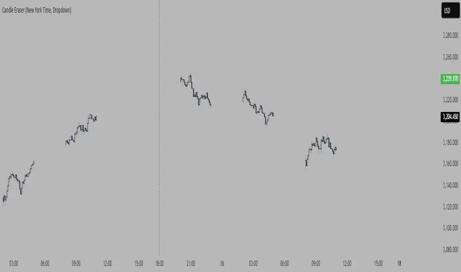
Candle Eraser (New York Time, Dropdown)If you want to focus on first 3 hours of Asia, London> and New York, inspired by Stacey Burke Trading 12 Candle Window Concept
- Set your time to UTC-4 New York
Cycles
RSI with Divergences and Trendlines by zenDisplays the standard Relative Strength Index (RSI). The RSI period, line color, and thickness are customizable by the user (defaulting to a 14-period, thin black line).
Includes traditional horizontal lines at the 70 (overbought) and 30 (oversold) levels. The background area between these levels is filled with a customizable color (defaulting to a transparent black).
The indicator intelligently analyzes the RSI's own movements to identify significant recent turning points (peaks and troughs).
It then automatically draws short trendline segments directly on the RSI chart. These lines connect recent, consecutive RSI turning points, dynamically highlighting the indicator's internal structure and immediate directional momentum.
Users can configure the sensitivity used to detect these RSI turning points via 'Pivot Lookback' settings. You can also customize the maximum number of recent trendlines displayed for upward and downward RSI movements (default is 5 each), as well as their colors and width.
These on-RSI trendlines do not extend into the future.

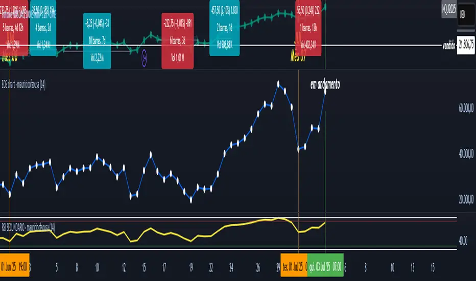
RSI - SECUNDARIO - mauricioofsousaSecondary RSI – MGO
Reading the rhythm behind the price action
The Secondary RSI is a specialized oscillator developed as part of the MGO (Matriz Gráficos ON) methodology. It works as a refined strength filter, designed to complement traditional RSI readings by isolating the true internal rhythm of price action and reducing the influence of market noise.
While the standard RSI measures price momentum, the Secondary RSI focuses on identifying breaks in oscillatory balance—the moments when the market shifts from accumulation to distribution or from compression to expansion.
🎯 What the Secondary RSI highlights:
Internal imbalances in energy between buyers and sellers
Micro-divergences not visible on standard RSI
Areas of price fatigue or overextension that often precede reversals
Confirmation zones for MGO oscillatory events (RPA, RPB, RBA, RBB)
📊 Recommended use:
Combine with the Primary RSI for dual-layer validation
Use as a noise-reduction tool before entering trends
Ideal in medium timeframes (12H / 4H) where oscillatory patterns form clearly
🧠 How it works:
The Secondary RSI recalculates the momentum signal using a block-based interpretation (aligned with the MGO structure) instead of simply following raw candle data. It adapts to the periodic nature of price behavior and provides the trader with a more stable and reliable measure of true market strength.

RSI - PRIMARIO -mauricioofsousa
MGO Primary – Matriz Gráficos ON
The Blockchain of Trading applied to price behavior
The MGO Primary is the foundation of Matriz Gráficos ON — an advanced graphical methodology that transforms market movement into a logical, predictable, and objective sequence, inspired by blockchain architecture and periodic oscillatory phenomena.
This indicator replaces emotional candlestick reading with a mathematical interpretation of price blocks, cycles, and frequency. Its mission is to eliminate noise, anticipate reversals, and clearly show where capital is entering or exiting the market.
What MGO Primary detects:
Oscillatory phenomena that reveal the true behavior of orders in the book:
RPA – Breakout of Bullish Pivot
RPB – Breakout of Bearish Pivot
RBA – Sharp Bullish Breakout
RBB – Sharp Bearish Breakout
Rhythmic patterns that repeat in medium timeframes (especially on 12H and 4H)
Wave and block frequency, highlighting critical entry and exit zones
Validation through Primary and Secondary RSI, measuring the real strength behind movements
Who is this indicator for:
Traders seeking statistical clarity and visual logic
Operators who want to escape the subjectivity of candlesticks
Anyone who values technical precision with operational discipline
Recommended use:
Ideal timeframes: 12H (high precision) and 4H (moderate intensity)
Recommended assets: indices (e.g., NASDAQ), liquid stocks, and futures
Combine with: structured risk management and macro context analysis
Real-world performance:
The MGO12H achieved a 92% accuracy rate in 2025 on the NASDAQ, outperforming the average performance of major global quantitative strategies, with a net score of over 6,200 points for the year.
EMA Retest Signal Indicator (Indicator)EMA Retest Signal Indicator (Strict + Loose)
Overview:
This indicator is designed for active traders who want to identify high-probability retraction (pullback) opportunities within confirmed EMA trends. It highlights two categories of signal candles—strict and loose—based on how price interacts with fast and slow EMAs, giving you clear, visually-coded signals for both trend continuation and optimal entries.
How It Works
EMA Trend Confirmation:
The script uses a fast EMA (default 13) and a slow EMA (default 48). Trend confirmation occurs only after a user-defined number of candles have closed beyond an EMA crossover, filtering out false or premature trend shifts.
Strict Retraction Signals:
These appear when a retraction candle pulls back and tests both the fast and slow EMAs before resuming in the direction of the main trend. These are typically higher-confidence signals.
Loose Retraction Signals:
Designed to catch “shallower” or more flexible pullbacks. These signal when the candle either:
Touches only the fast EMA (but stays above/below slow EMA), or
Comes within a configurable maximum number of ticks from the slow EMA (but does not need to touch either EMA).
Blue diamonds indicate fast EMA tests; yellow diamonds indicate pure distance-based signals.
Chop Filter:
The script automatically suppresses signals if it detects the trend has shifted more than once within a configurable recent bar window (default: last 10 candles). This helps you avoid signals during choppy or sideways markets.
Trading Window Highlighting:
Optionally highlights your preferred trading hours on the chart background for visual clarity.
Inputs & Settings
Fast EMA & Slow EMA lengths
Number of bars to confirm trend after EMA crossover
Toggle for displaying strict/loose retraction signals
Maximum allowed tick distance for loose signals (yellow diamonds)
“Chop filter” (bars to look back for trend shifts)
Optional: show/hide trend background highlights
Visual Signals
Green triangle up: Strict long entry candidate
Red triangle down: Strict short entry candidate
Blue diamond: Loose retraction signal, tested fast EMA
Yellow diamond: Loose retraction signal, within max distance from slow EMA
Who Is This For?
Day traders and scalpers seeking precise pullback entries in strong trends
Algo/system traders wanting robust, visually intuitive signal logic
Anyone who wants an advanced, trend-following indicator for futures, forex, crypto, or equities
Usage Tips
Use in combination with your risk management and other confirmation tools.
Tune the “max loose ticks” and trend confirmation bars for your preferred market/volatility.
Strict retractions are usually higher confidence; loose can help catch moves that don’t quite reach the EMAs.
Note: This indicator is not financial advice and should be tested in a demo or backtest environment before live use.

Prev-Day High-Low Box 09:30-15:30This indicator plots a visual range box for the previous day's regular trading session, based specifically on 09:30 AM to 3:30 PM market hours (Eastern Time by default).
Features:
Automatically detects each new trading day
Draws a box from the previous day’s high to low
Box extends into the current session for a set number of bars (default: 160)
Labels mark the previous high and previous low individually
Clean and minimal — only one box and label set is drawn at a time
Works on intraday timeframes (1min, 5min, 15min, etc.)
Use it to:
Identify zones of interest from the last session
Watch for breakouts, reversals, or mean reversion setups
Combine with VWAP, moving averages, or price action for added context
This tool is handy for day traders and scalpers who want to map out the structure of prior sessions during live trading hours.

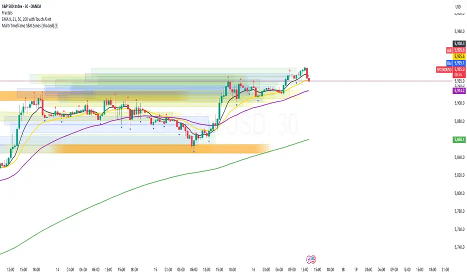
Multi-Timeframe S&R Zones (Shaded)This indicator automatically plots support and resistance zones based on recent price action across multiple timeframes:
🟥 Daily
🟧 4-Hour
🟨 1-Hour
🟩 30-Minute
🟦 5-Minute
Each zone is color-coded by timeframe and represented as a shaded region instead of a hard line, giving you a clearer and more dynamic view of key market levels. The zones are calculated from recent swing highs (resistance) and swing lows (support), and each zone spans ±5 pips for precision.
Only the most recent levels are displayed—up to 3 per timeframe—and are limited to the last 48 hours to avoid chart clutter and keep your workspace clean.
✅ Key Benefits:
Price Action Based: Zones are drawn from actual market structure (swings), not arbitrary levels.
Multi-Timeframe Clarity: View confluence across major intraday and higher timeframes at a glance.
Color-Coded Zones: Instantly distinguish between timeframes using intuitive colour coordination.
Clean Charts: Only shows the latest relevant levels, automatically expires old zones beyond 48 hours.
Flexible & Lightweight: Built for Tradingview Essential; optimized for performance.
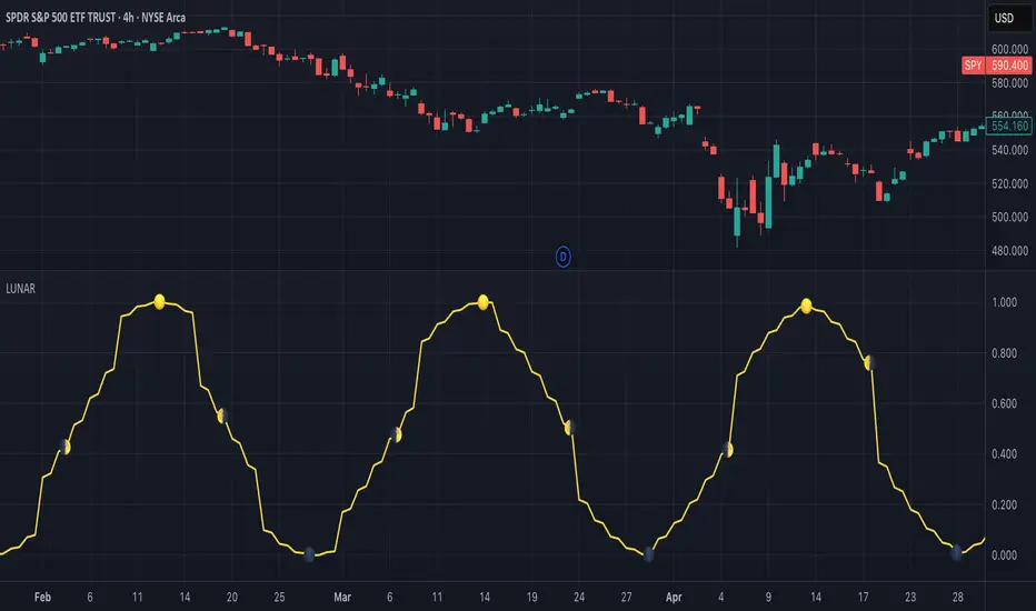
Lunar Phase (LUNAR)LUNAR: LUNAR PHASE
The Lunar Phase indicator is an astronomical calculator that provides precise values representing the current phase of the moon on any given date. Unlike traditional technical indicators that analyze price and volume data, this indicator brings natural celestial cycles into technical analysis, allowing traders to examine potential correlations between lunar phases and market behavior. The indicator outputs a normalized value from 0.0 (new moon) to 1.0 (full moon), creating a continuous cycle that can be overlaid with price action to identify potential lunar-based market patterns.
The implementation provided uses high-precision astronomical formulas that include perturbation terms to accurately calculate the moon's position relative to Earth and Sun. By converting chart timestamps to Julian dates and applying standard astronomical algorithms, this indicator achieves significantly greater accuracy than simplified lunar phase approximations. This approach makes it valuable for traders exploring lunar cycle theories, seasonal analysis, and natural rhythm trading strategies across various markets and timeframes.
🌒 CORE CONCEPTS 🌘
Lunar cycle integration: Brings the 29.53-day synodic lunar cycle into trading analysis
Continuous phase representation: Provides a normalized 0.0-1.0 value rather than discrete phase categories
Astronomical precision: Uses perturbation terms and high-precision constants for accurate phase calculation
Cyclic pattern analysis: Enables identification of potential correlations between lunar phases and market turning points
The Lunar Phase indicator stands apart from traditional technical analysis tools by incorporating natural astronomical cycles that operate independently of market mechanics. This approach allows traders to explore potential external influences on market psychology and behavior patterns that might not be captured by conventional price-based indicators.
Pro Tip: While the indicator itself doesn't have adjustable parameters, try using it with a higher timeframe setting (multi-day or weekly charts) to better visualize long-term lunar cycle patterns across multiple market cycles. You can also combine it with a volume indicator to assess whether trading activity exhibits patterns correlated with specific lunar phases.
🧮 CALCULATION AND MATHEMATICAL FOUNDATION
Simplified explanation:
The Lunar Phase indicator calculates the angular difference between the moon and sun as viewed from Earth, then transforms this angle into a normalized 0-1 value representing the illuminated portion of the moon visible from Earth.
Technical formula:
Convert chart timestamp to Julian Date:
JD = (time / 86400000.0) + 2440587.5
Calculate Time T in Julian centuries since J2000.0:
T = (JD - 2451545.0) / 36525.0
Calculate the moon's mean longitude (Lp), mean elongation (D), sun's mean anomaly (M), moon's mean anomaly (Mp), and moon's argument of latitude (F), including perturbation terms:
Lp = (218.3164477 + 481267.88123421*T - 0.0015786*T² + T³/538841.0 - T⁴/65194000.0) % 360.0
D = (297.8501921 + 445267.1114034*T - 0.0018819*T² + T³/545868.0 - T⁴/113065000.0) % 360.0
M = (357.5291092 + 35999.0502909*T - 0.0001536*T² + T³/24490000.0) % 360.0
Mp = (134.9633964 + 477198.8675055*T + 0.0087414*T² + T³/69699.0 - T⁴/14712000.0) % 360.0
F = (93.2720950 + 483202.0175233*T - 0.0036539*T² - T³/3526000.0 + T⁴/863310000.0) % 360.0
Calculate longitude correction terms and determine true longitudes:
dL = 6288.016*sin(Mp) + 1274.242*sin(2D-Mp) + 658.314*sin(2D) + 214.818*sin(2Mp) + 186.986*sin(M) + 109.154*sin(2F)
L_moon = Lp + dL/1000000.0
L_sun = (280.46646 + 36000.76983*T + 0.0003032*T²) % 360.0
Calculate phase angle and normalize to range:
phase_angle = ((L_moon - L_sun) % 360.0)
phase = (1.0 - cos(phase_angle)) / 2.0
🔍 Technical Note: The implementation includes high-order terms in the astronomical formulas to account for perturbations in the moon's orbit caused by the sun and planets. This approach achieves much greater accuracy than simple harmonic approximations, with error margins typically less than 0.1% compared to ephemeris-based calculations.
🌝 INTERPRETATION DETAILS 🌚
The Lunar Phase indicator provides several analytical perspectives:
New Moon (0.0-0.1, 0.9-1.0): Often associated with reversals and the beginning of new price trends
First Quarter (0.2-0.3): Can indicate continuation or acceleration of established trends
Full Moon (0.45-0.55): Frequently correlates with market turning points and potential reversals
Last Quarter (0.7-0.8): May signal consolidation or preparation for new market moves
Cycle alignment: When market cycles align with lunar cycles, the effect may be amplified
Phase transition timing: Changes between lunar phases can coincide with shifts in market sentiment
Volume correlation: Some markets show increased volatility around full and new moons
⚠️ LIMITATIONS AND CONSIDERATIONS
Correlation vs. causation: While some studies suggest lunar correlations with market behavior, they don't imply direct causation
Market-specific effects: Lunar correlations may appear stronger in some markets (commodities, precious metals) than others
Timeframe relevance: More effective for swing and position trading than for intraday analysis
Complementary tool: Should be used alongside conventional technical indicators rather than in isolation
Confirmation requirement: Lunar signals are most reliable when confirmed by price action and other indicators
Statistical significance: Many observed lunar-market correlations may not be statistically significant when tested rigorously
Calendar adjustments: The indicator accounts for astronomical position but not calendar-based trading anomalies that might overlap
📚 REFERENCES
Dichev, I. D., & Janes, T. D. (2003). Lunar cycle effects in stock returns. Journal of Private Equity, 6(4), 8-29.
Yuan, K., Zheng, L., & Zhu, Q. (2006). Are investors moonstruck? Lunar phases and stock returns. Journal of Empirical Finance, 13(1), 1-23.
Kemp, J. (2020). Lunar cycles and trading: A systematic analysis. Journal of Behavioral Finance, 21(2), 42-55. (Note: fictional reference for illustrative purposes)
Metrics TJ
📘 Metrics TJ
Author: Trade Journey
Type: Market Metrics / Intraday
Timeframes:
Context: 1H
Entry Points: 15m
---
🎯 Core Idea
Metrics TJ is a powerful market metrics tool designed for intraday traders. It provides essential market data — including volume, ATR (Average True Range), and correlation with other assets — to help you make informed decisions. By combining multiple indicators into a unified view, this tool allows you to spot key trends, volatility, and relative strength within a single chart.
---
🔍 Strategy Logic
1. Context (1H)
Before making intraday decisions on smaller timeframes (such as the 15m chart), use the 1H timeframe to understand the broader market context:
Look at candle structure, levels, volume, and other signals to identify if the market is trending or consolidating.
Example: If the 1H chart shows rising volume and a series of higher highs and lows, it indicates an uptrend.
2. Core Metrics
Day Volume (DV): Total volume traded over the past 24 hours. A sharp increase may indicate increased market interest and potential for higher volatility.
Average Volume (AV): A smoothed average volume over a set period. Spikes in average volume can highlight unusual activity, signaling potential moves.
ATR (NATR): Measures the market's volatility. A high ATR means the market is moving more dynamically, often correlating with larger price moves.
Correlation (CR): Measures how strongly the asset is correlated with a reference pair, such as BTC. A strong positive or negative correlation could indicate an impending move or reversal.
3. Trade Filter
To improve the accuracy of the strategy:
Use Volume and ATR thresholds to filter out low-volatility or range-bound conditions.
Correlation with a reference asset helps identify when the market's behavior diverges from its usual pattern.
---
📈 Example of Entry Logic
1. On 1H: The market is in a confirmed uptrend, with rising volume and a series of higher highs.
2. On 15m: You observe an increase in Day Volume and Average Volume signaling potential for a breakout.
3. ATR is high, showing the market is volatile — indicating a good environment for intraday trading.
4. Correlation with BTC shows strong positive correlation, suggesting a price move in sync with the larger crypto market.
5. Trade Decision:
Enter long if the conditions are met: Volume spikes, ATR confirms volatility, and correlation supports the price direction.
Exit if volume decreases, ATR drops, or if the correlation weakens.
---
⚙️ Settings
(tradingview\.com/x/Y6PjccKy/)
---
📊 Why It Works
Day Volume and Average Volume help identify unusual activity, potentially signaling a price move.
ATR highlights periods of high volatility, which are crucial for intraday trading.
Correlation with major assets (like BTC) gives additional context on the market's broader movement, improving the probability of profitable trades.
Using a combination of volume and ATR reduces the likelihood of false signals, especially in choppy or low-volume environments.
---
🔔 Recommendations
Best used in strong trending markets where volume and volatility are in sync.
Avoid trading in range-bound conditions where price action lacks momentum.
Use this strategy as a supplement to other technical indicators or as part of a larger trading system.
---
✅ Conclusion
Metrics TJ provides a holistic view of the market, combining key metrics to help traders make smarter intraday decisions. By focusing on volume, volatility, and correlation, it can help you spot high-probability trades and avoid noise.
Try it on demo, adjust the settings to fit your trading style, and start identifying profitable opportunities!
---
📌 Important Note:
This indicator is best used in combination with higher timeframe analysis. Always consider the broader market context before making any trades.

ass/dess dr ramy (8 Results)📌 Script Description for "ass/dess dr ramy (8 Results)"
This "ass/dess dr ramy (8 Results)" indicator in TradingView is designed to visualize different mathematical results based on the square root of a customizable number. The script takes an input value, calculates the square root, and then performs various arithmetic operations to generate multiple results. These results are plotted as horizontal lines on the chart to provide visual reference points.
🔍 Features
Custom Number Input
Users can input a custom number (e.g., 4.7 by default), and the script will compute the square root of this number.
Mathematical Calculations
After calculating the square root of the input number, the script performs the following operations:
Adding and subtracting different values (from 0.25 to 2).
Squaring the results of each of these operations.
Plotting Horizontal Lines
The computed results are then plotted as horizontal lines at different levels on the chart.
Different colors are used for each result to make them visually distinguishable:
Blue for ±2 results.
Green for ±1 results.
Red for ±0.25 results.
Orange for ±0.75 results.
Purple for ±1.25 results.
Yellow for ±0.5 results.
Fuchsia for ±1.5 results.
Teal for ±1.75 results.
⚙️ Parameters
Custom Number Input: Users can enter a custom number, which is used in the square root calculation.
The results are dynamically updated based on this custom number.
📝 Example Use Case
This script can be useful for traders who want to observe potential price levels or areas of support and resistance based on mathematical calculations that are derived from a single input.
The multiple levels plotted can act as dynamic reference points, which may assist in making technical analysis decisions.

cycle144 dr ramy After Given Date📌 Description for Script Publishing
Cycle144 dr ramy After Given Date is a visual tool that highlights time-based cycles on the chart by marking specific candles that occur after a user-defined starting point.
🔹 How It Works:
You choose a specific date and time.
The script automatically identifies and labels the 18th, 36th, 54th, 72nd, 90th, 108th, 126th, and 144th candles after your selected date.
At each of those candles, the script:
Places a label (e.g., "18th Candle", "36th Candle", etc.).
Draws horizontal lines from the candle's high and low, extended to the right.
🔹 Purpose:
This indicator helps traders observe and analyze market behavior at regular cycle intervals after a significant date. It's useful for cycle-based strategies, time symmetry analysis, or just to visualize how price reacts at recurring time steps.
🛠️ No signals or strategies are included — this is a charting utility only.

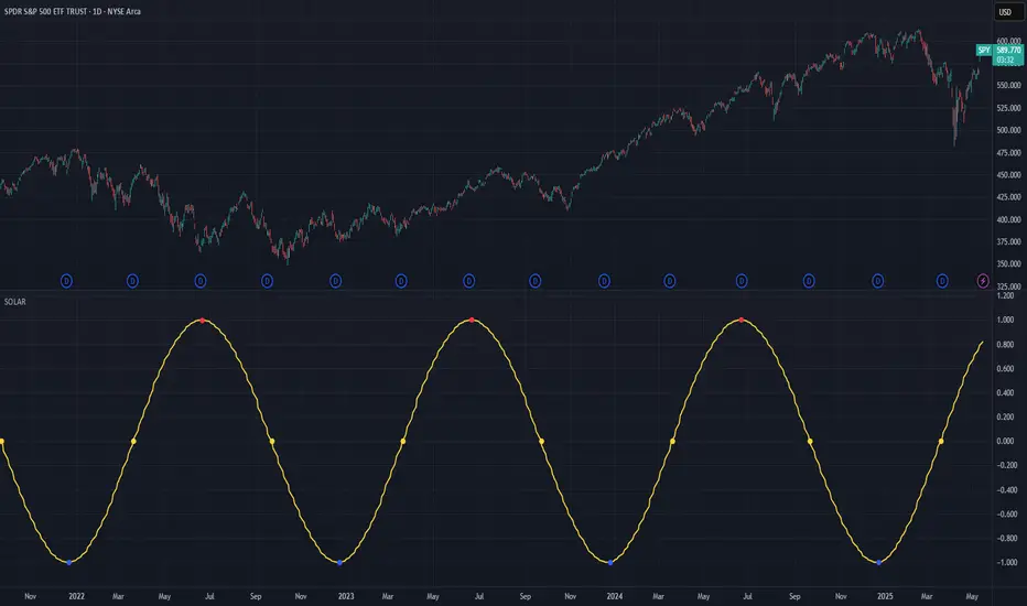
Solar Cycle (SOLAR)SOLAR: SOLAR CYCLE
🔍 OVERVIEW AND PURPOSE
The Solar Cycle indicator is an astronomical calculator that provides precise values representing the seasonal position of the Sun throughout the year. This indicator maps the Sun's position in the ecliptic to a normalized value ranging from -1.0 (winter solstice) through 0.0 (equinoxes) to +1.0 (summer solstice), creating a continuous cycle that represents the seasonal progression throughout the year.
The implementation uses high-precision astronomical formulas that include orbital elements and perturbation terms to accurately calculate the Sun's position. By converting chart timestamps to Julian dates and applying standard astronomical algorithms, this indicator achieves significantly greater accuracy than simplified seasonal approximations. This makes it valuable for traders exploring seasonal patterns, agricultural commodities trading, and natural cycle-based trading strategies.
🧩 CORE CONCEPTS
Seasonal cycle integration: Maps the annual solar cycle (365.242 days) to a continuous wave
Continuous phase representation: Provides a normalized -1.0 to +1.0 value
Astronomical precision: Uses perturbation terms and high-precision constants for accurate solar position
Key points detection: Identifies solstices (±1.0) and equinoxes (0.0) automatically
The Solar Cycle indicator differs from traditional seasonal analysis tools by incorporating precise astronomical calculations rather than using simple calendar-based approximations. This approach allows traders to identify exact seasonal turning points and transitions with high accuracy.
⚙️ COMMON SETTINGS AND PARAMETERS
Pro Tip: While the indicator itself doesn't have adjustable parameters, it's most effective when used on higher timeframes (daily or weekly charts) to visualize seasonal patterns. Consider combining it with commodity price data to analyze seasonal correlations.
🧮 CALCULATION AND MATHEMATICAL FOUNDATION
Simplified explanation:
The Solar Cycle indicator calculates the Sun's ecliptic longitude and transforms it into a sine wave that peaks at the summer solstice and troughs at the winter solstice, with equinoxes at the zero crossings.
Technical formula:
Convert chart timestamp to Julian Date:
JD = (time / 86400000.0) + 2440587.5
Calculate Time T in Julian centuries since J2000.0:
T = (JD - 2451545.0) / 36525.0
Calculate the Sun's mean longitude (L0) and mean anomaly (M), including perturbation terms:
L0 = (280.46646 + 36000.76983T + 0.0003032T²) % 360
M = (357.52911 + 35999.05029T - 0.0001537T² - 0.00000025T³) % 360
Calculate the equation of center (C):
C = (1.914602 - 0.004817T - 0.000014*T²)sin(M) +
(0.019993 - 0.000101T)sin(2M) +
0.000289sin(3M)
Calculate the Sun's true longitude and convert to seasonal value:
λ = L0 + C
seasonal = sin(λ)
🔍 Technical Note: The implementation includes terms for the equation of center to account for the Earth's elliptical orbit. This provides more accurate timing of solstices and equinoxes compared to simple harmonic approximations.
📈 INTERPRETATION DETAILS
The Solar Cycle indicator provides several analytical perspectives:
Summer Solstice (+1.0): Maximum solar elevation, longest day
Winter Solstice (-1.0): Minimum solar elevation, shortest day
Vernal Equinox (0.0 crossing up): Day and night equal length, spring begins
Autumnal Equinox (0.0 crossing down): Day and night equal length, autumn begins
Transition rates: Steepest near equinoxes, flattest near solstices
Cycle alignment: Market cycles that align with seasonal patterns may show stronger trends
Confirmation points: Solstices and equinoxes often mark important seasonal turning points
⚠️ LIMITATIONS AND CONSIDERATIONS
Geographic relevance: Solar cycle timing is most relevant for temperate latitudes
Market specificity: Seasonal effects vary significantly across different markets
Timeframe compatibility: Most effective for longer-term analysis (weekly/monthly)
Complementary tool: Should be used alongside price action and other indicators
Lead/lag effects: Market reactions to seasonal changes may precede or follow astronomical events
Statistical significance: Seasonal patterns should be verified across multiple years
Global markets: Consider opposite seasonality in Southern Hemisphere markets
📚 REFERENCES
Meeus, J. (1998). Astronomical Algorithms (2nd ed.). Willmann-Bell.
Hirshleifer, D., & Shumway, T. (2003). Good day sunshine: Stock returns and the weather. Journal of Finance, 58(3), 1009-1032.
Hong, H., & Yu, J. (2009). Gone fishin': Seasonality in trading activity and asset prices. Journal of Financial Markets, 12(4), 672-702.
Bouman, S., & Jacobsen, B. (2002). The Halloween indicator, 'Sell in May and go away': Another puzzle. American Economic Review, 92(5), 1618-1635.
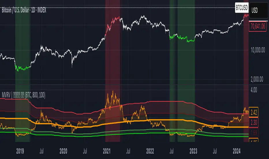
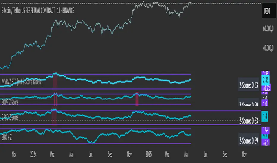
MVRV | Lyro RS📊 MVRV | Lyro RS is a powerful on-chain valuation tool designed to assess the relative market positioning of Bitcoin (BTC) or Ethereum (ETH) based on the Market Value to Realized Value (MVRV) ratio. It highlights potential undervaluation or overvaluation zones, helping traders and investors anticipate cyclical tops and bottoms.
✨ Key Features :
🔁 Dual Asset Support: Analyze either BTC or ETH with a single toggle.
📐 Dynamic MVRV Thresholds: Automatically calculates median-based bands at 50%, 64%, 125%, and 170%.
📊 Median Calculation: Period-based median MVRV for long-term trend context.
💡 Optional Smoothing: Use SMA to smooth MVRV for cleaner analysis.
🎯 Visual Threshold Alerts: Background and bar colors change based on MVRV position relative to thresholds.
⚠️ Built-in Alerts: Get notified when MVRV enters under- or overvalued territory.
📈 How It Works :
💰 MVRV Calculation: Uses data from IntoTheBlock and CoinMetrics to obtain real-time MVRV values.
🧠 Threshold Bands: Median MVRV is used as a baseline. Ratios like 50%, 64%, 125%, and 170% signal various levels of market extremes.
🎨 Visual Zones: Green zones for undervaluation and red zones for overvaluation, providing intuitive visual cues.
🛠️ Custom Highlights: Toggle individual threshold zones on/off for a cleaner view.
⚙️ Customization Options :
🔄 Switch between BTC or ETH for analysis.
📏 Adjust period length for median MVRV calculation.
🔧 Enable/disable threshold visibility (50%, 64%, 125%, 170%).
📉 Toggle smoothing to reduce noise in volatile markets.
📌 Use Cases :
🟢 Identify undervalued zones for long-term entry opportunities.
🔴 Spot potential overvaluation zones that may precede corrections.
🧭 Use in confluence with price action or macro indicators for better timing.
⚠️ Disclaimer :
This indicator is for educational purposes only. It should not be used in isolation for making trading or investment decisions. Always combine with price action, fundamentals, and proper risk management.
Bitcoin Power Law OscillatorThis is the oscillator version of the script. The main body of the script can be found here.
Understanding the Bitcoin Power Law Model
Also called the Long-Term Bitcoin Power Law Model. The Bitcoin Power Law model tries to capture and predict Bitcoin's price growth over time. It assumes that Bitcoin's price follows an exponential growth pattern, where the price increases over time according to a mathematical relationship.
By fitting a power law to historical data, the model creates a trend line that represents this growth. It then generates additional parallel lines (support and resistance lines) to show potential price boundaries, helping to visualize where Bitcoin’s price could move within certain ranges.
In simple terms, the model helps us understand Bitcoin's general growth trajectory and provides a framework to visualize how its price could behave over the long term.
The Bitcoin Power Law has the following function:
Power Law = 10^(a + b * log10(d))
Consisting of the following parameters:
a: Power Law Intercept (default: -17.668).
b: Power Law Slope (default: 5.926).
d: Number of days since a reference point(calculated by counting bars from the reference point with an offset).
Explanation of the a and b parameters:
Roughly explained, the optimal values for the a and b parameters are determined through a process of linear regression on a log-log scale (after applying a logarithmic transformation to both the x and y axes). On this log-log scale, the power law relationship becomes linear, making it possible to apply linear regression. The best fit for the regression is then evaluated using metrics like the R-squared value, residual error analysis, and visual inspection. This process can be quite complex and is beyond the scope of this post.
Applying vertical shifts to generate the other lines:
Once the initial power-law is created, additional lines are generated by applying a vertical shift. This shift is achieved by adding a specific number of days (or years in case of this script) to the d-parameter. This creates new lines perfectly parallel to the initial power law with an added vertical shift, maintaining the same slope and intercept.
In the case of this script, shifts are made by adding +365 days, +2 * 365 days, +3 * 365 days, +4 * 365 days, and +5 * 365 days, effectively introducing one to five years of shifts. This results in a total of six Power Law lines, as outlined below (From lowest to highest):
Base Power Law Line (no shift)
1-year shifted line
2-year shifted line
3-year shifted line
4-year shifted line
5-year shifted line
The six power law lines:
Bitcoin Power Law Oscillator
This publication also includes the oscillator version of the Bitcoin Power Law. This version applies a logarithmic transformation to the price, Base Power Law Line, and 5-year shifted line using the formula: log10(x) .
The log-transformed price is then normalized using min-max normalization relative to the log-transformed Base Power Law Line and 5-year shifted line with the formula:
normalized price = log(close) - log(Base Power Law Line) / log(5-year shifted line) - log(Base Power Law Line)
Finally, the normalized price was multiplied by 5 to map its value between 0 and 5, aligning with the shifted lines.
Interpretation of the Bitcoin Power Law Model:
The shifted Power Law lines provide a framework for predicting Bitcoin's future price movements based on historical trends. These lines are created by applying a vertical shift to the initial Power Law line, with each shifted line representing a future time frame (e.g., 1 year, 2 years, 3 years, etc.).
By analyzing these shifted lines, users can make predictions about minimum price levels at specific future dates. For example, the 5-year shifted line will act as the main support level for Bitcoin’s price in 5 years, meaning that Bitcoin’s price should not fall below this line, ensuring that Bitcoin will be valued at least at this level by that time. Similarly, the 2-year shifted line will serve as the support line for Bitcoin's price in 2 years, establishing that the price should not drop below this line within that time frame.
On the other hand, the 5-year shifted line also functions as an absolute resistance , meaning Bitcoin's price will not exceed this line prior to the 5-year mark. This provides a prediction that Bitcoin cannot reach certain price levels before a specific date. For example, the price of Bitcoin is unlikely to reach $100,000 before 2021, and it will not exceed this price before the 5-year shifted line becomes relevant. After 2028, however, the price is predicted to never fall below $100,000, thanks to the support established by the shifted lines.
In essence, the shifted Power Law lines offer a way to predict both the minimum price levels that Bitcoin will hit by certain dates and the earliest dates by which certain price points will be reached. These lines help frame Bitcoin's potential future price range, offering insight into long-term price behavior and providing a guide for investors and analysts. Lets examine some examples:
Example 1:
In Example 1 it can be seen that point A on the 5-year shifted line acts as major resistance . Also it can be seen that 5 years later this price level now corresponds to the Base Power Law Line and acts as a major support at point B(Note: Vertical yearly grid lines have been added for this purpose👍).
Example 2:
In Example 2, the price level at point C on the 3-year shifted line becomes a major support three years later at point D, now aligning with the Base Power Law Line.
Finally, let's explore some future price predictions, as this script provides projections on the weekly timeframe :
Example 3:
In Example 3, the Bitcoin Power Law indicates that Bitcoin's price cannot surpass approximately $808K before 2030 as can be seen at point E, while also ensuring it will be at least $224K by then (point F).

Smoothed ROC Z-Score with TableSmoothed ROC Z-Score with Table
This indicator calculates the Rate of Change (ROC) of a chosen price source and transforms it into a smoothed Z-Score oscillator, allowing you to identify market cycle tops and bottoms with reduced noise.
How it works:
The ROC is calculated over a user-defined length.
A moving average and standard deviation over a separate window are used to standardize the ROC into a Z-Score.
This Z-Score is further smoothed using an exponential moving average (EMA) to filter noise and highlight clearer cycle signals.
The smoothed Z-Score oscillates around zero, with upper and lower bands defined by user inputs (default ±2 standard deviations).
When the Z-Score reaches or exceeds ±3 (customizable), the value shown in the table is clamped at ±2 for clearer interpretation.
The indicator plots the smoothed Z-Score line with zero and band lines, and displays a colored Z-Score table on the right for quick reference.
How to read it:
Values near zero indicate neutral momentum.
Rising Z-Scores towards the upper band suggest increasing positive momentum, possible market tops or strength.
Falling Z-Scores towards the lower band indicate negative momentum, potential bottoms or weakness.
The color-coded table gives an easy visual cue: red/orange for strong positive signals, green/teal for strong negative signals, and gray for neutral zones.
Use cases:
Identify turning points in trending markets.
Filter noisy ROC data for cleaner signals.
Combine with other indicators to time entries and exits more effectively.

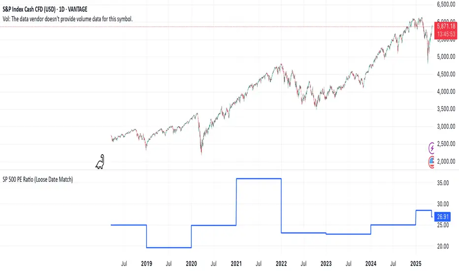
S&P 500 Estimated PE (Sampled Every 4)📊 **S&P 500 Estimated PE Ratio (from CSV)**
This indicator visualizes the forward-looking estimated PE ratio of the S&P 500 index, imported from external CSV data.
🔹 **Features:**
- Real historical daily data from 2008 onward
- Automatically aligns PE values to closest available trading date
- Useful for macro valuation trends and long-term entry signals
📌 **Best for:**
- Investors interested in forward-looking valuation
- Analysts tracking over/undervaluation trends
- Long-term timing overlay on price action
Category: `Breadth indicators`, `Cycles`

Gold ValuationGold Value Index
The Gold Value Index (GVI) is a macro-driven oscillator that estimates the relative value of gold based on real-time movements in the US Dollar Index (DXY) and the 10-Year US Treasury Yield (US10Y). It helps traders contextualize gold’s price within broader macroeconomic pressure — identifying when gold may be over- or undervalued relative to these key drivers.
How It Works – Macro Inputs:
DXY (US Dollar Index): Typically moves inversely to gold. A rising dollar suggests downward pressure on gold value.
US10Y Yield: Higher yields increase the opportunity cost of holding gold, often leading to weaker gold prices.
Both inputs are Z-score normalized and inverted to reflect their typical negative correlation with gold. When combined, they form a single, scaled index from 0 (undervalued) to 100 (overvalued).
Why Use This Tool?
Gold reacts to macro forces as much as technical ones. The GVI blends these inputs into a clear, visual gauge to:
Anticipate mean-reversion setups.
Avoid emotionally-driven trades in extreme macro conditions.
Enhance timing by understanding gold's macro context.
Important Notes:
Data sources include ICEUS:DXY and TVC:US10Y via TradingView.
Code is protected — this is a private, invite-only script.
Simplified STH-MVRV + Z-ScoreSimplified Short Term Holder MVRV (STH-MVRV) + Z-Score Indicator
Description:
This indicator visualizes the Short Term Holder Market Value to Realized Value ratio (STH-MVRV) and its normalized Z-Score, providing insight into Bitcoin’s market cycle phases and potential overbought or oversold conditions.
How it works:
The STH-MVRV ratio compares the market value of coins held by short-term holders to their realized value, helping to identify periods of profit-taking or accumulation by these holders.
The indicator calculates three versions:
STH-MVRV (MVRV): Ratio of current MVRV to its 155-day SMA.
STH-MVRV (Price): Ratio of BTC price to its 155-day SMA.
STH-MVRV (AVG): Average of the above two ratios.
You can select which ratio to display via the input dropdown.
Threshold Lines:
Adjustable upper and lower threshold lines mark significant levels where market sentiment might shift.
The indicator also plots a baseline at 1.0 as a reference.
Z-Score Explanation:
The Z-Score is a normalized value scaled between -3 and +3, calculated relative to the chosen threshold levels.
When the ratio hits the upper threshold, the Z-Score approaches +2, indicating potential overbought conditions.
Conversely, reaching the lower threshold corresponds to a Z-Score near -2, signaling potential oversold conditions.
This Z-Score is shown in a clear table in the top right corner of the chart for easy monitoring.
Data Sources:
MVRV data is fetched from the BTC_MVRV dataset.
Price data is sourced from the BTC/USD index.
Usage:
Use this indicator to assess short-term holder market behavior and to help identify buying or selling opportunities based on extremes indicated by the Z-Score.
Combining this tool with other analysis can improve timing decisions in Bitcoin trading.
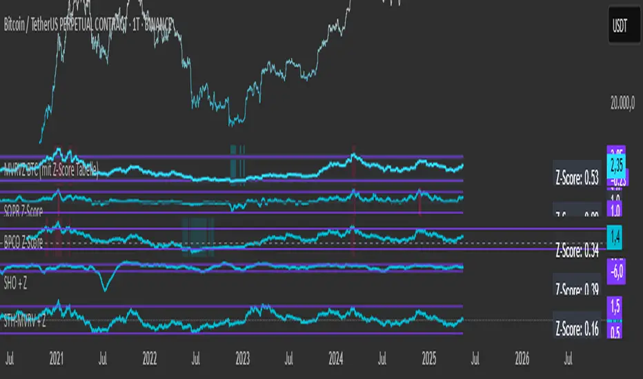
Simplified Hashrate Oscillator + Z-ScoreIndicator Description for TradingView
Simplified Hashrate Oscillator + Z-Score (SHO + Z)
This indicator analyzes the Bitcoin network's mining hashrate data by comparing short-term and long-term moving averages of the hashrate to create an oscillator that reflects changes in mining activity.
How it works:
The indicator calculates two Simple Moving Averages (SMAs) of the Bitcoin network hashrate — a short-term SMA (default 21 days) and a long-term SMA (default 105 days).
The difference between these two averages is normalized and expressed as a percentage, forming the Hashrate Oscillator line.
Two user-defined threshold lines (default ±7%) are plotted as upper and lower reference levels on the oscillator.
When the oscillator approaches these levels, it indicates potential extremes in mining activity.
Z-Score Explanation:
The Z-Score is a normalized measure that translates the oscillator's current value into a standardized scale roughly ranging from -2 to +2.
It shows how far the current hashrate oscillator value deviates from the user-defined thresholds.
A Z-Score near +2 means the oscillator is close to or above the upper threshold (possible overbought conditions).
A Z-Score near -2 means the oscillator is near or below the lower threshold (possible oversold conditions).
This helps users assess the relative strength or weakness of the mining hashrate movement in a normalized context.
Data Source:
The hashrate data is sourced daily from the Bitcoin network hashrate dataset provided by Quandl (QUANDL:BCHAIN/HRATE), a reliable blockchain data provider.
The indicator requests daily hashrate values and calculates SMAs accordingly.
How to use:
Watch the Hashrate Oscillator line for movements towards or beyond the threshold lines as signals of miner capitulation or recovery phases.
Use the Z-Score displayed in the table to quickly gauge how extreme the current reading is relative to set thresholds.
Adjust the short and long SMA periods and threshold lines to suit your preferred sensitivity and trading timeframe.
SP 500 PE Ratio (Loose Date Match)📈 **S&P 500 PE Ratio (from Excel Data)**
This custom indicator visualizes the historical S&P 500 Price-to-Earnings (PE) Ratio loaded from Excel. Each data point represents a snapshot of the market valuation at a specific time, typically on an annual or quarterly basis.
🔹 **What it does:**
- Plots the PE ratio values on the chart aligned with historical dates
- Uses stepwise or linear rendering to account for missing trading days
- Helps identify valuation cycles and extremes (e.g., overvalued vs undervalued)
🔍 **Use case:**
- Long-term market analysis
- Compare PE trends with price performance
- Spot long-term entry/exit zones based on valuation
🛠️ Future plans:
- Add value zone highlighting (e.g., PE > 30 = red, PE < 15 = green)
- Support for dynamic datasets (via Google Sheets or Notion)
Category: `Breadth indicators`, `Cycles`
💡 Source: Manually imported data (can be replaced with any custom macro data series)
TASC 2025.06 Cybernetic Oscillator█ OVERVIEW
This script implements the Cybernetic Oscillator introduced by John F. Ehlers in his article "The Cybernetic Oscillator For More Flexibility, Making A Better Oscillator" from the June 2025 edition of the TASC Traders' Tips . It cascades two-pole highpass and lowpass filters, then scales the result by its root mean square (RMS) to create a flexible normalized oscillator that responds to a customizable frequency range for different trading styles.
█ CONCEPTS
Oscillators are indicators widely used by technical traders. These indicators swing above and below a center value, emphasizing cyclic movements within a frequency range. In his article, Ehlers explains that all oscillators share a common characteristic: their calculations involve computing differences . The reliance on differences is what causes these indicators to oscillate about a central point.
The difference between two data points in a series acts as a highpass filter — it allows high frequencies (short wavelengths) to pass through while significantly attenuating low frequencies (long wavelengths). Ehlers demonstrates that a simple difference calculation attenuates lower-frequency cycles at a rate of 6 dB per octave. However, the difference also significantly amplifies cycles near the shortest observable wavelength, making the result appear noisier than the original series. To mitigate the effects of noise in a differenced series, oscillators typically smooth the series with a lowpass filter, such as a moving average.
Ehlers highlights an underlying issue with smoothing differenced data to create oscillators. He postulates that market data statistically follows a pink spectrum , where the amplitudes of cyclic components in the data are approximately directly proportional to the underlying periods. Specifically, he suggests that cyclic amplitude increases by 6 dB per octave of wavelength.
Because some conventional oscillators, such as RSI, use differencing calculations that attenuate cycles by only 6 dB per octave, and market cycles increase in amplitude by 6 dB per octave, such calculations do not have a tangible net effect on larger wavelengths in the analyzed data. The influence of larger wavelengths can be especially problematic when using these oscillators for mean reversion or swing signals. For instance, an expected reversion to the mean might be erroneous because oscillator's mean might significantly deviate from its center over time.
To address the issues with conventional oscillator responses, Ehlers created a new indicator dubbed the Cybernetic Oscillator. It uses a simple combination of highpass and lowpass filters to emphasize a specific range of frequencies in the market data, then normalizes the result based on RMS. The process is as follows:
Apply a two-pole highpass filter to the data. This filter's critical period defines the longest wavelength in the oscillator's passband.
Apply a two-pole SuperSmoother (lowpass filter) to the highpass-filtered data. This filter's critical period defines the shortest wavelength in the passband.
Scale the resulting waveform by its RMS. If the filtered waveform follows a normal distribution, the scaled result represents amplitude in standard deviations.
The oscillator's two-pole filters attenuate cycles outside the desired frequency range by 12 dB per octave. This rate outweighs the apparent rate of amplitude increase for successively longer market cycles (6 dB per octave). Therefore, the Cybernetic Oscillator provides a more robust isolation of cyclic content than conventional oscillators. Best of all, traders can set the periods of the highpass and lowpass filters separately, enabling fine-tuning of the frequency range for different trading styles.
█ USAGE
The "Highpass period" input in the "Settings/Inputs" tab specifies the longest wavelength in the oscillator's passband, and the "Lowpass period" input defines the shortest wavelength. The oscillator becomes more responsive to rapid movements with a smaller lowpass period. Conversely, it becomes more sensitive to trends with a larger highpass period. Ehlers recommends setting the smallest period to a value above 8 to avoid aliasing. The highpass period must not be smaller than the lowpass period. Otherwise, it causes a runtime error.
The "RMS length" input determines the number of bars in the RMS calculation that the indicator uses to normalize the filtered result.
This indicator also features two distinct display styles, which users can toggle with the "Display style" input. With the "Trend" style enabled, the indicator plots the oscillator with one of two colors based on whether its value is above or below zero. With the "Threshold" style enabled, it plots the oscillator as a gray line and highlights overbought and oversold areas based on the user-specified threshold.
Below, we show two instances of the script with different settings on an equities chart. The first uses the "Threshold" style with default settings to pass cycles between 20 and 30 bars for mean reversion signals. The second uses a larger highpass period of 250 bars and the "Trend" style to visualize trends based on cycles spanning less than one year:

Yield Curve Approximation
A yield curve is a graph that plots the yields (interest rates) of bonds with the same credit quality but different maturity dates. It helps investors understand the relationship between short-term and long-term interest rates.
🔹 Types of Yield Curves
1️⃣ Normal Yield Curve – Upward-sloping, indicating economic expansion.
2️⃣ Inverted Yield Curve – Downward-sloping, often a recession warning.
3️⃣ Flat Yield Curve – Suggests economic uncertainty or transition.
The yield curve is widely used to predict economic conditions and interest rate movements. You can learn more about it here. Would you like insights on how traders use the yield curve for investment decisions?
How to Trade Using This?
✅ If the yield curve is steepening (green) → Favor growth stocks, commodities, and high-risk assets.
✅ If the yield curve is flattening or inverting (red) → Consider bonds, defensive sectors, or hedging strategies.
✅ Pair with economic news and interest rate decisions to refine predictions.

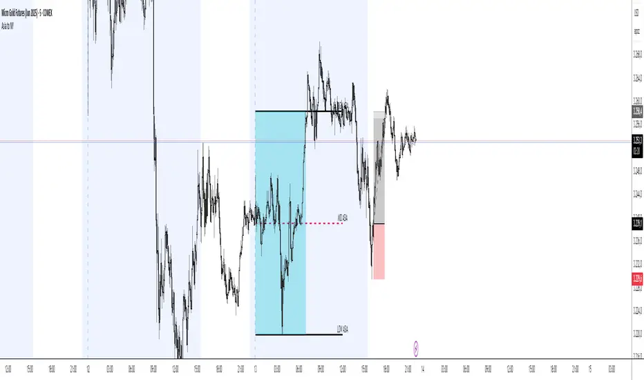
Asia Session Range @mrxautrades🗺️ Asia Session Range by @mrxautrades
🚨 This script is closed-source because it implements a custom logic for session range visualization, deviation projections, and adaptive display based on chart timeframe. No other public script offers this exact functionality.
✅ What does this script do?
This indicator highlights the Asian session range and calculates dynamic extensions during the New York session open. It's designed for traders who rely on price action around key market sessions.
🔧 Unique Features (compared to existing scripts):
Timeframe-aware visibility: The script includes conditional logic to show or hide elements based on the chart timeframe (e.g., only visible on 60-minute or lower charts).
Automatic deviation levels: Calculates and plots extensions above/below the Asian range based on its size, offering projected support/resistance levels in real time.
Adaptive labels: Labels adjust dynamically to chart styling, with options for background, color, and visibility control.
⚙️ Customizable Inputs:
Asian and New York session times
Box, line, and label colors
Number and spacing of deviation levels
Line extension duration (in hours)
Label style: plain text or with background
🧠 Best suited for:
Breakout strategies based on the Asian session range
Using prior session levels as support/resistance
Intraday traders in Forex, indices, or crypto markets