EMA 21, 55, 200 with Small LabelsThis is a combination of ema21/50/200. Helps to identify market trends. It comes with small labels so it won't confuse which line is which. I hope it helps and good luck with your trading!
Cycles


Market Up and Low VolatilityThis indicator identifies uptrends in the customizable index (e.g. SP500) together with a customizable volatility index (e.g. VIX) being below a threshold such as 20.

Multi-timeframe Spot ETH ETF flowsDescription of Multi-timeframe Spot ETH ETF Flows Pine Script
This Pine Script™ (version 6) creates a Multi-timeframe Spot ETH ETF Flows indicator to track and visualize net and cumulative capital flows for various Ethereum (ETH) Spot Exchange-Traded Funds (ETFs) listed on AMEX and NASDAQ. The script calculates up and down volume based on price movements in a lower timeframe, multiplies these by the average price (HLC3) for accuracy, and aggregates the data to display net and cumulative flows.
Key Features:
ETF List : Tracks nine ETH Spot ETFs (e.g., AMEX:ETHE, NASDAQ:ETHA, etc.).
Custom Timeframe Input : Allows users to override the default lower timeframe (automatically selected based on the chart’s timeframe) with a custom timeframe (default: 720 minutes). Higher timeframes provide more historical data but less precision.
Volume Analysis : Calculates positive (up) and negative (down) volume based on price movements (close vs. open or close vs. previous close) in the lower timeframe, weighted by the average price.
Net and Cumulative Flows :
Net flow is the sum of up and down volumes across all ETFs, displayed as colored columns (green for positive, red for negative, with transparency based on trend direction).
Cumulative flow is the running total of net flows since the ETFs' launch, plotted as a line. Visualization : Uses dynamic colors for net flow columns to indicate direction and strength, with a black line for cumulative flow.
Technical Details:
Data Retrieval : Uses request.security and request.security_lower_tf to fetch price and volume data from lower timeframes.
Array Processing : Sums up and down volume arrays to compute net flows for each ETF.
Auto Timeframe Switching : Selects an appropriate lower timeframe (e.g., 1-second for seconds-based charts, 5-minute for daily charts) unless a custom timeframe is specified.
Styling : Net flow is plotted as columns, with color intensity reflecting flow direction and trend continuity.
Purpose:
The indicator helps traders and investors monitor capital inflows and outflows for ETH Spot ETFs, providing insights into market sentiment and fund activity across multiple timeframes.
License : Mozilla Public License 2.0.

Correlation & Mean Reversion - Paired Stocks/ETFs (By MC)This indicator is designed to help identify mean reversion opportunities between two correlated instruments, such as ETFs or stocks (e.g., SPY vs. TLT). It provides statistical insight, visual signals, and a summary table to support pair trading strategies.
🔍 Key Functions:
Price Ratio Analysis
Calculates and monitors the price ratio (A/B) between two user-defined tickers over a rolling period.
Z-Score Calculation
Measures how far the current ratio deviates from its mean in standard deviation units (Z-score), with safeguards against unstable values.
Mean Reversion Probability
Uses a normal distribution function to estimate the likelihood of the ratio reverting to its mean — shown as a percentage.
Rolling Correlation
Computes the correlation of log returns between the two instruments to gauge relationship strength.
| Correlation Value | Interpretation |
| ----------------- | ----------------------------- |
| +1.0 | Perfect positive correlation (price of both move in the same direction)|
| +0.7 to +0.9 | Strong positive correlation |
| +0.4 to +0.6 | Moderate positive correlation |
| 0 | No correlation (independent) |
| -0.4 to -0.6 | Moderate negative correlation |
| -0.7 to -0.9 | Strong negative correlation |
| -1.0 | Perfect negative correlation (price both move in the opposite direction)|
Trade Signal Alerts
🔴 Strong Mean Reversion if probability > 95%
🟡 Moderate Mean Reversion if probability > 80%
% Reversion >= 0.9 - "High"
% Reversion >= 0.8 - "Moderate High"
% Reversion >= 0.6 - "Low"
% Reversion < 0.6 "Very Low"
Color-Coded Backgrounds & Signal Markers
Visual indicators appear on the chart to flag potential trade setups.
Stats Table (Mobile-Optimized)
Displays:
Symbol A & B
Ratio
Z-Score
Mean Reversion %
Rolling Correlation
Trade Quality: High, Moderate High, Low, or Very Low (color-coded)
User Customization
Table position (top/bottom left/right)
Toggle display of plots (Z-score, correlation, ratio overlay)
Chart style for mean reversion % (line/histogram)
🎯 Use Case:
This tool is ideal for pair traders looking to exploit statistical arbitrage opportunities by entering trades when price relationships deviate from their historical norm.

Period Separator with DatesSimple Period Separator script for multiple timeframes with dates and months for higher timeframes, and time if you are using lower time frames.

SantiHOURchange
Indicator to mark changes in the next hours; once an hour passes, the following one will be marked automatically. It's ideal for those who do not want to wait for the indicator to mark it upon arrival, but rather see it beforehand.

HalfTrend cross 2.0 LcfxCore Functionality
HalfTrend Baseline
Plots a dynamic trend-following line that alternates between blue (bullish) and red (bearish)
Uses amplitude and channel deviation settings to adapt to market volatility
Shows ATR-based channels around the trend line (optional)
Key Signals:
Reversal Signals: Traditional arrows at trend reversal points
Cross Signals: Basic "B"/"S" labels when price crosses the HalfTrend line
Re-Cross Signals: Special "RB"/"RS" labels for strategic re-entry opportunities
Unique Re-Cross Logic
Bullish Trend:
Triggers RB (Re-Cross Buy) only when:
Price first crosses BELOW HalfTrend (bearish cross)
Then crosses BACK ABOVE HalfTrend
Only the FIRST such occurrence in current bullish trend
Bright green "RB" label
Bearish Trend:
Triggers RS (Re-Cross Sell) only when:
Price first crosses ABOVE HalfTrend (bullish cross)
Then crosses BACK BELOW HalfTrend
Only the FIRST such occurrence in current bearish trend
Orange "RS" label
Smart Signal Management
Prevents signal spam by allowing only one re-cross signal per trend phase
Automatically resets signals when trend reverses
Dedicated alerts for all signal types
Customizable visual elements (colors, channels, arrows)
Practical Use Case
Identifies high-probability continuation entries:
RB signals: Potential add-to-position points in uptrends after minor pullbacks
RS signals: Shorting opportunities in downtrends after dead-cat bounces
This enhanced version reduces noise while highlighting strategic trade setups where price temporarily violates the trend line but quickly reconfirms the dominant trend direction.

Cumulative Volume Delta with MAdelta scirpt with single ma , good on 5 minute for single ma and higher time framess

Weekly PO3 Market Structure ToolThis script is designed to assist traders in identifying the "Power of Three" (PO3) model on a weekly basis — as taught by ICT (Inner Circle Trader).
It automatically plots:
- The **Weekly Open**, a crucial reference level for detecting manipulation zones.
- **Weekly High and Low**, to frame liquidity zones and potential sweep areas.
- A customizable **Manipulation Zone**, calculated as a percentage range above and below the weekly open.
The PO3 model breaks market structure into:
1. Accumulation (early-week range)
2. Manipulation (false breakouts and liquidity grabs)
3. Distribution (true directional move)
This tool helps visualize those stages and align trades with smart money behavior.
Best used on 1H, 4H, or 15M timeframes for clarity.
Tip: Combine with FVGs, Order Blocks, and time-of-day filters for enhanced setups.

Recuadro 06:00–07:30 NY extendido hasta 11:00 con DRThis indicator includes the daily range between 6 am to 7.30 am ny time acoordinly to quarterly theory

Weekly Open LineThis script is designed to assist traders in identifying the "Power of Three" (PO3) model on a weekly basis — as taught by ICT (Inner Circle Trader).
It automatically plots:
- The **Weekly Open**, a crucial reference level for detecting manipulation zones.
- **Weekly High and Low**, to frame liquidity zones and potential sweep areas.
- A customizable **Manipulation Zone**, calculated as a percentage range above and below the weekly open.
The PO3 model breaks market structure into:
1. Accumulation (early-week range)
2. Manipulation (false breakouts and liquidity grabs)
3. Distribution (true directional move)
This tool helps visualize those stages and align trades with smart money behavior.
Best used on 1H, 4H, or 15M timeframes for clarity.
Tip: Combine with FVGs, Order Blocks, and time-of-day filters for enhanced setups.

SmartFlow ProSmartFlow Pro - Advanced Market Intelligence
Revolutionary Trading Technology
SmartFlow Pro represents a breakthrough in technical analysis, utilizing proprietary geometric algorithms combined with adaptive machine learning to identify high-probability trade setups. This is not your typical indicator - it's a complete market intelligence system.
What Makes SmartFlow Pro Unique
🔬 Advanced Mathematical Foundation
Proprietary Geometric Analysis: Uses advanced mathematical concepts to create dynamic market zones
Multi-Dimensional Calculations: Processes price action through sophisticated spatial algorithms
Adaptive Intelligence: Self-learning system that continuously optimizes performance
Zero-Lag Architecture: Real-time analysis without traditional indicator delays
Core Methodology
SmartFlow Pro employs a three-tier analytical framework:
Structural Recognition Engine: Identifies key market geometry patterns using proprietary pivot detection
Dynamic Zone Mapping: Creates intelligent support/resistance areas that adapt to market volatility
Probabilistic Signal Generation: Combines multiple validation layers for high-confidence trade signals
Signal Intelligence
LONG Signals: Generated when multiple geometric and probabilistic conditions align for bullish momentum
SHORT Signals: Triggered by convergence of bearish structural and statistical factors
Smart Filtering: Advanced validation system eliminates low-probability setups
Adaptive Timing: Machine learning component optimizes entry timing based on historical patterns
Key Advantages Over Traditional Indicators
✅ No Moving Averages: Eliminates lag associated with traditional trend indicators
✅ Dynamic Adaptation: Automatically adjusts to changing market conditions
✅ Multi-Market Compatibility: Optimized for Forex, Stocks, Crypto, and Commodities
✅ All Timeframe Support: Effective from 1-minute to monthly charts
✅ Institutional-Grade Logic: Professional-level analytical framework
✅ 100% Original Code: Completely proprietary algorithm with no built-in dependencies
Optimal Usage Scenarios
Primary Applications
Swing Trading: Exceptional for 4H to Daily timeframes
Trend Reversal Detection: Early identification of momentum shifts
Breakout Confirmation: Validates genuine breakouts vs. false signals
Risk Management: Clear entry/exit levels for position sizing
Market Conditions
Trending Markets: Captures momentum continuation setups
Consolidating Markets: Identifies range breakout opportunities
Volatile Markets: Filters noise while maintaining signal accuracy
All Market Sessions: Performs consistently across different trading sessions
Technical Specifications
Algorithm Type: Proprietary geometric and statistical hybrid
Calculation Method: Multi-layered mathematical analysis
Signal Generation: Probabilistic convergence model
Optimization: Machine learning adaptive framework
Code Base: 100% original, no built-in functions used
Professional Disclaimer
SmartFlow Pro is designed for experienced traders who understand market dynamics and risk management. The advanced nature of this indicator requires proper education in its application. Past performance does not guarantee future results.
Experience the Next Generation of Technical Analysis
SmartFlow Pro - Where Advanced Mathematics Meets Market Intelligence

📈 Hedgefund Momentum Strategy v3 (Long Only)any opinions about this strategy?
just started making and perfecting them

BTC vs 美元指数(DXY) 强度指标1. Introduction
一、 指标简介
In the grand game of macroeconomics, the relationship between Bitcoin (BTC) and the US Dollar Index (DXY) is a key barometer for market risk appetite versus risk-aversion.
在宏观经济的大棋局中,比特币(BTC)与美元指数(DXY)的强弱关系,是衡量市场风险偏好与避险情绪的核心风向标。
It is often said that "BTC is a hedge against a falling dollar." This indicator is built upon this classic logic, providing you with a quantitative and intuitive analytical tool.
交易员们常说「BTC 是抗美元下跌的工具」,本指标正是基于这一经典逻辑,为您提供一个量化、直观的分析工具。
The BTC vs. DXY Strength Index helps you gain insight into critical questions by calculating the relative performance spread between the two assets, combined with statistical tools (Bollinger Bands) and significant historical macro signals (DXY weekly death cross):
BTC vs 美元指数(DXY) 强度指标 通过计算两者的相对表现差异,并结合统计学工具(布林带)和重要的历史宏观信号(DXY周线死叉),帮助您洞察以下关键问题:
Is the current market dominated by BTC (risk-on) or the Dollar (risk-off)?
当前市场由 BTC 主导(风险偏好),还是由美元主导(避险情绪)?
Has the strength relationship between them reached an extreme level where a reversal is possible?
两者之间的强弱关系是否达到了可能逆转的极端水平?
Has a major macro reversal signal, which has historically triggered significant market shifts, appeared?
是否出现了历史上曾多次引发市场巨变的宏观反转信号?
2. Features & Interpretation
二、 核心功能与解读
2.1. Performance Spread Histogram
1. 强度差柱状图
The core of the indicator is a histogram extending from the zero line, representing the performance spread of BTC relative to DXY.
指标的核心是一系列从 0 轴延伸的柱状图,它代表了 BTC 相对于 DXY 的表现强度差。
Green Bars (Positive Value): Indicates that BTC has outperformed the DXY over the period. The taller the green bar, the stronger BTC's momentum and the higher the market's risk appetite.
绿色柱 (正值): 代表在该周期内,BTC 的表现优于美元指数。绿色柱越高,说明 BTC 越强势,市场风险偏好情绪越高。
Red Bars (Negative Value): Indicates that the DXY has outperformed BTC. The deeper the red bar, the stronger the Dollar and the more prevalent the risk-off sentiment.
红色柱 (负值): 代表在该周期内,美元指数的表现优于 BTC。红色柱越深,说明美元越强势,市场避险情绪越浓。
2.2. Bollinger Bands Extreme Signal
2. 布林带极端信号
The indicator calculates Bollinger Bands for the "performance spread" in the background. When the histogram breaks above or below the bands, an alert is triggered.
指标在后台对「强度差」计算布林带。当柱状图突破上下轨时,会触发警报。
Breakout Above Upper Band: BTC's strength relative to DXY has reached a statistical extreme, signaling caution for a potential mean reversion (e.g., a BTC pullback or DXY strengthening).
向上突破: BTC 相对于 DXY 的强势达到了统计上的极端,警惕短期关系回归(例如 BTC 回调或 DXY 走强)。
Breakdown Below Lower Band: BTC's weakness relative to DXY has reached a statistical extreme, signaling a potential opportunity for a bounce (e.g., BTC strengthening or DXY pulling back).
向下突破: BTC 相对于 DXY 的弱势达到了统计上的极端,关注潜在的反弹机会(例如 BTC 走强或 DXY 回调)。
2.3. DXY Historical Anomaly Signal
3. DXY 历史规律信号
This is the essence of this indicator. Based on research from Coindesk analysts, the "Death Cross" (50-week MA crossing below the 200-week MA) on the DXY weekly chart has often acted as a contrarian indicator—a "bear trap"—since 2009.
这是本指标的精髓所在。根据 Coindesk 分析师的研究,自 2009 年以来,美元指数(DXY)周线级别的「死亡交叉」(50周均线下穿200周均线)往往是一个反向指标,即「空头陷阱」。
Instead of preceding a bear market for the dollar, it has repeatedly marked major cyclical bottoms for the DXY.
它非但没有引发美元的熊市,反而屡次成为美元阶段性大底的标志。
Blue Background Highlight: When the indicator detects a "Death Cross" on the DXY weekly chart, the background will turn blue, and a high-priority alert will be triggered. This is designed to warn you that, based on historical patterns, the US Dollar may be about to bottom and strengthen, posing a significant potential bearish risk for BTC.
蓝色背景高亮: 当指标检测到 DXY 周线图上形成「死亡交叉」时,指标背景会变为蓝色,并触发最高优先级的警报。这旨在提醒您:根据历史规律,美元可能即将见底走强,这对 BTC 构成潜在的重大利空风险,需高度警惕!
3. Settings
三、 主要功能与设定
Customizable symbols for BTC and DXY.
可自定义 BTC 和 DXY 的交易对。
Freely adjustable periods for performance calculation and Bollinger Bands.
可自由调整表现计算周期、布林带参数。
Configurable MA periods for the DXY Death Cross detection, with the ability to toggle this signal on or off.
可配置 DXY 死亡交叉的均线周期,并自由开关此信号的显示。
Includes a comprehensive info panel and alert system.
包含功能全面的信息面板与警报系统。
Disclaimer: This indicator is a tool for supplementary macro analysis and is intended to provide a reference for market sentiment. It does not constitute any investment advice. All trading decisions should be based on your own research and risk assessment. Happy trading!
免责声明: 本指标是辅助宏观分析的工具,旨在提供市场情绪的参考,不构成任何投资建议。所有交易决策都应基于您自己的研究和风险判断。祝您交易顺利!

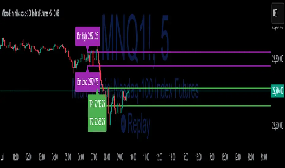
15-Min ORB Indicator with Breakout Targets **What this indicator does:**
The 15-Min ORB (Opening Range Breakout) Indicator helps traders spot breakout trades by automatically detecting the high and low of the first 15 minutes after a session opens. It then monitors for breakouts above or below this range and plots dynamic take-profit levels based on your chosen multipliers.
**How it works:**
You set the start time for your session (hour and minute) in the settings.
The indicator marks the high and low during the first 15 minutes after your chosen open time, drawing lines on the chart and, if enabled, labels for these levels.
If price breaks above the 15-min high, a potential long breakout is identified; if it breaks below the low, a potential short breakout is detected.
Upon a breakout, the script calculates the distance from the entry (breakout) to the opposite side of the 15-min range and uses your input multipliers to project two take-profit levels (TP1/TP2).
All lines and labels (for the range and targets) can be individually toggled on or off in the settings.
Both the 15-min range and the targets can be styled (color, line style, label position).
**How to use it:**
Add the indicator to your chart.
Set the session start hour and minute to match your instrument’s open (e.g., 9:30 for US stocks or futures).
Use the settings to customize which levels and labels are shown, their appearance, and the target expansion multiples.
When price breaks out above or below the opening range, the script will plot TP1 and TP2 lines at your chosen risk/reward multiples, and label them if desired.
You can use the visual levels for trade entries, profit taking, or alerts.
**What makes it unique and useful:** >
Unlike many basic ORB indicators, this script not only marks the opening range but also tracks breakouts, auto-plots your profit targets based on range expansion, and gives you full control over display (styles, toggles, and label positions).
The TP targets are dynamic and can be set to any multiples, adapting to your risk/reward plan and breakout style.
Everything is customizable for your own session times, instrument, or trading approach.
**Typical uses:**
Intraday traders looking for clear breakout setups around the session open.
Automated R-multiple target planning for both long and short trades.
Visualizing volatility and measuring early price expansion.
MEAN X VIBRATION(dynammic)This is a base example for using mean reversion in trading. the probability of sellers coming in on the 1.9-2.4 band is highly likely . use 1.2-0.9 as a smaller vibration.
key note universal laws are used in this. those who can see will see.

FORTIS80 - Monday's Range SignalThis TradingView indicator by Fortis80 displays Monday’s high and low range across all timeframes, helping traders easily identify key weekly levels. The customizable display allows you to show ranges from the past 1 to 24 weeks.

down up Oscillator (No Repaint)
It was integrated according to volume/movement. If it remains in the scissors, know that hard movements will develop.

VIKRANT ComboThank you for your interest in my custom TradingView script.
I've granted you access to my Invite-Only script, titled “VIKRANT COMBO” on TradingView. This script is designed to help you with more accurate entries and exits based on advanced trend de


AZ Dynamic Trend Indicator with Heikin-Ashi### Dynamic Trend Indicator with Heikin-Ashi (v2.7)
**Effortlessly identify trends and reversals** with this versatile tool combining multi-timeframe analysis, adaptive moving averages, and Heikin-Ashi smoothing. Here's what it offers:
#### 🔍 **Core Features**
1. **Dual Timeframe Analysis**:
- Track trends on higher timeframes (e.g., 1H/D) while viewing signals on your current chart.
- Toggle between **Heikin-Ashi** or standard candles for cleaner trend visualization.
2. **8 Customizable MAs**:
- Choose from **ALMA, HMA, SMA, SWMA, VWMA, WMA, ZLEMA, or EMA** with adjustable periods.
- Unique "Trend Strength" metric: `(MA_Close - MA_Open) / (MA_High - MA_Low)` highlights momentum direction.
3. **Smart Signals**:
- **Entry/Exit**: Triangles mark crossovers between MA Close/Open.
- **Reversal Alerts**: Detects counter-trend moves within a user-defined window (default: 3 bars) after signals.
- Color-coded plots: Bullish (🟢), Bearish (🔴), Reversal Bull (🔵), Reversal Bear (🟠).
#### 🎨 **Visual Customization**
- Toggle **High/Low MA lines**, **Close line**, and **fill colors**.
- Adjust colors for all elements to match your chart theme.
- Hide signals or reversal markers as needed.
#### ⚙️ **Practical Use**
- **Trend Following**: Use the MA Close/Open crossover with trend fill colors to confirm direction.
- **Reversal Trading**: Capitalize on pullbacks with reversal signals (e.g., after a bearish signal, watch for Bull Reversal markers).
- **Multi-Timeframe Confirmation**: Avoid false signals by aligning higher-timeframe trends with your entries.
*Ideal for swing traders and trend riders!*
**Note**: Adjust `MA Period`, `Reversal Window`, and `Trend Timeframe` for your strategy. Disable Heikin-Ashi in choppy markets for faster reactions.
---
*Code v2.7 updates: Optimized reversal logic, added ALMA/ZLEMA support, and enhanced visual controls.*

محدد الأوقات المطور جداً v6
Determine the candle times at any hour you want. If the strategy you are working on is CRT, specify the 4-hour frame and choose the time 1-5-9.
