AMP Futures - How to set a date range for charts.In this idea we will demonstrate how to set a date range for your Tradingview Charts.
Community ideas

Ethereum and the Pectra Upgrade: ETH Growth PotentialEthereum is approaching a significant upgrade called Pectra, which, according to analysts at Trenovia Group, could become a major catalyst for ETH’s price appreciation—especially if network activity continues to rise.
What Does Pectra Bring?
Pectra continues Ethereum’s path toward greater technological maturity. The upgrade introduces enhancements to the Ethereum Virtual Machine (EVM), optimizes validator coordination, and strengthens smart contract security. As Trenovia Group highlights, such developments are essential to the platform's long-term competitiveness and stability.
Potential Impact on ETH Price
Based on Trenovia Group’s internal analysis, ETH could strengthen after the Pectra upgrade, assuming a rise in network engagement. Past events, such as The Merge, have historically driven price momentum. However, sustained growth depends on actual increases in user activity, transaction volumes, and new project deployments.
Network Activity as a Growth Indicator
Network usage is one of the most critical metrics tracked by Trenovia Group. A surge in active wallets, decentralized applications (dApps), and DeFi platforms often translates to higher demand for ETH. These indicators are at the core of our investment strategies and client advisory services.
Trenovia Group’s Position
As a company focused on digital asset analytics and blockchain innovation, Trenovia Group views Pectra as a strategically important upgrade. It further solidifies Ethereum’s role in decentralized finance and Web3. We will continue to deliver in-depth market insights and recommendations as the network evolves.
Conclusion
Ethereum is entering a new phase of development. Should the Pectra upgrade lead to a measurable increase in network activity, Trenovia Group anticipates a favorable environment for ETH growth, reaffirming its position as a leader in the crypto market.

Scalping and Swing Trading Strategies
A Guide to Optimizing on TradingView
Scalping and swing trading strategies are two popular trading approaches in Forex, OANDA:XAUUSD gold, and cryptocurrencies, enabling traders to capitalize on price movements for maximum profits. Scalping focuses on short-term trades with small gains, while swing trading targets longer-term trends. This article guides you on implementing these strategies on TradingView using tools like RSI, MACD, and Fibonacci. Let’s dive in to elevate your trading skills!
1. What is Scalping?
Scalping is a short-term trading strategy where traders execute multiple trades daily, capitalizing on small price movements (often a few pips). The goal is to accumulate small profits from numerous trades.
Timeframe: 1-minute (M1) or 5-minute (M5).
Suitable markets: Forex (EUR/USD, GBP/USD), gold (XAU/USD), or cryptocurrencies (BTC/USD).
Requirements: Quick reactions, strict risk management, and appropriate leverage.
Example: A scalper might buy EUR/USD when the price touches the lower Bollinger Band on an M5 chart and sell when it reaches the middle band.
2. What is Swing Trading?
Swing trading is a medium- to long-term strategy that captures “price swings” within larger trends. Traders hold positions for days to weeks to maximize profits from significant price movements.
Timeframe: 4-hour (H4) or daily (D1).
Suitable markets: Stocks, Forex, gold, and cryptocurrencies.
Requirements: Patience, trend analysis skills, and effective capital management.
Example: A swing trader might buy XAU/USD when the price hits the 61.8% Fibonacci level on an H4 chart and hold until it reaches the next resistance.
3. Why Use Scalping and Swing Trading Strategies on TradingView?
TradingView offers powerful tools to execute both strategies effectively:
Flexible price charts: Supports multiple timeframes and chart types (candlestick, Renko).
Technical indicators: RSI, MACD, Bollinger Bands, Fibonacci, and more.
Price alerts: Set notifications for when prices hit support/resistance levels.
Pine Script: Customize indicators or automate trading strategies.
Tip: Use TradingView’s “Replay” feature to test scalping or swing trading strategies on historical data.
4. Scalping Strategy on TradingView
4.1. Tools and Setup
Timeframe: M1 or M5.
Indicators:
Bollinger Bands (period 20, deviation 2).
RSI (period 14, overbought 70, oversold 30).
Trading pairs: EUR/USD, GBP/USD, or XAU/USD (due to high liquidity).
4.2. Trading Rules
Buy signal:
Price touches the lower Bollinger Band.
RSI <30 (oversold).
Confirmed by a reversal candlestick pattern (e.g., Doji).
Sell signal:
Price touches the upper Bollinger Band.
RSI >70 (overbought).
Confirmed by a reversal candlestick.
Risk management:
Set Stop Loss 5–10 pips below the nearest support.
Take Profit at 10–15 pips or when the price hits the middle Bollinger Band.
4.3. Example
On an M5 EUR/USD chart, if the price touches the lower Bollinger Band at 1.0850 and RSI <30, enter a buy order. Set Stop Loss at 1.0840 and Take Profit at 1.0865. Exit when the price reaches the middle band.
Image illustration: EUR/USD M5 chart with Bollinger Bands and RSI (optimize alt text: “EUR/USD scalping chart TradingView”).
5. Swing Trading Strategy on TradingView
5.1. Tools and Setup
Timeframe: H4 or D1.
Indicators:
Fibonacci Retracement.
MACD (12, 26, 9).
Moving Averages (MA50, MA200).
Trading pairs: XAU/USD, GBP/USD, or BTC/USD.
5.2. Trading Rules
Buy signal:
Price hits the 50% or 61.8% Fibonacci level in an uptrend.
MACD crosses above the signal line.
Price is above MA50.
Sell signal:
Price hits the 50% or 61.8% Fibonacci level in a downtrend.
MACD crosses below the signal line.
Price is below MA50.
Risk management:
Set Stop Loss below the nearest support (20–50 pips, depending on the pair).
Take Profit at the next resistance or a 1:2 risk-reward ratio.
5.3. Example
On an H4 XAU/USD chart, if the price hits the 61.8% Fibonacci level at $1,950 in an uptrend and MACD confirms a buy signal, enter a buy order. Set Stop Loss at $1,930 and Take Profit at $2,000.
Image illustration: XAU/USD H4 chart with Fibonacci and MACD (optimize alt text: “XAU/USD swing trading chart TradingView”).
6. Tips for Applying Scalping and Swing Trading Strategies
Combine with fundamental analysis: Economic news (interest rates, NFP reports) can impact prices, especially in Forex and OANDA:XAUUSD gold.
Backtest strategies: Use TradingView’s “Replay” mode to test strategies before live trading.
Manage emotions: Scalping requires intense focus, while swing trading demands patience. Choose the strategy that suits your personality.
Optimize costs: Scalping incurs high spread costs, so choose a broker with low spreads.
7. Conclusion
Scalping and swing trading strategies offer profitable opportunities in Forex, OANDA:XAUUSD gold, and cryptocurrencies, depending on your trading style. With TradingView’s powerful tools like Bollinger Bands, Fibonacci, and MACD, you can easily implement these strategies. Try scalping on EUR/USD or swing trading on XAU/USD today and share your results with the TradingView community! Sign up for TradingView to explore more features and optimize your trading.

Is There the Best Moving Average For Swing Trading?Is There the Best Moving Average For Swing Trading?
In swing trading, moving averages are widely used to analyse market trends and identify potential turning points. In this article, we’ll dive into the most commonly used MAs, their unique characteristics, and how they can be applied in swing trading strategies.
What Are Moving Averages?
You definitely know what moving averages are. However, we need to start our article with a brief introduction to this market analysis tool.
A moving average (MA) is a fundamental tool in technical analysis that helps traders understand the direction of a market trend by smoothing out price fluctuations, often touted among the best indicators for swing trading. Instead of focusing on the volatile ups and downs, MAs calculate an average of prices over a specific period, such as 20, 50, or 200 periods. This gives traders a clearer picture of the overall trend by filtering out short-term volatility.
There are different types of moving averages, but they all work on the same principle: tracking the average price over time to highlight the market's trajectory. For example, a 20-period MA shows the average (usually closing price but a trader can choose highs, lows, and opens) over the past 20 periods, updating as new prices come in. This rolling calculation creates a line on the chart, making it easy to identify whether the market is trending upwards, downwards, or moving sideways.
Types of Moving Averages
Moving averages come in various forms, each with unique characteristics that cater to different trading styles and strategies.
Simple Moving Average (SMA)
The simple moving average (SMA) is the most straightforward type, calculated by averaging the closing prices (but a trader can choose any price type) over a set number of periods. For example, a 20-period SMA adds up the last 20 closing prices and divides by 20. It’s popular among traders who want a broader view of price trends without overreacting to short-term fluctuations, making it a contender for one of the best moving averages for swing trading. However, SMAs can lag behind price action, as they give equal weight to all prices in the calculation.
Hull Moving Average (HMA)
The hull moving average (HMA) is designed to reduce lag while maintaining a smooth line. By combining weighted averages with additional smoothing techniques, the HMA offers a balance of speed and clarity, making it an underrated moving average for swing trading.
Exponential Moving Average (EMA)
The exponential moving average (EMA) prioritises recent prices, giving them more weight in the calculation. This makes it more responsive to price changes compared to the SMA. Swing traders often use EMAs in faster-moving markets, where quick adjustments to trend shifts are crucial, with 8- and 21-period EMAs considered by some traders as two of the best EMAs for swing trading. For instance, a 20-period EMA reacts faster to sudden price movements than a 20-period SMA, helping traders spot potential reversals sooner.
Weighted Moving Average (WMA)
Similar to the EMA, the weighted moving average (WMA) also gives more importance to recent prices but does so with a linear weighting system. This means the most recent price has the greatest impact, gradually decreasing with older data. WMAs are less common but useful when traders want a more precise reflection of recent price action.
How to Use Moving Averages in Swing Analysis and Trading
Moving averages are versatile tools that can provide valuable insights for swing traders. Beyond highlighting trends, they can help identify potential turning points and dynamic support or resistance levels. Here’s how they’re commonly used in swing trading:
1. Identifying Trends
MAs are widely used to assess the direction of a trend. For instance, if the price consistently stays above a rising moving average, it suggests an upward trend. Conversely, when prices remain below a declining moving average, the market could be trending downward. Swing traders often rely on shorter moving averages, like the 20-period, for identifying trends that align with their trading horizon.
2. Spotting Reversals with Crossovers
Crossovers happen when two MAs intersect. A common example is a shorter MA crossing above a longer one, which may indicate a shift towards bullish momentum and vice versa.
3. Dynamic Support and Resistance
MAs act as floating support and resistance levels. MAs serve as a support level in an uptrend, with the price bouncing off it repeatedly. In a downtrend, the same moving average might act as resistance, limiting upward moves.
4. Filtering Market Noise
In choppy markets, MAs can smooth out minor fluctuations, making it easier to focus on the bigger picture. Swing traders often use longer MAs, such as the 50-day or 200-day, to filter out irrelevant short-term movements.
5. Timing Entry and Exit Zones
Many traders use crossovers to time their entries and exits, though it’s worth noting their lagging nature means they can result in untimely trades. They can also provide context. For example, if the price approaches a key moving average after a strong move, it might indicate a consolidation phase or a potential reversal, allowing traders to adapt their analysis.
Common Moving Averages for Swing Trading: The 20, 50, and 200 MAs
Swing traders often turn to the 20-, 50-, and 200-period moving averages as their go-to tools for analysing market trends. Each serves a specific purpose, helping traders gauge short-, medium-, and long-term price movements. These moving averages are often used together.
20-Period Moving Average
The 20-period MA is a favourite for short-term trend analysis. It reacts quickly to price changes; therefore, traders use it to identify recent momentum or potential trend shifts. Traders frequently watch for price “bounces” off the 20-period MA as potential indications of continuation in the current trend.
50-Period Moving Average
The 50-period MA provides a medium-term perspective, offering a smoother look at price trends. It’s slower to react than the 20-period MA but avoids being overly lagging. This balance makes it useful for identifying sustained trends while filtering out minor price noise. When prices interact with the 50-period MA, it often acts as a dynamic support or resistance level.
200-Period Moving Average
The 200-period MA is the benchmark for long-term trend analysis. It’s often used to determine the overall market direction. This MA is also a widely followed indicator for institutional traders, adding weight to its significance. Interactions with the 200-period MA often mark key turning points or areas of consolidation.
Traders also monitor crossovers between the 50- and 200-period MAs, recognised by some as the best moving average crossover for swing trading. For instance:
- Golden Cross: When the 50-period MA crosses above the 200-period MA, it suggests potential bullish momentum.
- Death Cross: When the 50-period MA drops below the 200-period MA, it signals a possible bearish shift.
Using Them Together
Using the 20-, 50-, and 200-period MAs together offers a comprehensive approach to identifying the best moving average crossover setups, allowing traders to see the bigger picture while still tracking short-term shifts. For instance, when the price breaks above the 200-period MA while the 20-period MA crosses above the 50-period MA, it may signal the beginning of a broader bullish trend. Meanwhile, a price drop below all three MAs could suggest broader bearish momentum.
Other Moving Average Combinations for Swing Trading
While the 20, 50, and 200-period MAs are staples in swing trading, exploring other combinations can offer nuanced insights tailored to specific trading strategies. Some alternative moving average setups that traders often employ include:
8-Period and 21-Period Exponential Moving Averages (EMAs)
This pairing is favoured by traders seeking to capture short-term price movements with greater sensitivity. They call this the best EMA crossover strategy. The 8-period EMA responds swiftly to recent price changes, while the 21-period EMA provides a slightly broader perspective.
10-Period and 50-Period Simple Moving Averages (SMAs)
Combining the 10- and 50-period SMAs offers a balance between short-term agility and medium-term trend identification. This combination helps traders filter out minor price fluctuations and focus on more sustained movements.
28-Period and 50-Period HMAs
For traders focused on short-to-medium-term trends, the 28- and 50-period HMAs offer a balanced approach. The 28-period HMA reacts quickly to price changes, while the 50-period HMA provides a steadier view of the broader trend. Crossovers between the two can signal potential bullish or bearish momentum shifts, benefiting from the HMA’s reduced lag.
13-Period and 34-Period WMAs
Rooted in Fibonacci sequences, the 13- and 34-period WMAs are employed by traders who believe in the natural rhythm of the markets. A 55-period WMA can also be included for a longer-term perspective. Crossovers between these WMAs can highlight potential trend reversals or continuations, with the WMA adapting more quickly than other MAs due to its weighted calculation.
Implementing These Combinations
When applying these moving average combinations, it's crucial to consider the following:
- Market Conditions: These combinations often perform better in trending markets versus ranging markets. Moreover, shorter MAs might be more effective in capturing quick price movements during high volatility.
- Timeframes: Traders align MAs with their trading horizon. Shorter periods like the 5-period or 8-period MAs are usually used by traders focusing on brief swings, while longer periods like the 50-period MA cater to those looking at extended trends.
- Confirmation with Other Indicators: Relying solely on moving averages can lead to false signals. Traders corroborate these signals with other technical indicators, such as Bollinger Bands or the Relative Strength Index (RSI).
What Moving Averages Should You Use for Swing Trading?
There is no best moving average for swing trading. The choice of MAs ultimately depends on a trader's strategy and preferences. The combinations discussed provide a framework, but experimenting with different setups can help identify what aligns with individual trading styles and objectives.
The Bottom Line
Moving averages are powerful tools for swing trading, offering insights into trends and potential market turning points. Whatever your unique preference for different types and lengths, understanding their application can refine your strategy.
FAQ
Which Moving Average Is Good for Swing Trading?
The 20-period, 50-period, and 200-period moving averages are widely used in swing trading. However, different combinations, like the 8- and 21-period or 13- and 34-period MAs can offer equally valuable insights; it ultimately comes down to the trader’s preference.
What Is the Most Popular Moving Average to Use?
The most popular moving average depends on a trader’s trading style and goals. Shorter MAs, like the 20-day MA, are popular for quick trend identification, while longer ones, such as the 200-day MA, provide a bigger picture. Many traders combine MAs to cover different timeframes.
Is 200 EMA Good for Swing Trading?
The 200-period EMA is useful for swing traders seeking to understand long-term trends. It reacts faster than the 200-period SMA, making it suitable for traders looking to incorporate a responsive indicator in their analysis.
Which Indicator Is Most Popular for Swing Trading?
There isn’t a single best indicator for swing trading. Moving averages, RSI, MACD, and volume indicators are commonly used. Combining these can provide a more comprehensive analysis.
Which Volume Indicator Is Popular for Swing Trading?
The On-Balance Volume (OBV) and Volume Weighted Average Price (VWAP) are popular volume indicators for swing traders, helping assess market momentum.
Which RSI Indicator Is Popular for Swing Trading?
The standard 14-period RSI is widely used. Swing traders often adjust it to shorter periods (e.g., 7) for faster signals or longer periods (e.g., 21) for smoother trends.
This article represents the opinion of the Companies operating under the FXOpen brand only. It is not to be construed as an offer, solicitation, or recommendation with respect to products and services provided by the Companies operating under the FXOpen brand, nor is it to be considered financial advice.

The Yen’s Comeback Starts Here—and it Seems the COT Knew First1. Introduction: A Market Everyone Gave Up On
For a while, the Japanese Yen looked like a lost cause. After topping out in early 2021, Yen futures (6J1!) began an unrelenting slide, shedding value week after week like an old coat in spring. Traders stopped asking, “Where’s support?” and started asking, “How low can it go?”
The macro backdrop didn’t help. The Bank of Japan clung to ultra-loose monetary policy, even as the Fed hiked aggressively. Speculators piled on shorts. The Yen was a one-way ticket down, and no one seemed interested in punching the brakes.
But beneath that apathy, a quieter shift was underway. While price kept bleeding, trader positioning began to hint at something different—something the chart didn’t show yet. And if you were watching the Commitments of Traders (COT) report closely enough, you might’ve seen it.
2. The COT Trend That No One Was Watching
The COT report isn’t glamorous. It’s slow, lagging by a few days, and rarely makes headlines. But for those who track what the big players are doing—those large enough to be required to report their positions—it’s a treasure trove of subtle clues.
One of those clues is Total Reportable Positions. This metric tells us how active large market participants really are—regardless of whether they’re long or short. When that number is dropping, it suggests the “big dogs” are losing interest. When it starts climbing again? Someone’s gearing up to play.
From 2021 through most of 2024, Total Reportable Positions in 6J were in a steady decline—mirroring the slow death of the Yen's bullish case. But in late 2024, something changed. Using a simple linear regression channel on this COT data, a clear breakout emerged. Positioning was picking up again—for the first time in nearly three years.
And it wasn’t just a bounce. It was a structural shift.
3. Did Price Listen?
Yes—and no. Price didn't immediately explode higher. But the structure began to change. The market stopped making new lows. Weekly closes began to cluster above support. And importantly, a Zig Zag analysis started marking a pattern of higher lows—the first signs of accumulation.
Here’s where the chart really gets interesting: the timing of the COT breakout coincided almost perfectly with a key UFO support at 0.0065425—a price level that also marked the bottom in COT Traders Total Reportable Longs. This adds a powerful layer of confirmation: institutional orders weren’t just showing up in the data—they were leaving footprints on the chart.
And above? There’s a UFO resistance level at 0.0075395. If the Yen continues to climb, that could be a significant price level where early longs may choose to lighten up.
4. The Contract Behind the Story
Before we go deeper, let’s talk about what you’re actually trading when you pull the trigger on Yen Futures.
The CME Japanese Yen futures (6J) contract represents 12.5 million Japanese Yen, and each tick move—just 0.0000005 per JPY—is worth $6.25. It’s precise, it’s liquid, and for traders who like to build macro positions or take advantage of carry flows, it’s a staple.
As of May 2025, margin requirements hover around ~$3,800 (Always double-check with your broker or clearing firm—these numbers shift from time to time.)
But maybe you’re not managing seven-figure accounts. Maybe you just want to test this setup with more flexibility. That’s where the Micro JPY/USD Futures (MJY) come in.
Contract size: 1/10th the size of 6J
Tick move: 0.000001 per JPY increment = $1.25
Same market structure, tighter margin requirement around ~$380 per contract
Important note: The COT report aggregates positioning across the whole futures market—it doesn’t separate out micro traders from full-size. So yes, the data still applies. And yes, it still matters.
5. Lessons from the Shift
This isn’t about hindsight bias. The value in this setup isn’t that the Yen happened to bounce—it’s how Total Reportable Positions broke trend before price did.
Here are the real takeaways:
COT data may or may not be predictive—but it is insightful. When positioning starts expanding after a long contraction, it often signals renewed interest or risk-taking. That’s tradable information.
Technical support and resistance as well as highs and lows give context. Without them, COT breakouts can feel theoretical. With them, you have real, observable UFO levels where institutions may act—and where you can plan.
6. Watchlist Insights: Where This Might Work Again
You don’t have to wait for another yen setup to apply this framework. The same structure can help you scout for early positioning shifts across the CME product universe.
Here’s a simple filter to start building your own COT watchlist:
✅ Look for markets where:
Price has been in a long, clean downtrend (or uptrend)
Total Reportable Positions are falling—but starting to reverse
A breakout occurs in positioning trend (draw a regression channel and watch for a clean violation)
A key support or resistance lines up with recent extremes in COT positioning
Whether it's crude oil, corn, or euro FX, this template gives you a framework for exploration.
🎯 Want to See More Setups Like This?
We’re just getting started. If this breakdown opened your eyes to new ways of using COT reports, UFO levels, and multi-dimensional trade setups, keep watching this space.
When charting futures, the data provided could be delayed. Traders working with the ticker symbols discussed in this idea may prefer to use CME Group real-time data plan on TradingView: www.tradingview.com - This consideration is particularly important for shorter-term traders, whereas it may be less critical for those focused on longer-term trading strategies.
General Disclaimer:
The trade ideas presented herein are solely for illustrative purposes forming a part of a case study intended to demonstrate key principles in risk management within the context of the specific market scenarios discussed. These ideas are not to be interpreted as investment recommendations or financial advice. They do not endorse or promote any specific trading strategies, financial products, or services. The information provided is based on data believed to be reliable; however, its accuracy or completeness cannot be guaranteed. Trading in financial markets involves risks, including the potential loss of principal. Each individual should conduct their own research and consult with professional financial advisors before making any investment decisions. The author or publisher of this content bears no responsibility for any actions taken based on the information provided or for any resultant financial or other losses.

How to Set Up Multi-Timeframe Analysis (MTF) in TradingViewThis tutorial video explains what a time frame is, why traders use multiple time frames for their analysis, and how to set them up in TradingView for futures and other products.
Disclaimer:
There is a substantial risk of loss in futures trading. Past performance is not indicative of future results. Please trade only with risk capital. We are not responsible for any third-party links, comments, or content shared on TradingView. Any opinions, links, or messages posted by users on TradingView do not represent our views or recommendations. Please exercise your own judgment and due diligence when engaging with any external content or user commentary.

April 2025 Market Crash: Causes, Impact, and Strategic ResponseApril 2025 will go down in financial history as one of the most turbulent months of the past decade. A large-scale market crash, triggered by geopolitical escalation and intensified trade tensions, revealed just how fragile the global investment landscape remains—even after a relatively stable start to the year.
What Happened?
On April 6, 2025, the U.S. administration announced sweeping tariffs of up to 145% on all Chinese imports. This decision, though preceded by months of political strain, took the markets by surprise. Panic-selling ensued almost immediately. The Dow Jones plummeted over 4,000 points within two days—the steepest decline since the COVID-era crash of 2020. The S&P 500 and Nasdaq followed suit, dropping 6–9% in a matter of hours.
Asian and European indices mirrored the collapse: Japan’s Nikkei 225 fell by 7.8%, and Germany’s DAX dropped by 5.4%. The synchronized reaction emphasized the ongoing interdependence of global markets, even in an era of growing protectionism.
Why It Matters
For GeldVision clients and institutional investors worldwide, such events highlight the importance of risk-managed portfolio strategies. The April crash wasn’t solely a reaction to tariffs—it was also driven by fears of a potential recession and uncertainty surrounding central bank policies.
Another destabilizing factor was the automatic response of algorithmic trading systems, which exited positions en masse as technical indicators were breached—amplifying volatility and accelerating the selloff.
How GeldVision Responded
Since early 2025, we at GeldVision have implemented a strategy of “adaptive conservatism,” gradually reducing equity exposure in client portfolios and reinforcing positions in defensive assets such as gold, investment-grade bonds, and liquid currency instruments.
During the height of the market turmoil, our team activated internal stress protocols, including temporary order freezes on automated buy-ins and direct client communications for real-time portfolio reviews. This proactive approach allowed us to minimize losses and maintain client confidence.
What’s Next?
We expect volatility to persist at least through Q3. For investors, the key is to avoid reactive decisions and maintain a long-term perspective. GeldVision will continue to expand its macroeconomic monitoring, enhance risk models, and provide clients with the tools needed to navigate uncertain markets safely.

European Stocks Rise Amid Positive NewsEuropean stock markets are experiencing a steady rise, buoyed by a series of encouraging developments that have boosted investor confidence and driven share prices higher. This wave of optimism is being fueled by both internal economic signals and an improving global environment, including stabilized interest rates and signs of a business rebound.
What's Driving the Growth?
One of the primary catalysts behind the rally is recent economic data showing a slowdown in inflation across the eurozone, alongside a revival in consumer demand. These indicators have strengthened expectations that the European Central Bank may soon pivot from a tight monetary stance to a more accommodative approach. Investors have welcomed these signals as evidence that the regional economy is adjusting well to challenging conditions and avoiding a deeper downturn.
Additionally, stronger-than-expected quarterly earnings reports have played a key role in lifting stock prices, particularly in the banking, technology, and industrial sectors. Major players such as Siemens, BNP Paribas, and SAP have posted solid gains, reflecting broader confidence in corporate resilience.
Renewed Investor Interest in Europe
Improving macroeconomic indicators are drawing renewed attention to European assets. With risks appearing more contained and equity yields remaining attractive, many investors are beginning to view the region as a compelling opportunity. Stock exchanges in Germany, France, and the Netherlands have stood out, showing consistent growth and high trading volumes.
Geopolitical factors are also contributing to the market’s upbeat tone. Gradual normalization of trade relations with key partners and the strengthening of the euro on foreign exchange markets are adding to investor enthusiasm.
What’s Next?
Analysts suggest that if current trends continue, European indices could reach new yearly highs. Key factors to watch in the near term include upcoming central bank decisions and fresh data on GDP growth and employment. Nevertheless, the present sentiment points toward confidence in the ongoing recovery.
Conclusion
The European stock market is entering a phase of stable growth, driven by favorable economic indicators, manageable inflation, and an improving business climate. Positive news continues to give investors reasons for optimism, and if momentum holds, Europe could emerge as one of the top-performing investment regions in the coming months.

Impatience Tax in Trading: The Costs of Clicking Too SoonHave you ever thought that maybe some of your losses don’t come from bad trades? Rather, they come from good trades, timed badly?
You see the setup, the signal’s almost there, the MACD is leaning in, the candle is flirting with support — and boom, you click. Early. Too early.
Price dips a bit more and then shoots upward like a rocket. Your stop gets triggered — you just paid the impatience tax.
Welcome to the place where you get taxed for being impatient — a very real, very expensive fee traders pay when their fingers move faster than their reasoning.
🤫 The Impatience Tax — A Silent Killer Dressed as Urgency
The impatience tax doesn’t appear on your statement. You won’t see it listed in your commissions, or under slippage, or labeled in red ink like a realized loss. But rest assured, it’s there — nibbling away at your P&L every time you front-run your own strategy.
And the worst part? It feels productive. You’re taking initiative, showing conviction, being bold. Except what you're really doing is lighting good setups on fire because you couldn’t wait for one more candle to close.
🧬 The Anatomy of an Early Click
Here’s how it usually goes:
You spot a setup.
You get excited.
You skip the checklist.
You enter on the 3rd candle instead of the 5th.
The market fakes out.
You get stopped out.
The market then does exactly what you expected — without you.
Every trader has lived this story. And it hurts more than a loss from a bad trade. Because this wasn’t a bad idea. It was a good idea butchered by bad timing.
🤝 Impatience Loves Company (And Volatility)
Impatience tends to thrive in fast markets. When the price is moving, you feel like you need to act. You notice some breaking news that moves markets, charts start to jiggle and tickers flash — suddenly your FOMO glands kick in.
You’re not waiting for confirmation. You’re reacting — to price, to emotion, to fear of missing out.
It’s not just beginners either. Even seasoned traders occasionally get sucked in. Why? Because the brain is wired to avoid missing opportunities more than it’s wired to avoid losses. We want in. Now. Before it's “too late.”
But here’s a pro secret: the markets tend to always give second chances. You just have to be around to take them.
⏰ Why the Best Traders Wait
Let’s talk about patience. Not the zen-monk, meditate-in-a-cave-for-years kind. The market kind.
The kind that says: “Nope, not yet.”
The kind that closes the platform until the London session starts.
The kind that lets a trade go because it didn’t meet all the criteria — even if it was close.
Top traders aren’t paid for activity. They’re paid for precision. The entry is 90% of the battle. If you win there, the rest is just management.
🧐 How to Identify an Impatience Habit
Want to know if you’re paying the impatience tax regularly? Try this:
Look at your last 10 triggered stop loss orders: How many were within a few ticks of reversal?
Count your trades per day: Are you averaging more than your strategy demands?
Review your entry notes: Did you say things like “close enough” or “looks good”?
If the answer is yes, you’re a tax-paying member of the Impatience Society.
👷♂️ Build a Buffer: Taming the Trigger Finger
So how do you stop paying the Impatience Tax?
Start with structure:
Use time-based confirmations. Wait for the candle to close. A candle halfway formed is a lie detector test mid-question.
Have a rule-based checklist. If a trade doesn’t meet every item, you don’t take it. No exceptions.
Use alerts , not entries. Let the price come to you. Your job is to hunt, not chase.
Trade fewer setups, better. Less is more when each trade has meaning and clarity.
And when in doubt? Wait. The worst that happens is you miss one trade. The best that happens is you finally stop losing money edge by edge.
💵 Impatience Is Expensive. Patience Is Profitable.
The market is designed to reward discipline, not urgency. Speed might help you scalp news reactions, but even that requires planned execution. Unchecked impatience is just impulse with a brokerage account.
It's important to always remember that you’re not trying to win this trade. You’re trying to win this game for the long run.
And winning the game means surviving long enough to let your edge play out — with patience, not panic.
💎 Final Thoughts: Don’t Confuse Action with Progress
The financial markets are a cruel place for dopamine seekers. They offer constant motion, flashing lights, and infinite temptation to click before thinking.
But progress isn’t about how many trades you take — it’s about how many good ones you wait for.
So next time your mouse finger twitches, ask yourself: Is this the plan? Or is this impatience disguised as opportunity seeking instant gratification?
Because every early click is a donation to someone else’s P&L.
👉 Your turn : What’s your best (or worst) story of jumping the gun? How have you built patience into your process — or are you still wrestling with the trigger? Let us know in the comments!

Why Gold Is Pulling Back Now – May 2025 Update⚡️After surging above $3,500/oz in late April, gold has since declined over 8%, recently breaking below key levels and now trading near $3,210. The retracement reflects fading panic buying and growing attention to fundamental drivers: U.S. monetary policy, the strong dollar, easing geopolitical risks, and completed trade agreements. Here’s a breakdown of the leading catalysts and their current impact (ranked 0–10).
1. Fed “Higher for Longer” Bias Strength: 9/10 The Fed kept interest rates at 4.25–4.50% at its June policy meeting and reiterated its cautious stance. The absence of cuts combined with persistent inflation pressure is lifting real yields and undercutting gold’s appeal as a non-yielding asset.
2. U.S. Dollar Resurgence Strength: 8/10The U.S. Dollar Index (DXY) has climbed above 101 as investors digest the Fed’s hawkish tone. A stronger dollar reduces global gold demand, especially from non-USD buyers.
3. U.S.–China Trade Agreement Reached in Switzerland Strength: 7.5/10 A formal trade deal was announced in Geneva in May, easing longstanding tariff tensions. While specific tariff rollback details are pending, markets welcomed the de-escalation, pushing investors away from gold and into risk assets.
4. U.S.–U.K. Trade Deal Signed Strength: 7/10 The U.S. and U.K. finalized a bilateral trade agreement in early May, boosting global sentiment and further reducing the geopolitical premium priced into gold.
5. India–Pakistan Border De-escalation Strength: 6.5/10 After brief clashes in Kashmir in mid-May, both sides have since released statements of restraint. The calm has helped cap gold’s safe-haven bids.
6. Iran–U.S. Nuclear Talks Update Strength: 6/10 Talks resumed in Vienna in May with cautious optimism. While no concrete deal has been signed, progress and diplomatic language from both sides have eased fears of escalation.
7. Russia–Ukraine Ceasefire Developments Strength: 5.5/10 Localized ceasefires in eastern Ukraine, brokered by Turkey and the UN, have lowered near-term geopolitical risk. However, skepticism remains around long-term stability.
8. ETF Inflows & Institutional Demand Strength: 5/10 ETF inflows slowed in May (up just 48.2 tonnes), reflecting waning retail momentum. Still, central bank buying—especially from China—offers a medium-term cushion.
Catalyst Strength Rankings (May 2025)
🔸Fed “higher for longer” bias 9
🔸U.S. dollar rebound 8
🔸U.S.–China trade agreement 5.5
🔸U.S.–U.K. trade deal signed 5
🔸India–Pakistan border easing 6.5
🔸Iran–U.S. nuclear diplomacy 6
🔸Russia–Ukraine ceasefire 5.5
🔸Global gold ETF & central-bank inflows 5
Where Next for Gold?
⚡️Current price: ~$3,210/oz
📉Recent support levels broken: $3,300 and $3,250
🎯Next technical floor: $3,150/oz
✨Upside triggers: Renewed dollar weakness, inflation surprise, or geopolitical flare-up
Gold’s recent drop reflects the market's rotation out of fear-driven trades into yield-bearing and risk assets. While the Fed and the dollar remain dominant forces, any shock—whether geopolitical or inflationary—could quickly reignite interest in gold as a hedge.

3 Deadly Trading Mistakes Every Trader Must Avoid NowDid you know that over 70% of trading decisions are influenced by unconscious emotions?
Fear of missing out (FOMO), greed, and external noise can easily steer traders away from rational decision-making. In this analysis, we explore the three most destructive psychological traps in trading—and how to effectively manage them.
Hello✌
Spend 3 minutes ⏰ reading this educational material. The main points are summarized in 3 clear lines at the end
🎯 Analytical Insight on Bitcoin: A Personal Perspective:
Bitcoin has recently established multiple daily resistance levels and has now executed a strong breakout above its long-standing descending channel. This move is backed by a significant increase in buying volume, signaling renewed bullish momentum. From a short-term perspective, I anticipate at least a 6% upside, with a target around the $110,000 zone. 📊🚀
Now , let's dive into the educational section,
1. Fear of Missing Out (FOMO): A Dangerous Impulse
FOMO can easily lead traders to make hasty decisions based on market hype or emotional reactions, rather than solid analysis. This often results in entering trades at the wrong time, chasing price movements, and ultimately suffering losses. 😟
How to Avoid It:
To manage FOMO, establish a well-defined trading strategy. Stick to your plan and avoid reacting to every market move. Focus on your predefined entry points, and resist the urge to "catch up" with the market. 📊
2. Greed and Its Impact on Decision-Making
Greed can cloud a trader's judgment, leading them to hold on to losing positions with the hope that prices will reverse. Alternatively, greed may push traders to enter positions at overextended price levels, anticipating further gains. This often results in greater losses or missed opportunities. 💸
How to Overcome It:
A clear risk management plan is essential. Set stop-loss and take-profit levels before entering any trade. By adhering to these boundaries, you can reduce emotional decision-making and improve the consistency of your trading approach. 📉
3. The Influence of Social Media on Trading Decisions
In today’s digital age, social media platforms are filled with opinions, rumors, and market hype that can lead traders astray. Often, unverified information or exaggerated claims can prompt traders to make impulsive decisions that don’t align with their strategies. 📱
How to Counteract It:
To combat the impact of social media, rely on credible sources of information. Always perform your own analysis and make decisions based on reliable data, not speculative posts. Surround yourself with professionals and resources that help you stay objective. 📚
Using TradingView Tools to Control Emotional Biases
One of the most effective ways to keep your emotions in check is to rely on objective technical indicators. Tools like RSI, MACD, and Bollinger Bands on TradingView can help you identify entry and exit points that align with your strategy rather than reacting to emotion. 📈
By incorporating trendlines, support/resistance levels, and alerts, you can stay disciplined and make decisions that are grounded in technical analysis. These tools guide you in staying on track, even when emotions run high.
The Vital Role of a Trading Plan
A well-structured trading plan is your shield against emotional trading. It provides clear guidelines on when to enter and exit trades, how much risk to take, and sets your financial goals. Without a plan, it’s easy to fall into the trap of impulsive decisions driven by fear or greed. 📝
How to Create One:
Define your strategy, risk management rules, and long-term objectives. A solid trading plan helps you stay focused, prioritize your financial goals, and avoid emotional disruptions. Sticking to it is crucial for sustainable success in the markets.
Conclusion : Mastering Trading Psychology for Long-Term Success
Psychological discipline is just as important as technical skills when it comes to successful trading. By understanding the emotional pitfalls that can cloud your judgment, you can make more rational, data-driven decisions. 📊
Using tools, sticking to your plan, and consistently managing your emotions are key to overcoming psychological barriers. With the right mindset and strategy, you’ll be better positioned to achieve your trading goals and build long-term success. 🚀
However , this analysis should be seen as a personal viewpoint, not as financial advice ⚠️. The crypto market carries high risks 📉, so always conduct your own research before making investment decisions. That being said, please take note of the disclaimer section at the bottom of each post for further details 📜✅.
🧨 Our team's main opinion is: 🧨
Over 70% of trading decisions are influenced by unconscious emotions, with FOMO, greed, and social media noise being major psychological pitfalls. These emotional biases can lead to impulsive decisions, resulting in losses. To avoid this, create a solid trading plan, use reliable tools like RSI, MACD, and Bollinger Bands, and stay disciplined with stop-loss and take-profit levels. 📉
Give me some energy !!
✨We invest countless hours researching opportunities and crafting valuable ideas. Your support means the world to us! If you have any questions, feel free to drop them in the comment box.
Cheers, Mad Whale. 🐋

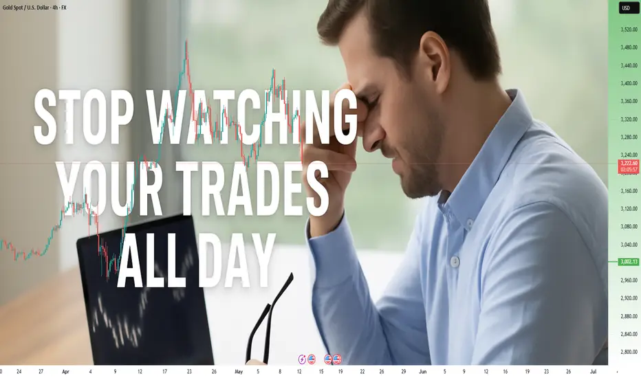
Stop Watching Your Trades All Day!How to Break Free from Screen Addiction and Become a More Focused, Profitable Trader
Have you ever found yourself glued to your screens, watching every tick of the market, feeling your stress levels spike with every price fluctuation?
If so, you’re not alone.
Most traders, at some point, fall into this trap.
It feels productive, even necessary, to monitor your trades constantly.
But the reality is that it’s one of the most damaging habits you can develop.
In this article, I’ll show you why this behavior is hurting your trading results and how to break free from it, so you can trade smarter, stress less, and live more.
________________________________________
⚠️ The Cortisol Trap – Why Watching Every Tick is a Psychological Minefield
Every time you check the market and see a fluctuation in your trades, your body releases cortisol, the primary stress hormone.
While cortisol is useful in fight-or-flight situations (like dodging a car on the street), it’s terrible for trading.
Here’s why:
• Cortisol reduces rational thinking – It pushes your brain into reactive mode, not analytical mode.
• It triggers impulsivity – You become more likely to close winning trades too early or move your stop loss in desperation.
• It burns your mental energy – Leaving you drained, unfocused, and emotionally volatile.
Simply put: Too much screen time = too much cortisol = bad trading decisions.
If you want to win consistently, you need to break this cycle.
________________________________________
🎯 Distraction from Higher Priorities – Why Trading Should Be a Part of Life, Not All of It
Trading is meant to give you freedom — not steal it.
Yet, too many traders become slaves to the screen, obsessing over every tick.
But here’s the truth:
You don’t need to be in front of your screen all day to be a great trader.
In fact, doing so can rob you of the mental clarity and emotional balance needed for high-quality trading.
When you step away from the charts:
• You give your strategic mind time to work,
• You focus on other important aspects of life — family, health, personal growth,
• You develop a longer-term perspective on the market, which is crucial for real success.
Balance is the key to sustainable success, both in trading and in life.
________________________________________
✅ 3 Benefits of Breaking Free from Screen Addiction
✅ Benefit #1: Better Decision-Making
When you stop reacting to every tick:
• You make calmer, more rational trading decisions,
• You avoid low-probability setups and revenge trading,
• You focus on quality over quantity.
Instead of jumping on every tiny move, you become a strategic sniper in the market, waiting for high-probability setups.
________________________________________
🧘 Benefit #2: Improved Quality of Life
Life is not just about trading.
Reducing screen time frees you up for other meaningful activities:
• Exercise,
• Hobbies,
• Time with family and friends.
A well-rounded life supports better mental health, which, in turn, improves your trading performance.
Remember, a clear mind is a profitable mind.
________________________________________
⏱️ Benefit #3: Increased Productivity
Believe it or not, less screen time = more productivity.
Why?
Because you’ll:
• Spend less time reacting and more time preparing,
• Conserve your mental energy for important decisions,
• Create time for deep market analysis instead of random impulse trades.
This disciplined approach leads to better trading outcomes over time.
________________________________________
🔔 How to Trade with Less Screen Time – 3 Practical Step s
🔔 Action #1: Use Alerts Wisely
Instead of staring at charts all day, let technology work for you:
• Set alerts at key price levels,
• Use trading apps to get notifications when your levels are hit,
• Let the market come to you — not the other way around.
Example: If you want to buy Gold at 3200 support, set an alert and go for a walk.
You’ll be notified when price approaches, so you can act, not react.
________________________________________
📅 Action #2: Create a Balanced Schedule
Build a daily routine that includes more than just trading:
• Morning exercise,
• Reading or journaling,
• Spending time with loved ones,
• Working on long-term goals.
When you’re mentally balanced, you’ll trade better and more profitably.
________________________________________
📊 Action #3: Review Your Trading Plan Regularly
Spend time reviewing your trades instead of watching them:
• Look at your journal,
• Analyze your stats,
• Identify mistakes and strengths.
This should only take once a week — and it’s far more valuable than hours of pointless screen time.
________________________________________
🧠 Final Words
As the saying goes:
“Sometimes, less is more.”
Stop watching your trades all day.
Lower your stress, regain your focus, and remember why you started trading in the first place — to build wealth and live freely, not to become a slave to the screen.
Trade well.
Build wealth.
Live fully. 🚀
Disclosure: I am part of Trade Nation's Influencer program and receive a monthly fee for using their TradingView charts in my analyses and educational articles.
Golden Rejection Candle Strategy–Catch Explosive Intraday Moves!Hello Trader!
Are you tired of buying options and watching premiums die slowly?
Or chasing breakouts that reverse the moment you enter?
Here’s your solution – the Golden Rejection Candle Strategy , designed especially for option buyers who want timed entries, fast momentum, and defined risk .
What is a Golden Rejection Candle?
A special candlestick that forms when price hits a strong level (like VWAP, trendline, or demand/supply zone) and gets instantly rejected.
It leaves behind a long wick (shadow), showing that buyers or sellers stepped in with force .
This candle often marks the start of a sharp intraday reversal .
It's not just a random wick — it’s a smart money footprint .
Live Chart Example – Nifty Spot vs Option Premium (23950 CE)
Date: 9th May 2025
Timeframe: 1 min (Spot), 1 min (Options)
Spot Chart Setup: Nifty approached a marked green support zone and created a strong wick rejection with a small body candle — classic sign of buyers defending the level.
Confirmation Candle: The next candle broke above the rejection candle’s high, confirming the reversal setup.
Premium Reaction: On the 1-min ATM Option chart (23950 CE), premiums jumped from 270 to 344 – a clean 26% gain within few minutes.
Risk-Reward Snapshot: Entry was at breakout, SL just below rejection wick, and target hit in a single momentum burst — the kind of move option buyers live for.
How to Trade It as an Option Buyer
Choose the Right Strike: Use ATM or slightly ITM options to get faster movement when price reverses.
Entry Strategy: Wait for the next candle to break the rejection candle’s high/low. No break = No trade.
SL Placement: Keep it just beyond the wick. Small loss if wrong, big reward if right.
Exit Plan: Aim for intraday resistance/support or spike-based exits — option premiums often give quick moves post-rejection.
What NOT to Do:
Don’t enter on the rejection candle itself — wait for confirmation.
Avoid trading this pattern in low volume or middle of the range.
Don’t hold blindly — if premium spikes, take the money and run!
Rahul’s Tip:
“Sudden reversals are where option buyers make money — not slow trends. The rejection candle shows intent. The breakout shows confirmation. Combine both.”
Conclusion:
The Golden Rejection Candle Strategy gives you an edge that most random trades lack — timing, context, and structure.
If you're an option buyer, this can be your go-to setup to avoid traps and enter only when smart money steps in.
No more guessing. No more fear.
Just clean, price-action-based entries that make sense.
👇 Have you ever used rejection-based setups? Drop your favorite trade below! Let’s learn together.
If you found this post valuable, don't forget to LIKE and FOLLOW!
I regularly share real-world trading setups, actionable strategies, and learning-focused content — all from real trading experience , not theory . Stay connected if you're serious about growing as a trader!

Capital First: The Golden Rule of TradingTrading is your business. And the most important rule in any business is this: don’t blow all your money. Always protect your capital — it’s the most valuable thing you have. You don’t want to be a baker without any bread, right?
In trading, capital preservation comes first. Making money is secondary.
1. Always use stop losses.
2. Don’t add margin if your account is underfunded.
A margin call is a clear signal that everything you’ve been doing up to this point was wrong. The worst thing you can do is keep doubling down on bad decisions. Stop. Take a break — a month, a year if needed.
3. Analyze your actions and their consequences.
4. Know your stats.
Numbers will tell you, honestly and without emotion, what kind of trader you really are and where your business is headed.

Why You Need to Know How the Markets Work Before TradingMany new traders jump into forex driven by excitement, but without a real grasp of how financial markets work. I know this because I did the same, and spent years trying to correct it.
When I first entered the forex market, it felt accessible, fast-moving, and flexible. The 24-hour trading cycle made it seem like an ideal fit. But what I didn’t realize was that trading success isn’t built on convenience. It’s built on understanding.
Knowing how the markets work isn’t just a nice-to-have — it’s foundational. Financial markets don’t exist in isolation. The forex market, for example, doesn’t move without being influenced by interest rates, global economic indicators, and even other markets like bonds or commodities. I didn’t understand this at first. I thought forex was self-contained — just charts, price action, and maybe some indicators. It’s not.
Over time, I started noticing patterns. Not just in price movement, but in my own behavior. I’d react emotionally, enter impulsive trades, or avoid certain setups because I didn’t really trust what I was doing. The missing piece was a true understanding of the broader market structure.
It’s also important to separate the idea of trading from investing. I used to think they were the same thing. They're not. Investing, to me, means long-term value holding. Trading is shorter-term speculation. Without understanding this difference, it's easy to misapply strategies meant for one into the other.
I also misunderstood the tools. At first, I avoided the stock market entirely because I didn’t know you could short stocks. I avoided options, bonds, and futures because they seemed too complicated. That lack of knowledge wasn’t just limiting — it shaped my entire trading path.
If I had taken the time early on to explore how the markets work — including what kinds of financial instruments are out there and how they behave — I would have made far more informed decisions. I would have known which tools fit my mindset, risk tolerance, and time commitment.
Today, I’m still trading forex, but with a calmer, more methodical mindset. I’ve accepted that trading requires a clear plan, an understanding of market context, and constant self-reflection. I’m no longer chasing excitement — I’m aiming for consistency.
If you’re just getting started, or if you feel stuck, pause and ask yourself: Do I truly understand how the markets function? Not just the one I’m trading in, but the financial ecosystem as a whole? The answer might change your entire approach — and that shift can be what helps you move from confusion to clarity.

Are You Using Technical Indicators All Wrong?Most indicators aren’t broken. Most traders use them wrong.
Thousands of traders rely on RSI, MACD, and moving averages — and most of them still lose money. Why? Because they use tools the wrong way, in the wrong context, with the wrong mindset.
Let’s break it down:
1. Indicators don’t predict — they react.
RSI hitting 30 doesn’t mean “buy”. It means selling pressure dominated recently.
2. One tool ≠ one strategy.
MACD or CCI alone won’t build you a system. Context, confluence, and confirmation matter.
3. Emotional confirmation kills discipline.
Seeing RSI 70 after price moves doesn’t mean you’re late. It means your emotions want to join the move — not your logic.
🚨 Solution?
Use indicators as filters, not triggers.
Build rules. Track what works. Trade the system — not your excitement.
Want to see more posts like this? Let us know — We're preparing a series of deep-dives into indicator psychology and structure.

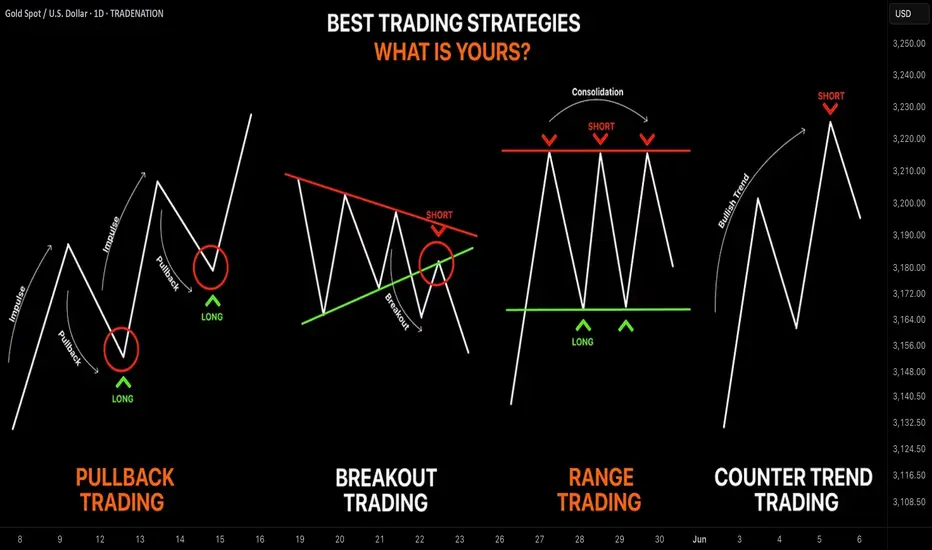
Learn the 4 Best Strategies to Maximize Your Profits in Trading
In the today's article, we will discuss 4 classic yet profitable forex and gold trading strategies.
1️⃣Pullback Trading
Pullback trading is a trend-following strategy where you open the positions after pullbacks.
If the market is trading in a bullish trend, your goal as a pullback trader is to wait for a completion of a bullish impulse and then let the market correct itself. Your entry should be the assumed completion point of a correctional movement. You expect a trend-following movement from there.
In a bearish trend, you wait for a completion of the bearish impulse, let the market retrace, and you look for short-entry after a completion of the retracement leg.
Here is the example of pullback trading.
On the left chart, we see the market that is trading in a bearish trend.
A pullback trader would short the market upon completion of the correctional moves.
On the right chart, I underlined the buy entry points of a pullback trader.
That strategy is considered to be one of the simplest and profitable and appropriate for newbie traders.
2️⃣Breakout Trading
Breakout trading implies buying or selling the breakout of a horizontal structure or a trend line.
If the price breaks a key support, it signifies a strong bearish pressure.
Such a violation will trigger a bearish continuation with a high probability.
Alternatively, a bullish breakout of a key resistance is a sign of strength of the buyers and indicates a highly probable bullish continuation.
Take a look, how the price broke a key daily resistance on a daily time frame. After a breakout, the market retested the broken structure that turned into a support. A strong bullish rally initiated from that.
With the breakout trading, the best entries are always on a retest of a broken structure.
3️⃣Range Trading
Range trading signifies trading the market that is consolidating .
Most of the time, the market consolidates within the horizontal ranges.
The boundaries of the range may provide safe points to buy and sell the market from.
The upper boundary of the range is usually a strong resistance and one may look for shorting opportunities from there,
while the lower boundary of the range is a safe place to buy the market from.
EURCAD pair is trading within a horizontal range on a daily.
The support of the range is a safe zone to buy the market from.
A bullish movement is anticipated to the resistance of the range from there.
Taking into considerations, that the financial instruments may consolidate for days, weeks and even months, range trading may provide substantial gains.
4️⃣Counter Trend Trading
Counter trend trading signifies trading against the trend.
No matter how strong is the trend, the markets always trade in zig-zags. After impulses follow the corrections , and after the corrections follow the impulses.
Counter trend traders looks for a completion of the bullish impulses in a bullish trend to short the market, and for a completion of bearish impulses in a downtrend to buy it.
Here is the example of a counter trend trade.
EURJPY is trading in a bullish trend. However, the last 3 bearish moves initiated from a rising trend line. For a trader, shorting the trend line was a perfect entry to catch a bearish move.
Such trading strategy is considered to be one of the most complicated , because one goes against the crowd and overall sentiment.
With the experience, traders may combine these strategies.
❤️Please, support my work with like, thank you!❤️
I am part of Trade Nation's Influencer program and receive a monthly fee for using their TradingView charts in my analysis.
RSI 101: The Secret of RSI’s WMA45 Line and How to Use ItIn my trading method, I use the WMA45 line together with RSI to help spot the trend more clearly.
Today, I’ll share with you how it works and how to apply it — whether you're doing scalping or swing trading.
Why WMA45?
WMA (Weighted Moving Average) is a type of moving average where recent prices are given more importance.
WMA45 simply means it takes the average of the last 45 candles (could be 45 minutes, 45 hours, or 45 days depending on your chart).
Because it moves slower than RSI, it helps reduce the “noise” and gives you a better idea of the real trend.
This idea is not new — many traders have tested RSI strategies also use this line. I just applied and adjusted it in my own way.
👉 How to set it up on TradingView (very simple):
What WMA45 Tells You
Trending
This line shows you the overall direction of the market:
📉 If WMA45 is going down, the price is likely going down.
📈 If WMA45 is going up, the price is likely going up.
Also, the steeper the line, the stronger the trend is:
Looking at the example above, the WMA45 line starts from the same level in two different phases, but the slope is different. The steeper line shows a larger price range.
This happens because the price was more volatile, which caused the RSI to move more sharply, and that, in turn, made the WMA45 slope steeper.
In multi-timeframe analysis, when the trend on the higher timeframe is strong (shown by a steep WMA45 line), the RSI on the lower timeframe will usually move within a tighter range and react more accurately to key levels.
If you’re not sure what these key RSI levels are, check out my previous post here:
For example, in a strong downtrend on H1, RSI on M5 might not even reach 50:
✅ What does this mean for trading?
Use WMA45 on higher timeframes to define trend bias.
On lower timeframes, watch RSI responses at key zones for optimal entries.
When holding positions, WMA45 helps determine whether to stay in the trade.
Moving Sideways
Here’s something important to note: when WMA45 is flat, RSI will keep crossing back and forth over it.
Depending on where WMA45 is flat, RSI tends to move within that range and creates different sideways price patterns. Here are the main types:
Around 50 → price moves in a box: According to RSI theory, the 50 level is the balance between buyers and sellers. RSI fluctuating around this causes price to move sideways in a rectangular box range.
Above 50 → price goes up in a rising channel: Above 50 is where buyers dominate sellers. RSI operating in this zone will continually create bullish candles pushing the price upward.
Below 50 → price goes down in a falling channel: Below 50 is where sellers dominate buyers. RSI in this zone will consistently form lower highs and lower lows, pushing the price downward.
Trend Reversal of WMA45
WMA45 is calculated from the average of 45 candles, so it's almost impossible for it to reverse direction suddenly. When it's sloping (trending), it takes time for RSI to fluctuate enough to "flatten" it before it can reverse.
As shown in the example, after WMA45 slopes up, before it turns downward, RSI must cross back and forth through it to reduce the steepness => flatten it => then reverse.
Does this align with Dow Theory? It represents the phases: Trend > Sideway > Trend. Sideway is when the WMA45 line is flattened.
✅ What does this mean for trading?
After a trend forms, if you want to enter a counter-trend trade, patiently wait for WMA45 to flatten to confirm the previous trend has ended.
Dynamic Support and Resistance
In addition to being a trend indicator for RSI, WMA45 also serves as a dynamic support/resistance level for RSI.
You will often observe RSI reacting when it encounters the WMA45 line.
In an uptrend, WMA45 acts as support for RSI.
In a downtrend, WMA45 acts as resistance for RSI.
Notably, if the reactions occur at higher RSI values, the resulting price support is stronger. Conversely, if reactions happen at lower RSI values, the price is pushed down further.
In the above example, in the first reaction around RSI 60s, RSI dropped by 9.6 points and price dropped by 12 points. In the second reaction at RSI 40s, RSI dropped similarly, but the price dropped by 25 points.
✅ What does this mean for trading?
You can use WMA45 as an entry zone for your trade: Wait for reactions with WMA45 on the higher timeframe, then switch to a lower timeframe to find a trade entry.
Use WMA45 as a take-profit or stop-loss level: For a short trade near WMA45, you can stop out if RSI crosses above it.
When monitoring these reactions, pay attention to the number of reactions—more reactions require more caution in trading.
Some Trade Setups Using WMA45 and RSI
1. Intraday trading
Trend: Follow the trend on the H1 chart.
Entry zone: At WMA45 of H1.
Entry confirmation: 2 methods:
On M5: when WMA45 of RSI is already flattened, and RSI has crossed above WMA45.
On M5: when a divergence appears in RSI.
2. Scalping
With the RSI’s reaction to WMA45, even on smaller timeframes (M1, M5), you can scalp when RSI touches WMA45.
When WMA45 has a slope and RSI returns to touch it, you can enter a trade with SL behind the candle close (10–20 pips to avoid stop hunts and spread), and TP to the nearest peak.
As mentioned, the first touch gives the best reaction.
My trading system is entirely based on RSI, feel free to follow me for technical analysis and discussions using RSI.

You want to be a trader but you have a 9-5 Educational purpose only. You want to be a day trader but can't trade market open because you have a job or you are too busy. The daily bar can give you just as much profits as the 5 min charts. In this video ill teach you how to find support and resistance zone on any market. Opening a line chart starting from the weekly and then looking for areas where price has repeatedly reverse gives you a clue of where price may go in the future on a daily chart. Watch till the end to see how this strategy is applied to all markets.

7 reasons why people may still struggle to make money in crypto Why people may still struggle to make money in #crypto
1. ** #Market Volatility**
- The cryptocurrency market is highly volatile, with prices fluctuating dramatically. This can lead to significant losses if investments are not timed well.
2. **Lack of Information**
- Insufficient information can hinder investment decisions, making it difficult to identify profitable opportunities.
3. **Fraud and Scams**
- The crypto space is rife with scams and fraudulent schemes. It's crucial to be able to distinguish between legitimate projects and scams.
4. **Lack of Long-term Perspective**
- Many investors focus on short-term gains, which can lead to impulsive decisions and losses, rather than holding for the long term.
5. **Emotional Trading**
- Emotional reactions to market changes can lead to poor decision-making, such as panic selling or chasing after trends.
6. **Regulatory Uncertainty**
- Ongoing regulatory changes can impact the market and create uncertainty, affecting investment strategies.
7. **High Transaction Fees**
- Transaction fees can eat into profits, especially for smaller trades.
Conclusion
Investing in cryptocurrency requires careful research, a clear strategy, and an understanding of the risks involved.

Support and Resistance Levels: A Beginner Trader's GuideSupport and Resistance Levels: A Beginner Trader's Guide
Hello!
If you’re just starting your journey in trading, you’ve probably already heard about "support" and "resistance." These terms might sound intimidating, but their essence is simple. Think of an asset’s price as a ball bouncing between a floor and a ceiling. The floor is support , and the ceiling is resistance . Let’s break down how this works and how to use these levels in your trading.
1. What Are Support and Resistance?
- Support is a price level where buyers (bulls) are strong enough to halt a decline.
→ Example: Suppose the GBP/USD price drops to resistance line multiple times but bounces back each time. This line is a strong support level.
- Resistance is a level where sellers (bears) take control, preventing the price from rising further.
Why is this important?
These levels help you anticipate where the price might reverse or continue moving. They’re like road signs on your chart!
2. How to Identify Support and Resistance on a Chart
Start by analyzing price history. Support and resistance levels form where the price has repeatedly stalled.
- Step 1: Open a daily or hourly chart . The larger the timeframe, the more significant the level.
- Step 2: Look for points where the price reversed . For example, lows (for support) and highs (for resistance).
- Step 3: Draw horizontal lines through these points.
→ Visual Example:
On the GBP/USD chart, the price tested the level multiple times and bounced. This is clear support. The resistance level, where upward momentum stalled, acts as resistance.
3. How to Trade Using Support and Resistance
There are two main scenarios: *bouncing off a level* and *breaking through a level*.
Scenario 1: Bouncing Off Support or Resistance
- If the price approaches support, consider opening a long position (buying), expecting a rebound.
- If the price nears resistance, consider opening a short position (selling), anticipating a drop.
Scenario 2: Breaking Through a Level
If the price breaks support or resistance with high volume, it’s a signal to act:
- Breaking resistance → Buy.
- Breaking support → Sell.
→ Example:
GBP/USD breaks above resistance at 2.01050. You enter a short position, placing a stop-loss below 2.04040 order-block.
4. Common Beginner Mistakes to Avoid
- Overloading the chart with lines . Don’t mark every minor swing—focus on key levels.
- Ignoring volume . A breakout without increasing volume is often a false signal.
- Impatience . The price may test a level repeatedly—wait for confirmation before trading.
5. Practice Is the Key to Success
1. Study historical data . Open past charts and practice identifying levels retrospectively.
2. Use a demo account . Test your strategies risk-free.
3. Keep a trading journal . Note why you chose specific levels and analyze your mistakes.
6.Conclusion
Support and resistance levels are your best allies in trading. They reveal market structure and guide your decisions. Don’t get discouraged if it feels challenging at first—practice will sharpen your intuition. Remember, even professionals make mistakes. Focus on risk management and continuous learning.
Good luck! You’ve got this!

Fibonacci Extensions: Mapping Market Psychology Beyond the TrendHello, traders! 💫
Fibonacci numbers have traveled far from ancient Italian math to modern trading charts. In technical analysis, Fibonacci Extensions aren’t just mystical ratios; they’re a structured way to project potential price targets based on crowd psychology and trend continuation.
But what are they really, and why do so many traders draw those lines with near-religious fervor?
🧠 A Quick Historical Detour
Leonardo Fibonacci introduced the sequence to the West in the 13th century based on patterns he observed in Indian mathematics. The key idea is that each number in the sequence is the sum of the two before it: 1, 1, 2, 3, 5, 8, 13, 21...
When you divide specific numbers in the sequence, you get ratios that repeat throughout nature — and, intriguingly, financial markets. These include:
0.618 (the “golden ratio”)
1.618
2.618, and so on.
While Fibonacci Retracements look backward to gauge potential pullbacks, Fibonacci Extensions look forward to mapping possible continuation levels after a price move.
📊 Fibonacci Extensions
To use Fibonacci Extensions, you need three points:
The Start of a Trend (Point A)
The End of the Trend or Impulse Move (Point B)
A Retracement Low/High Where Price Bounces or Consolidates (Point C)
This ABC move applies Fibonacci ratios to project levels beyond point B, helping traders visualize where the price might go if the trend continues.
Common Extension Levels Include:
1.272
1.618 (golden ratio)
2.0
2.618
Each level acts as a kind of psychological milestone — not a guarantee, but a place where market participants may take profits, reassess, or react.
🔎 Let’s Take a Real Example: BTC/USDT Weekly
It's not that Fibonacci numbers have magical power. The theory is based on self-fulfilling behavior. When enough traders watch the same levels — and act on them — they can influence real outcomes.
The chart illustrates how Fibonacci retracement levels can be used to understand the depth and structure of a correction during a bullish cycle.
Low (~$4,783) in March 2020 (COVID-19 Сrash)
to the High (~$65,834) in November 2021 (Bull Market Peak)
From there, the price corrected throughout 2022–2023. Let’s look at what happened at each level — and what it tells us on the graph.
🔍 Why This Matters
Your retracement levels aren’t just lines — they mapped the psychology of the market:
Investors Testing Conviction at 0.5
Panic at 0.618
Capitulation Near 0.786 — but Without Full Breakdown
And Finally: A Rebound in 2023, Leading to New Highs in 2025
This kind of structure is textbook Fibonacci behavior — and is part of why retracement levels remain a core part of institutional technical analysis.
⚖️ Final Thought
Fibonacci Extensions are not about telling you where the price will go — they’re about framing where the price might go if the current trend keeps moving. It’s a lens through which to read market psychology, momentum, and expectation. Combined with volume, structure, and broader trend context, they potentially help analysts build a more nuanced market narrative.
And maybe Leonardo Fibonacci would have appreciated that his 800-year-old math is still trying to decode modern human emotion, just on candlestick charts.

BTCUSDT 13R Trade Breakdown: Deep Crab Pattern + SMC Precision Hello Traders!
If you enjoyed my previous post on combining Harmonic Patterns with Smart Money Concepts (SMC) for high-precision, high-risk-to-reward trades, then you're going to love this breakdown on BTCUSDT.
If you haven’t checked out my earlier content, make sure to scroll below this post and see that first—it sets the foundation for what we’re diving into here.
📈 BTCUSDT Trade Breakdown: Harmonic x SMC Precision Entry
This analysis was originally shared around three weeks ago on my YouTube channel, and if you were with me live, you’ll remember I was closely watching for a Bullish Deep Crab Pattern to complete before considering a LONG position.
Let’s walk through the setup and outcome step-by-step:
🕰 WEEKLY TIMEFRAME:
Price was reacting to a Weekly Fair Value Gap (FVG) and had filled the imbalance.
As shown in the chart:
🔍 SETUP: Strategy Confirmation
Important Reminder:
Just because price hits a key level doesn’t mean we jump in to buy or sell.
✅ There must be a confirmed Harmonic Pattern that aligns with the key SMC level.
On the Daily Chart, we identified a valid Bullish Deep Crab Pattern:
B-point at 0.886
PRZ (Potential Reversal Zone) at 1.618 FIB Extension
This PRZ aligned perfectly with the key level identified on the Weekly chart.
🎯 ENTRY STRATEGY (15-Minute Chart):
We zoomed into the 15M chart for an SMC-based entry.
Supply-to-demand flip confirmed with a visible liquidity inducement—textbook confirmation.
Entry was just a few pips below the recent swing low to limit downside risk in case of invalidation.
Take Profits (TPs) were set using standard Deep Crab targets, based on FIB retracements from A to D:
✅ TP1 at 0.382
✅ TP2 at 0.618
✅ TP3 at 0.786
✅ TRADE OUTCOME:
Entry was cleanly triggered and the price followed through as expected.
All three profit levels were successfully hit:
✅ TP1
✅ TP2
✅ TP3
We secured an impressive 13R on this single BTCUSDT trade —a solid example of what happens when Harmonics and Smart Money Concepts are aligned.
💬 Your Turn:
Did you take this BTC trade using a different strategy?
Or did you spot the pattern and enter alongside me?
Drop your thoughts and experiences below this analysis—let’s learn together!
