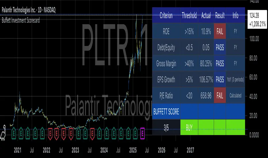
Buffett Investment ScorecardYou want to buy a stock and wonder if Warren Buffett would buy it?
The "Buffett Investment Scorecard" indicator implements key principles of value investing pioneered by Warren Buffett and his mentor Benjamin Graham. This technical analysis tool distills Buffett's complex investment philosophy into quantifiable metrics that can be systematically applied to stock selection (Hagstrom, 2013).
Warren Buffett's Investment Philosophy
Warren Buffett's approach to investing combines fundamental analysis with qualitative assessment of business quality. As detailed in his annual letters to Berkshire Hathaway shareholders, Buffett seeks companies with durable competitive advantages, often referred to as "economic moats" (Buffett, 1996). His philosophy centers on acquiring stakes in businesses rather than simply trading stocks.
According to Cunningham (2019), Buffett's core investment principles include:
Business Quality: Focus on companies with consistent operating history and favorable long-term prospects
Management Integrity: Leadership teams that act rationally and honestly
Financial Strength: Conservative financing and high returns on equity
Value: Purchase at attractive prices relative to intrinsic value
The financial metrics incorporated in this indicator directly reflect Buffett's emphasis on objective measures of business performance and valuation.
Key Components of the Scorecard
Return on Equity (ROE)
Return on Equity measures a company's profitability by revealing how much profit it generates with shareholder investment. Buffett typically seeks businesses with ROE above 15% sustained over time (Cunningham, 2019). As noted by Hagstrom (2013, p.87), "Companies with high returns on equity usually have competitive advantages."
Debt-to-Equity Ratio
Buffett prefers companies with low debt. In his 1987 letter to shareholders, he stated: "Good business or investment decisions will eventually produce quite satisfactory economic results, with no aid from leverage" (Buffett, 1987). The scorecard uses a threshold of 0.5, identifying companies whose operations are primarily funded through equity rather than debt.
Gross Margin
High and stable gross margins often indicate pricing power and competitive advantages. Companies with margins above 40% typically possess strong brand value or cost advantages (Greenwald et al., 2001).
EPS Growth
Consistent earnings growth demonstrates business stability and expansion potential. Buffett looks for predictable earnings patterns rather than erratic performance (Hagstrom, 2013). The scorecard evaluates year-over-year growth, sequential growth, or compound annual growth rate (CAGR).
P/E Ratio
The price-to-earnings ratio helps assess valuation. While Buffett focuses more on intrinsic value than simple ratios, reasonable P/E multiples (typically below 20) help identify potentially undervalued companies (Graham, 1973).
Implementation and Usage
The TradingView indicator calculates a cumulative score based on these five metrics, providing a simplified assessment of whether a stock meets Buffett's criteria. Results are displayed in a color-coded table showing each criterion's status (PASS/FAIL).
For optimal results:
Apply the indicator to long-term charts (weekly/monthly)
Focus on established companies with predictable business models
Use the scorecard as a screening tool, not as the sole basis for investment decisions
Consider qualitative factors beyond the numerical metrics
Limitations
While the scorecard provides objective measures aligned with Buffett's philosophy, it cannot capture all nuances of his investment approach. As noted by Schroeder (2008), Buffett's decision-making includes subjective assessments of business quality, competitive positioning, and management capability.
Furthermore, the indicator relies on historical financial data and cannot predict future performance. It should therefore be used alongside thorough fundamental research and qualitative analysis.
References
Buffett, W. (1987). Letter to Berkshire Hathaway Shareholders. Berkshire Hathaway Inc.
Buffett, W. (1996). Letter to Berkshire Hathaway Shareholders. Berkshire Hathaway Inc.
Cunningham, L.A. (2019). The Essays of Warren Buffett: Lessons for Corporate America. Carolina Academic Press.
Graham, B. (1973). The Intelligent Investor. Harper & Row.
Greenwald, B., Kahn, J., Sonkin, P., & van Biema, M. (2001). Value Investing: From Graham to Buffett and Beyond. Wiley Finance.
Hagstrom, R.G. (2013). The Warren Buffett Way. John Wiley & Sons.
Schroeder, A. (2008). The Snowball: Warren Buffett and the Business of Life. Bantam Books.
Educational
Big Whale Finder PROBig Whale Finder PRO
The Big Whale Finder PRO is an advanced technical indicator designed to detect and analyze the footprints of institutional traders (commonly referred to as "whales") in financial markets. Based on multiple proprietary detection algorithms, this indicator identifies distinct patterns of accumulation and distribution that typically occur when large market participants execute significant orders.
Theoretical Framework
The indicator builds upon established market microstructure theories and empirical research on institutional trading behavior. As Kyle (1985) demonstrated in his seminal work on market microstructure, informed traders with large positions tend to execute their orders strategically to minimize market impact. This often results in specific volume and price action patterns that the Big Whale Finder PRO is designed to detect.
Key Feature Enhancements
1. Volume Analysis Refinement
The indicator implements a dual-threshold approach to volume analysis based on research by Easley et al. (2012) on volume-based informed trading metrics. The normal threshold identifies routine institutional activity, while the extreme threshold flags exceptional events that often precede significant market moves.
2. Wickbody Ratio Analysis
Drawing from Cao et al. (2021) research on price formation and order flow imbalance, the indicator incorporates wick-to-body ratio analysis to detect potential order absorption and iceberg orders. High wick-to-body ratios often indicate hidden liquidity and resistance/support levels maintained by large players.
3. BWF-Index (Proprietary Metric)
The BWF-Index is a novel quantitative measure that combines volume anomalies, price stagnation, and candle morphology into a single metric. This approach draws from Harris's (2003) work on trading and exchanges, which suggests that institutional activity often manifests through multiple simultaneous market microstructure anomalies.
4. Zone Tracking System
Based on Wyckoff Accumulation/Distribution methodology and modern zone detection algorithms, the indicator establishes and tracks zones where institutional activity has occurred. This feature enables traders to identify potential support/resistance areas where large players have previously shown interest.
5. Trend Integration
Following Lo and MacKinlay's (1988) work on market efficiency and technical analysis, the indicator incorporates trend analysis through dual EMA comparison, providing context for volume and price patterns.
Labels and Signals Explanation
The indicator uses a system of labels to mark significant events on the chart:
🐋 (Whale Symbol): Indicates extreme volume activity that significantly exceeds normal market participation. This is often a sign of major institutional involvement and frequently precedes significant price moves. The presence of this label suggests heightened attention is warranted as a potential trend reversal or acceleration may be imminent.
A (Accumulation): Marks periods where large players are likely accumulating positions. This is characterized by high volume, minimal price movement upward, and stronger support at the lower end of the candle (larger lower wicks). Accumulation zones often form bases for future upward price movements. This pattern frequently occurs at the end of downtrends or during consolidation phases before uptrends.
D (Distribution): Identifies periods where large players are likely distributing (selling) their positions. This pattern shows high volume, minimal downward price movement, and stronger resistance at the upper end of the candle (larger upper wicks). Distribution zones often form tops before downward price movements. This pattern typically appears at the end of uptrends or during consolidation phases before downtrends.
ICE (Iceberg Order): Flags the potential presence of iceberg orders, where large orders are split into smaller visible portions to hide the true size. These are characterized by unusual wick-to-body ratios with high volume. Iceberg orders often indicate price levels that large institutions consider significant and may act as strong support or resistance areas.
Information Panel Interpretation
The information panel provides real-time analysis of market conditions:
Volume/Average Ratio: Shows how current volume compares to the historical average. Values above the threshold (default 1.5x) indicate abnormal activity that may signal institutional involvement.
BWF-Index: A proprietary metric that quantifies potential whale activity. Higher values (especially >10) indicate stronger likelihood of institutional participation. The BWF-Index combines volume anomalies, price action characteristics, and candle morphology to provide a single measure of potential whale activity.
Status: Displays the current market classification based on detected patterns:
"Major Whale Activity": Extreme volume detected, suggesting significant institutional involvement
"Accumulation": Potential buying activity by large players
"Distribution": Potential selling activity by large players
"High Volume": Above-average volume without clear accumulation/distribution patterns
"Normal": Regular market activity with no significant institutional footprints
Trend: Shows the current market trend based on EMA comparison:
"Uptrend": Fast EMA above Slow EMA, suggesting bullish momentum
"Downtrend": Fast EMA below Slow EMA, suggesting bearish momentum
"Sideways": EMAs very close together, suggesting consolidation
Zone: Indicates if the current price is in a previously identified institutional activity zone:
"In Buy Zone": Price is in an area where accumulation was previously detected
"In Sell Zone": Price is in an area where distribution was previously detected
"Neutral": Price is not in a previously identified institutional zone
Trading Recommendations
Based on the different signals and patterns, the following trading recommendations apply:
Bullish Scenarios
Accumulation (A) + Uptrend: Strong buy signal. Large players are accumulating in an established uptrend, suggesting potential continuation or acceleration.
Strategy: Consider entering long positions with stops below the accumulation zone.
Extreme Volume (🐋) + In Buy Zone + Price Above EMAs: Very bullish. Major whale activity in a previously established buying zone with positive price action.
Strategy: Aggressive buying opportunity with wider stops to accommodate volatility.
High BWF-Index (>10) + Accumulation + Downtrend Ending: Potential trend reversal signal. High institutional interest at the potential end of a downtrend.
Strategy: Early position building with tight risk management until trend confirmation.
Bearish Scenarios
Distribution (D) + Downtrend: Strong sell signal. Large players are distributing in an established downtrend, suggesting potential continuation or acceleration.
Strategy: Consider entering short positions with stops above the distribution zone.
Extreme Volume (🐋) + In Sell Zone + Price Below EMAs: Very bearish. Major whale activity in a previously established selling zone with negative price action.
Strategy: Aggressive shorting opportunity with wider stops to accommodate volatility.
High BWF-Index (>10) + Distribution + Uptrend Ending: Potential trend reversal signal. High institutional interest at the potential end of an uptrend.
Strategy: Early short position building with tight risk management until trend confirmation.
Neutral/Caution Scenarios
Iceberg Orders (ICE) + Sideways Market: Suggests significant hidden liquidity at current levels.
Strategy: Mark these levels as potential support/resistance for future reference. Consider range-trading strategies.
Conflicting Signals (e.g., Accumulation in Downtrend): Requires careful analysis.
Strategy: Wait for additional confirmation or reduce position sizing.
Multiple Extreme Volume Events (🐋) in Succession: Indicates unusual market conditions, possibly related to news events or major market shifts.
Strategy: Exercise extreme caution and potentially reduce exposure until clarity emerges.
Practical Applications
Short-Term Trading:
Use the indicator to identify institutional activity zones for potential intraday support/resistance levels
Watch for whale symbols (🐋) to anticipate potential volatility or trend changes
Combine with price action analysis for entry/exit timing
Swing Trading
Focus on accumulation/distribution patterns in conjunction with the prevailing trend
Use buy/sell zones as areas to establish or exit positions
Monitor the BWF-Index for increasing institutional interest over time
Position Trading
Track long-term whale activity to identify shifts in institutional positioning
Use multiple timeframe analysis to confirm major accumulation/distribution phases
Combine with fundamental analysis to validate potential long-term trend changes
References
Kyle, A. S. (1985). Continuous auctions and insider trading. Econometrica, 53(6), 1315-1335.
Easley, D., López de Prado, M. M., & O'Hara, M. (2012). Flow toxicity and liquidity in a high-frequency world. The Review of Financial Studies, 25(5), 1457-1493.
Cao, C., Hansch, O., & Wang, X. (2021). The information content of an open limit order book. Journal of Financial Markets, 50, 100561.
Harris, L. (2003). Trading and exchanges: Market microstructure for practitioners. Oxford University Press.
Lo, A. W., & MacKinlay, A. C. (1988). Stock market prices do not follow random walks: Evidence from a simple specification test. The Review of Financial Studies, 1(1), 41-66.
Wyckoff, R. D. (1931). The Richard D. Wyckoff method of trading and investing in stocks. Transaction Publishers.
Menkhoff, L., & Taylor, M. P. (2007). The obstinate passion of foreign exchange professionals: Technical analysis. Journal of Economic Literature, 45(4), 936-972.

London Judas Swing Indicator by PoorTomTradingThis indicator is designed to help people identify and trade the London Judas Swing by Inner Circle Trader (ICT).
UPDATES IN V2:
This is a v2 update with automatic timezone settings, there is no longer any need to adjust the time or offset for DST.
It will now also work on any chart that trades during the Asia and London sessions (20:00 - 05:00 NY Time), including crypto.
It is recommended to use this indicator on the 5 minute timeframe.
INTRODUCTION OF KEY CONCEPTS:
Swing Points are a candle patterns defining highs and lows, these are explained further down in the description in more detail. They are shown on the indicator by arrows above and below candles. They can be removed if you wish by turning their opacity to 0% in settings. Swing points are automatically removed when price trades beyond them (above swing highs, below swing lows).
The Asia Session can be set by the user, but is defined by default as 20:00 - 00:00 NY time. Lines are drawn at the high and low of the Asia Session and the Asian Range is set at midnight.
The London Session is defined as 02:00 - 05:00 NY time.
The user can also include the pre-London session (00:00 - 02:00) for detection of breakouts and Market Structure Breaks (MSBs - explained lower down in the description with examples). This is selected by default.
EXPLANATION OF INDICATOR:
During the London Session, the indicator will wait for a break of either the high or low of the Asian Range.
When this is detected, it will draw a dashed line where the breakout occurred and trigger an alert.
After the break of the Asian Range, the indicator will look for an MSB in the opposite direction, which is when price closes beyond a swing point opposing current price direction. The indicator will draw a line indicating the MSB point and trigger an alert.
Finally, the indicator will also trigger an alert when price returns to this MSB level, which is the most simple Judas Swing entry method.
The Judas swing
Example with chart for Judas Swing short setups -
Price breaks above the Asia High, no candle close is required, the indicator will then wait for price to close a candle below the last swing low.
A swing low is defined as a 3 candle pattern, with two candles on either side of the middle one having higher lows. When a candle closes below the middle candle's low, that is an MSB.
When price returns to the MSB point, the Take Profit and Stop Loss levels will appear.
When price goes to either the Stop Loss or Take Profit level, the MSB, TP and SL, lines will be removed.
After this, if price creates a new setup in the opposite direction, the indicator will also work for this, as shown in this example that occurred right after the first example
SETTINGS:
- The "Swing Point strength" can be adjusted in the settings.
Example:
For a swing low:
The default setting is 1 (one candle on each side of a middle candle has a higher low).
You can change this setting to 2, for a 5 candle pattern (two candles on each side of the middle candle have higher lows).
This can be changed to a maximum of 10. But only 1 or 2 is recommended especially on the 5 minute chart.
- ATR Length and Triangle Distance Multiplier settings are for adjusting how the swing point symbols appear on the chart.
This is to ensure triangles are not drawn over candles when price gets volatile.
The default setting is ideal for almost all market conditions, but you can play around with it to adjust to your liking.
- Alerts.
For alerts to be triggered, they must first be selected in settings.
Then you need to go on to the chart and right-click on an element of the indicator (such as the swing point symbols) and select "add alert on PTT-LJS-v2".
If after this, you change any settings on the indicator such as session times or pre-London session, you must add the alert again, and delete the old one if you wish.

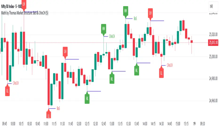
Market Structure: BoS & CHoCH (Math by Thomas)📌 Description:
Market Structure: BoS & CHoCH (Math by Thomas) is a clean and reliable market structure tool designed to visually mark Swing Highs, Swing Lows, and classify each one as HH (Higher High), LH (Lower High), LL (Lower Low), or HL (Higher Low) based on price action. It also detects and labels Break of Structure (BoS) and Change of Character (CHoCH) to help identify potential continuation or reversal in trend.
🛠️ How to Use:
Add the indicator to your chart (works on any timeframe and asset).
Adjust the "Swing Sensitivity" input to fine-tune how many bars the script uses to detect a swing high/low. A higher number smooths out noise.
The script will automatically:
Mark every confirmed swing high or low with a solid line.
Label the swing as HH, LH, HL, or LL depending on its relative position.
Show BoS (trend continuation) or CHoCH (trend reversal) labels with the current trend direction.
Toggle labels or lines on or off with the corresponding checkboxes in settings.
🔍 Tip:
Use this indicator alongside other tools like volume or RSI for more confident entries. A CHoCH followed by two BoS in the same direction often signals a strong trend reversal.
Volume towers by GSK-VIZAG-AP-INDIAVolume Towers by GSK-VIZAG-AP-INDIA
Overview :
This Pine Script visualizes volume activity and provides insights into market sentiment through the display of buying and selling volume, alongside moving averages. It highlights high and low volume candles, enabling traders to make informed decisions based on volume anomalies. The script is designed to identify key volume conditions, such as below-average volume, high-volume candles, and their relationship to price movement.
Script Details:
The script calculates a Simple Moving Average (SMA) of the volume over a user-defined period and categorizes volume into several states:
Below Average Volume: Volume is below the moving average.
High Volume: Volume exceeds the moving average by a multiplier (configurable by the user).
Low Volume: Volume that doesn’t qualify as either high or below average.
Additionally, the script distinguishes between buying volume (when the close is higher than the open) and selling volume (when the close is lower than the open). This categorization is color-coded for better visualization:
Green: Below average buying volume.
Red: Below average selling volume.
Blue: High-volume buying.
Purple: High-volume selling.
Black: Low volume.
The Volume Moving Average (SMA) is plotted as a reference line, helping users identify trends in volume over time.
Features & Customization:
Customizable Inputs:
Volume MA Length: The period for calculating the volume moving average (default is 20).
High Volume Multiplier: A multiplier for defining high volume conditions (default is 2.0).
Color-Coded Volume Histograms:
Different colors are used for buying and selling volume, as well as high and low-volume candles, for quick visual analysis.
Alerts:
Alerts can be set for the following conditions:
Below-average buying volume.
Below-average selling volume.
High-volume conditions.
How It Works:
Volume Moving Average (SMA) is calculated using the user-defined period (length), and it acts as the baseline for categorizing volume.
Volume Conditions:
Below Average Volume: Identifies candles with volume below the SMA.
High Volume: Identifies candles where volume exceeds the SMA by the set multiplier (highVolumeMultiplier).
Low Volume: When volume is neither high nor below average.
Buying and Selling Volume:
The script identifies buying and selling volume based on the closing price relative to the opening price:
Buying Volume: When the close is greater than the open.
Selling Volume: When the close is less than the open.
Volume histograms are then plotted using the respective colors for quick visualization of volume trends.
User Interface & Settings:
Inputs:
Volume MA Length: Adjust the period for the volume moving average.
High Volume Multiplier: Define the multiplier for high volume conditions.
Plots:
Buying Volume: Green bars indicate buying volume.
Selling Volume: Red bars indicate selling volume.
High Volume: Blue or purple bars for high-volume candles.
Low Volume: Black bars for low-volume candles.
Volume Moving Average Line: Displays the moving average line for reference.
Source Code / Authorship:
Author: prowelltraders
Disclaimer:
This script is intended for educational purposes only. While it visualizes important volume data, users are encouraged to perform their own research and testing before applying this script for trading decisions. No guarantees are made regarding the effectiveness of this script for real-world trading.
Contact & Support:
For questions, support, or feedback, please reach out to the author directly through TradingView (prowelltraders).
Signature:
GSK-VIZAG-AP-INDIA

Adaptive Signal OracleAdaptive Signal Oracle – Precision Forecasting with Weighted KNN & HMA Trend Logic
🔍 Overview
Adaptive Signal Oracle is a forward-looking trend prediction strategy that merges non-repainting technical analysis with a machine-learning-inspired forecasting model. Built from scratch, it is not a mashup of off-the-shelf indicators. Instead, it uses a handcrafted K-Nearest Neighbors (KNN)-style prediction engine combined with a classic HMA (Hull Moving Average) trend filter to deliver actionable, high-confidence entries.
📈 Core Components Explained
🔸 1. KNN-Weighted Future Predictor (Custom Engine)
Simulates a machine learning process using historical price behavior.
Compares current conditions to a rolling dataset of past feature/label pairs.
Assigns weights based on distance, forming a probabilistic directional bias.
Generates:
Prediction Probability (% confidence)
Expected Price Movement Magnitude
Dynamic Trade Targets (TP1/TP2)
🔸 2. HMA Trend Filter (Hull Moving Average)
Used for real-time trend confirmation.
Prevents entry during whipsaws by enforcing directional alignment.
Non-repainting and adaptive to volatility swings.
🔸 3. Risk-Managed Execution Logic
Built-in 2-level take-profit system:
TP1: Partial exit (50%)
TP2: Full exit (remaining 100%)
Hard-coded stop-loss at a configurable percentage (default: 2%)
Includes cooldown logic to prevent same-bar entries and exits
🔸 4. Integrated Visual Dashboard
Tracks:
Trade status
Entry price
TP/SL hits
Trend direction
Real-time PnL
Dashboard is resizable and repositionable for user control
🔸 5. Clean Bar Coloring
Highlights predicted direction with green (bullish) and red (bearish) candles
Enhances signal visibility without interfering with price action
⚠️ Important Notes
This script does not repaint.
All calculations are based on confirmed historical data, using bar-closed logic only.
Ideal for crypto, forex, and trending asset classes, especially on the 1H+ timeframes.
Not intended for use as financial advice or automated investment decision-making.
🧠 How to Use
Set desired TP/SL levels in the strategy inputs.
Adjust k-value and lookback for best fit with your instrument.
Monitor the dashboard and colored bars for trade entries.
Use as part of a broader system with structure, support/resistance, or volume confirmation if needed.
🛡️ Disclaimer
This script is for educational and informational purposes only. It does not constitute financial advice. Past performance does not guarantee future results. Always test on historical data and demo environments before applying to live trading. The author is not liable for any financial decisions made based on this script.

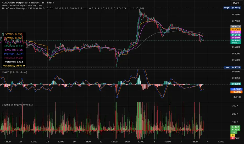
Timeframe StrategyThis is a multi-timeframe trading strategy inspired by Ross Cameron's style, optimized for scalping and trend-following across various timeframes (1m, 5m, 15m, 1h, and 1D). The strategy integrates a comprehensive set of technical indicators, dynamic risk management, and visual tools.
Core Features
Dynamic Take Profit, Stop Loss & Trailing Stop
> Separate settings per timeframe for:
-TP% (Take Profit)
-SL% (Stop Loss)
-Trailing Stop %
-Cooldown bars
> Configurable via UI inputs.
>Smart Entry Conditions
Bullish entry: EMA9 crossover EMA20 and EMA50 > EMA200
Bearish entry: EMA9 crossunder EMA20 and EMA50 < EMA200
>Additional confirmation filters:
-Volume Filter (enabled/disabled via UI)
-Time Filter (e.g., only between 15:00–20:00 UTC)
-Spike Filter: rejects high-volatility candles
-RSI Filter: above/below 50 for trend confirmation
-ADX Filter (only applied on 1m, e.g., ADX > 15)
-Micro-Volatility Filter: minimum range percentage (1m only)
-Trend Filter (1m only): price must be above/below EMA200
>Trailing Stop Logic
-Configurable for each timeframe.
- Optional via toggle (use_trailing).
>Trade Cooldown Logic
-Prevents consecutive trades within X bars, configurable per timeframe.
>Technical Indicators Used
-EMA 9 / 20 / 50 / 200
-VWAP
-RSI (14)
-ATR (14) for volatility-based spike filtering
-Custom-calculated ADX (14) (manually implemented)
>Visual Elements
🔼/🔽 Entry signals (long/short) plotted on the chart.
📉 Table in bottom-left:
Displays current values of EMA/VWAP/volume/ATR/ADX.
> Optional "Tab info" panel in top-right (toggleable):
-Timeframe & strategy settings
-Live status of filters (volume, time, cooldown, spike, RSI, ADX, range, trend)
-Uses emoji (✅ / ❌) for quick diagnostics.
>User Customization
-Inputs per timeframe for all key parameters.
-Toggle switches for:
-Trailing stop
-Volume filter
-Info table visibility
This strategy is designed for active traders seeking a balance between momentum entry, risk control, and adaptability across timeframes. It's ideal for backtesting quick reversals or breakout setups in fast markets, especially at lower timeframes like 1m or 5m.
Global ETF Capital FlowsThe Global ETF Capital Flows indicator is designed as a research and monitoring tool for identifying capital allocation trends across major global exchange-traded funds (ETFs). It provides standardized fund flow data for regional equity markets (including the United States, Europe, Asia, and Emerging Markets), as well as alternative asset classes such as bonds and gold.
Fund flows into and out of ETFs are increasingly recognized as a leading indicator of investor behavior, particularly in the context of tactical asset allocation and risk appetite (Ben-David et al., 2017). By tracking aggregated ETF flows, the script enables the user to detect shifts in global investment preferences, which may precede price action and influence broader macro trends (Bank of International Settlements, 2018). For example, consistent inflows into U.S. large-cap ETFs such as SPY or QQQ may signal heightened investor confidence in domestic equities, whereas rising flows into bond ETFs such as TLT may suggest a flight to safety or expectations of declining interest rates (Israeli et al., 2017).
The visualization aspect of the script uses standardized z-scores to represent cumulative flows over a specified period. This normalization allows users to compare fund flows across regions and asset classes on a relative basis, filtering out scale differences and allowing for more effective cross-market analysis. According to Coates and Herbert (2008), normalization techniques such as z-scores are crucial in behavioral finance research, as they help detect anomalies and emotional extremes in investor activity.
Practically, this indicator is suited for top-down macro analysis, sector rotation strategies, and confirmation of technical signals. For instance, significant positive deviations in the standardized flow data for European ETFs may support a bullish bias on regional equities, especially if corroborated by technical breakouts or improving economic indicators. Conversely, elevated inflows into gold ETFs may be interpreted as hedging behavior against geopolitical uncertainty or inflationary pressure, consistent with historical patterns of gold’s role as a safe haven (Baur and Lucey, 2010).
Additionally, the tool allows for visual alerts when flow anomalies exceed a user-defined threshold, thereby supporting more responsive and data-driven decision-making. This feature aligns with findings from the CFA Institute (2019), which emphasize the growing importance of alternative data and automated alert systems in modern portfolio management.
From a research perspective, the indicator facilitates empirical study into capital mobility, intermarket relationships, and ETF investor psychology. It offers real-time monitoring of region-specific investment flows, thus serving as a proxy for investor conviction, liquidity trends, and cross-border risk-on/risk-off sentiment. Several recent studies have demonstrated the predictive power of ETF flows on future returns and volatility, particularly during periods of market stress or structural dislocations (Madhavan, 2016; Pan and Zeng, 2019).
References
• Baur, D.G. and Lucey, B.M., 2010. Is gold a hedge or a safe haven? An analysis of stocks, bonds and gold. Financial Review, 45(2), pp.217-229.
• Ben-David, I., Franzoni, F. and Moussawi, R., 2017. Exchange-traded funds (ETFs). Annual Review of Financial Economics, 9, pp.169–189.
• Bank of International Settlements (BIS), 2018. ETFs – growing popularity, growing risks? BIS Quarterly Review, March 2018.
• CFA Institute, 2019. Investment Professional of the Future. Available at: www.cfainstitute.org .
• Coates, J.M. and Herbert, J., 2008. Endogenous steroids and financial risk taking on a London trading floor. Proceedings of the National Academy of Sciences, 105(16), pp.6167–6172.
• Israeli, D., Lee, C.M. and Sridharan, S.A., 2017. Is there a dark side to ETF trading? Evidence from corporate bond ETFs. SSRN Working Paper. Available at SSRN: ssrn.com
• Madhavan, A., 2016. Exchange-Traded Funds and the New Dynamics of Investing. Oxford University Press.
• Pan, K. and Zeng, Y., 2019. ETF Arbitrage Under Liquidity Mismatch. Journal of Finance, 74(6), pp.2731–2783.

Ticker DataThis script mostly for Pine coders but may be useful for regular users too.
I often find myself needing quick access to certain information about a ticker — like its full ticker name, mintick, last bar index and so on. Usually, I write a few lines of code just to display this info and check it.
Today I got tired of doing that manually, so I created a small script that shows the most essential data in one place. I also added a few extra fields that might be useful or interesting to regular users.
Description for regular users (from Pine Script Reference Manual)
tickerid - full ticker name
description - description for the current symbol
industry - the industry of the symbol. Example: "Internet Software/Services", "Packaged software", "Integrated Oil", "Motor Vehicles", etc.
country - the two-letter code of the country where the symbol is traded
sector - the sector of the symbol. Example: "Electronic Technology", "Technology services", "Energy Minerals", "Consumer Durables", etc.
session - session type (regular or extended)
timezone - timezone of the exchange of the chart
type - the type of market the symbol belongs to. Example: "stock", "fund", "index", "forex", "futures", "spread", "economic", "fundamental", "crypto".
volumetype - volume type of the current symbol.
mincontract - the smallest amount of the current symbol that can be traded
mintick - min tick value for the current symbol (the smallest increment between a symbol's price movements)
pointvalue - point value for the current symbol
pricescale - a whole number used to calculate mintick (usually (when minmove is 1), it shows the resolution — how many decimal places the price has. For example, a pricescale 100 means the price will have two decimal places - 1 / 100 = 0.01)
bar index - last bar index (if add 1 (because indexes starts from 0) it will shows how many bars available to you on the chart)
If you need some more information at table feel free to leave a comment.

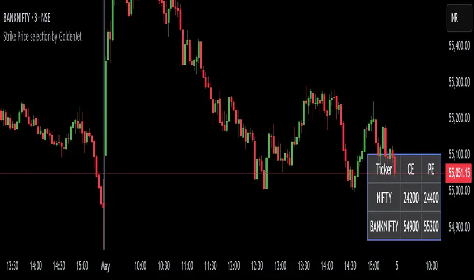
Strike Price selection by GoldenJetThis script is designed to assist options traders in selecting appropriate strike prices based on the latest prices of two financial instruments. It retrieves the latest prices, rounds them to the nearest significant value, and calculates potential strike prices for both call and put options. The results are displayed in a customizable table, allowing traders to quickly see the relevant strike prices for their trading decisions.
The strike prices shown are In-The-Money (ITM), which helps options traders in several ways:
Saving from Theta Decay: On expiry day, ITM options experience less time decay (Theta), which can help preserve the option's value.
Capturing Good Points: ITM options have a higher Delta, meaning they move more in line with the underlying asset's price. This can help traders capture a good amount of points as the underlying asset's price changes.
In essence, this tool simplifies the process of determining strike prices, making it easier for traders to make informed decisions and potentially improve their trading outcomes.
Heikin Ashi Colored Regular OHLC CandlesHeikin Ashi Colored Regular OHLC Candles
In the world of trading, Heikin Ashi candles are a popular tool for smoothing out price action and identifying trends more clearly. However, Heikin Ashi candles do not reflect the actual open, high, low, and close prices of a market. They are calculated values that change the chart’s structure. This can make it harder to see precise price levels or use standard price-based tools effectively.
To get the best of both worlds, we can apply the color logic of Heikin Ashi candles to regular OHLC candles. This means we keep the true market data, but show the trend visually in the same smooth way Heikin Ashi candles do.
Why use this approach
Heikin Ashi color logic filters out noise and helps provide a clearer view of the current trend direction. Since we are still plotting real OHLC candles, we do not lose important price information such as actual highs, lows, or closing prices. This method offers a hybrid view that combines the accuracy of real price levels with the visual benefits of Heikin Ashi trend coloring. It also helps maintain visual consistency for traders who are used to Heikin Ashi signals but want to see real price action.
Advantages for scalping
Scalping requires fast decisions. Even small price noise can lead to hesitation or bad entries. Coloring regular candles based on Heikin Ashi direction helps reduce that noise and makes short-term trends easier to read. It allows for faster confirmation of momentum without switching away from real prices. Since the candles are not modified, scalpers can still place tight stop-losses and targets based on actual price structure. This approach also avoids clutter, keeping the chart clean and focused.
How it works
We calculate the Heikin Ashi values in the background. If the Heikin Ashi close is higher than the Heikin Ashi open, the trend is considered bullish and the candle is colored green. If the close is lower than the open, it is bearish and the candle is red. If they are equal, the candle is gray or neutral. We then use these colors to paint the real OHLC candles, which are unchanged in shape or position.
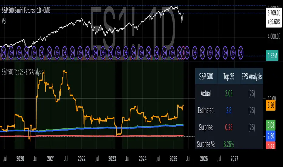
S&P 500 Top 25 - EPS AnalysisEarnings Surprise Analysis Framework for S&P 500 Components: A Technical Implementation
The "S&P 500 Top 25 - EPS Analysis" indicator represents a sophisticated technical implementation designed to analyze earnings surprises among major market constituents. Earnings surprises, defined as the deviation between actual reported earnings per share (EPS) and analyst estimates, have been consistently documented as significant market-moving events with substantial implications for price discovery and asset valuation (Ball and Brown, 1968; Livnat and Mendenhall, 2006). This implementation provides a comprehensive framework for quantifying and visualizing these deviations across multiple timeframes.
The methodology employs a parameterized approach that allows for dynamic analysis of up to 25 top market capitalization components of the S&P 500 index. As noted by Bartov et al. (2002), large-cap stocks typically demonstrate different earnings response coefficients compared to their smaller counterparts, justifying the focus on market leaders.
The technical infrastructure leverages the TradingView Pine Script language (version 6) to construct a real-time analytical framework that processes both actual and estimated EPS data through the platform's request.earnings() function, consistent with approaches described by Pine (2022) in financial indicator development documentation.
At its core, the indicator calculates three primary metrics: actual EPS, estimated EPS, and earnings surprise (both absolute and percentage values). This calculation methodology aligns with standardized approaches in financial literature (Skinner and Sloan, 2002; Ke and Yu, 2006), where percentage surprise is computed as: (Actual EPS - Estimated EPS) / |Estimated EPS| × 100. The implementation rigorously handles potential division-by-zero scenarios and missing data points through conditional logic gates, ensuring robust performance across varying market conditions.
The visual representation system employs a multi-layered approach consistent with best practices in financial data visualization (Few, 2009; Tufte, 2001).
The indicator presents time-series plots of the four key metrics (actual EPS, estimated EPS, absolute surprise, and percentage surprise) with customizable color-coding that defaults to industry-standard conventions: green for actual figures, blue for estimates, red for absolute surprises, and orange for percentage deviations. As demonstrated by Padilla et al. (2018), appropriate color mapping significantly enhances the interpretability of financial data visualizations, particularly for identifying anomalies and trends.
The implementation includes an advanced background coloring system that highlights periods of significant earnings surprises (exceeding ±3%), a threshold identified by Kinney et al. (2002) as statistically significant for market reactions.
Additionally, the indicator features a dynamic information panel displaying current values, historical maximums and minimums, and sample counts, providing important context for statistical validity assessment.
From an architectural perspective, the implementation employs a modular design that separates data acquisition, processing, and visualization components. This separation of concerns facilitates maintenance and extensibility, aligning with software engineering best practices for financial applications (Johnson et al., 2020).
The indicator processes individual ticker data independently before aggregating results, mitigating potential issues with missing or irregular data reports.
Applications of this indicator extend beyond merely observational analysis. As demonstrated by Chan et al. (1996) and more recently by Chordia and Shivakumar (2006), earnings surprises can be successfully incorporated into systematic trading strategies. The indicator's ability to track surprise percentages across multiple companies simultaneously provides a foundation for sector-wide analysis and potentially improves portfolio management during earnings seasons, when market volatility typically increases (Patell and Wolfson, 1984).
References:
Ball, R., & Brown, P. (1968). An empirical evaluation of accounting income numbers. Journal of Accounting Research, 6(2), 159-178.
Bartov, E., Givoly, D., & Hayn, C. (2002). The rewards to meeting or beating earnings expectations. Journal of Accounting and Economics, 33(2), 173-204.
Bernard, V. L., & Thomas, J. K. (1989). Post-earnings-announcement drift: Delayed price response or risk premium? Journal of Accounting Research, 27, 1-36.
Chan, L. K., Jegadeesh, N., & Lakonishok, J. (1996). Momentum strategies. The Journal of Finance, 51(5), 1681-1713.
Chordia, T., & Shivakumar, L. (2006). Earnings and price momentum. Journal of Financial Economics, 80(3), 627-656.
Few, S. (2009). Now you see it: Simple visualization techniques for quantitative analysis. Analytics Press.
Gu, S., Kelly, B., & Xiu, D. (2020). Empirical asset pricing via machine learning. The Review of Financial Studies, 33(5), 2223-2273.
Johnson, J. A., Scharfstein, B. S., & Cook, R. G. (2020). Financial software development: Best practices and architectures. Wiley Finance.
Ke, B., & Yu, Y. (2006). The effect of issuing biased earnings forecasts on analysts' access to management and survival. Journal of Accounting Research, 44(5), 965-999.
Kinney, W., Burgstahler, D., & Martin, R. (2002). Earnings surprise "materiality" as measured by stock returns. Journal of Accounting Research, 40(5), 1297-1329.
Livnat, J., & Mendenhall, R. R. (2006). Comparing the post-earnings announcement drift for surprises calculated from analyst and time series forecasts. Journal of Accounting Research, 44(1), 177-205.
Padilla, L., Kay, M., & Hullman, J. (2018). Uncertainty visualization. Handbook of Human-Computer Interaction.
Patell, J. M., & Wolfson, M. A. (1984). The intraday speed of adjustment of stock prices to earnings and dividend announcements. Journal of Financial Economics, 13(2), 223-252.
Skinner, D. J., & Sloan, R. G. (2002). Earnings surprises, growth expectations, and stock returns or don't let an earnings torpedo sink your portfolio. Review of Accounting Studies, 7(2-3), 289-312.
Tufte, E. R. (2001). The visual display of quantitative information (Vol. 2). Graphics Press.
Future OI AnalysisThis indicator appears to be a Futures Open Interest (OI) Analysis Tool designed to help traders understand market sentiment (long/short bias), cost of carry dynamics, and rollover behaviour. Below is a comprehensive description along with the formulas used:
To analyze futures market trends using:
Price change
Open Interest (OI) data
Cost of Carry (COC)
Rollover percentage
Column Breakdown and Formulas:
Date : Trading date.
Close : Close price of the spot on that day.
OI Cur (Current Open Interest) : Total open interest of the current (near) month contract.
OI Next (Next Month Open Interest) : Open interest of the next month contract.
COI (Cumulative Open Interest) : OI Cur + OI Next
COI Chg = ((Current COI - Previous COI) / Previous COI) × 100
Price Cng = ((Current Close - Previous Close) / Previous Close) × 100
OI BuildUP (Interpreted sentiment based on price & OI change):
Long Buildup : Price ↑ & OI ↑
Short Buildup : Price ↓ & OI ↑
Short Covering : Price ↑ & OI ↓
Long Unwinding : Price ↓ & OI ↓

PoiBox# PoiBox: Advanced Market Structure and POI Visualization Tool
PoiBox is a comprehensive market structure analysis tool designed to identify high-probability trading zones through advanced internal market structure (IDM) detection and points of interest (POI) calculation.
## How It Works
The indicator uses a multi-step approach to analyze price action:
1. **Market Structure Identification**: The script identifies significant highs and lows within your selected time range to determine the overall market structure direction (up or down).
2. **IDM Pattern Detection**: It then analyzes internal market structure patterns within this range, focusing on significant price movements that create trading opportunities.
3. **POI Calculation**: Using adaptive ATR measurements across multiple timeframes, the indicator calculates precise POI zones where price is likely to react. These zones are calibrated based on the volatility profile of each identified structure.
4. **Timeframe Correlation**: The script automatically determines which timeframe best matches each structure's size, providing valuable context for your trading decisions.
5. **Technical Implementation**: The indicator uses a sophisticated algorithm to analyze price swings, identify pivot points, and calculate market structure connections. It maintains a database of significant highs/lows and uses these to determine trend direction and potential reversal zones.
## Display Modes
PoiBox offers three powerful display options:
- **Main BOS**: Shows only the most significant breakout structure with its associated POI zone
- **Leg**: Displays the largest price leg within the selected range along with percentage-based POI zones
- **All IDMs**: Reveals all detected internal market structures and their POI zones
## Advanced Features
- **QM Mode**: Visualizes important market structure relationships with dashed lines connecting significant highs and lows
- **Trick Display**: Identifies nested market structures (tricks) within larger patterns, perfect for precision entries
- **Customizable POI Labels**: Control which price labels appear to maintain chart clarity
- **Extensive Color Settings**: Fully customizable colors for all visual elements
- **Safety Functions**: Includes built-in buffer management and error prevention algorithms to ensure stable performance across all timeframes and market conditions
## Trading Examples
**Downtrend Example:**
When PoiBox identifies a downtrend structure (Higher High → High → Low → Lower Low), it creates POI zones based on the market structure. As shown in the chart, these zones provide excellent entry opportunities when price returns to test previous structure. In this example, entering at the red POI zone with a stop above the zone and target at the QM level resulted in a 3.45 risk/reward trade.
**How to Read QM Lines:**
The dashed lines connecting High → Low → Higher High → Lower Low reveal the market's true structure. These connections help you anticipate where price might head next. When price breaks below a significant Low and creates a Lower Low, it confirms the downtrend continuation and provides a trading opportunity when price retests the broken structure.
**POI Zone Interpretation:**
- Red zones indicate bearish POI areas (ideal for short entries)
- Green zones indicate bullish POI areas (ideal for long entries)
- Yellow zones highlight the identified market structure
## Practical Application Example
In the GBP/USD example shown in the chart:
1. PoiBox identified a downtrend structure with Higher High → High → Low → Lower Low
2. The yellow box shows the main market structure area
3. The red POI zone appeared when price returned to test previous structure
4. Entry was taken at the POI zone with stop loss above structure
5. Target was placed at the QM level, resulting in a 3.45 risk/reward ratio trade
6. The dashed QM lines showed the overall market flow and direction
This demonstrates how PoiBox automatically identifies optimal entry and exit points based on market structure, without requiring manual analysis of each price swing.
## Mathematical Approach
PoiBox uses several mathematical concepts to determine market structure and calculate POI zones:
1. **Adaptive ATR Integration**: The script analyzes ATR (Average True Range) across multiple timeframes (M1, M5, M15, H1, H4, D1, W1, MN1) to determine the appropriate volatility context for each structure.
2. **Height-to-ATR Ratio**: The indicator calculates the ratio between structure height and the closest matching ATR value to determine the structure's timeframe context.
3. **Dynamic POI Calculation**: POI values are calculated using the formula:
`POI = factor * (atr_trigger + atr_double_trigger)`
where `factor` is derived from the structure's height-to-ATR ratio.
4. **Self-Adjusting Limits**: If the calculated POI value exceeds certain thresholds relative to structure height, the script automatically applies proportional adjustments to maintain optimal zone sizing.
## What Makes PoiBox Unique
While many indicators use common concepts like support/resistance or trend analysis, PoiBox stands apart through its:
1. **Adaptive POI Calculation**: Unlike static indicators, PoiBox automatically calibrates POI zones based on each market structure's volatility profile by analyzing ATR across multiple timeframes.
2. **Smart Timeframe Detection**: The indicator automatically determines the most relevant timeframe for each structure, eliminating guesswork and helping you align your trading with the appropriate market cycles.
3. **QM Visualization System**: Our proprietary QM visualization method reveals hidden market structure relationships that standard indicators cannot detect, giving you an edge in anticipating price movements.
4. **Nested Pattern Recognition**: The "Trick" detection feature identifies high-probability setups where smaller patterns form within larger ones, creating precise entry opportunities missed by conventional tools.
5. **Self-Adjusting Analysis**: PoiBox dynamically adapts to changing market conditions without requiring manual parameter adjustments, saving you time and increasing accuracy.
These innovations combine to create a truly original trading system that transforms complex market structure concepts into clear, actionable signals.
## How To Use
1. Define your analysis area using the time range selectors (X1 and X2)
2. Choose your preferred display mode based on your trading style
3. Enable QM Mode for additional market structure context if needed
4. Use the POI zones as potential entry and exit areas for your trades
5. Reference the automatically detected timeframe indicators to align your trading with the appropriate timeframe
### Settings Explanation
**Display Settings:**
- Display Mode: Choose between Main BOS, Leg, or All IDMs visualization
- QM Mode: Enable to see market structure connections with dashed lines
**Trick Settings:**
- Trick Display: Show the main trick or all nested patterns
- Trick POI: Control which POI zones appear for trick patterns
**Label Settings:**
- Leg POI %: Customize percentage-based POI zones in Leg mode
- POI Labels: Control which price labels appear on your chart
**Time Range:**
- X1 and X2: Define the analysis area for market structure detection
**Colors:**
- TF Color: Color for timeframe labels
- H/L Color: Color for high/low labels
- QM Lines: Color for market structure connection lines
- Trick Color: Color for nested pattern visualization
This indicator is designed for traders who understand market structure concepts and want a powerful tool that automatically identifies high-probability trading zones based on structural price patterns and volatility-adjusted measurements.

FVG [TakingProphets]🧠 Purpose
This indicator is built for traders applying Inner Circle Trader (ICT) methodology. It detects and manages Fair Value Gaps (FVGs) — price imbalances that often act as future reaction zones. It also highlights New Day Opening Gaps (NDOGs) and New Week Opening Gaps (NWOGs) that frequently play a role in early-session price behavior.
📚 What is a Fair Value Gap?
A Fair Value Gap forms when price moves rapidly, skipping over a portion of the chart between three candles — typically between the high of the first candle and the low of the third. These zones are considered inefficient, meaning institutions may return to them later to:
-Rebalance unfilled orders
-Enter or scale into positions
-Engineer liquidity with minimal slippage
In ICT methodology, FVGs are seen as both entry zones and targets, depending on market structure and context.
⚙️ How It Works
-This script automatically identifies and manages valid FVGs using the following logic:
-Bullish FVGs: When the low of the current candle is above the high from two candles ago
-Bearish FVGs: When the high of the current candle is below the body of two candles ago
-Minimum Gap Filter: Gaps must be larger than 0.05% of price
-Combine Consecutive Gaps (optional): Merges adjacent gaps of the same type
-Consequent Encroachment Line (optional): Plots the midpoint of each gap
-NDOG/NWOG Tracking: Labels gaps created during the 5–6 PM session transition
-Automatic Invalidation: Gaps are removed once price closes beyond their boundary
🎯 Practical Use
-Use unmitigated FVGs as potential entry points or targets
-Monitor NDOG and NWOG for context around daily or weekly opens
-Apply the midpoint (encroachment) line for precise execution decisions
-Let the script handle cleanup — only active, relevant zones remain visible
🎨 Customization
-Control colors for bullish, bearish, and opening gaps
-Toggle FVG borders and midpoint lines
-Enable or disable combining of consecutive gaps
-Fully automated zone management, no manual intervention required
✅ Summary
This tool offers a clear, rules-based approach to identifying price inefficiencies rooted in ICT methodology. Whether used for intraday or swing trading, it helps traders stay focused on valid, active Fair Value Gaps while filtering out noise and maintaining chart clarity.

ICT - Trading ToolsThis indicator is designed for traders who follow the ICT (Inner Circle Trader) concepts. It brings together several essential tools for contextual and time-based market analysis, helping to identify key moments throughout the trading day and highlighting important areas of interest.
🕒 Market Sessions
The indicator allows you to configure up to four distinct sessions: Asia, London, New York AM, and New York PM.
Each session is fully customizable:
Start and end times
Background or line colors
Displayed title on the chart
This makes it easy to quickly identify the different phases of the trading day and spot potential accumulation or distribution zones specific to each session.
⏰ Key Times
You can enable the display of major time-based reference points, such as:
New York Open
New York Midnight
International Midnight (UTC)
These time markers are individually toggleable and fully customizable to suit various timing strategies.
📊 Macro
The indicator also displays the timing of macro - Only displayed on TF < M5
Each macro can be:
Enabled or disabled
Visually customized (text, color, display duration)
This feature helps you anticipate volatility spikes related to economic news and manage your risk accordingly.
🧭 Contextual Display
The indicator also includes several useful visual elements:
Previous Day High/Low (PDH/PDL)
Previous Week High/Low (PWH/PWL)
A customizable title and subtitle at the top of the chart (e.g., strategy or setup name)
Optional display at the bottom of the chart showing: Currency pair, Date, Current timeframe (The position of this info box is configurable)

External Signals Strategy Tester v5External Signals Strategy Tester v5 – User Guide (English)
1. Purpose
This Pine Script strategy is a universal back‑tester that lets you plug in any external buy/sell series (for example, another indicator, webhook feed, or higher‑time‑frame condition) and evaluate a rich set of money‑management rules around it – with a single click on/off workflow for every module.
2. Core Workflow
Feed signals
Buy Signal / Sell Signal inputs accept any series (price, boolean, output of request.security(), etc.).
A crossover above 0 is treated as “signal fired”.
Date filter
Start Date / End Date restricts the test window so you can exclude unwanted history.
Trade engine
Optional Long / Short enable toggles.
Choose whether opposite signals simply close the trade or reverse it (flip direction in one transaction).
Risk modules – all opt‑in via check‑boxes
Classic % block – fixed % Take‑Profit / Stop‑Loss / Break‑Even.
Fibonacci Bollinger Bands (FBB) module
Draws dynamic VWMA/HMA/SMA/EMA/DEMA/TEMA mid‑line with ATR‑scaled Fibonacci envelopes.
Every line can be used for stops, trailing, or multi‑target exits.
Separate LONG and SHORT sub‑modules
Each has its own SL plus three Take‑Profits (TP1‑TP3).
Per TP you set line, position‑percentage to close, and an optional trailing flag.
Executed TP/SLs deactivate themselves so they cannot refire.
Trailing behaviour
If Trail is checked, the selected line is re‑evaluated once per bar; the order is amended via strategy.exit().
3. Inputs Overview
Group Parameter Notes
Trade Settings Enable Long / Enable Short Master switches
Close on Opposite / Reverse Position How to react to a counter‑signal
Risk % Use TP / SL / BE + their % Traditional fixed‑distance management
Fibo Bands FIBO LEVELS ENABLE + visual style/length Turn indicator overlay on/off
FBB LONG SL / TP1‑TP3 Enable, Line, %, Trail Rules applied only while a long is open
FBB SHORT SL / TP1‑TP3 Enable, Line, %, Trail Rules applied only while a short is open
Line choices: Basis, 0.236, 0.382, 0.5, 0.618, 0.764, 1.0 – long rules use lower bands, short rules use upper bands automatically.
4. Algorithm Details
Position open
On the very first bar after entry, the script checks the direction and activates the corresponding LONG or SHORT module, deactivating the other.
Order management loop (every bar)
FBB Stop‑Loss: placed/updated at chosen band; if trailing, follows the new value.
TP1‑TP3: each active target updates its limit price to the selected band (or holds static if trailing is off).
The classic % block runs in parallel; its exits have priority because they call strategy.close_all().
Exit handling
When any strategy.exit() fires, the script reads exit_id and flips the *_Active flag so that order will not be recreated.
A Stop‑Loss (SL) also disables all remaining TPs for that leg.
5. Typical Use Cases
Scenario Suggested Setup
Scalping longs into VWAP‐reversion Enable LONG TP1 @ 0.382 (30 %), TP2 @ 0.618 (40 %), SL @ 0.236 + trailing
Fade shorts during news spikes Enable SHORT SL @ 1.0 (no trail) and SHORT TP1,2,3 on consecutive lowers with small size‑outs
Classic trend‑follow Use only classic % TP/SL block and disable FBB modules
6. Hints & Tips
Signal quality matters – this script manages exits, it does not generate entries.
Keep TV time zone in mind when picking start/end dates.
For portfolio‑style testing allocate smaller default_qty_value than 100 % or use strategy.percent_of_equity sizing.
You can combine FBB exits with fixed‑% ones for layered management.
7. Limitations / Safety
No pyramiding; the script holds max one position at a time.
All calculations are bar‑close; intra‑bar touches may differ from real‑time execution.
The indicator overlay is optional, so you can run visual‑clean tests by unchecking FIBO LEVELS ENABLE.

[TTM] ICT Sessions & Ranges🌟 Overview 🌟
The ICT Sessions & Ranges Indicator helps traders identify key intraday price levels by marking custom session highs/lows and opening ranges.
It helps traders spot potential liquidity grabs, reversals, and breakout zones by tracking price behavior around these key areas
🌟 Session Highs & Lows – Liquidity Zones 🌟
Session highs and lows often attract price due to stop orders resting above or below them. These levels are frequently targeted during high-volatility moves.
🔹 Asia Session
- Usually ranges in low volatility.
- Highs/lows often get swept during early London.
- Price may raid these levels, then reverse.
🔹 London Session
- First major volatility of the day.
- Highs/lows often tested or swept in New York.
- Commonly forms the day’s true high or low.
🌟 Opening Range Concepts 🌟
The Opening Range is the first 15, 30, or 60 minutes of a session (e.g., New York).
The high (ORH) and low (ORL) define the market’s initial balance and key reaction levels.
🔹 Breakout Trade
- Price breaks ORH/ORL with momentum.
- Signals directional intent.
- Traders enter on the breakout, with stops inside the range.
🔹 Liquidity Raid
- Price briefly breaks ORH/ORL to trigger stops.
- Reverses after the sweep.
- Look for structure shift and entry near FVG or OB.
🌟 Customizable Settings 🌟
The indicator includes 3 configurable ranges , each with:
Start & End Time – Set any custom time window.
Display Type – Choose Box (highlight range) or Lines (mark high/low).
Color Settings – Set custom colors for boxes and lines.
🌟 Default Settings 🌟
Range 1 : 19:00–00:00 (Asia Session)
Range 2 : 01:45–05:15 (London Session)
Range 3 : 09:30–10:00 (NY Opening Range – 30m)

6 Dynamic EMAs by Koenigsegg🚀 6 Dynamic EMAs by Koenigsegg
Take control of your chart with ultimate flexibility. This tool gives you 6 customizable EMAs across any timeframe, helping you read the market like a pro — whether you're scalping seconds or swinging days. Built for precision, designed for dominance.
The combinations? Endless. Mix and match any EMA lengths and timeframes for tailored confluence — exactly how elite traders operate.
🔑 Key Features
✅ 6 Fully Customizable EMAs
⏳ Multi-Timeframe Support (from seconds to months)
🎨 Custom Colors & Thickness for each EMA
🚨 Built-in Cross Alerts for instant trade signals
🧠 Clean, efficient logic using request.security()
🔁 Dynamically toggle EMAs on/off
⚙️ Lightweight for smooth chart performance
🧩 Endless combo potential — confluence on your terms
📈 What Is an EMA?
The EMA is a type of moving average that adjusts more quickly to recent price changes than a Simple Moving Average (SMA). It does this by giving exponentially more weight to the most recent candles.
⚙️ How Does It Function?
Smoothing Price Data:
It takes the average of closing prices over a chosen period (like 20 or 50 candles), but gives more influence to the latest prices.
Reacts Quickly to Price Shifts:
Since recent data is weighted more heavily, the EMA adjusts faster to sudden price changes — helping you spot trend reversals or momentum shifts earlier.
Dynamic Support & Resistance:
Traders often use EMAs as moving support/resistance levels. Price often "respects" EMAs in trending markets — bouncing off them during pullbacks.
Trend Confirmation:
- If price is above the EMA, the market is likely in an uptrend.
- If price is below the EMA, the market is likely in a downtrend.
- Multiple EMAs (like 12/21 or 50/200) crossing each other are used for entry/exit signals.
💡 Example:
If you use a 21 EMA on a chart, it shows you the average price of the last 21 candles, but the most recent ones weigh heavier. This makes the EMA more responsive than an SMA, and better for short-term or active trading.
📊 Why EMAs Matter — and How Multi-Timeframe EMAs Give You the Edge
Exponential Moving Averages (EMAs) are essential tools for identifying trend direction, momentum shifts, and dynamic support/resistance. Because they weight recent price data more heavily, EMAs adapt quickly to changing market conditions, giving traders early insight into reversals or continuations.
Where this script shines is in its multi-timeframe (MTF) capability. For example, plotting a daily EMA on a 4H chart gives you high-level directional guidance while still allowing precision entries. This enables confluence between LTF (low timeframe) signals and HTF (high timeframe) momentum — a crucial edge used by institutional-level traders.
You can configure the tool to run classic combos like the 12/21 crossover on your current chart, while layering in a 50 or 200 EMA from a higher timeframe for macro confirmation. The 6th EMA, colored light blue by default, is perfect for adding one final level of structure insight — often used as a long-term anchor or trend bias marker.
Whether you're riding the wave or catching the reversal, these EMAs serve as your adaptable compass in every environment.
🎯 Purpose
This indicator was built to give traders a clear, responsive, and multi-timeframe edge using dynamic Exponential Moving Averages. Whether you're trend-following, identifying momentum shifts, or building a confluence system — these 6 EMAs are here to align with your strategy and style.
💡 Pro Tip
Instead of cluttering your chart with multiple EMA indicators, this script consolidates all into one sleek tool. You can toggle off bands you don't currently need, like running only the 12/21 EMAs on your active chart timeframe, while adding the 12/21 EMAs from a higher timeframe to guide trade decisions.
With this setup, you're not just reacting — you're orchestrating your trades with intention.
⚠️ Disclaimer
This script is for educational and informational purposes only. It does not constitute financial advice. Always do your own research and trade responsibly. Past performance does not guarantee future results.

BTC Markup/Markdown Zones by Koenigsegg📈 BTC Markup/Markdown Zones
A handcrafted indicator designed to mark Bitcoin's most critical High Time Frame (HTF) structure shifts. This tool overlays true institutional-level Markup and Markdown Zones, selected manually after deep market review. Whether you're testing strategies or actively trading, this tool gives you the bigger picture at all times.
🔍 Key Features:
✅ HTF Markup & Markdown Zones
Every zone is manually selected — no indicators, no repainting. Just raw market history and real structure.
✅ Two Display Modes
• Background Zones — soft overlays with low opacity for visual context — with the option to increase opacity manually if desired.
• Start Candle Highlight — sharply highlighted candle marking the final pivot before a macro reversal.
✅ Custom Color Controls (Style Tab)
All visual styling lives in the Style tab, with clearly labeled fields:
• Markup Zone
• Markdown Zone
• Start Candle Highlight Markup
• Start Candle Highlight Markdown
✅ Minimal Input Section
Just one toggle: display mode. Everything else is kept clean and intuitive.
🧠 Purpose:
This script is made for any timeframe:
• Zoom into lower timeframes to know whether you're trading inside a Markup or Markdown
• Use it during strategy testing for true structural awareness
📅 Handpicked Macro Turning Points:
Each zone originates from a manually confirmed candle — the last meaningful candle before a shift in control between bulls and bears:
• FRI 19 AUG 2011 12PM – MARK DOWN
• THU 20 OCT 2011 12AM – MARK UP
• WED 10 APR 2013 12PM – MARK DOWN
• FRI 12 APR 2013 12PM – MARK UP
• SAT 30 NOV 2013 12AM – MARK DOWN
• WED 14 JAN 2015 12PM – MARK UP
• SUN 17 DEC 2017 12PM – MARK DOWN
• SAT 15 DEC 2018 12PM – MARK UP
• WED 14 APR 2021 4AM – MARK DOWN
• TUE 22 JUN 2021 12PM – MARK UP
• WED 10 NOV 2021 12PM – MARK DOWN
• MON 21 NOV 2022 8PM – MARK UP
• THU 14 MAR 2024 4AM – MARK DOWN
• MON 5 AUG 2024 12PM – MARK UP
• MON 20 JAN 2025 4AM – MARK DOWN
💡 Zones are manually updated by me after each new confirmed Markup or Markdown.
🧬 Fractal Structure for MTF Systems
Price is fractal — meaning the same principles of structure repeat across all timeframes. In Version 2, this tool evolves by introducing manually selected sub-zones inside each High Time Frame (HTF) Markup or Markdown. These sub-zones reflect Medium Timeframe (MTF) structure shifts, offering precision for traders who operate on both intraday and swing levels.
This makes the indicator ideal for low timeframe (LTF) Markup/Markdown awareness — whether you're managing 15m entries or building multi-timeframe confluence systems.
No auto-zones. No guesswork. Just clean, intentional structure division within the broader trend, handpicked for maximum clarity and edge.
💡 Pro Tip:
When price is inside a Markup Zone, shorting becomes riskier — you're trading against a macro bullish structure.
When inside a Markdown Zone, longing becomes riskier — you're fighting against confirmed bearish momentum.
Use this tool to stay aligned with the broader move, especially when zoomed into smaller timeframes or managing entries/exits during intraday setups.
📈 Markup Phase – Bullish Sentiment
Definition: A period where price makes higher highs and higher lows — the uptrend is in full force.
Why sentiment is bullish:
- Institutions and smart money are already positioned long.
- Public/institutional demand drives prices up.
- Momentum is supported by positive news, breakouts, and FOMO.
- Higher highs confirm buyers are in control.
📉 Markdown Phase – Bearish Sentiment
Definition: A period where price makes lower lows and lower highs — clear downtrend.
Why sentiment is bearish:
- Distribution has already occurred, and supply outweighs demand.
- Smart money is short or sidelined, waiting for deeper prices.
- Panic selling or trend-following traders add downside momentum.
- Lower lows confirm sellers are in control.
❌ Trading Against the Trend — Consequences:
-Reduced Probability of Success
-You’re fighting the dominant flow. Most participants are pushing in the opposite direction.
-Drawdowns & Stop-Outs
-Countertrend trades often get wicked or flushed before any meaningful move, especially without structure-based entries.
-Low Risk-Reward Ratio
-Trends offer sustained moves. Countertrend trades may have small take-profit zones or chop.
-Mental Drain & Doubt
-Fighting momentum causes anxiety, second-guessing, and emotional reactions.
-Missed Opportunities
-Focusing on fighting the trend makes you blind to the high-probability setups with the trend.
-Increased Transaction Costs
-More stop-outs and re-entries mean more fees, more friction.
-FOMO from Watching the Trend Run
-Entering countertrend means you might watch the trend explode without you.
-Confirmation Bias & Stubbornness
-Countertrend traders often look for reasons to justify staying in the wrong direction — leading to bigger losses.
🧠 Summary
In markup = bulls dominate → you swim with the current.
In markdown = bears dominate → going long is like pushing a rock uphill.
Trading with the trend is not just safer, it's smarter. The edge lives in momentum — not ego.
⚠️ Disclaimer
This indicator is for educational and analytical use only. It is not financial advice and should not be relied on for decision-making without personal analysis.
This is not a predictive tool. No indicator can forecast upcoming price movements.
What you see here is based purely on past market behavior — specifically, historical tops and bottoms that marked the start of confirmed reversals.
This script does not know where the next reversal begins, nor can it determine where a new Markup or Markdown starts or ends. It is designed to provide context, not prediction.
Always trade with responsibility and perform your own due diligence.

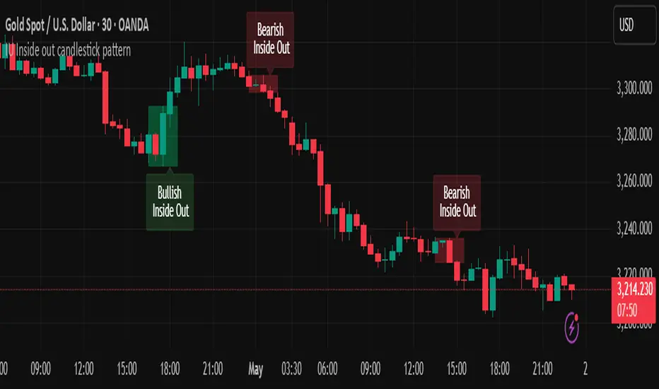
IU Inside out candlestick patternIU Inside Out Candlestick Pattern
This indicator identifies the Inside Out Candlestick Pattern — a unique 3-bar price action setup that captures strong market momentum and potential reversals with greater reliability than traditional patterns.
Pattern Logic:
The Inside Out pattern builds upon a classic engulfing setup by adding a breakout confirmation, making it a refined and filtered approach to candlestick analysis.
Bullish Inside Out Logic:
- Bar must be a bullish engulfing candle (engulfs previous bearish candle).
- Current bar must be bullish and must close above the high of the engulfing candle (a bullish breakout).
- When this setup is confirmed, a shaded green box is drawn around the range of the engulfing candle and its preceding bar.
Bearish Inside Out Logic:
- Bar must be a bearish engulfing candle (engulfs previous bullish candle).
- Current bar must be bearish and must close below the low of the engulfing candle (a bearish breakdown).
- When confirmed, a red box highlights the zone formed by the engulfing candle and its prior bar.
Why this is unique:
Unlike conventional candlestick indicators that trigger signals immediately after an engulfing pattern, this script adds a breakout condition to validate follow-through strength. This reduces false positives and gives traders a clearer edge. The pattern is also rare, which means it captures strong, decisive moves when it does appear.
How users can benefit:
- High-quality entries: Only shows patterns with proven follow-through, improving trade timing.
- Visual clarity: Boxes and labels highlight significant price zones for easy interpretation.
- Flexible use: Applicable across timeframes and instruments — ideal for both intraday and swing traders.
- Alerts included: Real-time alerts help traders stay updated without staring at charts all day.
This script is a powerful tool for price action traders looking to enhance pattern reliability and signal strength through structure-based breakout confirmation.
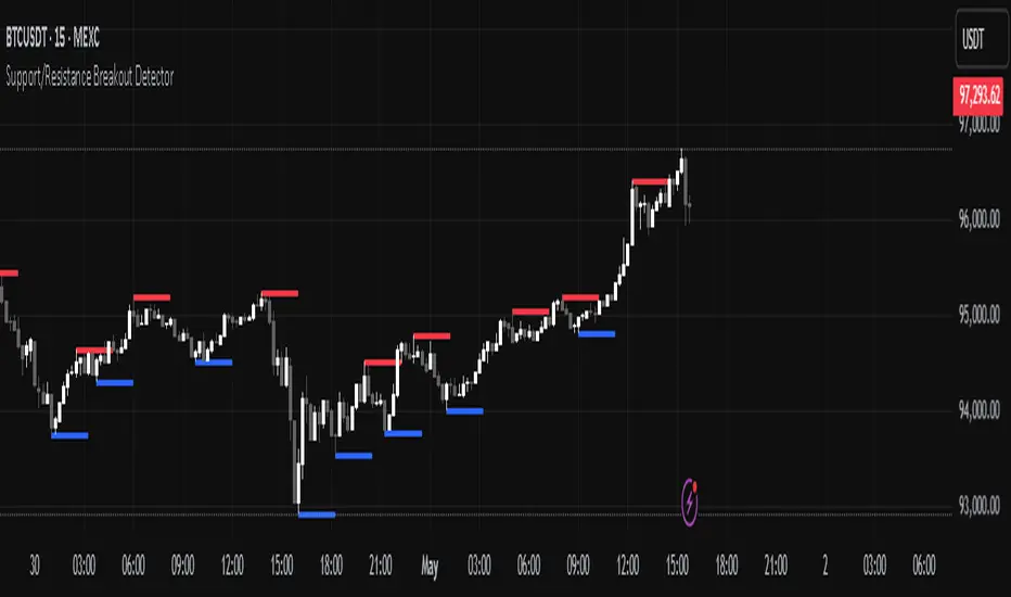
Support/Resistance Breakout DetectorThis indicator automatically detects and plots dynamic support and resistance levels using pivot highs and lows.
✅ It draws red resistance lines and blue support lines,
✅ The lines extend forward but automatically stop when the price touches them,
✅ It monitors for breakouts with strong volume,
✅ When a breakout happens, it shows labels like “B” or “Bull Wick” / “Bear Wick” on the chart,
✅ It also triggers alerts when support or resistance breaks with high volume.
Main settings:
Pivot lookback period
Show/hide breakout labels
Minimum volume for breakout
Maximum extension length for lines
This tool helps traders easily spot key price levels and watch for meaningful breakouts.
DXY-XAUUSD Correlation with ThresholdsIndicator Description: "DXY-XAUUSD Correlation with Thresholds"
This indicator tracks the dynamic correlation between the US Dollar Index (DXY) and gold prices (XAUUSD) over a user-defined period, expressed as a percentage. It calculates the rolling correlation coefficient between the closing prices of these two assets, scaled to ±100%, and visualizes it as a histogram.
Key Features:
Adjustable correlation period (default: 30 bars) and configurable positive/negative thresholds (default: ±70%).
Color-coded histogram: Intense green/red highlights correlations exceeding thresholds, signaling strong positive/negative relationships.
Horizontal dotted lines mark threshold levels, aiding in identifying overextended "overbought" or "oversold" correlation conditions.
An info table displays the current correlation value and active thresholds for quick reference.
Designed for traders analyzing the inverse relationship between the dollar and gold, this tool helps spot periods of extreme correlation divergence or convergence. The visual alerts and customizable parameters make it adaptable to various trading strategies and timeframes.
Note: The indicator is plotted in a separate pane (non-overlay) for clarity.
