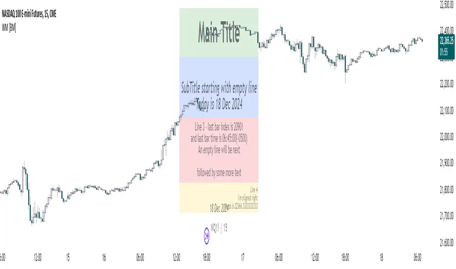
Watermark with dynamic variables [BM]█ OVERVIEW
This indicator allows users to add highly customizable watermark messages to their charts. Perfect for branding, annotation, or displaying dynamic chart information, this script offers advanced customization options including dynamic variables, text formatting, and flexible positioning.
█ CONCEPTS
Watermarks are overlay messages on charts. This script introduces placeholders — special keywords wrapped in % signs — that dynamically replace themselves with chart-related data. These watermarks can enhance charts with context, timestamps, or branding.
█ FEATURES
Dynamic Variables : Replace placeholders with real-time data such as bar index, timestamps, and more.
Advanced Customization : Modify text size, color, background, and alignment.
Multiple Messages : Add up to four independent messages per group, with two groups supported (A and B).
Positioning Options : Place watermarks anywhere on the chart using predefined locations.
Timezone Support : Display timestamps in a preferred timezone with customizable formats.
█ INPUTS
The script offers comprehensive input options for customization. Each Watermark (A and B) contains identical inputs for configuration.
Watermark settings are divided into two levels:
Watermark-Level Settings
These settings apply to the entire watermark group (A/B):
Show Watermark: Toggle the visibility of the watermark group on the chart.
Position: Choose where the watermark group is displayed on the chart.
Reverse Line Order: Enable to reverse the order of the lines displayed in Watermark A.
Message-Level Settings
Each watermark contains up to four configurable messages. These messages can be independently customized with the following options:
Message Content: Enter the custom text to be displayed. You can include placeholders for dynamic data.
Text Size: Select from predefined sizes (Tiny, Small, Normal, Large, Huge) or specify a custom size.
Text Alignment and Colors:
- Adjust the alignment of the text (Left, Center, Right).
- Set text and background colors for better visibility.
Format Time: Enable time formatting for this watermark message and configure the format and timezone. The settings for each message include message content, text size, alignment, and more. Please refer to Formatting dates and times for more details on valid formatting tokens.
█ PLACEHOLDERS
Placeholders are special keywords surrounded by % signs, which the script dynamically replaces with specific chart-related data. These placeholders allow users to insert dynamic content, such as bar information or timestamps, into watermark messages.
Below is the complete list of currently available placeholders:
bar_index , barstate.isconfirmed , barstate.isfirst , barstate.ishistory , barstate.islast , barstate.islastconfirmedhistory , barstate.isnew , barstate.isrealtime , chart.is_heikinashi , chart.is_kagi , chart.is_linebreak , chart.is_pnf , chart.is_range , chart.is_renko , chart.is_standard , chart.left_visible_bar_time , chart.right_visible_bar_time , close , dayofmonth , dayofweek , dividends.future_amount , dividends.future_ex_date , dividends.future_pay_date , earnings.future_eps , earnings.future_period_end_time , earnings.future_revenue , earnings.future_time , high , hl2 , hlc3 , hlcc4 , hour , last_bar_index , last_bar_time , low , minute , month , ohlc4 , open , second , session.isfirstbar , session.isfirstbar_regular , session.islastbar , session.islastbar_regular , session.ismarket , session.ispostmarket , session.ispremarket , syminfo.basecurrency , syminfo.country , syminfo.currency , syminfo.description , syminfo.employees , syminfo.expiration_date , syminfo.industry , syminfo.main_tickerid , syminfo.mincontract , syminfo.minmove , syminfo.mintick , syminfo.pointvalue , syminfo.prefix , syminfo.pricescale , syminfo.recommendations_buy , syminfo.recommendations_buy_strong , syminfo.recommendations_date , syminfo.recommendations_hold , syminfo.recommendations_sell , syminfo.recommendations_sell_strong , syminfo.recommendations_total , syminfo.root , syminfo.sector , syminfo.session , syminfo.shareholders , syminfo.shares_outstanding_float , syminfo.shares_outstanding_total , syminfo.target_price_average , syminfo.target_price_date , syminfo.target_price_estimates , syminfo.target_price_high , syminfo.target_price_low , syminfo.target_price_median , syminfo.ticker , syminfo.tickerid , syminfo.timezone , syminfo.type , syminfo.volumetype , ta.accdist , ta.iii , ta.nvi , ta.obv , ta.pvi , ta.pvt , ta.tr , ta.vwap , ta.wad , ta.wvad , time , time_close , time_tradingday , timeframe.isdaily , timeframe.isdwm , timeframe.isintraday , timeframe.isminutes , timeframe.ismonthly , timeframe.isseconds , timeframe.isticks , timeframe.isweekly , timeframe.main_period , timeframe.multiplier , timeframe.period , timenow , volume , weekofyear , year
█ HOW TO USE
1 — Add the Script:
Apply "Watermark with dynamic variables " to your chart from the TradingView platform.
2 — Configure Inputs:
Open the script settings by clicking the gear icon next to the script's name.
Customize visibility, message content, and appearance for Watermark A and Watermark B.
3 — Utilize Placeholders:
Add placeholders like %bar_index% or %timenow% in the "Watermark - Message" fields to display dynamic data.
Empty lines in the message box are reflected on the chart, allowing you to shift text up or down.
Using in the message box translates to a new line on the chart.
4 — Preview Changes:
Adjust settings and view updates in real-time on your chart.
█ EXAMPLES
Branding
DodgyDD's charts
Debugging
█ LIMITATIONS
Only supports variables defined within the script.
Limited to four messages per watermark.
Visual alignment may vary across different chart resolutions or zoom levels.
Placeholder parsing relies on correct input formatting.
█ NOTES
This script is designed for users seeking enhanced chart annotation capabilities. It provides tools for dynamic, customizable watermarks but is not a replacement for chart objects like text labels or drawings. Please ensure placeholders are properly formatted for correct parsing.
Additionally, this script can be a valuable tool for Pine Script developers during debugging . By utilizing dynamic placeholders, developers can display real-time values of variables and chart data directly on their charts, enabling easier troubleshooting and code validation.
Educational
Bitcoin Exponential Profit Strategy### Strategy Description:
The **Bitcoin Trading Strategy** is an **Exponential Moving Average (EMA) crossover strategy** designed to identify bullish trends for Bitcoin.
1. **Indicators**:
- **Fast EMA (default 9 periods)**: Represents the short-term trend.
- **Slow EMA (default 21 periods)**: Represents the longer-term trend.
2. **Entry Condition**:
- A **bullish crossover** occurs when the Fast EMA crosses above the Slow EMA.
- The strategy enters a **long position** with a user-defined order size (default 0.01 BTC).
3. **Exit Conditions**:
- **Take Profit**: Closes the position when the profit target is reached (default $100).
- **Stop Loss**: Closes the position when the price drops below the stop loss level (default $50).
- **Bearish Crossunder**: Closes the position when the Fast EMA crosses below the Slow EMA.
4. **Visual Signals**:
- **BUY signals**: Displayed when a bullish crossover occurs.
- **SELL signals**: Displayed when a bearish crossunder occurs.
This strategy is optimized for trend-following behavior, ensuring positions are aligned with upward-moving trends while managing risk through clear stop-loss and take-profit levels.

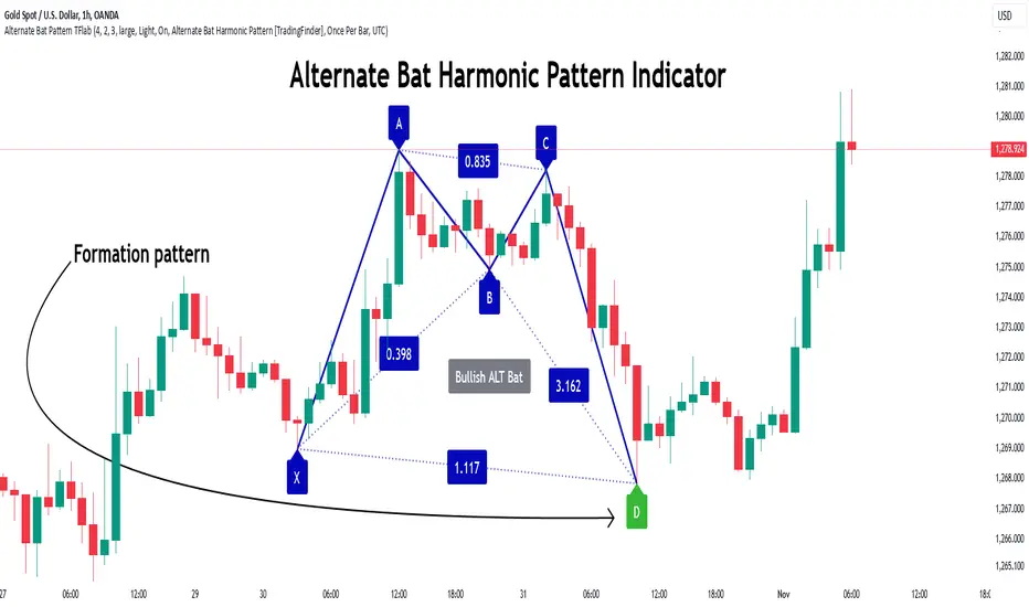
Alternate Bat Harmonic Pattern [TradingFinder] ALT Bat Indicator🔵 Introduction
The Alternate Bat harmonic pattern is one of the most precise and practical tools in technical analysis, introduced by Scott Carney in 2003. This pattern focuses on specific Fibonacci ratios, such as 0.382 at point B and 1.13XA at point D, to identify Potential Reversal Zones (PRZ) where price is likely to reverse.
The Alternative Bat pattern emerged as a result of repeated failures observed in the standard Bat pattern. Traders entering trades near the 0.886XA level of the standard Bat often encountered losses. In the Alternate Bat, point D extends beyond 0.886XA, typically reversing at 1.13XA, offering a more accurate identification of the reversal zone.
A key characteristic of this pattern is its M- or W-shaped structure, where the midpoint B retraces 0.382XA or less. Additionally, the CD leg requires an extension of 2.0 to 3.618 to complete the pattern. Due to its accuracy and the predictable behavior of price near the PRZ, the Alternate Bat pattern is recognized as a powerful tool for forecasting price reversals.
In the bullish Alternative Bat pattern, an M-shaped structure forms. After an initial upward movement (XA), price undergoes a short correction at point B (0.382XA) and then declines toward point D (1.13XA and an extension of 2.0 to 3.618BC), where a potential upward reversal is expected.
In the bearish Alternate Bat pattern, a W-shaped structure forms. After an initial downward movement (XA), price retraces slightly at point B (0.382XA) and then rises toward point D (1.13XA and an extension of 2.0 to 3.618BC), where a potential downward reversal is anticipated.
🔵 How to Use
The Alternate Bat harmonic pattern is a key tool for identifying potential reversal zones (PRZ) in the market. By leveraging the 0.382 retracement at point B and the 1.13XA extension at point D, along with symmetrical price structures, this pattern offers precise reversal opportunities in both bullish and bearish market conditions.
🟣 Bullish Alternate Bat Pattern
The bullish Alternate Bat pattern forms during a downtrend, signaling a potential reversal to the upside. This pattern consists of three downward movements with two corrective waves, ultimately reaching point D, which marks the PRZ.
At the PRZ, the convergence of Fibonacci levels—1.13XA and extensions ranging from 2.0 to 3.618BC—creates a strong support zone where price is likely to reverse upward.
🟣 Bearish Alternative Bat Pattern
The bearish Alternate Bat pattern develops during an uptrend, indicating a potential reversal to the downside. This pattern features three upward price movements with two retracements, ending at point D, where the PRZ forms.
Point D is defined by the 1.13XA extension and the 2.0 to 3.618BC projection, creating a strong resistance zone where price is expected to reverse downward.
🔵 Setting
🟣 Logical Setting
ZigZag Pivot Period : You can adjust the period so that the harmonic patterns are adjusted according to the pivot period you want. This factor is the most important parameter in pattern recognition.
Show Valid Format : If this parameter is on "On" mode, only patterns will be displayed that they have exact format and no noise can be seen in them. If "Off" is, the patterns displayed that maybe are noisy and do not exactly correspond to the original pattern.
Show Formation Last Pivot Confirm : if Turned on, you can see this ability of patterns when their last pivot is formed. If this feature is off, it will see the patterns as soon as they are formed. The advantage of this option being clear is less formation of fielded patterns, and it is accompanied by the latest pattern seeing and a sharp reduction in reward to risk.
Period of Formation Last Pivot : Using this parameter you can determine that the last pivot is based on Pivot period.
🟣 Genaral Setting
Show : Enter "On" to display the template and "Off" to not display the template.
Color : Enter the desired color to draw the pattern in this parameter.
LineWidth : You can enter the number 1 or numbers higher than one to adjust the thickness of the drawing lines. This number must be an integer and increases with increasing thickness.
LabelSize : You can adjust the size of the labels by using the "size.auto", "size.tiny", "size.smal", "size.normal", "size.large" or "size.huge" entries.
🟣 Alert Setting
Alert : On / Off
Message Frequency : This string parameter defines the announcement frequency. Choices include: "All" (activates the alert every time the function is called), "Once Per Bar" (activates the alert only on the first call within the bar), and "Once Per Bar Close" (the alert is activated only by a call at the last script execution of the real-time bar upon closing). The default setting is "Once per Bar".
Show Alert Time by Time Zone : The date, hour, and minute you receive in alert messages can be based on any time zone you choose. For example, if you want New York time, you should enter "UTC-4". This input is set to the time zone "UTC" by default.
🔵 Conclusion
The Alternate Bat harmonic pattern, with its precise Fibonacci ratios like 0.382 and 1.13XA, is a reliable tool for identifying Potential Reversal Zones (PRZ) in financial markets. By recognizing symmetrical price structures and focusing on both bullish and bearish scenarios, traders can identify optimal entry and exit points with high accuracy.
The key strength of this pattern lies in its ability to define strong support and resistance zones near the PRZ, increasing the probability of price reversals. Combining the pattern with candlestick confirmations and volume analysis enhances its effectiveness.
Ultimately, incorporating the Alternative Bat pattern with proper risk management and Fibonacci-based targets allows traders to enter the market confidently and capitalize on potential price reversals.
DCA Fundamentals 1.0DCA Fundamentals 1.0
Description:
DCA Fundamentals 1.0 is an invite-only indicator designed to help traders and investors make informed decisions by analyzing key fundamental metrics of a company. It aggregates essential financial data—such as book value, earnings per share, total equity, total debt, net income, and total revenue—to provide a comprehensive overview of the stock’s intrinsic value and risk profile. By examining factors like the debt-to-equity ratio and dynamically computing Buffet’s Limit, this tool assists in identifying whether a stock may be undervalued, fairly valued, or overvalued.
Key Features:
Intrinsic Value Calculation: Estimates a stock’s intrinsic worth using a weighted combination of book value per share and EPS.
Buffet’s Limit & Margin of Safety: Adjusts intrinsic value based on the company’s debt-to-equity ratio, providing a margin of safety percentage to gauge potential investment risk.
Debt Warning: Highlights when the debt-to-equity ratio exceeds 2, signaling possible financial instability.
Data Visualization: Displays equity, debt, net income, and revenue as area plots or histograms, helping users quickly assess financial health.
Investment Status: Classifies the stock as undervalued, fairly valued, or overvalued based on current price relative to intrinsic value and Buffet’s Limit.
Dividend-to-ROE Ratio: Offers insight into dividend payout sustainability relative to the company’s return on equity.
Instructions
Fallback Data Handling:
If any financial data is unavailable, fallback values are automatically used to ensure that key calculations remain meaningful and uninterrupted.
Intrinsics & Risk Assessment:
Intrinsic Value: Computed using book value and EPS to understand the stock’s core worth.
Buffet’s Limit: Adjusted from the intrinsic value based on the debt-to-equity ratio. The resulting margin of safety helps gauge the current price’s risk level.
Debt Warning:
Debt-to-Equity Ratio > 2: Triggers a red warning, advising caution due to potentially excessive debt.
Visual Indicators:
Intrinsically Undervalued (Green Area): When price is below intrinsic value, a green shaded area suggests the stock may be undervalued, potentially presenting a buying opportunity.
Debt vs. Equity (Area Plots):
Red Area: Represents debt. A larger red area signals relatively high debt levels.
Green Area: Represents equity. A larger green area suggests stronger financial health.
Revenue & Net Income (Histograms):
Green Bars: Positive or improving fundamentals.
Red Bars: Negative or declining performance.
Investment Status:
Undervalued (Green): Price below intrinsic value.
Fairly Valued (Yellow): Price between intrinsic value and Buffet’s Limit.
Overvalued (Red): Price above intrinsic value, implying increased downside risk.
Table Display:
A convenient table summarizes key metrics at a glance, including P/E ratio, Debt-to-Equity ratio, intrinsic value, margin of safety, net income, total revenue, and the Dividend-to-ROE Ratio.
Dividend-to-ROE Ratio:
This metric provides additional context on the company’s dividend policy relative to its return on equity, aiding in evaluating dividend sustainability.
Disclaimer
Important Disclaimer:
The DCA Fundamentals 1.0 indicator is provided solely for educational and informational purposes. It is not investment advice, a recommendation, or an endorsement of any security or strategy. All calculations are based on data provided by third parties, and their accuracy or completeness is not guaranteed.
Investing and trading involve significant risks. You may lose more than your initial investment. Historical performance or indicators cannot guarantee future results. Before making any investment decisions, you should conduct thorough research, consider consulting a qualified financial professional, and implement robust risk management strategies.
By using DCA Fundamentals 1.0, you acknowledge these risks and agree that neither the creator nor any affiliated parties are responsible for any losses incurred. Use this tool at your own discretion and risk.

Mastering ATR for Smart Stop Loss and Take Profit PlacementUsing the ATR indicator to set Stop Loss and Take Profit levels provides a dynamic and flexible way to manage risk based on the volatility of the market. This method ensures that your SL and TP are always in tune with current market conditions, preventing unnecessary stop-outs while maximizing the potential for profit. The table in the script makes it easy to view your calculated levels directly on the chart, improving your trading efficiency.
If you're looking for a more automated way to manage your trades, integrating ATR-based SL and TP can be a powerful tool in your strategy.
Happy Trading!

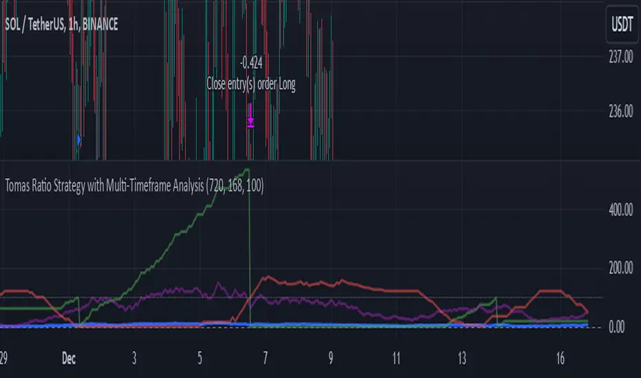
Tomas Ratio Strategy with Multi-Timeframe AnalysisHello,
I would like to present my new indicator I have compiled together inspired by Calmar Ratio which is a ratio that measures gains vs losers but with a little twist.
Basically the idea is that if HLC3 is above HLC3 (or previous one) it will count as a gain and it will calculate the percentage of winners in last 720 hourly bars and then apply 168 hour standard deviation to the weekly average daily gains.
The idea is that you're supposed to buy if the thick blue line goes up and not buy if it goes down (signalized by the signal line). I liked that idea a lot, but I wanted to add an option to fire open and close signals. I have also added a logic that it not open more trades in relation the purple line which shows confidence in buying.
As input I recommend only adjusting the amount of points required to fire a signal. Note that the lower amount you put, the more open trades it will allow (and vice versa)
Feel free to remove that limiter if you want to. It works without it as well, this script is meant for inexperienced eye.
I will also publish a indicator script with this limiter removed and alerts added for you to test this strategy if you so choose to.
Also, I have added that the trades will enter only if price is above 720 period EMA
Disclaimer
This strategy is for educational purposes only and should not be considered financial advice. Always backtest thoroughly and adjust parameters based on your trading style and market conditions.
Made in collaboration with ChatGPT.
AHR999X IndexAHR999X Index - A Tool to Watch BITSTAMP:BTCUSD Bitcoin Tops
The AHR999X Index is designed as an extension of the well-known AHR999 Index, specifically to help identify Bitcoin's market tops. This index combines two critical components:
200-Day Fixed Investment Cost:
The average cost if you invested a fixed amount into Bitcoin every day over the last 200 days (using a geometric mean).
Growth Estimate:
A price estimate derived from a logarithmic regression model based on Bitcoin's age.
The formula for AHR999X is:
AHR999X = (Bitcoin Price ÷ 200-Day Fixed Investment Cost) × (Bitcoin Price ÷ Growth Estimate) × 3
How to Interpret AHR999X
Above 8: Accumulation Zone – Bitcoin is historically undervalued.
Between 0.45 and 8: Neutral Zone – Bitcoin is within a reasonable price range.
Below 0.45: Exit Zone – Historically signals market tops and high-risk areas.
A Cycle Observation
One important point to note:
The bottom value of AHR999X increases with every Bitcoin market cycle.
This reflects Bitcoin's long-term price appreciation and diminishing volatility over time.

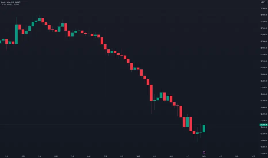
Lanczos CandlesThis indicator reconstructs price action using Lanczos resampling, incorporating lower timeframe data to create a more detailed representation of market movements. Traditional candle aggregation on higher timeframes tends to lose some price action detail - this indicator attempts to preserve more of that information through mathematical resampling.
The indicator samples price data from a lower timeframe and uses the Lanczos algorithm, a mathematical method commonly used in signal processing and image resampling, to reconstruct the price series at the chart's timeframe. The process helps maintain price movements that might otherwise be smoothed out in regular candle aggregation.
The main settings allow you to select the source timeframe for sampling, adjust the Lanczos filter width to balance smoothness versus detail preservation, and optionally enable Heikin Ashi calculation. The filter width parameter (default: 3) affects how aggressive the smoothing is - higher values produce smoother results while lower values retain more of the original variation.
This approach can be useful for technical analysis when you want to work with higher timeframes while maintaining awareness of significant price movements that occurred within those candles. The optional Heikin Ashi mode can help visualize trends in the resampled data.
The indicator works best when there's a clear ratio between your chart timeframe and the source timeframe (for example, using 1-minute data to build 5-minute candles).
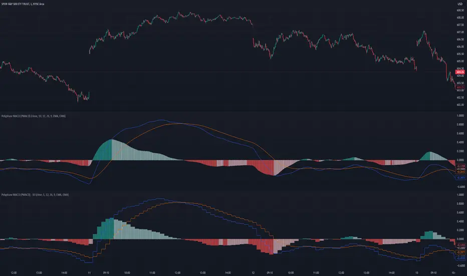
Polyphase MACD (PMACD)The Polyphase MACD (PMACD) uses polyphase decimation to create a continuous estimate of higher timeframe MACD behavior. The number of phases represents the timeframe multiplier - for example, 3 phases approximates a 3x higher timeframe.
Traditional higher timeframe MACD indicators update only when each higher timeframe bar completes, creating stepped signals that can miss intermediate price action. The PMACD addresses this by maintaining multiple phase-shifted MACD calculations and combining them with appropriate anti-aliasing filters. This approach eliminates the discrete jumps typically seen in higher timeframe indicators, though the resulting signal may sometimes deviate from the true higher timeframe values due to its estimative nature.
The indicator processes price data through parallel phase calculations, each analyzing a different time-offset subset of the data. These phases are filtered and combined to prevent aliasing artifacts that occur in simple timeframe conversions. The result is a smooth, continuous signal that begins providing meaningful values immediately, without requiring a warm-up period of higher timeframe bars.
The PMACD maintains the standard MACD components - the MACD line (fast MA - slow MA), signal line, and histogram - while providing a more continuous view of higher timeframe momentum. Users can select between EMA and SMA calculations for both the oscillator and signal components, with all calculations benefiting from the same polyphase processing technique.
Polyphase Stochastic RSI (PSRSI)The Polyphase Stochastic RSI (PSRSI) provides a continuous estimate of higher timeframe Stochastic RSI behavior by using polyphase decimation. The number of phases represents the timeframe multiplier - for example, 3 phases approximates a 3x higher timeframe.
While traditional higher timeframe indicators only update at the completion of each higher timeframe bar, the PSRSI creates a continuous signal by maintaining multiple phase-shifted calculations and combining them with appropriate anti-aliasing filters. This approach eliminates the gaps and discontinuities typically seen in higher timeframe indicators, though the resulting signal may sometimes deviate from the true higher timeframe values due to its estimative nature.
The indicator processes data through parallel phase calculations, each handling a different subset of price data offset in time. These phases are then filtered and combined to prevent aliasing artifacts that occur in simple timeframe conversions. The result is a smooth, continuous signal that starts providing meaningful values immediately, without requiring a warm-up period of higher timeframe bars.
Users can choose between RSI and Stochastic RSI modes, with both benefiting from the same polyphase processing technique. The indicator maintains the standard interpretation of overbought and oversold conditions while providing a more continuous view of higher timeframe momentum.

Weighted Fourier Transform: Spectral Gating & Main Frequency🙏🏻 This drop has 2 purposes:
1) to inform every1 who'd ever see it that Weighted Fourier Tranform does exist, while being available nowhere online, not even in papers, yet there's nothing incredibly complicated about it, and it can/should be used in certain cases;
2) to show TradingView users how they can use it now in dem endevours, to show em what spectral filtering is, and what can they do with all of it in diy mode.
... so we gonna have 2 sections in the description
Section 1: Weighted Fourier Transform
It's quite easy to include weights in Fourier analysis: you just premultiply each datapoint by its corresponding weight -> feed to direct Fourier Transform, and then divide by weights after inverse Fourier transform. Alternatevely, in direct transform you just multiply contributions of each data point to the real and imaginary parts of the Fourier transform by corresponding weights (in accumulation phase), and in inverse transform you divide by weights instead during the accumulation phase. Everything else stays the same just like in non-weighted version.
If you're from the first target group let's say, you prolly know a thing or deux about how to code & about Fourier Transform, so you can just check lines of code to see the implementation of Weighted Discrete version of Fourier Transform, and port it to to any technology you desire. Pine Script is a developing technology that is incredibly comfortable in use for quant-related tasks and anything involving time series in general. While also using Python for research and C++ for development, every time I can do what I want in Pine Script, I reach for it and never touch matlab, python, R, or anything else.
Weighted version allows you to explicetly include order/time information into the operation, which is essential with every time series, although not widely used in mainstream just as many other obvious and right things. If you think deeply, you'll understand that you can apply a usual non-weighted Fourier to any 2d+ data you can (even if none of these dimensions represent time), because this is a geometric tool in essence. By applying linearly decaying weights inside Fourier transform, you're explicetly saying, "one of these dimensions is Time, and weights represent the order". And obviously you can combine multiple weightings, eg time and another characteristic of each datum, allows you to include another non-spatial dimension in your model.
By doing that, on properly processed (not only stationary but Also centered around zero data), you can get some interesting results that you won't be able to recreate without weights:
^^ A sine wave, centered around zero, period of 16. Gray line made by: DWFT (direct weighted Fourier transform) -> spectral gating -> IWFT (inverse weighted Fourier transform) -> plotting the last value of gated reconstructed data, all applied to expanding window. Look how precisely it follows the original data (the sine wave) with no lag at all. This can't be done by using non-weighted version of Fourier transform.
^^ spectral filtering applied to the whole dataset, calculated on the latest data update
And you should never forget about Fast Fourier Transform, tho it needs recursion...
Section 2: About use cases for quant trading, about this particular implementaion in Pine Script 6 (currently the latest version as of Friday 13, December 2k24).
Given the current state of things, we have certain limits on matrix size on TradingView (and we need big dope matrixes to calculate polynomial regression -> detrend & center our data before Fourier), and recursion is not yet available in Pine Script, so the script works on short datasets only, and requires some time.
A note on detrending. For quality results, Fourier Transform should be applied to not only stationary but also centered around zero data. The rightest way to do detrending of time series
is to fit Cumulative Weighted Moving Polynomial Regression (known as WLSMA in some narrow circles xD) and calculate the deltas between datapoint at time t and this wonderful fit at time t. That's exactly what you see on the main chart of script description: notice the distances between chart and WLSMA, now look lower and see how it matches the distances between zero and purple line in WFT study. Using residuals of one regression fit of the whole dataset makes less sense in time series context, we break some 'time' and order rules in a way, tho not many understand/cares abouit it in mainstream quant industry.
Two ways of using the script:
Spectral Gating aka Spectral filtering. Frequency domain filtering is quite responsive and for a greater computational cost does not introduce a lag the way it works with time-domain filtering. Works this way: direct Fourier transform your data to get frequency & phase info -> compute power spectrum out of it -> zero out all dem freqs that ain't hit your threshold -> inverse Fourier tranform what's left -> repeat at each datapoint plotting the very first value of reconstructed array*. With this you can watch for zero crossings to make appropriate trading decisions.
^^ plot Freq pass to use the script this way, use Level setting to control the intensity of gating. These 3 only available values: -1, 0 and 1, are the general & natural ones.
* if you turn on labels in script's style settings, you see the gray dots perfectly fitting your data. They get recalculated (for the whole dataset) at each update. You call it repainting, this is for analytical & aesthetic purposes. Included for demonstration only.
Finding main/dominant frequency & period. You can use it to set up Length for your other studies, and for analytical purposes simply to understand the periodicity of your data.
^^ plot main frequency/main period to use the script this way. On the screenshot, you can see the script applied to sine wave of period 16, notice how many datapoints it took the algo to figure out the signal's period quite good in expanding window mode
Now what's the next step? You can try applying signal windowing techniques to make it all less data-driven but your ego-driven, make a weighted periodogram or autocorrelogram (check Wiener-Khinchin Theorem ), and maybe whole shiny spectrogram?
... you decide, choice is yours,
The butterfly reflect the doors ...
∞

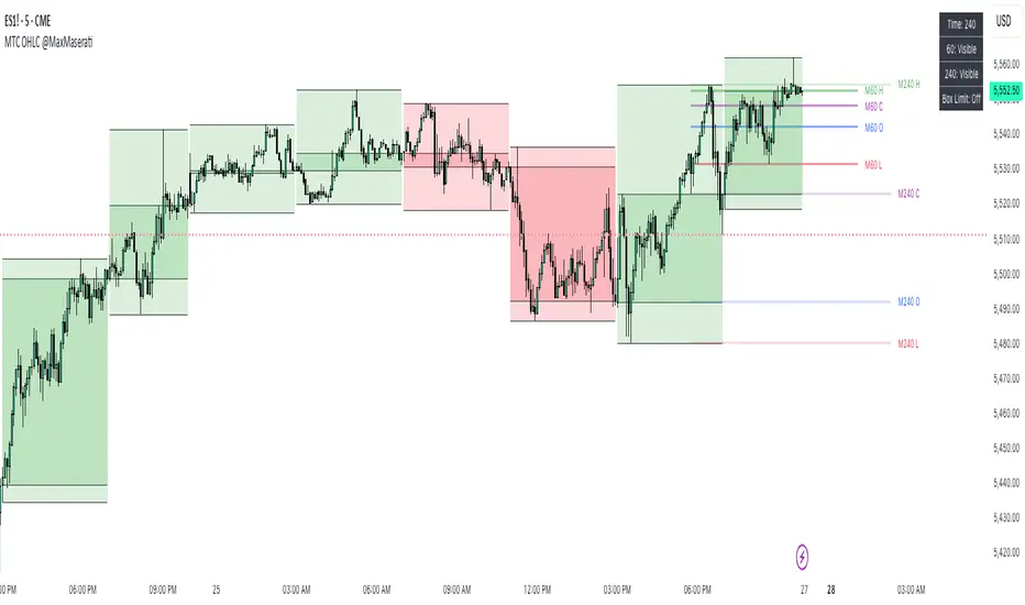
Multi TimeFrame OHLC Overlay @MaxMaseratiMulti TimeFrame OHLC Overlay @MaxMaserati
A powerful and versatile indicator that displays OHLC (Open, High, Low, Close) data across multiple timeframes with enhanced visualization features. Perfect for traders who need to analyze price action across different time periods simultaneously.
Key Features:
Customizable multi-timeframe OHLC visualization with box and line overlays
Extended OHLC lines from higher timeframes with clear labeling
Distinct bullish and bearish candle representations
Fully configurable color schemes and display options
Real-time timeframe information display
Main Components:
Multi-Timeframe Display
Primary timeframe OHLC visualization with boxes and lines
Extended timeframe overlay for broader market context
Clear visual distinction between timeframes
Customizable Visuals
Separate color settings for bullish and bearish patterns
Adjustable transparency for both body and wick components
Configurable OHLC line colors and visibility
Extended Lines Features
Higher timeframe OHLC level overlay
Custom labels with timeframe identification
Adjustable line properties and visibility
Information Display
Current timeframe indicator
Extended timeframe reference
Clean and unobtrusive interface
Settings Groups:
Extended OHLC Lines
Labels Options
Display Options
Bullish/Bearish Candle Settings
OHLC Lines Configuration
Usage Tips:
Start with the default 240-minute timeframe or adjust to your preferred interval
Use the extended lines feature to view higher timeframe levels
Customize colors and transparency to match your chart theme
Enable/disable specific components based on your analysis needs
Perfect For:
Multi-timeframe analysis
Support/Resistance identification
Price action trading
Trend following strategies
Market structure analysis
This indicator combines powerful multi-timeframe analysis capabilities with clean visualization, making it an essential tool for traders who need to maintain awareness of price action across different time periods.
Note:
For optimal performance, adjust the visual settings according to your chart's timeframe and color scheme. The indicator is designed to work seamlessly across all trading instruments and timeframes.
Custom Strategy: ETH Martingale 2.0Strategic characteristics
ETH Little Martin 2.0 is a self-developed trading strategy based on the Martingale strategy, mainly used for trading ETH (Ethereum). The core idea of this strategy is to place orders in the same direction at a fixed price interval, and then use Martin's multiple investment principle to reduce losses, but this is also the main source of losses.
Parameter description:
1 Interval: The minimum spacing for taking profit, stop loss, and opening/closing of orders. Different targets have different spacing. Taking ETH as an example, it is generally recommended to have a spacing of 2% for fluctuations in the target.
2 Base Price: This is the price at which you triggered the first order. Similarly, I am using ETH as an example. If you have other targets, I suggest using the initial value of a price that can be backtesting. The Base Price is only an initial order price and has no impact on subsequent orders.
3 Initial Order Amount: Users can set an initial order amount to control the risk of each transaction. If the stop loss is reached, we will double the amount based on this value. This refers to the value of the position held, not the number of positions held.
4 Loss Multiplier: The strategy will increase the next order amount based on the set multiple after the stop loss, in order to make up for the previous losses through a larger position. Note that after taking profit, it will be reset to 1 times the Initial Order Amount.
5. Long Short Operation: The first order of the strategy is a multiple entry, and in subsequent orders, if the stop loss is reached, a reverse order will be opened. The position value of a one-way order is based on the Loss Multiplier multiple investment, so it is generally recommended that the Loss Multiplier default to 2.
Improvement direction
Although this strategy already has a certain trading logic, there are still some improvement directions that can be considered:
1. Dynamic adjustment of spacing: Currently, the spacing is fixed, and it can be considered to dynamically adjust the spacing based on market volatility to improve the adaptability of the strategy. Try using dynamic spacing, which may be more suitable for the actual market situation.
2. Filtering criteria: Orders and no orders can be optimized separately. The biggest problem with this strategy is that it will result in continuous losses during fluctuations, and eventually increase the investment amount. You can consider filtering out some fluctuations or only focusing on trend trends.
3. Risk management: Add more risk management measures, such as setting a maximum loss limit to avoid huge losses caused by continuous stop loss.
4. Optimize the stop loss multiple: Currently, the stop loss multiple is fixed, and it can be considered to dynamically adjust the multiple according to market conditions to reduce risk.

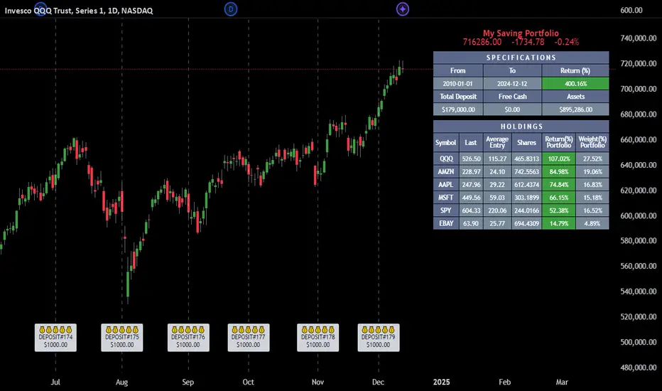
Employee Portfolio Generator [By MUQWISHI]▋ INTRODUCTION :
The “Employee Portfolio Generator” simplifies the process of building a long-term investment portfolio tailored for employees seeking to build wealth through investments rather than traditional bank savings. The tool empowers employees to set up recurring deposits at customizable intervals, enabling to make additional purchases in a list of preferred holdings, with the ability to define the purchasing investment weight for each security. The tool serves as a comprehensive solution for tracking portfolio performance, conducting research, and analyzing specific aspects of portfolio investments. The output includes an index value, a table of holdings, and chart plots, providing a deeper understanding of the portfolio's historical movements.
_______________________
▋ OVERVIEW:
● Scenario (The chart above can be taken as an example) :
Let say, in 2010, a newly employed individual committed to saving $1,000 each month. Rather than relying on a traditional savings account, chose to invest the majority of monthly savings in stable well-established stocks. Allocating 30% of monthly saving to AMEX:SPY and another 30% to NASDAQ:QQQ , recognizing these as reliable options for steady growth. Additionally, there was an admired toward innovative business models of NASDAQ:AAPL , NASDAQ:MSFT , NASDAQ:AMZN , and NASDAQ:EBAY , leading to invest 10% in each of those companies. By the end of 2024, after 15 years, the total monthly deposits amounted to $179,000, which would have been the result of traditional saving alone. However, by sticking into long term invest, the value of the portfolio assets grew, reaching nearly $900,000.
_______________________
▋ OUTPUTS:
The table can be displayed in three formats:
1. Portfolio Index Title: displays the index name at the top, and at the bottom, it shows the index value, along with the chart timeframe, e.g., daily change in points and percentage.
2. Specifications: displays the essential information on portfolio performance, including the investment date range, total deposits, free cash, returns, and assets.
3. Holdings: a list of the holding securities inside a table that contains the ticker, last price, entry price, return percentage of the portfolio's total deposits, and latest weighted percentage of the portfolio. Additionally, a tooltip appears when the user passes the cursor over a ticker's cell, showing brief information about the company, such as the company's name, exchange market, country, sector, and industry.
4. Indication of New Deposit: An indication of a new deposit added to the portfolio for additional purchasing.
5. Chart: The portfolio's historical movements can be visualized in a plot, displayed as a bar chart, candlestick chart, or line chart, depending on the preferred format, as shown below.
_______________________
▋ INDICATOR SETTINGS:
Section(1): Table Settings
(1) Naming the index.
(2) Table location on the chart and cell size.
(3) Sorting Holdings Table. By securities’ {Return(%) Portfolio, Weight(%) Portfolio, or Ticker Alphabetical} order.
(4) Choose the type of index: {Assets, Return, or Return (%)}, and the plot type for the portfolio index: {Candle, Bar, or Line}.
(5) Positive/Negative colors.
(6) Table Colors (Title, Cell, and Text).
(7) To show/hide any of selected indicator’s components.
Section(2): Recurring Deposit Settings
(1) From DateTime of starting the investment.
(2) To DateTime of ending the investment
(3) The amount of recurring deposit into portfolio and currency.
(4) The frequency of recurring deposits into the portfolio {Weekly, 2-Weeks, Monthly, Quarterly, Yearly}
(5) The Depositing Model:
● Fixed: The amount for recurring deposits remains constant throughout the entire investment period.
● Increased %: The recurring deposit amount increases at the selected frequency and percentage throughout the entire investment period.
(5B) If the user selects “ Depositing Model: Increased % ”, specify the growth model (linear or exponential) and define the rate of increase.
Section(3): Portfolio Holdings
(1) Enable a ticker in the investment portfolio.
(2) The selected deposit frequency weight for a ticker. For example, if the monthly deposit is $1,000 and the selected weight for XYZ stock is 30%, $300 will be used to purchase shares of XYZ stock.
(3) Select up to 6 tickers that the investor is interested in for long-term investment.
Please let me know if you have any questions
DCA Order Info PlannerDescription :
This script is a Dollar-Cost Averaging (DCA) order planner designed for SPOT, LONG, and SHORT markets. It automatically calculates the optimal price levels for your orders based on configurable parameters, while also considering leverage and liquidation price.
🔹 Key Features:
1. Automatic Order Planning:
- The script calculates price levels for your orders based on an adjustable scaling coefficient (default: 1.5).
- You can set the percentage interval between each order (default: 2%).
- Displays the number of units to buy/sell at each level.
2.Leverage Management:
- Integrates a configurable leverage and computes the liquidation price for LONG and SHORT positions.
3.Clear Visual Display:
- Markers on the chart indicating order levels with customizable labels.
- A summary table shows price levels and corresponding quantities.
- Visualizes Stop Loss and Take Profit levels if defined.
4.Automatic Alerts:
- Sends alerts when the price reaches an order level.
🔹 Customizable Parameters:
- Starting Price: Initial price for calculating orders.
- Budget: Total budget for DCA orders.
- Leverage: Multiplier for LONG/SHORT positions.
- Scaling Coefficient: Adjusts the spacing between order levels.
- Maximum DCA Levels: Limits the number of generated orders.
🔹 How to Use:
1. Configure the parameters according to your strategy.
2. The script displays order levels and quantities on the chart.
3. Use the summary table to manually input orders on your favorite trading platform.
This script is particularly useful in volatile market conditions to average your entry or exit price and manage risk effectively.

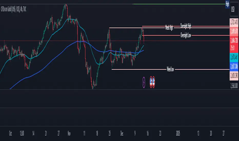
Overnight High/LowThe script identifies the Overnight High (the highest price) and Overnight Low (the lowest price) for a trading instrument during a specified overnight session. It then plots these levels on the chart for reference in subsequent trading sessions.
Key Features:
Time Settings:
The script defines the start (startHour) and end (endHour + endMinute) times for the overnight session.
The session spans across two calendar days, such as 5:00 PM (17:00) to 9:30 AM (09:30).
Tracking High and Low:
During the overnight session, the script dynamically tracks:
Overnight High: The highest price reached during the session.
Overnight Low: The lowest price reached during the session.
Reset Mechanism:
After the overnight session ends (at the specified end time), the script resets the overnightHigh and overnightLow variables, preparing for the next session.
Visual Representation:
The script uses horizontal dotted lines to plot:
A green line for the Overnight High.
A red line for the Overnight Low.
These lines extend to the right of the chart, providing visual reference points for traders.
How It Works:
Session Detection:
The script checks whether the current time falls within the overnight session:
If the hour is greater than or equal to the start hour (e.g., 17:00).
Or if the hour is less than or equal to the end hour (e.g., 09:30), considering the next day.
The end minute (e.g., 30 minutes past the hour) is also considered for precision.
High and Low Calculation:
During the overnight session:
If the overnightHigh is not yet defined, it initializes with the current candle's high.
If already defined, it updates by comparing the current candle's high to the existing overnightHigh using the math.max function.
Similarly, overnightLow is initialized or updated using the math.min function.
Post-Session Reset:
After the session ends, the script clears the overnightHigh and overnightLow variables by setting them to na (not available).
Line Drawing:
The script draws horizontal dotted lines for the Overnight High and Low during and after the session.
The lines extend indefinitely to the right of the chart.
Benefits:
Visual Aid: Helps traders quickly identify overnight support and resistance levels, which are critical for intraday trading.
Automation: Removes the need for manually plotting these levels each day.
Customizable: Time settings can be adjusted to match different markets or trading strategies.
This script is ideal for traders who use the overnight range as part of their analysis for breakouts, reversals, or trend continuation strategies.
IU Opening range Breakout StrategyIU Opening Range Breakout Strategy
This Pine Script strategy is designed to capitalize on the breakout of the opening range, which is a popular trading approach. The strategy identifies the high and low prices of the opening session and takes trades based on price crossing these levels, with built-in risk management and trade limits for intraday trading.
Key Features:
1. Risk Management:
- Risk-to-Reward Ratio (RTR):
Set a customizable risk-to-reward ratio to calculate target prices based on stop-loss levels.
Default: 2:1
- Max Trades in a Day:
Specify the maximum number of trades allowed per day to avoid overtrading.
Default: 2 trades in a day.
- End-of-Day Close:
Automatically closes all open positions at a user-defined session end time to ensure no overnight exposure.
Default: 3:15 PM
2. Opening Range Identification
- Opening Range High and Low:
The script detects the high and low of the first trading session using Pine Script's session functions.
These levels are plotted as visual guides on the chart:
- High: Lime-colored circles.
- Low: Red-colored circles.
3. Trade Entry Logic
- Long Entry:
A long trade is triggered when the price closes above the opening range high.
- Entry condition: Crossover of the price above the opening range high.
-Short Entry:
A short trade is triggered when the price closes below the opening range low.
- Entry condition: Crossunder of the price below the opening range low.
Both entries are conditional on the absence of an existing position.
4. Stop Loss and Take Profit
- Long Position:
- Stop Loss: Previous candle's low.
- Take Profit: Calculated based on the RTR.
- **Short Position:**
- **Stop Loss:** Previous candle's high.
- **Take Profit:** Calculated based on the RTR.
The strategy plots these levels for visual reference:
- Stop Loss: Red dashed lines.
- Take Profit: Green dashed lines.
5. Visual Enhancements
-Trade Level Highlighting:
The script dynamically shades the areas between the entry price and SL/TP levels:
- Red shading for the stop-loss region.
- Green shading for the take-profit region.
- Entry Price Line:
A silver-colored line marks the average entry price for active trades.
How to Use:
1.Input Configuration:
Adjust the Risk-to-Reward ratio, max trades per day, and session end time to suit your trading preferences.
2.Visual Cues:
Use the opening range high/low lines and shading to identify potential breakout opportunities.
3.Execution:
The strategy will automatically enter and exit trades based on the conditions. Review the plotted SL and TP levels to monitor the risk-reward setup.
Important Notes:
- This strategy is designed for intraday trading and works best in markets with high volatility during the opening session.
- Backtest the strategy on your preferred market and timeframe to ensure compatibility.
- Proper risk management and position sizing are essential when using this strategy in live markets.

ATR% multiple historyThe average true range (ATR) is a technical analysis indicator introduced by market technician J. Welles Wilder Jr. in his book New Concepts in Technical Trading Systems. It measures market volatility by decomposing the entire range of an asset's price for that period.
The true range is calculated as the greatest of the following: the current high minus the current low; the absolute value of the current high minus the previous close; and the absolute value of the current low minus the previous close.
The ATR is then a moving average, generally using 14 days, of the true ranges. Therefore, the parameter "Length" in this indicator is set to 14 by default.
This indicator offers three "Smoothing" techniques: RMA, SMA, and EMA, to calculate ATR. RMA is set as the default.
ATR% is calculated by dividing the ATR by the close of the latest bar.
The ATR% multiple builds on ATR%, serving as a measurable gauge of price extension from 50-MA. It is calculated by dividing the distance between the price and the 50-MA by ATR%. Users can change how the distance between the price and the 50-MA is calculated by switching the "Price" parameter among the high, close, and open of the bar.
Each security has a historical ATR% multiple at which it tends to retrace. This is not necessarily a "short" signal. Instead, it can be used as a signal to sell further into strength or avoid initiating new/additional entries.
ATR% multiples from the 50-MA can also be used as a tool for monitoring market indices, assessing technical headwinds versus tailwinds, and determining whether to take on risk or hold positions and wait.
This indicator can show the real-time ATR% multiple from the 50-MA as well as historical data. As shown in the chart above, SPY usually pulls back at over a 5X ATR% multiple in its history, so new exposures can be avoided at that time.
There are five horizontal lines in this indicator, with values of 0, 4, 6, 8, and 10. These five lines can be hidden, and their colors and line widths can be customized. When the ATR% multiple drops below zero, the line's color turns red.

Asset Correlation CheckThis indicator evaluates how your current chart symbol interacts with key markets such as stock indices NASDAQ:NDX SP:SPX AMEX:IWM XETR:DAX PEPPERSTONE:CN50 , commodities CAPITALCOM:GOLD CAPITALCOM:SILVER , bonds NASDAQ:TLT NASDAQ:SHY , and cryptocurrencies BINANCE:BTCUSD , and displays the results in a compact, interactive table. It allows you to adjust the analysis period and select one of three correlation calculation methods (Index, Relative, and Beta) to gain different perspectives on the relationships between assets.
Index Correlation
Advantages: Provides a classic statistical correlation value, making it easy to understand overall directional alignment.
Drawbacks: Less reliable for highly volatile or short-term conditions, as temporary spikes can distort the correlation.
When to use: Ideal if you want a clear overview of whether two markets generally move together, for example to assess diversification effects.
Relative Correlation
Advantages: Focuses on percentage changes rather than absolute prices, offering a more dynamic view of short-term shifts.
Drawbacks: More prone to noise due to emphasizing daily or intra-period fluctuations.
When to use: Useful for timing-sensitive strategies, helping you quickly identify if one asset consistently outpaces or lags another in the short run.
Beta Correlation
Advantages: Examines how strongly one asset responds to changes in another, factoring in volatility and sensitivity, helpful for risk profiling.
Drawbacks: More abstract since it does not convey simple directional similarity but how intensely an asset reacts to market movements.
When to use: Ideal if you need to understand how a security may amplify or dampen broader market-level shifts, aiding in portfolio risk management.
Additionally, a Bull-Market Filter narrows the analysis to upward-trending phases, potentially delivering more meaningful insights. The indicator also computes average correlation values over your selected period, so you are not misled by brief fluctuations. It shows the percentage of positive versus negative readings to reveal if markets generally move in tandem or counter to each other.
For stock pickers, this tool is particularly valuable. It helps determine whether individual equities follow broader market forces, move with specific sectors, or behave independently. With this knowledge, you can refine stock selection, balance sector exposures, and seek opportunities that complement existing positions.
The indicator also facilitates the detection of patterns and anomalies, enabling early recognition of shifts in sentiment or new trend impulses. By visualizing how benchmarks, commodities, bonds, and digital assets relate, you gain deeper insight into key drivers that influence your investments.
Regarding rapid changes in correlation, keep in mind that correlation can frequently flip between positive and negative. Such volatility can create confusion if you rely on single readings. One moment, two assets may seem perfectly aligned; the next, they diverge. This does not necessarily indicate a lack of an underlying pattern; short-term factors can distort the picture. By looking at averages and the frequency of positive and negative occurrences, you confirm whether a correlation trend is genuine or simply a result of temporary noise. In other words, these additional metrics ensure that short-lived swings do not overshadow the true, longer-term relationship between the assets.
In essence, this indicator condenses complex intermarket analysis into a practical resource. By leveraging its insights, you can make data-driven decisions, adapt strategies to evolving market conditions, and lay a stronger foundation for long-term trading success.

Custom Sign [Alert + Marker]Custom Sign
An indicator that detects crossovers between two values and displays them with customizable markers and colors on your TradingView chart.
Key Features
Detection of crossover, crossunder, and cross (both) events
Two display modes: Oscillator and Indicator
Customizable markers and colors
Bar-close alerts
Settings
Source Settings
Source 1: Select the first value to compare
Cross Type: Select cross type (⏫up, ⏬down, 🔀both)
Source 2: Select the second value to compare
Oscillator Side
Use Unified Signal: Toggle unified marker
Unified: Shape for unified marker
CrossOver: Marker for upward cross
CrossUnder: Marker for downward cross
Location: Marker position (Top/Bottom/Invisible)
Indicator Side
Use Unified Signal: Toggle unified marker
Unified: Shape for unified marker
CrossOver: Marker for upward cross
CrossUnder: Marker for downward cross
Location: Marker position (Auto/Top/Bottom/AboveBar/BelowBar/Invisible)
Color Settings
Oscillator
* Use Unified Color: Toggle single color mode
* Unified: Color for unified mode
* CrossOver: Color for upward cross
* CrossUnder: Color for downward cross
Indicator
* Use Unified Color: Toggle single color mode
* Unified: Color for unified mode
* CrossOver: Color for upward cross
* CrossUnder: Color for downward cross
Alert Settings
Alert Message: Customize alert message
Notes
Oscillator and Indicator sides can be configured independently
Different markers and colors can be used for each side
Alerts trigger once per bar at close
Price Delivery Bias @MaxMaserati Price Delivery Bias (PDB) Indicator @ MaxMaserati
The Price Delivery Bias (PDB) indicator is a powerful tool designed to identify and track market structure shifts through price action analysis. It helps traders identify potential trend changes and continuation patterns by monitoring price delivery sequences.
Key Features:
- Automatically detects and labels Change of Delivery Long (CDL) and Change of Delivery Short (CDS) points
- Tracks subsequent Delivery sequences (LD1, LD2, LD3... for longs; SD1, SD2, SD3... for shorts)
- Dynamic support and resistance lines for active buyers and sellers
- Real-time bias status display with delivery count
- Customizable colors and display options
How It Works:
The indicator analyzes price action using fractal patterns to identify significant structural points where the market bias changes or continues. When price breaks above a key level, it marks a CDL (Change of Delivery Long), followed by subsequent long deliveries (LD1, LD2, etc.). Similarly, breaks below key levels are marked as CDS (Change of Delivery Short), followed by short deliveries (SD1, SD2, etc.).
Use Cases:
- Trend Direction: Identify potential trend changes through CDL and CDS signals
- Trend Strength: Monitor delivery sequences (LD/SD count) to gauge trend strength
- Support/Resistance: Track active buyer and seller levels
- Trade Management: Use delivery sequences for managing entries, stops, and targets
Customization Options:
- Adjust the look back period for structure detection
- Customize colors for long and short bias signals
- Toggle label visibility for CDL/CDS and delivery sequences
- Modify text size for better visibility
- Show/hide buyer and seller lines
- Customize table position and appearance
Settings Guide:
1. Length: Determines the look back period for structure detection (default: 5)
2. CDL/CDS Colors: Set colors for bullish and bearish signals
3. Label Controls: Toggle visibility of CDL/CDS and delivery labels
4. Text Size: Choose between Tiny, Small, and Normal for label text
5. Buyer/Seller Lines: Toggle and customize dashed lines showing active levels
6. Bias Table: Configure position and visibility of the status table
#### Pro Tips:
- Use the delivery count to gauge trend strength - higher counts often indicate stronger trends
- Watch for bias changes (CDL/CDS) after extended delivery sequences
- Combine with volume and momentum indicators for confirmation
- Use buyer/seller lines as dynamic support/resistance levels
- Monitor label sequences for potential exhaustion points
#### Notes:
- The indicator works best on higher timeframes (1H and above)
- Signals are more reliable in trending markets
- Multiple delivery sequences often indicate strong trend continuations
- Consider using with other indicators for confirmation
This indicator is ideal for both trend traders and swing traders who want to understand market structure and bias through price action analysis. It provides clear visual cues for potential trend changes and continuation patterns while offering extensive customization options to suit different trading styles.

Realistic Position Sizing Calculator @MaxMaseratiA professional position sizing calculator designed for futures traders who want to trade safely and manage risk effectively. This tool helps you determine exactly how many contracts you can trade based on your capital.
🎯 Main Features:
• Real-time position size calculations for 8 major futures contracts:
- E-mini: ES, NQ, YM, RTY
- Micro E-mini: MES, MNQ, MYM, M2K
• Smart Risk Management:
- Automatic safe lot size calculations
- Daily/Weekly/Bi-weekly/Monthly risk tracking
- Built-in margin safety buffer
- Stop loss point value calculator
- Risk percentage controls (0.01% to 10%)
• Advanced Capital Protection:
- Intraday vs. overnight margin calculations
- Conservative position sizing recommendations
- Real-time margin usage warnings
- Visual risk status indicators (Safe/Caution/High Risk)
• Flexible Settings:
- Adjustable capital amount
- Customizable risk periods
- Point-based stop loss inputs
- Option to use specific trading amounts
Perfect for both new and experienced futures traders who want to:
✓ Avoid overtrading
✓ Protect their capital
✓ Make informed position sizing decisions
✓ Manage multiple contract types safely
The indicator displays all calculations in an easy-to-read table, helping you make quick, safe trading decisions while keeping your risk in check.
Created by @MaxMaserati

Candle Countdown Timer @MaxMaserati
Candle Countdown Timer is a professional-grade time management tool designed for precision traders who need to track multiple timeframes simultaneously. This versatile indicator combines market hours monitoring, multi-timeframe tracking, and visual alerts in one clean interface.
Key Features:
• Custom Multi-Timeframe Display
- Track up to 5 custom timeframes simultaneously
- Supports timeframes from 15 seconds to 1 month
- Standardized format (S15, M5, H1, D1, 1M etc.)
- Configurable default timeframe highlighting
⏰ Precision Time Tracking
- Real-time countdown for each timeframe
- Visual warning system (red text) for candle closing
- Synchronized NY and CME time display
- Automatic market status updates
🎯 Market Status Monitoring
- Clear market open/closed status
- Maintenance period alerts
- CME trading hours integration
- Color-coded status indicators
🎨 Customizable Interface
- Adjustable table position (9 positions available)
- Three size options (Tiny, Small, Normal)
- Customizable colors for all elements
- Clean, non-intrusive design
Perfect For:
• Day traders tracking multiple timeframes
• CME futures traders
• Swing traders managing multiple positions
• Anyone needing precise market timing
This indicator helps you:
✓ Never miss a candle close
✓ Maintain awareness of market status
✓ Manage multiple timeframe strategies
✓ Stay synchronized with market hours
