Rotation Phase TriggerHow to Use the Full Rotation Phase Trigger Tool (non-floating version)
This version is ideal for macro-level market context, helping you decide when to rotate between growth, income, and defensive positions using visual cues directly on the chart.
🧱 Components Recap (Non-Floating Version)
ROC Histograms:
SPY:TLT ROC (green bars): Measures equity strength vs. bonds
QQQ:XLU ROC (blue bars): Measures growth vs. defensive rotation
EMA Trend Filter:
Uses a fast/slow EMA crossover on both ratios to confirm the trend
When both are rising → confirms GROWTH phase
Phase Background Colors:
🟩 Green = GROWTH
🟧 Orange = INCOME
🟥 Red = DEFENSIVE
No color = NEUTRAL
Instruction Labels:
Show what sectors to add and what to sell (with ETF tickers)
Alert Conditions:
Can be linked to email, SMS, or app notifications
Triggered when phase changes
✅ Weekly Workflow
Every Monday (or Weekend Prep)
1. Open SPY on a Weekly Chart
This tool is designed around the U.S. equity vs bond regime
Always keep SPY as the main chart for best alignment
2. Check the Background Color
Instantly tells you what regime you're in:
Green → rotate into growth ETFs
Orange → stick to or buy income-generating ETFs
Red → get defensive, raise cash, or buy bond/hedge ETFs
3. Read the Labels
Top label = phase status (e.g., GROWTH)
Bottom label = action instructions:
What ETFs to accumulate (MTUM, VUN, HYLD, etc.)
What sectors or funds to rotate out of
4. Look at Momentum Histograms
Confirms whether the regime shift is gaining strength
Larger bars = stronger conviction
Diverging directions? Wait for confirmation
🔁 Tactical Rotation Plan
Phase Add Trim/Sell
GROWTH MTUM, VUN, XMTM, HXS, VTI HYLD, HHIS, HPYT
INCOME HYLD, HHIS, QQQY, DFN, DGS MTUM, VUN
DEFENSIVE HPYT, HPYT.U, ZGLD, GDE All equities
NEUTRAL Nothing new, rebalance if needed Excess risk positions
🔔 Alert Setup (Optional)
You can create alerts in TradingView using:
Right-click chart → "Add Alert"
Use condition: "Rotation Phase Trigger" → "GROWTH" / "INCOME" / "DEFENSIVE"
Choose notification method (popup, app, email, etc.)
💡 Pro Tips
Use this version on SPY weekly only — for best signal clarity
Educational

Hamid Double RSIRSI with Moving Average and Another RSI
This script combines two Relative Strength Index (RSI) indicators with configurable moving averages. It allows traders to track momentum and market strength with adjustable periods for both the RSI and moving averages. The script also allows you to choose different data sources for each RSI, offering flexibility in analysis.
Features:
Two RSIs: One with a shorter period and another with a longer period .
Moving Averages: Each RSI has its own configurable moving average . The moving averages help smooth out the RSI and provide clearer trends.
Customizable Inputs: Adjust the RSI period and the length of the moving averages. You can also choose different sources for each RSI (e.g., close, open, high, low).
Mid Line: A horizontal line at 50, which is commonly used as the neutral level for the RSI. It helps identify whether the RSI is above or below neutral, indicating bullish or bearish conditions.
Overbought and Oversold Levels: Horizontal lines at 70 (overbought) and 30 (oversold) to highlight when the asset might be overbought or oversold according to the RSI.
How it works:
RSI Calculation: The script calculates two RSIs using different lengths
Moving Averages: A Simple Moving Average (SMA) is applied to both RSIs to smooth their values and help identify trends.
Overbought/Oversold Indicators: The script includes horizontal lines at 70 and 30 to show overbought and oversold conditions. The mid line is plotted at 50 to highlight neutral levels.
This indicator is useful for traders who want to compare the behavior of two RSIs over different time periods and use the moving averages to filter out noise. The ability to customize the source data for each RSI makes this script adaptable to different trading strategies.

Intraday LevelsWhat it shows:
This indicator is useful for day trading, where it will track and display you important price levels which includes:
Premarket Low (PML)
Premarket High (PMH)
Previous Day Low (PDL)
Previous Day High (PDH)
Previous Day Close (PDC)
After Hours Low (AHL)
After Hours High (AHH)
Day Low (DL)
Day High (DH)
The price level lines and labels will automatically adjust itself as the price moves, eliminating the need of manually having to adjusting these levels.
How to use it:
At these levels it can act as important support resistance points during the day and can often serve as a important pivot point for any ticker. You can expect price rejection or bounce when the price approaches these levels.
Key settings:
For each of the levels, user can adjust in the settings menu:
Line Colour
Line Thickness
Line Style
Label Text
Price Labelling on Label
Label Location (Offset from current bar)
Ability to turn on/off the price level and label
Display levels for either all days or on the day

Mercury Venus Conjunction Sextiles 2019-2026How to Use It and What It Means Astrologically
How to Use the Script in TradingView
This Pine Script, called "Mercury Venus Aspects 2019–2026," is made to highlight the dates of Mercury-Venus conjunctions (0°) and sextiles (60°) from 2019 to 2026 on TradingView charts. Here's how to use it:
click “Add to Chart.” It will apply to any chart you have open—stocks, forex, crypto, etc.
Customize the Display
You can turn on/off the visibility of conjunctions and sextiles using checkboxes under "Inputs" in the settings.
You can also adjust the label size (small, normal, large, or huge) for better readability on your chart.
What You’ll See on the Chart
Conjunctions appear as blue shaded zones with labels like “C1,” “C2,” etc. These mark dates when Mercury and Venus are at the same degree.
Sextiles show up in orange with labels like “S1,” “S2,” marking when they’re about 60° apart.
Each event spans a 2-day window (one day before and after the exact aspect).
How to Use It Practically
You can overlay the script on market charts to look for any patterns between these planetary aspects and price movements.
You can also use it to plan personal or financial activities, since these aspects often affect communication, money, and relationships.
What to Keep in Mind
Dates are approximate and based on average planetary cycles (Mercury: ~88 days, Venus: ~225 days). For exact timing, use an ephemeris.
Only conjunctions and sextiles are shown. Oppositions, squares, and trines aren’t included because Mercury and Venus never get far enough apart (more than 75°).
This script is great for astrologers, traders, and enthusiasts who want to see Mercury-Venus aspects directly on their charts and explore their possible effects.
Astrological Meaning of Mercury-Venus Aspects
What Mercury and Venus Represent
Mercury rules communication, thinking, technology, travel, and trade. In global events (mundane astrology), it affects media, markets, and movement of information.
Venus is about love, beauty, money, and pleasure. It influences relationships, aesthetics, and finance. In the world stage, it’s linked to luxury, art, fashion, and economic balance.
When Mercury and Venus form aspects (like conjunctions or sextiles), their energies mix in helpful ways that can affect people and events.
Conjunction (0°) – Mercury and Venus Together
These two planets are in the same sign and degree, so their qualities merge.
For people:
Positive: Smooth communication, charm, creativity, and better relationships. Great for romance, art, and social interaction.
Negative: Too much focus on appearances, sweet talk, or pleasure can cloud judgment. Decisions may lack depth.
For the economy:
Positive: Boosts in media, entertainment, fashion, and tech. Good for trade, deals, and optimism in financial markets.
Negative: Risk of overspending or unrealistic expectations. May cause small market bubbles or misleading hype.
Sextile (60°) – Mercury and Venus in Harmony
These two planets are two signs apart, creating a smooth, supportive energy.
For people:
Positive: Easy conversations, creative teamwork, small financial wins, and pleasant social experiences.
Negative: Energy is mild, so opportunities might be missed if not acted on. People may avoid hard decisions.
For the economy:
Positive: Gradual improvements in areas like marketing, social media, hospitality, and design. Good for diplomacy.
Negative: Lack of strong initiative could limit bigger gains. Minor missteps are possible due to a laid-back attitude.
General Effects
These aspects are mostly beneficial. They support creativity, financial thinking, and social harmony.
Downsides: Conjunctions may lead to overindulgence or shallow choices, while sextiles may cause missed chances due to low energy.
These aspects rarely cause major economic shifts on their own but can amplify trends depending on other planetary influences (like Saturn or Uranus).
Zodiac Sign Influence
Fire signs (Aries, Leo, Sagittarius): Bold communication, energetic spending, gains in media or entertainment.
Earth signs (Taurus, Virgo, Capricorn): Practical results, stable finances, growth in real-world assets like property or food.
Air signs (Gemini, Libra, Aquarius): Intellectual growth, tech innovation, and social ideas flourish.
Water signs (Cancer, Scorpio, Pisces): Emotional depth in conversations, artistic growth, and financial sensitivity.
Mercury-Venus aspects are gentle but helpful. They combine logic (Mercury) with emotion and value (Venus). They’re good times for love, communication, and money—but their benefits depend on how we use the energy. This script lets you easily track these moments on a chart and explore how they might align with real-life trends or decisions.
Disclaimer: This script and its interpretations are for informational and educational purposes only. They do not constitute financial, trading, or professional astrological advice. Always conduct your own research and consult qualified professionals before making any financial or personal decisions. Use at your own discretion.

SMT Divergence ICT 02 [TradingFinder] Smart Money Technique SMC🔵 Introduction
SMT Divergence (Smart Money Technique Divergence) is a price action-based trading concept that detects discrepancies in market behavior between two assets that are generally expected to move in the same direction. Rooted in ICT (Inner Circle Trader) methodology, this approach helps traders recognize subtle signs of market manipulation or imbalance, often ahead of traditional indicators.
The core idea behind SMT divergence is simple: when two correlated instruments—such as currency pairs, indices, or assets from the same sector—start forming different swing points (highs or lows), this can reveal a lack of confirmation in the trend. Such divergence is often a precursor to a price reversal or pause in momentum.
This technique works effectively across various markets including Forex, stocks, and cryptocurrencies. It’s particularly valuable when used alongside concepts like liquidity sweeps, market structure breaks (MSBs), or order block identification.
In advanced use cases, Sequential SMT helps uncover patterns of alternating divergences across sessions, often signaling engineered liquidity traps before price reacts.
When combined with the Quarterly Theory—which segments market behavior into Accumulation, Manipulation, Distribution, and Continuation/Reversal phases—traders gain insight not only into where divergence happens, but when it's most likely to be significant within the market cycle.
Bullish SMT :
Bullish SMT Divergence occurs when one asset prints a higher low while the correlated asset forms a lower low. This asymmetry often suggests that the downside move is losing strength, hinting at a potential bullish shift.
Bearish SMT :
Bearish SMT Divergence is formed when one asset creates a higher high, while the second asset fails to confirm by printing a lower high. This typically signals weakening bullish pressure and the possibility of a reversal to the downside.
🔵 How to Use
The SMT Divergence indicator is designed to detect imbalances between two positively correlated assets—such as major currency pairs, indices, or commodities. These divergences often indicate early signs of market inefficiency or smart money manipulation and can help traders anticipate trend shifts with higher precision.
Unlike traditional divergence indicators or earlier versions of this script, this upgraded version does not rely solely on consecutive pivot comparisons. Instead, it dynamically scans all available pivots within the chart to identify divergences at any structural level—major or minor—across the price action. This broader detection method increases the reliability and frequency of meaningful SMT signals.
Moreover, when integrated with Sequential SMT logic, the indicator is capable of identifying multiple divergence sequences across sessions. These sequences often signal engineered liquidity traps and can be mapped within the Quarterly Theory framework, allowing traders to pinpoint not just the presence of divergence but also the phase of the market cycle it appears in (Accumulation, Manipulation, Distribution, or Continuation).
🟣 Bullish SMT Divergence
This signal occurs when the primary asset forms a higher low, while the correlated asset forms a lower low. This pattern implies weakening bearish momentum and a potential shift to the upside.
If the correlated asset breaks its previous low but the primary asset does not, this divergence suggests absorption of selling pressure and possible accumulation by smart money—making it a strong bullish signal, especially when aligned with a favorable market phase (e.g., the end of a manipulation phase in Q2).
🟣 Bearish SMT Divergence
This signal occurs when the primary asset creates a higher high, while the correlated asset forms a lower high. This mismatch indicates fading bullish momentum and a potential reversal to the downside.
If the correlated asset fails to confirm a breakout made by the main asset, the divergence may point to distribution or exhaustion. When seen within Q3 or Q4 phases of the Quarterly Theory, this pattern often precedes sharp declines or fake-outs engineered by smart money
🔵 Settings
⚙️ Logical Settings
Symbol : Choose the secondary asset to compare with the main chart asset (e.g., XAUUSD, US100, GBPUSD).
Pivot Period : Sets the sensitivity of the pivot detection algorithm. A smaller value increases responsiveness to price swings.
Activate Max Pivot Back : When enabled, limits the maximum number of past pivots to be considered for divergence detection.
Max Pivot Back Length : Defines how many past pivots can be used (if the above toggle is active).
Pivot Sync Threshold : The maximum allowed difference (in bars) between pivots of the two assets for them to be compared.
Validity Pivot Length : Defines the time window (in bars) during which a divergence remains valid before it's considered outdated.
🎨 Display Settings
Show Bullish SMT Line : Draws a line connecting the bullish divergence points.
Show Bullish SMT Label : Displays a label on the chart when a bullish divergence is detected.
Bullish Color : Sets the color for bullish SMT markers (label, shape, and line).
Show Bearish SMT Line : Draws a line for bearish divergence.
Show Bearish SMT Label : Displays a label when a bearish SMT divergence is found.
Bearish Color : Sets the color for bearish SMT visual elements.
🔔 Alert Settings
Alert Name : Custom name for the alert messages (used in TradingView’s alert system).
Message Frequency :
All : Every signal triggers an alert.
Once Per Bar : Alerts once per bar regardless of how many signals occur.
Per Bar Close : Only triggers when the bar closes and the signal still exists.
Time Zone Display : Choose the time zone in which alert timestamps are displayed (e.g., UTC).
Bullish SMT Divergence Alert : Enable/disable alerts specifically for bullish signals.
Bearish SMT Divergence Alert : Enable/disable alerts specifically for bearish signals
🔵Conclusion
The SMT Plus indicator offers a refined and powerful approach to detecting smart money behavior through divergence analysis between correlated assets. By removing the limitations of consecutive pivot comparisons and allowing for broader structural detection, it captures more accurate and timely signals that often precede major market moves.
When paired with frameworks like Sequential SMT and the Quarterly Theory, the indicator not only highlights where divergence occurs, but also when in the market cycle it's most likely to matter. Its flexible settings, customizable visuals, and integrated alert system make it suitable for intraday scalpers, swing traders, and even long-term macro analysts.
Whether you're using it as a standalone decision-making tool or combining it with other ICT concepts, SMT Plus gives you an edge in recognizing manipulation, timing reversals, and staying in sync with the real market narrative—not just the chart.

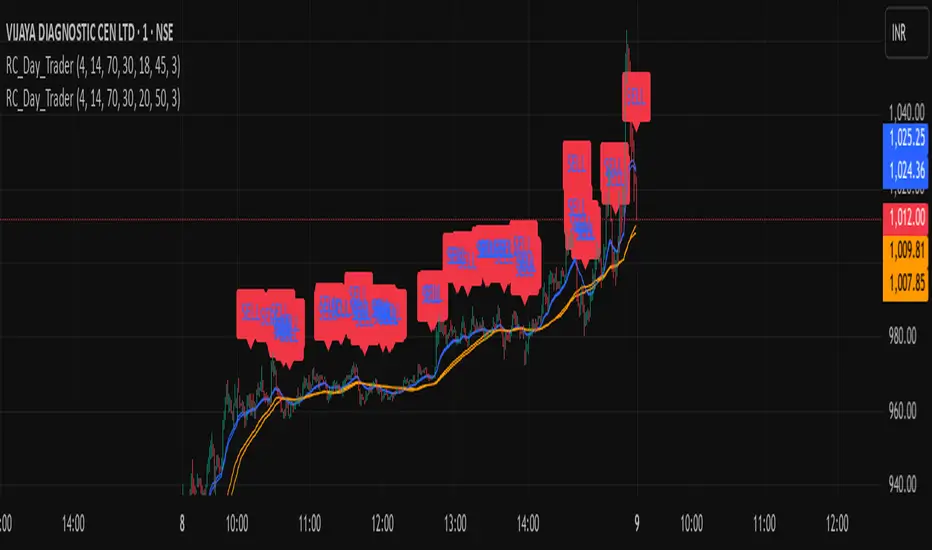
Ross Cameron-Inspired Day Trading StrategyExplanation for Community Members:
Title: Ross Cameron-Inspired Day Trading Strategy
Description:
This script is designed to help you identify potential buy and sell opportunities during the trading day. It combines several popular trading strategies to provide clear signals.
Key Features:
Gap and Go: Identifies stocks that have gapped up or down at the open.
Momentum Trading: Uses RSI and EMA to identify momentum-based entry points.
Mean Reversion: Uses RSI and SMA to identify potential reversals.
How to Use:
Apply to Chart: Add this script to your TradingView chart.
Set Timeframe: Works best on 5-minute and 10-minute timeframes.
Watch for Signals: Look for green "BUY" labels for entry points and red "SELL" labels for exit points.
Parameters:
Gap Percentage: Adjust to identify larger or smaller gaps.
RSI Settings: Customize the RSI length and overbought/oversold levels.
EMA and SMA Lengths: Adjust the lengths of the moving averages.
Confirmation Period: Set how many bars to wait for confirmation.
Visual Elements:
BUY Signals: Green labels below the price bars.
SELL Signals: Red labels above the price bars.
Indicators: Displays EMA (blue) and SMA (orange) for additional context.
This script is a powerful tool for day trading on NSE and BSE indices, combining multiple strategies to provide robust trading signals. Adjust the parameters to suit your trading style and always combine with your own analysis for best results.
Gann Percentage of High & Low Prices for Options - Keanu_RiTzThis Indicator is based on the text from Chapter 4 "Percentage of High & Low Prices" page number "30" from the book "WD Gann 45 years in Wall Street".
This Indicator is to be used on Intraday Timeframes and only on Options Charts (CALL & PUT) and not on any other chart.
The following is the text from that page :-
One of the greatest discoveries I ever made was how to figure the percentage of high and low prices on the averages and individual stocks.
The percentages of extreme high and low levels indicate future resistance levels.
There is a relation between every low price to some future high price and a percentage of the low price indicates what levels to expect the next high price.
At this price you can sell out long stocks and sell short with a limited risk.
The extreme high price or any minor tops are related to future bottoms er low levels.
The percentage of the high price tells where to expect low prices in the future and gives you resistance levels where you can buy with a limited risk.
The most important resistance level is 50% of any high or low price.
Second in importance is 100% on the lowest selling price on the averages or individual stocks.
You must also use 200%, 300%, 400%, 500%, 600% or more, depending upon the price and the Time Periods from High and Low.
Third in importance is 25% of the Lowest price or the Highest price.
Fourth in importance is 121/2% of the extreme Low or extreme High price.
Fifth in importance is 61/4% of the Highest price, but this is only to be used when the averages or individual stocks are selling at very high levels.
Sixth in importance is 33 1/3 and 66 2/3%. These percentages should be calculated and watched for resistance next after 25% and after 50%.
You should always have percentage tables made up on the Industrial Averages and on the individual stocks you trade in in order to know where these important resistance levels are located.
Description :
It plots the Intraday % levels from the highest high and lowest low of that day.
The calculation of these levels is based on the text from Chapter 4 "Percentage of High & Low Prices" page number "30" from the book "WD Gann 45 years in Wall Street".
I developed this indicator to see if those percentages work on Options prices or not,
and from my observation I found that it works wonderfully in Options as well.
These % levels work like magic and act as great Dynamic Support and Resistance levels.
Don't trust my words blindly and see for yourself.
This indicator is for educational and research purpose only.
It does not provide any BUY/SELL signals.

Intrinsic Event (Multi DC OS)Overview
This indicator implements an event-based approach to analyze price movements in the foreign exchange market, inspired by the intrinsic time framework introduced in Fractals and Intrinsic Time - A Challenge to Econometricians by U. A. Müller et al. (1995). It identifies significant price events using an intrinsic time perspective and supports multi-agent analysis to reflect the heterogeneous nature of financial markets. The script plots these events as lines and labels on the chart, offering a visual tool for traders to understand market dynamics at different scales.
Key Features
Intrinsic Events : The indicator detects directional change (DC) and overshoot (OS) events based on user-defined thresholds (delta), aligning with the paper’s concept of intrinsic time (Section 6). Intrinsic time redefines time based on market activity, expanding during volatile periods and contracting during inactive ones, rather than relying on a physical clock.
Multi-Agent Analysis : Supports up to five agents, each with its own threshold and color settings, reflecting the heterogeneous market hypothesis (Section 5). This allows the indicator to capture the perspectives of market participants with different time horizons, such as short-term FX dealers and long-term central banks.
How It Works
Intrinsic Events Detection : The script identifies two types of events using intrinsic time principles:
Directional Change (DC) : Triggered when the price reverses by the threshold (delta) against the current trend (e.g., a drop by delta in an uptrend signals a "Down DC").
Overshoot (OS) : Occurs when the price continues in the trend direction by the threshold (e.g., a rise by delta in an uptrend signals an "Up OS").
DC events are plotted as solid lines, and OS events as dashed lines, with labels like "Up DC" or "OS Down" for clarity. The label style adjusts based on the trend to ensure visibility.
Multi-Agent Setup : Each agent operates independently with its own threshold, mimicking market participants with varying time horizons (Section 5). Smaller thresholds detect frequent, short-term events, while larger thresholds capture broader, long-term movements.
Settings
Each agent can be configured with:
Enable Agent : Toggle the agent on or off.
Threshold (%) : The percentage threshold (delta) for detecting DC and OS events (default values: 0.1%, 0.2%, 0.5%, 1%, 2% for agents 1–5).
Up Mode Color : Color for lines and labels in up mode (DC events).
Down Mode Color : Color for lines and labels in down mode (OS events).
Usage Notes
This indicator is designed for the foreign exchange market, leveraging its high liquidity, as noted in the paper (Section 1). Adjust the threshold values based on the instrument’s volatility—higher volatility leads to more intrinsic events (Section 4). It can be adapted to other markets where event-based analysis applies.
Reference
The methodology is based on:
Fractals and Intrinsic Time - A Challenge to Econometricians by U. A. Müller, M. M. Dacorogna, R. D. Davé, O. V. Pictet, R. B. Olsen, and J. R. Ward (June 28, 1995). Olsen & Associates Preprint.

YY Price LimitsThis Pine Script indicator is designed to visualize potential price limits (e.g., daily price limits used in some markets like commodities) on a TradingView chart. It calculates and plots lines representing percentage-based price limits above and below a reference price (typically the previous day's close). The indicator allows you to customize the displayed price limits, their appearance, and how they extend across the chart. It's particularly useful for intraday traders who need to be aware of potential price ceilings and floors.
Key Features:
Percentage-Based Limits:
Calculates price limits based on percentages (3%, 5%, and 7%) of a reference price.
Customizable Display:
Toggle visibility of reference price and each percentage limit (3%, 5%, 7%).
Customize the color, style (solid, dashed, dotted), and width of the price limit lines.
Extends Lines: Allows you to extend the price limit lines to the left, right, both directions, or not at all.
CME Reference Price: It is designed to plot price limits based on the CME (Chicago Mercantile Exchange) methodology, which uses the last close as the reference price. The tooltip reminds users to verify the actual reference price on the CME Group website.
Intraday Focus: The indicator is specifically designed for intraday timeframes, as it uses the previous day's close as the reference point.
Clear Visuals: Plots horizontal lines with labels indicating the price level and percentage.

US Recessions with SPX reversals v3 [FornaxTV]In addition to highlighting periods of official US recessions (as defined by the NBER) this script also displays vertical lines for the SPX market top and bottom associated with each recession .
This facilitates more detailed analysis of potential leading and coincident indicators for market tops and bottoms. This is particularly relevant for market tops, which typically precede the start of a recession by several months.
In addition to recessions with SPX market tops and market bottoms:
- A horizontal line can optionally be displayed for the last market top . (NOTE: this line will only be displayed for SPX tickers.)
- Labels can optionally be displayed for market tops & bottoms, plus the start and end of recessions. If the statistics are enabled (see below) these labels will also indicate the number of weeks between key market events, e.g. a market top and the start of a recession.
- A statistics table can optionally be displayed, contained statistics such as the number of weeks wince the last recession & market bottom, as well as averages for all recessions included in the analysis set.
For the recession statistics:
- "Outlier" recessions such as 1945 (WWII, where the market top occurred well after the recession itself) and 2020 (COVID pandemic, which was arguably not a "true" economic recession) can optionally be excluded.
- You can choose to exclude recessions occurring before a specific year.

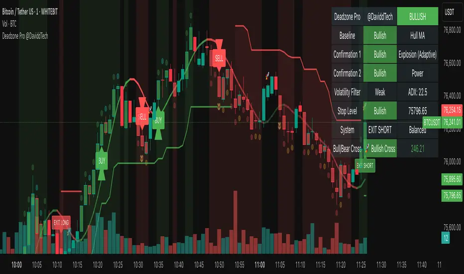
Deadzone Pro @DaviddTechDeadzone Pro by @DaviddTech – Adaptive Multi-Strategy NNFX Trading System
Deadzone Pro by @DaviddTech is a meticulously engineered trading indicator that strictly adheres to the No-Nonsense Forex (NNFX) methodology. It integrates adaptive trend detection, dual confirmation indicators, advanced volatility filtering, and dynamic risk management into one powerful, visually intuitive system. Ideal for traders seeking precision and clarity, this indicator consistently delivers high-probability trade setups across all market conditions.
🔥 Key Features:
The Setup:
Adaptive Hull Moving Average Baseline: Clearly identifies trend direction using an advanced, gradient-colored Hull MA that intensifies based on trend strength, providing immediate visual clarity.
Dual Confirmation Indicators: Combines Waddah Attar Explosion (momentum detector) and Bull/Bear Power (strength gauge) for robust validation, significantly reducing false entries.
Volatility Filter (ADX): Ensures entries are only made during strong trending markets, filtering out weak, range-bound scenarios for enhanced trade accuracy.
Dynamic Trailing Stop Loss: Implements a SuperTrend-based trailing stop using adaptive ATR calculations, managing risk effectively while optimizing exits.
Dashboard:
💎 Gradient Visualization & User Interface:
Dynamic gradient colors enhance readability, clearly indicating bullish/bearish strength.
Comprehensive dashboard summarizes component statuses, real-time market sentiment, and entry conditions at a glance.
Distinct and clear buy/sell entry and exit signals, with adaptive stop-loss levels visually plotted.
Candlestick coloring based on momentum signals (Waddah Attar) for intuitive market reading.
📈 How to Interpret Signals:
Bullish Signal: Enter when Hull MA baseline trends upward, both confirmation indicators align bullish, ADX indicates strong trend (>25), and price breaks above the previous trailing stop.
Bearish Signal: Enter short or exit long when Hull MA baseline trends downward, confirmations indicate bearish momentum, ADX confirms trend strength, and price breaks below previous trailing stop.
📊 Recommended Usage:
Timeframes: Ideal on 1H, 4H, and Daily charts for swing trading; effective on shorter (5M, 15M) charts for day trading.
Markets: Compatible with Forex, Crypto, Indices, Stocks, and Commodities.
The Entry & Exit:
🎯 Trading Styles:
Choose from three distinct trading modes:
Conservative: Requires full alignment of all indicators for maximum accuracy.
Balanced (Default): Optimized balance between signal frequency and reliability.
Aggressive: Fewer confirmations needed for more frequent trading signals.
📝 Credits & Originality:
Deadzone Pro incorporates advanced concepts inspired by:
Hull Moving Average by @Julien_Eche
Waddah Attar Explosion by @LazyBear
Bull Bear Power by @Pinecoders
ADX methodology by @BeikabuOyaji
This system has been significantly refactored and enhanced by @DaviddTech to maximize synergy, clarity, and usability, standing apart distinctly from its original components.
Deadzone Pro exemplifies precision and discipline, aligning fully with NNFX principles to provide traders with a comprehensive yet intuitive trading advantage.
HinduTime Choghadiya(Dynamic Day & Night)🕉️ HinduTime Choghadiya (Dynamic Day & Night) — Visualize real-time Choghadiya Muhurat across global timezones with dynamic sunrise/sunset-based day & night cycles. Perfect for astrology-based or Vedic timing strategies.
How to Use:
Add to Chart: Click "Add to chart" from the TradingView script panel.
Select Your Timezone: Use the dropdown to choose your local timezone (e.g., Asia/Kolkata).
Customize Sunrise/Sunset:
Set "Day Start Hour" (typically 6 AM).
Set "Night Start Hour" (typically 6 PM).
Visual Choghadiya Overlay:
Background color represents the current Choghadiya (e.g., Amrit, Shubh, Rog).
Adjusts dynamically by weekday and day/night period.
Use for Timing Entries:
Favorable: Amrit, Shubh, Labh
Neutral: Chal
Avoid: Rog, Kal, Udveg

Circuit Breaker - MFFUThis Indicator Is Used To Protect User From Over Trading After Market Hit The Circuit Breakers.
The CME Exchange Usually Halts Trading If Market Hit + or - 7%.
To Protect Users From Extreme Volatile Condition MFFU, Halts Trading If Market Hits + or - 5%.
This Indicator helps us to plot the circuit breaking lines helping us to when to stop trading.

ORB - Futures and Stocks (Breakouts + Alerts + ORB Selector)This indicator shows the Opening Range Breakout (ORB) based on the time range you choose.
Important:
It only works for intraday trading on time frames less than 1 day (like 1-minute, 5-minute, or hourly charts).
You can use it with any stock or futures, such as US500, NAS100, or GER40.
Inputs:
ORB Range - Your preference.
Session Start
Time Zone Offset
Examples:
for EU Frankfurt, DAX (GER40):
Set your ORB range
Session Start 0900
Time Zone Offset +1
For US Stock Market and US500, NAS100:
Set your ORB range
Session Start 0930
Time Zone Offset -5
Created using ChatGPT

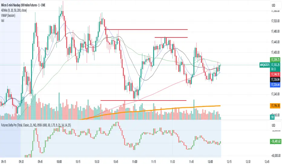
NQ/MNQ Futures Delta+ with Price Action EntriesNQ/MNQ Futures Delta+ with Price Action Entries
Description: This TradingView indicator combines Futures Delta analysis with advanced price action techniques to provide an enhanced trading strategy for the NQ/MNQ futures market. The script analyzes the market using a variety of methods including Delta, volume analysis, and candlestick patterns, while also incorporating price action factors like support/resistance levels and breakouts to offer more refined buy and sell signals.
Key Features:
Delta Analysis:
The Delta calculation tracks the difference between buying and selling pressure within each market bar. The indicator calculates delta based on different modes (Classic, Volume Based, Tick Based), and then applies cumulative delta for trend analysis.
The Cumulative Delta is calculated using one of the three available modes:
Total: Tracks the cumulative delta over time.
Periodic: Measures delta over a defined period (user-configurable).
EMA: Applies an Exponential Moving Average to smooth the delta values.
Volume Confirmation:
The script includes volume analysis to confirm price movements. A volume spike is used to validate buy/sell signals, ensuring that price movements are supported by significant trading volume.
Price Action-Based Entries:
Support and Resistance: Dynamic support and resistance levels are calculated based on the lowest low and highest high of the last 20 bars. These levels are used to identify breakout points, providing context for potential buy/sell entries.
Candlestick Patterns: The script recognizes Bullish Engulfing and Bearish Engulfing candlestick patterns. These patterns signal potential reversals in price direction and are used to confirm trade entries.
Breakout Logic: Buy signals are triggered when the price breaks above resistance, and sell signals are triggered when the price breaks below support, providing high-probability entry points during trend reversals or continuations.
Moving Average Trend Confirmation:
The script uses two moving averages:
9-period Exponential Moving Average (EMA): Short-term trend indicator.
21-period Exponential Moving Average (EMA): Longer-term trend indicator.
Trades are only considered in the direction of the prevailing trend:
A bullish signal is confirmed if the price is above both EMAs.
A bearish signal is confirmed if the price is below both EMAs.
Buy/Sell Signal Triggers:
Buy Signal: A buy signal is triggered when:
A bullish divergence is confirmed with volume support.
A bullish engulfing candlestick pattern forms.
The price breaks above resistance.
The price is above both the 9 EMA and 21 EMA, indicating an uptrend.
Sell Signal: A sell signal is triggered when:
A bearish divergence is confirmed with volume support.
A bearish engulfing candlestick pattern forms.
The price breaks below support.
The price is below both the 9 EMA and 21 EMA, indicating a downtrend.
Visualization:
Delta Candles: The cumulative delta is plotted as a candlestick on the chart, with green and red coloring to show buying or selling dominance.
Support and Resistance Levels: Support and resistance zones are plotted to show key levels where price action may react.
Moving Averages: The 9 EMA and 21 EMA are plotted to show short-term and long-term trend direction.
Signal Markers: Buy and sell signals are marked on the chart with green triangles (buy) and red triangles (sell) for easy visualization of trade opportunities.
Alerts:
Alerts can be set up for buy and sell signals, enabling you to be notified when the script identifies potential trade opportunities based on Delta analysis, volume confirmation, and price action.
How to Use This Script:
Market: This script is optimized for NQ and MNQ futures contracts but can be adapted for other markets as well.
Signal Interpretation: Use the buy and sell signals for trend-following or counter-trend trades. These signals are particularly useful for 1-minute or 5-minute charts but can be adjusted to fit other timeframes.
Support/Resistance: Pay close attention to the dynamic support and resistance levels, as these are key price action points where significant price movements can occur.
Trend Confirmation: Ensure that trades are aligned with the overall trend confirmed by the 9 EMA and 21 EMA. The script prioritizes signals that align with the broader market trend.
Breakouts: Use the breakout logic to catch price moves when the market breaks key support or resistance levels. These can often lead to strong moves in the direction of the breakout.
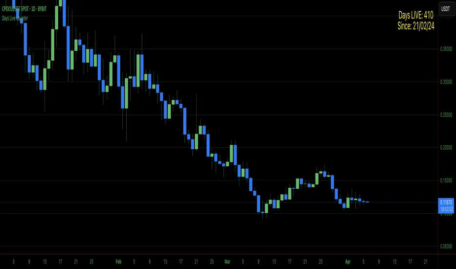
Days Live CounterThis quite simply tracks how many days an asset has been on Trading View for.
The indicator calculates the day count based on the timestamp of the first visible bar in your current chart view. Since monthly charts generally load data from further back in time than daily or intraday charts, they'll show a larger day count.
This isn't a bug in the indicator - it's correctly counting the days from the first bar it can see in each timeframe.
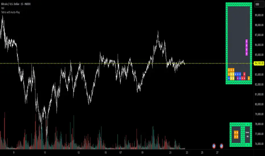
Tetris with Auto-PlayThis indicator is implemented in Pine Script™ v6 and serves as a demonstration of TradingView's capabilities. The core concept is to simulate a classic Tetris game by creating a grid-based environment and managing game state entirely within Pine Script.
Key Technical Aspects:
Grid Representation:
The script defines a custom grid structure using a user-defined type that holds the grid’s dimensions and a one-dimensional array to simulate a two-dimensional board. This structure is used to track occupied cells, clear full rows, and determine stack height.
Piece Management:
A second custom type is used to represent the state of a tetromino piece, including its type, rotation, and position. The code includes functions to calculate the block offsets for each tetromino based on its rotation state.
Collision Detection and Piece Locking:
Dedicated functions check for collisions against the grid borders and existing blocks. When a collision is detected during a downward move, the piece is locked into the grid, and any complete lines are cleared.
AIgo-Driven Placement:
The script incorporates a simple heuristic to determine the best placement for the next tetromino. It simulates different rotations and horizontal positions, evaluating each based on aggregated column height, cleared lines, holes, and bumpiness. This decision-making process is encapsulated in an AI-like function that returns the optimal rotation and placement.
Rendering Using Tables:
The visual representation is managed via TradingView’s table objects. The game board is rendered with a bordered layout, while a separate preview table displays the next piece and the current score. Each cell is updated with text and background colors that correspond to the state of the game.
Execution Flow and Timing:
The main execution loop handles real-time updates by dropping pieces at set intervals and checking for game-over conditions. The code leverages persistent variables and time comparisons to control game speed and manage transitions between piece drops.
Executing:
Add the indicator to the chart
It starts playing itself till game over
There are no parameters to change in this version but the grid in the code directly
p.s. Sadly we have no interactive buttons in the current pinescript versions to play ourself, but its about the possibilitys what we could do ;-)
Maybe in a future version there is more possible, if i find time to enhance and expand the idea
Have fun :-)
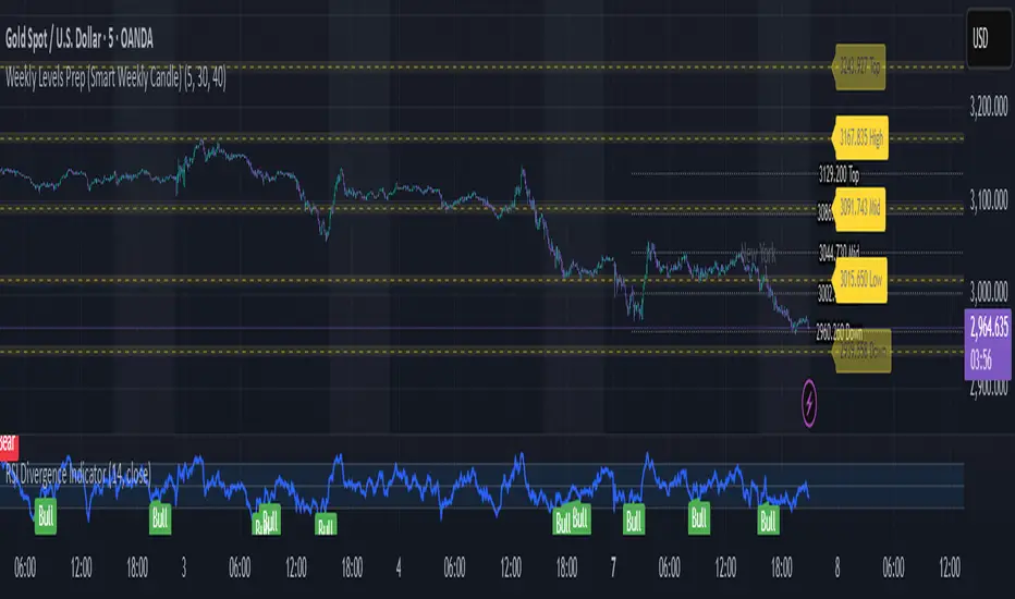
Weekly Levels Prep (Smart Weekly Candle)This script draws key weekly levels based on the most recent completed weekly candle (Monday–Friday). It automatically calculates and plots:
✅ Weekly High & Low
✅ Midpoint (50% level)
✅ Extension levels above and below
All levels are dynamically updated every new week and are visually marked with clean color-coded horizontal lines. Price values are shown near the price axis for clear visibility across all timeframes.
Great for:
Weekly preparation
Swing trading setups
Mean reversion and range breakouts
🔄 Works on all timeframes
🔍 Lightweight and non-intrusive
Built by a trader, for traders. 💼📈
Wyckoff Schematic - Accumulation [TrendX_]Wyckoff Schematic 1 - Accumulation is an advanced Wyckoff method tool on TradingView, designed to automate the identification of critical phases and price structures within the Wyckoff Accumulation Schematic. By detecting key events such as SC (Selling Climax), AR (Automatic Rally), Spring, and SOS (Sign of Strength), this tool helps traders visualize institutional accumulation patterns, anticipate trend reversals, and identify potential entry points aligned with the Wyckoff model—all without requiring hours of manual monitoring. The indicator dynamically labels key points, draws accumulation zones, and triggers alerts upon phase confirmations, reducing manual analysis and emotional bias.
💎 FEATURES
▶ Phase A: Bottom Identification
Auto-detects Selling Climax (SC), Automatic Rally (AR), and Secondary Test (ST).
Customizable initial trend detection: FTD (Follow-Through Day), Market Structure Shift, Triple MA Crossover, or Ichimoku Cloud.
▶ Phase B: Accumulation Range Formation
Identifies SOS(b) and ST(b) in Phase B
Customizable sweep levels for ST detection: previous SC / ST(a) / Fibonacci retracement levels of AR & SC.
▶ Phase C: Accumulation Confirmation
Flags Spring (false breakdown) and Test (confirmation of false breakdown).
▶ Phase D: Breakout Preparation
Detects SOS and BU/LPS for breakout confirmation.
▶ Visual Tools
Auto-draws accumulation range SC, AR, SOS(b) with real-time extensions.
Labels all critical events (SC, AR, ST, SOS, Spring, LPS) with text and markers.
Draws colored boxes for confirmed phases A, B and C, and triggers alerts for start of Markup with SOS and BU/LPS.
🔎 BREAKOUT
Phase A: Halting the Downtrend
▶ Key Events: SC, AR, ST(a).
▶ Functions:
SC: Marks panic selling, often with high volume.
AR: Sharp rebound after SC, reflecting short-term demand.
ST(a): Retest of SC lows to confirm weakening supply.
▶ Importance:
Phase A signals the end of a downtrend. The SC shows exhaustion, while the AR and ST confirm that sellers are losing control. Customizable trend detection (e.g., Ichimoku Cloud or FTD) ensures alignment with broader market context or your preference.
Phase B: Building the Accumulation Range
▶ Key events: SOS (Pha B), ST (Pha B).
▶ Functions:
SOS(b): A rally breaking above the AR, indicating strong demand.
ST(b): Retests of SC / ST(a) / Fib level to sweep liquidity (trap late sellers).
▶ Importance:
Phase B confirms the sideways range. SOS reflects institutional buying, while ST(b) traps sellers. Sweeping SC / ST(a) / Fib level would help identify false breakdowns.
Phase C: Spring & Test
▶ Key events: Spring (false breakdown), Test (confirmation).
▶ Functions:
Spring: A deliberate drop below Phase B support to eliminate weak traders.
Test: Retest of the Spring low to confirm sustained demand.
▶ Importance:
Phase C is the final "shakeout" to confirm accumulation. The Spring traps weak hands, while the Test validates support, confirming the institution has bought enough, signaling readiness for Markup.
Phase D: Breakout / Start of Markup
▶ Key events: SOS, BU/LPS.
▶ Functions:
SOS: A strong rally breaking above the accumulation range.
BU/LPS: Pullback after SOS to retest the breakout level.
▶ Importance:
Phase D confirms the start of a Markup. SOS shows demand overpowering supply, while BU/LPS offers low-risk entry points.
Accumulation Range & Visual Tools
▶ Accumulation Range: Drawn between SC (low) and AR (high), reflecting institutional buying activity.
▶ Labels/Boxes: Clear labels (SC, AR, ST, SOS, Spring, …) track each phase.
▶ Alerts: Notifies users when SOS or BU/LPS appears.
🛠️ USAGE
▶ Configuration
Phase A: Select trend detection method based on your preference and trading style (FTD, Market Structure, Triple MA, Mây Ichimoku).
Phase B: Adjust sweep levels (SC, ST(a), Fibonacci 61.8% của AR & SC).
▶ Interpretation
Bullish Trend: Confirmed Phase C (Spring + Test) followed by SOS in Phase D.
▶ Trading Strategy
Enter long positions at BU/LPS (Phase D) with volume or momentum confirmation.
Uses other Break-out strategy after SOS appear for Long Entry.
DISCLAIMER
This indicator is not financial advice, it can only help traders make better decisions. There are many factors and uncertainties that can affect the outcome of any endeavor, and no one can guarantee or predict with certainty what will occur. Therefore, one should always exercise caution and judgment when making decisions based on past performance.

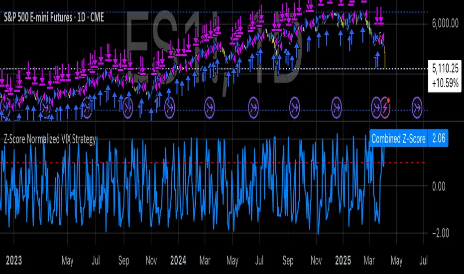
Z-Score Normalized VIX StrategyThis strategy leverages the concept of the Z-score applied to multiple VIX-based volatility indices, specifically designed to capture market reversals based on the normalization of volatility. The strategy takes advantage of VIX-related indicators to measure extreme levels of market fear or greed and adjusts its position accordingly.
1. Overview of the Z-Score Methodology
The Z-score is a statistical measure that describes the position of a value relative to the mean of a distribution in terms of standard deviations. In this strategy, the Z-score is calculated for various volatility indices to assess how far their values are from their historical averages, thus normalizing volatility levels. The Z-score is calculated as follows:
Z = \frac{X - \mu}{\sigma}
Where:
• X is the current value of the volatility index.
• \mu is the mean of the index over a specified period.
• \sigma is the standard deviation of the index over the same period.
This measure tells us how many standard deviations the current value of the index is away from its average, indicating whether the market is experiencing unusually high or low volatility (fear or calm).
2. VIX Indices Used in the Strategy
The strategy utilizes four commonly referenced volatility indices:
• VIX (CBOE Volatility Index): Measures the market’s expectations of 30-day volatility based on S&P 500 options.
• VIX3M (3-Month VIX): Reflects expectations of volatility over the next three months.
• VIX9D (9-Day VIX): Reflects shorter-term volatility expectations.
• VVIX (VIX of VIX): Measures the volatility of the VIX itself, indicating the level of uncertainty in the volatility index.
These indices provide a comprehensive view of the current volatility landscape across different time horizons.
3. Strategy Logic
The strategy follows a long entry condition and an exit condition based on the combined Z-score of the selected volatility indices:
• Long Entry Condition: The strategy enters a long position when the combined Z-score of the selected VIX indices falls below a user-defined threshold, indicating an abnormally low level of volatility (suggesting a potential market bottom and a bullish reversal). The threshold is set as a negative value (e.g., -1), where a more negative Z-score implies greater deviation below the mean.
• Exit Condition: The strategy exits the long position when the combined Z-score exceeds the threshold (i.e., when the market volatility increases above the threshold, indicating a shift in market sentiment and reduced likelihood of continued upward momentum).
4. User Inputs
• Z-Score Lookback Period: The user can adjust the lookback period for calculating the Z-score (e.g., 6 periods).
• Z-Score Threshold: A customizable threshold value to define when the market has reached an extreme volatility level, triggering entries and exits.
The strategy also allows users to select which VIX indices to use, with checkboxes to enable or disable each index in the calculation of the combined Z-score.
5. Trade Execution Parameters
• Initial Capital: The strategy assumes an initial capital of $20,000.
• Pyramiding: The strategy does not allow pyramiding (multiple positions in the same direction).
• Commission and Slippage: The commission is set at $0.05 per contract, and slippage is set at 1 tick.
6. Statistical Basis of the Z-Score Approach
The Z-score methodology is a standard technique in statistics and finance, commonly used in risk management and for identifying outliers or unusual events. According to Dumas, Fleming, and Whaley (1998), volatility indices like the VIX serve as a useful proxy for market sentiment, particularly during periods of high uncertainty. By calculating the Z-score, we normalize volatility and quantify the degree to which the current volatility deviates from historical norms, allowing for systematic entry and exit based on these deviations.
7. Implications of the Strategy
This strategy aims to exploit market conditions where volatility has deviated significantly from its historical mean. When the Z-score falls below the threshold, it suggests that the market has become excessively calm, potentially indicating an overreaction to past market events. Entering long positions under such conditions could capture market reversals as fear subsides and volatility normalizes. Conversely, when the Z-score rises above the threshold, it signals increased volatility, which could be indicative of a bearish shift in the market, prompting an exit from the position.
By applying this Z-score normalized approach, the strategy seeks to achieve more consistent entry and exit points by reducing reliance on subjective interpretation of market conditions.
8. Scientific Sources
• Dumas, B., Fleming, J., & Whaley, R. (1998). “Implied Volatility Functions: Empirical Tests”. The Journal of Finance, 53(6), 2059-2106. This paper discusses the use of volatility indices and their empirical behavior, providing context for volatility-based strategies.
• Black, F., & Scholes, M. (1973). “The Pricing of Options and Corporate Liabilities”. Journal of Political Economy, 81(3), 637-654. The original Black-Scholes model, which forms the basis for many volatility-related strategies.
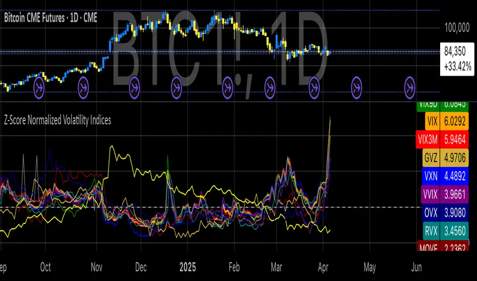
Z-Score Normalized Volatility IndicesVolatility is one of the most important measures in financial markets, reflecting the extent of variation in asset prices over time. It is commonly viewed as a risk indicator, with higher volatility signifying greater uncertainty and potential for price swings, which can affect investment decisions. Understanding volatility and its dynamics is crucial for risk management and forecasting in both traditional and alternative asset classes.
Z-Score Normalization in Volatility Analysis
The Z-score is a statistical tool that quantifies how many standard deviations a given data point is from the mean of the dataset. It is calculated as:
Z = \frac{X - \mu}{\sigma}
Where X is the value of the data point, \mu is the mean of the dataset, and \sigma is the standard deviation of the dataset. In the context of volatility indices, the Z-score allows for the normalization of these values, enabling their comparison regardless of the original scale. This is particularly useful when analyzing volatility across multiple assets or asset classes.
This script utilizes the Z-score to normalize various volatility indices:
1. VIX (CBOE Volatility Index): A widely used indicator that measures the implied volatility of S&P 500 options. It is considered a barometer of market fear and uncertainty (Whaley, 2000).
2. VIX3M: Represents the 3-month implied volatility of the S&P 500 options, providing insight into medium-term volatility expectations.
3. VIX9D: The implied volatility for a 9-day S&P 500 options contract, which reflects short-term volatility expectations.
4. VVIX: The volatility of the VIX itself, which measures the uncertainty in the expectations of future volatility.
5. VXN: The Nasdaq-100 volatility index, representing implied volatility in the Nasdaq-100 options.
6. RVX: The Russell 2000 volatility index, tracking the implied volatility of options on the Russell 2000 Index.
7. VXD: Volatility for the Dow Jones Industrial Average.
8. MOVE: The implied volatility index for U.S. Treasury bonds, offering insight into expectations for interest rate volatility.
9. BVIX: Volatility of Bitcoin options, a useful indicator for understanding the risk in the cryptocurrency market.
10. GVZ: Volatility index for gold futures, reflecting the risk perception of gold prices.
11. OVX: Measures implied volatility for crude oil futures.
Volatility Clustering and Z-Score
The concept of volatility clustering—where high volatility tends to be followed by more high volatility—is well documented in financial literature. This phenomenon is fundamental in volatility modeling and highlights the persistence of periods of heightened market uncertainty (Bollerslev, 1986).
Moreover, studies by Andersen et al. (2012) explore how implied volatility indices, like the VIX, serve as predictors for future realized volatility, underlining the relationship between expected volatility and actual market behavior. The Z-score normalization process helps in making volatility data comparable across different asset classes, enabling more effective decision-making in volatility-based strategies.
Applications in Trading and Risk Management
By using Z-score normalization, traders can more easily assess deviations from the mean in volatility, helping to identify periods when volatility is unusually high or low. This can be used to adjust risk exposure or to implement volatility-based trading strategies, such as mean reversion strategies. Research suggests that volatility mean-reversion is a reliable pattern that can be exploited for profit (Christensen & Prabhala, 1998).
References:
• Andersen, T. G., Bollerslev, T., Diebold, F. X., & Vega, C. (2012). Realized volatility and correlation dynamics: A long-run approach. Journal of Financial Economics, 104(3), 385-406.
• Bollerslev, T. (1986). Generalized autoregressive conditional heteroskedasticity. Journal of Econometrics, 31(3), 307-327.
• Christensen, B. J., & Prabhala, N. R. (1998). The relation between implied and realized volatility. Journal of Financial Economics, 50(2), 125-150.
• Whaley, R. E. (2000). Derivatives on market volatility and the VIX index. Journal of Derivatives, 8(1), 71-84.
Option Contract Size CalculatorOption Contract Size Calculator
This indicator helps you to figure out the ideal number of contracts for your trade and its only used for options day trading.
The indicator needs to fill the input section in order to give you the information table that includes Contract size .
The input section consists of two sections. The first section requires user entry of the delta of the options contract from the broker chain and the stop loss size on the chart.
The second section allows you to enter your account balance and risk per trade
(2% recommended) .
There is also the option for where you wish to display your table like bottom right , bottom left or top right, top left.
special thanks to @Mohamedawke for the open source script this code is based off

TP/SL Percentage & RR Visual ToolThis tool is designed to help traders visually and statistically assess their trade setup by calculating Stop Loss (SL), Take Profit (TP), and Risk-to-Reward (RR) based on percentage inputs from the current price.
🔧 How It Works:
Uses the current candle’s close price as your entry.
Calculates TP and SL as percentage-based levels (e.g., 1% SL, 1.5% TP).
Displays horizontal lines and labels on the chart for TP and SL (only on the latest candle to reduce clutter).
Shows a compact table in the top-right corner with all key values:
Entry Price
Current Price
TP Price (+%)
SL Price (-%)
TP Distance from current price
RR Ratio (e.g., 1:1.5)
💡 Use Cases:
Quickly validate if a trade setup meets your desired RR profile (e.g., 1:2).
Perfect for scalpers, swing traders, and position traders who rely on structured risk management.
Combine with your entry signal strategy to visualize targets and stops without manual calculations.
⚙️ Inputs:
Stop Loss % – Sets how far your SL is from the entry.
Take Profit % – Sets how far your TP is from the entry.
