Improved Trend Shot | JeffreyTimmermansImproved Trend Shot
The "Improved Trend Shot" is an advanced trend-following tool that integrates cutting-edge features and the principles of John Ehlers’ SuperSmoother Filter to provide traders with more accurate trend detection and better decision-making. This enhanced version includes multiple smoothing types, customizable lengths, dynamic alerts, and a comprehensive dashboard to help traders quickly interpret market conditions.
This script is inspired by "TRW" . However, it is more advanced and includes additional features and options.
Key Features and Improvements
Smoothed Lines and Trend Detection
The core of the Improved Smooth Trend Shot relies on three key lines to capture market momentum:
Fast Line: Highly sensitive to short-term price changes, offering rapid responsiveness to market movements.
Middle Line: Provides a medium-term view of market trends, acting as a more stable reference.
Slow Line: Focuses on long-term trends, offering a broader perspective on market direction.
These three smoothed lines interact dynamically to create a visual color-coded cloud that helps traders easily interpret market conditions:
Green Cloud: Indicates an upward trend when the Fast line is above the Slow line.
Red Cloud: Signals a downward trend when the Fast line is below the Slow line.
The cloud color adjusts based on the relative positioning of the Fast, Middle, and Slow lines, helping traders to identify bullish or bearish trends with ease.
Dynamic Cloud Visualization and Alerts
The cloud and trend lines adapt to market conditions, updating in real-time to reflect changes in trend strength and momentum. Traders can also set up real-time alerts to notify them of important trend shifts, such as:
Fast and Slow Crossovers: Alerts when the Fast line crosses the Slow line.
Middle and Slow Crossovers: Alerts when the Middle line crosses the Slow line.
This makes it easier to capture trading opportunities and respond promptly to market changes.
Enhanced Smoothing Options
Traders can now choose from multiple smoothing types, including:
EMA (Exponential Moving Average)
SMA (Simple Moving Average)
DEMA (Double Exponential Moving Average)
WMA (Weighted Moving Average)
Each smoothing type has different properties, allowing traders to select the best fit for their trading style. The smoothing length can also be customized, offering flexibility in fine-tuning how sensitive or stable the trend lines should be.
Improved Signal Logic and Precision
The signal logic has been optimized for better precision. Now, the system provides more accurate buy and sell alerts based on:
Trend Detection: The color-coded cloud and the relative positions of the Fast, Middle, and Slow lines help visualize whether the trend is bullish or bearish.
Rising and Falling Indicators: The indicator also checks if each line is rising or falling over the last three bars, offering early signals of momentum shifts.
Dashboard Insights
The dashboard provides real-time updates on the positions and movements of the smoothed lines:
Line Positions: Displays the positions of the Fast, Middle, and Slow lines.
Trend Direction: Shows whether each line is rising or falling.
Price Levels: Displays the price levels for each of the smoothed lines, offering clear reference points for market evaluation.
These features help traders better understand the state of the market, offering valuable insights for both trend-following and reversal-based strategies.
Crossovers and Signal Triggers
The Improved Smooth Trend Shot focuses on crossovers between the different smoothed lines as primary trading signals. There are two types of crossovers:
Fast Shots: This occurs when the Fast line crosses the Slow line.
Slow Shots: This occurs when the Middle line crosses the Slow line.
These crossovers serve as key entry or exit points for traders, helping them spot potential trend reversals. The improved logic ensures that crossovers are accurately detected, reducing the chances of false signals.
Customization Options
The Improved Smooth Trend Shot offers a high degree of customization:
Smoothing Length: Adjust the smoothing period to balance between fast responses and stable trends.
Source Selection: Default to the average of high and low prices (hl2), or choose other price sources.
Smoothing Type: Select from EMA, SMA, DEMA, or WMA for personalized trend analysis.
Signal Type: Choose between Fast Shots or Slow Shots based on the type of crossover you want to focus on.
Long, Medium, and Short-Term Applications
Although the default settings are optimized for long-term trend analysis, the Improved Smooth Trend Shot is highly adaptable. By adjusting the smoothing length and selecting different smoothing types, traders can use the tool for:
Short-Term Trading: Focus on fast responses to market shifts using shorter smoothing periods.
Medium-Term Trading: Tailor the settings to capture intermediate trends.
Long-Term Trend Analysis: Use longer smoothing periods for a more stable and comprehensive view of market dynamics.
Advanced ATR Filtering and Alerts
The inclusion of ATR (Average True Range) filtering helps ensure that signals are triggered only when significant price movements occur. This helps reduce noise and false signals, ensuring traders only act on meaningful market shifts.
Conclusion
The Improved Smooth Trend Shot is a powerful and versatile tool that enhances the original SuperSmoother Filter with advanced features like customizable smoothing options, real-time alerts, and an intuitive dashboard. Whether you're a day trader, swing trader, or long-term investor, this enhanced indicator provides a comprehensive and actionable view of market trends.
The combination of enhanced signal accuracy, dynamic trend visualization, and in-depth customization ensures that the Improved Smooth Trend Shot is an indispensable tool for traders across all market conditions.
-Jeffrey
Educational

Drawdown Tracker [SpokoStocks]Drawdown Tracker
The Drawdown Tracker is a powerful tool designed to help traders monitor and visualize the drawdown of symbol. By tracking both current and maximum drawdown levels, this indicator provides valuable insights into risk and potential capital preservation.
Features:
> Current Drawdown:
The current drawdown is calculated as the percentage drop from the record high to the current low, providing a real-time view of the loss from the peak.
> Maximum Drawdown:
The maximum drawdown represents the deepest drop observed from any peak in the historical data, giving an understanding of the worst-case scenario for losses.
> You can choose between two modes:
Full History: Tracks the maximum drawdown from the entire available data.
Rolling Period: Tracks the maximum drawdown within a defined rolling period (default 50 bars), allowing for a shorter-term risk assessment.
> Customizable Rolling Period:
You can adjust the rolling period length through the Rolling Period Length input to reflect different time frames for drawdown calculations.
> Warning Level:
A customizable warning level (default -65%) is plotted on the chart. This acts as a threshold to alert users when the drawdown crosses into a potentially concerning territory.
> Gradient Color Visualization:
The current drawdown is visualized using a gradient color, transitioning from red to yellow as the drawdown increases from -100% to 0%, providing an easy-to-interpret view of the severity of the drawdown.
> New Max Drawdown Marker:
Whenever a new maximum drawdown is recorded, a triangle marker is displayed at the bottom of the chart, along with a label showing the drawdown percentage. This provides clear visual confirmation when a new historical low is reached.
> Alerts:
Warning Level Breach Alert: Alerts you when the drawdown breaches the warning level you’ve set, helping you stay aware of significant risk events.
New Max Drawdown Alert: Triggers when a new maximum drawdown is recorded, allowing you to act quickly if necessary.
Use Cases:
Risk Management: Keep track of how much an asset is down from the peak, helping you make informed decisions about risk and drawdown tolerances.
Risk Disclaimer:
The information provided by this script is for educational and informational purposes only. It is not intended as financial advice and should not be construed as such. All trading and investment activities involve a high level of risk and may result in the loss of capital. The user is solely responsible for any decisions made based on the content provided by this script.
By using this script, you acknowledge and agree that you use it at your own risk. The creator of this script makes no warranties regarding the accuracy, completeness, or reliability of the information, and disclaims any responsibility for any losses or damages arising from its use.
Always conduct your own research and consult with a qualified financial advisor before making any investment decisions.

MMXM ICT [TradingFinder] Market Maker Model PO3 CHoCH/CSID + FVG🔵 Introduction
The MMXM Smart Money Reversal leverages key metrics such as SMT Divergence, Liquidity Sweep, HTF PD Array, Market Structure Shift (MSS) or (ChoCh), CISD, and Fair Value Gap (FVG) to identify critical turning points in the market. Designed for traders aiming to analyze the behavior of major market participants, this setup pinpoints strategic areas for making informed trading decisions.
The document introduces the MMXM model, a trading strategy that identifies market maker activity to predict price movements. The model operates across five distinct stages: original consolidation, price run, smart money reversal, accumulation/distribution, and completion. This systematic approach allows traders to differentiate between buyside and sellside curves, offering a structured framework for interpreting price action.
Market makers play a pivotal role in facilitating these movements by bridging liquidity gaps. They continuously quote bid (buy) and ask (sell) prices for assets, ensuring smooth trading conditions.
By maintaining liquidity, market makers prevent scenarios where buyers are left without sellers and vice versa, making their activity a cornerstone of the MMXM strategy.
SMT Divergence serves as the first signal of a potential trend reversal, arising from discrepancies between the movements of related assets or indices. This divergence is detected when two or more highly correlated assets or indices move in opposite directions, signaling a likely shift in market trends.
Liquidity Sweep occurs when the market targets liquidity in specific zones through false price movements. This process allows major market participants to execute their orders efficiently by collecting the necessary liquidity to enter or exit positions.
The HTF PD Array refers to premium and discount zones on higher timeframes. These zones highlight price levels where the market is in a premium (ideal for selling) or discount (ideal for buying). These areas are identified based on higher timeframe market behavior and guide traders toward lucrative opportunities.
Market Structure Shift (MSS), also referred to as ChoCh, indicates a change in market structure, often marked by breaking key support or resistance levels. This shift confirms the directional movement of the market, signaling the start of a new trend.
CISD (Change in State of Delivery) reflects a transition in price delivery mechanisms. Typically occurring after MSS, CISD confirms the continuation of price movement in the new direction.
Fair Value Gap (FVG) represents zones where price imbalance exists between buyers and sellers. These gaps often act as price targets for filling, offering traders opportunities for entry or exit.
By combining all these metrics, the Smart Money Reversal provides a comprehensive tool for analyzing market behavior and identifying key trading opportunities. It enables traders to anticipate the actions of major players and align their strategies accordingly.
MMBM :
MMSM :
🔵 How to Use
The Smart Money Reversal operates in two primary states: MMBM (Market Maker Buy Model) and MMSM (Market Maker Sell Model). Each state highlights critical structural changes in market trends, focusing on liquidity behavior and price reactions at key levels to offer precise and effective trading opportunities.
The MMXM model expands on this by identifying five distinct stages of market behavior: original consolidation, price run, smart money reversal, accumulation/distribution, and completion. These stages provide traders with a detailed roadmap for interpreting price action and anticipating market maker activity.
🟣 Market Maker Buy Model
In the MMBM state, the market transitions from a bearish trend to a bullish trend. Initially, SMT Divergence between related assets or indices reveals weaknesses in the bearish trend. Subsequently, a Liquidity Sweep collects liquidity from lower levels through false breakouts.
After this, the price reacts to discount zones identified in the HTF PD Array, where major market participants often execute buy orders. The market confirms the bullish trend with a Market Structure Shift (MSS) and a change in price delivery state (CISD). During this phase, an FVG emerges as a key trading opportunity. Traders can open long positions upon a pullback to this FVG zone, capitalizing on the bullish continuation.
🟣 Market Maker Sell Model
In the MMSM state, the market shifts from a bullish trend to a bearish trend. Here, SMT Divergence highlights weaknesses in the bullish trend. A Liquidity Sweep then gathers liquidity from higher levels.
The price reacts to premium zones identified in the HTF PD Array, where major sellers enter the market and reverse the price direction. A Market Structure Shift (MSS) and a change in delivery state (CISD) confirm the bearish trend. The FVG then acts as a target for the price. Traders can initiate short positions upon a pullback to this FVG zone, profiting from the bearish continuation.
Market makers actively bridge liquidity gaps throughout these stages, quoting continuous bid and ask prices for assets. This ensures that trades are executed seamlessly, even during periods of low market participation, and supports the structured progression of the MMXM model.
The price’s reaction to FVG zones in both states provides traders with opportunities to reduce risk and enhance precision. These pullbacks to FVG zones not only represent optimal entry points but also create avenues for maximizing returns with minimal risk.
🔵 Settings
Higher TimeFrame PD Array : Selects the timeframe for identifying premium/discount arrays on higher timeframes.
PD Array Period : Specifies the number of candles for identifying key swing points.
ATR Coefficient Threshold : Defines the threshold for acceptable volatility based on ATR.
Max Swing Back Method : Choose between analyzing all swings ("All") or a fixed number ("Custom").
Max Swing Back : Sets the maximum number of candles to consider for swing analysis (if "Custom" is selected).
Second Symbol for SMT : Specifies the second asset or index for detecting SMT divergence.
SMT Fractal Periods : Sets the number of candles required to identify SMT fractals.
FVG Validity Period : Defines the validity duration for FVG zones.
MSS Validity Period : Sets the validity duration for MSS zones.
FVG Filter : Activates filtering for FVG zones based on width.
FVG Filter Type : Selects the filtering level from "Very Aggressive" to "Very Defensive."
Mitigation Level FVG : Determines the level within the FVG zone (proximal, 50%, or distal) that price reacts to.
Demand FVG : Enables the display of demand FVG zones.
Supply FVG : Enables the display of supply FVG zones.
Zone Colors : Allows customization of colors for demand and supply FVG zones.
Bottom Line & Label : Enables or disables the SMT divergence line and label from the bottom.
Top Line & Label : Enables or disables the SMT divergence line and label from the top.
Show All HTF Levels : Displays all premium/discount levels on higher timeframes.
High/Low Levels : Activates the display of high/low levels.
Color Options : Customizes the colors for high/low lines and labels.
Show All MSS Levels : Enables display of all MSS zones.
High/Low MSS Levels : Activates the display of high/low MSS levels.
Color Options : Customizes the colors for MSS lines and labels.
🔵 Conclusion
The Smart Money Reversal model represents one of the most advanced tools for technical analysis, enabling traders to identify critical market turning points. By leveraging metrics such as SMT Divergence, Liquidity Sweep, HTF PD Array, MSS, CISD, and FVG, traders can predict future price movements with precision.
The price’s interaction with key zones such as PD Array and FVG, combined with pullbacks to imbalance areas, offers exceptional opportunities with favorable risk-to-reward ratios. This approach empowers traders to analyze the behavior of major market participants and adopt professional strategies for entry and exit.
By employing this analytical framework, traders can reduce errors, make more informed decisions, and capitalize on profitable opportunities. The Smart Money Reversal focuses on liquidity behavior and structural changes, making it an indispensable tool for financial market success.

Stop Loss & Take Profit LevelsCalculate and Plot Stop Loss (SL) Levels:
The indicator calculates the Stop Loss price level based on the account balance, risk percentage, and the trade's entry price.
For long positions, the SL is below the entry price.
For short positions, the SL is above the entry price.
Calculate and Plot Take Profit (TP) Levels:
The indicator calculates up to three Take Profit (TP) levels, each based on different Risk/Reward (R:R) ratios.
The R:R ratio determines how much reward (profit) you aim to achieve relative to the risk (the distance between the entry price and the stop loss).
These TP levels are plotted on the chart as lines above the entry price for long positions or below the entry price for short positions.
Manual Entry Price:
The user can input a manual entry price to simulate trades or plan trades before entering the market. This makes it useful for pre-trade analysis.
Dynamic Position Type:
Users can toggle between Long or Short positions:
Long Position: The trader expects the price to go up.
Short Position: The trader expects the price to go down.
The indicator adapts its calculations (SL and TP levels) based on the selected position type.
Risk Calculation Based on Account Balance:
The indicator calculates the amount of capital at risk (in €) based on the trader's account balance and the selected risk percentage.
For example:
If the account balance is €1,000 and the Stop Loss percentage is 1%, the risk amount is €10.
Visual Representation on the Chart:
The following levels are plotted on the chart:
Stop Loss Level (Red Line): The price level at which the trader would exit the trade to limit losses.
Take Profit Levels (Green Lines): Up to three price levels where the trader could take profits based on R:R ratios.
Entry Price (Blue Line): The price level where the trade begins.
These lines are dynamically updated as inputs are changed, providing instant feedback to the trader.

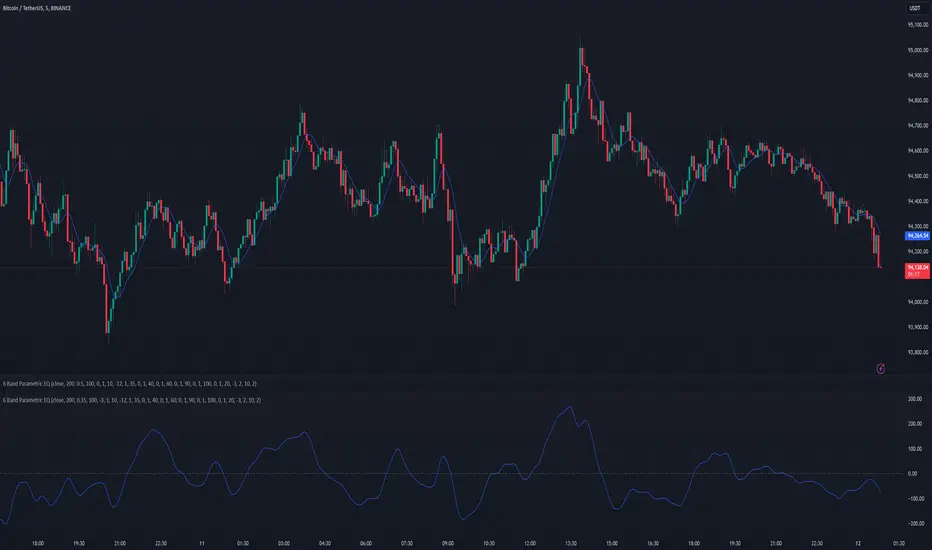
6 Band Parametric EQThis indicator implements a complete parametric equalizer on any data source using high-pass and low-pass filters, high and low shelving filters, and six fully configurable bell filters. Each filter stage features standard audio DSP controls including frequency, Q factor, and gain where applicable. While parametric EQ is typically used for audio processing, this implementation raises questions about the nature of filtering in technical analysis. Why stop at simple moving averages when you can shape your signal's frequency response with surgical precision? The answer may reveal more about our assumptions than our indicators.
Filter Types and Parameters
High-Pass Filter:
A high-pass filter attenuates frequency components below its cutoff frequency while passing higher frequencies. The Q parameter controls resonance at the cutoff point, with higher values creating more pronounced peaks.
Low-Pass Filter:
The low-pass filter does the opposite - it attenuates frequencies above the cutoff while passing lower frequencies. Like the high-pass, its Q parameter affects the resonance at the cutoff frequency.
High/Low Shelf Filters:
Shelf filters boost or cut all frequencies above (high shelf) or below (low shelf) the target frequency. The slope parameter determines the steepness of the transition around the target frequency , with a value of 1.0 creating a gentle slope and lower values making the transition more abrupt. The gain parameter sets the amount of boost or cut in decibels.
Bell Filters:
Bell (or peaking) filters create a boost or cut centered around a specific frequency. A bell filter's frequency parameter determines the center point of the effect, while Q controls the width of the affected frequency range - higher Q values create a narrower bandwidth. The gain parameter defines the amount of boost or cut in decibels.
All filters run in series, processing the signal in this order: high-pass → low shelf → bell filters → high shelf → low-pass. Each stage can be independently enabled or bypassed.
The frequency parameter for all filters represents the period length of the targeted frequency component. Lower values target higher frequencies and vice versa. All gain values are in decibels, where positive values boost and negative values cut.
The 6-Band Parametric EQ combines these filters into a comprehensive frequency shaping tool. Just as audio engineers use parametric EQs to sculpt sound, this indicator lets you shape market data's frequency components with surgical precision. But beyond its technical implementation, this indicator serves as a thought experiment about the nature of filtering in technical analysis. While traditional indicators often rely on simple moving averages or single-frequency filters, the parametric EQ takes this concept to its logical extreme - offering complete control over the frequency domain of price action. Whether this level of filtering precision is useful for analysis is perhaps less important than what it reveals about our assumptions regarding market data and its frequency components.
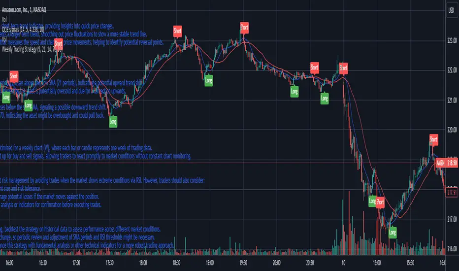
Weekly Trading StrategyStrategy Overview:
This trading strategy is designed for short-term trades over weekly intervals, utilizing the combination of Simple Moving Averages (SMA) for trend identification and the Relative Strength Index (RSI) for overbought/oversold conditions. It aims to capitalize on momentum shifts while mitigating the risk of entering a market at extreme points.
Key Components:
Fast SMA (9 periods): Acts as a short-term trend indicator, providing insights into quick price changes.
Slow SMA (21 periods): Represents a longer-term trend, smoothing out price fluctuations to show a more stable trend line.
RSI (14 periods): An oscillator that measures the speed and change of price movements, helping to identify potential reversal points.
Entry Signals:
Buy Signal:
Condition 1: The fast SMA (9 periods) crosses above the slow SMA (21 periods), indicating a potential upward trend shift.
Condition 2: RSI falls below 30, suggesting the asset is potentially oversold and due for a correction upwards.
Sell Signal:
Condition 1: The fast SMA crosses below the slow SMA, signaling a possible downward trend shift.
Condition 2: RSI climbs above 70, indicating the asset might be overbought and could pull back.
Strategy Execution:
Timeframe: This strategy is optimized for a weekly chart (W), where each bar or candle represents one week of trading data.
Alert System: Alerts can be set up for buy and sell signals, allowing traders to react promptly to market conditions without constant chart monitoring.
Risk Management:
This strategy includes inherent risk management by avoiding trades when the market shows extreme conditions via RSI. However, traders should also consider:
Position sizing based on account size and risk tolerance.
Setting stop-loss orders to manage potential losses if the market moves against the position.
Considering additional market analysis or indicators for confirmation before executing trades.
Considerations:
Backtesting: Before live trading, backtest the strategy on historical data to assess performance across different market conditions.
Adaptation: Market dynamics change, so periodic review and adjustment of SMA periods and RSI thresholds might be necessary.
Complementary Analysis: Enhance this strategy with fundamental analysis or other technical indicators for a more robust trading approach.
This strategy is suited for traders looking for weekly swings in the market, balancing between following the trend and spotting potential reversals. However, like all trading strategies, it should not be used in isolation but as part of a broader trading plan.
Candle Spread Oscillator (CS0)The Candle Spread Oscillator (CSO) is a custom technical indicator designed to help traders identify momentum and directional strength in the market by analyzing the relationship between the candle body spread and the total candle range. This oscillator provides traders with a visually intuitive representation of price action dynamics and highlights key transitions between positive and negative momentum.
How It Works:
Body Spread vs. Total Range:
The CSO calculates the body spread (difference between the close and open price) and compares it to the total range (difference between the high and low price) of a candle.
The ratio of the body spread to the total range represents the proportion of price movement driven by directional momentum.
Smoothed Oscillator:
To remove noise and enhance clarity, the ratio is smoothed using a Hull Moving Average (HMA). The smoothing period can be adjusted through the "Smoothing Period" input, enabling traders to tailor the indicator to their preferred timeframes or strategies.
Gradient Visualization:
A gradient coloring is applied to the oscillator, transitioning smoothly between colors (e.g., fuchsia for negative momentum and aqua for positive momentum). This provides traders with a clear, intuitive visual cue of market behavior.
Visual Features:
Oscillator Plot:
The oscillator is displayed as an area-style plot, dynamically colored using a gradient. Positive values are represented in shades of aqua, while negative values are in shades of fuchsia.
Midline (0 Level):
A horizontal midline is plotted at the zero level, serving as a key reference point for identifying transitions between positive and negative momentum.
Background Highlights:
The chart background is subtly colored to match the oscillator's state, enhancing the visual emphasis on current momentum conditions.
Alerts for Key Crossovers:
The CSO comes with built-in alert conditions, making it highly actionable for traders:
Cross Up Alert: Triggers when the oscillator crosses above the midline (0), signaling a potential shift into positive momentum.
Cross Down Alert: Triggers when the oscillator crosses below the midline (0), indicating a potential transition into negative momentum.
These alerts allow traders to stay informed about critical market shifts without constantly monitoring the chart.
How to Use:
Trend Identification:
When the oscillator is above the midline and positive, it indicates that price action is moving with bullish momentum.
When the oscillator is below the midline and negative, it reflects bearish momentum.
Momentum Strength:
The magnitude of the oscillator (its distance from the midline) helps traders gauge the strength of the momentum. Stronger moves will push the oscillator further from zero.
Potential Reversals:
Crossovers of the oscillator through the midline can signal potential reversals or shifts in market direction.
Customization:
Adjust the Smoothing Period to adapt the sensitivity of the oscillator to different timeframes. A lower smoothing period reacts faster to price changes, while a higher smoothing period smooths out noise.
Best Use Cases:
Momentum Trading: Identify periods of sustained bullish or bearish momentum to align with the trend.
Reversal Signals: Spot transitions in market direction when the oscillator crosses the midline.
Confirmation Tool: Use the CSO alongside other indicators (e.g., volume, trendlines, or moving averages) to confirm trading signals.
Key Inputs:
Smoothing Period: Customize the sensitivity of the oscillator by adjusting the lookback period for the Hull Moving Average.
Gradient Range: The color gradient transitions between defined thresholds (-0.1 to 0.2 by default), ensuring a smooth visual experience.
[Why Use the Candle Spread Oscillator?
The CSO is a simple yet powerful tool for traders who want to:
Gain a deeper understanding of price momentum.
Quickly visualize shifts between bullish and bearish trends.
Use clear, actionable signals with customizable alerts.
Disclaimer: This indicator is not a standalone trading strategy. It should be used in combination with other technical and fundamental analysis tools. Always trade responsibly, and consult a financial advisor for personalized advice.

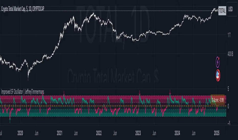
Improved SF Oscillator | JeffreyTimmermansImproved SF Oscillator
The "Improved SF Oscillator" is an advanced and versatile technical indicator designed to transform any moving average (MA) into a dynamic oscillator. This cutting-edge tool incorporates up to 13 different moving average types, including specialized indicators like Kaufman’s Adaptive Moving Average (KAMA), Tillson's Exponential Moving Average (T3), and the Arnaud Legoux Moving Average (ALMA). The oscillator offers traders a powerful tool for both trend-following and mean reversion strategies, significantly enhancing their ability to analyze market movements, identify potential entry and exit points, and make informed trading decisions.
This script is inspired by "EliCobra" . However, it is more advanced and includes additional features and options.
Core Functionality and Methodology
The Improved SF Oscillator leverages user-defined parameters to calculate the selected moving average type. Key inputs, such as the length of the MA and smoothing factors, offer traders extensive customization. Additionally, the indicator utilizes a unique process of deriving both the mean and standard deviation of the moving average over a defined normalization period. This method is crucial for normalizing the moving average and standardizing its behavior. The final step in this calculation involves deriving the Z-Score, which is computed by subtracting the moving average's mean from its current value and then dividing the result by the standard deviation.
This normalization allows the oscillator to display a standardized value that highlights the relative position of the moving average, offering a clear view of market volatility and potential trend shifts. By incorporating this statistical approach, the Improved SF Oscillator helps traders assess price behavior in relation to its typical fluctuations, providing vital insight into whether the price is overbought, oversold, or near a turning point.
The Moving Average Types
One of the standout features of the Improved SF Oscillator is its support for a wide variety of moving average types. Each MA type has its own unique methodology and behavior, allowing traders to choose the best fit for their trading strategy:
KAMA (Kaufman’s Adaptive Moving Average):
KAMA is designed to adapt its smoothing period dynamically based on market volatility. When market conditions are more volatile, KAMA responds quickly, while during calmer periods, it smooths price action more effectively. This characteristic allows KAMA to capture trends with minimal noise, providing traders with a smoother and more adaptive moving average.
T3 (Tillson's Exponential Moving Average):
The T3 MA is a refined version of the traditional EMA. By applying additional smoothing to the moving average, it significantly reduces lag and increases responsiveness. This allows traders to capture trends more accurately while maintaining the benefit of smooth price tracking.
ALMA (Arnaud Legoux Moving Average):
ALMA combines both linear regression and exponential smoothing techniques. Its unique formula allows for reduced lag and noise, providing a smoother representation of price trends. ALMA is particularly useful in detecting trend changes and is highly favored for its precision and ability to identify entry and exit points with minimal delay.
Z-Score and Normalization
The Z-Score is central to the functionality of the Improved SF Oscillator. By calculating the standard deviation and mean of the moving average over a defined period, the Z-Score standardizes the values of the MA. This transformation allows traders to assess the relative position of price in terms of how far it deviates from its mean, taking market volatility into account.
The Z-Score provides the following key benefits:
Overbought/Oversold Conditions: By assessing the Z-Score, traders can identify whether the price is approaching overbought or oversold conditions. Extreme positive or negative Z-Score values indicate potential reversals.
Volatility Adjustments: The Z-Score allows traders to understand market volatility in a normalized way, facilitating more accurate readings of price movements in relation to their typical behavior.
Enhanced Utility and Features
The Improved SF Oscillator is built for use in both trend-following and mean-reversion strategies. Traders can analyze the position of the oscillator relative to its midline to confirm trends. The oscillator’s deviation from the midline can indicate potential reversals, while extreme values can serve as signals for mean-reversion trades.
Additional features include:
Custom Alerts: The Improved SF Oscillator comes with real-time alerts for significant events such as trend reversals or when the oscillator crosses important thresholds. Traders can set alerts for when the oscillator exceeds a specified Z-Score, signaling overbought or oversold conditions.
Reversal Bubbles: To further aid in identifying turning points, the oscillator provides visually distinctive bubbles on the chart that highlight potential reversal points. These bubbles mark instances when the oscillator reaches an extreme value and then begins to reverse, offering valuable signals for potential entry or exit points.
Bar Coloring Options: The oscillator features a variety of bar coloring options, including:
Trend (Midline Cross): Bar colors change when the oscillator crosses its midline, signaling potential shifts in market momentum.
Extremities: Bars are colored based on extreme values, helping traders quickly identify periods of high volatility or potential trend reversals.
Reversions: Bar colors change when reversal conditions are met, such as when the oscillator shows signs of turning from overbought to oversold or vice versa.
Slope: Bars are colored based on the slope of the oscillator, providing insights into the underlying momentum of the market.
Recent Improvements and Features
After its initial release, the Improved SF Oscillator underwent several significant updates aimed at enhancing its usability and providing traders with more advanced tools:
Reversal Point Alerts: The addition of alerts for potential reversal points adds a crucial layer of functionality. These alerts notify traders in real time when the oscillator signals an overbought or oversold condition, or when it reaches a reversal point that could mark a shift in market direction.
Dashboard Integration: A dashboard feature was introduced to provide an overview of the oscillator’s readings. This allows traders to quickly assess the market conditions and oscillator behavior across multiple timeframes or instruments, ensuring that they are always aware of potential opportunities or risks.
Visual Enhancements: Several visual improvements were made to the bar coloring system, making it easier for traders to quickly interpret market conditions at a glance. The addition of customized bar color schemes for trends, extremes, and slopes helps traders make faster decisions based on clear visual cues.
Revised Inputs and Customization: The user interface was improved to offer more flexibility in customizing the indicator’s inputs. Traders can now fine-tune the oscillator's behavior to match their trading style, adjusting factors such as the length of the moving average, the type of smoothing, and the threshold values for overbought and oversold conditions.
Use Cases and Practical Application
The Improved SF Oscillator is ideal for a wide range of trading strategies, from long-term trend-following techniques to short-term mean-reversion approaches. Here are some practical use cases:
Trend Confirmation: Traders can use the oscillator to confirm existing trends. When the oscillator is above the midline and moving upward, it may confirm a bullish trend. Similarly, a downward slope below the midline may indicate a bearish trend.
Mean Reversion Trading: By observing the oscillator’s movement beyond certain Z-Score thresholds, traders can identify potential mean-reversion opportunities. Extreme readings above or below the midline signal that price may be ready to revert to its average.
Reversal Detection: The reversal bubbles and alerts provide early warnings of potential trend reversals, making the Improved SF Oscillator an effective tool for spotting turning points before they fully manifest.
Volatility Assessment: The Z-Score and different MA types allow traders to assess market volatility, adjusting their trading approach based on the current market conditions. For instance, during periods of low volatility, slower MAs like KAMA may be more suitable, while during high volatility, faster MAs like T3 or ALMA can offer more responsiveness.
Key Features Recap
13 moving average types to suit different market conditions and trading strategies.
Z-Score normalization for accurate assessments of market volatility and overbought/oversold conditions.
Alerts for reversal points, extreme Z-Score values, and trend changes.
Dashboard to monitor oscillator values and conditions across timeframes and instruments.
Reversal point bubbles to visually highlight potential turning points.
Customizable bar coloring for trend, extremity, reversal, and slope visualization.
The Improved SF Oscillator offers a comprehensive, flexible, and user-friendly tool for traders looking to enhance their analysis and make better-informed decisions in a constantly evolving market. Whether used for trend-following, mean-reversion, or volatility analysis, this indicator is designed to provide valuable insights that can help traders navigate even the most challenging market conditions.
-Jeffrey
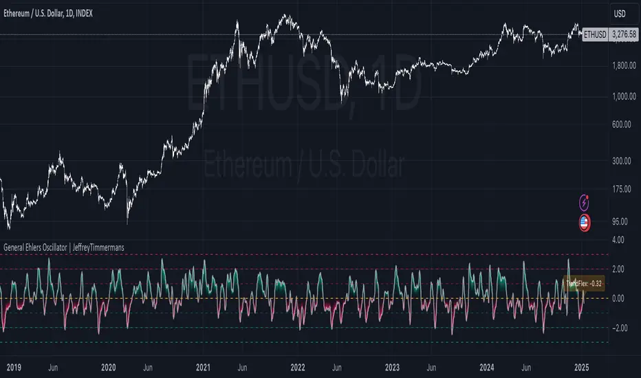
General Ehlers Oscillator | JeffreyTimmermansGeneral Ehlers Oscillator
The "General Ehlers Oscillator" is a powerful, technical indicator designed to provide traders with precise insights into market trends, reversals, and momentum. Built upon Dr. John Ehlers' innovative methodologies, this tool leverages advanced signal processing techniques to deliver near-zero lag with exceptional sensitivity to trend changes. Contact us via direct message to request access to this exclusive indicator.
Designed for multi-timeframe usability, the oscillator operates seamlessly across all intervals, from 1-second candles to monthly charts. Its outputs are normalized within a consistent range of -3.0 to +3.0, ensuring clarity and uniformity in identifying overbought, oversold, and midline conditions. With enhancements and added functionality, the General Ehlers Oscillator is a comprehensive tool for traders seeking to refine their analysis and improve trade timing.
This script is inspired by the Wizard: "ImmortalFreedom" . However, it is more advanced and includes additional features and options.
Core Methodology
The General Ehlers Oscillator employs cutting-edge techniques to enhance trend-following and reversal detection:
TrendFlex Calculation: Retains trend information while being highly responsive to reversals.
Zero-Lag Averaging: Near-zero lag processing ensures that signals are timely and reliable.
Bounded Output: Oscillator values are normalized between -3.0 and +3.0, allowing consistent interpretation across all timeframes.
Key Features
The General Ehlers Oscillator combines advanced calculations with user-friendly customization options to meet the needs of diverse trading strategies.
Adjustable Thresholds
Additional threshold levels have been introduced, offering more granular insights into overbought and oversold conditions.
Enhanced Threshold Coloring
Improved visual cues allow traders to quickly interpret the oscillator's position relative to key thresholds, making it easier to identify significant market conditions.
Dynamic Alerts
Real-time alerts provide notifications for critical events, such as midline crosses, extreme values, and reversal points, ensuring you never miss an important signal.
Dashboard Integration
The oscillator now features an integrated dashboard that displays key information at a glance. Traders can monitor critical metrics and oscillator conditions across multiple timeframes, ensuring comprehensive situational awareness.
Dynamic Label for TrendFlex
A dynamic label overlays the chart, providing immediate feedback on the oscillator’s TrendFlex readings and reinforcing its usability as a trend-confirmation and reversal tool.
Practical Applications
The General Ehlers Oscillator supports a variety of trading strategies, including:
Trend Confirmation: Use midline crossings and the slope of the oscillator to confirm ongoing trends.
Reversal Detection: Identify key turning points in the market with high sensitivity to reversals.
Mean-Reversion Strategies: Spot overbought and oversold conditions using oscillator extremes, signaling potential reversion opportunities.
Enhanced Utility
Reversal Sensitivity
The oscillator’s ability to detect reversals is enhanced by additional threshold levels and dynamic visual cues, helping traders act decisively at critical turning points.
Multi-Timeframe Consistency
With a bounded range of -3.0 to +3.0, the oscillator maintains consistent behavior across all timeframes, offering reliable insights for both intraday and long-term analysis.
Comprehensive Alerts
Set custom alerts for threshold breaches, midline crossings, and reversal signals to stay ahead of market movements.
Visual Enhancements
Improved threshold coloring and dynamic labels make interpreting market conditions faster and more intuitive, reducing analysis time and decision-making delays.
Recent Updates
The General Ehlers Oscillator has been significantly improved with the following updates:
Additional Thresholds: More thresholds have been added, providing detailed insights into varying levels of market conditions.
Enhanced Threshold Coloring: Thresholds are now color-coded with improved clarity, making it easier to identify critical zones.
Dynamic Alerts: Real-time alerts for trading, reversal points, and threshold breaches ensure timely notifications of key events.
Integrated Dashboard: The new dashboard consolidates critical information, offering a clear overview of oscillator behavior across timeframes.
Dynamic TrendFlex Label: A dynamic label overlays the chart, displaying real-time TrendFlex values and reinforcing the oscillator’s analytical capabilities.
Why Use the General Ehlers Oscillator?
The General Ehlers Oscillator combines advanced methodologies with enhanced usability, making it an indispensable tool for traders.
Advanced Signal Processing: Built on Dr. John Ehlers’ innovative techniques.
Bounded Range: Consistent performance with a normalized range of -3.0 to +3.0.
Enhanced Alerts: Stay on top of critical market events with dynamic alerts.
Visual Improvements: Clear, intuitive visuals ensure faster interpretation and decision-making.
Customizable Features: Tailor the oscillator’s behavior to suit your trading style and market conditions.
Whether you’re focused on trend-following, mean-reversion, or volatility analysis, the General Ehlers Oscillator provides the tools and insights you need to navigate complex market conditions with confidence. However, the General Ehlers Oscillator works best in trend-following regimes.
-Jeffrey
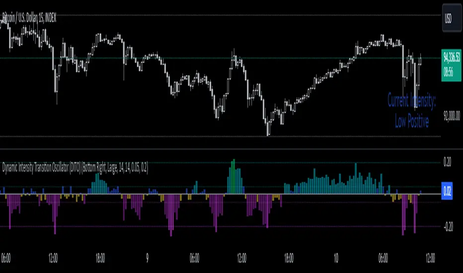
Dynamic Intensity Transition Oscillator (DITO)The Dynamic Intensity Transition Oscillator (DITO) is a comprehensive indicator designed to identify and visualize the slope of price action normalized by volatility, enabling consistent comparisons across different assets. This indicator calculates and categorizes the intensity of price movement into six states—three positive and three negative—while providing visual cues and alerts for state transitions.
Components and Functionality
1. Slope Calculation
- The slope represents the rate of change in price action over a specified period (Slope Calculation Period).
- It is calculated as the difference between the current price and the simple moving average (SMA) of the price, divided by the length of the period.
2. Normalization Using ATR
- To standardize the slope across assets with different price scales and volatilities, the slope is divided by the Average True Range (ATR).
- The ATR ensures that the slope is comparable across assets with varying price levels and volatility.
3. Intensity Levels
- The normalized slope is categorized into six distinct intensity levels:
High Positive: Strong upward momentum.
Medium Positive: Moderate upward momentum.
Low Positive: Weak upward movement or consolidation.
Low Negative: Weak downward movement or consolidation.
Medium Negative: Moderate downward momentum.
High Negative: Strong downward momentum.
4. Visual Representation
- The oscillator is displayed as a histogram, with each intensity level represented by a unique color:
High Positive: Lime green.
Medium Positive: Aqua.
Low Positive: Blue.
Low Negative: Yellow.
Medium Negative: Purple.
High Negative: Fuchsia.
Threshold levels (Low Intensity, Medium Intensity) are plotted as horizontal dotted lines for visual reference, with separate colors for positive and negative thresholds.
5. Intensity Table
- A dynamic table is displayed on the chart to show the current intensity level.
- The table's text color matches the intensity level color for easy interpretation, and its size and position are customizable.
6. Alerts for State Transitions
- The indicator includes a robust alerting system that triggers when the intensity level transitions from one state to another (e.g., from "Medium Positive" to "High Positive").
- The alert includes both the previous and current states for clarity.
Inputs and Customization
The DITO indicator offers a variety of customizable settings:
Indicator Parameters
Slope Calculation Period: Defines the period over which the slope is calculated.
ATR Calculation Period: Defines the period for the ATR used in normalization.
Low Intensity Threshold: Threshold for categorizing weak momentum.
Medium Intensity Threshold: Threshold for categorizing moderate momentum.
Intensity Table Settings
Table Position: Allows you to position the intensity table anywhere on the chart (e.g., "Bottom Right," "Top Left").
Table Size: Enables customization of table text size (e.g., "Small," "Large").
Use Cases
Trend Identification:
- Quickly assess the strength and direction of price movement with color-coded intensity levels.
Cross-Asset Comparisons:
- Use the normalized slope to compare momentum across different assets, regardless of price scale or volatility.
Dynamic Alerts:
- Receive timely alerts when the intensity transitions, helping you act on significant momentum changes.
Consolidation Detection:
- Identify periods of low intensity, signaling potential reversals or breakout opportunities.
How to Use
- Add the indicator to your chart.
- Configure the input parameters to align with your trading strategy.
Observe:
The Oscillator: Use the color-coded histogram to monitor price action intensity.
The Intensity Table: Track the current intensity level dynamically.
Alerts: Respond to state transitions as notified by the alerts.
Final Notes
The Dynamic Intensity Transition Oscillator (DITO) combines trend strength detection, cross-asset comparability, and real-time alerts to offer traders an insightful tool for analyzing market conditions. Its user-friendly visualization and comprehensive alerting make it suitable for both novice and advanced traders.
Disclaimer: This indicator is for educational purposes and is not financial advice. Always perform your own analysis before making trading decisions.
ICT Digital open Daily DividersDescription for "ICT Digital Open Daily Dividers" TradingView Indicator
Overview
The "ICT Digital Open Daily Dividers" is a versatile and comprehensive TradingView Pine Script indicator designed for traders who utilize Institutional Order Flow methodologies, particularly in ICT (Inner Circle Trader) trading. This indicator provides a structured visual framework to assist traders in identifying key daily market sessions, critical opening prices, and distinguishing different trading days, especially focusing on the Sunday open, which is a crucial element in the ICT trading strategy.
Core Functionalities
Daily Vertical Lines: The script plots vertical lines at the start of each trading day, which helps to demarcate daily trading sessions. These lines are customizable, allowing traders to choose their color, style (solid, dashed, or dotted), and width. This feature helps in visually segmenting each trading day, making it easier to analyze daily price action patterns.
Sunday Open Differentiation: Unlike many other daily divider indicators, this script uniquely provides the option to highlight the Sunday open at 6 PM EST with distinct lines. This feature is especially valuable for ICT traders who consider the Sunday open as a critical reference point for weekly analysis. The color, style, and width of the Sunday open lines can be set separately, providing a clear visual distinction from regular weekday separators.
12 AM Open Toggle: For markets that are influenced by midnight opens, the indicator includes an option to shift the daily open line to 12 AM instead of the default 6 PM. This flexibility allows traders to adapt the indicator to different market dynamics or trading strategies.
Timezone Customization: The indicator allows traders to set the timezone for the open lines, ensuring that the vertical lines align accurately with the trader’s specific market hours, whether they follow New York time or any other timezone.
Session Time Filters: The script can hide or show specific trading session markers, such as the New York session open and close, which are pivotal for ICT traders. These markers help in focusing on the most active and liquid trading times.
Customizable Style Settings: The script includes comprehensive styling options for the plotted lines and session markers, allowing traders to personalize their charts to suit their visual preferences and improve clarity.
Day of the Week Labels: The indicator can plot labels for each day of the week, providing a quick reference to the day’s price action. This feature is particularly useful in reviewing weekly trading patterns and performance.
Use in ICT Trading
In ICT trading, the concept of the "open" is fundamental. The "ICT Digital Open Daily Dividers" indicator serves multiple purposes:
Market Structure Identification: By clearly marking daily opens, traders can easily identify market structure changes such as breakouts, retracements, or consolidations around these key levels.
Reference Points: The Sunday open is often a key level in ICT analysis, serving as a benchmark for assessing market direction for the upcoming week. This indicator’s ability to plot Sunday opens separately makes it uniquely suited for ICT strategies.
Time-based Analysis: ICT methodology often involves analyzing the market at specific times of the day. This indicator supports such analysis by marking significant session opens and closes.
Uniqueness and Advantages
The "ICT Digital Open Daily Dividers" stands out from other similar indicators due to its specialized features:
Sunday Open Highlighting: Few indicators offer the capability to specifically mark the Sunday open with distinct styling options.
Flexibility in Time Adjustments: With options to adjust the open time to either 6 PM or 12 AM, this indicator caters to a broader range of trading strategies and market conditions.
Enhanced Visualization: The wide range of customization options ensures that traders can tailor the indicator to their specific needs, enhancing the usability and visual clarity of their charts.
Compliance with TradingView's Pine Script Community Guidelines
The description adheres to TradingView's guidelines by being comprehensive, clear, and informative. It highlights the utility of the script, its unique features, and its application in trading strategies without making exaggerated claims about performance or profitability. The detailed customization options and unique functionalities are emphasized to differentiate this script from other standard daily divider indicators.

[ADDYad] Google Search Trends - Bitcoin (2012 Jan - 2025 Jan)This Pine Script shows the Google Search Trends as an indicator for Bitcoin from January 2012 to January 2025, based on monthly data retrieved from Google Trends. It calculates and displays the relative search interest for Bitcoin over time, offering a historical perspective on its popularity mainly built for BITSTAMP:BTCUSD .
Important note: This is not a live indicator. It visualizes historical search trends based on Google Trends data.
Key Features:
Data Source : Google Trends (Last retrieved in January 10 2025).
Timeframe : The script is designed to be used on a monthly chart, with the data reflecting monthly search trends from January 2012 to January 2025. For other timeframes, the data is linearly interpolated to estimate the trends at finer resolutions.
Purpose : This indicator helps visualize Bitcoin's search interest over the years, offering insights into public interest and sentiment during specific periods (e.g., major price movements or news events).
Data Handling : The data is interpolated for use on non-monthly timeframes, allowing you to view search trends on any chart timeframe. This makes it versatile for use in longer-term analysis or shorter timeframes, despite the raw data being available only on a monthly basis. However, it is most relevant for Monthly, Weekly, and Daily timeframes.
How It Works:
The script calculates the number of months elapsed since January 1, 2012, and uses this to interpolate Google Trends data values for any given point in time on the chart.
The linear interpolation function adjusts the monthly data to provide an approximate trend for intermediate months.
Why It's Useful:
Track Bitcoin's historic search trends to understand how interest in Bitcoin evolved over time, potentially correlating with price movements.
Correlate search trends with price action and other market indicators to analyze the effects of public sentiment and sentiment-driven market momentum.
Final Notes:
This script is unique because it shows real-world, non-financial dataset (Google Trends) to understand price action of Bitcoin correlating with public interest. Hopefully is a valuable addition to the TradingView community.
ADDYad

Percentage Calculator by Akshay GaurThis indicator calculates and displays percentage levels above and below the current price. It allows you to easily identify any percentage levels which can be used in many things like creating strangles and straddles and make informed trading decisions. The indicator automatically adjusts and redraws the lines and labels on the latest bar to reflect real-time market conditions.
Key Features:
• Calculates percentage levels above and below the current price
• Displays percentage levels on big labels with the horizontal lines on the chart
• Allows you to adjust the percentage value and every details.
• Allows you to see Fluctuation line on the chart.
How to Use:
1. Set the percentage value to the desired level (e.g. 1%, 2%, etc.)
2. If you want to see Fluctuation lines also then turn on it from Input settings.
3. Use the displayed levels to identify desired percentage levels.
4. Make informed trading decisions based on the calculated levels

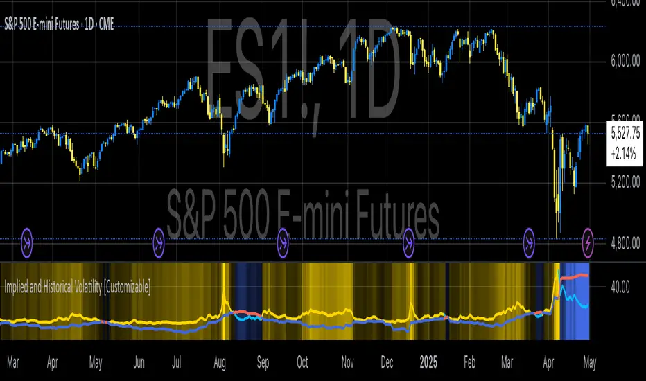
Implied and Historical VolatilityAbstract
This TradingView indicator visualizes implied volatility (IV) derived from the VIX index and historical volatility (HV) computed from past price data of the S&P 500 (or any selected asset). It enables users to compare market participants' forward-looking volatility expectations (via VIX) with realized past volatility (via historical returns). Such comparisons are pivotal in identifying risk sentiment, volatility regimes, and potential mispricing in derivatives.
Functionality
Implied Volatility (IV):
The implied volatility is extracted from the VIX index, often referred to as the "fear gauge." The VIX represents the market's expectation of 30-day forward volatility, derived from options pricing on the S&P 500. Higher values of VIX indicate increased uncertainty and risk aversion (Whaley, 2000).
Historical Volatility (HV):
The historical volatility is calculated using the standard deviation of logarithmic returns over a user-defined period (default: 20 trading days). The result is annualized using a scaling factor (default: 252 trading days). Historical volatility represents the asset's past price fluctuation intensity, often used as a benchmark for realized risk (Hull, 2018).
Dynamic Background Visualization:
A dynamic background is used to highlight the relationship between IV and HV:
Yellow background: Implied volatility exceeds historical volatility, signaling elevated market expectations relative to past realized risk.
Blue background: Historical volatility exceeds implied volatility, suggesting the market might be underestimating future uncertainty.
Use Cases
Options Pricing and Trading:
The disparity between IV and HV provides insights into whether options are over- or underpriced. For example, when IV is significantly higher than HV, options traders might consider selling volatility-based derivatives to capitalize on elevated premiums (Natenberg, 1994).
Market Sentiment Analysis:
Implied volatility is often used as a proxy for market sentiment. Comparing IV to HV can help identify whether the market is overly optimistic or pessimistic about future risks.
Risk Management:
Institutional and retail investors alike use volatility measures to adjust portfolio risk exposure. Periods of high implied or historical volatility might necessitate rebalancing strategies to mitigate potential drawdowns (Campbell et al., 2001).
Volatility Trading Strategies:
Traders employing volatility arbitrage can benefit from understanding the IV/HV relationship. Strategies such as "long gamma" positions (buying options when IV < HV) or "short gamma" (selling options when IV > HV) are directly informed by these metrics.
Scientific Basis
The indicator leverages established financial principles:
Implied Volatility: Derived from the Black-Scholes-Merton model, implied volatility reflects the market's aggregate expectation of future price fluctuations (Black & Scholes, 1973).
Historical Volatility: Computed as the realized standard deviation of asset returns, historical volatility measures the intensity of past price movements, forming the basis for risk quantification (Jorion, 2007).
Behavioral Implications: IV often deviates from HV due to behavioral biases such as risk aversion and herding, creating opportunities for arbitrage (Baker & Wurgler, 2007).
Practical Considerations
Input Flexibility: Users can modify the length of the HV calculation and the annualization factor to suit specific markets or instruments.
Market Selection: The default ticker for implied volatility is the VIX (CBOE:VIX), but other volatility indices can be substituted for assets outside the S&P 500.
Data Frequency: This indicator is most effective on daily charts, as VIX data typically updates at a daily frequency.
Limitations
Implied volatility reflects the market's consensus but does not guarantee future accuracy, as it is subject to rapid adjustments based on news or events.
Historical volatility assumes a stationary distribution of returns, which might not hold during structural breaks or crises (Engle, 1982).
References
Black, F., & Scholes, M. (1973). "The Pricing of Options and Corporate Liabilities." Journal of Political Economy, 81(3), 637-654.
Whaley, R. E. (2000). "The Investor Fear Gauge." The Journal of Portfolio Management, 26(3), 12-17.
Hull, J. C. (2018). Options, Futures, and Other Derivatives. Pearson Education.
Natenberg, S. (1994). Option Volatility and Pricing: Advanced Trading Strategies and Techniques. McGraw-Hill.
Campbell, J. Y., Lo, A. W., & MacKinlay, A. C. (2001). The Econometrics of Financial Markets. Princeton University Press.
Jorion, P. (2007). Value at Risk: The New Benchmark for Managing Financial Risk. McGraw-Hill.
Baker, M., & Wurgler, J. (2007). "Investor Sentiment in the Stock Market." Journal of Economic Perspectives, 21(2), 129-151.
BTC vs Mag7 Combined IndexThis Mag7 Combined Index script is a custom TradingView indicator that calculates and visualizes the collective performance of the Magnificent 7 (Mag7) stocks—Apple, Microsoft, Alphabet, Amazon, NVIDIA, Tesla, and Meta (red line) compared to Bitcoin (blue line). It normalizes the daily closing prices of each stock to their initial value on the chart, scales them into percentages, and then computes their simple average to form a combined index. The result is plotted as a single red line, offering a clear view of the aggregated performance of these influential stocks over time compared to Bitcoin.
This indicator is ideal for analyzing the overall market impact of Bitcoin compared to the Mag7 stocks.

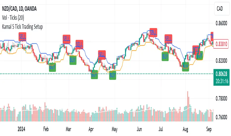
Kamal 5 Tick Trading SetupKamal 5 Tick Trading Setup
The "Kamal 5 Tick Trading Setup" is a custom indicator designed by Kamal Preet Singh Trader for TradingView to identify potential Buy and Sell signals on daily forex charts. This indicator helps traders make informed decisions based on the price action of the previous five daily candles.
Indicator Logic:
Buy Signal: A Buy signal is generated when the closing price of the current candle exceeds the highest high of the previous five daily candles.
Sell Signal: A Sell signal is generated when the closing price of the current candle falls below the lowest low of the previous five daily candles.
Features:
Lookback Period: The indicator uses a lookback period of five candles to determine the highest high and lowest low.
Visual Signals: Buy signals are plotted as green "BUY" labels below the candles, while Sell signals are plotted as red "SELL" labels above the candles.
Debugging Plots: The highest high and lowest low of the previous five candles are plotted as blue and orange lines, respectively, to help verify the conditions for Buy and Sell signals.
Non-Repetitive Signals: The indicator ensures that once a Buy signal is given, no further Buy signals are generated until a Sell signal is given, and vice versa.
Usage:
Apply the indicator to your daily forex chart in TradingView.
Observe the plotted Buy and Sell signals to identify potential entry and exit points.
Use the debugging plots to ensure the conditions for the signals are being met correctly.
This indicator provides a straightforward approach to trading based on recent price action, helping traders capitalize on potential breakout and breakdown opportunities.
Supply and Demand RebalancingPlease do not use this rudimentary script to lose money. As far as I can tell it has ZERO EDGE on its own.
Supply and Demand Pattern Detection Script
Overview
This script identifies potential supply and demand zones by detecting a specific double-wick pattern formation. It's designed as an educational tool and research aid for traders interested in price action and supply/demand concepts.
Pattern Detection
Looks for consecutive candles with long wicks (tails) that align with each other
The wicks must be larger than a specified percentile of recent wick lengths
The candle bodies must be relatively small compared to their wicks
Volume and volatility filters can be optionally applied
Higher timeframe trend confirmation is available as an optional filter
Visual Aids
Green triangles appear when a long setup is detected
Red triangles appear when a short setup is detected
Boxes show the risk zone (red) and reward zone (green)
Boxes extend until the trade reaches either its target or stop loss
A performance table shows win rate and profit factor statistics
Key Settings
1. Pattern Detection:
Wick Alignment Tolerance: How closely the wicks need to align
Min Wick Length Percentile: Minimum size requirement for wicks
Max Body/Wick Ratio: Controls maximum candle body size relative to wick
2. Additional Filters:
Volume Filter: Optional volume confirmation
ATR Filter: Optional volatility confirmation
Higher Timeframe Confirmation: Optional trend alignment
3. Trade Parameters:
Risk/Reward Ratio: Default 2:1
Bars to Wait for Outcome: How long to track trade results
Important Disclaimers
This is an educational tool and should NOT be used to trade real money without extensive testing and modification. Please do not use this rudimentary script to lose money. As far as I can tell it has zero edge on its own.
Historical backtesting results are not indicative of future performance. The script may miss some valid setups or generate false signals. Trade outcomes are simplified and don't account for:
Slippage
Trading fees
Market liquidity
Gap risk
Real-world execution challenges
Recommended Usage
Use as a learning tool to understand supply/demand concepts
Practice identifying these patterns manually
Paper trade the setups first
Combine with other forms of analysis and risk management
Consider it one tool among many, not a complete trading system
Best Practices
Always use proper risk management
Test thoroughly on demo accounts first
Keep detailed trading logs
Understand why each pattern forms
Study both winning and losing trades to improve pattern recognition
Remember: No trading script can guarantee profits. This tool is meant for educational purposes and should be part of a broader trading education and development process.

Simple Average Price & Target ProfitThis script is designed to help users calculate and visualize the weighted average price of an asset based on multiple entry points, along with the target price and the potential profit. The user can input specific prices for three different entries, along with the percentage of total investment allocated to each price point. The script then calculates the weighted average price based on these entries and displays it on the chart. Additionally, it calculates the potential profit at a given target price, which is plotted on the chart.

mr.crypto731Description:
📊 Enhanced MACD with Strong Buy/Sell Signals 🚀
This script is designed to enhance the standard MACD indicator by adding clear, strong buy and sell signals. It includes:
MACD Line: A fast-moving average that reacts quickly to price changes.
Signal Line: A slower-moving average that smooths out price fluctuations.
MACD Histogram: The difference between the MACD Line and Signal Line, helping to identify trend strength and direction.
Key Features:
Strong Buy/Sell Signals: Uses crossovers of the MACD Line and Signal Line to generate strong buy/sell signals.
Color-Coded Background: Provides visual cues with background colors to highlight strong signals.
User-Friendly Interface: Customizable settings for MACD Fast Length, Slow Length, and Signal Smoothing.

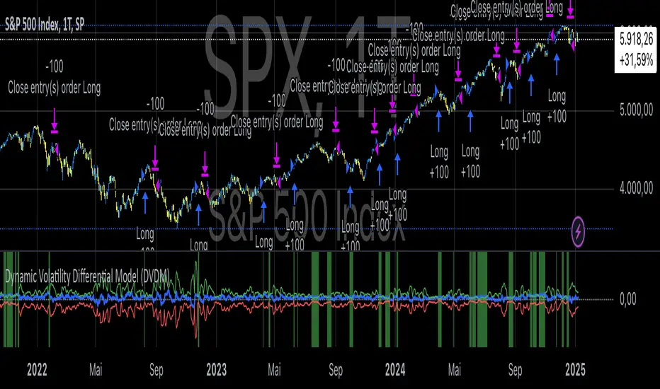
Dynamic Volatility Differential Model (DVDM)The Dynamic Volatility Differential Model (DVDM) is a quantitative trading strategy designed to exploit the spread between implied volatility (IV) and historical (realized) volatility (HV). This strategy identifies trading opportunities by dynamically adjusting thresholds based on the standard deviation of the volatility spread. The DVDM is versatile and applicable across various markets, including equity indices, commodities, and derivatives such as the FDAX (DAX Futures).
Key Components of the DVDM:
1. Implied Volatility (IV):
The IV is derived from options markets and reflects the market’s expectation of future price volatility. For instance, the strategy uses volatility indices such as the VIX (S&P 500), VXN (Nasdaq 100), or RVX (Russell 2000), depending on the target market. These indices serve as proxies for market sentiment and risk perception (Whaley, 2000).
2. Historical Volatility (HV):
The HV is computed from the log returns of the underlying asset’s price. It represents the actual volatility observed in the market over a defined lookback period, adjusted to annualized levels using a multiplier of \sqrt{252} for daily data (Hull, 2012).
3. Volatility Spread:
The difference between IV and HV forms the volatility spread, which is a measure of divergence between market expectations and actual market behavior.
4. Dynamic Thresholds:
Unlike static thresholds, the DVDM employs dynamic thresholds derived from the standard deviation of the volatility spread. The thresholds are scaled by a user-defined multiplier, ensuring adaptability to market conditions and volatility regimes (Christoffersen & Jacobs, 2004).
Trading Logic:
1. Long Entry:
A long position is initiated when the volatility spread exceeds the upper dynamic threshold, signaling that implied volatility is significantly higher than realized volatility. This condition suggests potential mean reversion, as markets may correct inflated risk premiums.
2. Short Entry:
A short position is initiated when the volatility spread falls below the lower dynamic threshold, indicating that implied volatility is significantly undervalued relative to realized volatility. This signals the possibility of increased market uncertainty.
3. Exit Conditions:
Positions are closed when the volatility spread crosses the zero line, signifying a normalization of the divergence.
Advantages of the DVDM:
1. Adaptability:
Dynamic thresholds allow the strategy to adjust to changing market conditions, making it suitable for both low-volatility and high-volatility environments.
2. Quantitative Precision:
The use of standard deviation-based thresholds enhances statistical reliability and reduces subjectivity in decision-making.
3. Market Versatility:
The strategy’s reliance on volatility metrics makes it universally applicable across asset classes and markets, ensuring robust performance.
Scientific Relevance:
The strategy builds on empirical research into the predictive power of implied volatility over realized volatility (Poon & Granger, 2003). By leveraging the divergence between these measures, the DVDM aligns with findings that IV often overestimates future volatility, creating opportunities for mean-reversion trades. Furthermore, the inclusion of dynamic thresholds aligns with risk management best practices by adapting to volatility clustering, a well-documented phenomenon in financial markets (Engle, 1982).
References:
1. Christoffersen, P., & Jacobs, K. (2004). The importance of the volatility risk premium for volatility forecasting. Journal of Financial and Quantitative Analysis, 39(2), 375-397.
2. Engle, R. F. (1982). Autoregressive conditional heteroskedasticity with estimates of the variance of United Kingdom inflation. Econometrica, 50(4), 987-1007.
3. Hull, J. C. (2012). Options, Futures, and Other Derivatives. Pearson Education.
4. Poon, S. H., & Granger, C. W. J. (2003). Forecasting volatility in financial markets: A review. Journal of Economic Literature, 41(2), 478-539.
5. Whaley, R. E. (2000). The investor fear gauge. Journal of Portfolio Management, 26(3), 12-17.
This strategy leverages quantitative techniques and statistical rigor to provide a systematic approach to volatility trading, making it a valuable tool for professional traders and quantitative analysts.
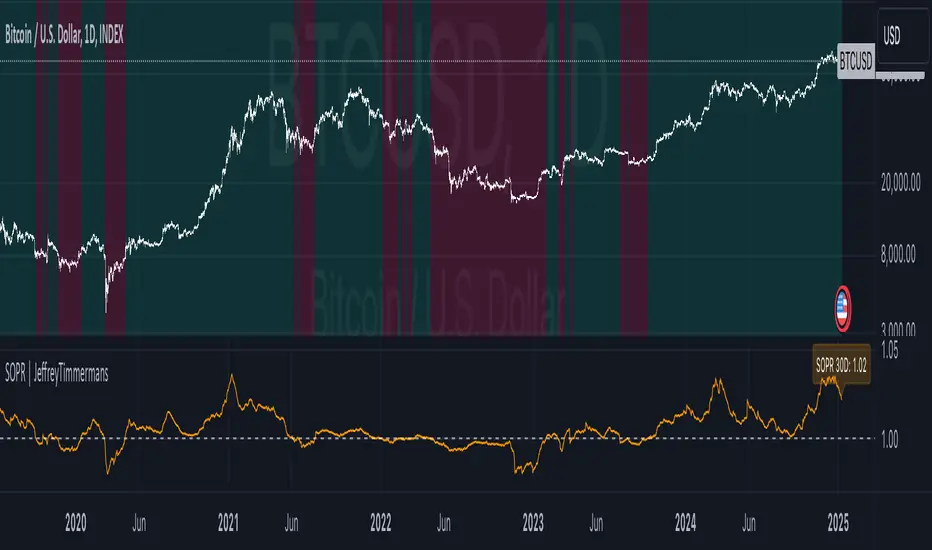
Spent Output Profit Ratio | JeffreyTimmermansSOPR
The "Spent Output Profit Ratio" , aka SOPR indicator is a valuable tool designed to analyze the profitability of spent Bitcoin outputs. SOPR is derived by dividing the selling price of Bitcoin by its purchase price, offering insights into market participants' profit-taking or loss-cutting behavior.
This script features two selectable SOPR metrics:
SOPR 30D: A 30-day Exponential Moving Average (EMA) for short-term trend analysis.
SOPR 365D: A 365-day EMA for assessing long-term profitability trends.
How It Works
Key Levels: The horizontal reference line at 1.0 acts as a critical threshold:
Above 1.0: Market participants are generally in profit, indicating bullish sentiment.
Below 1.0: Market participants are selling at a loss, often signaling bearish sentiment.
Background Colors
Green: Indicates bullish conditions when the selected SOPR value is above 1.
Red: Highlights bearish conditions when the value is below 1.
Dynamic Selection
Easily switch between SOPR 30D and SOPR 365D in the settings for tailored analysis.
Features
Customizable SOPR Selection: Toggle between 30-day and 365-day SOPR views based on your trading preferences.
Dynamic Label: A floating label displays the current SOPR value in real-time, along with the selected SOPR metric for easy monitoring.
Background Highlights: Visual cues for bullish and bearish conditions simplify chart interpretation.
Real-Time Alerts
Bullish Alerts: Triggered when the selected SOPR crosses above 1.
Bearish Alerts: Triggered when the selected SOPR crosses below 1.
Clean Visualization
The indicator includes a horizontal reference line and clear color schemes for easy trend identification.
The SOPR Indicator is an essential tool for traders and analysts seeking to understand Bitcoin market sentiment and profitability trends. Whether used for short-term trades or long-term market analysis, this script provides actionable insights to refine your decision-making process.
-Jeffrey
Market Regime DetectorMarket Regime Detector
The Market Regime Detector is a tool designed to help traders identify and adapt to the prevailing market environment by analyzing price action in relation to key macro timeframe levels. This indicator categorizes the market into distinct regimes—Bullish, Bearish, or Reverting—providing actionable insights to set trading expectations, manage volatility, and align strategies with broader market conditions.
What is a Market Regime?
A market regime refers to the overarching state or condition of the market at a given time. Understanding the market regime is critical for traders as it determines the most effective trading approach. The three main regimes are:
Bullish Regime:
Characterized by upward momentum where prices are consistently trending higher.
Trading strategies often focus on buying opportunities and trend-following setups.
Bearish Regime:
Defined by downward price pressure and declining trends.
Traders typically look for selling opportunities or adopt risk-off strategies.
Reverting Regime:
Represents a consolidation phase where prices move within a defined range.
Ideal for mean-reversion strategies or range-bound trading setups.
Key Features of the Market Regime Detector:
Dynamic Market Regime Detection:
Identifies the market regime based on macro timeframe high and low levels (e.g., weekly or monthly).
Provides clear and actionable insights for each regime to align trading strategies.
Visual Context for Price Levels:
Plots the macro high and low levels on the chart, allowing traders to visualize critical support and resistance zones.
Enhances understanding of volatility and trend boundaries.
Regime Transition Alerts:
Sends alerts only when the market transitions into a new regime, ensuring traders are notified of meaningful changes without redundant signals.
Alert messages include clear regime descriptions, such as "Market entered a Bullish Regime: Price is above the macro high."
Customizable Visualization:
Background colors dynamically adjust to the current regime:
Blue for Reverting.
Aqua for Bullish.
Fuchsia for Bearish.
Option to toggle high/low line plotting and background highlights for a tailored experience.
Volatility and Expectation Management:
Offers insights into market volatility by showing when price action approaches, exceeds, or reverts within macro timeframe levels.
Helps traders set realistic expectations and adjust their strategies accordingly.
Use Cases:
Trend Traders: Identify bullish or bearish regimes to capture sustained price movements.
Range Traders: Leverage reverting regimes to trade between defined support and resistance zones.
Risk Managers: Use macro high and low levels as dynamic stop-loss or take-profit zones to optimize trade management.
The Market Regime Detector equips traders with a deeper understanding of the market environment, making it an essential tool for informed decision-making and strategic planning. Whether you're trading trends, ranges, or managing risk, this indicator provides the clarity and insights needed to navigate any market condition.
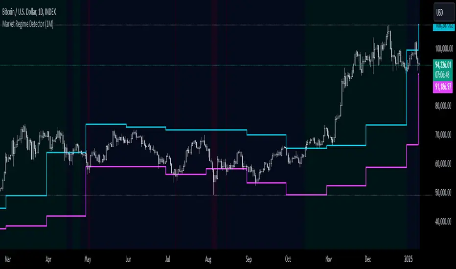
Simple COT ReportCOT Net Positions Indicator
Author: © Munkhtur
This indicator provides a comprehensive visualization of the Commitment of Traders (COT) report data, enabling traders to analyze market sentiment and positioning for key market participants.
Key Features:
Dashboard Display: Shows the net positions of Commercial, Noncommercial, and Nonreportable (Retail) traders.
Dynamic Position Tracking: Highlights significant changes in long and short positions for all trader categories based on customizable percentage thresholds.
COT Data Integration: Utilizes Legacy COT report data with clear segregation of long, short, and net positions.
Visual Signals:
Bullish and bearish trends are indicated with customizable colors for better chart visualization.
Displays "open" and "close" position changes directly on the price candles for easier tracking.
Flexible Configuration: Adjustable settings for dashboard location, text size, percentage thresholds, and color schemes.
How to Use:
Load the Script: Add the indicator to your Futures chart only by navigating to the TradingView indicators menu and selecting it from your saved scripts.
Customize Settings:
Dashboard: Enable or disable the dashboard, and set its position (Top Left, Top Right, etc.).
Data on Candle: Turn on/off the visualization of COT data changes on price candles and define the percentage change threshold to focus on significant moves.
Style Options: Customize bullish and bearish colors for better visual differentiation.
Select Trader Group: Choose from Commercial, Noncommercial, or Nonreportable positions in the settings menu to analyze the specific group of market participants.
Interpret Signals:
Green bars indicate opening long positions or bullish sentiment.
Red bars highlight opening short positions or bearish sentiment.
Yellow and purple bars signify the closure of long and short positions, respectively.
Use Cases:
Identify market sentiment shifts by observing net position changes among different trader groups.
Spot potential trend reversals based on COT data dynamics.
Use as a complementary tool to confirm your existing trading strategies.
Disclaimer:
This indicator is a tool for educational and informational purposes only. Always combine it with your own analysis and risk management strategy when trading.
