Real Success Rates of the Falling Wedge in TradingReal Success Rates of the Falling Wedge in Trading
The falling wedge is a chart pattern highly valued by traders for its potential for bullish reversals after a bearish or consolidation phase. Its effectiveness has been extensively studied and documented by various technical analysts and leading authors.
Key Statistics
Bullish Exit: In 82% of cases, the exit from the falling wedge is upward, making it one of the most reliable patterns for anticipating a positive reversal.
Price Target Achieved: The pattern's theoretical target (calculated by plotting the height of the wedge at the breakout point) is achieved in approximately 63% to 88% of cases, depending on the source, demonstrating a high success rate for profit-taking.
Trend Reversal: In 55% to 68% of cases, the falling wedge acts as a reversal pattern, signaling the end of a downtrend and the beginning of a new bullish phase.
Pullback: After the breakout, a pullback (return to the resistance line) occurs in approximately 53% to 56% of cases, which can provide a second entry opportunity but tends to reduce the pattern's overall performance.
False Breakouts: False exits represent between 10% and 27% of cases. However, a false bullish breakout only results in a true bearish breakout in 3% of cases, making the bullish signal particularly robust.
Performance and Context
Bull Market: The pattern performs particularly well when it appears during a corrective phase of an uptrend, with a profit target reached in 70% of cases within three months.
Gain Potential: The maximum gain potential can reach 32% in half of cases during a bullish breakout, according to statistical studies on equity markets.
Formation Time: The wider the wedge and the steeper the trend lines, the faster and more violent the post-breakout upward movement will be.
Comparative Summary of Success Rates:
Criteria Rate Observed Frequency
Bullish Exit 82%
Price Target Achieved 63% to 88%
Reversal Pattern 55% to 68%
Pullback After Breakout 53% to 56%
False Breakouts (False Exits) 10% to 27%
Bullish False Breakouts Leading to a Downside 3%
Points of Attention
The falling wedge is a rare and difficult pattern to correctly identify, requiring at least five contact points to be valid.
Performance is best when the breakout occurs around 60% of the pattern's length and when volume increases at the time of the breakout.
Pullbacks, although frequent, tend to weaken the initial bullish momentum.
Conclusion
The falling wedge has a remarkable success rate, with more than 8 out of 10 cases resulting in a bullish exit and a price target being reached in the majority of cases. However, it remains essential to validate the pattern with other technical signals (volume, momentum) and to remain vigilant against false breakouts, even if their rate is relatively low. When mastered, this pattern proves to be a valuable tool for traders looking for optimized entry points on bullish reversals.
Trend Analysis

S&P 500: The Indicator to Watch Right NowWith US stocks bouncing on Trump’s backtracking over tariffs — just weeks after a 20% correction — it’s fair to say caution is the name of the game. Even though the headline risk has eased slightly, markets are still navigating through a fog of geopolitical noise and economic uncertainty.
In moments like these, where the fundamental picture feels muddy at best, objective technical analysis can offer clarity — not crystal-ball predictions, but structure and focus.
The Traditional Technical Backdrop
Traditional technical analysis isn’t about magic lines on a chart — it’s about mapping out price behaviour with tools that help us stay grounded. Structural levels, trendlines, and a couple of moving averages might seem basic, but they’ve stood the test of time because they do something incredibly useful: they make sense of chaos.
In the case of the S&P 500, several key structural levels should anchor any serious analysis. We’ve got the pre-sell-off highs from February, the April lows, and two interim levels — broken support levels that flipped to resistance during retracement rallies between February and April. These levels now act like milestones in the market’s memory.
Drawing a downward-sloping trendline through the swing highs during the correction gives us a good sense of the broader downtrend. More recently, we’ve also started to see a modest uptrend emerge from the April lows. That creates something of a wedge formation — a narrowing range that’s coiling tighter as buyers and sellers battle it out.
Simple moving averages like the 50-day and 200-day are useful additions here. While they’re lagging by nature, they give us immediate context for where price sits in relation to recent momentum and long-term sentiment.
US500 Daily Candle Chart
Past performance is not a reliable indicator of future results
The Indicator to Watch
There’s a good argument to be made that the most important indicator to watch right now, with the S&P 500 trying to claw back ground, isn’t a moving average or RSI — it’s Anchored VWAP.
Anchored Volume-Weighted Average Price (VWAP) is one of the most effective ways to cut through the noise and see who’s really in control — buyers or sellers. It tells you the average price that traders have paid for the index, weighted by volume, since a specific event or turning point. And unlike regular VWAP that resets daily, Anchored VWAP lets us choose a significant date and track how price interacts with that “anchor.”
If we anchor the VWAP to the February highs, we’re essentially tracking how the market has performed relative to that peak. This anchored VWAP line becomes a kind of gravity — it reflects the average cost basis of those who bought just before the sell-off. If price remains below it, it tells us those buyers are still underwater, and therefore less likely to add risk. Sellers, in that case, still hold the advantage.
On the flip side, if we anchor VWAP to the April lows, we get the average cost basis of the recent bounce. This line reflects where more optimistic, bottom-fishing buyers stepped in. If price holds above this level, it suggests those participants remain in profit — and potentially willing to buy dips.
Right now, the S&P 500 is stuck in a battle between these two anchored VWAP levels. One tracks the pain, the other tracks the hope. It’s a VWAP funnel, and it won’t last forever. Eventually, price will break above one and leave the other behind — and when it does, we’ll have an objective answer as to which side is winning.
Will it be the late bears holding on from February’s highs, or the early bulls from the April lows? The answer is coming. Keep your eyes on the anchored VWAPs — they’re telling the real story.
US500 Daily Candle Chart
Past performance is not a reliable indicator of future results
Disclaimer: This is for information and learning purposes only. The information provided does not constitute investment advice nor take into account the individual financial circumstances or objectives of any investor. Any information that may be provided relating to past performance is not a reliable indicator of future results or performance. Social media channels are not relevant for UK residents.
Spread bets and CFDs are complex instruments and come with a high risk of losing money rapidly due to leverage. 83% of retail investor accounts lose money when trading spread bets and CFDs with this provider. You should consider whether you understand how spread bets and CFDs work and whether you can afford to take the high risk of losing your money.

How To Customize The 1 Minute Scalping IndicatorThis tutorial explains each setting of the 1 Minute Scalping Indicator in detail so you understand exactly how to adjust your settings to get the results you would like from the indicator.
Here is a list of the details we discuss:
How to fix loading errors
Tooltips that explain each setting for your reference
Trade modes and how they are affected by other settings
Average candle size rejection parameters
Higher timeframe candle filters, settings and levels
External indicator trend filtering capabilities and how to set them up correctly
Stoploss and take profit calculations and settings you can adjust
Signal arrow customization options
Candle coloring adjustments
Visual/styling options
Make sure to watch the whole video so you fully understand how each setting affects the indicator for best results.

How do I know if a day will be bullish?"Daily Bias" is one of the most asked questions by traders!
You’ve probably heard someone say:
“If only I knew where the candle would expand, I’d be rich!”
Well, today I’m sharing a framework that can help you start answering that exact question.
🚶🏽♂️Walk with me as we break down the ES Futures Daily Candle for April 24, 2024.
By the end of this video, you'll have a solid starting point to study and apply this method—
#OneCandlestickAtATime

What Is the Advance-Decline (A/D) Line, and How Can You Use ItWhat Is the Advance-Decline (A/D) Line, and How Can You Use It in Trading?
The Advance-Decline (A/D) Line is a widely used market breadth indicator that provides insights into the strength of trends by tracking advancing and declining stocks. Popular among traders analysing indices like the NASDAQ, it helps identify broad participation or hidden divergences. This article explores how this indicator works and its role in effective market analysis.
What Is the Advance-Decline Line?
The Advance-Decline (A/D) line, also known as the Advance-Decline Index, is a popular market breadth indicator used to gauge the overall health of a market's movement. Instead of focusing solely on price changes in an index, it analyses how many stocks are participating in the market's rise or fall. This makes it particularly useful for traders looking to understand whether a trend is supported by widespread participation or driven by just a handful of stocks.
The indicator can be set up based on stocks on different exchanges. For example, a NYSE Advance-Decline line provides insights into NYSE-listed stocks. However, it can be applied to any index or exchange, resulting in the Nasdaq Advance-Decline line or a line based on stocks listed in the UK, Australia, Europe, or Japan.
At its core, the A/D line is a cumulative measure of the net advances of stocks on a given day. The calculation is as follows:
1. Count the number of advancing stocks (those that closed higher than their previous close).
2. Count the number of declining stocks (those that closed lower than their previous close).
3. Subtract the number of declining stocks from the advancing stocks to get the net advance.
4. Add this net advance to the previous day’s A/D line value.
Formally, the Advance-Decline line formula is:
Net Advances = Advancing Stocks − Declining Stocks
Current A/D Line Value = Previous A/D Line Value + Net Advances
For example, if 500 stocks advanced and 300 declined on a given day, the net advance would be +200. If yesterday’s A/D Line value was 10,000, today’s value would be 10,200. Over time, these daily values form a line that tracks the cumulative net advances.
The indicator provides insights into sentiment. A rising line indicates more advancing stocks than declining ones, while a falling line suggests the opposite. Traders often use this data to determine whether a price trend in an index reflects broad strength or is being carried by a few heavyweights.
Understanding Market Breadth
Market breadth measures the extent to which individual assets are contributing to a market's overall movement, providing a clearer picture of the strength or weakness behind trends. Rather than relying solely on an index's price performance, breadth gives traders insights into how widespread participation is within a rally or decline. This information is crucial for understanding whether market moves are broad-based or concentrated in a few influential assets.
A market with a strong breadth typically sees most stocks or assets moving in the same direction as the overall trend. For example, during a rally, broad participation—where a large percentage of assets are advancing—signals a robust and healthy trend. Conversely, weak breadth occurs when only a small group of assets drives the movement, potentially indicating fragility in the trend. This is especially important in large indices where a few heavily weighted assets can mask underlying weaknesses.
How Traders Use the A/D Line
The A/D Line is more than just a market breadth indicator—it’s a practical tool traders use to gain insight into the strength and sustainability of trends. By analysing how the indicator behaves in relation to price movements, traders can uncover potential hidden opportunities and spot potential risks. Let’s consider how the Advance-Decline line behaves on a price chart.
Identifying Trend Strength
One of the A/D Line’s key uses is evaluating the strength of a market move by examining overall participation. When both the A/D Line and an index rise together, it suggests widespread buying activity, with most stocks contributing to the rally. Similarly, if both the index and the A/D Line decline, it often reflects broad-based selling, indicating that weakness is widespread across the market rather than concentrated in a few assets.
Spotting Divergences
Divergences between the A/D line and price are closely watched by traders. For instance, if an index continues to rise but the A/D line starts declining, it could signal that the trend is losing momentum. Conversely, when it begins rising ahead of a price recovery, it may suggest underlying strength before it becomes apparent in price action.
Complementing Other Indicators
Traders often pair the A/D line with other tools to refine their analysis. For example, combining it with moving averages or oscillators like RSI can help confirm signals or highlight discrepancies. A rising A/D line alongside RSI rising above 50 might reinforce the possibility of a price rise.
Strengths of the A/D Line
The A/D line is a widely respected tool for understanding market dynamics, offering insights that price-based analysis alone can’t provide. Its ability to measure participation across a broad range makes it especially valuable for traders looking to assess sentiment and trend reliability. Let’s explore some of its key strengths.
Broad Market Perspective
The A/D line captures the performance of all advancing and declining stocks within an index, offering a comprehensive view of how much support a trend has. Instead of focusing solely on a handful of large caps that often dominate indices, the indicator reveals whether the majority are moving in the same direction. This helps traders gauge the true strength of a rally or decline.
Early Warnings of Weakness or Strength
Divergences between the A/D line and the price can act as an early signal of potential changes in momentum. When the A/D Line deviates from the overall trend, it can highlight areas where market participation is inconsistent. This allows traders to assess whether a trend is gaining or losing support across a broad range of assets, offering clues about potential shifts before they fully materialise in price action.
Applicability Across Markets
Another strength is its versatility. The A/D line can be applied to indices, sectors, or even individual markets, making it useful across various trading strategies. Whether monitoring a broad index like the S&P 500 or a specific sector, the indicator can be adapted to provide valuable insights.
Limitations of the A/D Line
While the A/D line is a useful tool for analysing breadth, it isn’t without its limitations. Traders need to understand its drawbacks to use it effectively and avoid potential misinterpretations. Here are some of the key challenges to consider.
Ignores Stock Weighting
One major limitation is that the A/D index gives equal weight to every stock, regardless of size or market capitalisation. In indices like the S&P 500, where a small number of large-cap stocks often drive performance, this can create a disconnect. For example, a large-cap stock’s strong performance might lift an index while the indicator shows weakness due to low-caps underperforming.
Vulnerability to Noise
The index can produce misleading signals in certain conditions, such as during periods of low trading volume or heightened volatility. Market anomalies, such as large fluctuations in a small number of stocks, can skew the indicator and make it less reliable. This can be especially problematic in thinly traded assets or at times of high speculation.
Not a Standalone Indicator
The A/D line is combined with other tools. On its own, it doesn’t account for factors like momentum, valuation, or sentiment, which can provide critical context. Traders relying solely on it may miss out on key details or overemphasise its signals.
Comparing the A/D Line with Other Market Breadth Indicators
The A/D Line is a powerful tool, but it’s not the only market breadth indicator traders use. By understanding how it compares to other indicators, traders can select the one that suits their analysis needs or combine them for a more comprehensive view.
A/D Line vs Advance-Decline Ratio
The A/D Ratio measures the proportion of advancing to declining stocks. While the A/D line provides a cumulative value over time, the ratio offers a snapshot of market breadth for a single trading day. The A/D Ratio is often better for identifying short-term overbought or oversold conditions, whereas the A/D line excels at tracking long-term trends.
A/D Line vs McClellan Oscillator
The McClellan Oscillator uses the same advancing and declining stock data but applies exponential moving averages to calculate its value. This approach makes the McClellan Oscillator more sensitive to recent market changes, allowing it to highlight turning points more quickly than the A/D line. However, the A/D line’s simplicity and cumulative nature make it more straightforward to interpret for broader trend analysis.
A/D Line vs Percentage of Stocks Above Moving Averages
This indicator tracks the percentage of stocks trading above specific moving averages, such as the 50-day or 200-day. While the A/D line focuses on daily advances and declines, the moving average approach highlights whether stocks are maintaining longer-term momentum. The A/D line provides a broader perspective on participation, whereas this indicator zeros in on sustained trends.
The Bottom Line
The Advance-Decline line is a valuable tool for traders seeking deeper insights into market trends. By analysing market breadth, it helps identify potential opportunities and risks beyond price movements alone.
FAQ
What Is the Meaning of Advance-Decline?
Advance-decline refers to the difference between the number of advancing stocks (those that closed higher) and declining stocks (those that closed lower) on a specific trading day. It’s commonly used in market breadth indicators like the NYSE Advance-Decline line to measure the overall strength or weakness of the market.
How to Find Advance-Decline Ratio?
The Advance-Decline ratio compares advancing stocks to declining stocks in an index. It is calculated by dividing the number of advancing stocks by the number of declining stocks.
How to Use an Advance-Decline Line Indicator?
The A/D line indicator tracks the cumulative difference between advancing and declining stocks. Traders analyse its movement alongside price trends to assess market participation. For example, divergence between the A/D line and an index price direction can signal potential changes in momentum.
What Is the Advance-Decline Indicator Strategy?
Traders use the Advance-Decline indicator to analyse market breadth, identify divergences, and confirm trends. For example, a rising A/D line with an index suggests broad participation, while divergence may signal weakening trends.
This article represents the opinion of the Companies operating under the FXOpen brand only. It is not to be construed as an offer, solicitation, or recommendation with respect to products and services provided by the Companies operating under the FXOpen brand, nor is it to be considered financial advice.

Why All You Need Is the Chart: Let the Market Speak FirstYou missed the news? Doesn’t matter. The chart already heard it for you.
________________________________________
1. The Myth of Being “Informed”
Modern traders feel pressured to be constantly plugged in:
• Twitter alerts
• Trump’s latest outburst
• CNBC headlines
It feels like you’re missing out if you’re not watching everything.
But here’s the truth:
By the time you read the news, the market already priced it in.
Being "informed" doesn’t make you early . It usually makes you late .
________________________________________
2. The Chart Already Knows
Imagine a bullish surprise in the economy. You didn’t catch it live.
But when you open your chart, you see this:
📈 A bullish engulfing candle bouncing cleanly off major support.
That’s all you need. That’s your trade. You don’t need to know why it happened.
The chart speaks last. And the chart speaks loudest.
________________________________________
3. Price Is the Final Judge
All the noise — opinions, reports, breaking headlines — flows into a single output: price.
• Economic collapse? The chart shows a break.
• Political turmoil? Price still rejects resistance.
Price is truth.
Instead of asking: " What happened? ", start asking: " What is price doing? "
________________________________________
4. Real-Life Analogy
You don’t need to read the newspaper to know it’s raining. Just look out the window. 🌧️
Same with trading. Just look at the chart.
The price is your weather forecast. React to that. Not to noise.
________________________________________
5. What to Do Instead of Watching News:
• Draw clean support/resistance levels
• Wait for real confirmation (engulfings, breakouts, rejections)
• Manage risk — always
• Be patient. Let the market show its hand
________________________________________
Final Thought:
If something important happened, you’ll see it on the chart. You don’t need 10 sources. You don’t need speed. You need clarity.
Let the chart speak. It knows more than the news ever will.

Trading Tutorial Video for 25-04-2025Trading Tutorial for today on Index Nifty How one could have traded Nifty by following the process If someone is interested in trading stocks, pl leave the name of the stock in Comments section I will cover it in the video

Russia-Ukraine Peace Agreement what could it mean to forex!A peace agreement between Russia and Ukraine could send ripples through the Forex and Commodities markets. Here's how major assets might react:
📊 Key Market Shifts to Watch:
✅ Risk-On Sentiment Returns
Traders may rotate out of safe havens like USD, JPY, CHF, and Gold.
Risk currencies like AUD, NZD, and emerging market currencies could strengthen.
✅ Euro Strength Likely (EUR ↑)
Europe gains the most relief → energy prices fall, inflation cools, confidence grows.
✅ Oil & Energy Prices May Drop
Peace reduces supply fears → crude oil and gas prices could fall → impacting CAD, NOK, RUB.
🔀 Likely Forex Movements:
🔼 Pairs Likely to Rise 💡 Reason
EUR/USD Euro up on peace; USD weakens as fear fades.
AUD/JPY Aussie rises on risk appetite; Yen weakens.
EUR/JPY Similar to AUD/JPY—EUR gains, JPY loses.
NZD/JPY Risk-on favors NZD; JPY drops.
EUR/CHF Swiss Franc weakens; Euro benefits.
USD/ZAR (falls) Rand strengthens on global optimism.
🔽 Pairs Likely to Fall 💡 Reason
USD/JPY USD and JPY both weaken, but USD may drop more.
USD/CHF Same story—less demand for safe havens.
USD/RUB Ruble recovery if sanctions ease.
CAD/JPY Oil-sensitive CAD may dip slightly
🟡 What About Commodities Like Gold? (XAU/USD)
⬇️ Gold Likely to Fall
As a traditional safe-haven, Gold (XAU/USD) tends to rise during geopolitical turmoil.
Peace = lower fear = investors rotate out of Gold into riskier, yield-bearing assets.
Lower inflation expectations could also reduce demand for Gold as an inflation hedge.
🧠 Key Level Watch:
If peace is confirmed, XAU/USD could drop below key support zones, especially if USD strengthens slightly on rate differentials.
🔍 Final Thoughts:
The magnitude of these moves depends on the terms and credibility of the peace deal.
If it includes sanctions relief and long-term commitments, expect larger market reactions.
Stay alert for central bank policy shifts, especially if inflation drops.
💬 What pairs or commodities are you watching if peace becomes a reality? Drop your insights below!
📌 Follow me for more macro-FX breakdowns, commodities analysis, and trading insights.

Why Should You Care About ER?🚀 Hey Traders! Have You Ever Felt Lost in the Chaos of Market Fluctuations?
What if I told you there’s a powerful tool that can help you cut through the noise and give you a statistical edge to predict SUPPORT and RESISTANCE movements with confidence?
Let me take 5 minutes of your time to introduce you to something that could transform your trading game: Expected Range Volatility (ER) .
What is Expected Range Volatility (ER)?
The Expected Range (ER) is a framework that helps traders understand how much an asset is likely to move within a specific timeframe. Based on CME market data and Nobel Prize-winning calculations, price movements within the expected volatility corridor have a 68% probability of staying within those boundaries.
💡 Key Insight: When the price approaching certain levels, there’s a 68% chance the price won’t break through those boundaries. This means you can use ER as a powerful filter to identify more precise entry and exit points for your trades.
Why Should You Care About ER?
When I first discovered the ER tool, it felt like stumbling upon a gold mine in the trading world. Here’s why:
It’s free and available on the CME exchange’s website.
It’s underutilized —95% of traders don’t even know it exists.
It provides statistical clarity in a world full of uncertainty.
I remember the first time I used ER in my analysis—it completely changed the way I approached intraday trading. Now, I never make a trade without checking the ER data. It’s become an essential part of my strategy.
How to Use ER in Your Trading
1️⃣ Input the Data: Head over to the CME website, plug in the necessary parameters, and get your ER values.
2️⃣ Set Boundaries: Use the ER range as a guide to set potential support and resistance levels.
3️⃣ Filter Trades: Only take trades that align with the ER framework to improve your precision.
A recent example is the Japanese yen futures market.
Don't be confused by the fact that we take futures levels, it can easily be plotted on a spot chart for forex market (the dollar/yen).
Limitations to Keep in Mind
While ER is a powerful tool, it’s not a crystal ball. Here are some limitations:
Market Dynamics: Short-term price movements can be unpredictable due to sentiment, news, or economic events. ER provides a statistical estimate, but it doesn’t guarantee outcomes.
Assumptions: The formula assumes price movements follow a log-normal distribution , which may not hold true in all market conditions.
Your Turn: Are You Using ER in Your Strategy?
💭 Here’s the million-dollar question: Are you leveraging the power of Expected Range Volatility in your trading? If not, why not start today?
💬 Share your thoughts in the comments below:
Do you currently use ER or similar statistical tools?
Want to Dive Deeper?
If you’re ready to take your trading to the next level, don’t miss out on our all-in-one resource designed to help you master tools like ER and other valuable sources to gain market edge!
🔥 Remember:
No Valuable Data = No Edge!

What is ICT FVG ? – ICT Fair Value Gap Explained Step by Step !ICT FVG knowns as Fair Value Gap, is a three-candle formation having an un-retraced area between the high and low of 1st and 3rd candlestick.
A fair value gap is indicated by an imbalance and it acts as a level of support and resistance in the price chart.
This blog post will teach you all about the ICT FVG from their formation to identification and their use in trading.
You can jump to the section you are most interested in from below or can continue reading the whole article for better understanding.
Table of Contents
What is ICT FVG (Fair Value Gap)?
How to Identify an ICT Fair Value Gap?
Types of ICT FVG
(I) Bullish Fair Value Gap
(II) Bearish Fair Value Gap
ICT FVG Trading Strategy
Best Time Frame for ICT FVG Identification
Best Pair for ICT FVG Trading
Final Thoughts
What is ICT FVG (Fair Value Gap)?
ICT fair value gap is a three-candle structure indicating a gap between the high and low of 1st and 3rd candlestick.
The gap between three candles is created because price does not retrace in that area and leaves it open.
You can see the example of ICT FVG in the picture below :
ICT FVG acts as a magnet for price and price retrace back to the fair value gap to balance the price delivery.
After retracing to the FVG price then reverses and continues its trend .
How to Identify an ICT Fair Value Gap ?
To identify an ICT FVG, you need to look for a large candlestick with most body range.
After identifying the large candlestick, mark the high of candlestick prior to the large candle and low of the subsequent candlestick .
There will be a visible gap between the high and low of the two candlesticks which indicate the ICT fair value gap .
Types of ICT FVG
On the basis of price move the ICT FVG has two types which are explained below :
(I) Bullish Fair Value Gap
A bullish fair value gap in ICT terms appears during an uptrend with a three-candle pattern.
It happens when the middle candle has a large body , leaving a gap between the high of the first candle and the low of the third candle .
In an uptrend , a fair value gap can serve as strong support, with the price often retracing to fill the gap before moving higher .
You can see the example of bullish fair value gap in the picture below :
(II) Bearish Fair Value Gap
A bearish fair value gap appears in a downtrend within a three-candle pattern.
It forms when the middle candle has a large body, creating a gap between the low of the first candle and the high of the third candle .
In bearish trend a fair value gap can act as a good resistance and mostly price tends to fill this gap before moving lower .
You can see the example of bearish fair value gap in the picture below .
ICT FVG Trading Strategy
To trade using an ICT fair value gap, you need to go through below steps.
Step 1 – Determine Market Trend: First of all we need to identify the market trend of any asset whether it is bullish or bearish.
You can use ICT Daily Bias to anticipate the direction of price move.
In bullish trend price makes higher highs and higher lows, while in bearish trend price makes lower lows and lower highs
Step 2 – Identify Premium and Discount Zone: You would be looking for the premium fair value gap in bearish trend, while in bullish trend you would be looking for discount FVG.
Step 3 – Identify Large Candle:Once you have determined the trend, next step is to find a large candle with large body & small wicks.
If market is in bullish trend, we look for strong bullish candle with most body range while in bearish trend we look for large bearish candle with most body range.
Step 4 – Study Preceding & Proceeding Candles: Once you have identified one large candle, now study the one candle before it & the one candle after it.
Both of these candles should have such a structure that their bodies should not overlap the body of middle candle thus confirming a fair value gap between the wicks of first & third candle.
Step 4 – Mark Fair Value Gap: In bullish trend the gap between the high of first candle and the low of third candle.
While in bearish trend the gap between the low of first candle and the high of third candle will be marked as your fair value gap.
Step 6 – Execute the Trade: If the price is in bullish trend, we will wait for price to retrace and test the discount fair value gap to balance the move.
When price tests the discount fair value gap you can execute a buy trade with other technical confirmations like rejection or structure shift in lower time frame.
In the picture given below you can see price is in bullish trend making higher highs and higher lows.
It retraces back to test the fair value gaps and rejects from the fair value gaps, eventually going higher.
In a bearish trend, you would wait for the price to retrace up and test the premium fair value gap to balance the bearish price delivery.
When the price visits this gap, it can offer sell opportunities, especially when combined with additional confirmations like rejection or a shift in market structure.
In the image below, the market is in a downtrend, forming lower highs and lower lows.
It repeatedly tests bearish fair value gaps and rejects from these levels, leading to further price declines.
Best Time Frame for ICT FVG Identification
ICT FVG can serve different purpose, like it can be used as a tool to find the Daily Bias using higher timeframe like 1-Day.
But if you are using the fair value gap as a PD Array to find trade entry then you would be looking for a fair value gap in lower timeframes like 15-Minutes or lower than that.
Best Pair for ICT FVG Trading
Initially the ICT introduced the fair value gap using the index trading like Nasdaq and S&P-500 and it yielded best results in that market.
After that he demonstrated some examples of forex pairs using the FVG and it was equally good for that market too.
So, now a days ICT FVG serve as a key tool for traders in every market.
Final Thoughts
While trading using a fair value gap we should keep in mind that every fair value gap in the market is not tradeable , to trade using fair value gap, we should use it in conjugation with other strategies like demand & supply or support & resistance . At these levels fair value gaps can act as a more reliable tool to take a trade.
You can also check this article how traders use fair value gap to open the right trade.
Plus to mitigate your risks, you should always trade with stop loss in place as no strategy is foolproof in trading.

How To Filter Signals On The 1 Minute Scalping IndicatorThis tutorial shows you how to use external indicators to filter out signals on the 1 Minute Scalping Indicator so that you only get signals that are in the direction of the trend.
Step By Step Process:
1. Pick an external indicator that provides an output value of 1 for bullish, -1 for bearish or 0 for neutral and add it to your chart. We have multiple indicators that can do this, but you can also customize your own indicators to provide this value and use that to filter out signals.
2. Set your desired trend parameters on your external indicator and make sure that indicator is on the same chart as the 1 Minute Scalping Indicator.
3. Go to the indicator settings for the 1 Minute Scalping Indicator and turn on one of the 3 available External Indicator Filters. Then from the dropdown menu, select the external indicator you want to use and make sure to choose the output value that gives the 1, -1 or 0 output for trends. Our indicators will have an output titled "Trend Direction To Send To External Indicators" to make that value easy to find in the dropdown menus.
That's it! Let the 1 Minute Scalping Indicator reload with the external indicator trend values and it will only show buy signals during bullish trends, only show sell signals during bearish trends or no signals during neutral markets. Make sure to back test your setup until you find the best external indicators and settings to use that work best for your trading style and then apply that setup to any chart you would like.
Here is the code you can use to add a trend value to your own custom indicators and send it to the 1 Minute Scalping Indicator:
trendDirection = 0
if close > ema1
trendDirection := 1
else if close < ema1
trendDirection := -1
else
trendDirection := 0
plot(trendDirection, title="Trend Direction To Send To External Indicators", color=#00000000, display=display.data_window)
Change the (close > ema1) and (close < ema1) to use your own variables from within your script.

QUARTERLY RESULTS - HOW TO TRADE!This is an educational video explaining the set-ups to trade the quartely results.
Feedback and queries are welcome!
This video is for information/education purpose only. you are 100% responsible for any actions you take by reading/viewing this post.
please consult your financial advisor before taking any action.
----Vinaykumar hiremath, CMT

Altavics Group: Why Smart Investors Embrace CryptoVolatility Isn't the Enemy — It's the Opportunity
The crypto market is known for its fast and sharp moves. Yes, Bitcoin can drop 10% in a day. But it can also rise 40% in a month.
This is exactly why cryptocurrency remains one of the most profitable asset classes over the past decade.
At Altavics Group, we believe that fearing short-term price swings means missing out on long-term strategic opportunities.
Why Invest in Crypto?
1. Blockchain is not the future — it's already here
Web3, DeFi, and Central Bank Digital Currencies (CBDCs) are shaping a new financial system, where cryptocurrencies are the backbone of innovation.
2. Limited supply = growing value
There will never be more than 21 million Bitcoins. That makes BTC a digital equivalent of gold. In a world of inflation and excessive debt, scarcity is strength.
3. Portfolio diversification
Crypto assets help reduce exposure to traditional markets. Especially in times of geopolitical or economic instability, decentralized currencies offer a non-political, borderless hedge.
What if the market crashes?
Crypto corrections are not the end — they’re accumulation phases. Some of the best opportunities are found when the market is fearful.
Bitcoin dropped to $3,000 in 2018. Today it trades above $90,000.
Ethereum was $80 in 2019. Today it’s over $1,600.
The history of crypto is one of crashes and recoveries. Those who stay in smartly — win big.
What Altavics Group Offers
A secure, advanced platform for buying, storing, and trading cryptocurrencies
Real-time analysis and expert trading signals
Custom investment strategies aligned with your goals and risk appetite
Education for beginners and seasoned investors
Altavics Group’s Final Word
Investing in crypto doesn't mean taking blind risks. It means thinking ahead.
Those afraid of volatility today may regret missing the upside tomorrow.
Strong investors don’t chase comfort — they seek potential. And crypto is exactly that: proven potential.

Ultimate Guide to Liquidity Sweeps: Trading Smart Money MovesIn the world of Crypto and other financial markets, liquidity sweeps are deliberate price moves designed to capture liquidity sitting above or below key price levels. These moves are not random, they are orchestrated by large players who need to fill significant orders efficiently. By pushing price into zones where stop-losses and pending orders accumulate, these entities access the liquidity required to open large positions without causing excessive slippage.
Liquidity sweeps offer sharp insights into market structure and intent. Understanding how they work and recognizing them in real-time can significantly enhance a trader’s edge, especially in environments dominated by algorithmic and smart money behavior.
Defining the Liquidity Sweep
A liquidity sweep is characterized by a quick push through a well-defined support or resistance level, typically a recent high or low, followed by a swift reversal. These zones are hotspots for stop orders placed by retail traders, such as long stop-losses placed under swing lows or short stops above recent highs. When these stops are triggered, they act as liquidity pools.
Large players anticipate these zones and use them to enter positions. The sweep creates an illusion of breakout or breakdown, luring reactive traders in, only for the price to reverse direction once the necessary liquidity is absorbed. This mechanism reveals the strategic manipulation often present in efficient markets.
Structure and Behavior of a Sweep
The process typically starts with the market forming a recognizable range, often between a defined high and low. Price then consolidates or slowly trends toward one edge of the range, building tension. As the market reaches that boundary, a sudden surge beyond the level occurs, this is the sweep. Importantly, price does not sustain above or below the level. Instead, it quickly retraces, printing a rejection wick or reversal pattern.
Following the reversal, the market often resumes its original trend or begins a new leg in the opposite direction of the sweep. For traders, this offers a clear point of entry and invalidation, allowing for precise trade setups.
Bullish Scenario, Sweep of Lows
When Bitcoin approaches a prior low, especially one that marked a swing point or a support level, many traders place their stop-losses just below that low. This creates a pocket of sell-side liquidity.
In a bullish liquidity sweep, price will spike below this prior low, often triggered by a news event, a large market order, or a sudden increase in volatility. The market will quickly wick below the level, triggering stop-losses and perhaps inviting new short positions. However, instead of continuing lower, price snaps back above the broken level and begins to climb.
This reversal indicates that large players were absorbing liquidity at the lows and are now positioned long. Traders can look for bullish confirmation via engulfing candles, reclaim of the low, or a fast return into the previous range.
Bearish Scenario, Sweep of Highs
Conversely, when Bitcoin grinds higher toward a prior swing high or resistance level, traders anticipating a breakout may enter early, while others have stop-losses on short positions resting above the level.
A bearish liquidity sweep occurs when price spikes above the prior high, triggering those buy stops and breakout entries. Almost immediately, the market reverses, showing rejection at the highs. This action signals that buy-side liquidity has been used by larger players to enter short positions.
Once price fails to hold above the breakout level and begins to drop, the sweep is confirmed. Traders aligned with this read may look for bearish structure to form, such as a lower high, and enter short with a defined invalidation above the sweep.
Common Pitfalls and Misinterpretations
One of the most frequent mistakes traders make is confusing a sweep for a breakout. Liquidity sweeps are often mistaken for the beginning of a new trend leg, leading to premature entries that quickly get reversed.
Another pitfall is ignoring the broader market context. Liquidity sweeps are most reliable when they occur at logical levels aligned with higher time frame bias. Without that alignment, the sweep may simply be part of a choppy, indecisive range.
Lack of confirmation is also an issue. Entering trades immediately after a wick without seeing structure reclaim, volume shift, or candle confirmation can lead to unnecessary losses.
Confirming a Valid Sweep
To increase confidence in a sweep setup, traders should watch for several confirming behaviors. Volume often spikes during the sweep itself, followed by a drop in volatility as the market reverses. Divergences on momentum indicators like RSI or OBV can also support the idea of an exhausted move.
Most importantly, the reaction after the sweep matters more than the sweep itself. If price fails to reclaim the swept level or continues trending, the move was likely a true breakout, not a manipulation.
In high-probability sweeps, price often reclaims the level and begins forming structure in the opposite direction. Watching for breaker blocks, fair value gaps, or inefficiencies being respected in this phase can also strengthen the case for entry.
Conclusion
Liquidity sweeps are one of the clearest footprints left behind by smart money. While they can be deceptive in the moment, with enough practice and context awareness, they become one of the most powerful tools in a trader’s arsenal.
The key lies in understanding that these moves are engineered, not accidental. Recognizing where the market is likely hunting liquidity, and how it behaves after collecting it, can dramatically improve your ability to enter trades with precision, confidence, and clear invalidation.
__________________________________________
Thanks for your support!
If you found this guide helpful or learned something new, drop a like 👍 and leave a comment, I’d love to hear your thoughts! 🚀
Make sure to follow me for more price action insights, free indicators, and trading strategies. Let’s grow and trade smarter together! 📈

Market Psychology and ImpressionsHi There,
Right now, BTCUSDT looks like it’s going up, but the price movement isn’t very stable. It could still go higher—but there’s also a chance it might drop. The market is kind of in a tricky area where it’s not clear what will happen next. This is where a Fibonacci tool can be useful to spot areas of interest drawn from a High to Low and take note of 0.618 and 0.5. Never chase the market; only react. Let price come to your area and give you a clear signal in terms of higher lows and lower highs for entry with some confirmation.
This is the kind of situation where people often get caught up in FOMO, jumping in too fast because they’re afraid of missing a big move. But that can lead to getting stuck if the price suddenly moves the other way.
When the market is behaving like this—unpredictable and uncertain—it’s often better to just watch and wait.
Remember: not every move needs to be traded. Sometimes, the best position is no position at all.
Stay sharp and trade smart.
Khiwe.

Discipline in Trading: The Indicator That Works 100% of the TimeEvery trader has that one folder — “Winning Indicators,” “Secret Scripts,” or the iconic “Final Strategy v12_REAL_THIS_ONE_WORKS.” It's where we hoard indicators like Pokémon, convinced the next RSI+MACD+SMA combo tweak will finally reveal the holy grail of trading.
Spoiler: it won’t. Because the real indicator that works — actually works — isn’t on your chart. It’s not in a TradingView script. It’s not even on your screen.
But it’s there — etched into your trade history, tattooed into your losses, and reflected in your ability (or inability) to stop yourself from clicking “buy” because Elon Musk tweeted a goat emoji.
It’s called discipline . And it’s the only thing in trading that has a 100% hit rate… if you let it.
Let’s talk about why discipline isn’t just a virtue — it’s the foundation of every successful trader you admire. And why, ironically, it’s forged in the moments you want to throw your monitor out the window.
👋 Everyone’s a Genius — Until the Market Slaps You
When things are going well, discipline feels unnecessary. You enter a trade on a hunch, it flies. You skip the stop loss, and price reverses right where you “felt” it would. You’re up three trades in a row, so clearly you’ve transcended markets and deserve your own hedge fund. Right?
Until you don’t. And the one time you triple down on a loser “because it always bounces”… it doesn’t. And suddenly you're not a genius — you’re Googling how to recover a blown account and wondering if that crypto bro who offered signals still has his DMs open.
The reality is that everyone trades well in good times — bulls make money in rising markets and bears make money in falling markets. But real traders are made in the bad times. That’s where discipline is forged.
🧐 No Pain, No Gain
Here’s the deal: discipline is not something you're born with. It’s built, brick by painful brick, on the smoldering ruins of your worst trades.
The overleveraged EUR/USD short you held through an ECB rate hike? Discipline.
The meme stock you bought at the top because your barista mentioned it? Discipline.
The four back-to-back trades you entered on revenge mode after getting stopped out? Discipline — with a side of therapy.
These moments suck. But they’re also where the learning happens. You don’t develop discipline from your wins. You develop it from losses that leave a mark. The kind of mark you think about while brushing your teeth. The kind that whispers: “maybe follow the plan next time.”
🤝 Success Leaves Clues
You’ve probably heard the phrase “plan your trade and trade your plan” so many times it’s lost all meaning. But it’s the foundation of discipline. Not because rules are fun, but because rules are the only thing that can protect you from… well, yourself.
Let’s be honest — if left to your own devices, you run the risk of:
Entering too early because “it looks like it’s going to move.”
Exiting too late because “it might come back.”
Increasing the leverage because “I’m due for a win.”
Successful traders are those who follow a disciplined, rule-based approach to trading. Discipline says no. It says “this is the plan” and makes you stick to it — even when your ego is telling you to wing it. Discipline doesn’t care about your feelings. It cares about consistency. And that’s what makes it powerful.
🎯 Hedge Fund Bros Who Didn’t Win by Binge-Clicking
Let’s talk about those who actually did launch a fund — and didn’t blow it up in three months. Stanley Druckenmiller, former lead portfolio manager for George Soros’s Quantum Fund who later went on to launch his own Duquesne family office, famously said:
“The key to making money in markets is to have an opinion and to bet it big. But only when the odds are heavily in your favor.”
Notice what he didn’t say: “Click as many buttons as possible and hope it works out.”
Druckenmiller didn’t trade because he was bored. He waited. He watched. And when his setup came, he struck with discipline. Not with fear. Not with greed. With process.
If one of the greatest macro traders of all time had the patience to wait for his edge, maybe you don’t need to scalp every green candle on the 1-minute chart.
Ray Dalio — the one who built Bridgewater into a hedge fund juggernaut — doesn’t sugarcoat it: trading is hard. And mistakes are inevitable. Discipline, Dalio says, is what turns mistakes into evolution. His famous mantra?
“Pain + Reflection = Progress.”
He built a company culture (and a personal philosophy) around radical transparency — writing down every mistake, analyzing every trade, and building systems that override ego.
Most traders experience pain. Very few pause to reflect. Fewer still build processes to avoid making the same mistake twice. So next time you get stopped out for the third time in a row, don’t curse the chart. Open your journal. Write it down. Check what you missed. That’s what turns amateurs into professionals.
👀 Discipline in Trading: How It Actually Looks
Discipline isn’t glamorous. You won’t post it on Instagram (maybe it's good for LinkedIn, though). But here’s what it looks like in the wild:
Passing on a trade that doesn’t check all the boxes — even though you’re “pretty sure it’ll work.”
Taking a small win and moving on, even when your gut says to hold and “let it ride.”
Staying flat on FOMC day because you know news candles have a personal vendetta against your stop-losses.
Journaling a bad trade and owning the mistake. No excuses. Just honesty.
💪 How to Build Discipline
Building discipline isn’t about becoming a robot. It’s about creating a process that works even when your emotions don’t.
Here’s how to start:
Journal everything : Not just your trades, but your thoughts before and after. Discipline grows in awareness.
Have a checklist: Make it stupidly simple. If a trade doesn’t check every box, don’t take it.
Pre-set your risk: Before the trade. Not after. You’re not negotiating with yourself mid-trade.
Set trade limits: Three trades per day. One setup per session. Whatever keeps you from spiraling.
Take breaks: If you’re chasing losses, walk away. The markets will be there tomorrow. Will you?
📌 Final Thought: Why Discipline Works
You can have the best tools, the slickest chart setup, and the strongest trade ideas. But if you can’t follow your own rules, you won’t go far.
Discipline isn’t flashy. It doesn’t promise 1,000% returns or viral content. It just works. Quietly. Relentlessly. Predictably.
And when the market turns — because it always does — discipline is what will keep you standing.
Because it’s not the indicator that matters. It’s the trader using it.
So, be honest—where has discipline made (or broken) your trading? And what’s your best tip for sticking to the plan when your brain wants to do anything but?

What Is a PD Array in ICT, and How Can You Use It in Trading?What Is a PD Array in ICT, and How Can You Use It in Trading?
The PD array, or Premium and Discount array, is a key concept within the Inner Circle Trader methodology, designed to help traders map market movements and identify high-probability zones. By breaking down price behaviour into premium and discount levels, along with tools like order blocks and fair value gaps, the PD array provides a structured framework for analysis. This article explores its components, applications, and how traders can integrate it into their strategies.
What Is a PD Array?
An ICT PD array, short for Premium and Discount array, is a concept developed by Michael J. Huddleston, the mind behind the Inner Circle Trader (ICT) methodology. At its core, the PD array is a framework used to organise price levels and zones on a chart where significant institutional activity is likely to occur. These zones highlight areas of interest such as potential support or resistance, points where liquidity resides, or regions that might attract price movement.
The PD array divides the market into two primary zones: premium and discount. These zones help traders gauge whether the price is above or below its equilibrium, often calculated using the 50% level of a significant price range. In practical terms, prices in the premium zone are typically considered attractive in a downtrend and unattractive in an uptrend, while prices in the discount zone are more attractive in an uptrend and less attractive in a downtrend.
Beyond premium and discount zones, PD arrays include specific elements like order blocks, which are regions linked to institutional buying or selling, and fair value gaps (FVGs), which are imbalances or gaps in price that the market often seeks to revisit. Together, these elements create a structured roadmap for traders to interpret price behaviour.
Unlike a static indicator, an ICT PD array is dynamic and requires traders to interpret price movements in real time, considering the broader market context. It’s not a quick fix but a methodical approach to understanding how price delivers across different levels, offering a clearer view of where high-probability reactions could occur. The PD array is often combined with other ICT concepts, like market structure shifts or SMT divergence, to sharpen analysis and focus on precise market opportunities.
Premium and Discount Zones of a PD Array
The foundation of a PD array starts with defining the premium and discount zones. This is typically done by identifying a significant price swing—either a low to a high or vice versa—and applying a Fibonacci retracement. The 50% level of this range serves as the equilibrium point, dividing the chart into two zones:
- Premium zone: Price levels above 50%, often considered less attractive in an uptrend and more attractive in a downtrend.
- Discount zone: Price levels below 50%, seen as more attractive in an uptrend and less attractive in a downtrend.
This equilibrium acts as a baseline, helping traders assess whether the price is likely to reverse, consolidate, or continue based on its position relative to the 50% mark.
Tools Within the PD Array
The PD array doesn’t rely on a fixed set of tools. Instead, it offers a collection of components traders can use to refine their analysis. While the choice of tools can vary, they’re often ranked in a loose hierarchy, known as a PD array matrix, based on their importance within the ICT methodology. Let’s break down how this structure works.
Order Blocks
Order blocks are areas where institutional traders placed large buy or sell orders, often leading to significant price moves. On a chart, they appear as the last bullish or bearish candle before a sharp reversal. Order blocks are highly prioritised within the PD array because they indicate zones of potential support or resistance.
Fair Value Gaps (FVGs)
FVGs are gaps between price levels that form when the market moves too quickly to fill orders evenly. These imbalances create "unfinished business" in the market, and price often revisits these areas to restore balance. They are especially useful for spotting potential reversals or continuation points.
Breaker Blocks
Breaker blocks form when order blocks fail. When supply or demand zones are unable to hold and the market structure shifts, breaker blocks emerge, highlighting key levels to monitor.
Mitigation Blocks
Mitigation blocks are related to breaker blocks but form after a market structure shift, where the price makes a lower high (in an uptrend) or a higher low (in a downtrend). They function the same as breaker blocks, but the key difference is in the failure of a new high/low before the trend reverses.
Liquidity Voids
Liquidity voids are areas on the chart where there’s little to no trading activity, often following sharp price movements. These large FVGs are often revisited by price as the market seeks to rebalance liquidity, making them significant for identifying future price movements.
Rejection Blocks
ICT rejection blocks are similar in concept to order blocks but consist of the wicks present on a given timeframe where an order block could be drawn. They are essentially a refined version of an order block where the price may reverse.
Old Lows or Highs
Old lows or highs represent liquidity pools where traders place stop orders. These levels are magnets for the price, as the market often seeks to trigger these stops before reversing. Identifying these points helps traders anticipate where the price might gravitate.
Using ICT PD Arrays for Trading
Let’s consider how to use the PD array of the ICT methodology.
Evaluating Trend Structure
Before anything else, traders typically assess the broader trend by analysing highs and lows. The goal is to identify the current structure and wait for the market to form a new significant high or low that aligns with the existing trend. For instance, in an uptrend, a trader might wait for a new higher high to form, followed by a retracement.
Once the new high or low is established, traders often draw a Fibonacci retracement tool between the previous low and the recent swing high (or vice versa for a downtrend). This creates a clear division of the price range into premium and discount zones, providing the foundation of the PD array.
Retracement into the PD Array
As the price retraces within the range, traders watch for it to reach the premium zone in a downtrend or the discount zone in an uptrend. This positioning is essential—it signals that the price has reached an area where the risk-reward profile may be more favourable.
Finding Specific Setups
Within these zones, traders use the tools of the PD array to refine their approach. For instance, an FVG might act as a key level, particularly if it sits just ahead of an order block. Alternatively, a breaker block might signal a potential reversal if the price aligns with the broader trend structure. By combining these elements, traders can narrow their focus to setups that align with both the PD array and the underlying market conditions.
The Limitations of ICT PD Arrays
While ICT PD arrays offer a structured framework for analysing price behaviour, they’re not without their challenges. Traders relying on this methodology should be aware of its limitations to avoid potential pitfalls. Here are some key considerations:
- Subjectivity in Marking Zones: Identifying premium and discount zones, as well as order blocks or other components, can vary between traders. This subjectivity means that no two analyses are identical, which may lead to inconsistent outcomes.
- Experience Required: Effectively using PD arrays demands a solid understanding of market structure, liquidity concepts, and the ICT methodology. It can feel overwhelming for beginners without adequate practice.
- Higher Timeframe Dependence: While PD arrays are valuable, they’re more popular on higher timeframes. Traders focusing solely on smaller timeframes might encounter more false signals.
- Dynamic Nature: Markets evolve quickly, and PD arrays require traders to adapt in real time. This dynamic quality can be a challenge for those who struggle with decision-making under pressure.
- Overfitting Risk: With so many tools available within the ICT framework, it’s easy to overanalyse or misinterpret signals, leading to analysis paralysis.
The Bottom Line
ICT PD arrays offer traders a structured framework to analyse market movements and identify key price zones, helping them refine their strategies. By combining these arrays with other tools and techniques, traders can gain deeper insights into institutional activity.
FAQ
What Is the ICT PD Array?
The ICT PD array meaning refers to a Premium and Discount array, a trading concept developed within the Inner Circle Trader (ICT) methodology. It organises price levels and zones into premium and discount areas, helping traders analyse where the price is likely to react and reverse and place entry and exit points. The framework includes tools like order blocks, fair value gaps, and liquidity voids to identify potential areas of institutional interest.
What Is a Premium Array in Forex?
A premium array in forex refers to the portion of a price range above its equilibrium level, typically the 50% mark of a significant swing high and low. Traders consider this zone less attractive for buying, as it’s closer to overvaluation, and often watch for potential selling opportunities.
What Is a Discount Array in Forex?
A discount array is the zone below the equilibrium level of a price range. It represents a potentially more favourable area for potential buying opportunities, as prices are considered undervalued relative to the swing high and low.
This article represents the opinion of the Companies operating under the FXOpen brand only. It is not to be construed as an offer, solicitation, or recommendation with respect to products and services provided by the Companies operating under the FXOpen brand, nor is it to be considered financial advice.

The Importance of Framing a NarrativeIn this video I go through a trade setup and the importance of framing a narrative in your trading. This allows you to wait for trades to come to you, rather than making up trades out of thin air, which we all know does not usually end well.
I hope you find this video insightful.
- R2F Trading

How to use Correlation for your tradingHello,
Understanding correlation is key to elevating your trading success for two main reasons:
Avoid Trading Against Yourself: When you buy one asset and sell another that is positively correlated, you risk offsetting your gains with losses. This often results in a zero-sum outcome, as one trade may profit while the other incurs a loss. Recognizing correlated pairs helps you avoid this pitfall and trade more strategically. Using the chart below its clear that it will be unwise to sell GBPUSD while buying EURUSD since both pairs move in the same direction.
Capitalize on Lagging Pairs:
Identifying correlated pairs and their movement patterns enables smarter trading decisions. By spotting which pair tends to lead and which lags, you can focus on trading the lagging pair to increase your probability of success. While risks remain, this approach allows for more calculated and potentially profitable trades.
The charts provided illustrate the positive correlation between GBPUSD and EURUSD, showing how they move in tandem. This insight allows you to confidently buy or sell one pair based on the movement of the other, optimizing your trading strategy.
Goodluck in your trading.
Disclosure: I am part of Trade Nation's Influencer program and receive a monthly fee for using their TradingView charts in my analysis.

Best Liquidity Grab / Sweep Strategy For Trading Forex & Gold
Learn how to trade liquidity grab / sweep with multiple time frame analysis.
Discover how to combine top-down analysis and smart money concept SMC for trading forex and gold.
You will get a complete step by step trading strategy with entry, stop loss and target.
1. In order to trade liquidity grab / sweep properly, you need to find liquidity zones first.
For this trading strategy, the best liquidity zones will be on a daily time frame.
Check these 2 significant liquidity zones on EURAUD forex pair on a daily.
The zone where the selling activity concentrate will be called a supply zone. While the zone with a strong concentration of a buying activity will be a demand zone.
2. After that, you should look for a liquidity grab / sweep.
For a valid liquidity grab / sweep the daily candle should violate the liquidity zone only with the tail / wick of the candle , while the body should stay within the zone.
Above is the example of a liquidity grab of a demand zone.
While the daily candle closed within the underlined area, the wick went beyond that.
3. After you identified a liquidity grab/sweep, start analyzing lower time frames . For this strategy, the best time frames are 4H and 1H.
On these time frames, you should look for a consolidation and a formation of a horizontal range.
Here is such a range on EURAUD on a 4H.
These ranges will be used for confirmation .
Your bullish signal will be a breakout of the resistance of the range ,
it will confirm a strong buying interest after a liquidity grab.
That is the example of such a confirmation.
4. After that, set a buy limit order on a retest of a broken resistance of the range. Take profit will be the closest strong resistance, stop loss will be below the support of the range.
That is how we trade a liquidity grab/sweep of a demand zone.
With the supply zone liquidity grab trading strategy, you should wait for a bullish liquidity sweep followed by a bearish breakout of a range on a 4H / 1H time frames.
I always say to my students that a single time frame analysis is not sufficient for profitable trading SMC.
A proper combination of multiple time frames is the key to consistent profits.
Following this strategy, you should achieve up to 80% winning rate trading liquidity grabs / sweeps.
❤️Please, support my work with like, thank you!❤️
I am part of Trade Nation's Influencer program and receive a monthly fee for using their TradingView charts in my analysis.

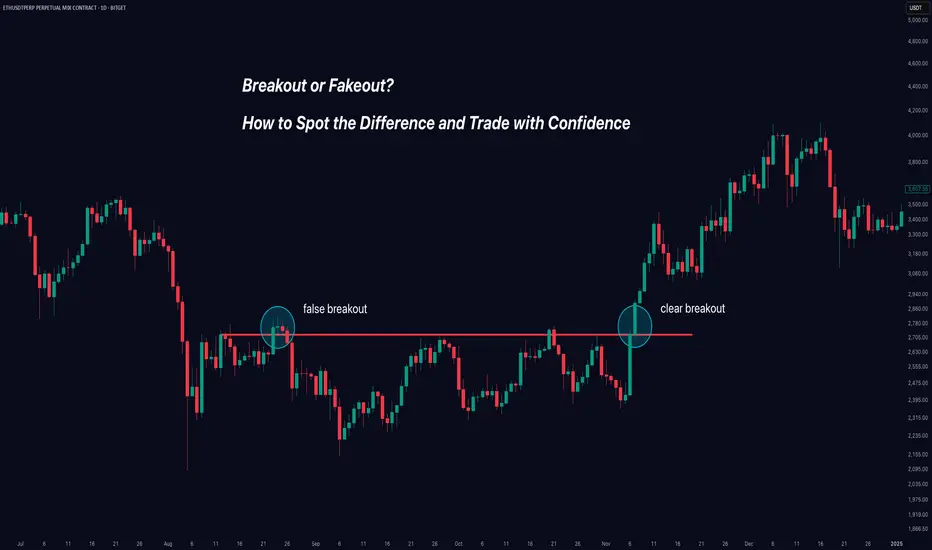
Breakout or Fakeout? How to Spot the Difference and Trade.Trading breakouts can be exciting - and profitable - when they're real. But how do you avoid getting caught in those frustrating false breakouts (fakeouts) that trap many traders?
In this clear and practical guide, you'll learn exactly how to identify genuine breakouts, avoid traps, and improve your trading decisions instantly.
Here's what we'll cover:
✅ Real Breakouts vs Fakeouts: Why it matters.
✅ Market Psychology: Why false breakouts happen.
✅ Volume: Your best friend for spotting authenticity.
✅ Price Structure & Context: When breakouts mean business.
✅ Momentum Confirmation: The hidden indicator that changes everything.
Let’s dive in!
🚩 Real Breakout vs Fakeout: Know the Difference
A breakout occurs when price decisively moves beyond a clear support or resistance level. Imagine Bitcoin breaking above $50,000 or Gold dropping below $1,900.
A fakeout happens when price briefly breaks these key levels—but quickly reverses, leaving traders stuck on the wrong side of the market.
Why it matters: Fakeouts aren't just frustrating—they’re costly. They drain your capital and confidence. Recognizing them early keeps you profitable and disciplined.
🧠 Why Do Fakeouts Happen? (The Psychology)
Fakeouts thrive because traders chase excitement and fear missing out (FOMO). Here’s the secret many traders overlook:
Bull and Bear Traps: Institutional traders deliberately push prices slightly past key levels to trigger stop orders—only to reverse the price sharply.
FOMO-driven trades: Retail traders jump in excitedly at any small breakout, providing fuel for these short-lived moves.
Understanding these tactics can help you stay calm and avoid impulsive entries.
🔥 Volume: The Ultimate Breakout Indicator
Want to know if a breakout is real? Look at volume—it reveals the market’s true intention.
High Volume: Means broad market participation and conviction, supporting a genuine breakout.
Low Volume: A red flag! This signals low market conviction and a higher likelihood of reversal.
Example: If Ethereum breaks above $4,000 with unusually high volume, that's a strong signal. But if volume remains low, beware—it's likely a fakeout.
📐 Context and Price Structure Make a Difference
Not all breakouts are created equal. Pay attention to these key context clues:
Trend Alignment: Breakouts in the direction of a clear existing trend are more reliable.
Significance of Level: Breakouts of major support/resistance levels (weekly or monthly highs/lows) have higher odds of success.
Follow-through and Retests: Genuine breakouts often retest broken levels, turning old resistance into new support.
⚡ Momentum Confirmation: Your Secret Weapon
Momentum indicators (like RSI or MACD) tell you what's happening beneath the surface. They help confirm or reject breakout validity:
Strong Momentum: If indicators confirm the breakout direction, the breakout is more reliable.
Divergence (Warning Sign): If price makes a new high but momentum indicators show lower highs, beware—a fakeout could be near.
Use momentum as your final confirmation step. It’s the missing piece that many traders ignore.
🎯 Quick Breakout Checklist
Use this simple checklist next time you're assessing a breakout:
🚦 Trade Breakouts Wisely: Final Tips
Be Patient: Waiting for breakout confirmation saves you from costly mistakes.
Set Clear Stops: If a breakout fails, exit quickly. Small losses protect your capital.
Scale into Trades: Enter gradually to manage your risk effectively.
Mind Market Context: Always align breakouts with the broader market direction.
Trading breakouts doesn't have to be stressful. When you know what signs to watch for, you trade with confidence—not guesswork.
🚀 Conclusion: Trade Better, Not Harder
Avoiding fakeouts is all about patience, confirmation, and understanding market psychology. By using volume, context, and momentum effectively, you'll greatly improve your breakout trading.
Now, put these strategies into practice. Stop guessing—start confidently trading real breakouts today!
Happy Trading!
Like this post? Follow us for more clear, actionable trading education.
#TradingTips #Breakouts #TechnicalAnalysis #TradingEducation #Crypto #Forex #StockTrading
Are You Backtesting or Backfilling Your Ego?You build the setup.
You run the test.
It’s not quite what you hoped for…
So you tweak it. Then tweak it again. Then again. And again.
Before you know it, you’re not testing a strategy anymore
you’re editing reality until it flatters you.
That’s not refinement.
That’s backfilling your ego.
The urge to make it look right
We’re human.
Nobody likes drawdowns.
Inconsistency feels uncomfortable.
And let’s be real.. win-rates under 50% just look bad.
We don’t want to see our promising idea fall apart in the data.
So instead of facing it, we start sculpting the results to make them easier to accept.
We don’t want to see our promising idea fall apart in the data.
So instead of facing it, we start sculpting the results to make them easier to accept.
Widen the stop just a little.
Tighten the take-profit, Perfect! Now my win-rate is 60%
Add a filter that “feels logical.”
Nudge the indicator setting.
Remove the choppy day, “that was news anyway.”
And just like that, the curve is smoother.
The stats are cleaner.
You feel better.
But here’s the problem:
You’re not building a strategy that works.
You’re building a strategy that looks like it works.
Optimization isn’t the enemy, but your intentions might be
Of course, tuning is part of the process.
You should test different inputs and variables.
But stop and ask yourself: why are you doing it?
If you're refining to understand the behavior of your system, that’s good.
If you're changing things to avoid discomfort? That’s not testing. That’s denial.
The market doesn’t care how hard you worked.
It doesn’t reward effort. It rewards resilience.
If your strategy only performs when everything’s perfectly aligned
when the moving average is exactly 13.53661,
and the RSI is 42.122 instead of 40,
and your entry is two bars after a wick touch…
Then you don’t have a strategy.
You have a sandcastle.
And when the tide shifts, it’s gone.
All because you wanted it to work so badly, you sculpted the data until it told you what you wanted to hear.
A strategy worth trading doesn’t just survive the good times
Anyone can build a system that performs in a trending market.
Or when volatility is ideal.
Or when the dataset ends right before the storm hits.
But markets don’t hand out clean conditions on demand.
So ask yourself:
Have you tested your strategy in stress conditions?
Have you run it through market noise, sideways action, volatility spikes, and traps?
Have you studied its worst stretch and still said, “Yes… I’d take these trades”?
Because if the answer is no, your system isn’t ready.
You’re not building a strategy to trade.
You’re building one to feel safe.. and that’s far more dangerous.
Break it before the market does
The best traders do the opposite of comfort:
They try to break their systems before live money does it for them.
Run a Monte Carlo simulation.
Shuffle the order of trades.
Randomize outcomes.
Apply slippage or missed entries.
If your equity curve collapses under that pressure, if your belief in the system evaporates when the trades aren’t perfectly sequenced, then you didn’t build robustness.
You built a lucky curve.
Loss streaks aren’t a bug, they’re the cost of playing
Too many traders design systems that avoid losing…
instead of building ones that know how to lose..
Every real edge has pain points.
Every equity curve has drawdowns.
Every stretch of performance has some ugly days.
If your backtest doesn’t show that? Be suspicious, because the market will definitely do.
So stop trying to eliminate every loss, and start asking better questions:
Where does this strategy actually break?
What’s the worst losing streak I can expect?
Can I survive that financially and emotionally?
bottom line:
It’s truth over comfort.
Clarity over illusion.
Edge over ego.
Test it honestly, or the market will ..

Am I receiving inaccurate data on my charts?
On April 9, 2025, I conducted a chart analysis and drew a vertical line labeled WLQ (Weekly Liquidity). The following week, I observed what appeared to be a wick touching the WLQ line. I initially blamed myself for being careless and possibly overlooking this detail. However, I was fairly confident that I hadn’t made such an error.
A day or two later, upon revisiting the chart, I noticed that the wick was no longer visible and that the line was placed accurately, just as I had originally drawn it. This inconsistency was quite surprising, so I took a screenshot as evidence.
Given this experience, I’m beginning to question whether I'm receiving inaccurate or inconsistent data on my charts. Has anyone else encountered something similar, or could there be another explanation for this?
