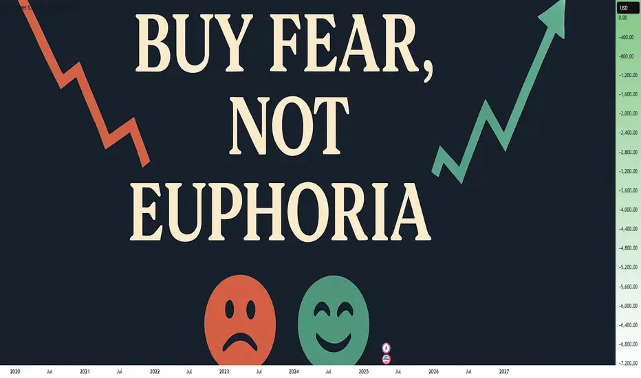
Buy Fear, Not Euphoria: The Trader's EdgeWhen you look back at the greatest trading opportunities in history, they all seem to share a common element: fear. Yet, when you're in the moment, it feels almost impossible to pull the trigger. Why? Because fear paralyzes, while euphoria seduces. If you want to truly evolve as a trader, you need to master this fundamental shift: buy fear, not euphoria.
Let's break it down together.
________________________________________
What Fear and Euphoria Really Mean in Markets
In simple terms, fear shows up when prices are falling sharply, when bad news dominates the headlines, and when people around you are saying "it's all over."
Euphoria, on the other hand, is everywhere when prices are skyrocketing, when everyone on social media is celebrating, and when it feels like "this can only go higher."
In those moments:
• Fear tells you to run away.
• Euphoria tells you to throw caution to the wind.
Both emotions are signals. But they are inverted signals. When fear is extreme, value appears. When euphoria is extreme, danger hides.
________________________________________
Why Buying Fear Works
Markets are pricing machines. They constantly adjust prices based on emotions, news, and expectations. When fear hits, selling pressure often goes beyond what is rational. People dump assets for emotional reasons, not fundamental ones.
Here’s why buying fear works:
• Overreaction: Bad news usually causes exaggerated moves.
• Liquidity Vacuums: Everyone sells, no one buys, creating sharp discounts.
• Reversion to Mean: Extreme moves tend to revert once emotions stabilize.
Buying into fear is not about being reckless. It’s about recognizing that the best deals are available when others are too scared to see them.
________________________________________
Why Chasing Euphoria Fails
At the peak of euphoria, risks are often invisible to the crowd. Valuations are stretched. Expectations are unrealistic. Everyone "knows" it's going higher — which ironically means there's no one left to buy.
Chasing euphoria often leads to:
• Buying high, selling low.
• Getting trapped at tops.
• Emotional regret and revenge trading.
You’re not just buying an asset — you're buying into a mass illusion.
________________________________________
How to Train Yourself to Buy Fear
It's not enough to "know" this. In the heat of the moment, you will still feel the fear. Here's how you build the right habit:
1. Pre-plan your entries: Before panic strikes, have a plan. Know where you want to buy.
2. Focus on strong assets: Not everything that falls is worth buying. Choose assets with strong fundamentals or clear technical setups.
3. Scale in: Don’t try to catch the bottom perfectly. Build positions gradually as fear peaks.
4. Use alerts, not emotions: Set price alerts. When they trigger, act mechanically.
5. Remember past patterns: Study previous fear-driven crashes. See how they recovered over time.
Trading is a game of memory. The more you internalize past patterns, the easier it is to act when everyone else panics.
________________________________________
A Recent Example: April 2025 Tariff Panic
Very recently, at the start of April, Trump’s new tariff announcements sent shockwaves through the market. Panic took over. Headlines screamed. Social media was flooded with fear.
But if you looked beyond the noise, charts like SP500 and US30 told a different story: the drops took price right into strong support zones.
At the time, I even posted this : support zones were being tested under emotional pressure.
If you had price alerts set and reacted mechanically, not emotionally , you could have bought into that fear — and potentially benefited from the rebound that followed just days later.
This is the essence of buying fear.
________________________________________
Final Thoughts
In trading, you are paid for doing the hard things. Buying when it feels terrible. Selling when it feels amazing.
Remember:
Fear offers you discounts. Euphoria offers you traps.
The next time the market feels like it's crashing, ask yourself:
• Is this fear real, or exaggerated?
• Is this an opportunity hiding under an emotional fog?
If you can answer that with clarity, you're already ahead of 90% of traders.
Stay rational. Stay prepared. And above all: buy fear, not euphoria.
Disclosure: I am part of Trade Nation's Influencer program and receive a monthly fee for using their TradingView charts in my analyses and educational articles.
Trend Analysis
From Scanner to Trade: Full Workflow GuidesFrom Scanner to Trade: Full Workflow Guides
Table of Contents
Introduction
Why a Full Workflow is Crucial for Consistent Trading
Step 1: Defining Your Edge-What to Scan For
Step 2: Setting Up Scanners in TradingView
Step 3: Filtering & Ranking Potential Trades
Step 4: Deep Analysis-Technical, Fundamental, and Sentiment Checks
Step 5: Planning the Trade-Entries, Exits, and Risk
Step 6: Executing the Trade and Real-Time Adjustments
Step 7: Trade Management-Monitoring and Adapting
Step 8: Post-Trade Review and Journaling
Step 9: Tips, Case Studies, and Advanced Workflows
Conclusion: Making the Scanner-to-Trade Workflow Your Own
Introduction
What separates a consistent trader from someone who hops between strategies, never seeing results? Workflow.
The difference is as dramatic as preparing a gourmet moussaka with carefully layered ingredients versus tossing random ones into a pan.
As passionate trading tool creators, we know the power of process . Yet, most TradingView users stop at scanning for new tickers, rarely following a structured approach from scanning to trade selection , execution , and review . That’s where this in-depth guide comes in.
This article will walk you through a step-by-step workflow , using TradingView’s powerful features and easy-to-follow frameworks to help you transform from a chart-hopper into a methodical trader.
Let’s get started!
Why a Full Workflow is Crucial for Consistent Trading
Before we break down the process, let’s understand why a workflow matters.
Eliminates Guesswork : A workflow ensures every trade passes the same high standards, reducing emotional decisions.
Saves Time : Systematic filtering and ranking quickly highlight the best opportunities.
Improves Results : Backtests show that traders using a structured workflow outperform those who pick trades impulsively.
Enables Review : Every step can be reviewed post-trade, so you always know what worked and what didn’t.
The workflow is your trading “recipe.” Follow it, tweak it, and the results will come.
Step 1: Defining Your Edge-What to Scan For
Your workflow begins before you scan. First, define what you want to find. Are you a breakout trader, mean-reversion specialist, or a momentum chaser? Your edge -the reason you believe you can profit-should drive every scan.
Ask Yourself:
Do I want to catch squeeze breakouts with momentum?
Am I seeking multi-timeframe trend alignment?
Are volume spikes important for my entries?
Do I care about a stock’s fundamentals or just the chart?
Case Study: Finding Squeeze Momentum Setups
Suppose you love the squeeze momentum strategy. Your scanner should look for:
Low Bollinger Bandwidth (market coiling up)
Rising momentum (e.g., MACD turning up)
Volume spike confirming interest
This is your “ingredient list”-customize it to your taste and strategy.
Step 2: Setting Up Scanners in TradingView
TradingView’s Stock Screener is powerful, yet many traders barely scratch the surface. Here’s how to go beyond the basics.
2.1 Launching the Screener
Open any TradingView chart.
Click the Screener tab (bottom panel).
Choose Stocks , Crypto , or Forex according to your focus.
2.2 Customizing Your Filters
Set market (e.g., NASDAQ, NYSE, Crypto Top 100).
Add technical filters: price change %, RSI, MACD, volume, volatility, and, if available, squeeze momentum values (e.g., your custom script output).
Add fundamental filters if needed: EPS growth, P/E ratio, market cap, etc.
Example Setup: Squeeze Momentum Breakout Scan
Market: US stocks (selected in the screener)
Liquidity Filter: Volume × Price > 100M USD (focuses on liquid stocks and avoids thinly traded names)
Volatility & Momentum Filter: Vol Change > 10% (captures stocks with significant recent movement)
Minimum Price Filter: Price > 10 USD (to avoid penny stocks and illiquid tickers)
Volatility Squeeze Condition: 1. Bollinger Bands (20, 1 day) Lower above Keltner Channels (20, 1 day) Lower, and 2. Bollinger Bands (20, 1 day) Upper below Keltner Channels (20, 1 day) Upper (classic squeeze setup: BB inside KC highlights contraction/ready-to-expand momentum)
Calibration isn't about being perfect-it's about making your tools work better for specific markets.
2.3 Saving and Automating Your Scanner
Save your screener settings as a preset ( Save Screener Template ).
Set up alerts (once this feature becomes available in TradingView) so you’ll be notified when a new ticker matches your criteria.
Step 3: Filtering & Ranking Potential Trades
Your scanner likely spits out dozens of results. Time to filter and rank them, so you focus only on the “cream of the crop.”
3.1 The First Pass-Eliminate Noise
Skip tickers with low liquidity (e.g., daily volume < 100,000 shares for stocks).
Ignore assets with unreliable price action (wide spreads, frequent gaps).
Check for major news events or earnings that could cause unexpected volatility.
3.2 Ranking Your Candidates
Prioritize by:
Strength of signal (e.g., squeeze + multi-timeframe trend alignment)
Volume surge (higher is better)
Relative strength vs. benchmark (e.g., SPY, BTC)
Proximity to strong support/resistance (closer is often better for risk/reward)
Pro Tip: Create a Scorecard
Assign 1–5 points for each criterion and total up scores for each ticker. Focus on the top 3–5 results.
Don’t just “feel” your top picks-score them for objective clarity!
Step 4: Deep Analysis-Technical, Fundamental, and Sentiment Checks
With ranked candidates, now perform a deeper dive. This is where your experience and favorite tools come into play.
4.1 Charting and Technicals
Apply your key indicators (e.g., Squeeze Mom, Power Trends, Volume Profile).
Check price structure: higher highs/lows, base breakouts, wedges, etc.
Look for confluence: do different indicators and patterns agree?
4.2 Multi-Timeframe Confirmation
Check setup validity on daily, 4H, and 1H charts.
Does the larger trend support your trade, or are you trading against momentum?
4.3 Optional: Fundamental & Sentiment Checks
Is the company reporting earnings soon? Any big news?
For crypto, is there on-chain or social sentiment you should know about?
Example Workflow:
Chart 1: Daily Squeeze setting up, MACD positive, volume picking up.
Chart 2: 1H uptrend confirmed, minor pullback for entry.
News: No earnings for two weeks-less risk of surprise.
Step 5: Planning the Trade-Entries, Exits, and Risk
Now that you have a shortlist of well-vetted opportunities, it’s time to craft a plan. Failing to prepare is preparing to fail-so we layer in precise entries, realistic targets, and robust risk management.
5.1 Entry Strategies: The Art of Timing
Your scanner found potential, but your entry determines your reward-to-risk. Here’s how to approach it on TradingView:
Breakout Entry: Place buy-stop orders just above resistance or the squeeze “release” point.
Pullback Entry: Wait for a retrace to moving average or previous support, then enter on bullish reversal candle.
Confirmation Entry: Wait for indicator confirmation (e.g., Squeeze firing, MACD cross, volume surge) before pulling the trigger.
Great entries are less about prediction and more about preparation and confirmation.
Visualizing Your Entry
Draw horizontal lines at anticipated entry points ( Alt + J hotkey). Use TradingView’s “long position” tool to visualize profit/loss zones.
5.2 Setting Targets: Aim for Realistic Wins
Don’t hope-measure! Define exits before entering so emotion doesn’t sabotage your plan.
Price Target: Project a move based on past squeeze breakouts (e.g., last breakout ranged $4, set target for similar move).
ATR (Average True Range): Use ATR to estimate typical moves and avoid setting targets too far or too close.
Fibonacci Extensions: Use Fibs to find likely resistance/support for partial profits.
5.3 Stop Losses: Defend Your Capital
Risk management is your lifeline. Set stops where the trade idea is invalidated-not just at arbitrary numbers.
Below previous support or swing low (for long trades).
At technical invalidation-e.g., squeeze fails and price dips below the setup.
ATR-based stop (e.g., 1.5x ATR below entry).
Trade Example:
Entry: Breakout above $100.
Stop Loss: $97 (previous support, 1.5x ATR).
Target: $104 (measured move from last squeeze).
5.4 Position Sizing: How Much to Risk?
Golden Rule: Risk only a small percentage of your trading capital per trade.
Standard: 1–2% of account per trade.
Use TradingView’s position tool to measure.
Calculate shares/contracts based on distance from entry to stop.
Position sizing is the invisible lever that controls your trading destiny.
Step 6: Executing the Trade and Real-Time Adjustments
Execution bridges planning and reality. Even the best plans need discipline, fast reflexes, and the willingness to adapt if markets shift.
6.1 Entering the Trade: Be Precise
Use limit or stop orders, not market orders, to avoid slippage-especially in fast-moving assets.
Review your parameters one last time.
Set alerts using TradingView’s Alarm Clock icon for your entry, stop, and target.
// Basic Alert Example in Pine Script
if (ta.crossover(ta.sma(close, 9),ta.sma(close, 21)) )
alert("Bullish crossover detected", alert.freq_once_per_bar)
6.2 Monitoring During the Trade
Keep emotions out-let the process work. However, always watch for:
Sudden news events or market shocks.
Volume surges against your position.
Reversal candles (e.g., bearish engulfing at target zone).
6.3 Adjusting On-the-Fly
Sometimes, price action demands flexibility:
Move stop to break-even once price moves in your favor.
Scale out (sell a portion) at first target, let the rest run.
Exit early if your setup is invalidated (e.g., heavy volume reversal).
Adaptation is not abandoning the plan-it’s respecting the market’s message.
Step 7: Trade Management-Monitoring and Adapting
Trade management is an art that separates amateur from pro.
7.1 Trailing Stops and Locking Profits
Use trailing stops (fixed % or ATR-based) to lock in gains if price runs well past your target.
TradingView’s “long/short position” tool helps visualize your risk/reward as price moves.
7.2 Scaling In/Out
Scale in: Add to winners on confirmed strength (e.g., after strong breakout retest).
Scale out: Sell partial positions at key resistance/fib levels.
7.3 Dealing With Adverse Moves
If stop hit, close trade-review, don’t revenge trade.
If setup changes dramatically (e.g., news reversal), consider exiting early.
The best traders protect profits, not egos.
Step 8: Post-Trade Review and Journaling
By now, you’ve completed the trade-but the learning (and edge-building) is just beginning.
8.1 Review Every Trade: The Secret to Improvement
Did you follow your plan? If not, why?
What worked? What didn’t?
Were your scanner criteria effective?
Was your sizing/risk on point?
8.2 Journaling Your Workflow
Create a trade journal, either in TradingView’s notes or external tool (Notion, Google Sheets, etc.)
Screenshot entry/exit with annotations.
Log your scanner triggers and reasoning.
Add psychological notes: Were you calm or emotional?
Tag setups: “Earnings Squeeze,” “Breakout,” etc.
A detailed journal is your best trading mentor.
8.3 Performance Analysis
Periodically review your logs to spot patterns:
Which setups yield best R/R?
Where do you most often break your rules?
How does time of day/market impact outcomes?
Step 9: Tips, Case Studies, and Advanced Workflows
9.1 Expert Tips for Workflow Success
Automate alerts for scanner triggers-don’t stare at screens all day.
Batch your research (e.g., scan every evening, then focus only on finalists).
Develop a pre-trade checklist (see sample below).
Refine regularly: Tweak scanner filters as markets evolve.
// Sample Pre-Trade Checklist as Comments
// 1. Is the squeeze setup clear on multiple timeframes?
// 2. Is volume confirming the move?
// 3. Any major news/earnings ahead?
// 4. Stop loss + target realistic?
9.2 Real-World Case Study: Squeeze Momentum on TSLA
Imagine your scanner spits out NASDAQ:TSLA due to a tight squeeze and surge in volume.
Analyze the chart: Daily chart shows a strong squeeze setup with multi-timeframe squeezes firing bullish momentum (see the MTF Squeeze dashboard and green histogram). Volume spikes confirm buying interest. The 4H and daily timeframes are both aligned to the upside.
Check Earnings: Earnings are 30 days away, reducing the risk of event-driven surprises.
Trade Setup: Set entry just above the most recent swing high ( $197.5 ), with stop-loss below the support and squeeze base ( $186 ). The initial profit target is set at a measured move near $220 (prior swing high resistance and typical squeeze expansion).
Manage the Trade: Enter on breakout above $197.5; once price reaches around $208–$210, move stop to break-even. As price hits $220, sell half and trail the remainder using the 4H ATR or dynamic support.
Journal: “Setup fired as per screener and indicator alignment: volume spike, momentum, and squeeze breakout confirmed. Exited partial at target, managed risk throughout.”
9.3 Advanced: Multi-Timeframe, Multi-Asset Workflow
Combine scans across different assets (stocks, crypto, forex) using saved screener presets for catching opportunities globally. Create custom “watchlists” for different strategies, and rotate focus based on market conditions.
Stocks: Focus on squeeze breakouts.
Crypto: Seek mean reversion in sideways markets.
Forex: Look for multi-timeframe trend alignment.
Conclusion: Making the Scanner-to-Trade Workflow Your Own
Trading is not about prediction, but process. The difference between hope and edge is workflow-layered, adaptable, and reviewable.
By mastering the scanner-to-trade workflow, you can:
Act with confidence, not hesitation.
Avoid missed wins and costly emotional losses.
Turn complexity into clarity-one structured step at a time.
Start simple, layer in complexity as your skills grow, and let your journal be your improvement compass. The recipes here are just a foundation-make them your own, adapt them for your tools, markets, and goals.
Your next high-quality trade is just a repeatable workflow away.
Happy trading and happy building!

TWAP and Chaikin's Osc vs VWAP Orders and VWAP IndicatorThere are two primary Order Types that the Professional Side of the market use.
1. Time Weighted at Average Price, aka TWAP , is used extensively by the Dark Pool Buy Side, Derivative Developers, and Sell Side Banks of record for Buybacks for corporations.
The TWAP can be set at a penny to few pennies spread and pings and transacts on a specific TIME to PRICE. It can be set to time intervals shorter or longer. This is why the stock market is called "fully automated".
TWAP is used most of the time. It is rare for the Giant Institutions to use VWAP orders due to the May 2010 FLASH CRASH when a fundamental trader of e-minis accidentally hit the VWAP order type rather than the TWAP order type which caused a massive collapse of all stocks as VWAPs accelerate selling as volume increases.
2. Volume Weighted at Price or VWAP is ALSO an ORDER TYPE. It is primarily used by Small Funds Managers and Small Asset Managers who are independents trading their customers' investment money actively, often intraday. Volume Weighted at price ORDER TYPES are also automated and ping to trigger the order to transact as volume increases.
This is an easy, simple way for a busy small fund manager to cope with the complexity of buying and selling stocks with 10,000 share lots to 100,000 share lots. These are the NEW "whales" of the market.
Professional Traders Swing trade 1 million to 5 million or higher share-lot sizes. The size of the orders of the professional trader has increased significantly in the past decade.
All of you need to be aware of the market participants on the professional side as they control 80% of the 1 trillion dollars that exchange hands daily on the US Markets.
Using Chaikin's Oscillator is ideal for tracking the Dark Pool Buy Side who create the bottoms. This excellent indicator analyzes all 3 data sets: price, volume and time. Thus, it can signal early that the Dark Pools have slowly started to accumulate over time and the runs down will turn into a bottom and then pro traders will nudge price to inspire VWAP orders from the Smaller funds managers.
The VWAP INDICATOR is excellent for tracking the smaller funds managers' trading activity and it ALSO has price, volume, and time in the formula. So this is great for those of you who need an indicator for following smaller funds activity as these smaller funds VWAP orders trigger more and more volume and then runs that can move up or down for several days.
TradingView has an awesome group of indicators to use. You should customize your indicators to which market participant groups you wish to track so that you can be ready and in a position before the big runs up or down.
Trade Wisely,
Martha Stokes CMT

HOW-TO: Use the Camarilla Pivots & BBT Strategies indicatorThis how-to shows the Camarilla Pivot & BBT Strategies indicator in action, the 5-minute timeframe is ideal for this. It shows the price action reacting to the HA play (S3 to R3 traversal). The "H" means that the ticker is in a Higher range on this day, the "A" refers to the label on the strategy in the image. In fact, the price does past R3 (which is the exit point) and reaches R4, at which point it trigger the "E" play, which is an R4 extreme reversal. A great trade, if you took it!

It’s Not Always the Strategy — Sometimes It’s the Wrong PairMany traders endlessly tweak their strategies, thinking small losses or missed trades are always a sign the system itself is broken. But in reality, sometimes the real problem isn't the strategy — it's the market you're applying it to.
Different forex pairs have different "personalities." Some are cleaner, trending smoothly with respect to structure, while others are choppier, heavily manipulated, or extremely news-sensitive. A structure-based strategy might perform well on pairs like GBP/JPY, where price respects support, resistance, and supply-demand zones cleanly. But the same strategy could struggle badly on a pair like EUR/USD, where high liquidity and institutional manipulation cause frequent fakeouts and liquidity sweeps.
Choosing the right pair for your strategy is just as important as the rules of the system itself. A good strategy in the wrong market will feel like a broken strategy. Before doubting your edge, ask: "Am I applying my system in the right place?"
Adapt your focus. Match your strategy with a market that suits its nature — and you'll be surprised how much smoother your trading becomes.
#forex #tradingpsychology #forexeducation #gbpjpy #eurusd #forextrading #tradingview

Gambling Is Not Trading : A Quick Reminder to THINKI've been getting quite a few messages from followers and many are positive. I seems my videos are helping many of you learn better skills and helping you find profits from these bigger price swings.
But it also seems some of you are really gambling for the bigger gains with 0DTE options and taking excessive risks (IMO).
I want to urge all of you to THINK and to try to learn to adopt a more fluid style of trading.
The markets will quickly humble many of you gamblers. They have a way of taking everything you have when you let your guard down.
Start Small.
Build Your Skills.
Learn How To Check Yourself When You Get Into That Gambling Mode.
Remember, The Market Can Take EVERYTHING (And MORE).
The trick to trading is to learn to GROW your account without gambling. It is like being a Sniper.
You have to learn when to take your shot and you also have to learn when to be patient and wait.
One of the best pieces of advice I've heard came from a friend (who trades options). He stated.
Start Small
Book Winners Quickly
Book Anything over 20-25%
-- Then Plan For The next Attack.
Think about it.
He's been trading for more than 20 years and has learned many of the pitfalls over that time. And, he is the one guy that I've seen generate 100-200%+ a week (consistently) over the past 2+ years.
If you want to survive as a trader, you have to start thinking like a trader (not a GAMBLER).
I hope this video helps.
Get some.
#trading #research #investing #tradingalgos #tradingsignals #cycles #fibonacci #elliotwave #modelingsystems #stocks #bitcoin #btcusd #cryptos #spy #gold #nq #investing #trading #spytrading #spymarket #tradingmarket #stockmarket #silver

Visa-Ripple Partnership Could Spark a Significan from Trenovia GThe financial world is undergoing a period of active transformation, and one of the most talked-about developments is the potential partnership between Visa and Ripple. According to a new analytical report by Trenovia Group, such a strategic collaboration could act as a catalyst for a substantial rise in Visa's stock value in the coming months.
Key Growth Drivers
Trenovia Group analysts emphasize that integrating Ripple’s technologies into Visa’s ecosystem would dramatically enhance the speed and reduce the cost of international transactions. RippleNet, built on blockchain technology, offers unique advantages: near-instant settlements, greater transparency, and lower fees compared to traditional interbank systems.
Partnering with Ripple would provide Visa with a powerful technological upgrade, reinforcing its dominance in the payment solutions market, particularly in cross-border transfers.
Expected Market Reaction
According to Trenovia Group, even the announcement of such a partnership could trigger a strong positive reaction from investors. In an increasingly competitive payments landscape, adopting blockchain innovations would be seen as a forward-looking move, enhancing Visa’s market appeal.
Technical analysis also points to favorable conditions: Visa shares are maintaining solid support around $260, and the formation of a "bullish flag" pattern suggests the potential for a breakout following positive news.
Strategic Importance of the Alliance
Trenovia Group highlights the long-term strategic benefits of this union. As digital currencies and decentralized payment systems gain traction, the integration of blockchain-based solutions would ensure Visa’s adaptability to evolving market and regulatory demands.
Meanwhile, Ripple would gain access to Visa’s vast global client network, boosting its position as a leader in the corporate cross-border payments sector.
Conclusion
According to Trenovia Group’s forecast, the Visa-Ripple partnership could provide a powerful boost to Visa’s stock. Upon successful integration of RippleNet technologies, analysts project a 15–25% rise in Visa's share price within the first six months after the announcement.
For investors, this could represent a rare opportunity to invest in the expansion of the world’s leading payment platform during a crucial phase of digital transformation.

Solvery IG Predicts Bitcoin to Reach $105,000 by May 10, 2025The cryptocurrency market continues to surprise even the most seasoned investors. Against this backdrop, the analytical firm Solvery IG has released an ambitious forecast: according to their calculations, Bitcoin's price could reach $105,000 by May 10, 2025.
Factors Supporting Bitcoin's Growth
In recent months, the market has shown strong positive momentum. Several key factors have contributed to this trend:
Institutional Investments: Major banks, funds, and corporations are increasingly incorporating Bitcoin into their portfolios as a hedge against risks.
Macroeconomic Instability: Inflationary pressures and weakening fiat currencies are driving investors to seek alternative assets.
According to Solvery IG experts, it is the combination of these factors that creates a "perfect storm" for the continued growth of the leading cryptocurrency.
Analysis and Potential Risks
Despite the optimistic forecast, potential threats should not be overlooked. The cryptocurrency market remains highly volatile. Possible tightening of regulations in the U.S. and Europe, as well as sudden shifts in Federal Reserve policies, could exert downward pressure on the market.
Nevertheless, Solvery IG highlights a crucial technical point: according to their data, Bitcoin has successfully held above key support levels between $60,000 and $65,000. This indicates strong buyer sentiment and supports expectations for a continued upward trend.
The impact of the halving event, which occurred in April 2024, should also be taken into account. Historically, Bitcoin has shown significant growth 12–18 months following a halving, and the current market behavior aligns closely with these cyclical patterns.
What This Means for Investors
If Solvery IG’s forecast comes true, Bitcoin would achieve more than a 50% increase compared to current levels. This presents significant opportunities for long-term investors. However, experts advise exercising caution, diversifying risks, and avoiding allocating all funds to a single asset.
Cryptocurrencies remain high-risk instruments, and successful investing requires a deep understanding of the market and a realistic assessment of all potential scenarios.
Conclusion
Solvery IG’s prediction of Bitcoin reaching $105,000 by May 10, 2025, sounds promising, especially given the positive momentum in recent months. However, investors should always remember: high returns come with high risks.

The Gold-Silver Ratio ExplainedCOMEX: Micro Gold Futures ( COMEX_MINI:MGC1! ), Micro Silver Futures ( COMEX_MINI:SIL1! )
The Gold-Silver Ratio is a financial term that measures the relative value of gold to silver. Specifically, how many ounces of silver it takes to buy one ounce of gold.
The Gold-Silver Ratio is an important tool for traders and investors. It has been used to indicate the market sentiment towards these two precious metals. A high ratio suggests that gold is more valued than silver, often seen during economic turmoil or when investors seek safe-haven assets. On the contrary, a lower ratio implies that silver is gaining value relative to gold, which normally occurs during periods of economic growth and strong industrial demand.
The ratio fluctuates over time due to supply and demand dynamics, geopolitical events, and changes in the global economy. By analyzing the ratio, traders can make informed decisions about when to buy or sell. This ratio reflects not only the market’s valuation of these metals but also an instrument for profit-making in the commodities market.
Historical Gold to Silver Ratio
Since 2000, the Gold-Silver Ratio has seen considerable fluctuations, reflecting various economic and market conditions. In the first decade of the 21st century, the ratio hovered around 65:1, meaning it took 65 ounces of silver to buy one ounce of gold.
However, the ratio has spiked during times of economic uncertainty. For example, during the financial crisis of 2008, the ratio reached highs not seen in decades. More recently, in the wake of the COVID-19 pandemic and the ensuing economic turmoil, the ratio surged, at one point exceeding 110:1 in 2020, indicating a strong preference for gold as a safe-haven asset compared to silver.
Over time, the Gold-Silver Ratio has been trending up, meaning gold has gained value at a faster pace compared to silver.
As of last Friday, gold is trading around all-time high at $3,330, while silver is quoted at $33.0. This makes the Gold-Silver Ratio almost exactly at 100.
When to Buy and Sell based on the Gold-Silver Ratio?
The decision to buy or sell the ratio hinges on interpreting its current value in the context of historical trends and market conditions.
When to Buy Silver: A high Gold-Silver Ratio, typically at or above the 90:1 mark, suggests that silver is undervalued relative to gold. This is often interpreted as a buying signal for silver. In such scenarios, silver is cheaper than gold, and investors may see it as an opportunity to purchase silver at a relatively low price. The rationale is that if the ratio decreases, the relative value of silver will increase compared to gold, potentially leading to significant gains.
When to Sell Silver/Buy Gold: Conversely, when the Gold-Silver Ratio is low, say around 50:1, it indicates that silver is relatively expensive, or gold is undervalued. In such situations, investors might consider selling silver and buying gold. The expectation is that the ratio will normalize or increase, meaning that gold’s value could rise relative to silver, offering a favorable return on the gold investment.
The Gold-Silver Ratio can be a valuable indicator of when to buy or sell gold and silver. However, since the ratio is not stable but upward trending over time, we could not use a mean-reversion strategy. The price band for normal, high and low ranges should be updated regularly.
Trade Setup with Micro Gold and Silver
Traders could deploy the Gold-Silver Ratio trading strategy using COMEX Micro Gold Futures ( AMEX:MGC ) and Micro Silver Futures ( AMEX:SIL ). The big advantages of using futures contracts are capital efficiency and leverage.
MGC contracts have a notional value of 10 troy ounces of gold. With Friday settlement price of $3,330.7, each June contract (MGCM5) has a notional value of $33,307. Buying or selling one contract requires an initial margin of $1,500 at the time of writing.
By putting a deposit equivalent to less than 0.5 ounce, traders could gain the full exposure to 10 ounces of gold. If gold prices move up by 5%, a long futures position would double in value (= (33307*0.05) / 1500 = 111%). This futures contract has a built-in leverage of 22:1.
Conversely, Micro Silver (SIL) contracts have a notional value of 1,000 troy ounces of silver. With Friday settlement price of $33.02, each June contract (SILM5) has a notional value of $33,020. Buying or selling one contract requires an initial margin of $3,000 at the time of writing.
By putting a deposit equivalent to 91 ounces, traders could gain the full exposure of 1,000 ounces of silver. If silver prices move up by 5%, a long position in Micro Silver futures would gain 55% (= (33020*0.05) / 3000). This futures contract has a built-in leverage of 11:1.
Micro gold futures (MGC, 10 oz) contracts tap into the deep liquidity of standard-size gold futures contracts (GC, 100 oz). As of last Friday, GC has an open interest (OI) of 447,356 contracts, while the OI for MGC is 44,449, according to data from CME Group.
The OI for standard Silver Futures (SI, 5000 oz) and Micro Silver Futures (SIL, 1000 oz) are 154,276 and 12,345, respectively.
Happy Trading.
Disclaimers
*Trade ideas cited above are for illustration only, as an integral part of a case study to demonstrate the fundamental concepts in risk management under the market scenarios being discussed. They shall not be construed as investment recommendations or advice. Nor are they used to promote any specific products, or services.
CME Real-time Market Data help identify trading set-ups and express my market views. If you have futures in your trading portfolio, you can check out on CME Group data plans available that suit your trading needs www.tradingview.com

Why does it always go against you? You might be new to trading, you may have several years of experience. But, where a lot of people still seem to go wrong is in not realising the relationships.
I have posted hundreds of educational posts here on Tradingview from cartoons, trying to simplify techniques through to market relationships between technical systems such as Elliott Wave and Wyckoff.
Many new traders fall foul of social media posts covering "SMC - Smart Money Concepts" and are not seasoned enough to appreciate what or why these can work for some and not for others.
You have Elliott Wave traders, there is a saying along the lines of "if you put 10 Elliott traders in a room searching for a wave count you will come out with 11 different answers"
This isn't to say Elliott doesn't work, nor Smart Money.
The market seeks liquidity, it forms seemingly complex patterns that humans try to make sense of. We are great at that, seeing patterns even if they are not there. - Look, there's an upside-down butterfly 1.618 extension!
First, you need to appreciate Elliott Wave counts on smaller timeframe are pointless, especially in the age of algo's and bots. However, sentiment on the larger timeframes can't really be spoofed.
In this first image; you can see a market wave that is straight out of a textbook.
Let's also add some Wyckoff; if you were to visualise this - Wyckoff schematics would be visible on smaller timeframes, the Green boxes represent accumulation and the Red show distribution.
Let's overlay and Elliott Wave count -
Take that to the next level, this count is only part of a higher fractal count.
How does this fit into smart money concepts? well, it's more like - How does Smart Money fit into this?
Elliott waves and Wyckoff have been around for over 100 years. Many of the techniques shown on YT video's today can be traced back to these older concepts.
Now, if you can see how a 1-2 EW count pushes up for a 3. You can zoom in again and start to see what to expect when trading using SMC.
In this image you can see a drop, then a gap as price pushes back up (I haven't bothered drawing wicks for simplicity assume their inside the box)
Many traders would now anticipate a move that looks something like this.
Only to see price do this
Yeah - you're not the only one!
The next issue is where and how Supply and Demand is drawn.
Ok, the gap didn't hold, it must be the demand level there. GO AGAIN!!!
How did that play out? Trade 1, Trade 2 =
What about now?
Price holds the support
This time you are afraid to go in. Then one of two things happens.
1)
Or
2)
In the first image, we can see a sweep of prior liquidity and that creates momentum for a move up. In the second image, price simply melts away.
This is an easy fix. It all comes down to understanding what the charts are trying to tell you.
People love to talk about how "Smart Money" is the banks and institutional players - how they are playing against you on every click of the button.
The truth is, most people don't understand the market.
When larger players enter the market, the can leave a pretty obvious footprint. In addition to that - they leave behind orders they had but were unable to fill. These orders they will be defended with even more buying or selling (if they need to), and this is the premise for a rally and pullback or a drop to pullback.
Now, visualise a 1-2 Elliott Wave move. Why do you think 2 often comes back so deep?
What would you expect the move from 2-3 to do?
Powerful push, yes?
In this image, the move that created demand is simply the opposing colour candle before the power play. The significant move pushed up (showing institutional involvement). Hence, a location they will likely defend.
In addition to the push up, they pushed with so much money - it created a natural gap.
This type of example doesn't always have to be a power play 1-5 up, it could be visualised on pullback moves too.
Here's a great example recently on Euro.
The demand candle 'buy before the sell" is clearly targeted on the way up. Price fails to close above it, drops, goes back to retest - sweeps and drops. If you were to zoom in you will see on smaller timeframes evidence of a Wyckoff schematic with a UTAD.
Add a volume profile there.
As the price breaks above, after it's pullback you can see an acceleration in price and of course the area has the PoC.
Back to where people go wrong.
They will see this GAP created and assume price will come back here to reject and go. However, look closer and the demand that started the move is very near that gap.
Where is the juicy liquidity? PoC is another little clue.
Let's take this to another level.
In this image I have a range, using the prior high just to give the example in this post.
We are in an uptrend = we just broke the high, we expect a Pullback. Where would that likely target?
Zoom in again. This time I have added a fixed range volume tool.
What do you know?!
Anyways, once you get a handle on the bigger picture and understand the relationships, you can zoom into any timeframe you like - the game is always the same.
Have a great week all!
Disclaimer
This idea does not constitute as financial advice. It is for educational purposes only, our principal trader has over 25 years' experience in stocks, ETF's, and Forex. Hence each trade setup might have different hold times, entry or exit conditions, and will vary from the post/idea shared here. You can use the information from this post to make your own trading plan for the instrument discussed. Trading carries a risk; a high percentage of retail traders lose money. Please keep this in mind when entering any trade. Stay safe.
Have Right Tools and Right StructureHi there,
Some insights on the recent movement of XRPUSDT. It recently broke through two key support trendlines, creating lows that line up with the 0.38 Fibonacci retracement level. This area has significant importance, especially when considering the lower point at 2.2404. The bullish RSI suggests we might see a positive price movement soon.
However, it's essential to recognize that while we're anticipating a bullish trend, we need more confirmation. We’ve identified 2.2404 as a significant low, supported by multiple indicators, but we should also validate this level using higher timeframes to ensure we have a solid structure behind it.
Measuring probabilities against the inherent randomness of the market, along with keeping an eye on the market calendar, is crucial. It's important to have clear definitions for the concepts you trade. Jumping into live trades without clarity can lead to confusion, mixing varying strategies like change of character (choch), liquidity, and price action coming all together as a confusing mess.
Remember, trading isn’t about shifting from one strategy to another. It’s about understanding how the market behaves at price lows and highs and aligning that movement with the concepts that work best for you.
So, it’s all about interpretation. The tools must allow you to see clearly without straining to understand what the market might be doing. The structure must also be clear. This means breaking previous highs and breaking previous lows, each followed by measurable retests, respectively.
Stay sharp and trade smart
Khiwe.

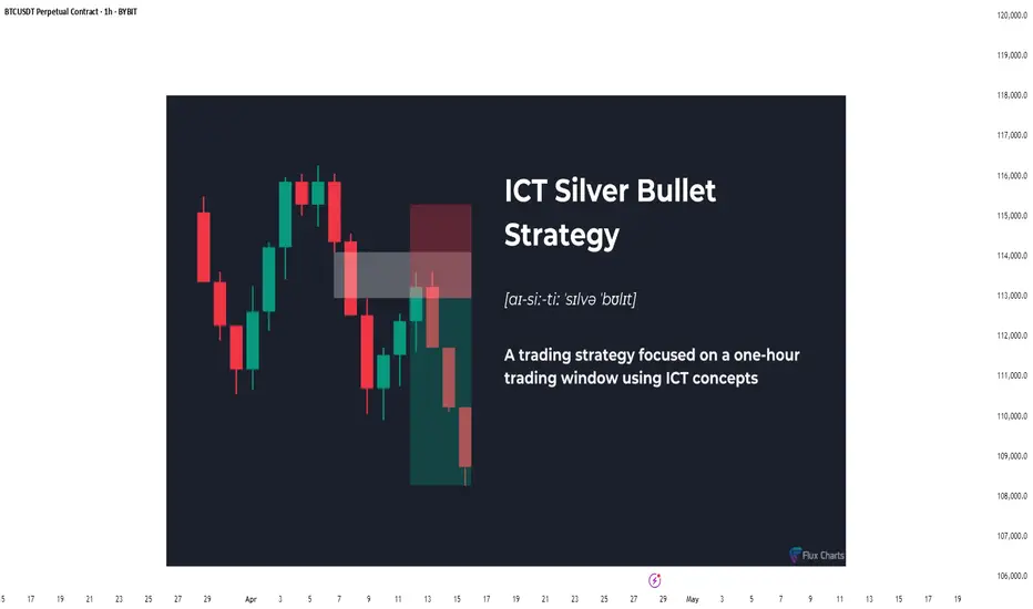
The Hidden Power of the Silver Bullet Strategy - Full GuideIntroduction
The Silver Bullet Strategy is a high-probability intraday trading technique popularized within the Smart Money Concepts community. It focuses on taking precision trades during specific times of the day when liquidity is most active. Mastering this strategy can help traders consistently capture high-quality setups with minimal risk.
In this guide, we will cover:
- What the Silver Bullet Strategy is
- Key Times to Watch
- Entry Models
- Target Setting
- Risk Management
- Real Chart Examples
---
What is the Silver Bullet Strategy?
The Silver Bullet Strategy is based on trading within a "window" of high-probability price action, typically during key liquidity times. It looks to capture moves after liquidity sweeps, order block mitigations, and Fair Value Gap (FVG) plays.
Key Principles:
- Focuses on high-probability windows (New York session especially)
- Waits for a liquidity grab and displacement
- Entries are often on FVGs, OBs, or MSS points
---
Silver Bullet Timing Windows
Timing is crucial to this strategy. The "Silver Bullet" typically occurs in these windows (New York time):
- First Window: 10:00 AM - 11:00 AM (New York)
- Second Window: 2:00 PM - 3:00 PM (New York)
These times capture major moves post-liquidity sweeps or reversals after news/market manipulation.
---
Silver Bullet Entry Model
The classic sequence for a Silver Bullet setup:
1. Identify Liquidity Sweep: Look for price to grab liquidity above a swing high or below a swing low.
2. Look for Displacement: A strong move away from the sweep, creating a Fair Value Gap (FVG) or Breaker Block.
3. Entry in FVG or OB: Enter on a retracement into the FVG or Order Block after displacement.
4. Confirmation: Use lower timeframe MSS or BOS to confirm the reversal.
Liquidity sweep and FVG at the 5m:
MSS + Displacement candle at the 1m:
So all 4 steps completed!
Example Entry Checklist:
- Liquidity sweep
- Strong displacement creating an FVG
- Price retraces into FVG or OB
- MSS/BOS confirmation
- Execute trade with tight stop-loss
---
Where to Set Targets
Targets should be logical based on market structure:
- First Target: Recent internal liquidity (equal highs/lows)
- Second Target: External liquidity zones (major swing highs/lows)
- Optional: Use 1R/2R/3R scaling based on risk-to-reward goals
---
Risk Management for Silver Bullet Trades
Golden Rules:
- Risk less than 1% per Silver Bullet setup
- Set stop-loss beyond the liquidity sweep (not too tight, not too loose) or above FVG
candle
- Stick to one or two trades per window maximum
- Avoid revenge trading outside the windows
---
Common Mistakes to Avoid
- Trading outside the specified time windows
- Entering without a confirmed sweep and displacement
- Overleveraging because the strategy "looks easy"
- Ignoring higher timeframe bias (HTF context is still critical!)
Pro Tip: Combine Silver Bullet entries with SMT Divergences, MSS, and IFVGs for maximum confluence.
---
Final Thoughts
The Silver Bullet Strategy is one of the cleanest ways to approach intraday trading. By mastering liquidity concepts, timing, and precision entries, traders can catch powerful moves with strong risk-to-reward setups.
Be patient, wait for your window, and always trade with discipline.
Happy Sniping!
Forex Grid Trading Overview: Practical Guide for 2025Forex Grid Trading Strategy: Detailed Overview & Low-Risk EUR/USD Application
1️⃣ What Is Grid Trading?
A grid trading strategy places a series of **buy** and **sell** orders at fixed intervals (“grid levels”) above and below a base price, without forecasting market direction. As price oscillates, it triggers orders across the grid, locking in small profits on each swing.
- **No Directional Bias** – Profits on both up- and down-moves
- **Automated Entry/Exit** – Ideal for Expert Advisors (EAs) on MT4/MT5
- **Scalable** – Grid size and lot sizing can be tailored to account size and volatility
2️⃣ How It Works – Core Components
1. **Grid Levels**
- Define a **base price** (e.g. current EUR/USD mid)
- Set **intervals** (e.g. every 20 pips) above/below the base
2. **Orders**
- **Buy Limit** orders at 20, 40, 60 pips below base
- **Sell Limit** orders at 20, 40, 60 pips above base
3. **Take Profit (TP) for Each Order**
- TP typically equals the grid interval (e.g. 20 pips) so each triggered order nets a small profit
- No hard Stop Loss per order—risk is managed via overall exposure
4. **Cumulative P&L**
- Winning trades roll profits into the floating drawdown of unfilled orders
- As price oscillates, the grid “locks in” incremental gains
3️⃣ Pros & Cons
| Pros | Cons |
|---------------------------------------|------------------------------------------|
| ✅ Profits in ranging markets | ❌ Can incur large drawdowns in strong trends |
| ✅ Automated, systematic execution | ❌ Requires significant margin for multiple open trades |
| ✅ Scalable to any time-frame | ❌ Floating negative exposure if grid one-sided |
---
✅Low-Risk Best Practices
1. **Grid Spacing & Width**
- Wider grid intervals (e.g. 30–50 pips) reduce order density and margin use
- Use **ATR** (Average True Range) to adapt spacing to EUR/USD volatility
2. **Lot Sizing & Equity Risk**
- Risk ≤ 1–2% equity per full grid cycle
- Use **fixed fractional** sizing: each order size = (Equity × 1%) / (max number of open grid orders)
3. **Drawdown Control**
- **Maximum Open Orders** cap (e.g. 5 orders per side)
- **Equity Stop-Out**: if floating drawdown exceeds e.g. 10% of equity, close all orders
4. **Trend Filters**
- Use a **200-period SMA** or **ADX** filter: only enable sell grid if price < SMA (downtrend) or ADX < 25 (low momentum)
- Disables grid in strong one-way trends
5. **Grid Shifting / Re-Base**
- After a net grid profit, **shift** the base price to current mid to reset exposure
- Prevents runaway open trades far from current price
5️⃣ Step-by-Step: Applying to EUR/USD
1. **Choose Time-Frame**
- **H4 or H1** recommended: balances signal frequency and margin needs
2. **Define Grid Parameters**
- **Base Price:** current EUR/USD mid (e.g. 1.0980)
- **Interval:** 30 pips (≈ recent ATR on H4)
- **Levels:** 3 buys at 1.0950 / 1.0920 / 1.0890; 3 sells at 1.1010 / 1.1040 / 1.1070
3. **Set Order Size**
- Account equity $10 000, risk 1% = $100 per full grid
- Max open orders 6 → each order $100/6 ≈ $16.7 → ≈ 0.02 lots
4. **Configure TP & No SL**
- Each order TP = 30 pips (equals interval)
- No per-order SL; overall drawdown managed by equity stop
5. **Implement Filters**
- Only open **sell** grid if H4 close < 200-SMA; only open **buy** grid if H4 close > 200-SMA
- Pause grid if ADX > 30 (strong trend) or market events (e.g. NFP, ECB rate decision)
6. **Deploy & Monitor**
- Run on MT4 with an EA or semi-automated Expert Advisor
- Monitor margin usage; adjust grid or disable before major news
6️⃣ Example P&L Mechanics
| Trigger Price | Order Type | Entry | TP Target | Profit (pips) |
|---------------|------------|---------|-----------|---------------|
| 1.0950 | Buy Limit | 1.0950 | 1.0980 | 30 |
| 1.0980 | Sell Limit | 1.0980 | 1.1010 | 30 |
- If price moves down to 1.0950: buy executes, TP at 1.0980 nets +30 pips
- If price then climbs above base, sells trigger at 1.1010 nets +30 pips
2️⃣ Introducing Progressive & Regressive Scaling
🔼 2.1 Progressive Scaling
“Let winners run”—increase exposure after success
Concept: After each profitable grid cycle, step up your lot size by a fixed increment.
Why: Capitalizes on momentum and winning streaks.
How to apply:
Base Lot: 0.02 lots per order (1% equity risk).
After grid closes net-positive, next cycle = 0.03 lots.
Continue stepping up (0.04, 0.05 …) until a drawdown or equity-stop is hit.
Reset back to base lot after a losing cycle or whenever floating drawdown > 5%.
Caps & Safeguards:
Max Lot Cap: Never exceed 0.10 lots (or 2% equity risk).
Equity Stop: If floating drawdown > 10%, close cycle & reset.
🔽 2.2 Regressive Scaling
“Protect the downside”—reduce exposure after losses
Concept: After a losing grid cycle, step down your lot size to conserve capital.
Why: Limits damage during rough periods and preserves margin.
How to apply:
Base Lot: 0.02 lots per order.
If grid hits equity-stop or nets negative, next cycle = 0.015 lots.
Continue stepping down (0.01, 0.005) until you record a net-positive cycle.
Reset to base lot after recovery (e.g. two consecutive winning cycles).
Thresholds:
Don’t drop below 0.005 lots (to avoid over-shrinking).
After two winning cycles at reduced lot, return to base.
✅ Bottom Line
Forex grid trading on EUR/USD can generate steady gains in choppy markets—but demands **strict risk controls** (grid spacing, lot sizing, drawdown limits) and **trend filters** to avoid large losses in trending conditions. When properly applied, a low-risk grid on EUR/USD offers a robust, mostly hands-off strategy for capturing repetitive market swings.
4️⃣ Key Takeaways
Progressive Scaling lifts lot sizes on winning streaks, amplifying gains—but must be capped and reset on losses.
Regressive Scaling shrinks exposure after drawdowns, preserving capital until the strategy recovers.
Combine both with your grid’s risk parameters, trend filter, and a solid equity-stop to maintain a balanced, low-risk EUR/USD grid.
By layering scaling rules atop your grid, you adapt dynamically to market performance—maximizing winners and protecting against prolonged losing runs. Good luck! 🚀

Russia-Ukraine Peace Agreement what could it mean to forex!A peace agreement between Russia and Ukraine could send ripples through the Forex and Commodities markets. Here's how major assets might react:
📊 Key Market Shifts to Watch:
✅ Risk-On Sentiment Returns
Traders may rotate out of safe havens like USD, JPY, CHF, and Gold.
Risk currencies like AUD, NZD, and emerging market currencies could strengthen.
✅ Euro Strength Likely (EUR ↑)
Europe gains the most relief → energy prices fall, inflation cools, confidence grows.
✅ Oil & Energy Prices May Drop
Peace reduces supply fears → crude oil and gas prices could fall → impacting CAD, NOK, RUB.
🔀 Likely Forex Movements:
🔼 Pairs Likely to Rise 💡 Reason
EUR/USD Euro up on peace; USD weakens as fear fades.
AUD/JPY Aussie rises on risk appetite; Yen weakens.
EUR/JPY Similar to AUD/JPY—EUR gains, JPY loses.
NZD/JPY Risk-on favors NZD; JPY drops.
EUR/CHF Swiss Franc weakens; Euro benefits.
USD/ZAR (falls) Rand strengthens on global optimism.
🔽 Pairs Likely to Fall 💡 Reason
USD/JPY USD and JPY both weaken, but USD may drop more.
USD/CHF Same story—less demand for safe havens.
USD/RUB Ruble recovery if sanctions ease.
CAD/JPY Oil-sensitive CAD may dip slightly
🟡 What About Commodities Like Gold? (XAU/USD)
⬇️ Gold Likely to Fall
As a traditional safe-haven, Gold (XAU/USD) tends to rise during geopolitical turmoil.
Peace = lower fear = investors rotate out of Gold into riskier, yield-bearing assets.
Lower inflation expectations could also reduce demand for Gold as an inflation hedge.
🧠 Key Level Watch:
If peace is confirmed, XAU/USD could drop below key support zones, especially if USD strengthens slightly on rate differentials.
🔍 Final Thoughts:
The magnitude of these moves depends on the terms and credibility of the peace deal.
If it includes sanctions relief and long-term commitments, expect larger market reactions.
Stay alert for central bank policy shifts, especially if inflation drops.
💬 What pairs or commodities are you watching if peace becomes a reality? Drop your insights below!
📌 Follow me for more macro-FX breakdowns, commodities analysis, and trading insights.

S&P 500: The Indicator to Watch Right NowWith US stocks bouncing on Trump’s backtracking over tariffs — just weeks after a 20% correction — it’s fair to say caution is the name of the game. Even though the headline risk has eased slightly, markets are still navigating through a fog of geopolitical noise and economic uncertainty.
In moments like these, where the fundamental picture feels muddy at best, objective technical analysis can offer clarity — not crystal-ball predictions, but structure and focus.
The Traditional Technical Backdrop
Traditional technical analysis isn’t about magic lines on a chart — it’s about mapping out price behaviour with tools that help us stay grounded. Structural levels, trendlines, and a couple of moving averages might seem basic, but they’ve stood the test of time because they do something incredibly useful: they make sense of chaos.
In the case of the S&P 500, several key structural levels should anchor any serious analysis. We’ve got the pre-sell-off highs from February, the April lows, and two interim levels — broken support levels that flipped to resistance during retracement rallies between February and April. These levels now act like milestones in the market’s memory.
Drawing a downward-sloping trendline through the swing highs during the correction gives us a good sense of the broader downtrend. More recently, we’ve also started to see a modest uptrend emerge from the April lows. That creates something of a wedge formation — a narrowing range that’s coiling tighter as buyers and sellers battle it out.
Simple moving averages like the 50-day and 200-day are useful additions here. While they’re lagging by nature, they give us immediate context for where price sits in relation to recent momentum and long-term sentiment.
US500 Daily Candle Chart
Past performance is not a reliable indicator of future results
The Indicator to Watch
There’s a good argument to be made that the most important indicator to watch right now, with the S&P 500 trying to claw back ground, isn’t a moving average or RSI — it’s Anchored VWAP.
Anchored Volume-Weighted Average Price (VWAP) is one of the most effective ways to cut through the noise and see who’s really in control — buyers or sellers. It tells you the average price that traders have paid for the index, weighted by volume, since a specific event or turning point. And unlike regular VWAP that resets daily, Anchored VWAP lets us choose a significant date and track how price interacts with that “anchor.”
If we anchor the VWAP to the February highs, we’re essentially tracking how the market has performed relative to that peak. This anchored VWAP line becomes a kind of gravity — it reflects the average cost basis of those who bought just before the sell-off. If price remains below it, it tells us those buyers are still underwater, and therefore less likely to add risk. Sellers, in that case, still hold the advantage.
On the flip side, if we anchor VWAP to the April lows, we get the average cost basis of the recent bounce. This line reflects where more optimistic, bottom-fishing buyers stepped in. If price holds above this level, it suggests those participants remain in profit — and potentially willing to buy dips.
Right now, the S&P 500 is stuck in a battle between these two anchored VWAP levels. One tracks the pain, the other tracks the hope. It’s a VWAP funnel, and it won’t last forever. Eventually, price will break above one and leave the other behind — and when it does, we’ll have an objective answer as to which side is winning.
Will it be the late bears holding on from February’s highs, or the early bulls from the April lows? The answer is coming. Keep your eyes on the anchored VWAPs — they’re telling the real story.
US500 Daily Candle Chart
Past performance is not a reliable indicator of future results
Disclaimer: This is for information and learning purposes only. The information provided does not constitute investment advice nor take into account the individual financial circumstances or objectives of any investor. Any information that may be provided relating to past performance is not a reliable indicator of future results or performance. Social media channels are not relevant for UK residents.
Spread bets and CFDs are complex instruments and come with a high risk of losing money rapidly due to leverage. 83% of retail investor accounts lose money when trading spread bets and CFDs with this provider. You should consider whether you understand how spread bets and CFDs work and whether you can afford to take the high risk of losing your money.

How To Customize The 1 Minute Scalping IndicatorThis tutorial explains each setting of the 1 Minute Scalping Indicator in detail so you understand exactly how to adjust your settings to get the results you would like from the indicator.
Here is a list of the details we discuss:
How to fix loading errors
Tooltips that explain each setting for your reference
Trade modes and how they are affected by other settings
Average candle size rejection parameters
Higher timeframe candle filters, settings and levels
External indicator trend filtering capabilities and how to set them up correctly
Stoploss and take profit calculations and settings you can adjust
Signal arrow customization options
Candle coloring adjustments
Visual/styling options
Make sure to watch the whole video so you fully understand how each setting affects the indicator for best results.

How do I know if a day will be bullish?"Daily Bias" is one of the most asked questions by traders!
You’ve probably heard someone say:
“If only I knew where the candle would expand, I’d be rich!”
Well, today I’m sharing a framework that can help you start answering that exact question.
🚶🏽♂️Walk with me as we break down the ES Futures Daily Candle for April 24, 2024.
By the end of this video, you'll have a solid starting point to study and apply this method—
#OneCandlestickAtATime

Why Should You Care About ER?🚀 Hey Traders! Have You Ever Felt Lost in the Chaos of Market Fluctuations?
What if I told you there’s a powerful tool that can help you cut through the noise and give you a statistical edge to predict SUPPORT and RESISTANCE movements with confidence?
Let me take 5 minutes of your time to introduce you to something that could transform your trading game: Expected Range Volatility (ER) .
What is Expected Range Volatility (ER)?
The Expected Range (ER) is a framework that helps traders understand how much an asset is likely to move within a specific timeframe. Based on CME market data and Nobel Prize-winning calculations, price movements within the expected volatility corridor have a 68% probability of staying within those boundaries.
💡 Key Insight: When the price approaching certain levels, there’s a 68% chance the price won’t break through those boundaries. This means you can use ER as a powerful filter to identify more precise entry and exit points for your trades.
Why Should You Care About ER?
When I first discovered the ER tool, it felt like stumbling upon a gold mine in the trading world. Here’s why:
It’s free and available on the CME exchange’s website.
It’s underutilized —95% of traders don’t even know it exists.
It provides statistical clarity in a world full of uncertainty.
I remember the first time I used ER in my analysis—it completely changed the way I approached intraday trading. Now, I never make a trade without checking the ER data. It’s become an essential part of my strategy.
How to Use ER in Your Trading
1️⃣ Input the Data: Head over to the CME website, plug in the necessary parameters, and get your ER values.
2️⃣ Set Boundaries: Use the ER range as a guide to set potential support and resistance levels.
3️⃣ Filter Trades: Only take trades that align with the ER framework to improve your precision.
A recent example is the Japanese yen futures market.
Don't be confused by the fact that we take futures levels, it can easily be plotted on a spot chart for forex market (the dollar/yen).
Limitations to Keep in Mind
While ER is a powerful tool, it’s not a crystal ball. Here are some limitations:
Market Dynamics: Short-term price movements can be unpredictable due to sentiment, news, or economic events. ER provides a statistical estimate, but it doesn’t guarantee outcomes.
Assumptions: The formula assumes price movements follow a log-normal distribution , which may not hold true in all market conditions.
Your Turn: Are You Using ER in Your Strategy?
💭 Here’s the million-dollar question: Are you leveraging the power of Expected Range Volatility in your trading? If not, why not start today?
💬 Share your thoughts in the comments below:
Do you currently use ER or similar statistical tools?
Want to Dive Deeper?
If you’re ready to take your trading to the next level, don’t miss out on our all-in-one resource designed to help you master tools like ER and other valuable sources to gain market edge!
🔥 Remember:
No Valuable Data = No Edge!

What is ICT FVG ? – ICT Fair Value Gap Explained Step by Step !ICT FVG knowns as Fair Value Gap, is a three-candle formation having an un-retraced area between the high and low of 1st and 3rd candlestick.
A fair value gap is indicated by an imbalance and it acts as a level of support and resistance in the price chart.
This blog post will teach you all about the ICT FVG from their formation to identification and their use in trading.
You can jump to the section you are most interested in from below or can continue reading the whole article for better understanding.
Table of Contents
What is ICT FVG (Fair Value Gap)?
How to Identify an ICT Fair Value Gap?
Types of ICT FVG
(I) Bullish Fair Value Gap
(II) Bearish Fair Value Gap
ICT FVG Trading Strategy
Best Time Frame for ICT FVG Identification
Best Pair for ICT FVG Trading
Final Thoughts
What is ICT FVG (Fair Value Gap)?
ICT fair value gap is a three-candle structure indicating a gap between the high and low of 1st and 3rd candlestick.
The gap between three candles is created because price does not retrace in that area and leaves it open.
You can see the example of ICT FVG in the picture below :
ICT FVG acts as a magnet for price and price retrace back to the fair value gap to balance the price delivery.
After retracing to the FVG price then reverses and continues its trend .
How to Identify an ICT Fair Value Gap ?
To identify an ICT FVG, you need to look for a large candlestick with most body range.
After identifying the large candlestick, mark the high of candlestick prior to the large candle and low of the subsequent candlestick .
There will be a visible gap between the high and low of the two candlesticks which indicate the ICT fair value gap .
Types of ICT FVG
On the basis of price move the ICT FVG has two types which are explained below :
(I) Bullish Fair Value Gap
A bullish fair value gap in ICT terms appears during an uptrend with a three-candle pattern.
It happens when the middle candle has a large body , leaving a gap between the high of the first candle and the low of the third candle .
In an uptrend , a fair value gap can serve as strong support, with the price often retracing to fill the gap before moving higher .
You can see the example of bullish fair value gap in the picture below :
(II) Bearish Fair Value Gap
A bearish fair value gap appears in a downtrend within a three-candle pattern.
It forms when the middle candle has a large body, creating a gap between the low of the first candle and the high of the third candle .
In bearish trend a fair value gap can act as a good resistance and mostly price tends to fill this gap before moving lower .
You can see the example of bearish fair value gap in the picture below .
ICT FVG Trading Strategy
To trade using an ICT fair value gap, you need to go through below steps.
Step 1 – Determine Market Trend: First of all we need to identify the market trend of any asset whether it is bullish or bearish.
You can use ICT Daily Bias to anticipate the direction of price move.
In bullish trend price makes higher highs and higher lows, while in bearish trend price makes lower lows and lower highs
Step 2 – Identify Premium and Discount Zone: You would be looking for the premium fair value gap in bearish trend, while in bullish trend you would be looking for discount FVG.
Step 3 – Identify Large Candle:Once you have determined the trend, next step is to find a large candle with large body & small wicks.
If market is in bullish trend, we look for strong bullish candle with most body range while in bearish trend we look for large bearish candle with most body range.
Step 4 – Study Preceding & Proceeding Candles: Once you have identified one large candle, now study the one candle before it & the one candle after it.
Both of these candles should have such a structure that their bodies should not overlap the body of middle candle thus confirming a fair value gap between the wicks of first & third candle.
Step 4 – Mark Fair Value Gap: In bullish trend the gap between the high of first candle and the low of third candle.
While in bearish trend the gap between the low of first candle and the high of third candle will be marked as your fair value gap.
Step 6 – Execute the Trade: If the price is in bullish trend, we will wait for price to retrace and test the discount fair value gap to balance the move.
When price tests the discount fair value gap you can execute a buy trade with other technical confirmations like rejection or structure shift in lower time frame.
In the picture given below you can see price is in bullish trend making higher highs and higher lows.
It retraces back to test the fair value gaps and rejects from the fair value gaps, eventually going higher.
In a bearish trend, you would wait for the price to retrace up and test the premium fair value gap to balance the bearish price delivery.
When the price visits this gap, it can offer sell opportunities, especially when combined with additional confirmations like rejection or a shift in market structure.
In the image below, the market is in a downtrend, forming lower highs and lower lows.
It repeatedly tests bearish fair value gaps and rejects from these levels, leading to further price declines.
Best Time Frame for ICT FVG Identification
ICT FVG can serve different purpose, like it can be used as a tool to find the Daily Bias using higher timeframe like 1-Day.
But if you are using the fair value gap as a PD Array to find trade entry then you would be looking for a fair value gap in lower timeframes like 15-Minutes or lower than that.
Best Pair for ICT FVG Trading
Initially the ICT introduced the fair value gap using the index trading like Nasdaq and S&P-500 and it yielded best results in that market.
After that he demonstrated some examples of forex pairs using the FVG and it was equally good for that market too.
So, now a days ICT FVG serve as a key tool for traders in every market.
Final Thoughts
While trading using a fair value gap we should keep in mind that every fair value gap in the market is not tradeable , to trade using fair value gap, we should use it in conjugation with other strategies like demand & supply or support & resistance . At these levels fair value gaps can act as a more reliable tool to take a trade.
You can also check this article how traders use fair value gap to open the right trade.
Plus to mitigate your risks, you should always trade with stop loss in place as no strategy is foolproof in trading.

Real Success Rates of the Falling Wedge in TradingReal Success Rates of the Falling Wedge in Trading
The falling wedge is a chart pattern highly valued by traders for its potential for bullish reversals after a bearish or consolidation phase. Its effectiveness has been extensively studied and documented by various technical analysts and leading authors.
Key Statistics
Bullish Exit: In 82% of cases, the exit from the falling wedge is upward, making it one of the most reliable patterns for anticipating a positive reversal.
Price Target Achieved: The pattern's theoretical target (calculated by plotting the height of the wedge at the breakout point) is achieved in approximately 63% to 88% of cases, depending on the source, demonstrating a high success rate for profit-taking.
Trend Reversal: In 55% to 68% of cases, the falling wedge acts as a reversal pattern, signaling the end of a downtrend and the beginning of a new bullish phase.
Pullback: After the breakout, a pullback (return to the resistance line) occurs in approximately 53% to 56% of cases, which can provide a second entry opportunity but tends to reduce the pattern's overall performance.
False Breakouts: False exits represent between 10% and 27% of cases. However, a false bullish breakout only results in a true bearish breakout in 3% of cases, making the bullish signal particularly robust.
Performance and Context
Bull Market: The pattern performs particularly well when it appears during a corrective phase of an uptrend, with a profit target reached in 70% of cases within three months.
Gain Potential: The maximum gain potential can reach 32% in half of cases during a bullish breakout, according to statistical studies on equity markets.
Formation Time: The wider the wedge and the steeper the trend lines, the faster and more violent the post-breakout upward movement will be.
Comparative Summary of Success Rates:
Criteria Rate Observed Frequency
Bullish Exit 82%
Price Target Achieved 63% to 88%
Reversal Pattern 55% to 68%
Pullback After Breakout 53% to 56%
False Breakouts (False Exits) 10% to 27%
Bullish False Breakouts Leading to a Downside 3%
Points of Attention
The falling wedge is a rare and difficult pattern to correctly identify, requiring at least five contact points to be valid.
Performance is best when the breakout occurs around 60% of the pattern's length and when volume increases at the time of the breakout.
Pullbacks, although frequent, tend to weaken the initial bullish momentum.
Conclusion
The falling wedge has a remarkable success rate, with more than 8 out of 10 cases resulting in a bullish exit and a price target being reached in the majority of cases. However, it remains essential to validate the pattern with other technical signals (volume, momentum) and to remain vigilant against false breakouts, even if their rate is relatively low. When mastered, this pattern proves to be a valuable tool for traders looking for optimized entry points on bullish reversals.

Why All You Need Is the Chart: Let the Market Speak FirstYou missed the news? Doesn’t matter. The chart already heard it for you.
________________________________________
1. The Myth of Being “Informed”
Modern traders feel pressured to be constantly plugged in:
• Twitter alerts
• Trump’s latest outburst
• CNBC headlines
It feels like you’re missing out if you’re not watching everything.
But here’s the truth:
By the time you read the news, the market already priced it in.
Being "informed" doesn’t make you early . It usually makes you late .
________________________________________
2. The Chart Already Knows
Imagine a bullish surprise in the economy. You didn’t catch it live.
But when you open your chart, you see this:
📈 A bullish engulfing candle bouncing cleanly off major support.
That’s all you need. That’s your trade. You don’t need to know why it happened.
The chart speaks last. And the chart speaks loudest.
________________________________________
3. Price Is the Final Judge
All the noise — opinions, reports, breaking headlines — flows into a single output: price.
• Economic collapse? The chart shows a break.
• Political turmoil? Price still rejects resistance.
Price is truth.
Instead of asking: " What happened? ", start asking: " What is price doing? "
________________________________________
4. Real-Life Analogy
You don’t need to read the newspaper to know it’s raining. Just look out the window. 🌧️
Same with trading. Just look at the chart.
The price is your weather forecast. React to that. Not to noise.
________________________________________
5. What to Do Instead of Watching News:
• Draw clean support/resistance levels
• Wait for real confirmation (engulfings, breakouts, rejections)
• Manage risk — always
• Be patient. Let the market show its hand
________________________________________
Final Thought:
If something important happened, you’ll see it on the chart. You don’t need 10 sources. You don’t need speed. You need clarity.
Let the chart speak. It knows more than the news ever will.

What Is the Advance-Decline (A/D) Line, and How Can You Use ItWhat Is the Advance-Decline (A/D) Line, and How Can You Use It in Trading?
The Advance-Decline (A/D) Line is a widely used market breadth indicator that provides insights into the strength of trends by tracking advancing and declining stocks. Popular among traders analysing indices like the NASDAQ, it helps identify broad participation or hidden divergences. This article explores how this indicator works and its role in effective market analysis.
What Is the Advance-Decline Line?
The Advance-Decline (A/D) line, also known as the Advance-Decline Index, is a popular market breadth indicator used to gauge the overall health of a market's movement. Instead of focusing solely on price changes in an index, it analyses how many stocks are participating in the market's rise or fall. This makes it particularly useful for traders looking to understand whether a trend is supported by widespread participation or driven by just a handful of stocks.
The indicator can be set up based on stocks on different exchanges. For example, a NYSE Advance-Decline line provides insights into NYSE-listed stocks. However, it can be applied to any index or exchange, resulting in the Nasdaq Advance-Decline line or a line based on stocks listed in the UK, Australia, Europe, or Japan.
At its core, the A/D line is a cumulative measure of the net advances of stocks on a given day. The calculation is as follows:
1. Count the number of advancing stocks (those that closed higher than their previous close).
2. Count the number of declining stocks (those that closed lower than their previous close).
3. Subtract the number of declining stocks from the advancing stocks to get the net advance.
4. Add this net advance to the previous day’s A/D line value.
Formally, the Advance-Decline line formula is:
Net Advances = Advancing Stocks − Declining Stocks
Current A/D Line Value = Previous A/D Line Value + Net Advances
For example, if 500 stocks advanced and 300 declined on a given day, the net advance would be +200. If yesterday’s A/D Line value was 10,000, today’s value would be 10,200. Over time, these daily values form a line that tracks the cumulative net advances.
The indicator provides insights into sentiment. A rising line indicates more advancing stocks than declining ones, while a falling line suggests the opposite. Traders often use this data to determine whether a price trend in an index reflects broad strength or is being carried by a few heavyweights.
Understanding Market Breadth
Market breadth measures the extent to which individual assets are contributing to a market's overall movement, providing a clearer picture of the strength or weakness behind trends. Rather than relying solely on an index's price performance, breadth gives traders insights into how widespread participation is within a rally or decline. This information is crucial for understanding whether market moves are broad-based or concentrated in a few influential assets.
A market with a strong breadth typically sees most stocks or assets moving in the same direction as the overall trend. For example, during a rally, broad participation—where a large percentage of assets are advancing—signals a robust and healthy trend. Conversely, weak breadth occurs when only a small group of assets drives the movement, potentially indicating fragility in the trend. This is especially important in large indices where a few heavily weighted assets can mask underlying weaknesses.
How Traders Use the A/D Line
The A/D Line is more than just a market breadth indicator—it’s a practical tool traders use to gain insight into the strength and sustainability of trends. By analysing how the indicator behaves in relation to price movements, traders can uncover potential hidden opportunities and spot potential risks. Let’s consider how the Advance-Decline line behaves on a price chart.
Identifying Trend Strength
One of the A/D Line’s key uses is evaluating the strength of a market move by examining overall participation. When both the A/D Line and an index rise together, it suggests widespread buying activity, with most stocks contributing to the rally. Similarly, if both the index and the A/D Line decline, it often reflects broad-based selling, indicating that weakness is widespread across the market rather than concentrated in a few assets.
Spotting Divergences
Divergences between the A/D line and price are closely watched by traders. For instance, if an index continues to rise but the A/D line starts declining, it could signal that the trend is losing momentum. Conversely, when it begins rising ahead of a price recovery, it may suggest underlying strength before it becomes apparent in price action.
Complementing Other Indicators
Traders often pair the A/D line with other tools to refine their analysis. For example, combining it with moving averages or oscillators like RSI can help confirm signals or highlight discrepancies. A rising A/D line alongside RSI rising above 50 might reinforce the possibility of a price rise.
Strengths of the A/D Line
The A/D line is a widely respected tool for understanding market dynamics, offering insights that price-based analysis alone can’t provide. Its ability to measure participation across a broad range makes it especially valuable for traders looking to assess sentiment and trend reliability. Let’s explore some of its key strengths.
Broad Market Perspective
The A/D line captures the performance of all advancing and declining stocks within an index, offering a comprehensive view of how much support a trend has. Instead of focusing solely on a handful of large caps that often dominate indices, the indicator reveals whether the majority are moving in the same direction. This helps traders gauge the true strength of a rally or decline.
Early Warnings of Weakness or Strength
Divergences between the A/D line and the price can act as an early signal of potential changes in momentum. When the A/D Line deviates from the overall trend, it can highlight areas where market participation is inconsistent. This allows traders to assess whether a trend is gaining or losing support across a broad range of assets, offering clues about potential shifts before they fully materialise in price action.
Applicability Across Markets
Another strength is its versatility. The A/D line can be applied to indices, sectors, or even individual markets, making it useful across various trading strategies. Whether monitoring a broad index like the S&P 500 or a specific sector, the indicator can be adapted to provide valuable insights.
Limitations of the A/D Line
While the A/D line is a useful tool for analysing breadth, it isn’t without its limitations. Traders need to understand its drawbacks to use it effectively and avoid potential misinterpretations. Here are some of the key challenges to consider.
Ignores Stock Weighting
One major limitation is that the A/D index gives equal weight to every stock, regardless of size or market capitalisation. In indices like the S&P 500, where a small number of large-cap stocks often drive performance, this can create a disconnect. For example, a large-cap stock’s strong performance might lift an index while the indicator shows weakness due to low-caps underperforming.
Vulnerability to Noise
The index can produce misleading signals in certain conditions, such as during periods of low trading volume or heightened volatility. Market anomalies, such as large fluctuations in a small number of stocks, can skew the indicator and make it less reliable. This can be especially problematic in thinly traded assets or at times of high speculation.
Not a Standalone Indicator
The A/D line is combined with other tools. On its own, it doesn’t account for factors like momentum, valuation, or sentiment, which can provide critical context. Traders relying solely on it may miss out on key details or overemphasise its signals.
Comparing the A/D Line with Other Market Breadth Indicators
The A/D Line is a powerful tool, but it’s not the only market breadth indicator traders use. By understanding how it compares to other indicators, traders can select the one that suits their analysis needs or combine them for a more comprehensive view.
A/D Line vs Advance-Decline Ratio
The A/D Ratio measures the proportion of advancing to declining stocks. While the A/D line provides a cumulative value over time, the ratio offers a snapshot of market breadth for a single trading day. The A/D Ratio is often better for identifying short-term overbought or oversold conditions, whereas the A/D line excels at tracking long-term trends.
A/D Line vs McClellan Oscillator
The McClellan Oscillator uses the same advancing and declining stock data but applies exponential moving averages to calculate its value. This approach makes the McClellan Oscillator more sensitive to recent market changes, allowing it to highlight turning points more quickly than the A/D line. However, the A/D line’s simplicity and cumulative nature make it more straightforward to interpret for broader trend analysis.
A/D Line vs Percentage of Stocks Above Moving Averages
This indicator tracks the percentage of stocks trading above specific moving averages, such as the 50-day or 200-day. While the A/D line focuses on daily advances and declines, the moving average approach highlights whether stocks are maintaining longer-term momentum. The A/D line provides a broader perspective on participation, whereas this indicator zeros in on sustained trends.
The Bottom Line
The Advance-Decline line is a valuable tool for traders seeking deeper insights into market trends. By analysing market breadth, it helps identify potential opportunities and risks beyond price movements alone.
FAQ
What Is the Meaning of Advance-Decline?
Advance-decline refers to the difference between the number of advancing stocks (those that closed higher) and declining stocks (those that closed lower) on a specific trading day. It’s commonly used in market breadth indicators like the NYSE Advance-Decline line to measure the overall strength or weakness of the market.
How to Find Advance-Decline Ratio?
The Advance-Decline ratio compares advancing stocks to declining stocks in an index. It is calculated by dividing the number of advancing stocks by the number of declining stocks.
How to Use an Advance-Decline Line Indicator?
The A/D line indicator tracks the cumulative difference between advancing and declining stocks. Traders analyse its movement alongside price trends to assess market participation. For example, divergence between the A/D line and an index price direction can signal potential changes in momentum.
What Is the Advance-Decline Indicator Strategy?
Traders use the Advance-Decline indicator to analyse market breadth, identify divergences, and confirm trends. For example, a rising A/D line with an index suggests broad participation, while divergence may signal weakening trends.
This article represents the opinion of the Companies operating under the FXOpen brand only. It is not to be construed as an offer, solicitation, or recommendation with respect to products and services provided by the Companies operating under the FXOpen brand, nor is it to be considered financial advice.

How To Filter Signals On The 1 Minute Scalping IndicatorThis tutorial shows you how to use external indicators to filter out signals on the 1 Minute Scalping Indicator so that you only get signals that are in the direction of the trend.
Step By Step Process:
1. Pick an external indicator that provides an output value of 1 for bullish, -1 for bearish or 0 for neutral and add it to your chart. We have multiple indicators that can do this, but you can also customize your own indicators to provide this value and use that to filter out signals.
2. Set your desired trend parameters on your external indicator and make sure that indicator is on the same chart as the 1 Minute Scalping Indicator.
3. Go to the indicator settings for the 1 Minute Scalping Indicator and turn on one of the 3 available External Indicator Filters. Then from the dropdown menu, select the external indicator you want to use and make sure to choose the output value that gives the 1, -1 or 0 output for trends. Our indicators will have an output titled "Trend Direction To Send To External Indicators" to make that value easy to find in the dropdown menus.
That's it! Let the 1 Minute Scalping Indicator reload with the external indicator trend values and it will only show buy signals during bullish trends, only show sell signals during bearish trends or no signals during neutral markets. Make sure to back test your setup until you find the best external indicators and settings to use that work best for your trading style and then apply that setup to any chart you would like.
Here is the code you can use to add a trend value to your own custom indicators and send it to the 1 Minute Scalping Indicator:
trendDirection = 0
if close > ema1
trendDirection := 1
else if close < ema1
trendDirection := -1
else
trendDirection := 0
plot(trendDirection, title="Trend Direction To Send To External Indicators", color=#00000000, display=display.data_window)
Change the (close > ema1) and (close < ema1) to use your own variables from within your script.
