Buy Sell Magic Rework
A version of the legendary Forex indicator Buy Sell Magic for TradingView, with optional additional filtering in the settings.
A simple yet very effective trend-following tool — I personally used it for trading gold 14 years ago, and it still works great today!
How it works:
This script combines the classic Parabolic SAR trend indicator with an optional ZigZag filter for additional signal confirmation.
Parabolic SAR:
The indicator plots the Parabolic SAR on the chart to help identify trend direction and potential reversals. A buy signal is generated when the SAR flips from above the price to below it, signaling a possible uptrend. A sell signal appears when the SAR moves from below to above the price, indicating a potential downtrend.
ZigZag Filter (optional):
The ZigZag filter uses pivot highs and lows to reduce market noise and confirm significant swings. When enabled, a signal is shown only after a clear pivot forms in the chosen period.
Inputs:
ZigZag Period: Controls pivot sensitivity.
SAR Start, Increment, Max: Adjust how responsive the SAR is.
Use ZigZag Filter: Enable or disable additional filtering.
Plots:
Gray crosses = Parabolic SAR points
Green arrows = Buy signals
Red arrows = Sell signals
Best Use:
This tool works well on various markets: Forex, crypto, stocks. It is best suited for trend-following or swing trading strategies. Adjust the settings for your preferred asset and timeframe, and always backtest before live trading.
⚠️ Disclaimer: This script is for educational purposes only and does not constitute financial advice. Always test any strategy thoroughly and trade at your own risk.
Indicators and strategies

Multi-TF Bullish Dashboard ✅🔼back test gives good results but try the indicator and give me the feedback

F2D Highlighter + FTFC + Volume Spike + Dashboard🧪 Why F2D Works
It traps short sellers who expect a breakdown
When it reclaims prior ranges, buyers flood back in
Paired with timeframe continuity (green on higher timeframes), it increases the edge
💸 F2D in Options Trading
Ideal for Calls when:
You're near a key level (VWAP, support, inside week/day)
Volume surges on reclaim
You catch a 2D that flips into a 2U (strong reversal)
🔧 Strike selection: ATM or 1–2 strikes OTM
⏰ Expiration: Same day or next day (if late in the day)
💥 Targets: 30–50% profit, then trail or scale out

ROGUE ICT PROROGUE ICT PRO | ICT-Inspired Confluence System
The ROGUE ICT PRO is a precision tool built for traders who follow the principles of Inner Circle Trader (ICT) methodology. This script is designed to highlight potential high-probability trade setups based on multiple confluences including Market Structure Shifts (MSS), Fair Value Gaps (FVGs), killzone timing, rejection confirmations, and optional HTF bias filters.
This tool is intended for educational and research purposes only and is best used by traders who already understand ICT-style concepts.
🔍 Key Features:
- Market Structure Shift (MSS): Detects bullish or bearish structure breaks and plots them on the chart.
- Fair Value Gaps (FVGs): Highlights potential imbalance zones after a structure shift.
- Signal Logic: Buy or sell signals only trigger when price returns to a valid FVG and confirms with a rejection wick or engulfing (optional).
- Session Killzones: Filter entries to only occur during specific sessions: Asian, London, or New York.
High Timeframe Bias (Optional):
- HTF EMA trend direction
- HTF swing structure break
- HTF candle bias
RSI Confirmation (Optional): A 3-period RSI must be in overbought (for sell) or oversold (for buy) territory.
ATR-Based Risk Management:
SL and TP lines are drawn dynamically using ATR with configurable multipliers and risk-reward ratio.
Cooldown Logic: Prevents signal spam by enforcing a minimum bar gap between trades.
Previous Day High/Low Anchoring (Optional): Visual levels drawn from the previous day’s extremes.
⚙️ Customization:
Every feature can be toggled or configured via the settings menu:
Choose which killzones to enable.
Select your HTF bias filter or disable bias altogether.
Adjust ATR, Risk:Reward, and RSI levels to suit your strategy.
Fine-tune structure sensitivity, gap size, and rejection rules.
🛡️ Disclaimer:
This indicator is provided for educational and informational purposes only. It is not intended as financial advice or a trading signal service. Past performance is not indicative of future results. Always conduct your own research and consult with a licensed financial advisor before making any trading decisions.

Hull MA + ADX (Manual) Trend FilterA basic Hull MA with adx imbedded that highlights green or red based on trend direction. The highlight doesn't initiate until the adx is above 20.


✅ Stochastic Divergence Alert PROAn indicator that tells you where divergences on the stochastic are.


Stochastic Divergence AlertA great way to figure out what divergence are taking place with price action.

ATR > VXN Alert (5m)ATR > VXN Volatility Divergence Indicator
This custom TradingView indicator monitors real-time volatility divergence between realized volatility (via Average True Range, ATR) and implied volatility (via the CBOE NASDAQ Volatility Index, VXN). It is inspired by the GJR-GARCH (Glosten-Jagannathan-Runkle Generalized Autoregressive Conditional Heteroskedasticity) model, which captures asymmetric volatility dynamics—particularly how markets respond more sharply to negative shocks than to positive ones.
Core Logic:
Chart on NQ 5 minute timeframe
ATR (5-min) reflects realized intraday volatility of the Nasdaq 100 futures (NQ).
VXN (5-min, delayed) represents forward-looking implied volatility.
The indicator highlights regime shifts in volatility:
ATR < VXN: Volatility compression → potential energy building up (market coiling).
ATR > VXN: Volatility expansion → real movement exceeds expectations → potential breakout zone.
Visuals & Alerts:
Background turns green when ATR crosses above VXN, signaling a bullish expansion regime.
Background turns red when ATR drops below VXN, signaling compression or risk-off environment.
Custom alerts trigger on volatility regime shifts for breakout traders.
Application (Manual GJR-GARCH Strategy):
Similar to how the GJR-GARCH model captures volatility clustering and asymmetry, this indicator identifies when actual price volatility (ATR) begins to spike beyond implied forecasts (VXN), often after periods of contraction—mirroring a conditional variance shock in the GARCH framework.
Traders can align with directional bias using technical confluence (order flow, structure breaks, liquidity zones) once expansion is confirmed.

ATR > VXN Alert (5m)ATR > VXN Volatility Divergence Indicator
This custom TradingView indicator monitors real-time volatility divergence between realized volatility (via Average True Range, ATR) and implied volatility (via the CBOE NASDAQ Volatility Index, VXN). It is inspired by the GJR-GARCH (Glosten-Jagannathan-Runkle Generalized Autoregressive Conditional Heteroskedasticity) model, which captures asymmetric volatility dynamics—particularly how markets respond more sharply to negative shocks than to positive ones.
Core Logic:
Chart on NQ (5 minute timeframe)
ATR (5-min) reflects realized intraday volatility of the Nasdaq 100 futures (NQ).
VXN (5-min, delayed) represents forward-looking implied volatility.
The indicator highlights regime shifts in volatility:
ATR < VXN: Volatility compression → potential energy building up (market coiling).
ATR > VXN: Volatility expansion → real movement exceeds expectations → potential breakout zone.
Visuals & Alerts:
Background turns green when ATR crosses above VXN, signaling a bullish expansion regime.
Background turns red when ATR drops below VXN, signaling compression or risk-off environment.
Custom alerts trigger on volatility regime shifts for breakout traders.
Application (Manual GJR-GARCH Strategy):
Similar to how the GJR-GARCH model captures volatility clustering and asymmetry, this indicator identifies when actual price volatility (ATR) begins to spike beyond implied forecasts (VXN), often after periods of contraction—mirroring a conditional variance shock in the GARCH framework.
Traders can align with directional bias using technical confluence (order flow, structure breaks, liquidity zones) once expansion is confirmed.

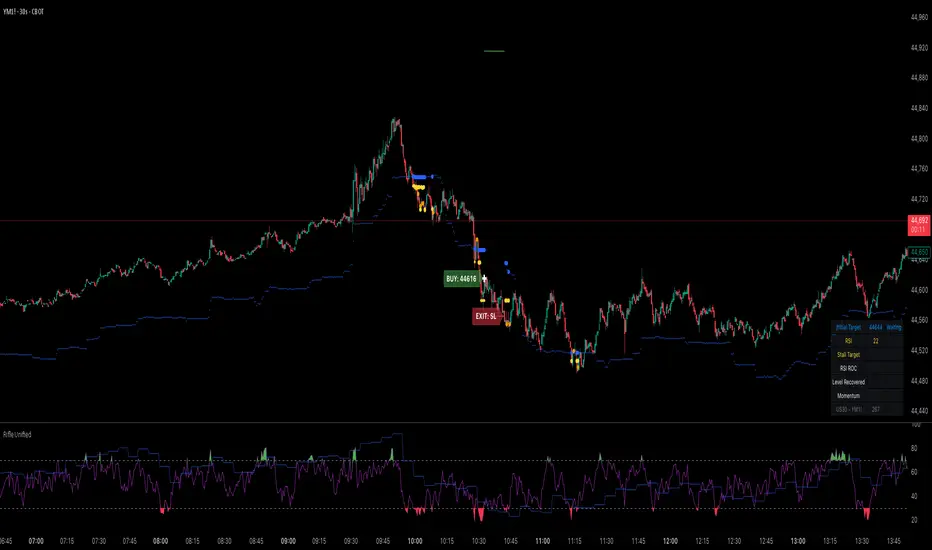
Rifle UnifiedThis script is designed for use on 30-second charts of Dow Jones-related symbols (YM, MYM, US30). It provides automated buy and sell signals using a combination of price action, RSI (Relative Strength Index), and volume analysis. The script is intended for both live trading signals and backtesting, with configurable risk management and debugging features.
Core Functionality
1. Signal Generation Logic
Trigger: The algorithm looks for a sharp price move (drop or rise) of a user-defined threshold (default: 80 points) within a specified lookback window (default: 20 minutes).
Levels: It monitors for price drops below specific numerical levels ending in 23, 43, or 73 (e.g., 42223, 42273).
RSI Condition: When price falls below one of these levels and the RSI is below 30, the setup is considered active.
Buy Signal: A buy is triggered if, after setup:
Price rises back above the level,
The RSI rate of change (ROC) indicates exhaustion of the drop,
The current bar shows positive momentum.
2. Trade Management
Stop Loss & Take Profit: Configurable fixed or trailing stop loss and take profit levels are plotted and managed automatically.
Exit Signals: The script signals exit based on price action relative to these risk management levels.
3. Filters & Enhancements
Parabolic Move Filter: Prevents entries during extreme price moves.
Dead Cat Bounce Filter: Avoids false signals after sharp reversals.
Volume Filter: Optionally requires volume conditions for trade entries (especially for shorts).
Multiple Confirmation Layers : Includes checks for 5-minute RSI, momentum, and price retracement.
User Inputs & Customization
Trade Direction: Toggle between LONG and SHORT signal generation.
Trigger Settings: Adjust thresholds for price moves, lookback windows, RSI ROC, and volume requirements.
Trade Settings: Set take profit, stop loss, and trailing stop behavior.
Debug & Visualization: Enable or disable various plots, labels, and debug tables for in-depth analysis.
Backtesting: Integrated backtester with summary and detailed statistics tables.
Technical Features
Uses External Libraries: Relies on RifleShooterLib for core logic and BackTestLib for backtesting and statistics.
Multi-timeframe Analysis: Incorporates both 30-second and 5-minute RSI calculations.
Chart Annotations: Plots entry/exit points, risk levels, and debug information directly on the chart.
Alert Conditions: Built-in alert triggers for key events (initial move, stall, entry).
Intended Use
Markets: Dow Jones symbols (YM, MYM, US30, or US30 CFD).
Timeframe: 30-second chart.
Purpose: Automated signal generation for discretionary or algorithmic trading, with robust risk management and backtesting support.
Notable Customization & Extension Points
Momentum Calculation: Plans to replace the current momentum measure with "sqz momentum".
Displacement Logic: Future update to use "FVG concept" for displacement.
High-Contrast RSI: Optional visual enhancements for RSI extremes.
Time-based Stop: Consideration for adding a time-based stop mechanism.
This script is highly modular, with extensive user controls, and is suitable for both live trading and historical analysis of Dow Jones index movements
Volume Spike Analyzer(SMA10-Based)📊 **Volume Spike Analyzer (SMA10-Based)**
This indicator highlights abnormal volume activity by comparing current volume to the 10-period Simple Moving Average (SMA) of volume. It helps traders visually identify unusual activity that may precede breakouts, reversals, or news-driven moves.
---
🔧 **Features:**
• ✅ Colors volume bars:
• Green = Volume > SMA(10)
• Red = Volume ≤ SMA(10)
• ✅ Detects and labels spike levels:
• 🔶2x — Volume > 2x SMA(10)
• 🟢3x — Volume > 3x SMA(10)
• 🔴4x — Volume > 4x SMA(10)
• ✅ Built-in alerts for all 3 spike levels
---
📈 **Best Use Cases:**
• Confirm breakouts with strong volume
• Detect accumulation/distribution
• Filter low-volume setups
• Combine with VWAP/EMA for directional confirmation
---
⏱️ **Recommended Timeframes:**
• Intraday: 5m, 15m, 1h
• Also works on daily for swing trades
---
🧠 **Pro Tips:**
• Use with VWAP or EMA(20/50/200) for confluence
• Add SMA(Volume, 10) to your price chart for quick correlation
• Combine with candle pattern detection for signal validation
---

No Supply No Demand by Tanveer)No Supply No Demand Indicator will help you to find confluence to follow VSA strategy.

PUNPORTFX MARKET STRUCTURE CHECK LiteIt is used for viewing trends with MACD and trend, showing it in a simple graphic.

ND NS by Tanveer)This indicator will help you to find No Supply and No Demand based on VSA strategy.


Multi Indicator Version 2This Pine Script combines multiple technical indicators into one TradingView overlay: two EMAs (High/Low), Supertrend, VWAP with flexible anchoring (e.g., Session, Week, Earnings), previous day’s high/low for intraday analysis, and RSI-based visual cues. The Supertrend dynamically shades the background based on trend direction and generates alerts on trend changes. VWAP visibility can be toggled and is hidden on daily or higher timeframes if desired. RSI stars indicate overbought (above 70) and oversold (below 30) conditions. This comprehensive tool aids traders in identifying market trends, momentum, and key support/resistance levels for better decision-making.

Market Strenght PRO by javicdc
💥 Market Strength PRO by javicdc
Who's dominating the market right now?
This indicator gives you the answer in real time using a custom system to measure buying and selling pressure, filtered by EMA 200 and RSI 14 to highlight only the most reliable market moments.
✅ What does this indicator offer?
🔹 Dynamic calculation of market strength based on volume and candle body size
🔹 Visual zones in green or red based on buyer/seller dominance
🔹 Top diagnostic label with clear readings:
🟢 Extreme Buy – ✅ Buyer Dominance – 🔻 Seller Dominance – 🔴 Extreme Sell
🔹 Dynamic background that adjusts with the real market strength
🔹 Smart filter mode: only displays values when trend confirmation is valid (via RSI & EMA200)
🔹 Customizable: choose between SMA or EMA smoothing and toggle filter mode on/off
🧪 How to interpret it?
Strength > 50 → strong buying pressure
Strength < -50 → strong selling pressure
Between -20 and +20 → neutral or indecision zone
The filters ensure signals only appear with true trend confirmation, reducing false positives.
📈 Ideal for:
Scalping, intraday or swing trading across all assets: Forex, crypto, indices or stocks.
Works on all timeframes.
📌 Created by Javier Carrasco (@javicdc) — if you find it useful, don’t forget to like and follow for more technical analysis tools.

Range Filter + SuperTrend 合并指标 - 1小时优化结合两种经典指标,适合做山寨币1小时趋势单
Combining two classic indicators, it is suitable for doing 1-hour trend orders of altcoins

SuperTrend Touch SignalsAlwin's Magic
"Bro I’ve cooked up a trading magic using Supertrend 😎
It literally tells me when to buy and when to sell — like green means go, red means run! Been testing it and damn, it's 🔥🔥🔥
Need to make it automatic next!"


Highs and Lows By ScalprHighs & Lows (HL) – Multi-Time-Frame Levels
What It Does
Highs & Lows plots the most important reference levels for up to four different time-frames at once. It displays divider lines that mark the start of each new period, opening lines showing the first price of the period, highs lines tracking the highest price reached, and lows lines tracking the lowest price reached in each period. Use it to read market structure at a glance, trade opening-range returns, gap fills, sweeps and other level-based setups.
Key Features
Multi-Time-Frame Engine
Choose from 4 Hour, 1 Hour, 30 minutes, 15 minutes, 10 minutes, 5 minutes, Daily, Weekly or Monthly for each of the four slots. Turn individual slots on/off from one global panel for easy management.
Per-Time-Frame Display Controls
For every active slot you can independently toggle divider lines, opening lines, highs lines, lows lines, and hide current opening to keep only completed periods visible.
Smart "Show Last X" Filters
Keep charts clean by limiting history. Control how many recent periods to show for lines and how many recent text labels to display. For example, show only the last 2 hours on a 1-hour chart.
Hide Swept Highs/Lows
Automatically hide any highs or lows that price has traded through, keeping your chart clean and focused only on unswept levels that remain relevant.
Text Labels
Add optional custom text for highs and lows like "H1" and "L1". Labels automatically position above highs and below lows with horizontal alignment options of left, center, or right. Adjust color, size and font weight to match your preferences.
Styling Freedom
Independent color, line style including solid, dashed, or dotted options, and width settings for each level type. Transparency is applied automatically when hiding current period information.
How to Use
Start by enabling the time-frame slots you need in Global Settings. In Multi-Time-Frame Settings, pick the interval for each slot and toggle which lines you want displayed. Fine-tune visibility using "Show Last X" in Time-Frame Lines to limit historical lines, and "Show Last X" in Text to limit labels. Adjust colors and widths in the Time-Frame Lines sections to match your chart theme.
Notes
The script is lightweight and deletes old objects in real time to maintain TradingView's limits. It works on any symbol and chart resolution with levels updating live. Text labels are purely textual with no background boxes to maximize clarity and reduce chart clutter.
Happy trading and stay level-headed!
