Momentum Buy/Sell IndicatorMomentum indicator that needs to be followed and not relied upon completely
Indicators and strategies

Pivot Tops & BottomsHow it works
strategy() call replaces indicator() and enables backtesting.
Longs are opened at each confirmed swing-low and closed at the next swing-high.
Shorts can be turned on via the Enable Short Side toggle.
Position sizing uses 10% of equity per trade by default—adjust in the default_qty_value input.
Turn on Show Pivot Shapes to see where tops/bottoms land on your chart (shifted back by pivotLen).
Use the built-in Strategy Tester tab to review performance, drawdowns, win rate, etc.

Scalping Candle [Crak x MMT]The Scalping Candle is a TradingView indicator designed for scalping strategies, identifying potential bullish and bearish engulfing patterns on price charts. It overlays directly on the chart and marks specific candle patterns with visual signals, helping traders spot short-term trading opportunities. The indicator includes a customizable bias filter to focus on bullish, bearish, or neutral market conditions.
Features
Overlay Indicator : Displays bullish and bearish signals directly on the price chart.
Bias Filter : Allows users to select a market bias ('Bullish', 'Bearish', or 'Neutral') to filter signals based on their trading preference.
Visual Signals : Plots green upward triangles below bullish candles and red downward triangles above bearish candles.
Alerts : Generates alerts for bullish and bearish engulfing patterns, enabling timely notifications for trade setups.
How It Works
The indicator analyzes the relationship between the current and previous candles to detect engulfing patterns:
Bullish Engulfing : Triggered when the current candle's low is at or below the previous candle's low, and its close is at or above the previous candle's midpoint. This signal is displayed only if the bias filter is set to 'Neutral' or 'Bullish'.
Bearish Engulfing : Triggered when the current candle's high is at or above the previous candle's high, and its close is at or below the previous candle's midpoint. This signal is displayed only if the bias filter is set to 'Neutral' or 'Bearish'.
The previous candle's midpoint is calculated as the average of its high and low prices.
Usage
- Add to Chart : Apply the indicator to any TradingView chart.
- Configure Bias Filter :
Neutral : Displays both bullish and bearish signals.
Bullish : Displays only bullish signals.
Bearish : Displays only bearish signals.
- Interpret Signals :
Green upward triangle below a candle indicates a potential bullish reversal.
Red downward triangle above a candle indicates a potential bearish reversal.
- Set Alerts : Use the built-in alert conditions to receive notifications when bullish or bearish engulfing patterns are detected.
Settings
Bias Filter : Choose between 'Neutral', 'Bullish', or 'Bearish' to control which signals are displayed.
Shape Size : Signals are plotted as small triangles for minimal chart clutter.
Alert Conditions : Enable alerts for 'Bullish Engulfing Detected' or 'Bearish Engulfing Detected' to stay informed of new signals.
Ideal Use Case
This indicator is tailored for scalpers and short-term traders looking to capitalize on quick price movements driven by engulfing candle patterns. It works best on 15-minute chart and can be combined with other technical tools for confirmation.

MP AMS (100 bars)Indicator Name: ICT Nested Pivots: Advanced Structure with Color Control
Description:
This indicator identifies and labels nested pivot points across three levels of market structure:
Short-Term Pivots (STH/STL)
Intermediate-Term Pivots (ITH/ITL)
Long-Term Pivots (LTH/LTL)
It detects local highs and lows using a user-defined lookback period and categorizes them into short, intermediate, and long-term pivots based on their relative strength compared to surrounding pivots.
Key Features:
Multi-level pivot detection: Nested identification of short, intermediate, and long-term highs and lows.
Customizable display: Toggle visibility of each pivot level independently for both highs and lows.
Color control: Customize colors for high and low pivot labels and text for enhanced chart readability.
Clear labeling: Each pivot is marked with intuitive labels ("STH", "ITH", "LTH" for highs and "STL", "ITL", "LTL" for lows) placed above or below bars accordingly.
Safe plotting: Avoids errors by validating data and only plotting labels within the lookback range.
This tool helps traders visually analyze market structure and identify key turning points at different time scales directly on their price charts.

GARCH Volatility [Trading Signals]This is a GARCH-like indicator rather than a full academic GARCH model
Current Strengths:
Current Strengths:
Captures core volatility clustering (alpha + beta)
Provides actionable signals
Lightweight for TradingView
When to Use This vs True GARCH:
Use This For: Real-time trading signals, visual market analysis
Use Full GARCH For: Risk modeling, quantitative research

Enhanced Multi-Timeframe Bias Dashboard + VolatilityProvides a table that indicates the RSI, MACD and overall bias across the daily, 4 hour and 1 hour timeframes

Hourly Divider with Opening Price🕐 Hour Lines with Opening Price — Utility Indicator
This lightweight TradingView script helps short-term option traders quickly visualize hourly structure and bias.
What it does:
Draws a vertical blue line at the start of each new hour
Draws a horizontal yellow line from the opening price of the hour, extending until the next hour
Purpose:
This tool makes it easy to:
Track hourly price context on lower timeframes like 1-minute
See how far price moves relative to the hourly open
Identify mean-reversion or breakout conditions around hourly transitions
Best used on:
1-minute (1m) charts, where understanding the position of price relative to the hourly open can inform "Up or Down" binary trades.

Hybrid Cumulative DeltaWhat does this indicator show?
This script displays two types of CVD (Cumulative Volume Delta):
1. Simple Cumulative Delta Volume:
This is the basic method:
pinescript
Kopiraj
Uredi
deltaVolume = volume * (close > close ? 1 : close < close ? -1 : 0)
➡️ It increases cumulative volume if the candle closes higher, and decreases it if it closes lower.
It's a simple assumption:
If the candle is bullish → more buying.
If bearish → more selling.
Then it's accumulated with:
pinescript
Kopiraj
Uredi
cumulativeDeltaVolume = ta.cum(deltaVolume)
It's plotted as candlesticks, rising or falling based on delta volume.
2. Monster Cumulative Delta (advanced method):
Uses a more complex formula, taking into account:
Candle range (high - low),
Relationship between open, close, and wicks,
Distribution of volume inside the candle.
pinescript
Kopiraj
Uredi
U1 = (close >= open ...) ? ...
D1 = (close < open ...) ? ...
Delta = close >= open ? U1 : -D1
cumDelta := nz(cumDelta ) + Delta
➡️ Purpose: to more realistically estimate aggressive buyers/sellers.
This is a refined CVD, ideal for markets without real order book data (like forex).
📍 What does the indicator tell us?
➕ If cumulative delta is rising:
Buyers are in control (more aggressive market buys).
➖ If cumulative delta is falling:
Sellers dominate (more aggressive market sells).
📈 How to read it on the chart:
You’ll see 2 candlestick plots:
One for the simple delta (green/red delta volume candles),
One for the monster delta, which is often smoother.
👉 The key is to watch for divergence between price and CVD:
If price goes up but CVD goes down → buyers are weak = potential reversal.
If price drops and CVD rises → selling pressure is weak = potential bounce.
🕐 Best timeframe (interval) for forex?
Timeframe Purpose Recommendation
1m–15m Scalping / short-term flow ✅ Works well, but needs high-volume pairs (e.g., EUR/USD, GBP/USD)
1H–4H Swing trading / intraday ✅ Best balance – reveals smart money movements
1D Macro overview, long-term volume Usable, but less granular info
🔹 Recommendation for forex: 4H interval
Enough volume data to detect shifts in real pressure.
Less noise than lower timeframes.
Great for spotting swing setups (e.g., divergences at support/resistance).

Auto AVWAP (Anchored-VWAP) with Breakout ScreenerAuto AWAP based indicator that is able to idenifty the breakout of AWAP

Previous Day LevelsPrevious Day Levels (PDH, PDL, PDC)
This indicator automatically plots the key price levels from the previous trading day onto your chart: the High (PDH), Low (PDL), Close (PDC), and the Midpoint.
These levels are essential for day traders who use them to identify potential areas of support and resistance, gauge market sentiment, and pinpoint key breakout or breakdown zones.
Key Features:
Smart Drawing: Lines for past days are neatly contained within their daily session, while the current day's lines extend in real-time for live analysis.
Four Key Levels: Plots the Previous Day High, Low, Close, and Midpoint.
Full Customization: Easily toggle the visibility of each line and customize its color, style (solid, dotted, dashed), and width to match your personal chart theme.
This is a clean, lightweight, and fully adjustable tool for adding a classic day trading strategy to your analysis.

OA - RS HistogramOA - RS Histogram Indicator
This indicator displays a histogram representation of Relative Strength (RS) analysis, helping traders visualize the momentum relationship between a security and a reference index.
Key Features:
RS Histogram: Shows the difference between the current RS ratio and its EMA smoothed line
Customizable Reference Index: Default set to XU100, but can be changed to any index
EMA Smoothing: Adjustable EMA period (default 21) for trend analysis
Visual Clarity: Histogram bars are colored aqua for positive values and purple for negative values
Zero Line Reference: Dotted gray line for easy identification of positive/negative zones
How It Works:
The indicator calculates the relative strength by comparing the normalized percentage changes of the current security against the selected reference index. A 5-period EMA is applied to the RS ratio, and then the difference between this smoothed RS line and a longer EMA (default 21 periods) is displayed as a histogram.
Technical Calculation:
Fetches reference index data with proper gap handling
Calculates normalized percentage changes for both security and index
Computes relative strength ratio
Applies EMA smoothing to reduce noise
Displays the difference as a histogram for clear momentum visualization
Customization Options:
Reference index selection (default: XU100)
EMA length adjustment (default: 21 periods)
Color customization for positive and negative histogram bars
Alert Conditions:
Histogram crossing above zero (potential bullish momentum shift)
Histogram crossing below zero (potential bearish momentum shift)
Usage:
This tool helps traders understand relative strength concepts through visual histogram representation. The zero-line crossovers can indicate momentum shifts in the security relative to the chosen benchmark index.

Dex Stoch RSI + WaveTrend Dots [Enhanced]Wave indicator with RSI and dots signaling. dots signals when its over bought or over sold but it also follows the rsi trend when bullish or bearish momentum is coming.

MTF Candles [Fadi x MMT]MTF Candles
Overview
The MTF Candles indicator is a powerful tool designed for traders who want to visualize higher timeframe (HTF) candles directly on their current chart. Built with flexibility and precision in mind, this Pine Script indicator displays up to six higher timeframe candles, complete with customizable styling, sweeps, midpoints, fair value gaps (FVGs), volume imbalances, and trace lines. It’s perfect for multi-timeframe analysis, helping traders identify key levels, market structure, and potential trading opportunities with ease.
Key Features
- Multi-Timeframe Candles : Display up to six higher timeframe candles (e.g., 5m, 15m, 30m, 4H, 1D, 1W) on your chart, with configurable timeframes and visibility.
- Sweeps Detection : Identify liquidity sweeps (highs/lows) with customizable line styles, widths, and colors, plus optional alerts for confirmed bullish or bearish sweeps.
- Midpoint Lines : Plot the midpoint (average of high and low) of the previous HTF candle, with customizable color, width, and style for enhanced market analysis.
- Fair Value Gaps (FVGs) : Highlight gaps between non-adjacent candles, indicating potential areas of interest for price action.
- Volume Imbalances : Detect and display volume imbalances between adjacent candles, aiding in spotting significant price levels.
- Trace Lines : Connect HTF candle open, close, high, and low prices to their respective chart bars, with customizable styles and optional price labels.
- Custom Daily Open Times : Support for custom daily candle open times (Midnight, 8:30, or 9:30) to align with specific market sessions.
- Dynamic Labels : Show timeframe names, remaining time until the next HTF candle, and interval labels (e.g., day of the week for daily candles) with adjustable positions and sizes.
- Highly Customizable : Fine-tune candle appearance, spacing, padding, and visual elements to suit your trading style.
How It Works
The indicator renders HTF candles as boxes (bodies) and lines (wicks) on the right side of the chart, with each timeframe offset for clarity. It dynamically updates candles in real-time, tracks their highs and lows, and displays sweeps and midpoints when conditions are met. FVGs and volume imbalances are calculated based on candle relationships, and trace lines link HTF candle levels to their originating bars on the chart.
Sweep Logic
- A bearish sweep occurs when the current candle’s high exceeds the previous candle’s high, but the close is below it.
- A bullish sweep occurs when the current candle’s low falls below the previous candle’s low, but the close is above it.
- Sweeps are visualized as horizontal lines and can trigger alerts when confirmed on the next candle.
Midpoint Logic
- A midpoint line is drawn at the average of the previous HTF candle’s high and low, extending until the next HTF candle forms.
- Useful for identifying potential support/resistance or mean reversion levels.
Imbalance Detection
- FVGs : Identified when a candle’s low is above the next-but-one candle’s high (or vice versa), indicating a price gap.
- Volume Imbalances : Detected between adjacent candles where the body of one candle doesn’t overlap with the next, signaling potential liquidity zones.
Settings
Timeframe Settings
- HTF 1–6 : Enable/disable up to six higher timeframes (default: 5m, 15m, 30m, 4H, 1D, 1W) and set the maximum number of candles to display per timeframe (default: 4).
- Limit to Next HTFs : Restrict the number of active timeframes (1–6).
Styling
- Body, Border, Wick Colors : Customize bull and bear candle colors (default: light gray for bulls, dark gray for bears).
- Candle Width : Adjust the width of HTF candles (1–4).
- Padding and Spacing : Set the offset from the current price action and spacing between candles and timeframes.
Label Settings
- HTF Label : Show/hide timeframe labels (e.g., "15m", "4H") at the top/bottom of candle sets.
- Remaining Time : Display the countdown to the next HTF candle.
Interval Value: Show day of the week for daily candles or time for intraday candles.
- Label Position/Alignment : Choose to display labels at the top, bottom, or both, and align them with the highest/lowest candles or follow individual candle sets.
Imbalance Settings
- Fair Value Gap : Enable/disable FVGs with customizable color (default: semi-transparent gray).
- Volume Imbalance : Enable/disable volume imbalances with customizable color (default: semi-transparent red).
Trace Settings
- Trace Lines : Enable/disable lines connecting HTF candle levels to their chart bars, with customizable colors, styles (solid, dashed, dotted), and sizes.
- Price Labels : Show price levels for open, close, high, and low trace lines.
- Anchor : Choose whether trace lines anchor to the first or last enabled timeframe.
Sweep Settings
- Show Sweeps : Enable/disable sweep detection and visualization.
- Sweep Line : Customize color, width, and style (solid, dashed, dotted).
- Sweep Alert : Enable alerts for confirmed sweeps.
Midpoint Settings
- Show Midpoint : Enable/disable midpoint lines.
- Midpoint Line : Customize color (default: orange), width, and style (solid, dashed, dotted).
Custom Daily Open
Custom Daily Candle Open : Choose between Midnight, 8:30, or 9:30 (America/New_York) for daily candle opens.
Usage
- Add the indicator to your TradingView chart.
- Configure the desired higher timeframes (HTF 1–6) and enable/disable features via the settings panel.
- Adjust styling, labels, and spacing to match your chart preferences.
Use sweeps, midpoints, FVGs, and volume imbalances to identify key levels for trading decisions.
- Enable sweep alerts to receive notifications for confirmed liquidity sweeps.
Notes
Performance: The indicator is optimized for up to 500 boxes, lines, and labels, with a maximum of 5000 bars back. Can be slow at a time
Time Zone: Custom daily opens use the America/New_York time zone for consistency with major financial markets.
Compatibility: Ensure selected HTFs are valid (higher than the chart’s timeframe and divisible by it for intraday periods).

Dex Stoch RSI + WaveTrend Dots [Enhanced]Wave indicator with RSI and dots signaling. dots signals when its over bought or over sold but it also follows the rsi trend when bullish or bearish momentum is coming.

SMA Variancegives value between 9 and 20 SMA. looking to create alarm based on decreasing difference
after large gap.

Chaikin Oscillator Enhanced📊 What Is the Chaikin Oscillator?
The Chaikin Oscillator is a momentum indicator that helps traders understand the strength of buying and selling pressure in the market, based on volume and price movement.
It is calculated as the difference between two moving averages (short-term and long-term) of the Accumulation/Distribution Line (A/D Line). This line combines price and volume to show whether money is flowing into or out of an asset.
________________________________________
🧠 Simple Concept
• When big traders are buying, they usually do so with volume support—the Chaikin Oscillator picks this up.
• When volume is rising but price is falling, or vice versa, it shows hidden strength or weakness.
So, this indicator helps you see what the smart money is doing, even if the price isn’t moving much.
________________________________________
🛠️ How It Works
• Oscillator Value Above Zero → More buying pressure (bullish).
• Oscillator Value Below Zero → More selling pressure (bearish).
• Crossing above zero → A potential buy signal.
• Crossing below zero → A potential sell signal.
The histogram (vertical bars) in the indicator changes color:
• Green bars = Positive momentum.
• Red bars = Negative momentum.
________________________________________
🎯 How Traders Use It for Entry and Exit
✅ For Entries:
• Buy Entry: When the oscillator crosses above the zero line and the bars turn green, it means buyers are stepping in with volume.
• For better confirmation, combine it with price breaking above a resistance level.
❌ For Exits or Shorts:
• Sell Exit or Short Entry: When the oscillator crosses below the zero line and bars turn red, it suggests selling pressure is growing.
• If the price is also below support, it’s a stronger signal.
________________________________________
🔍 Example Use Case:
1. You’re watching a stock or crypto that's been going sideways.
2. Suddenly, the Chaikin Oscillator crosses above zero, and green bars appear.
3. That’s your early clue that big buyers might be entering.
4. If price confirms this with a breakout, you can enter a long position.
________________________________________
🌐 Where Is It Useful?
The Chaikin Oscillator is great for:
• Stocks (especially volume-heavy large caps)
• ETFs
• Cryptocurrency (on exchanges that provide volume data)
• Forex – less reliable unless volume is proxy-based
⚠️ Important: It won’t work well on instruments where volume data is missing or unreliable (like some CFDs or synthetic assets).
________________________________________
🧭 Pro Tips for Using It:
• Combine it with support/resistance, moving averages, or candlestick patterns.
• Avoid trading only based on this indicator—use it as confirmation.
• Use the alerts (added in the script) so you don’t miss key movements.
________________________________________

Higher High Lower Low Multi-TF📊 Higher High Lower Low Multi-Timeframe Indicator
Detects market structure shifts (HH, HL, LH, LL)
Identifies trend direction (bullish / bearish / neutral)
Works across multiple timeframes (M5 to Weekly)
Displays a compact trend summary table on the chart
Customizable pivot sensitivity (Left/Right Bars)
Visual labels on chart for structure points
Ideal for structure-based trading and SMC traders

DIVAP RSI by:TMThe DIVAP RSI by:TM is a precision-focused RSI-based indicator designed to identify high-confidence entry and exit points. It uses a faster RSI (length 7) combined with extended levels (20 and 80) to capture momentum reversals at extreme zones.
✅ Green arrows signal entries when RSI crosses above 20 (exit from oversold)
✅ Red arrows signal exits when RSI crosses below 80 (exit from overbought)
This minimalist tool is ideal for traders who prefer clean chart setups with clear, timely alerts.
🔧 This is a test version and is actively being improved. Feedback is welcome!

Binary Satisfaction20‑EMA Trend Filter: Only long above EMA(20), short below (EMA isn’t plotted).
Volume Filter: Bar’s volume > 10‑bar SMA × volMult.
RSI Filter: Requires RSI(14) > 50 for buys, < 50 for sells.
ATR Volatility Filter: Only trade when ATR(14) > its 20‑bar SMA (avoids low‑vol markets).
Breakout Confirmation: BUY only if current close > prior high; SELL only if < prior low.

No Wick Candle MarkerDescription
The "No Wick Candle Marker" indicator identifies and highlights candles with no upper or lower wicks on your chart, helping traders spot potential reversal or continuation patterns. A candle with no lower wick (open equals low) is marked with a green triangle below the bar, while a candle with no upper wick (open equals high) is marked with a red triangle above the bar. This indicator is customizable, allowing you to use either the chart’s timeframe or a user-defined timeframe for detection.
Features
Wick Detection: Marks candles with no lower wick (bullish) and no upper wick (bearish) for easy identification.
Timeframe Flexibility: Choose between the chart’s current timeframe or a custom timeframe (e.g., 1-minute, 4-hour, daily, etc.).
Visual Clarity: Uses clear, color-coded triangles (green for no lower wick, red for no upper wick) for intuitive analysis.
Overlay Indicator: Seamlessly integrates with your chart without cluttering the view.
How It Works
The indicator checks each candle to determine if its open price equals its low (no lower wick) or high (no upper wick). When conditions are met, it plots a triangle marker below or above the candle, respectively. The timeframe setting allows you to analyze wick patterns on your preferred timeframe, making it versatile for scalping, swing trading, or long-term analysis.
Settings
Use Chart Timeframe: Enable to detect no-wick candles on the chart’s current timeframe. Disable to select a custom timeframe.
Custom Timeframe: Choose a specific timeframe (e.g., 1M, 5M, 15M, 1H, 4H, D, W, M) when not using the chart’s timeframe.
Use Cases
Identify strong bullish or bearish candles with no wicks, often associated with significant price momentum.
Combine with other technical tools to confirm reversals, breakouts, or trend continuations.
Analyze patterns across different timeframes for multi-timeframe trading strategies.
Notes
Best used in conjunction with other technical analysis tools to validate signals.
Works on any market (stocks, forex, crypto, etc.) and any timeframe supported by the platform.
Get Started
Add the "No Wick Candle Marker" to your chart, adjust the timeframe settings to suit your trading style, and start identifying key candle patterns with ease!

Purple Dot IndicatorDescription:
Identifies high-momentum candles using price % move + volume spike.
Purple = Combined signal | Blue = Price only | Orange = Volume only.
Created by Haseeb Badar (@HB_Stocks).

PL TrackerIt's a very simple script that returns daily and open PL given entry price and quantity of shares.
You can have a list of stocks owned and keep them as a list in this format:
$Ticker1, EntryPrice1, SharesOwned1, $Ticker2, EntryPrice2, SharesOwned2, etc...

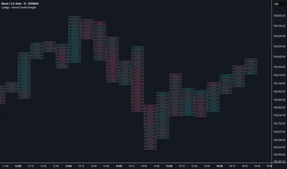
Internal Candle Strength [LuxAlgo]The Internal Candle Strength tool allows traders to divide each chart bar into multiple rows of custom size and inspect the strength of the lower timeframes trends located within each row.
This tool effectively helps traders in identifying the power dynamic between bulls and bears within multiple areas within each bar, providing the ability to conduct LTF analysis.
🔶 USAGE
The strength displayed within each row ranges from 0% to 100%, with 0% being the most bearish and 100% being the most bullish.
Traders should be aware of the extreme probabilities located at the higher/lower end of the bars, as this can signal a change in strength and price direction.
Traders can select the lower timeframe to pull the data from or the row size in the scale of the chart. Selecting a lower timeframe will provide more data to evaluate an area's strength.
Do note that only a timeframe lower than the chart timeframe should be selected.
🔹 Row Size
Selecting a smaller row size will increase the number of rows per bar, allowing for a more detailed analysis. A lower value will also generally mean that less data will be considered when calculating the strength of a specific area.
As we can see on the chart above (all BTCUSD 30m), by selecting a different row size, traders can control how many rows are displayed per bar.
🔶 SETTINGS
Timeframe: Lower timeframe used to calculate the candle strength.
Row Size: Size of each row on the chart scale, expressed as a fraction of the candle range.