Dettling Sexy Shirt LevelsThis indicator allows you to quickly enter levels you want to trade for quick scalps. You can enter your buy or sell point (Bull or Bear Line), and up to 5 profit levels. Pearsons Pivots and Camarillo Pivots are automatically updated each day, and can be selected on or off. It works well if you buy a call or put a few days until expiration, a few dollars out of the money.
After entering your buy points and Target levels, there is a drop down menu at the top of the settings page. You must select the ticker you are looking at on the chart, Tradingview will not automatically update the level if you are looking at a ticker but it is not selected in the menu.
Indicators and strategies

ICT Macro Highlighter + EMA 9/20/200 + Alertstest indicator for Triple ema cross during high probability ICT macros

First FVG📘 Indicator Description (English)
First FVG – NY Open is a TradingView indicator designed to automatically identify the first Fair Value Gap (FVG) that appears during the New York session, following the ICT (Inner Circle Trader) methodology.
It highlights institutional inefficiencies in price caused by imbalanced price action and helps traders spot high-probability entry zones, especially after the 9:30 AM EST (New York Open).
⚙️ How It Works
Session time: The indicator scans for FVGs starting at 9:32 AM (allowing 3 candles after the NY Open to form).
FVG Conditions:
Bullish FVG: When the high of 2 candles ago is lower than the low of the current candle and the middle candle is bullish.
Bearish FVG: When the low of 2 candles ago is higher than the high of the current candle and the middle candle is bearish.
Only the first FVG per session is drawn, as taught by ICT for setups like Judas Swing or NY Reversal models.
A colored box is drawn to represent the FVG zone.
A dotted horizontal line (CE) is drawn at the midpoint of the FVG box (Consequent Encroachment), a key level watched by smart money traders.
A dashed vertical line is drawn at 9:30 NY time to mark the open.
🧠 How to Use It
Wait for the NY Open (9:30 AM EST) – the indicator becomes active at 9:32 AM.
Watch for the first FVG box of the day. This is often a high-probability reaction zone.
Use the CE line (center of the FVG) as a reference for entries, rejections, or liquidity grabs.
Combine with market structure, PD Arrays, and liquidity concepts as taught by ICT for confluence.
The FVG box and CE line will extend forward for several candles for visual clarity.
🎛️ Customizable Settings
Session time (default: 09:32–16:00 NY)
FVG box color (up/down)
Text color
Max number of days to keep boxes on chart
Option to show or hide the 9:30 NY Open vertical line

Supply/Demand Zones with Midline (No Overlap Logic)Supply and demand formations based on inside bar breakouts. Automatically plots zones to buy and sell from. MTF analysis available.

Range Filter Buy & Sell 5min + Multi-TF DashboardElevate your edge with Range Filter Buy & Sell 5min + Multi-TF Dashboard—a precision-engineered trend companion that scans your favorite markets from the 5-minute tick to the higher-timeframe horizon. By harmonizing short-term signals with the broader trend, it delivers crystal-clear buy and sell cues—and the confidence to act on them. Whether you’re scalping, swing trading, or investing for the long haul, this all-in-one dashboard empowers you to ride only the strongest trends and step aside before the noise hits. Trade smarter. Trade with clarity. Trade with conviction.

Daily, Weekly, Monthly Current/Average RangeThe "Daily, Weekly, Monthly Current/Average Range" calculates and displays current and average price ranges (high - low) for daily, weekly, and monthly timeframes in a customizable table.
Users can adjust the lookback period, table size, and font color, with the table updating on the last bar for efficiency.
When the current range exceeds the average for a timeframe, the corresponding cell highlights green, signaling price possibly reaching maximum expansion and potential retracement or consolidation may follow.

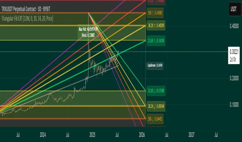
Triangular Fib🔍 Features
- Dynamic Lookback & Projection: Automatically adjusts the range and projection horizon based on timeframe changes.
- Triangular Fibonacci Arms: Projects fib levels upward and downward from high/low extremes to highlight potential price inflections.
- Volatility-Shaded Equilibrium: Visual zone highlights areas of consolidation or energy buildup before breakouts.
- Breakout Alerts: Detects and signals bullish/bearish breakouts from triangular fib thresholds.
- Auto-Traced Triangle Wedge: Dotted wedge lines visually represent narrowing price action from range extremes to midpoint.
Ideal for traders who seek visual clarity, price symmetry, and alert-driven decision-making across multiple timeframes. Whether you're swing trading or intraday scouting, this script provides a richly layered roadmap of market potential.
Not financial advice.
Customized ATR Trailing Stop with Fixed ATR DisplayCustomized ATR Trailing Stop with Fixed ATR Display

GMMA-MACDThe indicator itsels is a hybrid of the MACD and GMMA indicators, it has 2 modes, normal and Consensus mode.
The normal mode plots 2 modified MACD, one using the currently highest of the GMMA fast group to calculate the MACD line, and the other one uses the currently lowest of the slow group to do the same.
In Consensus mode all the GMMA moving averages being calculated separately, which means it uses 12 MACD indicators instead of 2, the logic is the same as in the normal MACD, turns bullish if MACD above it's signal line, in this mode also has a Donchian channel to help visualize potential divergences.
This mode can show trend direction and strength more effectively, and potential reversal points, coloring of the indicator is green if all MACD are in consensus of a bullish trend, turns light green if 7-11 of them shows slight/weakening bullish trend, orange for neutral (6-6), light red for 7-11 shows slight/weakening bearish trend, red if all shows bearish trend.
For easier adjustment instead of adjusting every single EMA period, the logic uses a multiplier to adjust the periods as a whole unit.
Tested in a few strategies against the normal MACD, as a trend filter, this one gave at least the same results, usually better, and because it's logic is dynamic it's more future proof than the normal MACD.

Smart Volatility Squeeze + Trend Filter
Smart Volatility Squeeze + Trend Filter
This advanced indicator detects low-volatility squeeze conditions and plots breakout signals, helping you spot strong price moves before they happen.
How it works
This script combines Bollinger Bands (BB) and the Keltner Channel (KC) — two popular volatility tools — to identify squeeze setups:
A squeeze occurs when the Bollinger Bands contract and move completely inside the Keltner Channel. This means the market is quiet and volatility is low — often right before a significant breakout.
When the squeeze condition is active, the background highlights the chart area with a soft color that gradually intensifies the longer the squeeze lasts. This gives a clear visual cue that pressure is building.
A breakout signal triggers when price crosses above the upper Bollinger Band (bullish) or below the lower Bollinger Band (bearish) — confirming that the squeeze has ended and a new impulse is likely starting.
To reduce false breakouts, you can enable the built-in trend filter. By default, it uses a simple EMA: breakouts are confirmed only if the price action aligns with the overall trend direction.
Key features
🔹 Bollinger Bands + Keltner Channel squeeze detection
🔹 Automatic squeeze marker and background shading
🔹 Breakout arrows for up and down signals
🔹 Optional trend filter with adjustable EMA length
🔹 Works on any market: crypto, stocks, forex, indices
🔹 Fully adjustable inputs for BB, KC and trend filter
🔹 Built-in ready-to-use alerts for breakouts
How to use
Watch for areas where the squeeze condition appears — the background will highlight them.
Wait for a breakout arrow to appear outside the bands.
Use the trend filter to focus only on breakouts in the dominant trend direction.
Combine with your existing risk management and confirmation tools.
Inputs
BB Length & StdDev: Control the Bollinger Bands settings.
KC EMA Length & ATR Multiplier: Control the Keltner Channel width.
Trend Filter Length: Adjust how smooth or sensitive the trend filter is.
Use Trend Filter: Enable or disable confirmation by trend direction.
Disclaimer
⚠️ This script is for educational purposes only and does not constitute financial advice. Always test any strategy thoroughly and trade at your own risk.


Custom Time LinesMarks out London and Asia Session open times and close times to help when trading New York Session

Daily MAs IntradayThis script overlays up to 6 customizable daily moving averages on any intraday chart. It’s designed for traders who want to see higher-timeframe trend levels while operating on lower timeframes (e.g., 5m, 15m, 1h).
Each line is calculated from daily candle data and projected forward into your intraday chart. This makes it ideal for intraday traders who rely on daily MA levels for trend confirmation, support/resistance, or bounce setups.

EMA Crossover with ArrowPlots two EMAs with a shape to indicate when the short EMA crosses over the long EMA.
Customizable settings
Short/Long EMA duration
Shape Type/Color/Position

Hidden Markov ModelOverview
This model uses a Hidden Markov Model to identify and predict market regimes in real-time. It is designed to probabilistically identify market regime changes and predict potential reversal point using a forward algorithm to calculate the probability of a state.
Unlike traditional technical indicators that rely on price patterns or moving averages, this HMM analyses the underlying statistical structure of market movements to detect when the market transitions between different behavioural states such as trending, ranging, or volatile periods
How it works
The HMM assumes that market behavior follows hidden states that aren't directly observable, but can be inferred from observable market data (emissions). The model uses a (somewhat simplified) Bayesian inference to estimate these probabilities.
State 0: (Normal Trading): Market continuation patterns, balanced buying/selling
State 1: (Top Formation): Exhaustion patterns at price highs
State 2: (Bottom Formation): Capitulation patterns at price lows
How to use
1) Identify the trend (you can also use it counter-trend)
2) For longing, look for a green arrow. The probability values should be red. For shorting, look for a red arrow. The probability values should be green
3) For added confluence, look for high probability values of above 25%.
Advantages and what makes it unique
Unlike moving averages or oscillators that react to price changes, the HMM proactively identifies the underlying market structure. This forward-looking approach can signal regime changes before they become apparent in price action, providing traders with an informational edge.

Sector SPDR ETFsThis script automatically identifies the SPDR sector ETF that corresponds to the currently viewed US stock ticker. It maps over 500 US-listed stocks to their respective SPDR sector ETFs — such as XLK (Technology), XLF (Financials), XLY (Consumer Discretionary), and others — based on pre-defined symbol lists.
When applied to a chart, the script displays a label below the last candle showing the SPDR sector symbol (e.g., "XLE" for Energy stocks like XOM). This allows traders and investors to quickly understand the sector classification of any stock they analyze.
Key Features:
Maps tickers to SPDR sector ETFs: XLC, XLY, XLP, XLE, XLF, XLV, XLI, XLB, XLRE, XLK, and XLU.
Displays the corresponding sector label on the chart.
Helpful for sector rotation strategies, macro analysis, or thematic investing.

Opening Print Line (Customizable)📈 Opening Print Line (Customizable) is a simple yet powerful intraday tool that plots the opening price of the regular trading session (RTH) and keeps it visible across the entire chart—including during pre-market and extended hours.
💡 Key Features:
🕒 Configurable time zone selector (choose from Pacific, Mountain, Central, or Eastern)
🎯 Automatically detects and plots the 9:30 AM local opening price
🎨 Customizable line color
🏷️ Optional on-chart label with editable text
This indicator is especially useful for:
Identifying opening breakout or fade setups
Anchoring support/resistance levels to the session open
Building opening range strategies or scalp setups
🔧 Built with Pine Script v6. Fully compatible with stocks, ETFs, futures, or any instrument that follows a regular session open time.
⚠️ Note: The script assumes the regular trading session starts at 9:30 AM in the selected time zone. You can modify the time if using it for futures, crypto, or other markets.

RSI Pivot Markers + Breakout Alerts + Anchored VWAPMarks RSI high price with a dotted line and marks low Pivot and puts an anchored vwap to the last rsi low price.

Smart RSI Divergence PRO | Auto Lines + Alerts
Smart RSI Divergence PRO
This indicator automatically finds RSI divergences on price charts:
🔹 Detects both regular & hidden divergences
🔹 Draws auto trendlines connecting swing highs & lows
🔹 Clear triangle labels directly on the chart
🔹 Ready-to-use alerts for your strategy
Use it to spot potential trend reversals and hidden continuation signals.
How it works
Regular Divergence: Price makes a higher high (or lower low) while RSI does not — this can signal a possible trend reversal.
Hidden Divergence: Price makes a lower high (or higher low) while RSI makes a higher high (or lower low) — this can signal a possible trend continuation in the same direction.
Auto Lines & Labels
The script automatically detects local swing highs and lows and draws connecting trendlines on price.
Labels appear on the chart as colored triangles, so signals are easy to see at a glance:
🔻 Red triangle — Regular Bearish Divergence (potential short)
🟠 Orange triangle — Hidden Bearish Divergence (possible trend continuation down)
🟢 Green triangle — Regular Bullish Divergence (potential long)
🔵 Blue triangle — Hidden Bullish Divergence (possible trend continuation up)
Customization
You can adjust:
RSI length
Show/hide regular or hidden divergences
Show/hide auto lines and labels
Customize line width and transparency
Works on any market and any timeframe — crypto, forex, indices, stocks.
⚠️ Disclaimer: This script is for educational purposes only and does not constitute financial advice. Always test any strategy thoroughly and trade at your own risk.

Smart Deviation Trend Bands PRO + MTF Filter
Smart Deviation Trend Bands PRO + MTF Filter
This advanced version of Smart Deviation Bands gives you everything you need to catch cleaner trend bounces and avoid fake signals.
🔹 Classic deviation bands with 1, 2 and 3 standard deviations
🔹 Dynamic SMA line with clear trend coloring
🔹 Built-in multi-timeframe trend filter (MTF)
🔹 Signals only appear when they align with the higher timeframe trend
🔹 Ready-to-use alerts for bullish and bearish bounces
How it works
The script plots classic standard deviation bands around a dynamic Simple Moving Average (SMA). The three bands (1, 2 and 3 standard deviations) help you spot different levels of pullbacks or extensions relative to the trend.
A built-in multi-timeframe filter checks the trend on a higher timeframe (HTF). A signal appears only when a bounce aligns with the bigger trend:
Bullish bounce: Price crosses up from the lower deviation band while the HTF trend is up.
Bearish bounce: Price crosses down from the upper deviation band while the HTF trend is down.
Signal markers
🟢 Green circle: Bullish bounce — price crossing up from lower band with HTF uptrend
🔴 Red circle: Bearish bounce — price crossing down from upper band with HTF downtrend
How to use
Works on any market (crypto, stocks, forex).
Works on any timeframe — the filter can use any higher timeframe you choose (for example, H4, 1D, 1W).
Fully adjustable settings: SMA length, standard deviation multipliers, and filter timeframe.
Combine this with your strategy to filter out fake breakouts and trade in line with the bigger trend.
⚠️ Disclaimer: This script is for educational purposes only and does not constitute financial advice. Always test any strategy thoroughly and trade at your own risk.

Smart Price Divergence (MACD Filter) + EMA
Smart MACD Price Divergence + EMA
This indicator automatically spots price divergences filtered by MACD momentum and trend direction with an adjustable EMA:
🔹 Detects regular bullish & bearish divergences
🔹 Filters signals using a simple EMA trend filter
🔹 Clear triangle labels on the chart
🔹 Ready-to-use alerts for your strategy
Use it to catch potential reversal points when the trend may be losing strength.
How it works
Bearish Divergence: Price makes a higher high above the EMA while MACD makes a lower high → possible reversal down.
Bullish Divergence: Price makes a lower low below the EMA while MACD makes a higher low → possible reversal up.
EMA filter: Helps identify when the market is overextended relative to its trend.
The indicator uses standard MACD settings (fast, slow, and signal lengths) which can be adjusted to fit your asset and timeframe. The EMA length is also fully customizable.
Signal colors
🔻 Red triangle — Bearish Price Divergence (potential short)
🔺 Green triangle — Bullish Price Divergence (potential long)
This script works on any timeframe and market — crypto, forex, indices, or stocks. Signals do not repaint once confirmed.
⚠️ Disclaimer: This script is for educational purposes only and does not constitute financial advice. Always test any strategy thoroughly and trade at your own risk.

Buy Sell Magic Rework
A version of the legendary Forex indicator Buy Sell Magic for TradingView, with optional additional filtering in the settings.
A simple yet very effective trend-following tool — I personally used it for trading gold 14 years ago, and it still works great today!
How it works:
This script combines the classic Parabolic SAR trend indicator with an optional ZigZag filter for additional signal confirmation.
Parabolic SAR:
The indicator plots the Parabolic SAR on the chart to help identify trend direction and potential reversals. A buy signal is generated when the SAR flips from above the price to below it, signaling a possible uptrend. A sell signal appears when the SAR moves from below to above the price, indicating a potential downtrend.
ZigZag Filter (optional):
The ZigZag filter uses pivot highs and lows to reduce market noise and confirm significant swings. When enabled, a signal is shown only after a clear pivot forms in the chosen period.
Inputs:
ZigZag Period: Controls pivot sensitivity.
SAR Start, Increment, Max: Adjust how responsive the SAR is.
Use ZigZag Filter: Enable or disable additional filtering.
Plots:
Gray crosses = Parabolic SAR points
Green arrows = Buy signals
Red arrows = Sell signals
Best Use:
This tool works well on various markets: Forex, crypto, stocks. It is best suited for trend-following or swing trading strategies. Adjust the settings for your preferred asset and timeframe, and always backtest before live trading.
⚠️ Disclaimer: This script is for educational purposes only and does not constitute financial advice. Always test any strategy thoroughly and trade at your own risk.

F2D Highlighter + FTFC + Volume Spike + Dashboard🧪 Why F2D Works
It traps short sellers who expect a breakdown
When it reclaims prior ranges, buyers flood back in
Paired with timeframe continuity (green on higher timeframes), it increases the edge
💸 F2D in Options Trading
Ideal for Calls when:
You're near a key level (VWAP, support, inside week/day)
Volume surges on reclaim
You catch a 2D that flips into a 2U (strong reversal)
🔧 Strike selection: ATM or 1–2 strikes OTM
⏰ Expiration: Same day or next day (if late in the day)
💥 Targets: 30–50% profit, then trail or scale out
