COBRA X Mastermind – Ultimate Smart Panel✅ COBRA X Mastermind – Ultimate Smart Panel
COBRA X Mastermind – Ultimate Panel | Structure, Volume, Signals & Smart Entry
📝 (Description):
COBRA X Mastermind is a precision smart panel for reading market structure, detecting high-quality entries and visualizing critical components in one screen:
Detect Break of Structure (BoS) and CHoCH with context
Auto-mark Order Blocks and Fair Value Gaps (FVGs)
Volume Spike & VWAP alignment for smart trend confirmation
Directional bias from EMA + Dynamic Flow analysis
Hidden divergence detection to anticipate trap moves
Built-in Signal Strength meter with real-time TP/SL suggestion
Each row in the panel reflects a real-time reading of price action, structure, volume, and entry risk.
🔍 How to use it:
Look for a valid signal only when structure + volume + divergence are in agreement. Use the panel strength bar to validate setups.
This script is open-source and optimized for 1m and 5m charts, especially on Gold and FX pairs.
Clean, non-repainting, and built for professional scalpers.
Indicators and strategies

Bull Momentum GaugeBull Momentum Gauge
The Bull Momentum Gauge is a powerful momentum oscillator designed to identify the underlying strength and sustainability of major market trends. Instead of trying to predict tops and bottoms, this indicator helps traders and investors ride long-term bull markets by signaling when momentum is building and when it is starting to fade.
What it Does
At its core, this tool measures how statistically "stretched" or "compressed" an asset's price is relative to its long-term (1-year) trend. It does this by:
Calculating the price's deviation from its 365-day moving average.
Normalizing this deviation into a Z-score to measure its statistical significance.
Comparing the inverted Z-score to its own 200-day moving average to gauge the momentum of the trend itself.
The result is a single, smooth line that oscillates around a zero value.
How to Use It
The signals are simple and based on the indicator's relationship to the zero line:
Green Line (Gauge below 0): This indicates that the price has been compressed relative to its long-term trend and is now showing signs of building upward momentum. A cross into the green zone can be interpreted as a potential entry signal for a new bull run.
Red Line (Gauge above 0): This suggests that the price has become over-extended or "stretched" and the upward momentum is beginning to weaken. A cross into the red zone can be used as a potential exit signal, indicating it may be time to take profits and wait for the next cycle.
This indicator is designed to work across multiple timeframes (Daily, Weekly, Monthly) and provides a clear, data-driven framework for navigating major market cycles.
ds-Volume with Flags & Alerts v1.2ds-Volume with Flags & Alerts: User & Training Guide
1. Summary of Features
This indicator is a powerful, all-in-one tool designed to give you a deep and customizable view of market volume. By analyzing volume in multiple ways, it helps you spot unusual activity, confirm trends, and identify potential reversals.
How It Helps a Trader:
Spotting Institutional Activity: The core purpose of the Volume Flags (using either the Multiplier or Standard Deviation method) is to highlight bars with exceptionally high volume. These spikes often signal the entry or exit of large institutional players. A high-volume up-bar can confirm bullish conviction, while a high-volume down-bar can signal significant selling pressure.
Identifying Climactic Events: The HVE (Highest Volume Ever) and HV1 (Highest Volume - 1 Year) labels automatically pinpoint the most significant volume events on the chart. A "blow-off top" at the end of a long uptrend or a "capitulation" event at a market bottom is almost always accompanied by an HVE or HV1 bar. These are critical moments to watch for potential trend reversals.
Gauging Buying vs. Selling Pressure: The Up/Down Volume Ratio gives you a more nuanced view than volume alone. A ratio consistently above 1.2 suggests that buyers are more aggressive, while a ratio below 0.8 suggests sellers are in control. Watching this ratio can help you confirm the strength of a trend or spot divergences where price is rising but the ratio is falling (a potential warning sign).
Visual Confirmation & Customization: With options to color both the volume bars and the main price bars, you can get instant visual confirmation of these events without having to look away from the price action. The ability to toggle features on and off keeps your chart clean and focused on what matters most to you.
Actionable Alerts: The comprehensive alert system ensures you don't miss a key event. You can be notified of everything from a new all-time high volume bar to a subtle shift in the Up/Down Volume Ratio, allowing you to react to market changes in real-time.
2. User-Changeable Options
This indicator is highly customizable. Here is a breakdown of every setting available in the "Inputs" tab.
General Settings
MA Length: The lookback period for the simple moving average (the gray area plot) of the volume.
Volume Flags
Color Price Bars with Flags: If checked, the main price bars on your chart will be colored when a high or low volume flag condition is met.
Color Volume Bars with Flags: If checked, the volume bars in the indicator pane will be colored for flag conditions.
Flag Calculation Method: This is a crucial setting.
Multiplier (Default): Identifies high volume based on a simple multiple of the average volume (e.g., volume is 1.4x its average). It's simple and intuitive.
Standard Deviation: Identifies high volume based on how statistically unusual it is compared to its recent behavior. This method is more adaptive to changing market volatility.
Daily/Weekly Lookback (Multiplier): Sets the lookback period for calculating the average volume when using the "Multiplier" method.
Daily/Weekly High-Vol Multiplier: Sets the multiplier for a high volume event (e.g., 1.4).
STDEV Length (Daily/Weekly): Sets the lookback period for calculating the average and standard deviation when using the "Standard Deviation" method.
STDEV Threshold (Daily/Weekly): Sets the number of standard deviations above the average required to trigger a high volume flag (e.g., 2.0).
Daily/Weekly Low-Vol Multiplier: Sets the threshold for a low volume event (e.g., 0.5 means volume is less than 50% of its average). This is always based on the multiplier method.
Ratios & Stats
Up/Down Ratio Daily/Weekly Lookback: Sets the lookback period for calculating the sum of up volume and down volume for the ratio.
Ratio Calculation Method:
Close vs. Open: Defines an "up volume" bar as one where the close is higher than the open.
Close vs. Previous Close (Default): Defines an "up volume" bar as one where the close is higher than the previous bar's close. This is a common standard.
Up Ratio Arrow Threshold: If the U/D Ratio exceeds this value, a green "up" arrow will appear.
Show Up Ratio Arrow: Toggles the visibility of the green "up" arrow.
Down Ratio Arrow Threshold: If the U/D Ratio falls below this value, a red "down" arrow will appear.
Show Down Ratio Arrow: Toggles the visibility of the red "down" arrow.

High Selling Point Reversal V6.0Criteria combined for a "High Selling Point" signal: Best used for exiting long positions or entering shorts
Overbought Condition (RSI):
Purpose: Ensures the asset has had a significant run-up and is potentially exhausted.
Criteria: RSI (Relative Strength Index) is above a certain threshold (e.g., 70 or 80).
Bearish Candlestick Reversal Pattern:
Purpose: Identifies specific price action that indicates a shift from buying to selling pressure.
Criteria: We can implement detection for one or more strong bearish patterns. A good starting point would be:
Bearish Engulfing: A bearish candle whose real body completely covers the previous bullish candle's real body. This is a very strong two-candle reversal signal.
Shooting Star: A candle with a small real body at the lower end of the range, a long upper shadow, and little to no lower shadow. It signifies rejection of higher prices.
Evening Star: A three-candle pattern: a large bullish candle, followed by a small-bodied candle (the "star"), and then a large bearish candle. This is a powerful top reversal.
Negative Divergence (Optional but powerful):
Purpose: Indicates weakening momentum despite price continuing to rise, suggesting underlying weakness.
Criteria: Price makes a higher high, but a momentum oscillator (like RSI or MACD) makes a lower high.
Combine with other indicators for confluence

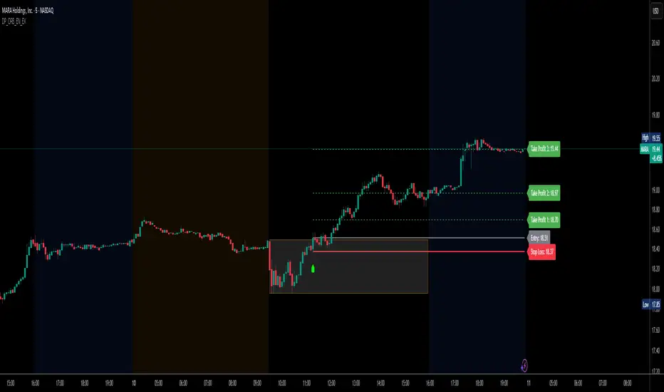
DP_ORB Entry & Exit IndicatorDisclaimer:
This indicator is for educational purposes only. It does not constitute financial advice. Always do your own research and manage your risk. Also, I cannot take full credit for 'ORB' as its a well known strategy amongst many traders, but I do need to give a special shout out to @TheBigDaddyMax for putting me on to this.
DP_ORB Entry & Exit Indicator
Description:
The DP_ORB Entry & Exit Indicator is a powerful tool designed for traders who utilize the Opening Range Breakout (ORB) strategy on the NYSE session. This indicator visually identifies the initial volatility window of the trading day, by marking the 15m High, and 15m Low into a ORB Box, & then tracks breakout opportunities, and provides clear, dynamic trade management levels—all directly on your chart.
Key Features:
Automatic Opening Range (ORB) Box:
Identifies and plots the high and low of the user-defined opening range (default 9:30–9:45 NYSE) for visual reference and strategy foundation.
Breakout Entry Signals:
Automatically detects and marks long or short breakout entries when price closes above or below the ORB range, with additional momentum confirmation.
Dynamic Stop Loss:
Stop loss is intelligently set to the previous bar’s low for long trades (or high for shorts), adapting to market structure at entry.
Take Profit Targets:
Up to three fully adjustable take-profit levels are plotted, calculated as percentages from entry, supporting progressive trade management.
Visual Trade Management:
Entry, stop loss, and take profit levels are displayed as extending dashed lines from entry point to the current bar, with labels always shown just to the right of price for clarity on all timeframes.
Automatic Reset and Cleanup:
Visuals and logic reset daily and upon exit, ensuring a clean, uncluttered chart experience.
How to Use:
Set your preferred opening range time and take profit levels in the settings.
Wait for a breakout and confirmation during the NYSE session.
Use the on-chart lines and labels to manage your trade according to your risk and strategy plan.
Best For:
Day traders and scalpers seeking a disciplined, visual, and fully-automated approach to opening range breakout trading.
TSL Drunken BirdA huge shoutout to @anotherDAPTrader for inspiration and support in developing this system!
Overview:
The Accurate Swing Trading System is a powerful technical analysis tool designed for swing traders on TradingView. It generates precise buy and sell signals based on price action crossing a dynamic Trailing Stop Loss (TSL) level, calculated from recent highs and lows. Enhanced with optional Higher Time Frame (HTF) confluence, the system aligns short-term signals with broader market trends, making it ideal for traders seeking to optimize entries and exits. Visual indicators include signal labels, customizable horizontal lines, a colored TSL line, and optional bar/background coloring. Alerts support trade execution across various assets, such as NASDAQ E-mini futures, stocks, forex, and more. A special shoutout to AnotherDAPTrader for inspiration and support in developing this system!
Key Features:
Swing Signals: Generates "BUY" and "SELL" signals when the closing price crosses above/below the TSL, based on a user-defined lookback period (Swing).
HTF Confluence: Adjusts signals based on the HTF trend (e.g., "EXIT LONG" instead of "SELL" if HTF is bullish), toggleable via Use HTF Confluence.
HTF Selection: Choose from 8 timeframes: 5-minute, 15-minute, 30-minute, 1-hour, 4-hour, Daily, Weekly, or Monthly.
Horizontal Lines: Plots green (buy) and red (sell) lines at the closing price of signal bars, with a toggle to extend lines 50 or 500 bars.
TSL Visualization: Displays a TSL line (green if close >= TSL, red if close < TSL) to highlight dynamic support/resistance levels.
Bar/Background Coloring: Optionally colors candlesticks and chart background green (bullish) or red (bearish) based on price relative to TSL.
Alerts: Configurable alerts for "Buy Signal" and "Sell Signal" on price crossovers/crossunders.
Persistent Behavior: All components (signals, labels, lines, TSL, coloring) remain on the chart indefinitely, consistent with the original design.
Use Cases:
Perfect for swing trading on any timeframe (e.g., 1-minute for scalping, 1-hour for swing trading) and asset (e.g., NASDAQ E-mini futures, stocks, forex).
Enhances decision-making by aligning short-term trades with higher timeframe trends.
Supports both manual trading (via visual cues) and automated trading (via alerts).
License:
Released under the Mozilla Public License 2.0. Created by ceyhun, with a shoutout to AnotherDAPTrader.
How to Use the Accurate Swing Trading System in TradingView
Add the Script to TradingView:
Open TradingView (www.tradingview.com) in a browser or desktop app.
Navigate to the Pine Editor (bottom panel of any chart).
Copy and paste the provided Pine Script code.
Click "Add to Chart" to apply the indicator to your active chart.
Configure Indicator Settings:
Access settings by clicking the gear icon next to the indicator name on the chart.
Adjust the following inputs:
Swing (default: 3): Defines the lookback period for calculating the highest high and lowest low used in the TSL. Higher values produce smoother but potentially delayed signals.
Barcolor (default: true): Enables/disables green (bullish) or red (bearish) candlestick coloring based on close vs. TSL.
Bgcolor (default: false): Enables/disables green/red background coloring for trend visualization.
Use HTF Confluence (default: true): Enables/disables HTF trend filtering. When enabled, signals adjust to reflect HTF trend (e.g., "EXIT LONG" for sell signals if HTF is bullish).
Higher Time Frame (default: "60"): Select from for 5-minute, 15-minute, 30-minute, 1-hour, 4-hour, Daily, Weekly, or Monthly HTF analysis.
Use Long Horizontal Lines (500 bars) (default: true): Toggles horizontal line length between 500 bars (long) and 50 bars (short).
Interpret Signals and Visuals:
Signal Labels:
"BUY" (green, below bar): Triggered when close crosses above TSL (and HTF is bullish or use_htf is off).
"SELL" (red, above bar): Triggered when close crosses below TSL (and HTF is bearish or use_htf is off).
"EXIT SHORT" (orange, below bar): Triggered on buy signals when HTF is bearish (with use_htf on).
"EXIT LONG" (orange, above bar): Triggered on sell signals when HTF is bullish (with use_htf on).
Horizontal Lines:
Green lines (buy signals) and red lines (sell signals) are plotted at the close price of the trigger bar, aligning with TSL color changes (green to red or vice versa).
Lines extend 50 bars (if long_lines is false) or 500 bars (if true) to the right.
TSL Line: A continuous line (linewidth=3) showing the TSL level, colored green (close >= TSL) or red (close < TSL).
Bar/Background Coloring: If enabled, candlesticks and background are colored green (bullish) or red (bearish) based on close vs. TSL.
Set Up Alerts:
Right-click the indicator name on the chart and select "Add Alert."
Choose "Buy Signal" or "Sell Signal" as the condition.
Configure alert settings (e.g., notification method, frequency: once per bar, etc.).
Alerts trigger on Buy (crossover) or Sell (crossunder) events, ideal for trade execution or monitoring.
Test on a Chart:
Apply to a chart (e.g., NASDAQ E-mini futures, 1-minute timeframe, as per your metadata from July 10, 2025, 05:41 PM CDT).
Verify:
Labels: "BUY", "SELL", "EXIT LONG", "EXIT SHORT" appear only on crossover/crossunder bars.
Horizontal Lines: Green/red lines plot at the close price where TSL changes color (green to red for Sell, red to green for Buy), extending 50 or 500 bars based on long_lines.
TSL Line: Updates continuously, colored green/red based on close vs. TSL.
Coloring: Bar/background coloring (if enabled) reflects trend direction.
HTF Confluence: With use_htf on, test htf_res = "M" (and others like "60", "D") to ensure signals adjust correctly (e.g., "EXIT LONG" for sell signals if monthly HTF is bullish).
Alerts: Confirm alerts trigger on crossovers/crossunders.
Ensure all components persist indefinitely (no decay).
Best Practices:
Timeframe: Use on any timeframe (e.g., 1m for scalping, 1h for swing trading). Adjust Swing to balance signal frequency and reliability.
Asset: Suitable for volatile assets like NASDAQ E-mini futures, stocks, or forex.
HTF Alignment: Enable use_htf for trend-aligned trades, especially on higher timeframes like "D" or "M".
Line Length: Use long_lines = true for longer-term visualization (500 bars) or false for shorter-term (50 bars).
Risk Management: Combine with stop-loss/take-profit levels and proper position sizing, as the system does not include risk management.
Acknowledgments:
License Note:
This script is provided under the Mozilla Public License 2.0. Users are free to use, modify, and distribute it per the license terms.

Smart Impulse Exhaustion Finder (ATR + ADX Filter)
Smart Impulse Exhaustion Finder (ATR + ADX Filter)
This advanced script helps you spot potential trend exhaustion points exactly where impulsive moves may lose strength.
It automatically combines multiple conditions:
✅ Identifies fresh swing highs and lows using a smart lookback range.
✅ Confirms strong price extension with a minimum ATR distance from the previous swing.
✅ Uses RSI extremes, volume spikes, and candle wick rejection to detect signals only when at least two out of three exhaustion factors align.
✅ Filters out false signals during sideways chop using an ADX trend strength filter.
✅ Ignores noise candles like dojis by requiring a clear minimum body size.
This makes the tool flexible for catching late-stage trend impulses that might be due for a pullback or reversal — ideal for trailing stop strategies, partial profit taking, or hunting reversal setups on crypto, forex or stocks.
How to use
📌 Tip: This is a sniper-type tool that can catch the very start of a reversal.
Therefore, when trading its signals, it’s strongly recommended to use a Risk:Reward ratio of at least 1:3 — especially for crypto markets.
The idea is simple:
Look for exhaustion signals at fresh swing highs for potential short pullbacks.
Or at fresh swing lows for potential long reversals.
Combine with your own trend and context tools.
Always test thoroughly before live trading.
Inputs
🔹 Extremum Lookback: Defines how far back to check for fresh highs/lows.
🔹 ATR Threshold: Controls the minimum impulse distance.
🔹 ADX Filter: Ensures signals only appear in meaningful trending conditions.
🔹 Body and Wick Filters: Reduce noise by rejecting tiny candles and highlighting clear rejection tails.
Disclaimer
⚠️ This script is for educational purposes only and does not constitute financial advice.
Trade responsibly — always use proper risk management and test before deploying in live conditions.

Tesla's 3-6-9 Grid – BTC Price LevelsThis indicator plots horizontal levels on the chart at every $1800 step, up to $180,000.
It’s inspired by Tesla’s 3-6-9 theory and the magic of the number 18 – the only number divisible by 3, 6, and 9, and whose digital root is 9.
Historically, many Bitcoin all-time highs have aligned closely with $1800 multiples, such as:
* $19,800 (2017 ATH)
* $64,800 and $68,400 (2021 double tops)
* $73,800 (2024 ATH)
This grid helps you visualize whether BTC respects these “Tesla levels” and how price interacts with them across cycles.
Created to assist multi-chart BTC traders who need quick reference levels without drawing lines manually.


EdgeXplorer - Smart Candle Patterns + SwingsEdgeXplorer – Smart Candle Patterns & Swings
Smart Candle Patterns & Swings by EdgeXplorer is a dual-function visual analysis tool that intelligently detects major swing points and overlays them with recognized candle reversal patterns. This tool brings together classical candlestick analysis and market structure theory, helping traders identify high-probability zones where price action may shift.
The script not only marks swing highs/lows as HH, LH, HL, or LL, but also labels key candlestick patterns—from Hammers to Engulfings to Three Black Crows—providing real-time context for possible trend continuation or reversal setups.
⸻
🔍 What Does This Tool Do?
This indicator performs two primary functions:
1. Swing Structure Labeling – Marks each new pivot as a higher high (HH), lower high (LH), higher low (HL), or lower low (LL)
2. Smart Candle Pattern Detection – Identifies 14 of the most widely studied candlestick reversal patterns and displays them alongside the swing label
It’s a lightweight, unobtrusive way to bring structure and pattern recognition to your chart—no repainting, no noise, and no signal promises.
⸻
⚙️ How It Works – Technical Breakdown
1. Swing Highs and Lows
• The script uses a pivot detection window (Pivot Length) to find local swing highs and lows
• When a new pivot forms:
• It is classified as one of:
• HH – Higher High
• LH – Lower High
• HL – Higher Low
• LL – Lower Low
• These swing points act as visual guides for traders tracking structure
2. Candlestick Pattern Logic
At each confirmed pivot, the script evaluates the candle and its neighbors for a match from a built-in library of 14 classical reversal patterns:
Pattern Description
Hammer Small body, long lower wick – bullish signal after a downtrend
Inverted Hammer Long upper wick, signals failed bearish push
Bullish Engulfing Green candle fully engulfs red one
Bearish Engulfing Red candle fully engulfs green one
Hanging Man Long lower wick after uptrend, often bearish
Shooting Star Long upper wick after uptrend, bearish signal
Doji Small or zero body, signals indecision
Morning Star Three-candle bullish reversal pattern
Evening Star Three-candle bearish reversal pattern
Spinning Top Small body with upper/lower wicks, signals indecision
Bullish Marubozu Large green candle with no wicks
Bearish Marubozu Large red candle with no wicks
Three White Soldiers Three large bullish candles in a row
Three Black Crows Three large bearish candles in a row
Each pattern is detected using precise criteria based on body size, wick ratios, and relative position to previous candles.
⸻
📈 What You See on the Chart
Visual Meaning
Swing Label (e.g., HH, LL) Identifies structural pivot and its type
Pattern Name (e.g., Doji, Bullish Engulfing) Displayed alongside swing label if pattern is detected
Label Tooltip Shows a short description of the pattern’s meaning
Color
• Swing High = red (customizable)
• Swing Low = green (customizable)
⸻
📊 Inputs & Customization
Input Description
Pivot Length Number of bars to the left/right used to confirm swing highs/lows
Swing High Label Color Customize color of HH/LH labels
Swing Low Label Color Customize color of HL/LL labels
All labels are plotted using small visual markers to avoid cluttering the chart.
⸻
🧠 How to Interpret It in Live Markets
This indicator provides context, not confirmation. Use it to:
• Validate your manual swing structure tracking with automatic HH/LL labels
• Identify when a key candle pattern forms at a major swing (e.g., Shooting Star at a HH)
• Spot potential reversal zones or breakout failures
• Add confluence to Smart Money Concepts, price action setups, or other technical strategies
Example:
• A new LL forms with a Hammer → Potential reversal from bearish exhaustion
• A HH forms with a Shooting Star → Possible trap or overextension
⸻
🧪 Use Case Ideas
• 🔄 Reversal Confirmation – Combine swing structure with pattern match for early reversal entries
• 🧭 Structure Validation – Let the HH/LL labels validate your trend bias
• 📉 Exhaustion Signals – Watch for Doji/Spinning Top patterns at mature moves
• ⚠️ Avoid Choppy Conditions – Use absence of patterns to avoid entering low-conviction zones
This tool works across all asset classes: crypto, forex, stocks, indices, and even futures.

5-Minute Momentum Indicator ($1000 Entry + 20% TP + 9:30 Exit)Showing entry candle and displaying entry, TP, and SL

EMA Pullback + Smart Breakout SystemSaint James
Your script filters for:
Strong trend (EMA stack)
Healthy dip (pullback to 21 EMA)
Breakout candle
Strong volume confirmation
And labels it clearly so you can act on it quickly for option trades.

Dettling Sexy Shirt LevelsThis indicator allows you to quickly enter levels you want to trade for quick scalps. You can enter your buy or sell point (Bull or Bear Line), and up to 5 profit levels. Pearsons Pivots and Camarillo Pivots are automatically updated each day, and can be selected on or off. It works well if you buy a call or put a few days until expiration, a few dollars out of the money.
After entering your buy points and Target levels, there is a drop down menu at the top of the settings page. You must select the ticker you are looking at on the chart, Tradingview will not automatically update the level if you are looking at a ticker but it is not selected in the menu.

ICT Macro Highlighter + EMA 9/20/200 + Alertstest indicator for Triple ema cross during high probability ICT macros

EdgeXplorer - Dynamic Price ActionEdgeXplorer – Dynamic Price Action
Dynamic Price Action by EdgeXplorer is a high-precision structural framework that detects and maps market structure shifts, liquidity zones, and sweep events in real time. Built for traders who prioritize price behavior over indicators, this suite intelligently interprets swing pivots, volatility ranges, and institutional footprints to surface key decision-making zones on your chart.
Whether you trade Smart Money Concepts (SMC), classical price action, or hybrid strategies, Dynamic Price Action helps you visualize where price is reacting, where it’s hunting stops, and when structure is shifting — without the noise.
⸻
🔍 What Does Dynamic Price Action Do?
This indicator tracks three core elements:
1. Market Structure Shifts – Bullish and bearish swing breaks (BOS and MSS)
2. Liquidity Zones – Dynamic detection of potential buy-side and sell-side liquidity pools
3. Sweep Events – Real-time detection when liquidity is taken out (aka stop hunts or raids)
It also contains logic for Order Block detection, giving you a foundational structure for further Smart Money analysis (note: OB visuals are currently off by default but fully supported).
⸻
⚙️ How It Works – Technical Breakdown
1. Market Structure (BOS / MSS)
• Detects swing highs and lows using a 3-bar pivot system
• When a valid swing is confirmed:
• A BOS (Break of Structure) line is drawn for bullish shifts
• An MSS (Market Structure Shift) line is drawn for bearish transitions
• Lines are plotted with customizable styles and optional labels
2. Liquidity Detection
• Liquidity zones are marked based on:
• Recent confirmed swing highs or lows
• ATR-based range check (swing must exceed Liquidity Sensitivity threshold)
• Post-swing candle direction (bullish or bearish close)
• Sell-Side Liquidity = swing highs likely containing stop clusters
• Buy-Side Liquidity = swing lows likely containing stop clusters
• Each zone is tagged visually and stored for later sweep checks
3. Sweep Recognition
• If price breaches a previously tagged liquidity level:
• A “Sell Sweep” label appears above the former sell-side zone
• A “Buy Sweep” label appears below the former buy-side zone
• Zones are removed after being swept to reduce clutter
4. Order Block Logic (Optional)
• The script includes full logic to detect bullish/bearish order blocks based on:
• Body-based or wick-based structure (user preference)
• Candle volume criteria
• Visuals are turned off for now but can be easily re-enabled
⸻
📈 What You See on the Chart
Visual Element Meaning
Green BOS Line Bullish break of market structure (higher high)
Red MSS Line Bearish shift in structure (lower low)
“Sellside Liquidity” Label Area above a swing high likely to hold resting liquidity
“Buyside Liquidity” Label Area below a swing low likely to hold resting liquidity
“Sell Sweep” Label A stop hunt above a prior high
“Buy Sweep” Label A stop hunt below a prior low
All elements are dynamically drawn, adapting to price behavior with zero repainting.
⸻
📊 Inputs & Settings Explained
Market Structures
Setting Description
Enable Market Structures Toggle BOS/MSS logic
Detection Mode Conceptual filter: Short-Term, Mid-Term, Long-Term (doesn’t affect logic)
Show Labels Display BOS and MSS labels above/below structure
Line Style Choose between Solid, Dashed, or Dotted
Bullish/Bearish Colors Customize line and label appearance
Liquidity Zones
Setting Description
Liquidity Sensitivity How large a swing must be (ATR multiplier) to qualify as a liquidity point
Order Blocks
Setting Description
Use Candle Body If true, OB zones are based on open/close instead of high/low
⸻
🧠 How Traders Can Interpret Dynamic Price Action
Structure-Based Bias:
• BOS = bullish structure continuing → look for long setups
• MSS = bearish structure breaking down → caution for reversals
Liquidity Zones:
• Price nearing a Sellside Liquidity zone? Watch for sweep + rejection
• Price tapping Buyside Liquidity? Look for absorption or reversal
Sweep Events:
• A Buy Sweep can signal accumulation
• A Sell Sweep can mark distribution or a trap breakout
Use sweeps as confirmation, trap detection, or entry filters.
⸻
🧪 Strategy Use Cases
• 🔍 Smart Money Concepts (SMC): Combine BOS/MSS + sweeps for refined CHoCH entries
• 🔄 Reversal Traders: Wait for sweep + structure shift before entering against prior trend
• 📉 Trend Continuation: Use BOS + liquidity clears to confirm direction
• 🎯 Scalping: Sweep zones act as high-probability entry areas on LTFs

First FVG📘 Indicator Description (English)
First FVG – NY Open is a TradingView indicator designed to automatically identify the first Fair Value Gap (FVG) that appears during the New York session, following the ICT (Inner Circle Trader) methodology.
It highlights institutional inefficiencies in price caused by imbalanced price action and helps traders spot high-probability entry zones, especially after the 9:30 AM EST (New York Open).
⚙️ How It Works
Session time: The indicator scans for FVGs starting at 9:32 AM (allowing 3 candles after the NY Open to form).
FVG Conditions:
Bullish FVG: When the high of 2 candles ago is lower than the low of the current candle and the middle candle is bullish.
Bearish FVG: When the low of 2 candles ago is higher than the high of the current candle and the middle candle is bearish.
Only the first FVG per session is drawn, as taught by ICT for setups like Judas Swing or NY Reversal models.
A colored box is drawn to represent the FVG zone.
A dotted horizontal line (CE) is drawn at the midpoint of the FVG box (Consequent Encroachment), a key level watched by smart money traders.
A dashed vertical line is drawn at 9:30 NY time to mark the open.
🧠 How to Use It
Wait for the NY Open (9:30 AM EST) – the indicator becomes active at 9:32 AM.
Watch for the first FVG box of the day. This is often a high-probability reaction zone.
Use the CE line (center of the FVG) as a reference for entries, rejections, or liquidity grabs.
Combine with market structure, PD Arrays, and liquidity concepts as taught by ICT for confluence.
The FVG box and CE line will extend forward for several candles for visual clarity.
🎛️ Customizable Settings
Session time (default: 09:32–16:00 NY)
FVG box color (up/down)
Text color
Max number of days to keep boxes on chart
Option to show or hide the 9:30 NY Open vertical line

Supply/Demand Zones with Midline (No Overlap Logic)Supply and demand formations based on inside bar breakouts. Automatically plots zones to buy and sell from. MTF analysis available.

Range Filter Buy & Sell 5min + Multi-TF DashboardElevate your edge with Range Filter Buy & Sell 5min + Multi-TF Dashboard—a precision-engineered trend companion that scans your favorite markets from the 5-minute tick to the higher-timeframe horizon. By harmonizing short-term signals with the broader trend, it delivers crystal-clear buy and sell cues—and the confidence to act on them. Whether you’re scalping, swing trading, or investing for the long haul, this all-in-one dashboard empowers you to ride only the strongest trends and step aside before the noise hits. Trade smarter. Trade with clarity. Trade with conviction.

Daily, Weekly, Monthly Current/Average RangeThe "Daily, Weekly, Monthly Current/Average Range" calculates and displays current and average price ranges (high - low) for daily, weekly, and monthly timeframes in a customizable table.
Users can adjust the lookback period, table size, and font color, with the table updating on the last bar for efficiency.
When the current range exceeds the average for a timeframe, the corresponding cell highlights green, signaling price possibly reaching maximum expansion and potential retracement or consolidation may follow.

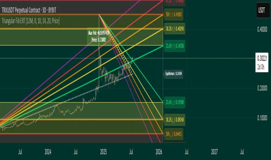
Triangular Fib🔍 Features
- Dynamic Lookback & Projection: Automatically adjusts the range and projection horizon based on timeframe changes.
- Triangular Fibonacci Arms: Projects fib levels upward and downward from high/low extremes to highlight potential price inflections.
- Volatility-Shaded Equilibrium: Visual zone highlights areas of consolidation or energy buildup before breakouts.
- Breakout Alerts: Detects and signals bullish/bearish breakouts from triangular fib thresholds.
- Auto-Traced Triangle Wedge: Dotted wedge lines visually represent narrowing price action from range extremes to midpoint.
Ideal for traders who seek visual clarity, price symmetry, and alert-driven decision-making across multiple timeframes. Whether you're swing trading or intraday scouting, this script provides a richly layered roadmap of market potential.
Not financial advice.
Customized ATR Trailing Stop with Fixed ATR DisplayCustomized ATR Trailing Stop with Fixed ATR Display

K棒開盤突破箭頭(4小時邏輯 + 可調距離)This indicator plots visual arrow signals based on specific opening breakout conditions.
🟢 A green upward arrow appears above the bar when:
The current bar’s opening price is greater than the previous bar’s close +10 points, and
The current bar’s open is also higher than the previous bar’s open
🔴 A red downward arrow appears below the bar when:
The current bar’s opening price is lower than the previous bar’s close −10 points, and
The current bar’s open is also lower than the previous bar’s open
These conditions are designed to detect strong opening gaps that suggest potential breakout moves. The indicator is non-repainting and suitable for use in manual signal tracking or alert setup.
Best used on:
Higher timeframes (e.g., 1H, 4H, Daily)
Indexes, futures, or assets with noticeable price gaps

GMMA-MACDThe indicator itsels is a hybrid of the MACD and GMMA indicators, it has 2 modes, normal and Consensus mode.
The normal mode plots 2 modified MACD, one using the currently highest of the GMMA fast group to calculate the MACD line, and the other one uses the currently lowest of the slow group to do the same.
In Consensus mode all the GMMA moving averages being calculated separately, which means it uses 12 MACD indicators instead of 2, the logic is the same as in the normal MACD, turns bullish if MACD above it's signal line, in this mode also has a Donchian channel to help visualize potential divergences.
This mode can show trend direction and strength more effectively, and potential reversal points, coloring of the indicator is green if all MACD are in consensus of a bullish trend, turns light green if 7-11 of them shows slight/weakening bullish trend, orange for neutral (6-6), light red for 7-11 shows slight/weakening bearish trend, red if all shows bearish trend.
For easier adjustment instead of adjusting every single EMA period, the logic uses a multiplier to adjust the periods as a whole unit.
Tested in a few strategies against the normal MACD, as a trend filter, this one gave at least the same results, usually better, and because it's logic is dynamic it's more future proof than the normal MACD.
