Indicators and strategies

Multi-Timeframe EMAs & WMAsMulti-Timeframe EMAs & WMAs (MTF EMAWMA)
The Multi-Timeframe EMAs & WMAs (MTF EMAWMA) indicator is a comprehensive tool designed to provide a multi-dimensional view of market trends by plotting various Exponential Moving Averages (EMAs) and Weighted Moving Averages (WMAs) from different timeframes onto your current chart. This allows traders to quickly assess confluent support and resistance levels, identify trend strength, and gain a broader market perspective without switching timeframes.
Key Features:
Multiple EMAs and WMAs:
This indicator includes:
- EMA 200: Plotted from H1 and M15 timeframes.
- EMA 100: Plotted from H1, M30, and M15 timeframes.
- EMA 50: Plotted from H4, H1, M30, and M15 timeframes.
- WMA 720: Plotted from H4, H1, M30, M15, and M1 timeframes.
Multi-Timeframe Analysis: By displaying moving averages from various timeframes, the indicator helps in understanding the interplay of different trends and their potential impact on price action.
Visual Distinction : Each moving average type and its timeframe representation are color-coded and styled (solid vs. dashed lines) for easy identification and clarity on the chart.
EMA 200: Dark Red
EMA 100: Cyan/Teal
EMA 50: SaddleBrown
WMA 720: Orange
Recommended Usage:
This indicator is specifically tailored for XAU/USD (Gold). It is intended to be used as a confluence tool to complement your existing trading strategies and indicators. It is not designed to be used solely as an entry or exit signal. Instead, leverage the information provided by these multi-timeframe moving averages to:
- Identify major trend directions: Observe the alignment and slope of longer-term moving averages.
- Spot potential support and resistance zones: Price often reacts to these key moving average levels from higher timeframes.
- Confirm trade bias: Use the higher timeframe moving averages to confirm the direction of your trades on lower timeframes.
- Enhance risk management: Understand where strong levels might exist to place stop-losses or take-profits.
Always combine this indicator with other forms of analysis, such as price action, chart patterns, volume analysis, or other technical indicators, to make informed trading decisions.
Remark: The script and description were created by AI.

RSI with Background Colorhis script implements a trading strategy based on an EMA (Exponential Moving Average) crossover, confirmed by the RSI (Relative Strength Index), and includes a built-in stop-loss and take-profit.

WaveTrend w/ Crosses & MTFWaveTrend Oscillator from LazeBear, modified to plot crosses and amplified delta.

Fisher Transform w/ Cross in MTFFisher Transform from Tradingview Technical indicators, modified to hard code settings for various time frames and to plot crosses.

CACo Oscillators// Description: An all-in-one momentum indicator designed to complement the main
// "Charles Ayede Convergence" script. It combines the Awesome
// Oscillator (AO) and the OsMA (MACD) into a single pane with a
// display toggle, visual signals, and custom alerts.

CQ_MTF Target Price Lines [BITCOIN HOY]Comprehensive Indicator Script Overview
Intraday, Four Hour, Daily, and Weekly Price Target Lines—A Versatile Tool for Traders
Welcome to a powerful and flexible indicator script designed to enhance your trading experience across multiple timeframes. This script empowers users to interactively set, visualize, and manage price targets, entries, and objectives for both short-term and long-term trading strategies. Whether you are a day trader seeking to mark crucial intraday levels or a long-term investor planning strategic entries, this tool offers an all-encompassing solution.
Key Features
• Multi-Time Frame Price Target Lines: Effortlessly input and display calculated price targets for Intraday, Four Hour, Daily, and Weekly periods, ensuring you always have a clear view of the market objectives at every scale.
• X-Axis Price Control: Set precise x-axis price points for each timeframe, granting you granular control over how and where your target lines appear on the chart.
• Weekly Price Objectives: Enter your calculated price objectives for the current week to remain aligned with your trading plan and adapt to evolving market conditions.
• Long-Term Investment Entry Events: Document and display significant entry events for long-term investments, helping you maintain a strategic perspective while navigating short-term fluctuations.
• Long-Term Price Objectives: Input and track price objectives for your long-term trades, supporting your investment decisions with clearly visualized milestones.
• Customizable Labels and Lines: Each price target is accompanied by clearly labeled lines, making it easy to distinguish between timeframes and targets at a glance.
Optional Price Gauge for Intraday Dynamics
For users who wish to monitor real-time market sentiment, the script includes an optional price gauge. This dynamic feature tracks intraday price movement, providing visual cues to quickly assess whether the prevailing tendency is bullish or bearish. The intuitive gauge aids in confirming your intraday strategies or alerting you to potential reversals.
User Experience and Customization
• Interactive Inputs: All key parameters—price targets, x-axis prices, entry events, and objectives—are entered manually by the user. This approach ensures the script adapts to your personal analysis and trading methodology.
• Easy Visualization: The clear display of lines, labels, and the optional gauge streamlines your chart, making it easier to make informed decisions at a glance.
• Flexible Application: Whether you’re trading short-term swings or building positions for the long haul, the indicator integrates seamlessly into your workflow.
How to Use
• Input your calculated price targets for each timeframe (Intraday, Four Hour, Daily, and Weekly).
• Specify the exact x-axis price points where you’d like the lines to appear for each timeframe.
• For the current week, enter your weekly price objectives for quick reference and planning.
• If you’re a long-term investor, document your key entry events and set long-term price objectives to track their progression.
• To monitor current market momentum, activate the price gauge and follow the visual cues for bullish or bearish trends.
Benefits
• Comprehensive Market Overview: Simultaneously track multiple timeframes and objectives, keeping all critical information at your fingertips.
• Improved Decision Making: Visual clarity and strategic labeling support faster, more confident trading decisions.
• Customizable and Adaptable: Tailor the script to your unique trading style and analytical approach.
Enjoy using the indicator, and happy trading! Let this versatile tool be your companion in navigating the ever-changing tides of the market.

Multi-Timeframe Trend Analysis [Aaron Diaz]🧠 Indicator Review: Multi-Timeframe Trend Analysis
📌 What Does It Do?
The "Multi-Timeframe Trend Analysis" indicator by Aaron Diaz performs a trend assessment across multiple timeframes using Exponential Moving Averages (EMAs) as internal logic. Instead of plotting EMAs on the chart, this version only displays a clean dashboard that shows whether each EMA is trending up or down, keeping your chart clutter-free.
🧾 Based on the original indicator by BigBeluga, this version was modified by Aaron Diaz to remove the EMA plots and focus solely on actionable trend information via a table.
🔍 How It Works
It calculates 5 different EMAs (default: 20, 30, 40, 50, 60 periods).
For each EMA, it checks if it’s trending up (EMA > EMA 2 candles ago) or down.
These signals are then evaluated across 5 customizable timeframes (e.g., 1h, 2h, 3h, etc.).
A dashboard/table appears on the top-right corner of your screen, showing:
🢁 = Uptrend for that EMA and timeframe.
🢃 = Downtrend.
It uses color codes (green = bullish, purple = bearish) to make trend reading fast and intuitive.
🧱 Technical Foundations
Exponential Moving Averages (EMAs):
EMAs give more weight to recent prices, making them highly responsive to current trends.
Widely used to detect momentum and reversals.
Multi-Timeframe Analysis (MTF):
Helps confirm trend strength by analyzing multiple timeframes.
Reduces false signals and noise found in a single timeframe.
📈 Suggested Strategy: "MTF Trend Confluence"
🎯 Goal:
Only trade when multiple timeframes confirm the same directional bias.
✅ Long Entry Rules:
At least 3 out of 5 timeframes must show 🢁 on at least 4 of the 5 EMAs.
Confirm entry with:
A bullish candlestick pattern.
A breakout above recent resistance.
Optional filter: RSI or MACD not in overbought zone.
🔻 Short Entry Rules:
At least 3 timeframes must show 🢃 on at least 4 EMAs.
Confirm with:
A bearish candle or breakdown below support.
Optional filter: RSI or MACD not in oversold zone.
🛑 Exit Rules:
Take Profit at key support/resistance levels or at a 2:1 risk-reward ratio.
Stop Loss below/above the last swing or fixed % (e.g., 1.5–2%).
Exit early if the dashboard shows a shift in trend across key timeframes.
🧪 Example Use Case
You're trading on a 15-minute chart:
The dashboard shows 🢁 across 1h, 2h, and 3h timeframes for EMA20, EMA30, and EMA40.
Price breaks a local resistance level.
You enter long and target the next liquidity zone, placing your stop-loss below the most recent swing low.
⚠️ Important Notes
This is not a signal generator—it’s a trend confirmation tool.
Best used for swing or intraday trend trading.
Avoid using it in ranging or sideways markets.

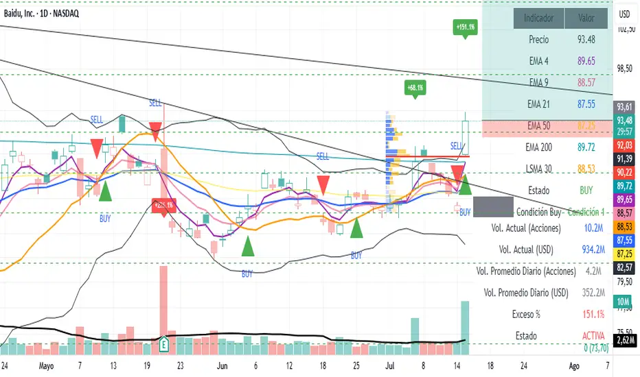
Volume Spike AlertIndicator Features:
📊 Core Functionalities:
Exceptional Volume Detection:
Calculates volume in USD (volume × price)
Compares it against a 90-day average (3 months)
Configurable from 1 to 252 days
Visual Signals:
Green labels for bullish candles with high volume
Red labels for bearish candles with high volume
Displays excess percentage (e.g., +45.2%)
Dual Alert System:
AlertCondition: For manual alert configuration in TradingView
Alert(): Automated alerts with detailed information
⚙️ Available Settings:
Average Period: 1–252 days (default: 90 days)
Enable/Disable Alerts: Configurable checkbox
Show/Hide Labels: Visual control
Label Size: Tiny, Small, Normal, Large
Minimum Threshold: Minimum percentage required to trigger a signal
📋 Displayed Information:
On Labels:
Excess percentage (e.g., +67.3%)
Color based on candle direction
In the Table:
Current volume in millions USD
Average volume in millions USD
Excess percentage
Alert status (ACTIVE/NORMAL)
Calculation period
In Alerts:
Candle type (BULLISH 🟢 / BEARISH 🔴)
Symbol and current price
Current volume vs. average
Timeframe used


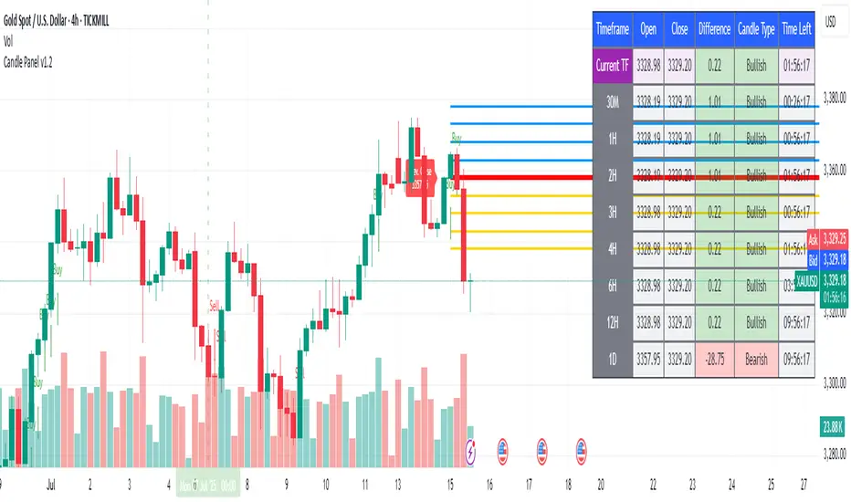
1H & 2H Candle Panel + Daily Grid v1.2Indicator: "1H & 2H Candle Panel + Daily Grid v1.2"
This powerful indicator combines two key features into one tool:
Daily Grid anchored to the previous day’s close
Multi-Timeframe Candle Panel for comprehensive market analysis
1. Daily Grid Logic
Input:
Grid Distance (Points): Adjustable spacing between grid lines (default: 5.0 pts).
How It Works:
Detects the start of a new trading day using ta.change(time("D")).
Fetches the prior day’s close via request.security().
Draws the following elements at each new session:
Thick Red Line: Previous day’s closing price (key reference level).
8-Point Grid:
4 blue lines above the close (+1x to +4x the grid distance).
4 gold lines below the close (-1x to -4x the grid distance).
Info Label: Displays the exact prior close value.
Automatically clears and redraws all elements daily to avoid clutter.
2. Multi-Timeframe Candle Panel
Timeframes Analyzed:
Current chart TF, 30M, 1H, 2H, 3H, 4H, 6H, 12H, and Daily (1D).
Data Displayed per TF:
Open, Close, High, Low
Price Difference (Close − Open)
Candle Type (Bullish/Bearish)
Time remaining until candle close (hh:mm:ss format)
Visual Output:
A right-aligned table with conditional coloring:
Bullish candles: Green background
Bearish candles: Red background
Current timeframe highlighted in purple.
Optimized Updates:
Uses request.security() for efficient cross-TF data fetching.
Tracks candle closing times via TradingView’s native time_close.
Updates only on the last bar or in real-time (barstate.islast/isrealtime).
3. Confluence Signals
Full Confluence:
Triggers when all timeframes align:
Buy Signal: All candles bullish → Green arrow + alert.
Sell Signal: All candles bearish → Red arrow + alert.
1H Special Confluence:
Activates 30 minutes after the 1H candle opens.
Requires alignment between 1H, 4H, and 6H candles.
Marks entries with price-level arrows (no alerts).
4. Technical Optimizations
Performance:
Dynamically manages graphic objects (no redundant redrawing).
Uses arrays to track grid lines efficiently.
Precision:
Leverages TradingView’s time_close for accurate countdowns.
Formats prices with format.mintick for asset-specific precision.
How to Use
Adjust Grid Distance based on asset volatility.
Monitor the panel for multi-TF trend strength.
Use the daily grid as support/resistance reference.
Confluence signals highlight high-probability setups.
Pro Tip: Combine with volume analysis or RSI for confirmation!

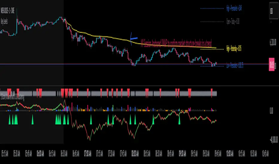
Z-Score Volume with CVD Clustering Script Title:
Z-Score Volume with CVD Clustering & NY VWAP
📘 Description:
This indicator combines statistical volume analysis with order flow confirmation to detect high-probability trade zones and volume-based divergences.
📌 Components:
Z-Score of Volume: Identifies statistically significant volume surges or drops relative to a moving average baseline.
Cumulative Volume Delta (CVD): Gauges net buying vs. selling pressure using high-frequency bid/ask delta.
K-Means Clustering: Applies clustering logic to classify each bar into:
Cluster 2 – Strong Bullish: Z-Score and CVD both strong
Cluster 1 – Divergence / Bull Trap: Z-Score high, but weak CVD
Cluster 0 – Neutral / Noise: No clear alignment
Anchored VWAP (NY Session Open): Confirms market structure and institutional trend bias from 9:30 AM ET forward.
🎯 Suggested Applications:
✅ 1. Trend Continuation Entries (Add-ons):
Look to add to positions when:
Cluster 2 signal occurs
Price is above the NY session VWAP
Price structure has broken out of prior day high/low or range
⚠️ 2. Divergence Detection (Fade Traps):
Cluster 1 signals a bearish divergence (e.g., high volume but weak CVD).
Especially useful when price is failing to stay above VWAP.
Useful for early exits or reversal setups.
📊 3. Volume Profile Confirmation:
Combine with fixed or session-based volume profile tools.
Use Z-Score clusters to confirm volume spikes into low-volume nodes (LVNs) or during imbalance transitions.
📍 4. VWAP Structure Confirmation:
Anchored VWAP acts as a dynamic reference point.
Helps confirm acceptance vs. rejection zones at key institutional levels.
📈 Visuals & Alerts:
Color-coded volume bars show intensity of Z-Score & CVD confluence
CVD Line plots real-time delta bias with green/red coloring
Cluster-based shape markers highlight key bars for actionable signals
Optional: Add alerts for Cluster 2 above VWAP or Cluster 1 below VWAP
⚙️ Customization Options:
Adjustable Z-Score length
Custom anchor timeframe for CVD (e.g., 1D or sessions)
Adjustable max lookback depth
Toggle VWAP inclusion
Extendable to include additional filters: RSI, structure break alerts, etc.
🔧 Ideal Use Cases:
NY session intraday traders (ES, NQ, CL, 6E, FX pairs)
Breakout traders wanting order flow confirmation
Mean reversion traders spotting fake moves
Volume-based scalpers looking for edge on short-term order imbalance
MTF Confirmation v2Multi-Timeframe Direction Confirmation Indicator
📊 Overview
This Pine Script indicator provides high-probability buy and sell signals by confirming that both 1-minute and 5-minute timeframes are moving in the same direction. It eliminates false signals by requiring multiple timeframe agreement before generating alerts.
🎯 How It Works
Trend Detection Method:
EMA Analysis: Uses 20-period Exponential Moving Average to determine trend direction
RSI Confirmation: 14-period RSI validates momentum (>50 bullish, <50 bearish)
Price Action: Confirms price is above/below EMA in trend direction
EMA Slope: Ensures EMA is actually rising (bullish) or falling (bearish)
Signal Generation:
BUY Signal: Only when BOTH 1M and 5M timeframes are bullish simultaneously
SELL Signal: Only when BOTH 1M and 5M timeframes are bearish simultaneously
Cooldown System: Prevents signal spam with 5-bar minimum between signals
📈 Visual Elements
Primary Signals:
Green "BUY" Labels: Appear below candles when both timeframes align bullish
Red "SELL" Labels: Appear above candles when both timeframes align bearish
Background Colors:
Light Green: Both timeframes trending up
Light Red: Both timeframes trending down
No Color: Timeframes not aligned or neutral
Trend Indicators:
Blue Dots: Show 1-minute timeframe trend direction
Orange Dots: Show 5-minute timeframe trend direction
Question Marks: Partial alignment (one timeframe trending, preparing for signal)
Status Table (Top Right):
Timeframe Status: Real-time direction of each timeframe
Alignment Status: Shows when timeframes are synchronized
Signal Status: Current signal state and cooldown timers
Cooldown Counters: Bars remaining until next signal available
⚙️ Customizable Settings
Technical Parameters:
EMA Period: Default 20 (trend smoothness)
RSI Period: Default 14 (momentum sensitivity)
Signal Cooldown: Default 5 bars (prevents overtrading)
Filter Options:
Volume Filter: Optional above-average volume requirement
Alerts Toggle: Enable/disable notifications
Table Display: Show/hide status information
🚨 Alert System
Instant Notifications: Alerts fire when both timeframes align
Price Information: Includes current price in alert message
Once Per Bar: Prevents alert spam during volatile periods
Clear Messages: "BUY SIGNAL: 1M and 5M both BULLISH" format
💡 Best Use Cases
Ideal For:
Scalping: Quick entries with multi-timeframe confirmation
Day Trading: Reliable intraday signals
Trend Following: Catching strong directional moves
Risk Management: Avoiding false breakouts
Timeframe Recommendations:
Works on any chart timeframe
Most effective on 1M, 5M, or 15M charts
Provides earlier signals than single-timeframe indicators
⚡ Key Advantages
Reduced False Signals:
Requires agreement between multiple timeframes
Filters out noise and whipsaws
Cooldown prevents overtrading
Clear Decision Making:
Simple buy/sell signals
Visual confirmation through colors and table
No complex interpretation required
Comprehensive Information:
Real-time status of all timeframes
Setup warnings with question marks
Countdown to next available signal
📋 Setup Instructions
Copy the Pine Script code
Open TradingView Pine Editor
Paste code and save
Add to chart
Configure settings to preference
Set up alerts for desired signals
🎪 Expected Performance
Signal Frequency: 3-8 signals per trading day (depending on volatility)
Quality Focus: Fewer but higher-probability setups
Win Rate: Improved due to multi-timeframe confirmation
Suitable for: Both automated and manual trading strategies

Light MA CrossExplanation of the "Light MA Cross" Indicator
Overview:
The "Light MA Cross" is a simple yet powerful trading indicator designed to identify potential buy and sell signals based on the crossover of two moving averages. This tool is optimized for short-term trading, specifically on 1-minute charts, making it ideal for active traders looking to capture quick market moves.

Colored EMAs 9/15/30/65/200Colored EMAs (9/15/30/65/200)
This script plots 5 exponential moving averages (EMAs) — 9, 15, 30, 65, and 200 — each with a distinct color for visual clarity.
These specific lengths are famously used by Peter Tuchman (the real “Wolf of Wall Street”) and his trading partner David Green for intraday momentum and trend analysis.
Great for scalpers and day traders looking to spot trend shifts, dynamic support/resistance, and entry zones with a clean EMA stack.

NEPALI DASHBOARD NEPALI DASHBORAD - All-In-One Sentiment Dashboard
Overview
The NEPALI DASHBORAD is a comprehensive, all-in-one dashboard designed to give day traders a quick yet powerful overview of market sentiment. Instead of cluttering your chart with dozens of individual indicators, this tool consolidates the signals from 11 different technical indicators into a single, easy-to-read table. It calculates an overall bull/bear sentiment score and provides a trading recommendation based on the confluence of these signals, helping you make more informed decisions at a glance.
The dashboard is fully customizable, allowing you to adjust indicator settings, change the table size, and move it to any corner of your chart.
Key Features
Multi-Indicator Analysis: Gathers data from 11 essential indicators covering trend, momentum, volume, and volatility.
Sentiment Score: Calculates a simple "Bull vs. Bear" score to instantly gauge market sentiment.
Actionable Recommendations: Provides a clear trading recommendation (Strong Buy, Buy, Sell, Strong Sell, Hold) based on the strength of the confluence.
Higher Timeframe (HTF) Context: Includes an HTF trend analysis to ensure your trades align with the bigger picture.
Customizable Dashboard: Easily change the size and position of the dashboard to fit your workspace.
How to Use
Check the Market Sentiment: Look at the "Bull vs. Bear" score first. A high score (e.g., 8 vs. 3) indicates strong confluence in one direction.
Verify the HTF Trend: Ensure your intended trade direction aligns with the higher timeframe trend for better probability. For example, be cautious about taking "SELL" signals if the HTF Trend is strongly "BULL."
Use the Recommendation as a Guide: The "Recommendation" and "Confidence" % give you a summary of the indicator signals. A "STRONG BUY" or "STRONG SELL" means that a significant majority of the indicators are in agreement.
Drill Down into Indicators: Use the individual indicator statuses in the table to understand why the market sentiment is bullish or bearish. For example, you might see that momentum indicators (RSI, Stoch) are bullish, but trend indicators (MA, MACD) are still lagging.
Combine with Your Strategy: This dashboard is a powerful confirmation tool. Use its signals to confirm entries and exits for your existing trading strategy. Do not use it as a standalone signal provider.
Disclaimer
In simple terms: This is a tool for analysis, not a signal to trade. Your money is your responsibility.
This script is for educational and informational purposes only. I am not a financial advisor; I am just a learner sharing my work. The information and tools provided are not, and should not be construed as, financial advice, an offer, or a solicitation to buy or sell any securities.
Trading and investing in financial markets involve substantial risk of loss and is not suitable for every investor. I do not guarantee the accuracy, completeness, or profitability of this script. All trading decisions you make are your own, and you are solely responsible for any resulting profits or losses.
Always conduct your own research and seek advice from a qualified financial advisor before making any investment decisions. By using this script, you agree that I am not liable for any and all losses you may incur.

VWAP with Prev. Session BandsVWAP with Prev. Session Bands is an advanced indicator based on TradingView’s original VWAP. It adds configurable standard deviation or percentage-based bands, both for the current and previous session. You can anchor the VWAP to various timeframes or events (like Sessions, Weeks, Months, Earnings, etc.) and selectively show up to three bands.
The unique feature of this script is the ability to display the VWAP and bands from the previous session, helping traders visualize mean reversion levels or historical volatility ranges.
Built on top of the official TradingView VWAP implementation, this version provides enhanced flexibility and visual clarity for intraday and swing traders alike.

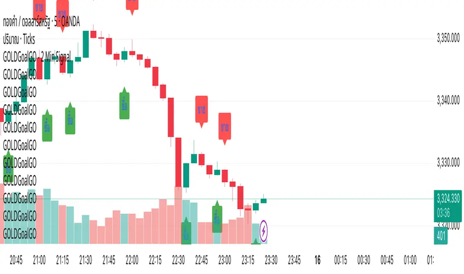
GOLDGoalGO - 2 Min SignalGOLDGoalGO" Indicator for TradingView
Introduction
The "GOLDGoalGO" indicator is designed to assist traders in analyzing short-term price movements of gold (XAUUSD). It provides buy and sell signals every 5 minutes, helping traders identify optimal entry and exit points based on recent price changes.
Concept and Functionality
Primary Goal: To offer clear and timely trading signals by analyzing short-term price trends, specifically tailored for 2-minute intervals.
How It Works: The indicator calculates the change in closing prices compared to the previous bar to generate buy and sell signals. These signals are only active during 2-minute timeframes, ensuring precision in short-term trading.
Signals Provided:
A buy signal (represented by an upward shape) appears when prices show upward momentum.
A sell signal (represented by a downward shape) appears when prices show downward momentum.
Visual Cues: The signals are displayed directly on the chart with intuitive shapes for quick recognition. Additionally, alert notifications are configured to inform you immediately when new signals occur.
How the Indicator Works in Detail
Timeframe Check: It activates only during 2-minute candlestick intervals to ensure signals are relevant for short-term trading.
Price Change Calculation: It compares the current close with the previous close to detect the direction of market movement.
Signal Generation:
If the price is increasing (positive change), a buy signal is generated.
If the price is decreasing (negative change), a sell signal is generated.
Chart Annotations: When a signal occurs, a shape appears on the chart indicating the optimal point for entering a trade.
Automated Alerts: The system sends a Thai-language notification every 2 minutes to alert you of new signals, enabling timely actions even when you're away from the screen.
How to Use
Paste this script into the Pine Editor in TradingView.
Click "Add to Chart" to activate the indicator.
Set up Alert rules:
Choose the alert condition for "Buy Signal" or "Sell Signal".
Select webhook or notification options to receive real-time alerts (for example, to Telegram).
The indicator provides real-time notifications every 2 minutes whenever new signals are generated.
Why Use This Indicator?
Simplicity: Designed for traders who prefer short-term, momentum-based trading strategies.
Timely Alerts: Signals are provided precisely every 2 minutes, helping you capitalize on short-term price movements.
Flexibility: Easily adaptable to other assets by adjusting the script if needed.
GOLDGoalGO"GOLDGoalGO" Indicator for TradingView
Introduction
The "GOLDGoalGO" indicator is designed to assist traders in analyzing short-term price movements of gold (XAUUSD). It provides buy and sell signals every 5 minutes, helping traders identify optimal entry and exit points based on recent price changes.
Concept and Functionality
Primary Goal: To offer clear and timely trading signals by analyzing short-term price trends, specifically tailored for 5-minute intervals.
How It Works: The indicator calculates the change in closing prices compared to the previous bar to generate buy and sell signals. These signals are only active during 5-minute timeframes, ensuring precision in short-term trading.
Signals Provided:
A buy signal (represented by an upward shape) appears when prices show upward momentum.
A sell signal (represented by a downward shape) appears when prices show downward momentum.
Visual Cues: The signals are displayed directly on the chart with intuitive shapes for quick recognition. Additionally, alert notifications are configured to inform you immediately when new signals occur.
How the Indicator Works in Detail
Timeframe Check: It activates only during 5-minute candlestick intervals to ensure signals are relevant for short-term trading.
Price Change Calculation: It compares the current close with the previous close to detect the direction of market movement.
Signal Generation:
If the price is increasing (positive change), a buy signal is generated.
If the price is decreasing (negative change), a sell signal is generated.
Chart Annotations: When a signal occurs, a shape appears on the chart indicating the optimal point for entering a trade.
Automated Alerts: The system sends a Thai-language notification every 5 minutes to alert you of new signals, enabling timely actions even when you're away from the screen.
How to Use
Paste this script into the Pine Editor in TradingView.
Click "Add to Chart" to activate the indicator.
Set up Alert rules:
Choose the alert condition for "Buy Signal" or "Sell Signal".
Select webhook or notification options to receive real-time alerts (for example, to Telegram).
The indicator provides real-time notifications every 5 minutes whenever new signals are generated.
Why Use This Indicator?
Simplicity: Designed for traders who prefer short-term, momentum-based trading strategies.
Timely Alerts: Signals are provided precisely every 5 minutes, helping you capitalize on short-term price movements.
Flexibility: Easily adaptable to other assets by adjusting the script if needed.
Summary
The "GOLDGoalGO" indicator helps traders stay on top of short-term market trends for gold, giving precise buy and sell signals every 5 minutes. With visual cues on the chart and notifications sent automatically in Thai, it ensures you're always informed of potential trading opportunities and can act swiftly to maximize profit.
Dashboard EMA Unifié [touli]DISCLAIMER
This indicator is provided for educational and informational purposes only. It does not constitute investment advice, a recommendation to buy or sell, or a solicitation for any transaction. Past performance is not indicative of future results. Trading involves significant risk, including the potential loss of capital. The user assumes full responsibility for their own trading decisions and risk management. The author of this script cannot be held liable for any losses or damages resulting from its use.
Indicator Title: Unified EMA Dashboard
Overview
This indicator is a comprehensive technical analysis tool that combines the display of Exponential Moving Averages (EMAs) on the chart with a multi-timeframe dashboard. It is designed to provide traders with a quick and clear overview of the trend across multiple timeframes, while also providing visual cues directly on the current chart.
Key Features
Multi-Timeframe Dashboard: Displays a clean and concise table showing the price's position relative to four different EMAs (9, 21, 50, 200) across 6 timeframes (from 1 minute to 1 day).
A blue arrow ▲ indicates that the closing price is above the EMA (potential bullish trend).
A red arrow ▼ indicates that the closing price is below the EMA (potential bearish trend).
Display of 4 EMAs on the Chart:
EMA 9 & 21: Plotted on the current timeframe, they help identify the very short-term trend.
EMA 50 (from the 5m TF) & EMA 200 (from the 15m TF): Plotted on the current chart but calculated on higher timeframes. They offer a perspective on the stronger, underlying trends.
Full Customization: The indicator's settings allow the user to:
Modify the periods of the four EMAs.
Choose the dashboard's position on the screen.
Change the dashboard's theme (Dark or Light).
Enable or disable the display of the EMAs on the chart.
Optimized Code: The script is designed for performance, drawing and calculating the dashboard only on the last available price bar, thus avoiding chart lag.
How to Use
1. Installation
On TradingView, open the chart of your chosen asset.
At the bottom of the screen, click on the "Pine Editor" tab.
Copy the entire corrected script and paste it into the editor, replacing any existing content.
Click the "Add to Chart" button. The indicator will then appear on your chart.
2. Configuration
Click the gear icon (⚙️) next to the indicator's name to access its settings.
General Settings:
Dashboard Theme: Choose "Dark" or "Light" for better readability depending on your chart's color scheme.
Dashboard Position: Select where you want the dashboard to appear (e.g., "Bottom Right," "Top Left," etc.).
EMA Settings:
Modify the periods (9, 21, 50, 200) if you prefer to use other values for your analysis.
Chart Display Settings:
Check or uncheck the boxes to show or hide the EMA lines on your main chart. For instance, you can disable the lines and only use the dashboard.
3. Interpretation (For Informational Purposes)
The Dashboard:
Confluence Analysis: The dashboard's main strength is identifying trend "confluence." A column that is entirely blue (▲) or red (▼) suggests a strong, aligned trend across multiple time scales.
Identifying Reversal Points: If the shorter timeframes (1m, 5m) start to change color while the longer ones (4h, 1D) remain stable, this may indicate a pullback or the beginning of a trend change.
The EMAs on the Chart:
Dynamic Support and Resistance: The EMA lines can act as areas of support in an uptrend and resistance in a downtrend.
Underlying Trend: The price's position relative to the longer-period EMAs (50 and 200) gives an indication of the general underlying trend.
Best Practices and Limitations
Do Not Use in Isolation: This indicator is a trend confirmation tool. It is recommended to use it in conjunction with other analysis tools (volume, market structure, other indicators).
Lagging Indicator: Moving averages are trend-following indicators, which means they react to past price movements. They do not predict future movements.
Risk Management: Always set a stop-loss and take-profit for every trade. Never risk more than a small percentage of your capital on a single position.
