EMA 50 + Highs and LowsJust a trend indicator considering volatility (EMA 50) and liquidity sweeps on active market sessions
Indicators and strategies

SessionsLondon, US , ASIA open sessions
Use this indicator to highlight Above time zones to analyse trading opportunity during those sessions

Niveles 7-8 AM México + EMAs + CrucesMexico 7-8 AM Levels + EMAs + Crossovers
Overview
This Pine Script indicator combines three powerful trading tools in one comprehensive overlay:
1. **Mexico 7-8 AM session levels** (high/low detection with dynamic color changes)
2. **Four customizable EMAs** (8, 13, 21, 55 periods)
3. **EMA crossover signals** (EMA 8 vs EMA 55)
Key Features
🕐 Mexico 7-8 AM Session Levels
- **Timezone Support**: Automatically adjusts for Mexico City timezone (America/Mexico_City)
- **Session Detection**: Identifies the crucial 7-8 AM Mexico trading session
- **Dynamic Levels**: Captures session high and low levels
- **Smart Color System**:
- Lines start **WHITE** after session ends
- Turn **RED** when price closes above the session high
- Turn **GREEN** when price closes below the session low
- **Duration**: Lines extend for 2 hours 30 minutes after session
- **Clean Labels**: Session levels clearly labeled on the left side
📈 Exponential Moving Averages (EMAs)
- **EMA 8** (Blue line) - Fast trend indicator
- **EMA 13** (Green line) - Short-term momentum
- **EMA 21** (Yellow line) - Medium-term trend
- **EMA 55** (Red line) - Long-term trend
- **Toggle Display**: Option to show/hide all EMAs
- **Customizable Periods**: All EMA periods can be adjusted
🎯 EMA Crossover Signals
- **Bullish Signal**: Green triangle up when EMA 8 crosses above EMA 55
- **Bearish Signal**: Red triangle down when EMA 8 crosses below EMA 55
- **Adjustable Size**: Choose from tiny, small, normal, or large markers
- **Clean Placement**: Bullish signals below bars, bearish signals above bars
- **Built-in Alerts**: Automatic alert conditions for both crossover types
How to Use
For Day Traders:
1. **Morning Setup**: Watch for price action around 7-8 AM Mexico levels
2. **Trend Confirmation**: Use EMA crossovers to confirm trend direction
3. **Entry Signals**: Combine level breaks with EMA crossovers for entries
4. **Risk Management**: Use session levels as support/resistance for stop losses
For Swing Traders:
1. **Trend Analysis**: Monitor EMA alignment for overall trend direction
2. **Key Levels**: Use Mexico session levels as important S/R zones
3. **Signal Confluence**: Look for crossovers near session levels for stronger signals
Configuration Options
Session Settings:
- **Session Time**: Default 7-8 AM (customizable)
- **Timezone**: Mexico City timezone with GMT offset options
EMA Settings:
- **Show/Hide**: Toggle EMA display
- **Period Adjustment**: Customize all four EMA periods
- **Color Coding**: Each EMA has distinct colors for easy identification
Crossover Settings:
- **Show/Hide**: Toggle crossover signals
- **Marker Size**: Adjust signal marker size
- **Alert Setup**: Enable notifications for crossover events
## Best Practices
1. **Combine Signals**: Don't rely on single indicators - look for confluence
2. **Respect Levels**: Pay attention to how price reacts at session levels
3. **Trend Context**: Use EMAs to understand the broader trend context
4. **Risk Management**: Always use proper position sizing and stop losses
Alert Conditions
- **Bullish Crossover**: EMA 8 crosses above EMA 55
- **Bearish Crossover**: EMA 8 crosses below EMA 55
Technical Requirements
- **Version**: Pine Script v5
- **Chart Type**: Works on all timeframes
- **Overlay**: Yes - plots directly on price chart
- **Resource Usage**: Lightweight and efficient
Disclaimer
This indicator is for educational and informational purposes only. Past performance does not guarantee future results. Always practice proper risk management and consider your risk tolerance before trading.
---
*Perfect for traders focusing on Mexico market hours and EMA-based strategies. Combines session-based levels with proven moving average crossover signals for comprehensive market analysis.*

Aggregated VolumeTakes the combined ETF and Top CEX Volume and visualizes on the chart. Best used with BTC 1D chart.

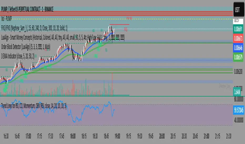
3 EMA Indicator3 EMA Indicator Description
The 3 EMA Indicator is a customizable TradingView indicator designed to plot three Exponential Moving Averages (EMAs) on a price chart. It helps traders analyze trends, identify potential trading signals, and monitor price momentum through the interaction of three EMAs with user-defined periods.
Features
Three EMAs: Displays three EMAs with default periods of 9, 21, and 50, which can be adjusted via input settings.
Customizable Parameters:
Source: Choose the price data (e.g., close, open, hlc3) for EMA calculations (default: close).
EMA Periods: Set custom lengths for each EMA (minimum 1).
Colors: Assign unique colors to each EMA for clear visualization (default: red, blue, green).
Line Width: Adjust the thickness of EMA lines (default: 2).
Dynamic Label: A label on the last bar displays the configured EMA periods (e.g., "EMA1: 9, EMA2: 21, EMA3: 50") for easy reference.
Overlay: Plots directly on the price chart, making it intuitive to compare EMAs with price action.
Usage
Trend Analysis: Use the relative positions of the EMAs to identify bullish (e.g., shorter EMA above longer EMA) or bearish trends.
Crossover Signals: Monitor EMA crossovers (e.g., 9-period EMA crossing above the 21-period EMA) for potential buy or sell signals.
Customization: Adjust periods, colors, and line width through the indicator’s settings to match your trading strategy.
How to Apply
Open TradingView’s Pine Editor.
Copy and paste the indicator’s Pine Script code.
Add the indicator to your chart.
Customize settings (periods, source, colors, line width) via the indicator’s input panel.
This indicator is ideal for traders seeking a simple yet flexible tool to track price trends and momentum using multiple EMAs.
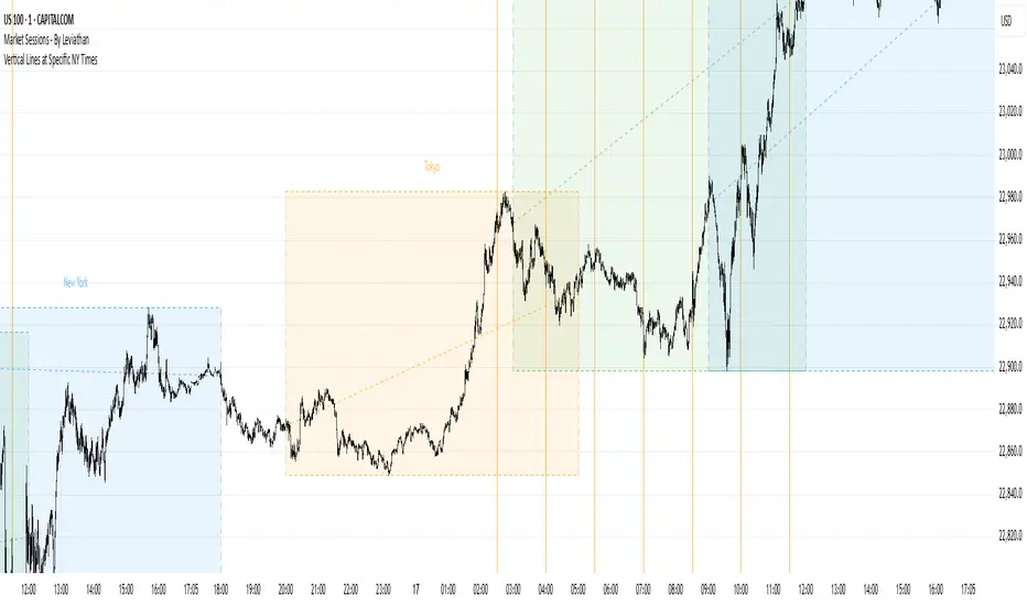
Vertical Lines at Specific NY Timesthese time zones indicates london session and new york session accumulation manipulation and distribution at than spesific time zones
Intraday Spark Chart [AstrideUnicorn]The Intraday Spark Chart (ISC) is a minimalist yet powerful tool designed to track an asset’s performance relative to its daily opening price. Inspired by Nasdaq’s real-time analytics analog dashboards. It visualizes intraday percentage changes as a color-coded sparkline, helping traders quickly gauge momentum and session bias.
Ideal for: Day traders, scalpers, and multi-asset monitors.
Best paired with: 1m to 4H timeframes (auto-warns on higher TFs).
Key metrics:
Real-time % change from daily open.
Final daily % change (updated at session close).
Daily open price labels for orientation.
HOW TO USE
Visual Guide
Sparkline Plot:
A green area/line indicates price is above the daily open (bullish).
A red area/line signals price is below the daily open (bearish).
The baseline (0%) represents the daily open price.
Session Markers:
The dotted vertical lines separate trading days.
Gray labels near the baseline show the exact daily open price at the start of each session.
Dynamic Labels:
The labels in the upper left corner of each session range display the current (or final) daily % change. Color matches the trend (green/red) for instant readability.
Practical Use Cases
Opening Range Breakouts: Spot early momentum by observing how price reacts to the daily open.
Multi-Asset Screening: Compare intraday strength across symbols by applying the indicator to multiple charts.
Session Close Prep: Anticipate daily settlement by tracking the final % change (useful for futures/swing traders).
SETTINGS
Asset (Input Symbol): Defaults to the current chart symbol. Switch to monitor other assets.

NEOs TDI + Sharkfin ScannerTDI + alert scanner for sharkfins use with Fibs and or support resistance for confluence

Alinhamento H1 + H4 com Fundo Colorido MACD Alignment Strategy: H1 + H4
This script highlights candles on the H1 chart with a colored background when there's full alignment between H1 and H4 based on the classic MACD (12,26,9) and EMA 200.
✅ Bullish background (green):
Price is above the EMA 200 on both H1 and H4
On both H1 and H4:
MACD line is above the Signal line
Histogram is green and above zero
MACD is above zero
❌ Bearish background (red):
Price is below the EMA 200 on both H1 and H4
On both H1 and H4:
MACD line is below the Signal line
Histogram is red and below zero
MACD is below zero
Use this tool to visually confirm trend alignment between timeframes and filter high-probability entries.

10/20 MA Coil: Progressive Colors & Multi-Day BreakoutThis indicator detects price “coil” setups and highlights potential breakout or breakdown opportunities using moving average alignment and volatility compression.
Features:
• Coil Detection:
• Identifies consolidation when:
• The 10 and 20 MAs are tightly aligned (within user-defined tolerance)
• Price is above both MAs and within 1.5x ADR of them
• The 50 MA is rising
• Progressive Coil Coloring:
• Coil candles are colored in progressively darker orange as the streak continues
• Bullish Breakout Signal:
• Triggers when a green candle follows a coiled bar
• The candle’s body must be greater than or equal to 1 ATR
• Colored lime green
• Bearish Breakdown Signal:
• Triggers when a red candle follows a coiled bar
• The candle’s body must be greater than or equal to 1 ATR to the downside
• Colored black
• Custom Candle Rendering:
• Candle body color represents coil or breakout state
• Wick and border are red or green to reflect price direction
• Optional Debug Tools:
• Coil streak, ATR, and distance from MAs can be plotted for deeper analysis
This script is designed for traders looking to spot price compression and prepare for high-probability moves following low-volatility setups.
TRIX Strong Hand - DidiTrix (or TRIX) is a technical analysis oscillator developed in the 1980s by Jack Hutson, editor of Technical Analysis of Stocks and Commodities magazine. It shows the slope (i.e., the derivative) of a triple-smoothed exponential moving average. The name Trix comes from "triple exponential."
The TRIX is a triple-smoothed exponential moving average used in technical analysis to track trends.
This is a customized version for use in conjunction with other indicators in the Didi Aguiar's CST Method. It has a standard setting of 9 periods and a 4-period average to signal crossovers. It is used as one of the indicators to detect trade exits, nicknamed "Strong Hand" and described as having "three coconuts between the legs" due to its strong confidence that the trade can continue in the trend.


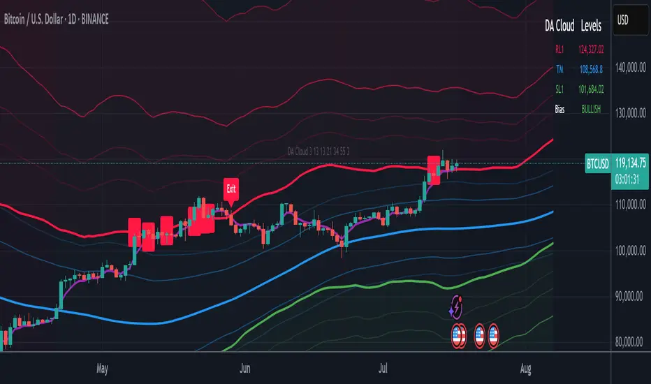
DA Cloud - DynamicDA Cloud - Dynamic | Detailed Overview
🌟 What Makes This Indicator Special
The DA Cloud - Dynamic is an advanced technical analysis tool that creates adaptive support and resistance zones that expand and contract based on market volatility. Unlike traditional static indicators, this cloud system "breathes" with the market, providing dynamic levels that adjust to changing market conditions.
📊 Core Components
1. Multi-Layered Cloud Structure
Resistance Cloud (Red): Three dynamic resistance levels (RL1, RL2, RL3) with intermediate channels (RC1, RC2)
Support Cloud (Green): Three dynamic support levels (SL1, SL2, SL3) with intermediate channels (SC1, SC2)
Trend Cloud (Blue): Five trend lines (TU2, TU1, TM, TL1, TL2) that flow through the center
Confirmation Line (Purple): A fast-reacting line that confirms trend changes
2. Forward Displacement Technology
The entire cloud system is projected 21 bars into the future (Fibonacci number), allowing traders to see potential support and resistance levels before price reaches them. This predictive element is inspired by Ichimoku Cloud theory but enhanced with modern volatility dynamics.
🔬 How It Works (Without Revealing the Secret Sauce)
Volatility-Responsive Design
The indicator continuously measures market volatility across multiple timeframes
During high volatility periods (like major breakouts), clouds expand dramatically
During consolidation, clouds contract and tighten around price
This creates a "breathing" effect that adapts to market conditions
Multi-Timeframe Analysis
Incorporates Fibonacci sequence periods (3, 13, 21, 34, 55) for calculations
Blends short-term responsiveness with long-term stability
Creates smooth, flowing lines that filter out market noise
Dynamic Level Calculation
Levels are not fixed percentages or static bands
Each level adapts based on current market structure and volatility
Channel lines (RC1, RC2, SC1, SC2) provide intermediate support/resistance
🎯 Key Features
1. Touch Point Detection
Colored dots appear when price touches key levels
Red dots = resistance touch
Green dots = support touch
Blue dots = trend median touch
2. Entry/Exit Signals
"Cloud Entry" labels when confirmation line crosses above SL1
"Cloud Exit" labels when confirmation line crosses below RL1
Background color changes based on bullish/bearish bias
3. Information Table
Real-time display of key levels (RL1, TM, SL1)
Current bias indicator (BULLISH/BEARISH)
Updates dynamically as market moves
⚙️ Customization Options
Main Controls:
Sensitivity (5-50): How responsive clouds are to price movements
Smoothing (1-50): Controls the flow and smoothness of cloud lines
Forward Displacement (0-50): How many bars to project the cloud forward
Advanced Volatility Settings:
Volatility Lookback (50-1000): Period for establishing volatility baseline
Volatility Smoothing (1-50): Reduces spikes in volatility expansion
Expansion Power (0.1-2.0): Controls how dramatically clouds expand
Range Divisor (1.0-20.0): Master control for overall cloud width
Level Spacing:
Individual multipliers for each resistance and support level
Allows fine-tuning of cloud structure to match different markets
Trend Spacing:
Separate controls for inner and outer trend bands
Customize the trend cloud density
📈 Trading Applications
1. Trend Identification
Price above TM (Trend Median) = Bullish bias
Price below TM = Bearish bias
Cloud color and width indicate trend strength
2. Support/Resistance Trading
Use RL1/SL1 as primary targets and reversal zones
RC1/RC2 and SC1/SC2 provide intermediate levels
RL3/SL3 mark extreme levels often seen at major tops/bottoms
3. Volatility Analysis
Expanding clouds signal increasing volatility and potential big moves
Contracting clouds indicate consolidation and potential breakout setup
Cloud width helps with position sizing and risk management
4. Multi-Timeframe Confirmation
Works on all timeframes from 1-minute to monthly
Higher timeframes show major market structure
Lower timeframes provide precise entry/exit points
🎓 Best Practices
Combine with Volume: High volume at cloud levels increases reliability
Watch for Touch Clusters: Multiple touches at a level indicate strength
Monitor Cloud Expansion: Sudden expansion often precedes major moves
Use Multiple Timeframes: Confirm signals across different time periods
Respect the Trend Median: This is often the most important level
⚡ Performance Notes
Optimized for up to 2000 bars of historical data
Smooth performance with 500+ lines and labels
Works on all markets: Crypto, Forex, Stocks, Commodities
📝 Version Info
Current Version: 1.0
Dynamic volatility expansion system
Full customization suite
Touch point detection
Entry/exit signals
Forward displacement projection
Relative Strength RSI with LevelsThis is a relative Strength Indicator used for comparing the performance of the Stock analyzed with the SPX, with a single line moving above or below a midline signaling over- or underperformance when compared to S&P500 SPX Index

Heikin Ashi Trend Strategy (Beginner)FOR BEGINNERS
Perfect! Below is a custom Pine Script for TradingView that:
Uses Heikin Ashi candles
Shows buy/sell signals based on trend conditions:
3+ green/red Heikin Ashi candles
Price above/below 20 EMA
RSI filter for momentum

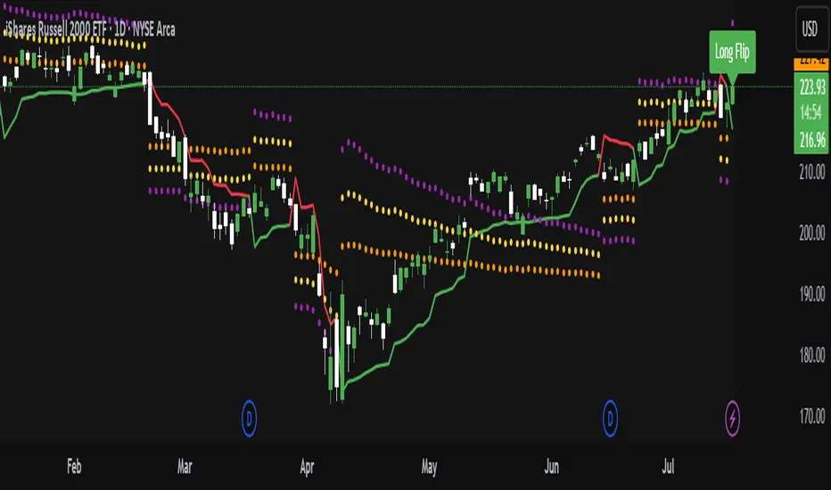
ATR Trailing Stop with ATR Targets [v6]What the Indicator Does
This custom TradingView indicator is designed for active traders who want to automate and visualize their trailing stop management and target setting, using true market volatility. It combines the Average True Range (ATR) with dynamic market structure logic to:
Trail a stop-loss behind major swings in real time, using 2×ATR (adjustable) from the highest high in uptrends or the lowest low in downtrends.
Flip trading bias between bullish and bearish when the stop is breached.
Identify and plot three profit targets (at 1, 2, and 3 ATR from the breakout/flip point) after every stop-flip, helping traders scale out or set take-profits objectively.
Maintain a visible presence on your chart every bar to avoid indicator errors, with color and labeling for clear distinction between long/short phases.
How the Indicator Works
1. ATR Calculation
ATR Period and Multiplier: You select your preferred ATR length (default is 14 bars) and a multiplier (default is 2.0).
Volatility Adjustment: ATR measures the average "true" bar range, so the trailing stop and targets adapt to current volatility.
2. Trailing Stop Logic
Uptrend (bullish bias): The indicator tracks the highest high made since the last bearish-to-bullish flip and sets the stop at - .
The stop only raises (never lowers) during an uptrend, protecting gains in strong moves.
Downtrend (bearish bias): Tracks the lowest low made since the last bullish-to-bearish flip, with stop at + .
The stop only lowers (never raises) in a downtrend.
Flip Point: If price closes through the trailing stop, the current bias “flips,” and the logic reverses (bullish to bearish or vice versa). At the new close, flip price and bar index are stored for target calculation.
3. ATR Targets after Flip
After each stop flip:
Three targets—based on the new close price—are calculated and plotted:
Long flip (new bull bias): Target1 = close + 1×ATR, Target2 = close + 2×ATR, Target3 = close + 3×ATR.
Short flip (new bear bias): Target1 = close - 1×ATR, Target2 = close - 2×ATR, Target3 = close - 3×ATR.
These targets help with scaling out, partial profit-taking, or setting automated orders.
4. Visual Feedback
Trailing stop line: Green for long bias, red for short bias.
Targets: Distinct color-coded circles at 1, 2, 3 ATR levels from the most recent flip.
Flip Labels: Mark the bar and price where bias flipped (“Long Flip” or “Short Flip”) for quick pattern recognition.
Subtle background shading: Ensures TradingView's requirement for “indicator output every bar.”
How to Use This Indicator
Parameter Setup
ATR Period and Multiplier: Adjust to match the timeframe and volatility of your instrument.
Lower periods/multipliers for short-term/volatile trading.
Higher values for smoother signals or higher timeframes.
Starting Trend: Set to match the expected initial bias if the instrument has strong trend characteristics.
Trading Application
1. Daily Bias Approach
Establish your bias in line with your trading plan (e.g., only trade long if price is above the previous day's high, short below the previous day's low).
Only look for trades in the indicator's current bias direction, as expressed by the stop and background color.
2. Entry
Use the indicator as a real-time confirmation or trailing stop for your entries.
Breakout: Enter when price establishes the current bias, using the trailing stop as your risk level.
Reversal: Wait for a bias flip after an extended move; enter in the direction of the new bias.
VWAP Rebound: Combine with a VWAP bounce—enter only if the indicator bias supports your direction.
3. Exits/Targets
Trailing stop management: Move your stop according to the plotted line; exit if your stop is hit.
Profit-taking: Scale out or take profits as price approaches each ATR-based target.
Use the dynamic labeling to identify reversal flips and reset your plan if stopped or the bias changes.
4. Market Context
Filter and frame setups by watching correlated indicators (DXY, VIX, AUDJPY, put/call ratio) and upcoming news; trade only in the daily bias direction for best consistency.
5. Practical Tips
Combine this indicator with your custom watchlist and alert settings to get notified on flips or targets.
Review the last label ("Long Flip"/"Short Flip") and targets to plan partial exits.
Remember: ATR adapts to volatility, so the stop and targets stay proportionate even when price action shifts.
Support & Resistance ZonesAuto Support And Resistance Lines, This AI auto support and ressitance lines helps identify support and resitance

kinetic test123mattThe Nuclear Regulatory Commission (NRC) is not the kind of agency most Americans think about often.
In fact, there’s a decent chance you’ve never even heard of it outside of a few advanced social studies classes in high school or college.
The NRC was originally established back in 1975 as a successor to the United States Atomic Energy Commission. Then, just a few years later, in 1979, there was a partial meltdown in the Unit 2 reactor at the Three Mile Island Nuclear Generating Station.
That disaster was mercifully averted, but the event left a lasting impact on the still-developing agency…
Following Three Mile Island, the NRC was widely perceived as risk-averse. They developed a licensing process that could be counted among the most bureaucratic and byzantine in history.
Just securing the NRC’s approval for a new nuclear reactor could take years (in some cases over a decade) and cost hundreds of millions of dollars. And that’s before you even start breaking ground!
Bringing Georgia’s 3 and 4 reactor units at Plant Vogtle online was estimated to cost $14 billion at first. However, due to various delays in the approval process and subsequent contracting issues, costs ballooned to more than $30 billion, with a wait of 15 years.
Sounds like a nightmare, right?
Don’t worry — it gets worse!
So far, we’ve only been talking about large light-water reactors (LWRs). Perish the thought, but those are the kinds of reactors the NRC is actually optimized to work with.
Newer technologies, such as small modular reactors (SMRs) or molten salt reactors (MSRs), are evaluated on a case-by-case basis. And it just so happens that the NRC has neither the manpower nor the realistic expertise to evaluate these developments comprehensively.
That means even for the companies that can develop next-generation nuclear technology, they’re going to face a huge production bottleneck when it comes to the NRC approving the projects.


8 AM & 9 AM NY Candle HighlighterThis indicator helps me to know when the 9am NY candle has closed above or below the previous candle.

3 Consecutive Same Color CandlesThis TradingView Pine Script detects when three consecutive candlesticks are either all bullish (green) or all bearish (red). It plots a triangle marker above or below the candle to visually signal the pattern and optionally triggers alerts.
How It Works:
A green signal (triangle up) appears below the third candle if the last 3 candles closed higher than they opened (bullish).
A red signal (triangle down) appears above the third candle if the last 3 candles closed lower than they opened (bearish).
Alerts can be set up to notify you immediately when the pattern forms.
Use Case on the 10-Minute Chart:
On the 10-minute chart, this script helps you spot short-term momentum buildups in either direction.
Bullish Signal (3 Green Candles):
Suggests buyers are gaining control.
Can be used to:
Enter breakout trades
Confirm trend continuation
Prepare for scalp entries or momentum trades
Bearish Signal (3 Red Candles):
Indicates sellers are applying pressure.
Can help:
Spot pullbacks or trend reversals
Set up for short positions
Warn of potential breakdowns
Example Trading Ideas:
Pair with EMA or support/resistance for confirmation.
Use as a momentum filter in scalping systems.
Combine with volume or RSI divergence to gauge strength or exhaustion.

Sesión Asiatica 5-10 PM México + EMAs + Cruces# Asian Session EMA Crossover Indicator
## Overview
This Pine Script indicator is designed specifically for trading during the Asian session (5-10 PM Mexico time) and focuses on EMA crossover signals with visual markers.
## Key Features
### 1. **Multiple EMAs Display**
- **EMA 8** (Blue line) - Short-term trend
- **EMA 13** (Green line) - Medium-term trend
- **EMA 21** (Yellow line) - Intermediate trend
- **EMA 55** (Red line) - Long-term trend
- Toggle option to show/hide all EMAs
### 2. **Asian Session Focus**
- Configured for Mexico timezone (America/Mexico_City)
- Active trading window: 5:00 PM - 10:00 PM Mexico time
- Crossover signals only trigger during this session
### 3. **EMA 8/13 Crossover Detection**
- **Bullish Signal**: Green triangle (↑) appears below price when EMA 8 crosses above EMA 13
- **Bearish Signal**: Red triangle (↓) appears above price when EMA 8 crosses below EMA 13
- Signals only occur during Asian session hours
### 4. **Alert System**
- Real-time alerts for bullish crossovers
- Real-time alerts for bearish crossovers
- Alerts only fire during Asian session
## Configuration Options
- Customizable EMA periods (default: 8, 13, 21, 55)
- Show/hide EMAs toggle
- Show/hide crossover signals toggle
- Timezone selection (Mexico City, GMT-6, GMT-5)
- Session time adjustment
## Use Case
Ideal for traders who focus on Asian market hours and use EMA crossover strategies for entry signals. The indicator helps identify momentum shifts during the Asian session while filtering out noise from other trading sessions.

7 EMA CloudThe "7 EMA Cloud" script was likely flagged because it reuses the core concept of EMA clouds (shading areas between multiple EMAs to visualize trends, support/resistance, and momentum) without crediting the original inventor, Ripster (author ripster47 on TradingView). This concept is prominently associated with Ripster's "EMA Clouds" indicator, which popularized filling spaces between EMA pairs for trading signals. TradingView's house rules require crediting authors when reusing open-source ideas or code, even if not a direct copy-paste, and mandate significant improvements where the original forms a small proportion of the script. Your version adds features like multiple color modes (Classic rainbow, Monochrome, Heatmap), customizable signal sizes, and crossover alerts between the first and last EMA, which are enhancements, but the foundational EMA ribbon/cloud idea needs explicit attribution in the description and ideally code comments to comply.
Additionally, the description might be seen as not fully self-contained (e.g., it uses promotional language like "Advanced" and "Adaptive Trend & Signal Suite" without deeply explaining calculations or use cases), potentially violating rules against relying on code or external references for clarity.
To fix this, republish a new version with proper credits, ensure the description is detailed and standalone, and emphasize your improvements (e.g., the 7 Fibonacci-based EMAs, color modes, and signals). Do not reuse the flagged script—create a fresh one. Here's a compliant description you can use:
7 EMA Cloud Indicator
Overview
The 7 EMA Cloud overlays seven exponential moving averages (EMAs) with Fibonacci-inspired periods and fills the spaces between them with customizable "clouds" to visually represent trend strength, direction, and convergence/divergence. It includes crossover signals between the shortest and longest EMAs for potential entry/exit points, with adjustable visual modes for different trading styles. This helps traders identify bullish/bearish momentum, support/resistance zones, and overextensions in trending or ranging markets.
This script builds on the EMA cloud concept popularized by Ripster (ripster47) in their "EMA Clouds" indicatortradingview.com, where areas between EMA pairs are shaded for trend analysis. Improvements include a fixed set of 7 Fibonacci EMAs, multiple color schemes (Classic rainbow, Monochrome grayscale, Heatmap for intensity), user-selectable signal sizes, and transparency controls. Released under the Mozilla Public License 2.0.
Key Features
7 EMAs with Clouds: EMAs at periods 8, 13, 21, 34, 55, 89, and 144; clouds filled between consecutive pairs to show alignment (tight clouds for consolidation, wide for trends).
Color Modes:
Classic: Rainbow gradients (blue to purple) for vibrant distinction.
Monochrome: Grayscale shades for minimalistic charts.
Heatmap: Red-to-blue spectrum to highlight "hot" (volatile) vs. "cool" (stable) areas.
Crossover Signals: Triangle markers (up for bullish, down for bearish) when the shortest EMA crosses the longest; sizes from Tiny to Huge.
Display Options: Toggle EMA lines on/off, adjust cloud transparency (0-100%), and enable alerts for crossovers.
Alerts: Notifications for "Bullish EMA Crossover" (EMA1 > EMA7) and "Bearish EMA Crossover" (EMA1 < EMA7).
How It Works
EMA Calculations: Each EMA is computed using ta.ema(close, period), with periods based on Fibonacci sequences for natural market rhythm alignment.
Clouds: Filled via fill() between plot pairs, with colors derived from the selected mode and transparency applied.
Signals: Detected with ta.crossover(ema1, ema7) and ta.crossunder(ema1, ema7), plotted as shapes with mode-specific colors (e.g., green/lime for bull, red for bear).
Customization: Inputs grouped into EMA Settings (periods), Display Settings (visibility, colors, transparency), and Signal Settings (size).
Customization Options
EMA Periods: Individually adjustable (defaults: 8, 13, 21, 34, 55, 89, 144).
Show EMAs: Toggle to hide lines and focus on clouds.
Cloud Transparency: 0% for solid fills, 100% for invisible (default 80%).
Color Mode: Switch between Classic, Monochrome, or Heatmap.
Signal Size: Tiny, Small, Normal, Large, or Huge for crossover markers.
Ideal Use Case
Suited for swing or trend-following on any timeframe (e.g., 15m-1h for intraday, daily for swings) and assets (stocks, forex, crypto, futures). Enter long on bullish crossovers above aligned clouds; exit on bearish signals or cloud widenings. Use Monochrome for clean charts or Heatmap for volatility emphasis. Combine with volume or RSI for confirmation.
Why It's Valuable
By expanding Ripster's EMA cloud idea with multi-mode visuals and integrated signals, this indicator provides a versatile, at-a-glance tool for trend assessment—reducing noise while highlighting key shifts. It's more adaptive than basic MA ribbons, with Fibonacci periods adding a layer of harmonic analysis.
Note: Test on historical data or demo accounts. Not financial advice—incorporate risk management. Optimized for Pine Script v5; some features may vary on non-overlay charts.
